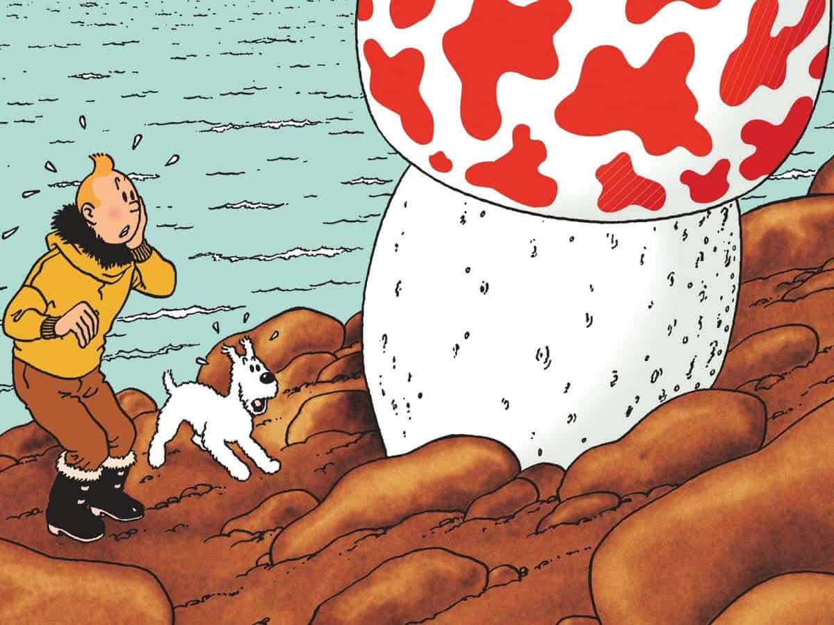
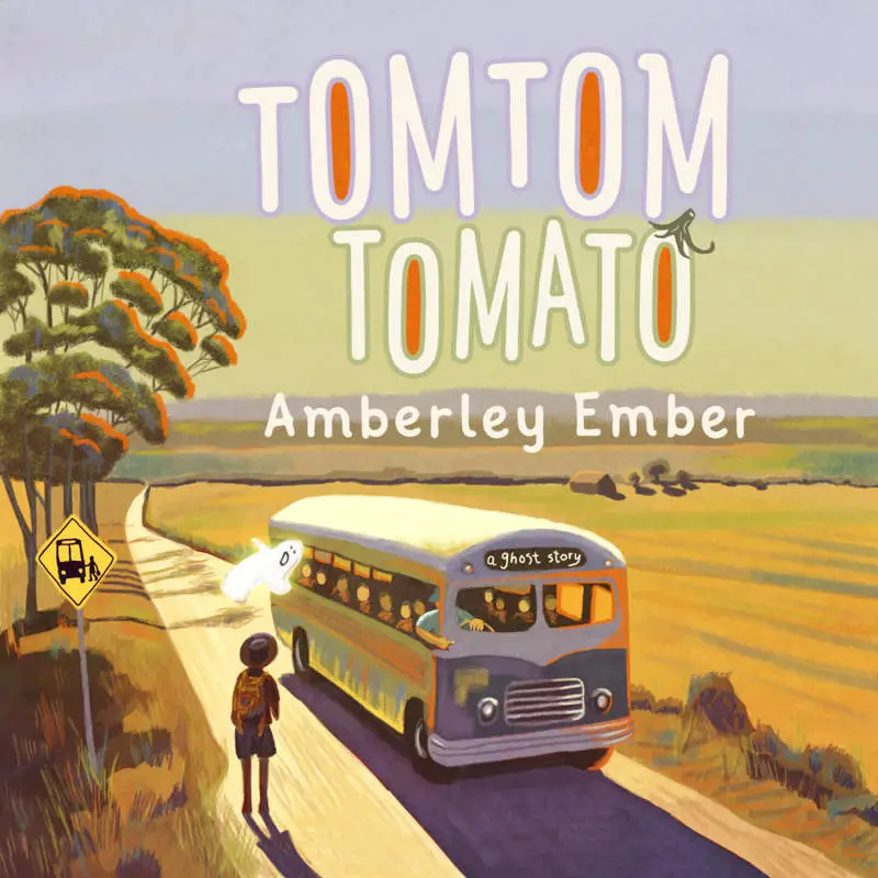
The atomic style of illustration is closely related to ‘ligne claire’. In French this means ‘clear line’.
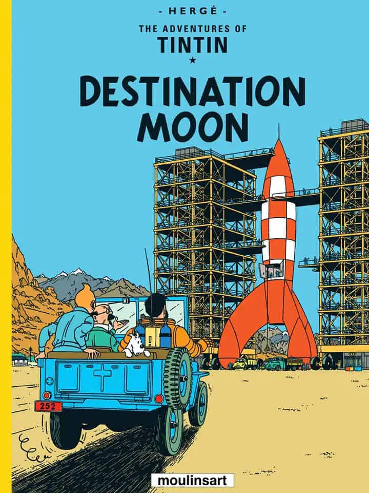
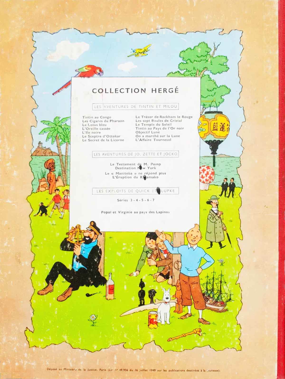
The ligne claire/atomic style of drawing was created and pioneered by Hergé (real name Georges Prosper Remi). Hergé was Belgian and lived from 1907 to 1983. He is best known for creating The Adventures of Tintin.
Hergé’s style of cartooning wasn’t called ‘ligne claire’ until 1977, coined by Dutch artist and graphic designer Joost Swarte.
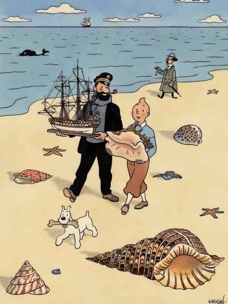
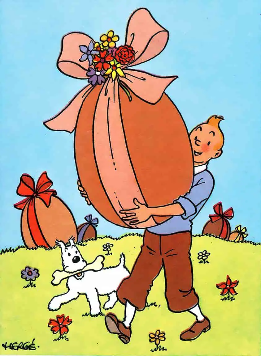
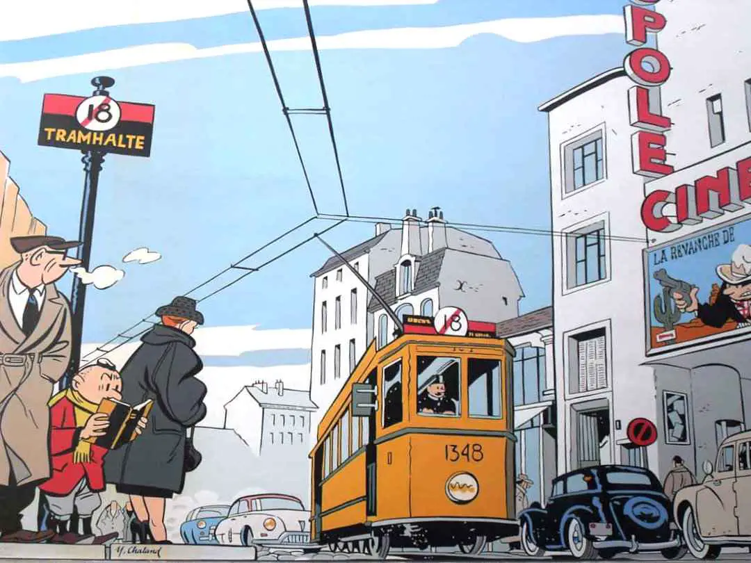
Rewind a bit and French illustrator Yves Chaland (1957-1990) sort of relaunched Hergé’s style in France. This is when the style also started to become known as ‘atomic’.
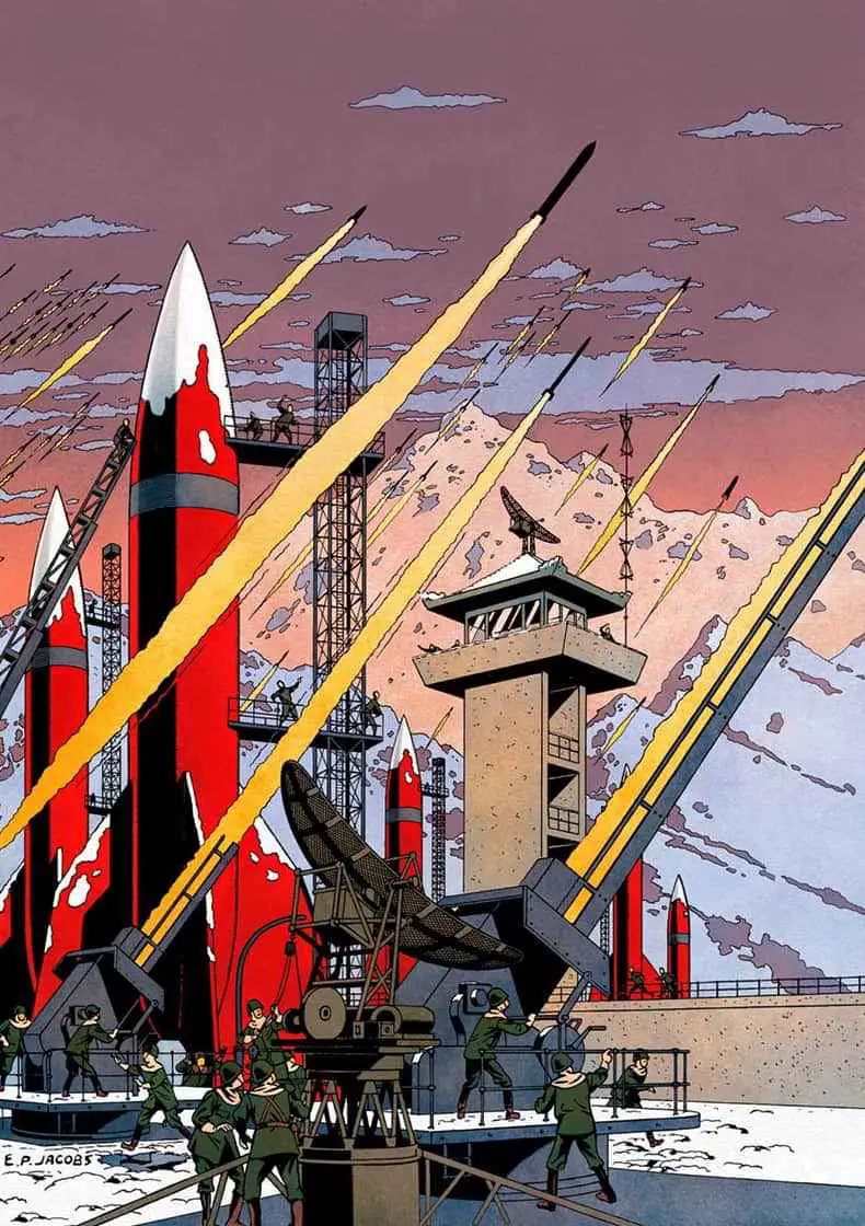
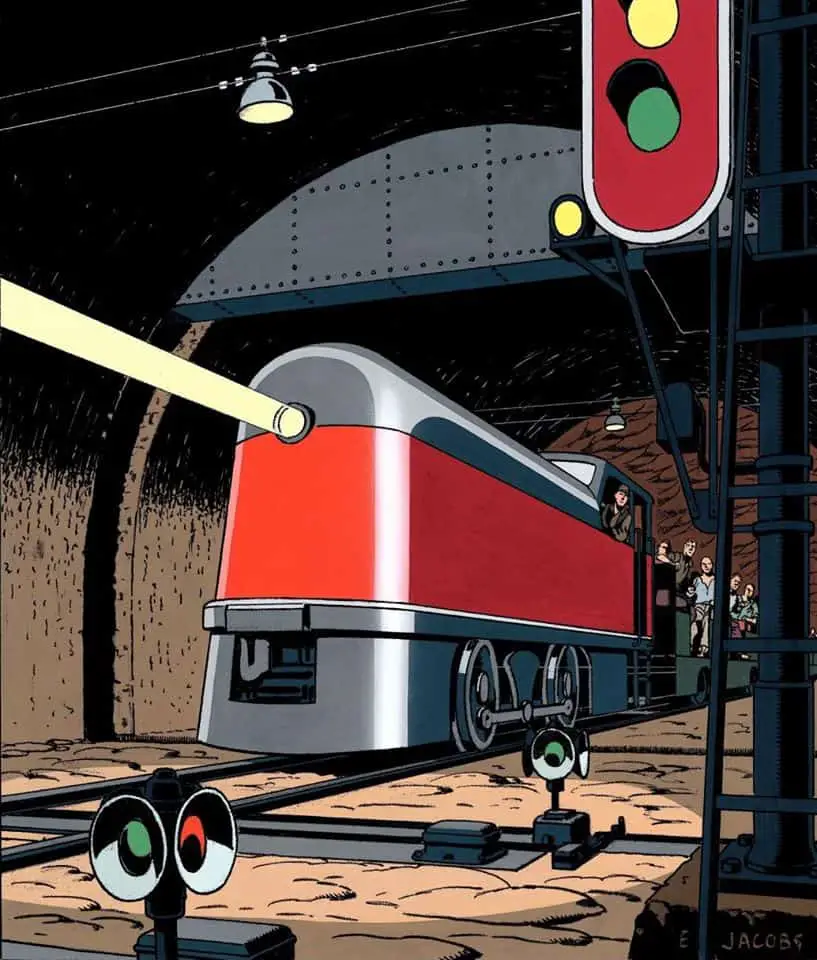
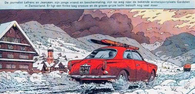
The French Clear-Line master Yves Chaland is the main representative of the so-called “atomic style”, a nostalgic 1950s retro style. In his modern style of nostalgia, he created an ironic note to the classic Franco-Belgian comics, in the form of his popular series ‘Freddy Lombard’.
Comiclopedia
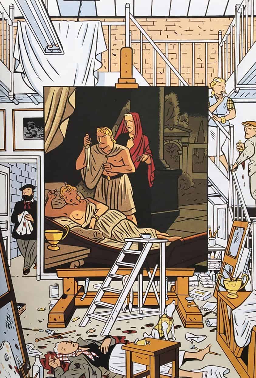
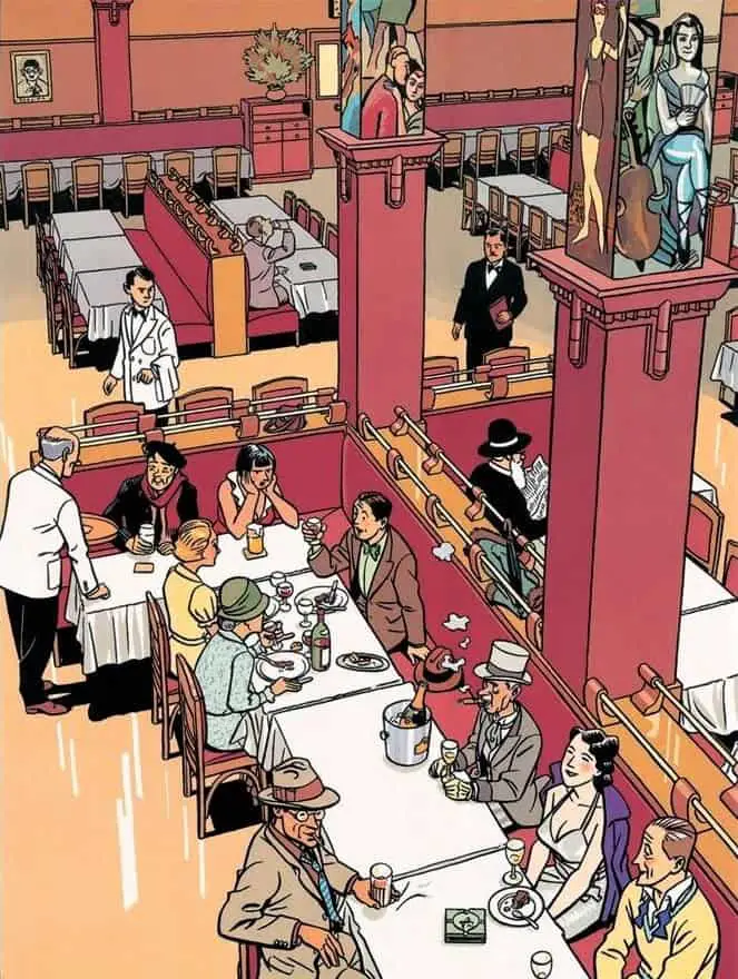
Yves Chaland sadly died young, in a car accident, at the age of 33. Below is one of his illustrations. If you’ve seen Tintin you’ll recognise the style.
FEATURES OF THE ATOMIC STYLE OF ILLUSTRATION
- Clear, strong lines. In ‘clear line”ligne claire illustration, these lines are all of the same width, though there is clear pressure sensitivity utlised in the style more broadly, with tapering lines. We also see thicker lines used to outline objects and/or people.
- However, there is no hatching.
- Contrast is downplayed.
- Shadows are important to the balance of the composition, and are therefore emphasised, as if there is a strong light source somewhere. Grounding shadows might be black, for example. A darker hue is often used to suggest form where shadow would fall, but it would not look so obvious in real life, or in realistic painting.
- When coloured, atomic illustrations feature hues which are more saturated and ‘interesting’ than what we’d expect in the real world. In Chaland’s illustration above, a yellow hue stands in for what would clearly be coded as ‘brown’ in the furniture and picture frame.
- Where the illustration features a background, cartoonish characters juxtapose against a ‘set’ which is more realistic than they are, with dots for eyes and other simplified features.
- Together, these elements result in a ‘flat aspect’ (relatively little depth perception). These illustrations seem influenced by the stage rather than the camera of modern TV, with its close-ups and various angles. This ‘stage’ aspect is partly what contributes to the nostalgic feel of atomic illustration, harking back to a pre-cinematic era.
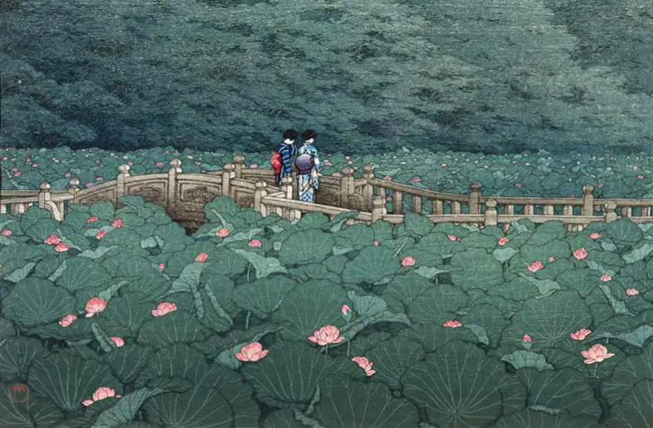
The 20th century atomic style of illustration didn’t come out of nowhere. The art of Hasui Kawase reminds me very much of Tin-tin, with the thin, even outlines and slightly cartoonish feel.
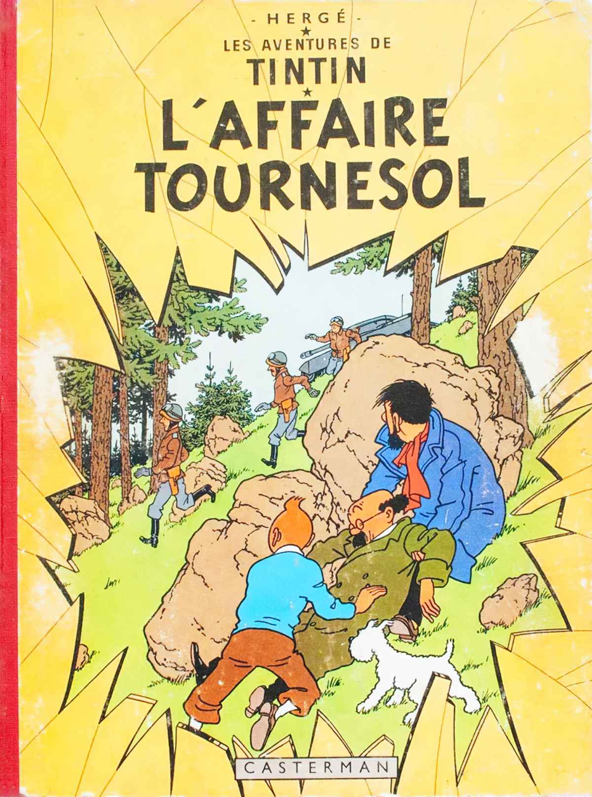
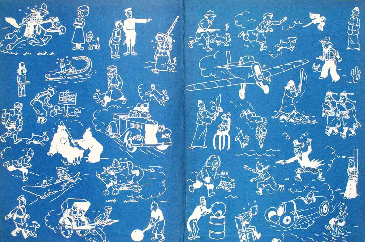
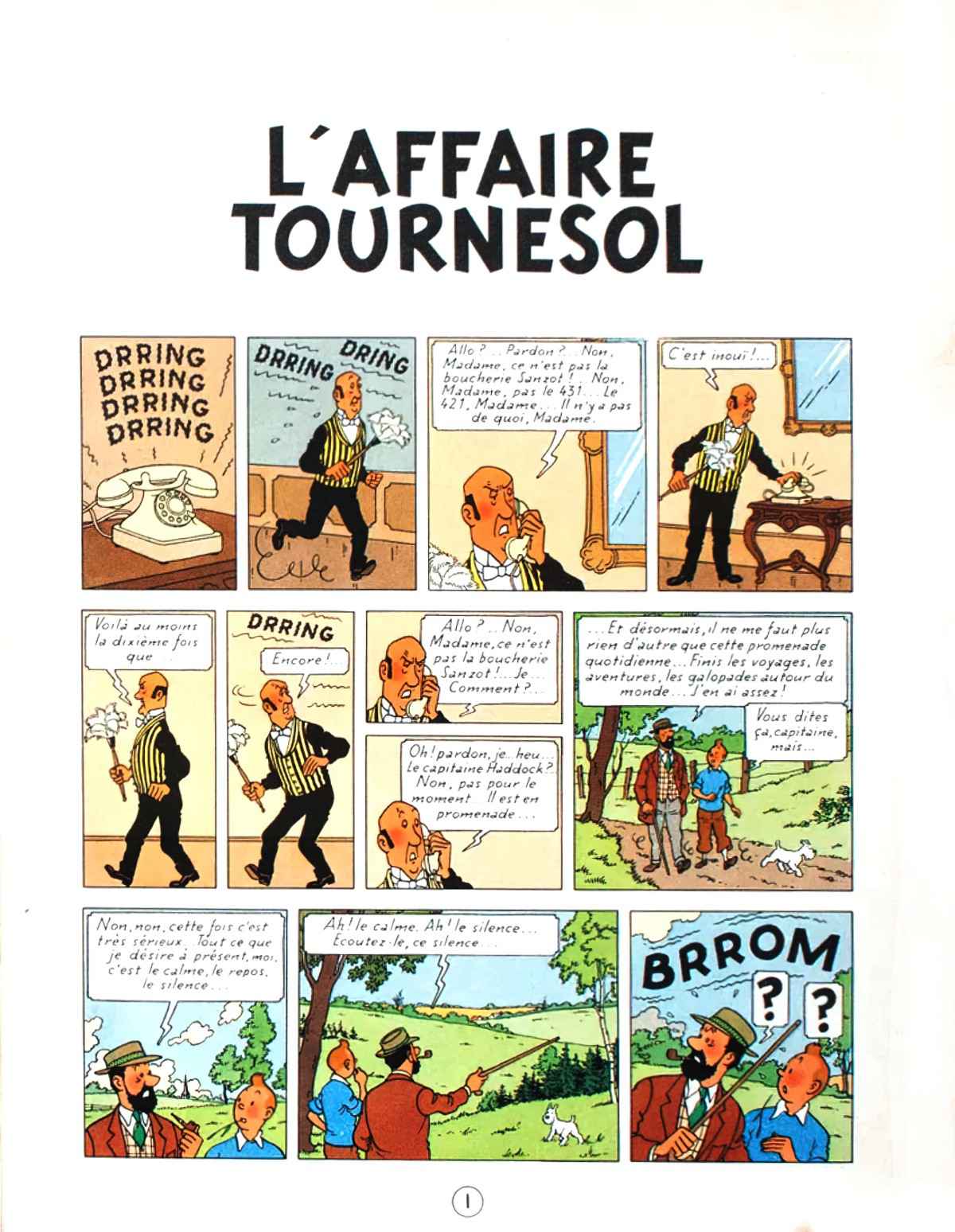
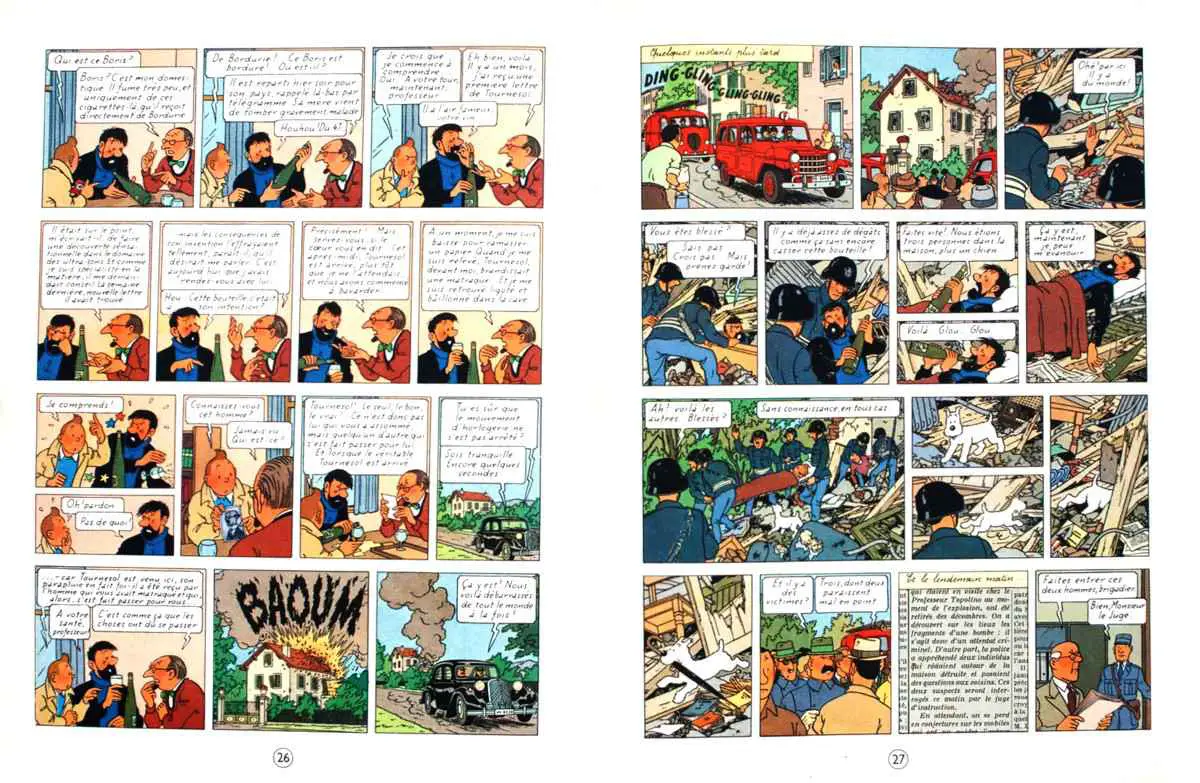
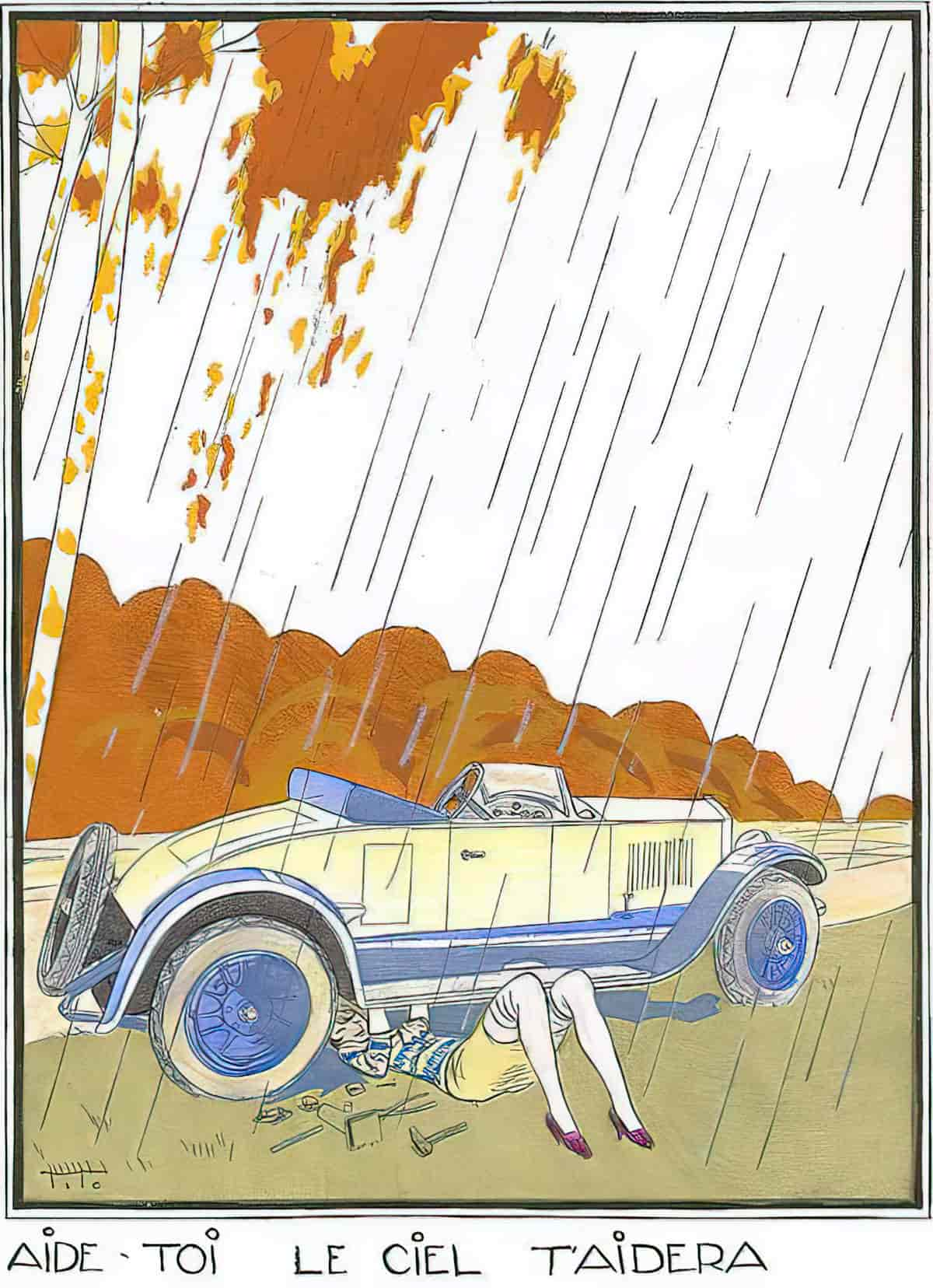
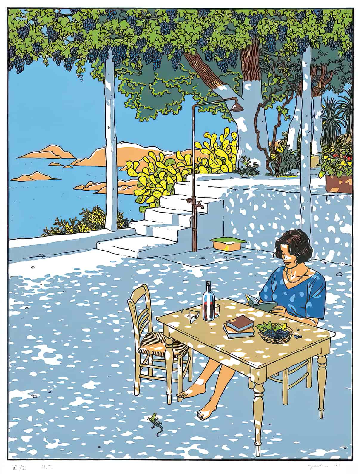
The atomic style of illustration didn’t come out of nowhere. The illustration below by Italian artist Ettore Tito dates from around 1920. This is not clear line/atomic — notice the crosshatching. But we have the clear border outlines, the atomic colour palette and little in the way of depth perception. (Look at the artist’s other paintings and you’ll see this isn’t his usual style.)
ATOMIC STYLE IN CHILDREN’S BOOKS AND STORIES
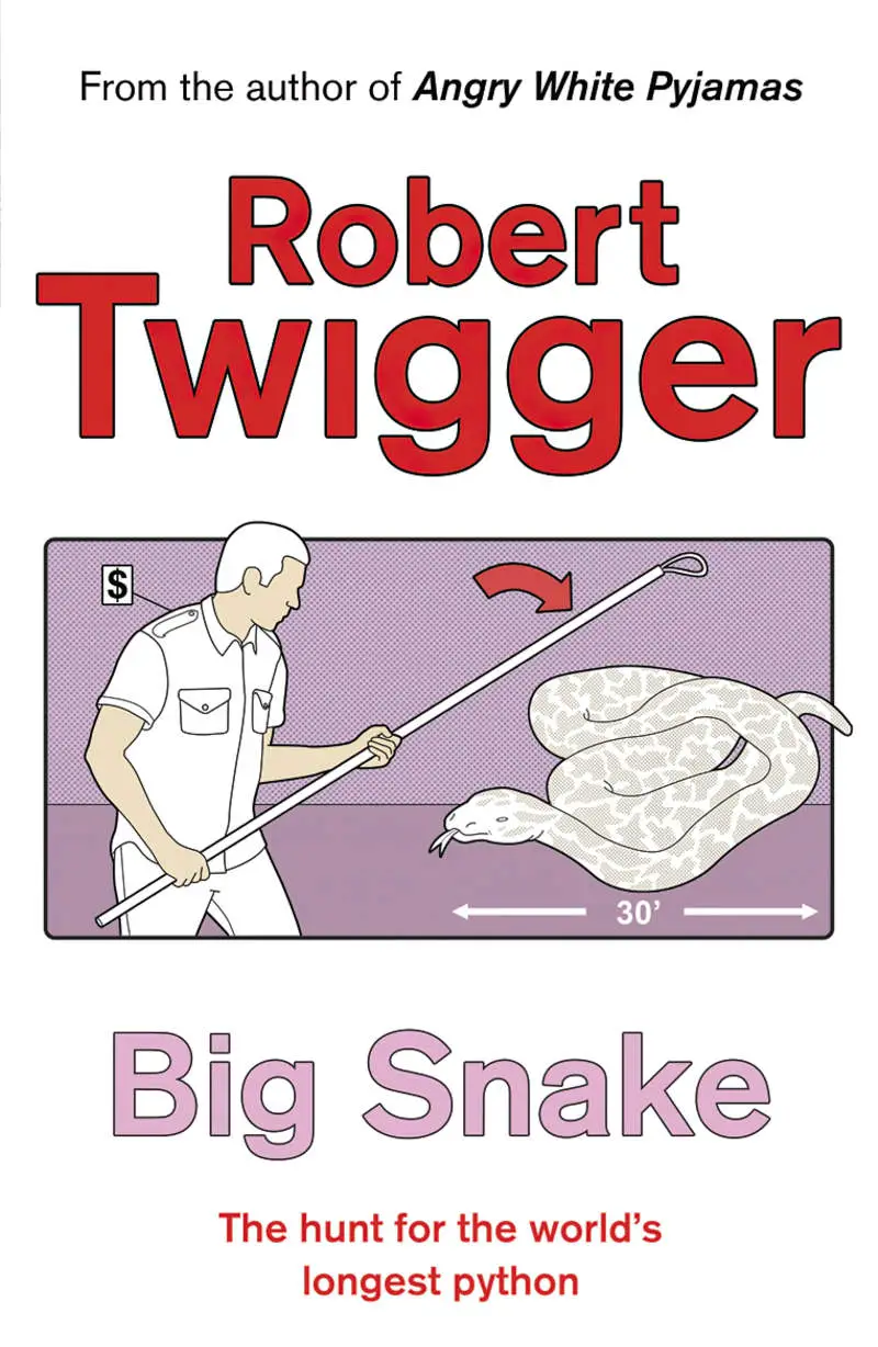
- The Where’s Wally? series by Martin Handford is especially well-suited to this style — indeed requires it — because the illustrations are so detailed they can’t take further interest value in the line and hatching.
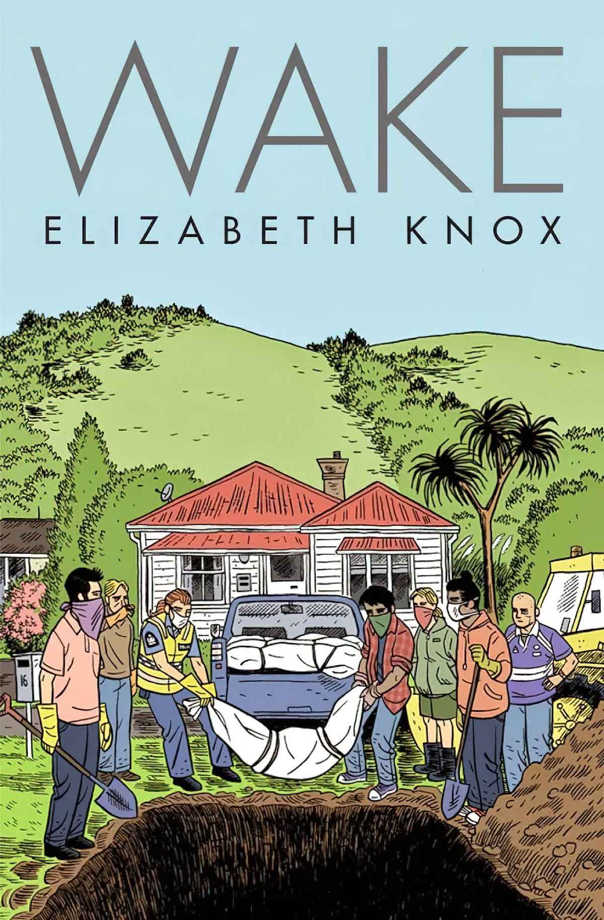
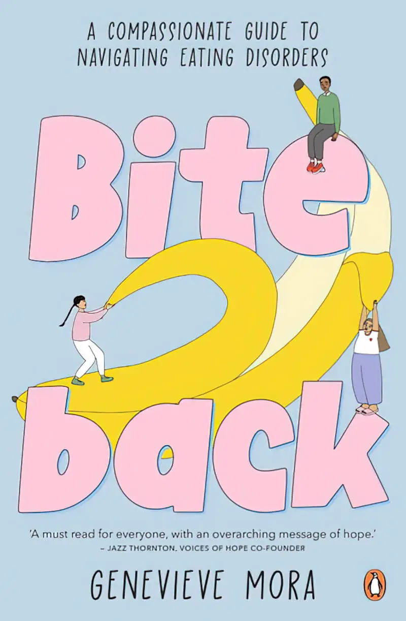
- Mo Willems illustrates with strong black line and flat aspect, though his line is less ‘ligne claire’ because much of it appears to have been created with a pencil or crayon, giving the work a more naive look. (See Elephant and Piggie.) The lines also overlap at times, deliberately, adding to the ‘handdrawn, sketchy’ look.
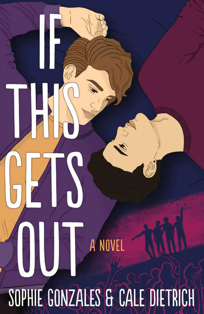
- Numerous examples can be found in graphic novels. The graphic novels of Raina Telgemeir are similar to the atomic style. The strokes clearly vary in width and contain interest in their own right. Thicker lines outline an object, while thinner lines add interior detail. However, there is no hatching. The flat aspect, the use of darker colour as shading, the absence of hatching and the character illustration is clearly ‘Tintin’-esque.
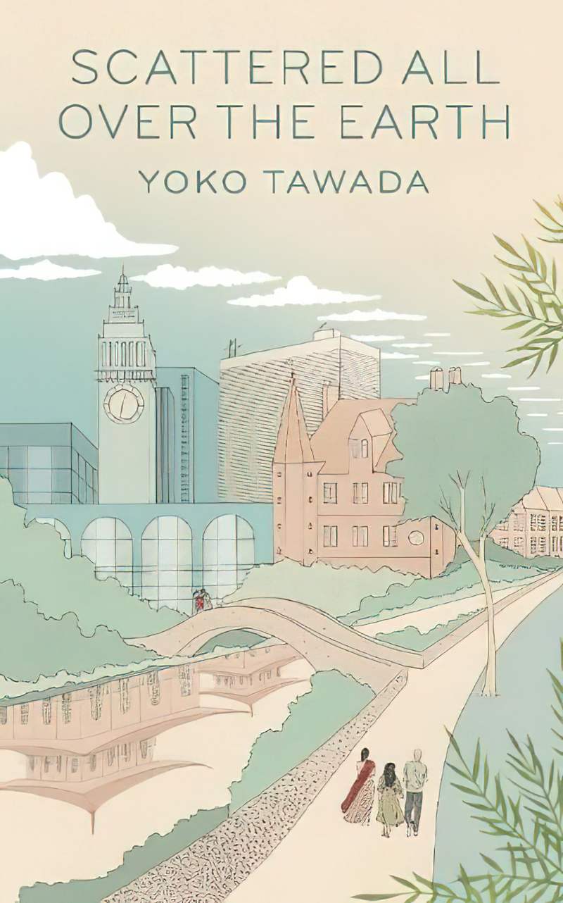
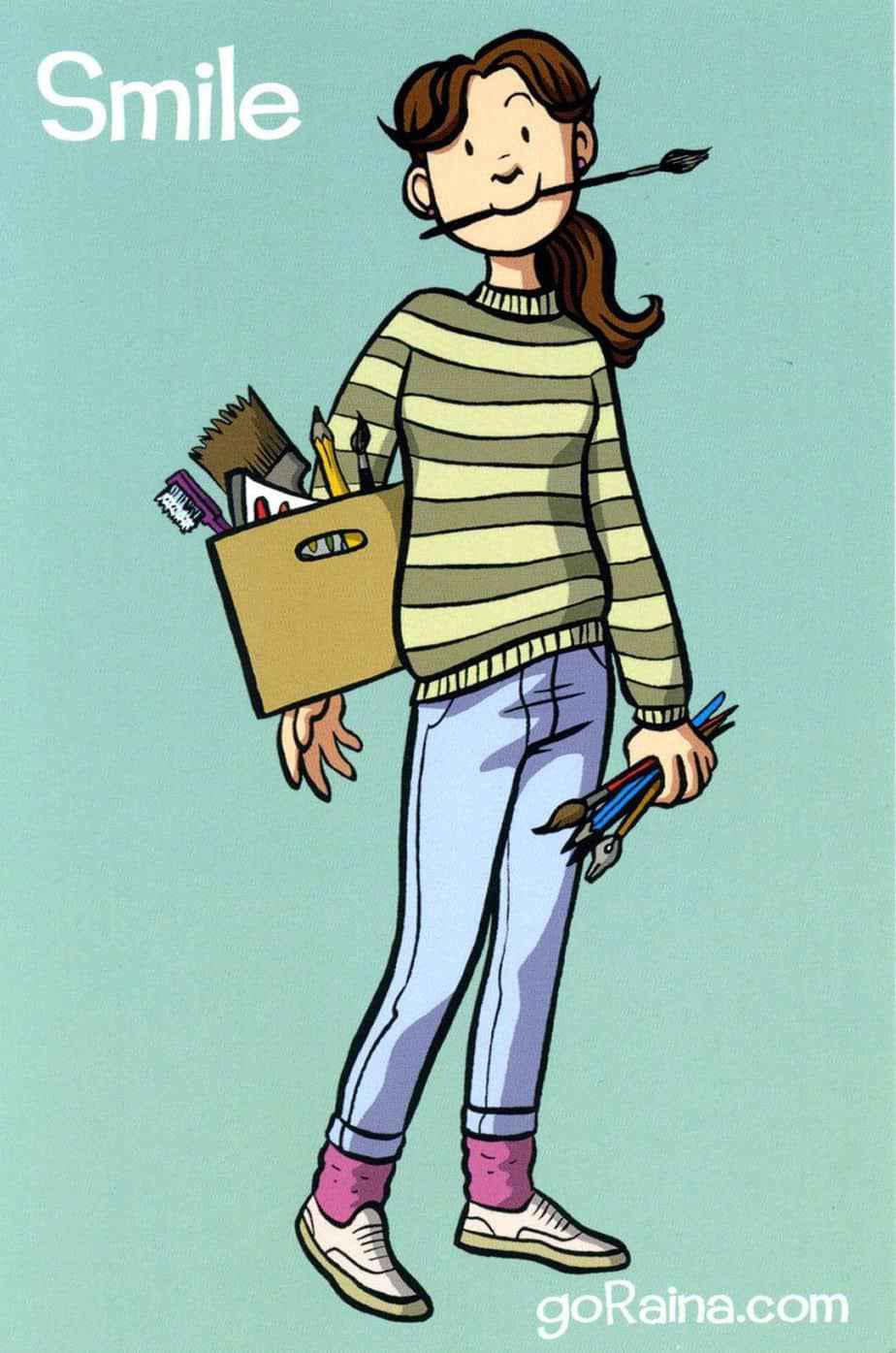
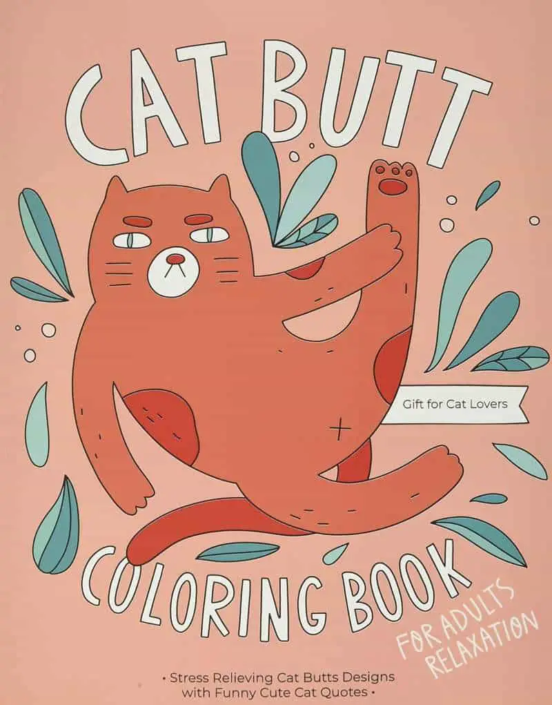
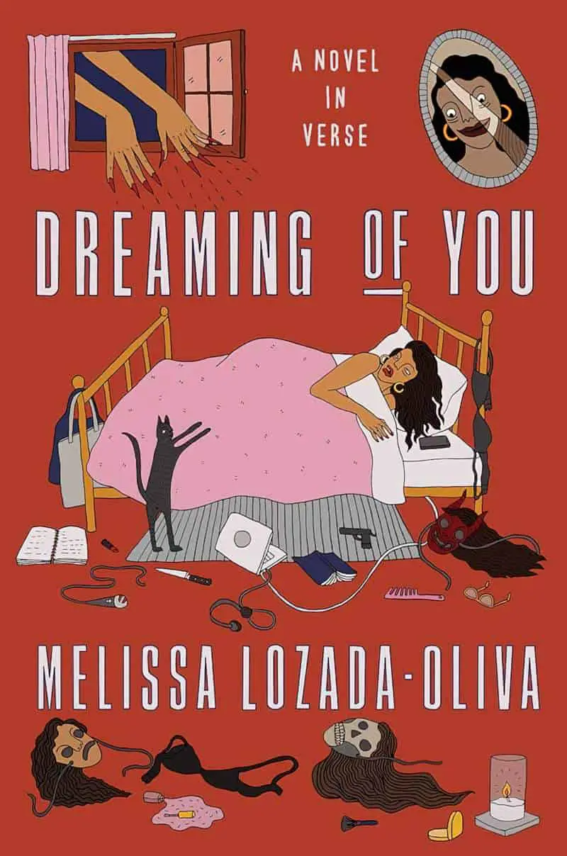
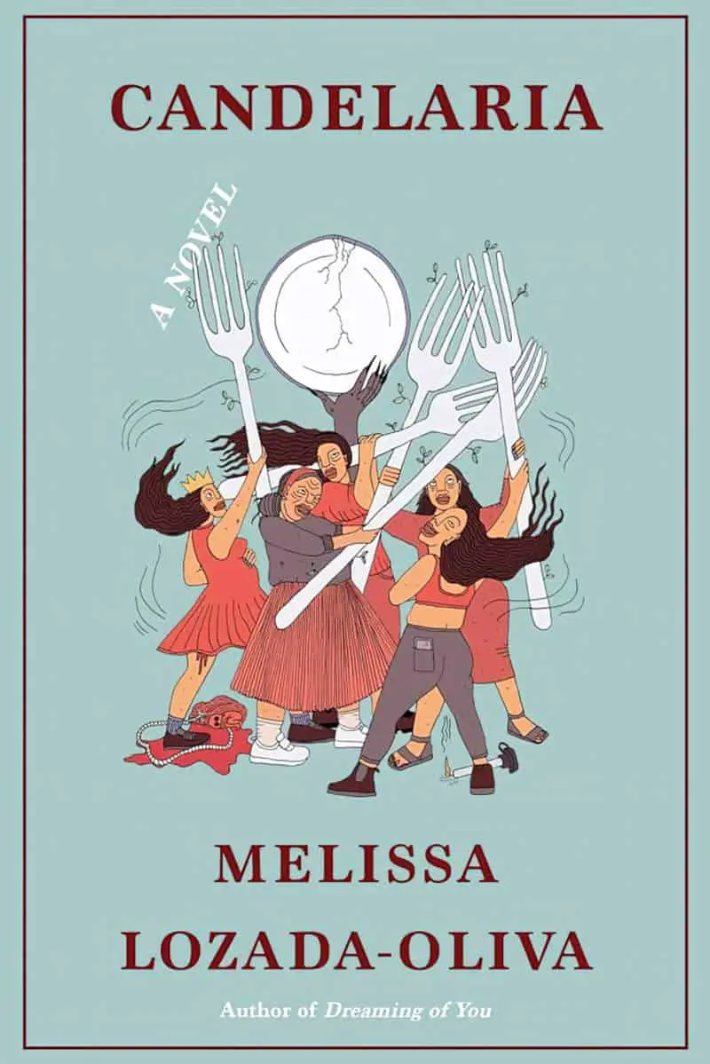
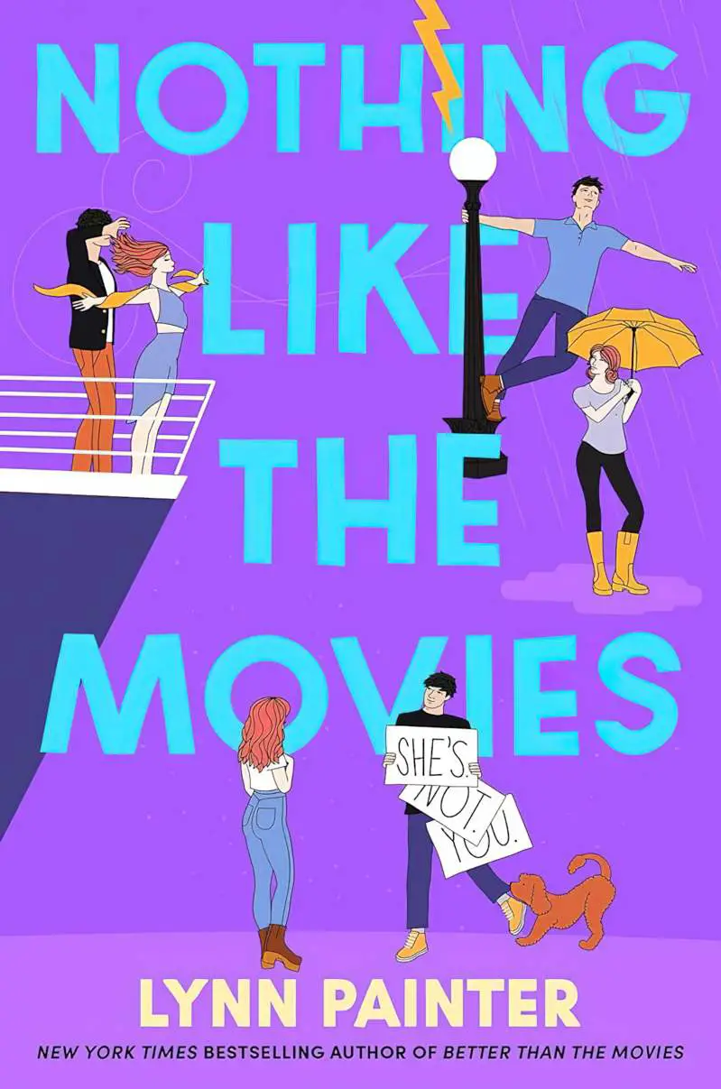
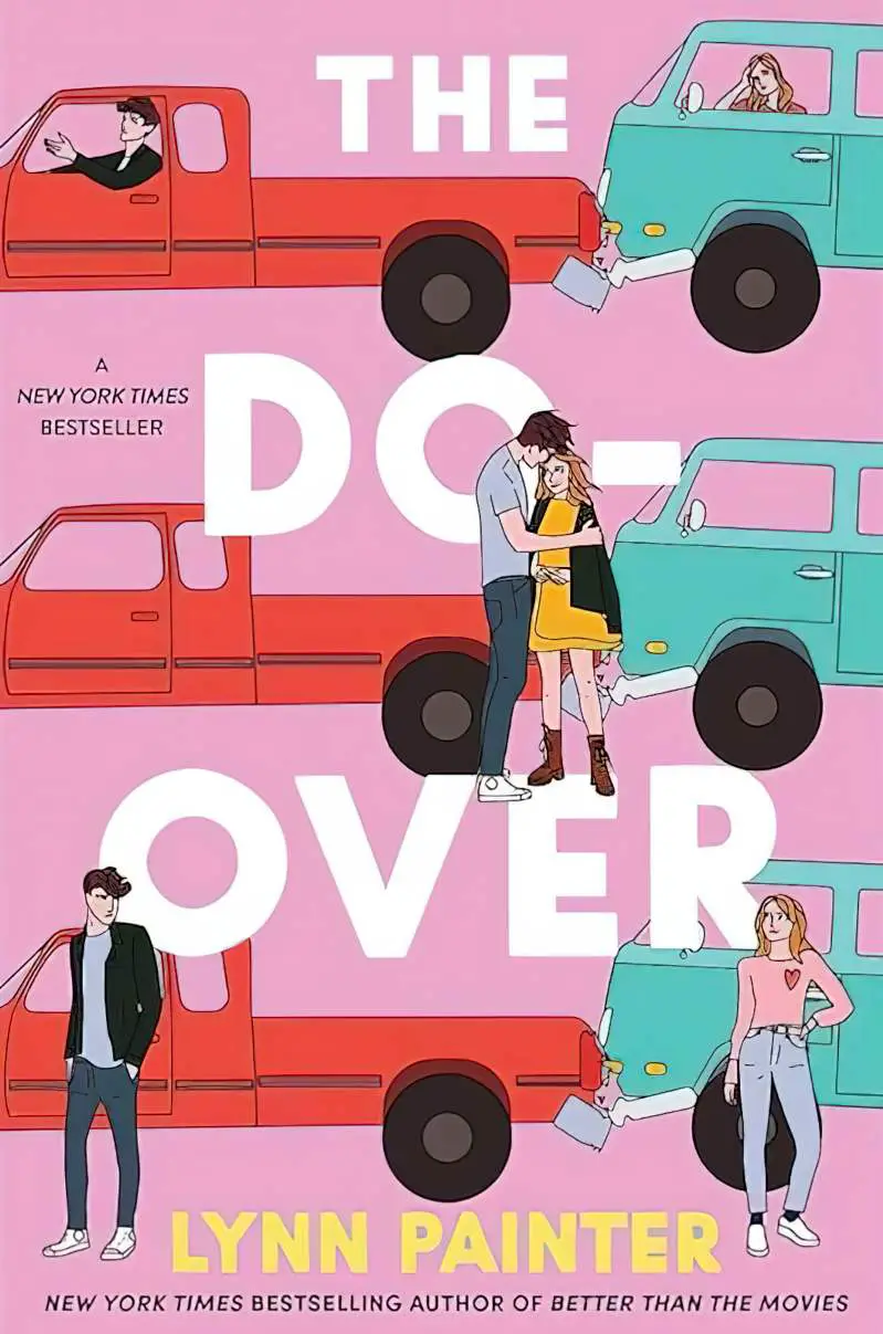
WHAT TYPES OF STORIES SUIT THE ATOMIC STYLE OF ILLUSTRATION?
Whereas the atomic style of illustration is often used in stories for adults to juxtapose against dark subject matter, there is often no such juxtaposition in stories for children, in which case the ‘lightness’ of the illustration style more closely matches the subject matter, with less ironic distance between (illustration) style and (subject matter) darkness.
The inherent nostalgic tone of this style is clear. It’s no coincidence that Raina Telgemeier uses it to depict stories from her own childhood. It doesn’t matter than Telgemeier grew up in the 1980s, long after the Tintin era. It seems that ‘any era before this one’ can be rendered nostalgic (especially to young readers), and stories set anytime in the past can be well-suited to an atomic illustration style.
Another advantage of this style: Characters are not highly individuated. Eyes are very often just black dots. Skin colour notwithstanding, these minimalist characterisations can therefore function as proxy for ‘the every child’.
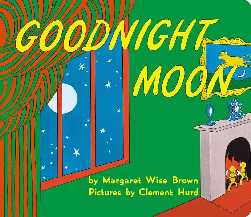
Books for very young children often feature strong, black outlines and flat hue. This is because the board book crew are still developing eye control and are drawn to objects with strong outlines and primary colours. The atomic illustration style is therefore well-suited to books for very young children, including babies.
Header illustration is from Tintin: The Shooting Star.
