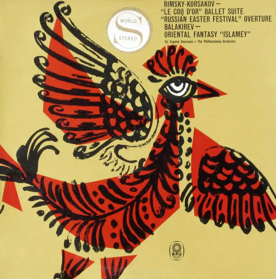
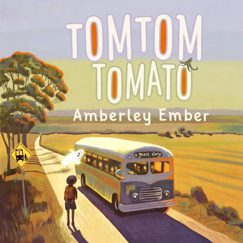
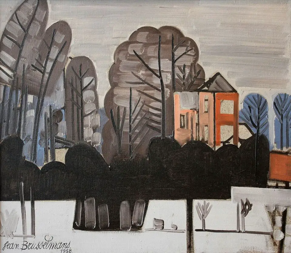
Thick, dark outlines in art and illustration is associated with several completely different types of art.
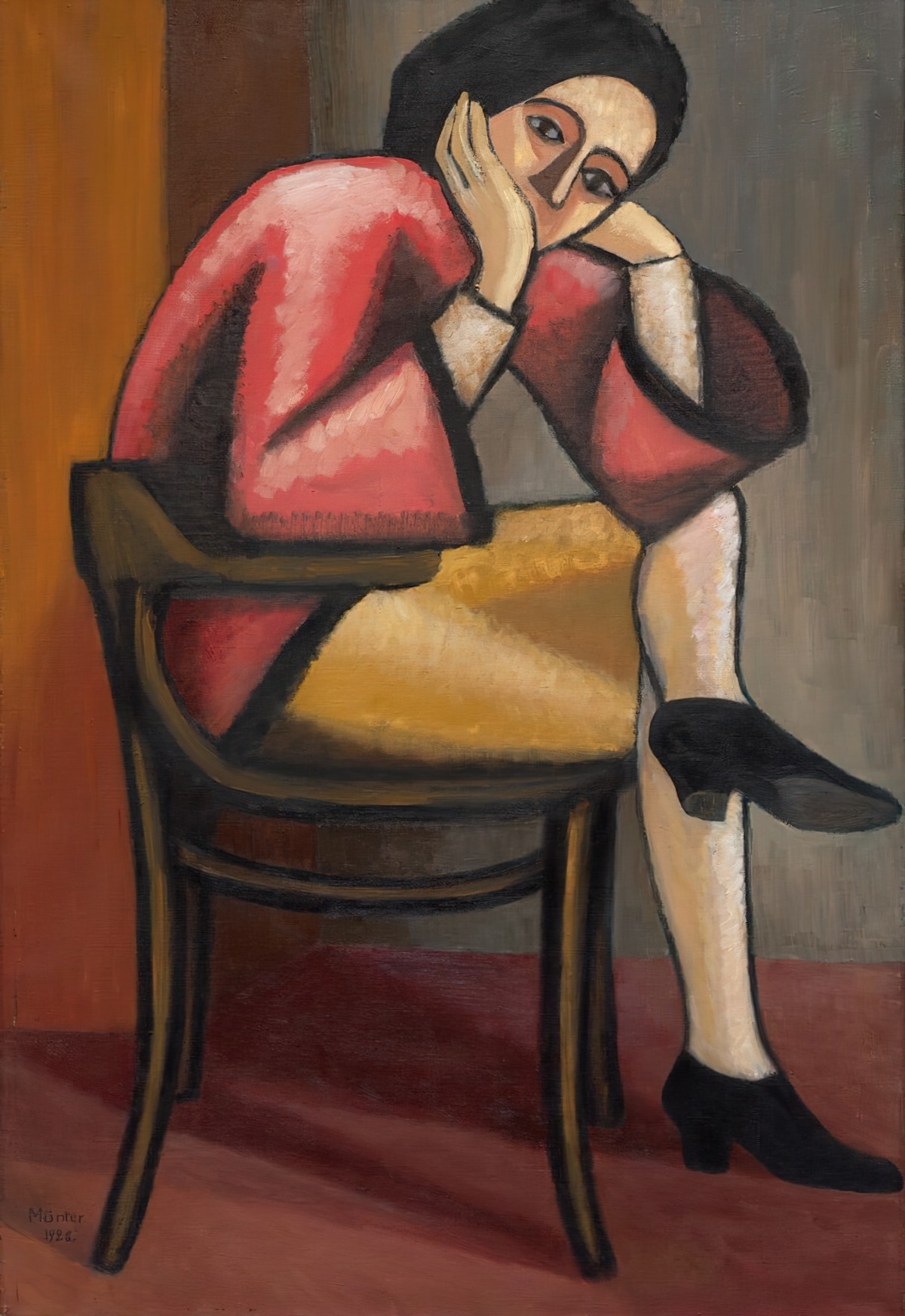
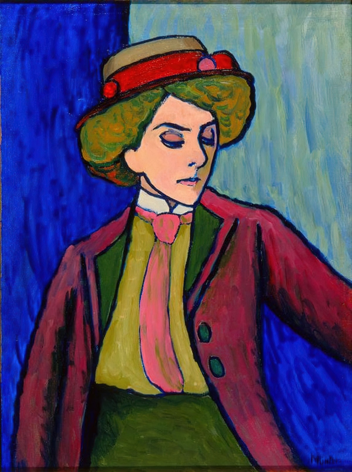
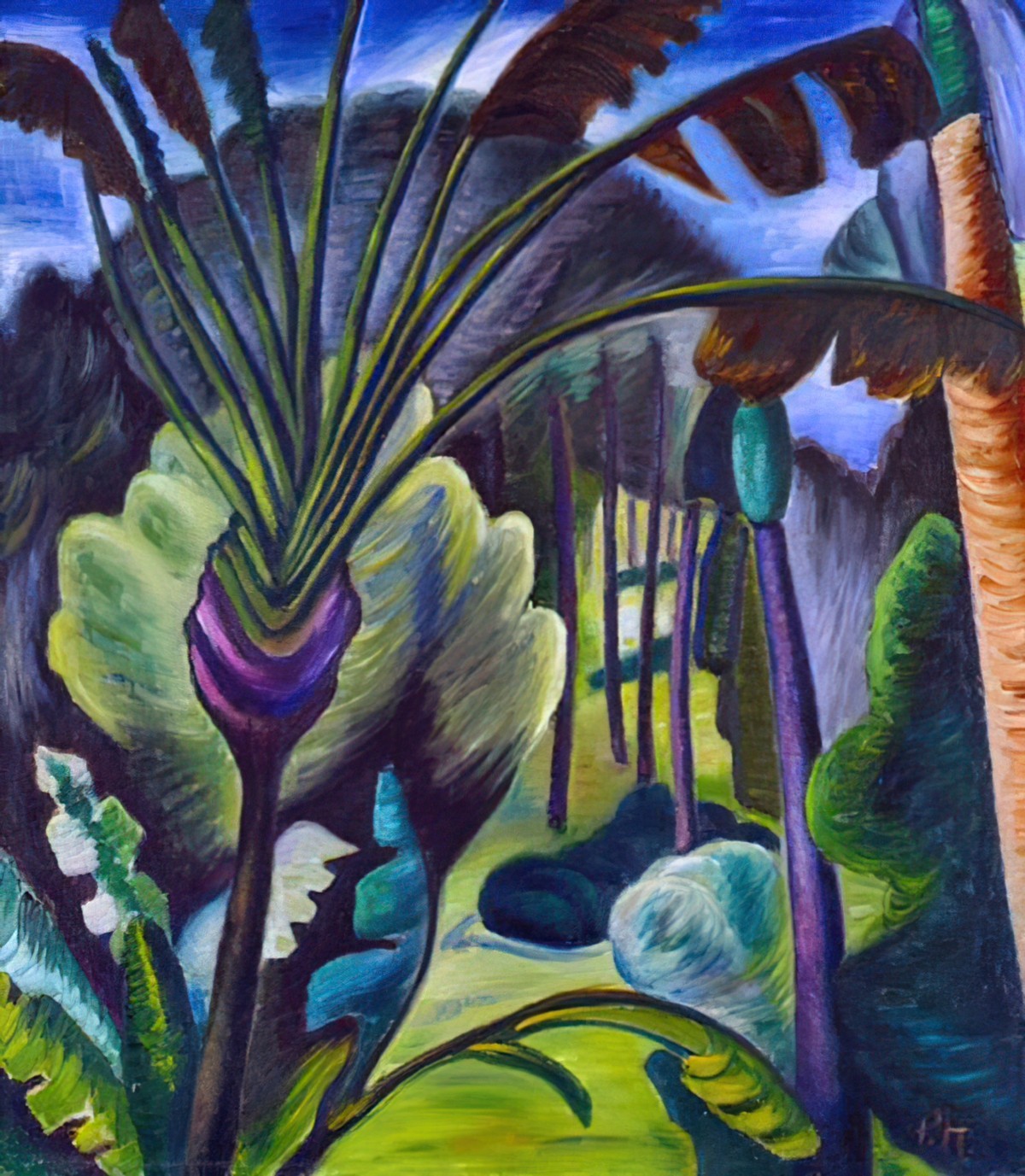
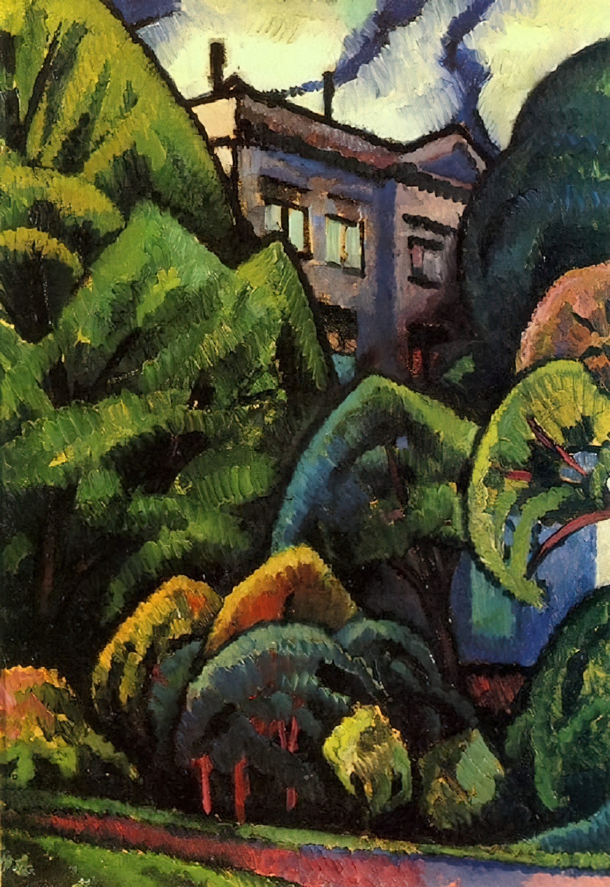
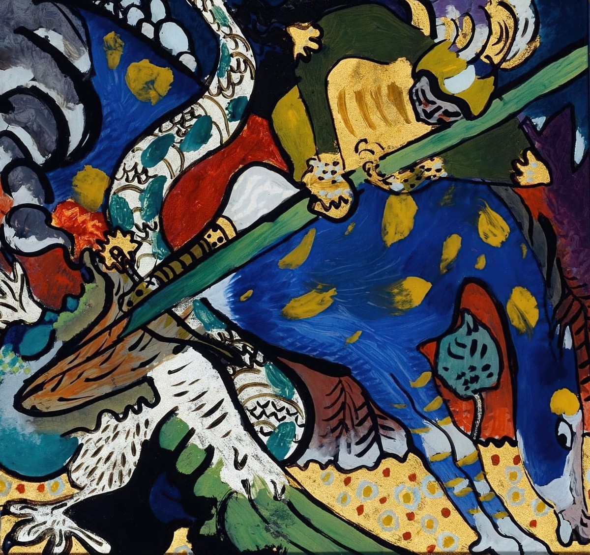
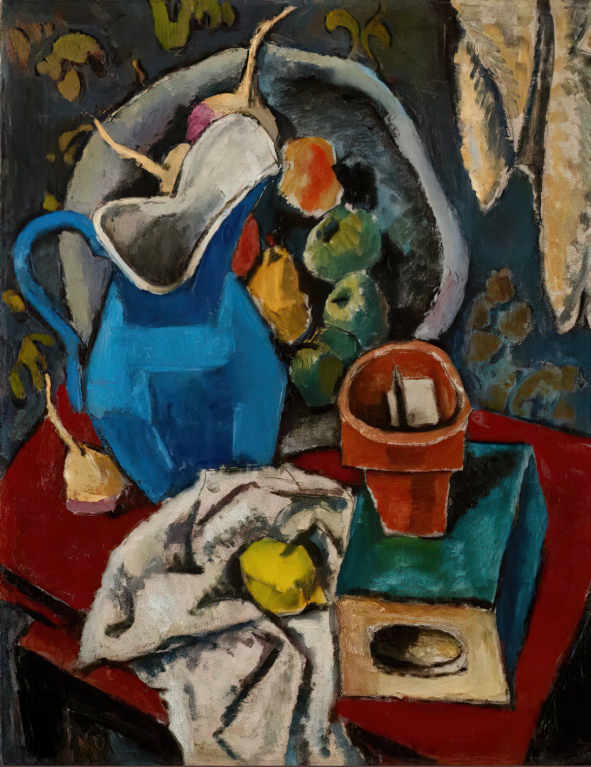
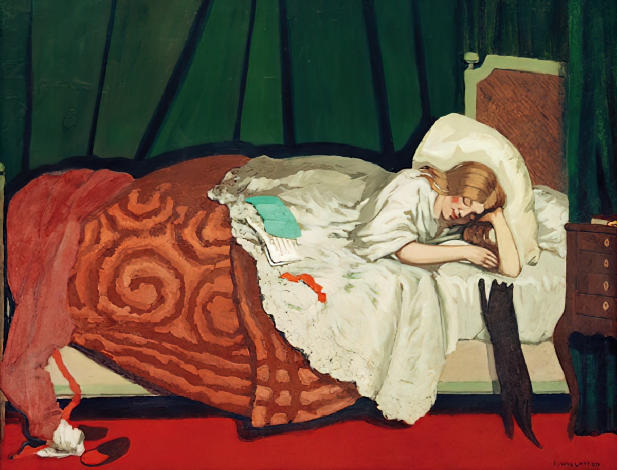
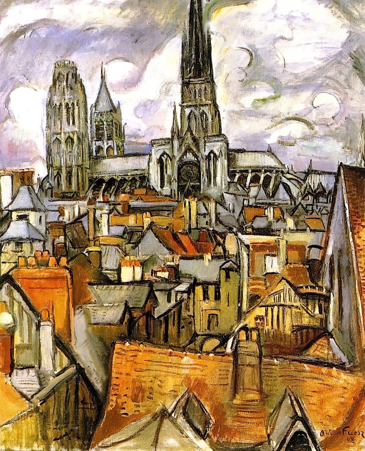
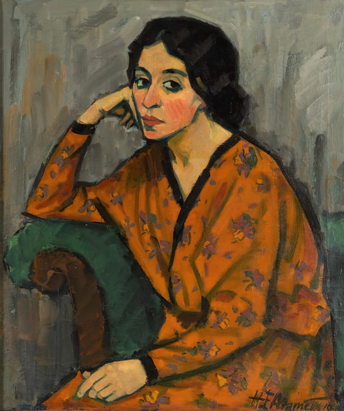
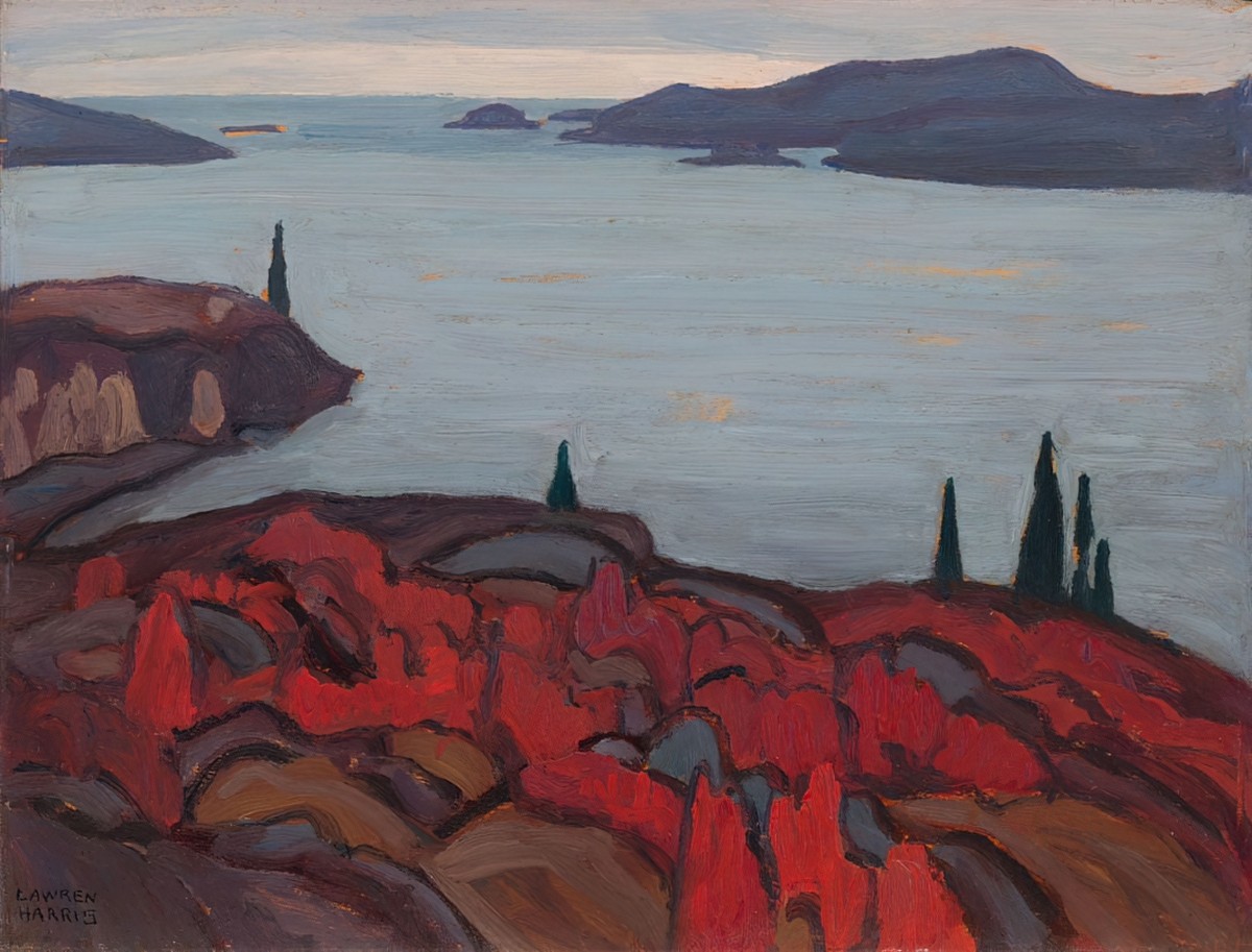
First, let’s takes a look at thick, dark outlines in fine art, which is a distinctive feature of certain art movements.
THICK DARK OUTLINES IN CHILDREN’S BOOKS
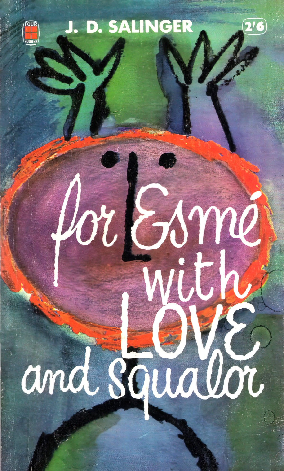
Parenting goes through fashions, just like art. In the 1990s parenting gurus were using new research about babies and baby eye-sight. Babies respond well to well-defined black and white shapes, parents were told. Hence all the black and white mobiles above cots decorating 1990s baby bedrooms.
This research also made it into picture books, which had already been full of bright colours and big shapes, but I suspect the black and white craze did influence book design for the very young.
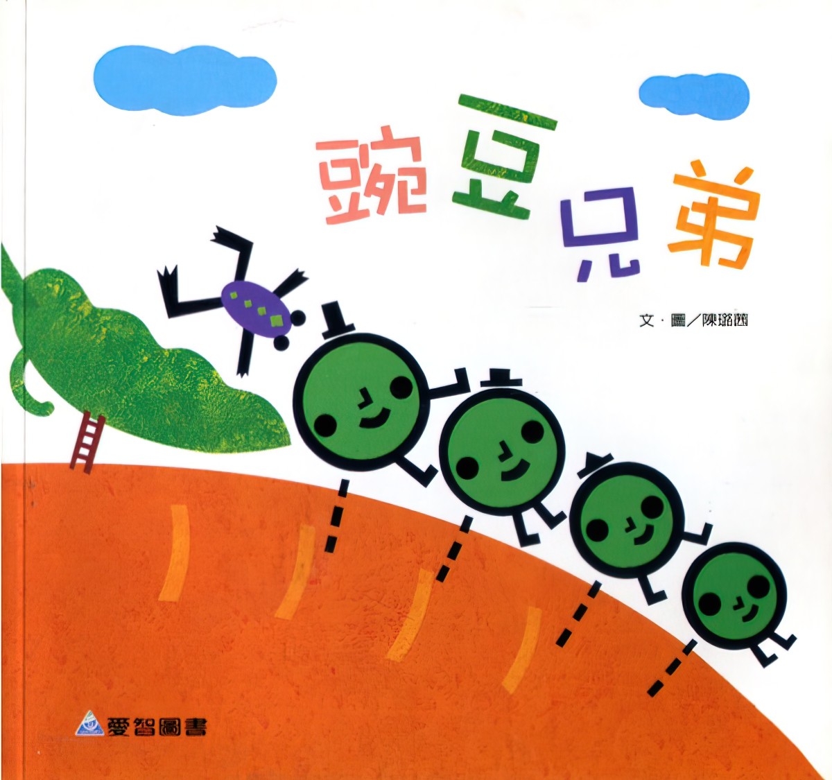
As you’ll see from the illustrations below, thick dark outlines precede the 1990s. But illustrations such as the Chinese example below may have also been to do with artists shifting to digital content creation. Early versions of Adobe Illustrator just weren’t that great, at least not by today’s standards. The outlines of those peas are vector shapes, with the function of separating the main characters from the background. (A type of atmospheric perspective.)
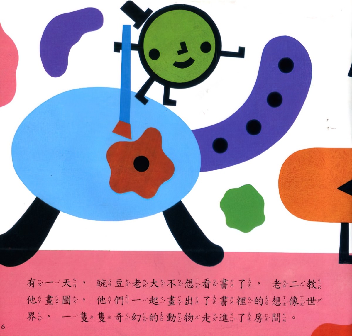
But just because art is created digitally doesn’t mean it has to look it. Art software now allows artists to create tapering, interesting lines, and this is reflected in picture books. (It is in fact impossible to tell if an artist has worked entirely digitally now.)
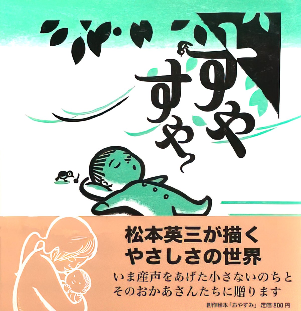
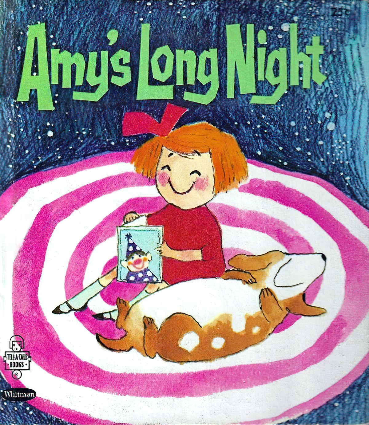
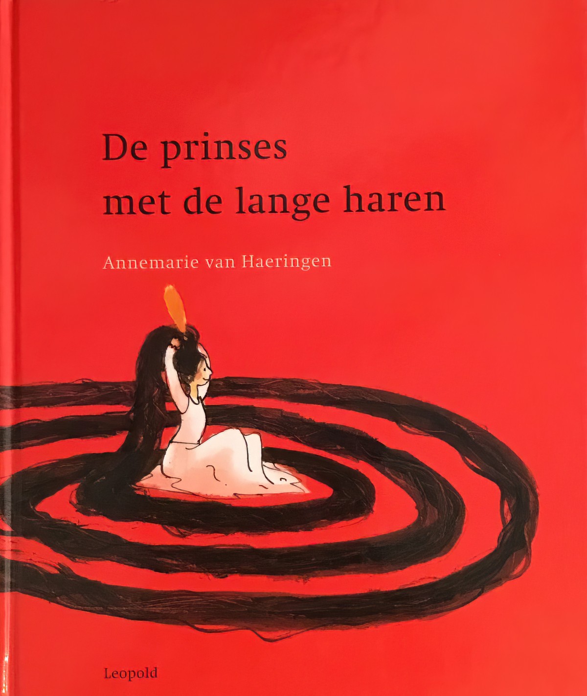
Here are two picture books with remarkably similar composition and design.
A standout example of a popular children’s character with thick outline: Miffy. The first Miffy book was produced in 1955. There have been at least 30 published since. (Here is the official Miffy website.)
Here’s another rabbit with thick outlines, published five years after the first Miffy came out.

I really like the book cover below as an example of a thick, dark outline because the outline itself is an interesting, textured part of the illustration. Sheep in real life don’t have thick, dark outlines but they are fluffy, and the fluff is incorporated into the outline.

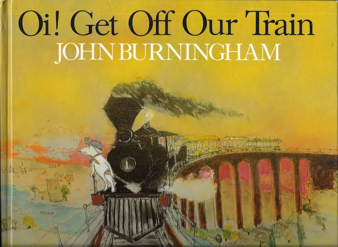
I’m reminded of the illustrations of John Burningham, who doesn’t always make use of thick, dark outlines, but who always makes much use of texture.
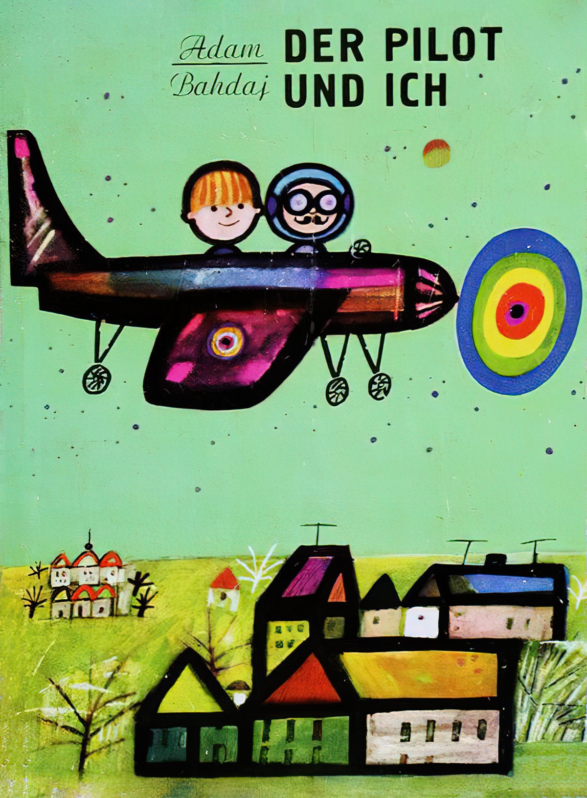
Here’s an example of thick, dark outlines created by felt tip markers.
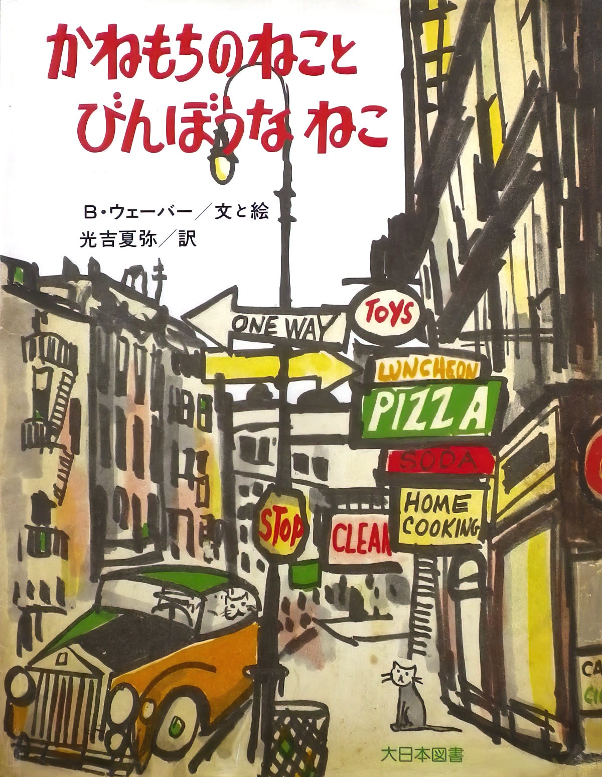
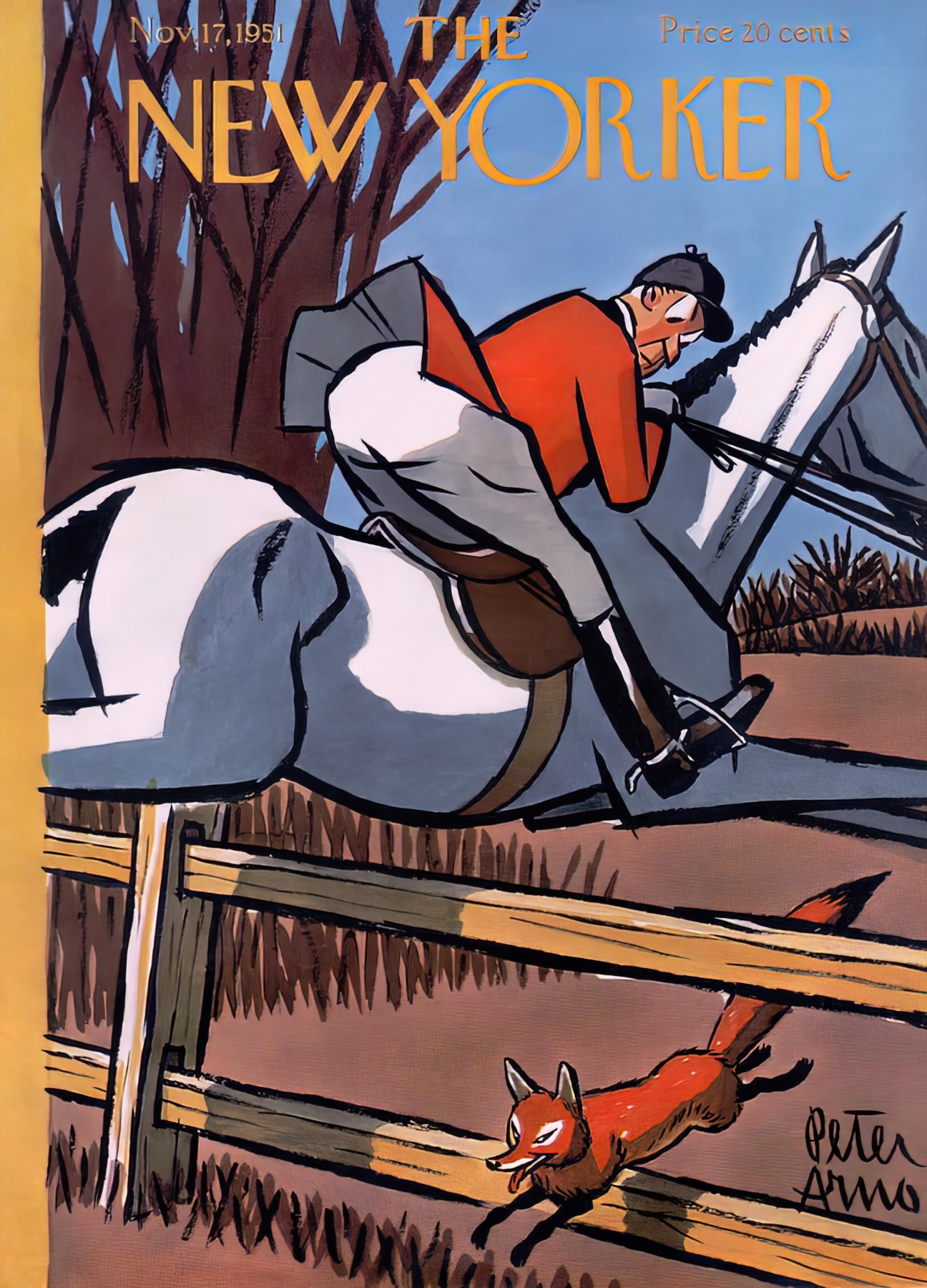
This style of art isn’t limited to art made for children, but does tend to have a slightly childlike quality to it. Peter Arno’s work makes use of heavy dark outlines which look to be made by a tapering brush.
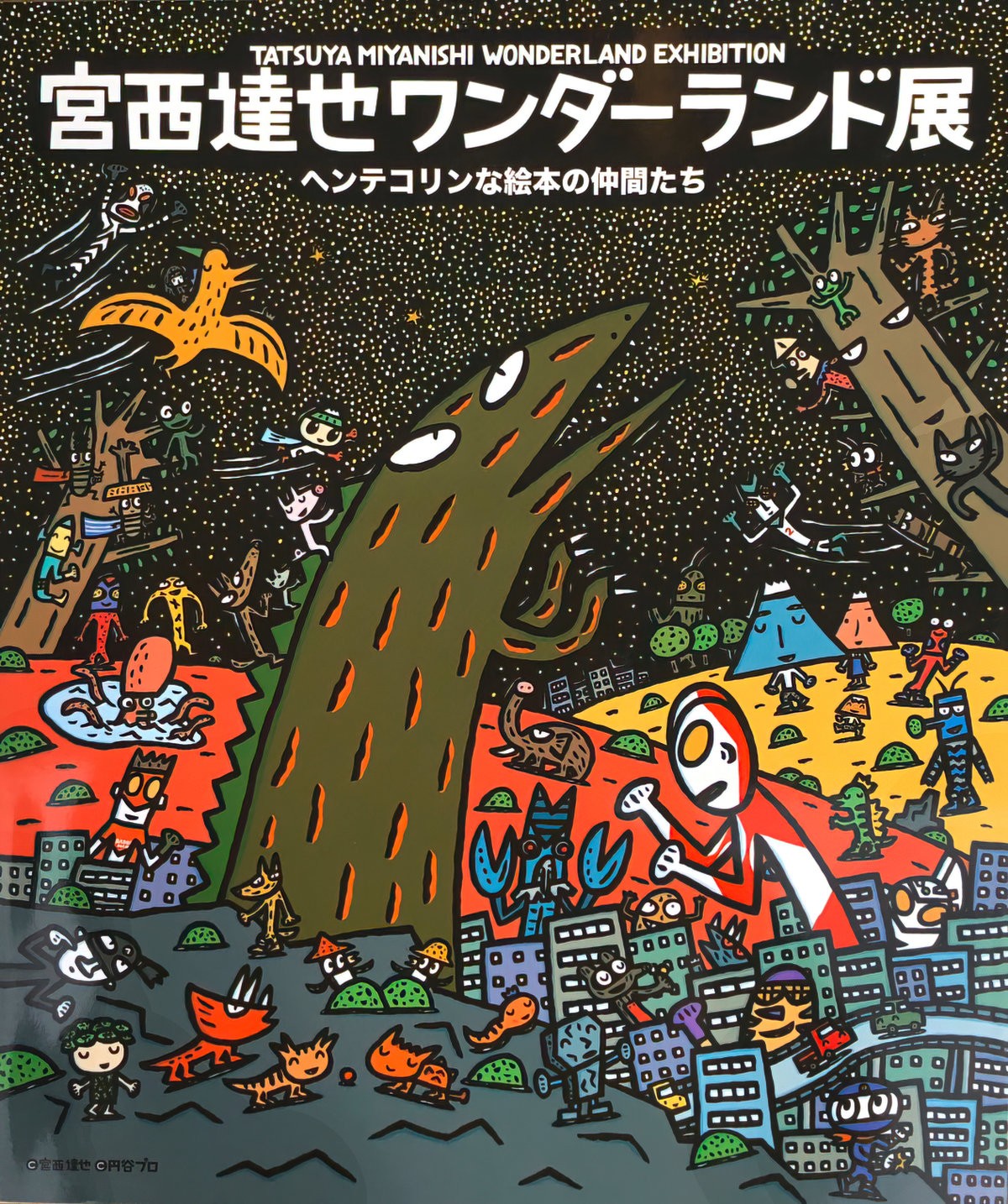
Comic books are full of outlines, of course. Some comic artists utilise thicker lines than others. Tatsuya Miyanishi is an example of an artist whose line work is on the thicker side.
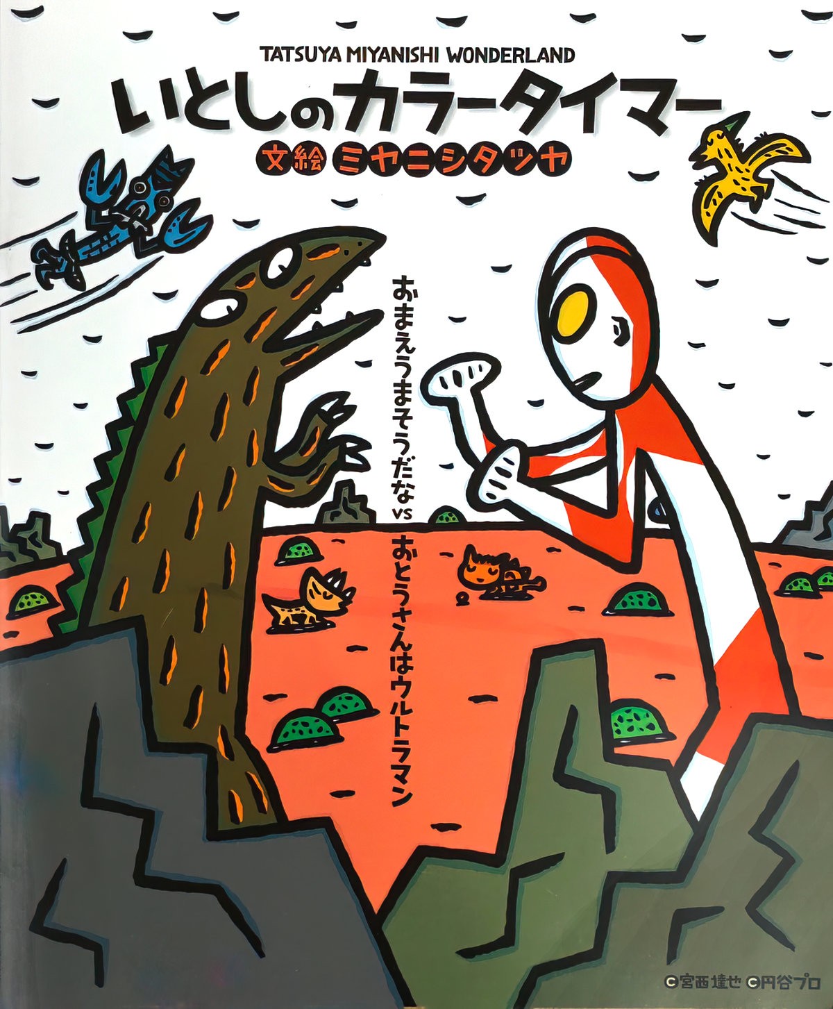
This stands in direct contrast to what is called atomic style, with the ‘clean’, fine lines.
See also examples of white outlines.
