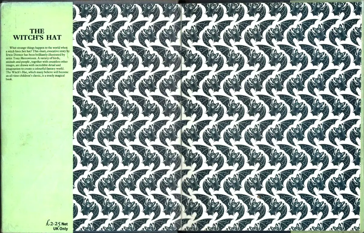
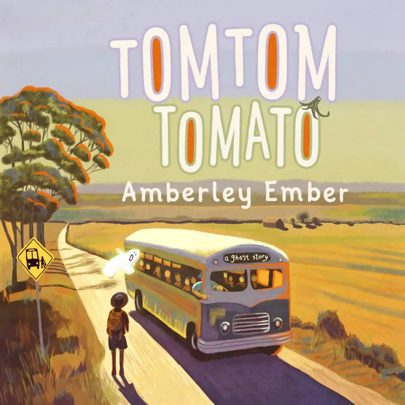
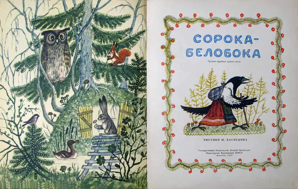
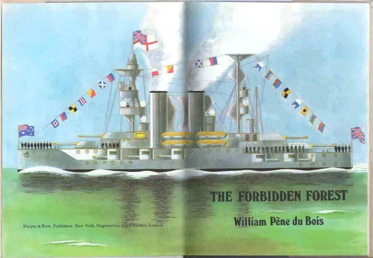
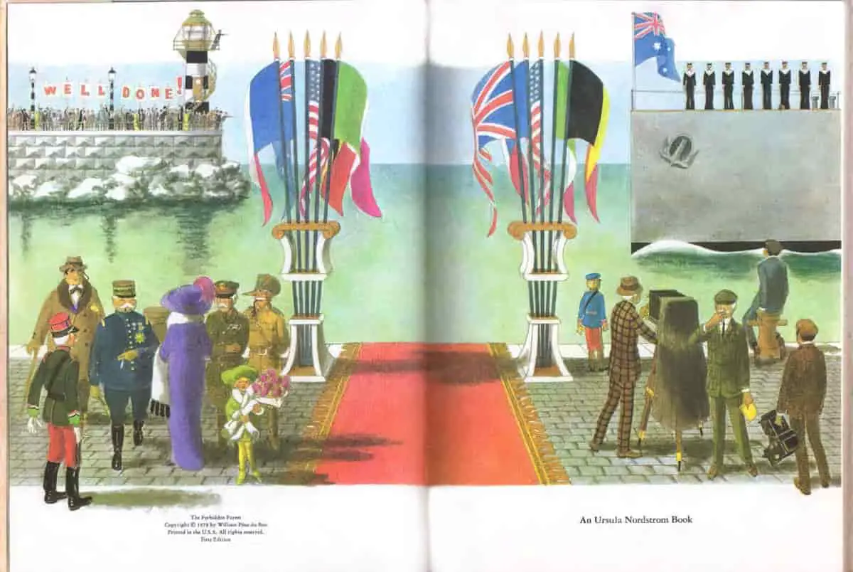
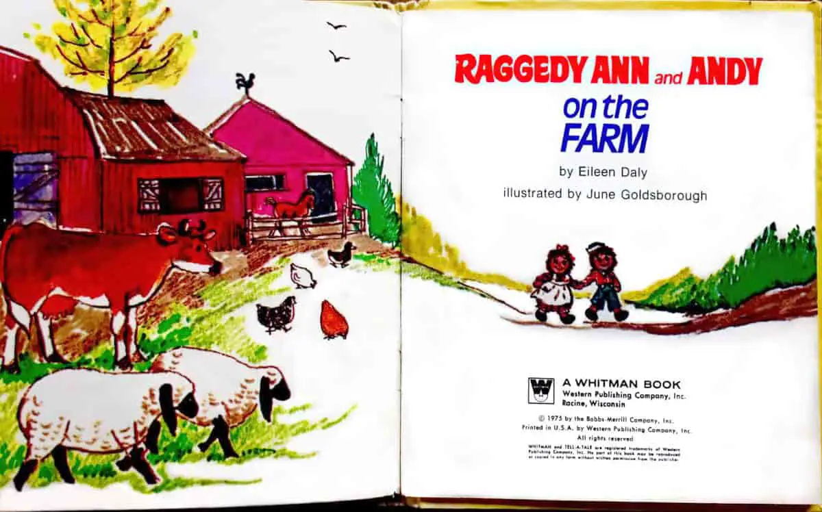
Peritext is especially important in picture books, and refers to the physical features and design elements that surround the story. When readers take note of this information, their experience of the story will be enhanced, or possibly change. Peritext includes information on:
- dust jackets
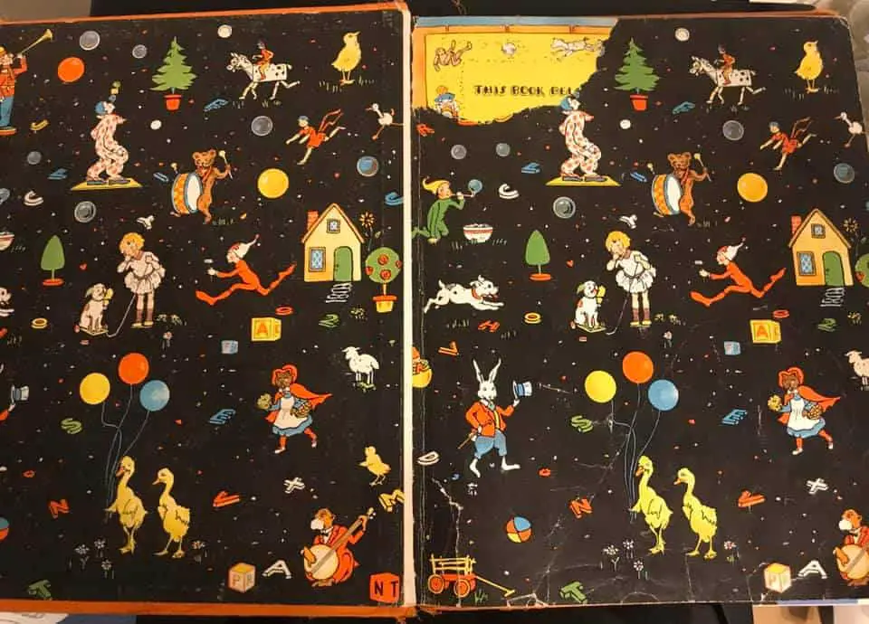
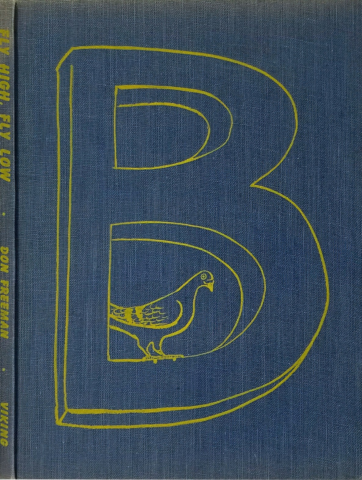
- under the dust jackets (of hardbacks)
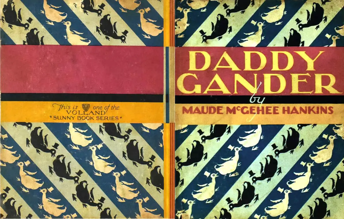
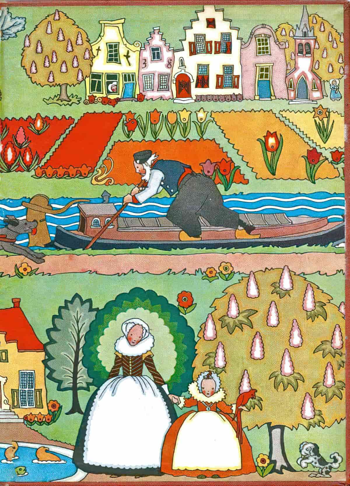
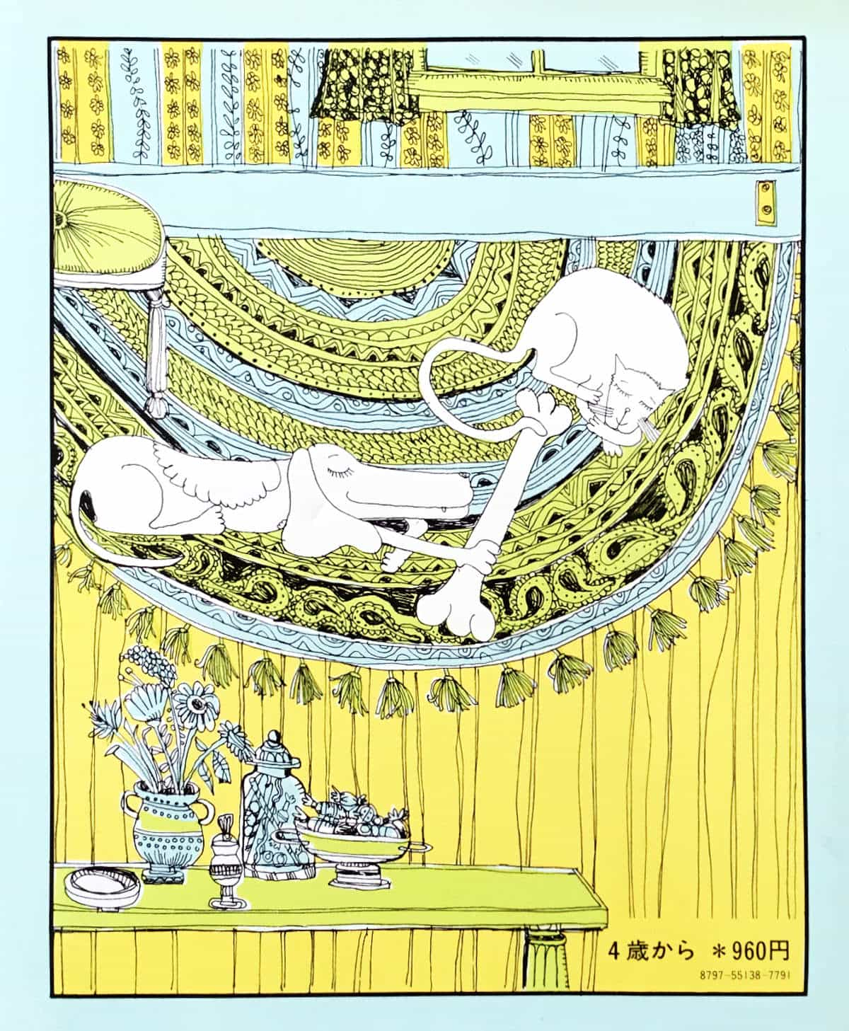
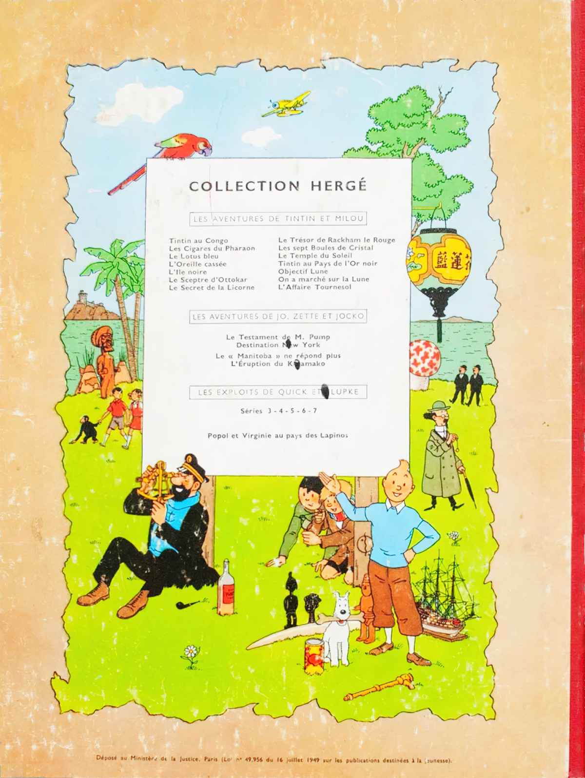
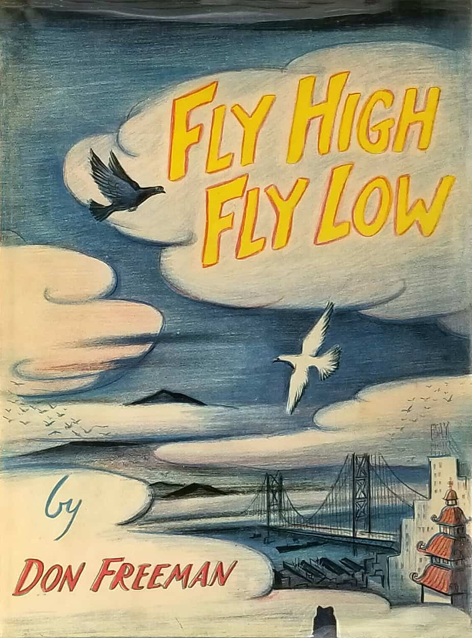
- front and back covers
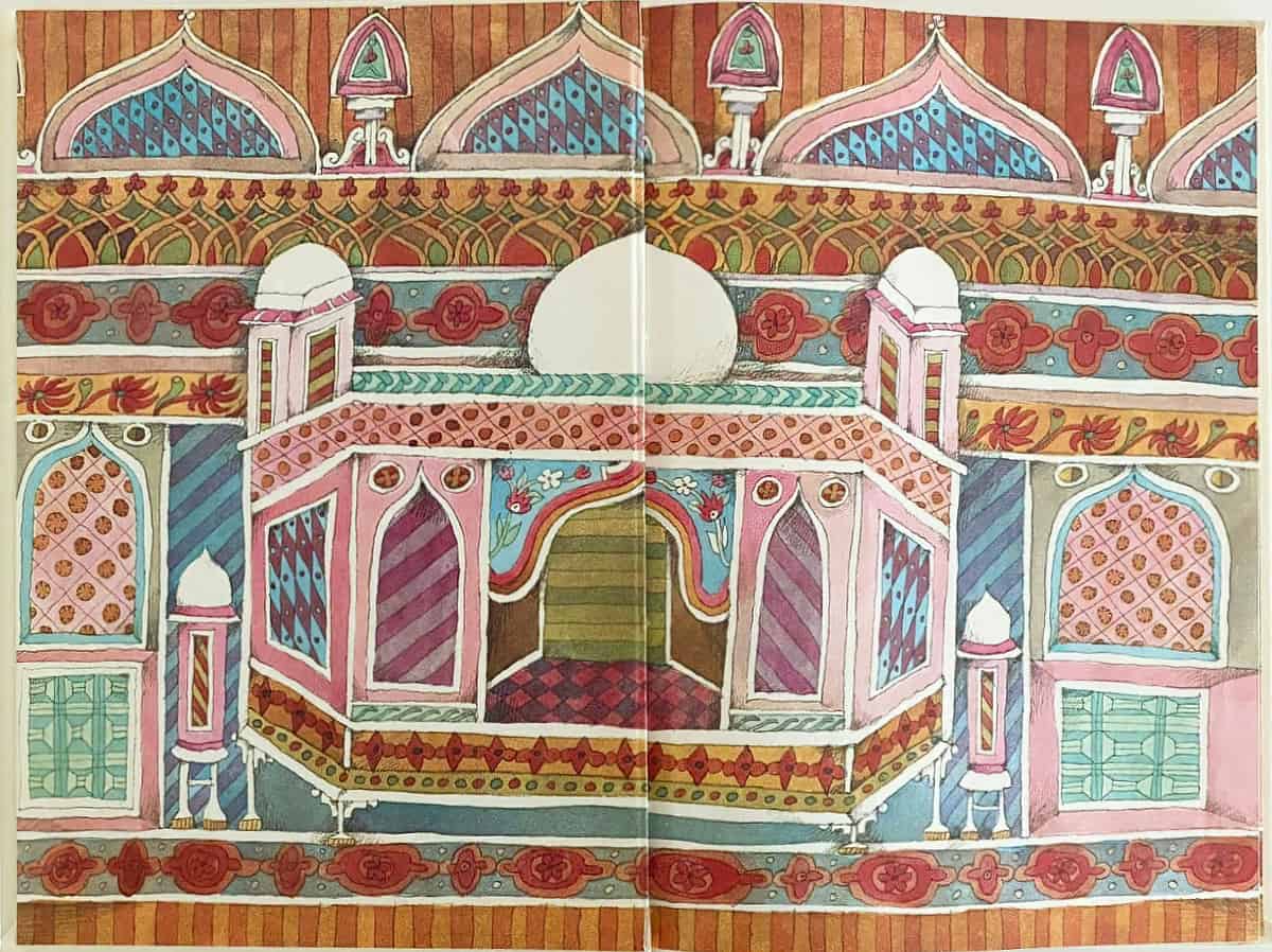
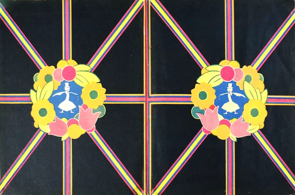
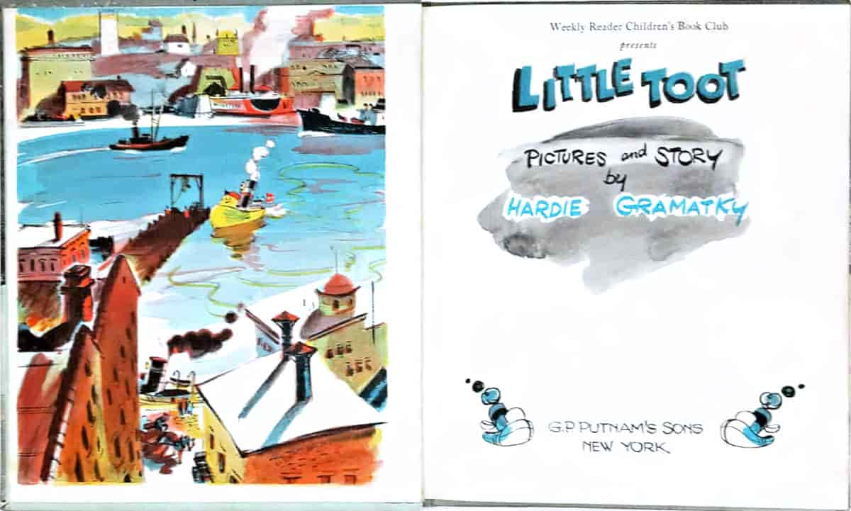
- endpapers
- dedication page
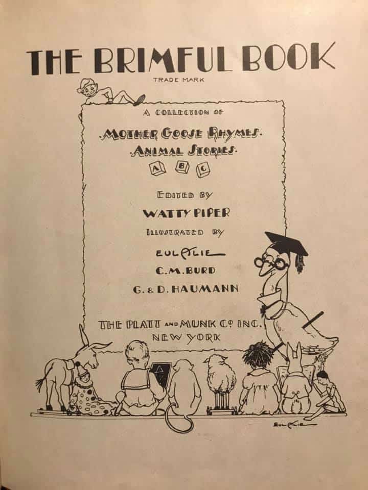
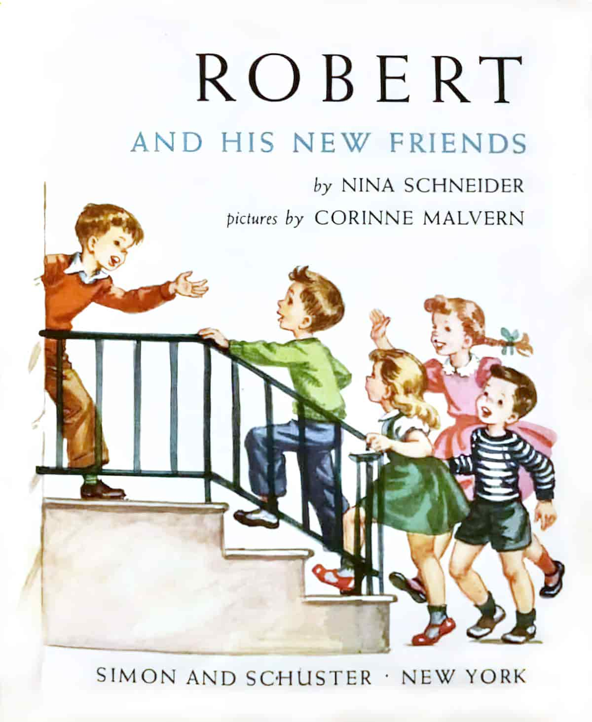
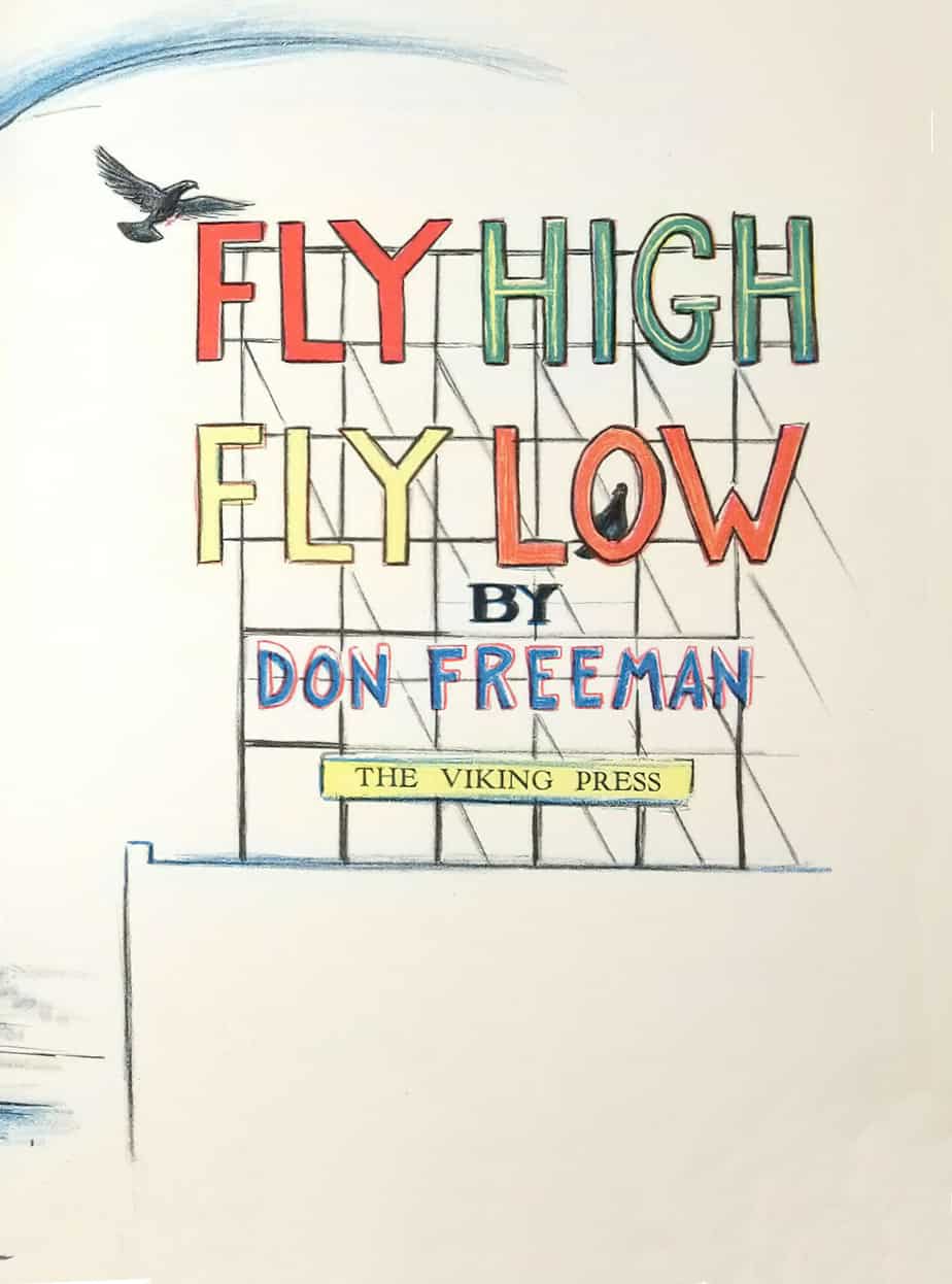
- title page
- endpapers
Part of me thinks that a reader’s preference for a physical book isn’t just about how it smells or about the reassuring heft of it in the hands, but derives from more subconscious things. Picture books are more ornamental than other kinds of books. In picture books you’ll sometimes see that an imaginative illustrator has done something creative with the colophon, or included easter egg doodles in unexpected places (maybe a face sticking out from under a dust cover).
I’ve not seen this much in novels for adults. When an adult picks up a book, they’ve probably done a bit of research about what it’s about, even if that’s just reading the back cover copy. In picture books for children, the peritext — everything in the book which is not the actual story — helps the reader to decode the story. A reader learns something about the story from the cover, the size of the book itself, the type of paper, any dust jacket and — often overlooked — the endpapers.
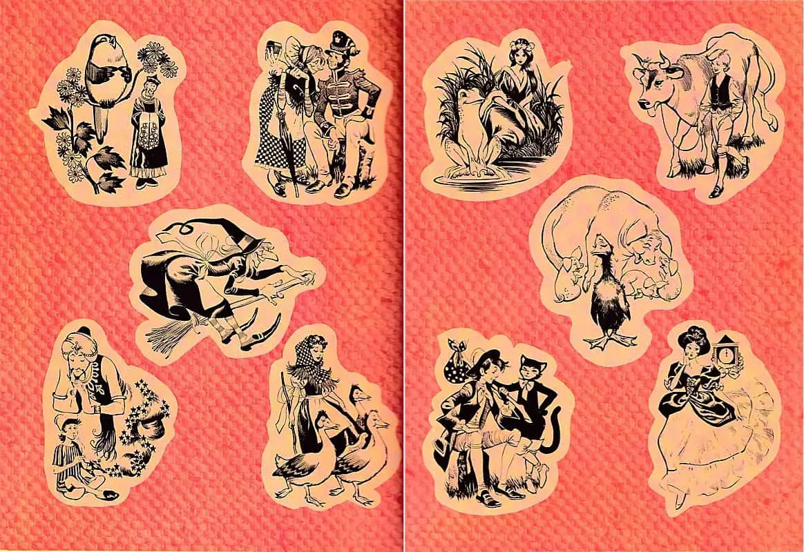
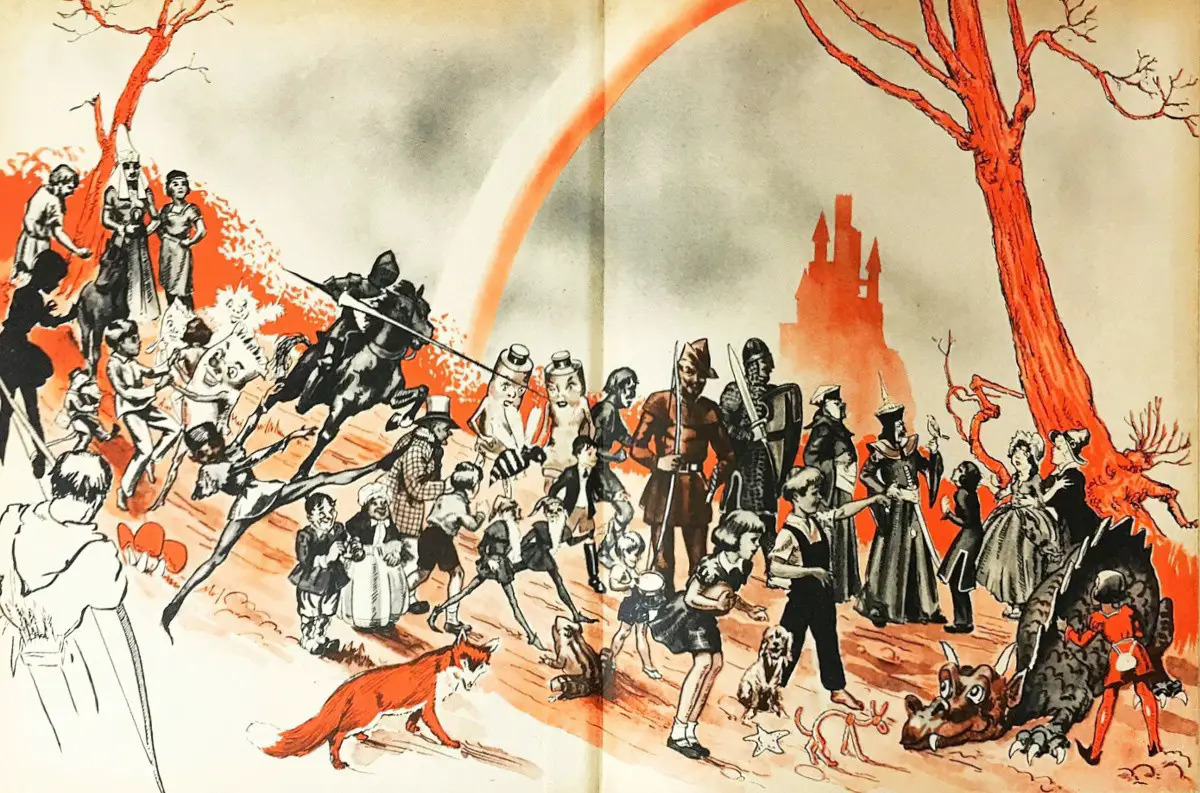
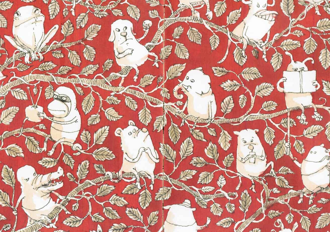
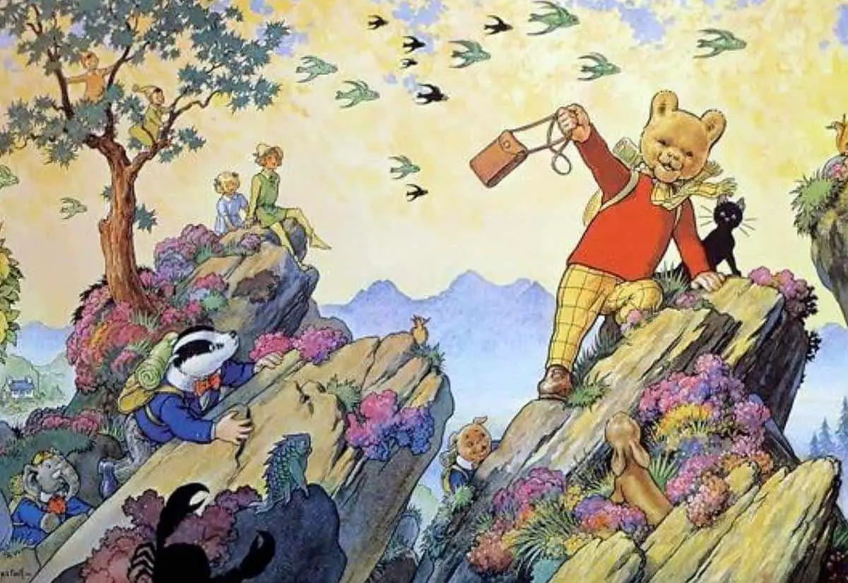
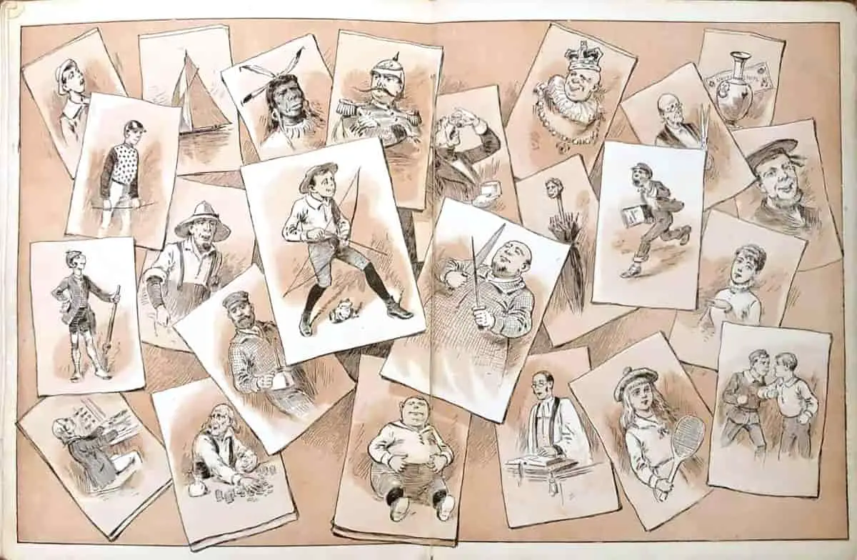
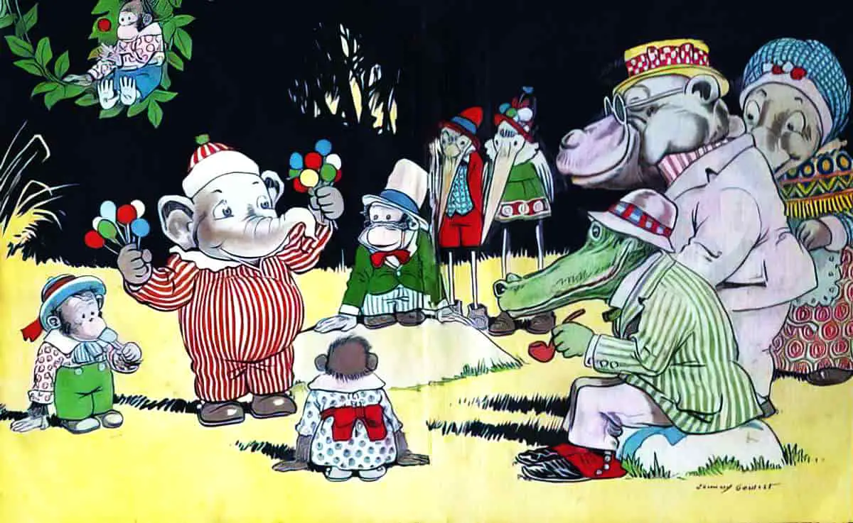
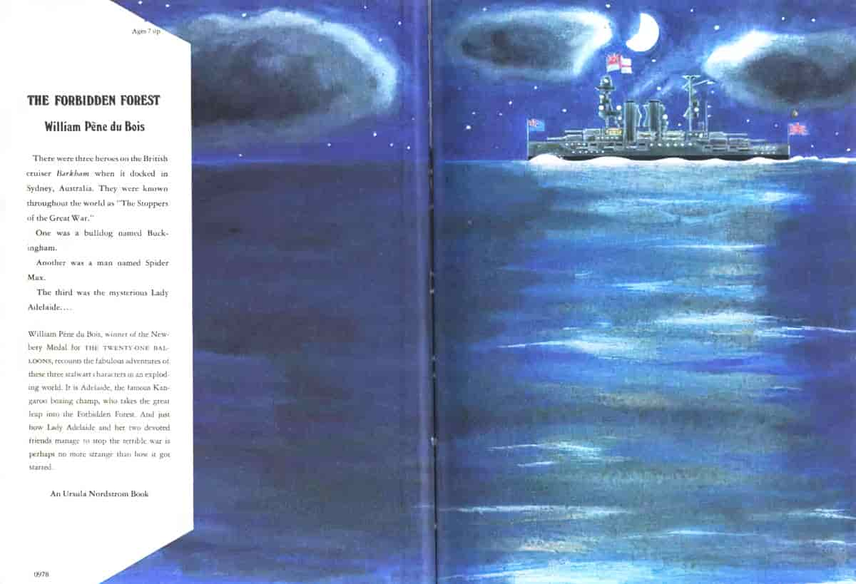
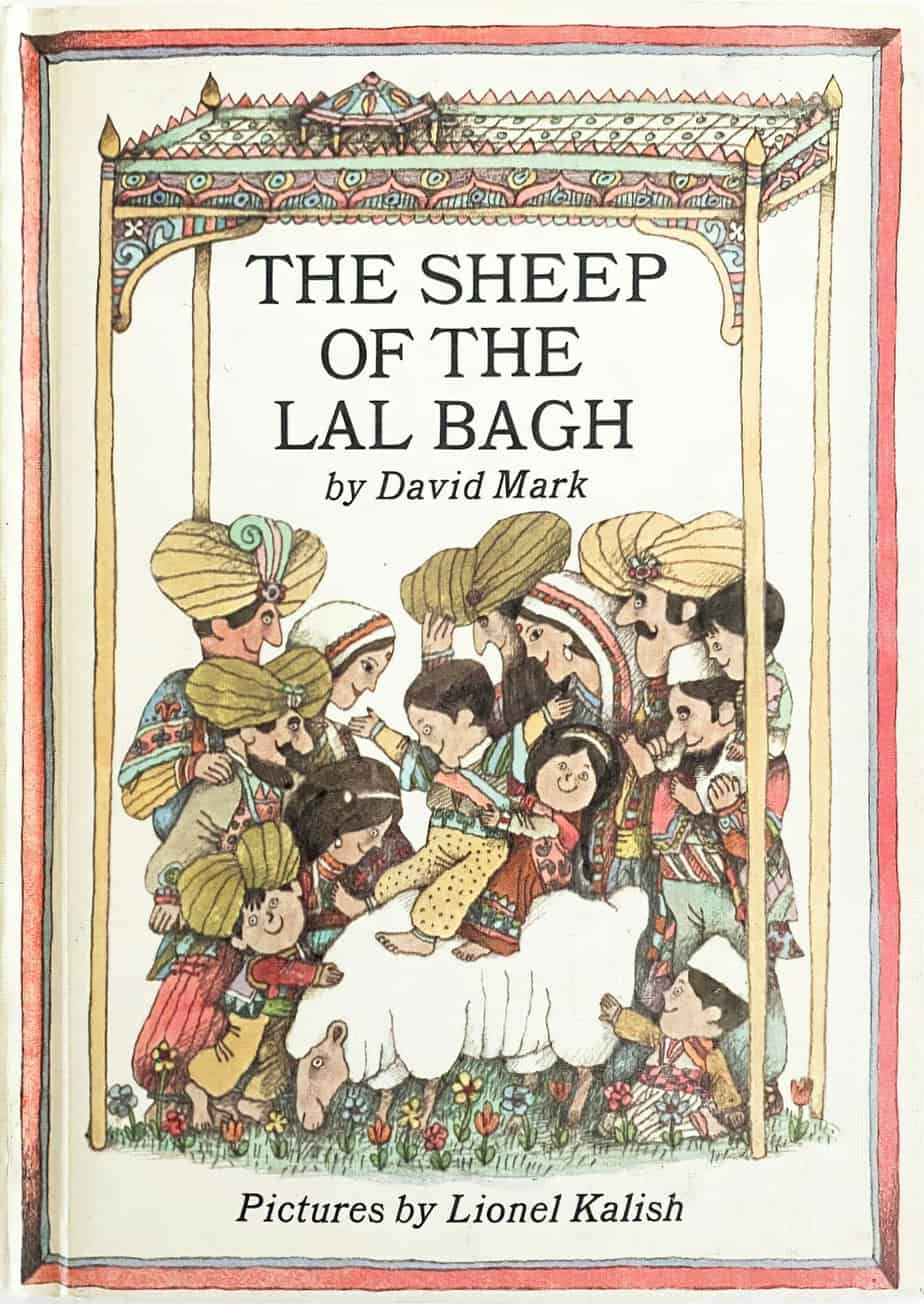
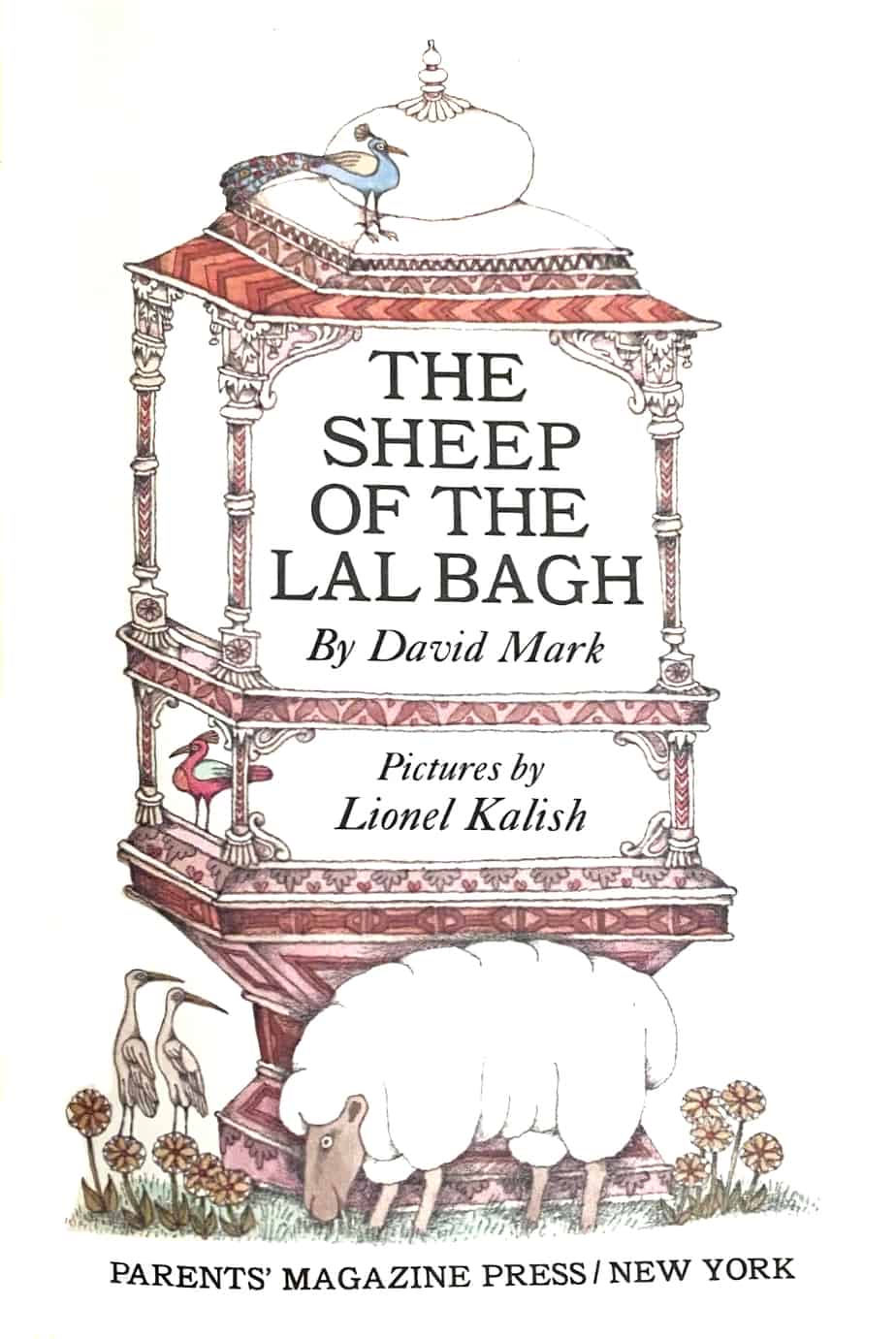
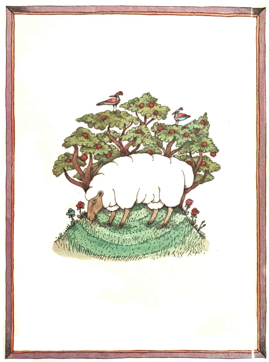
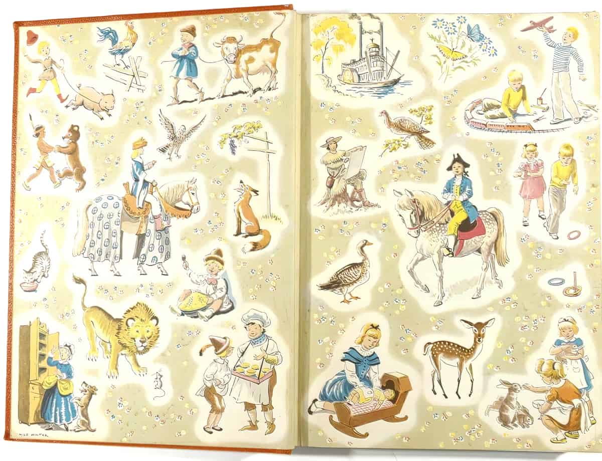
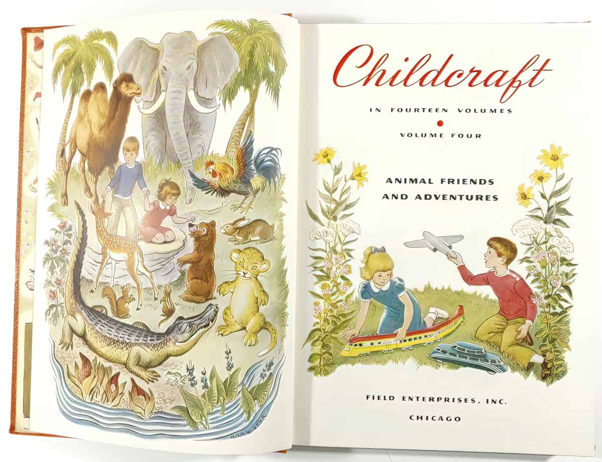
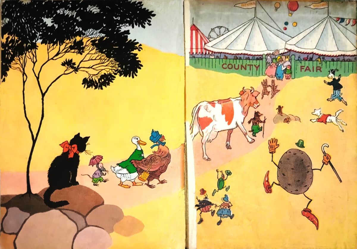
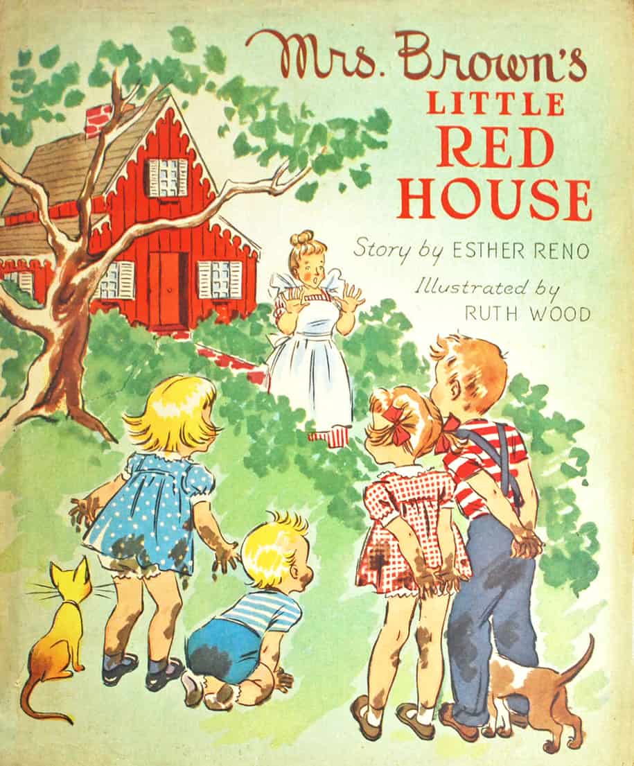
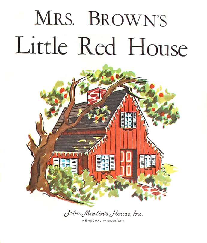
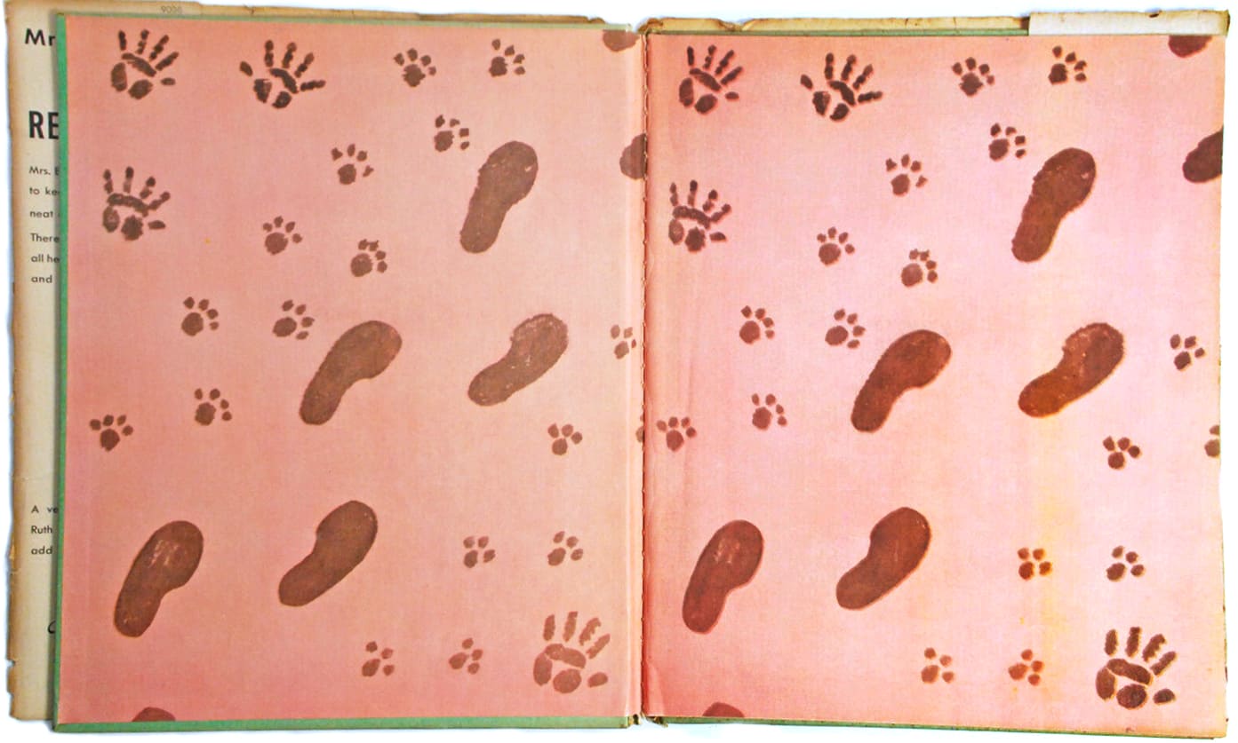
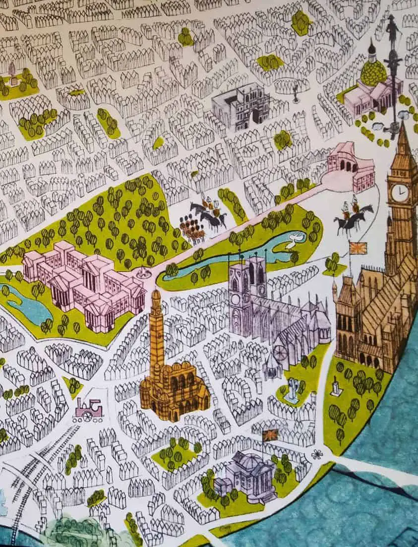
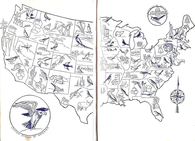
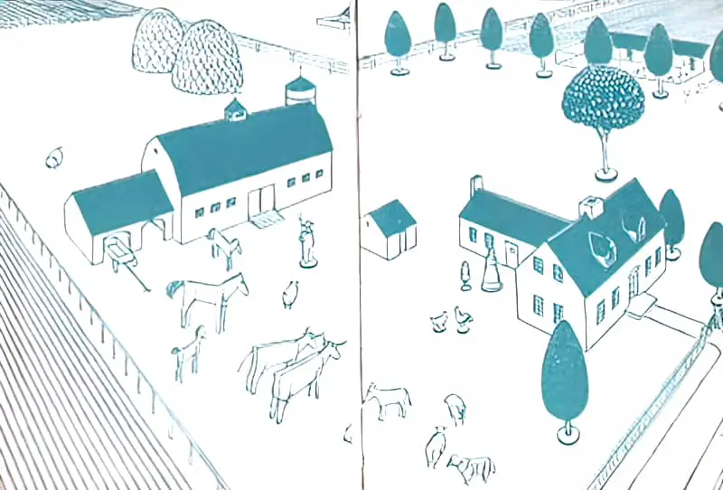
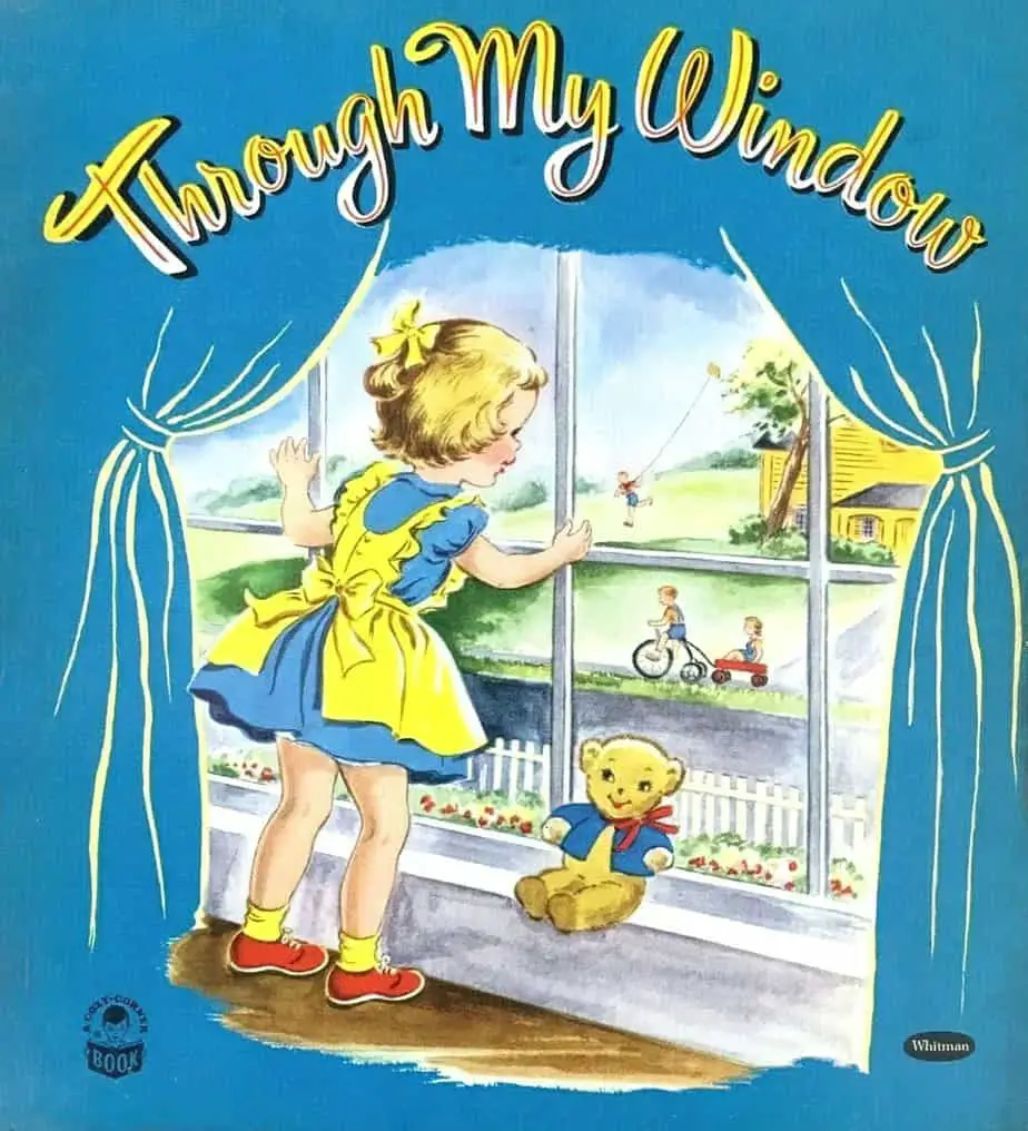
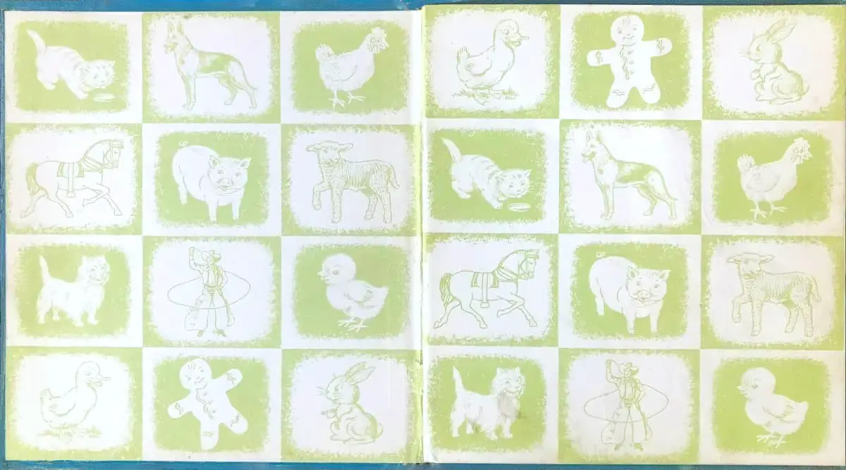
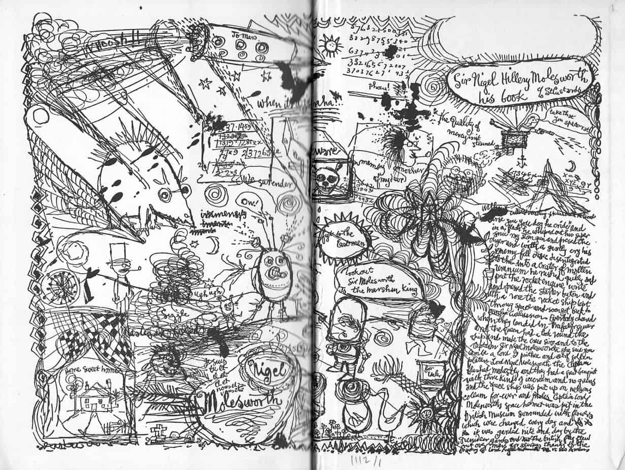
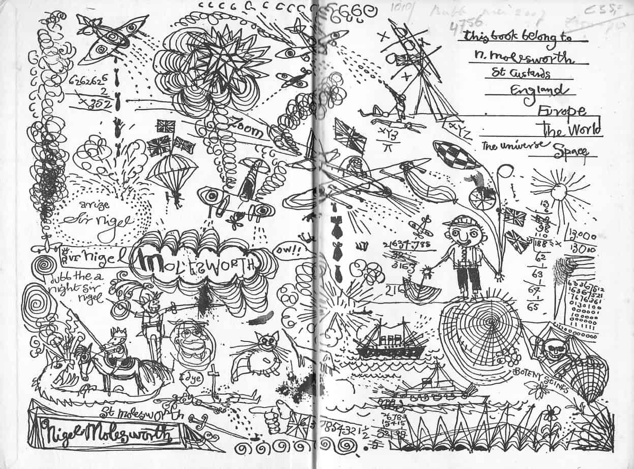
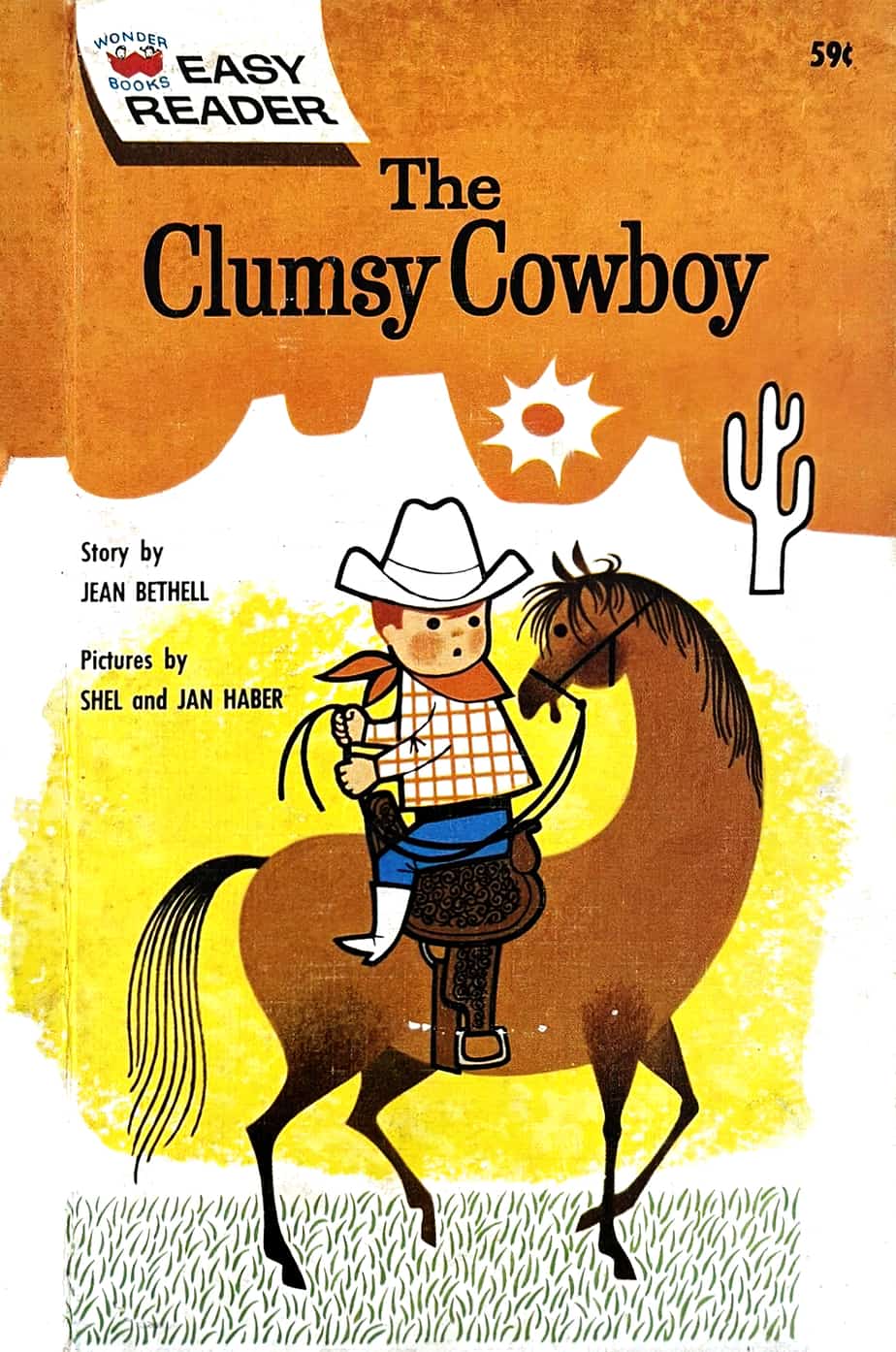
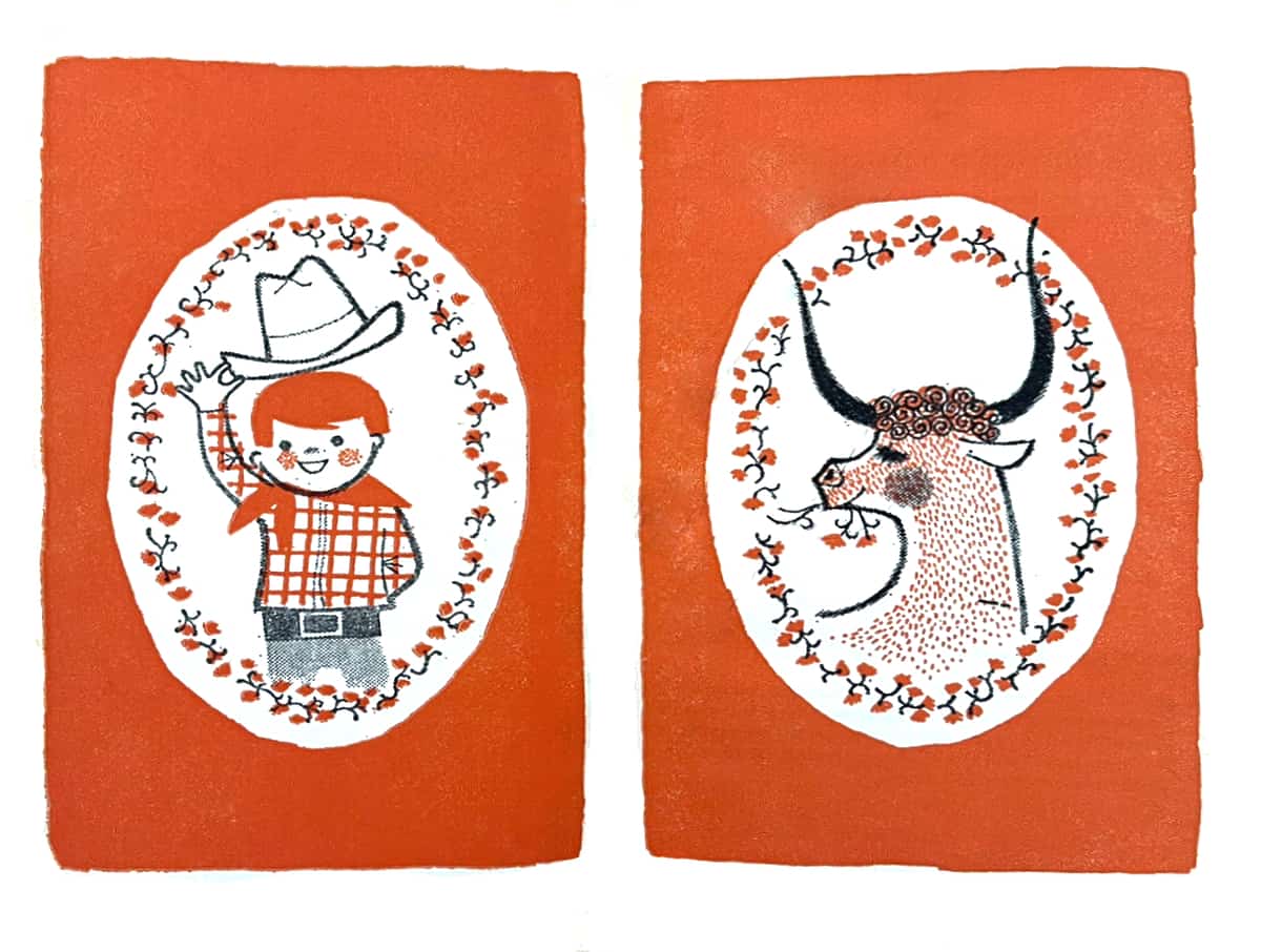
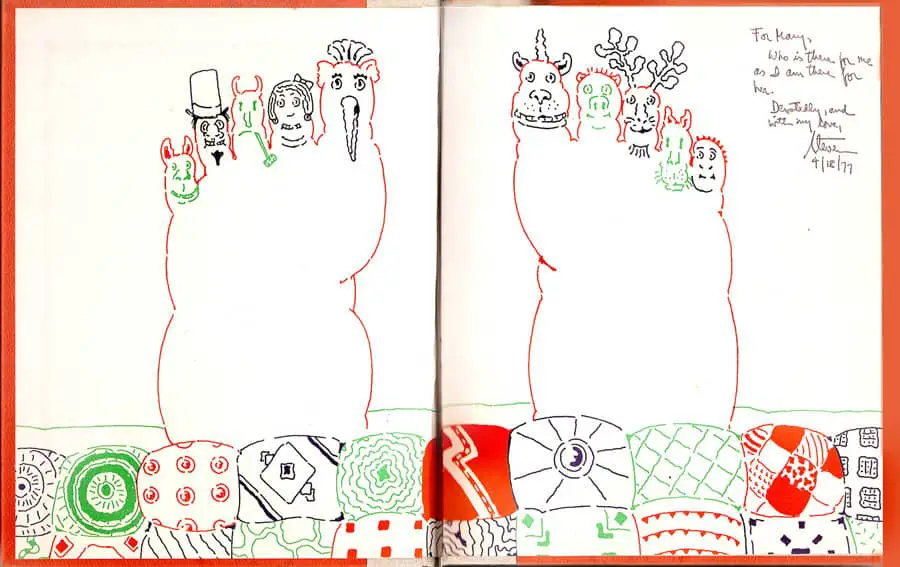
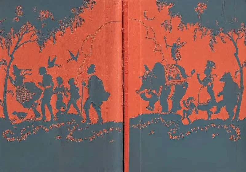
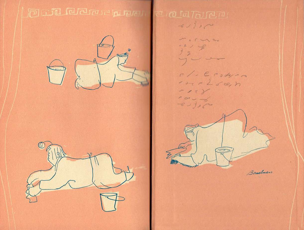
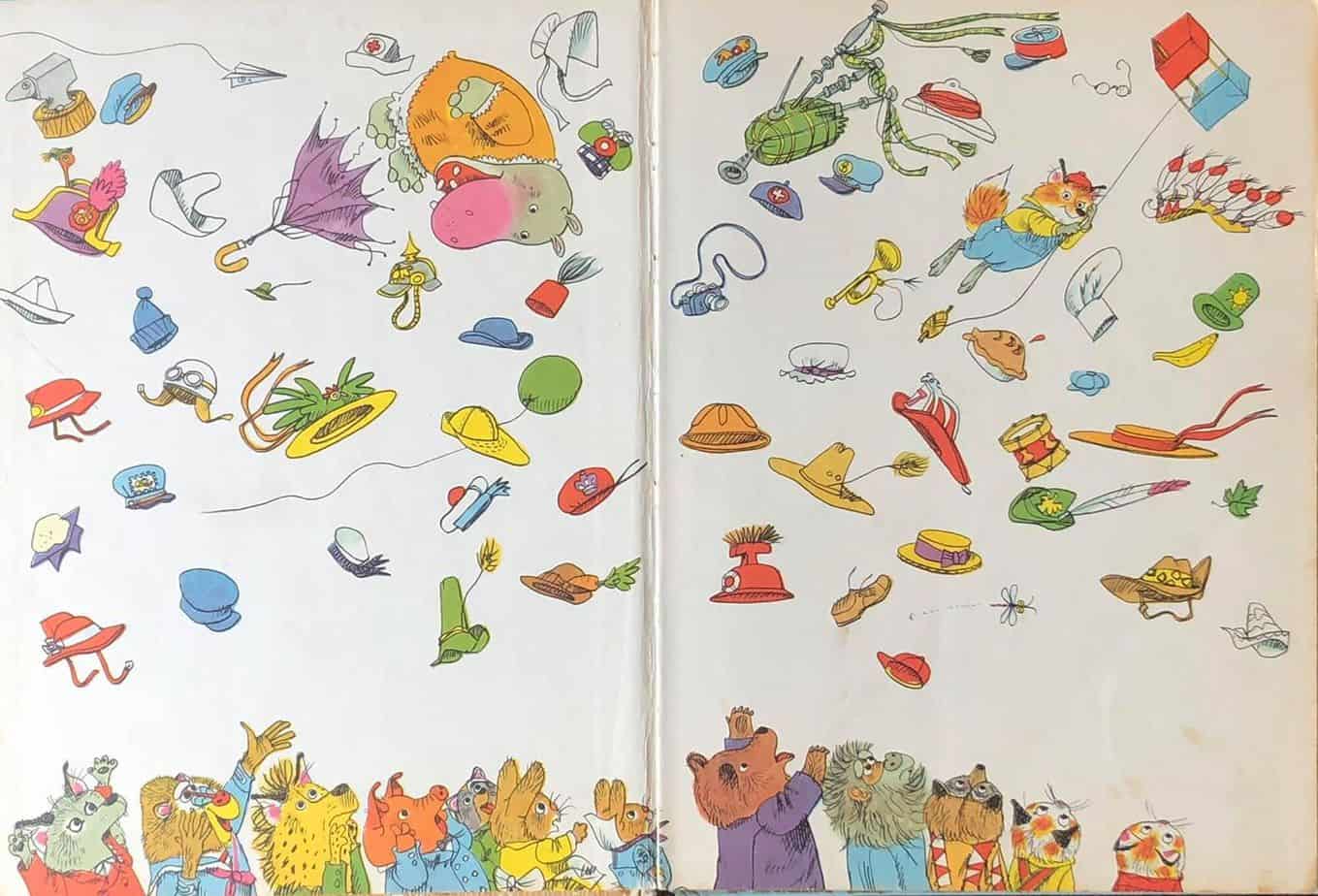
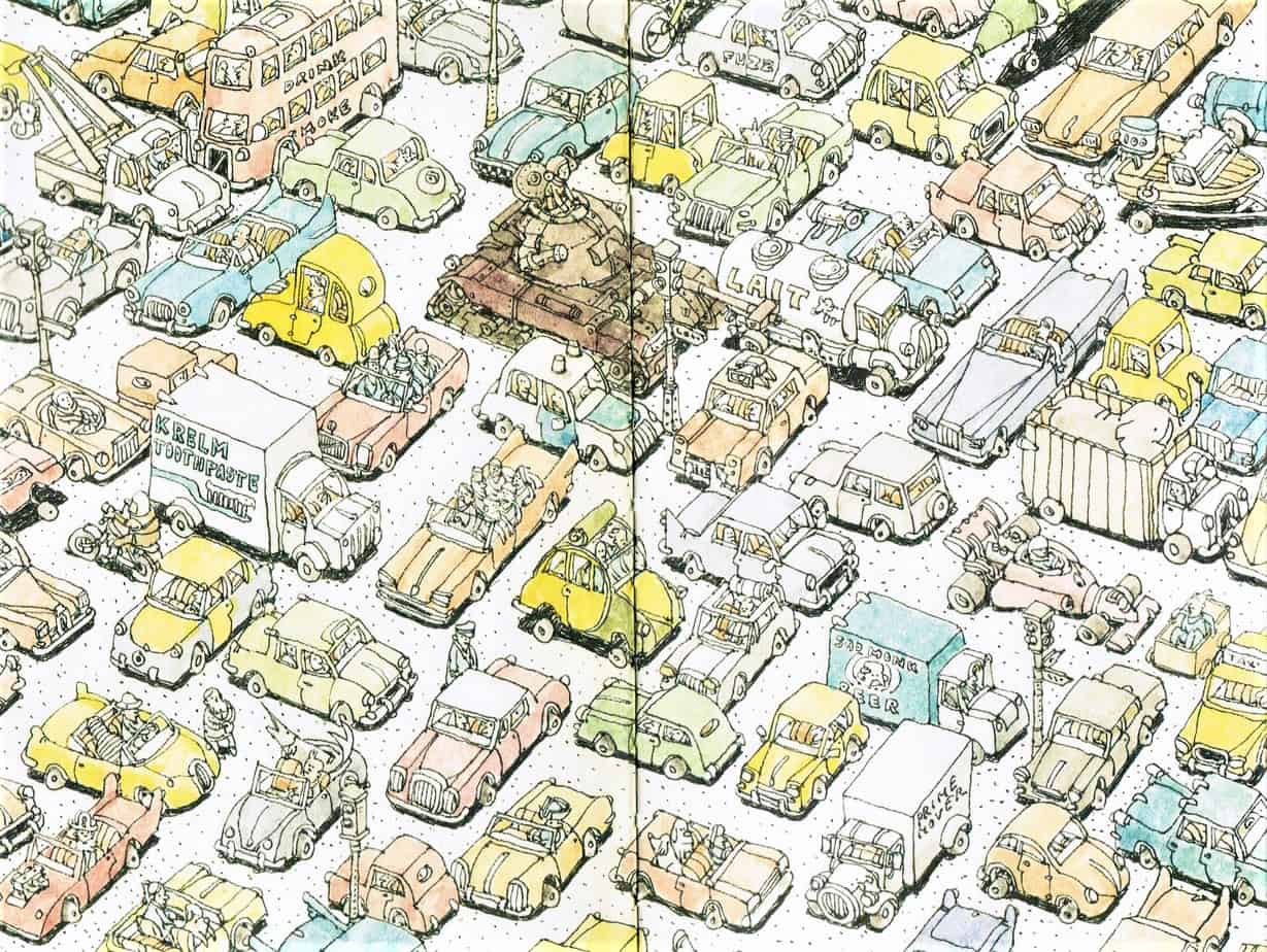
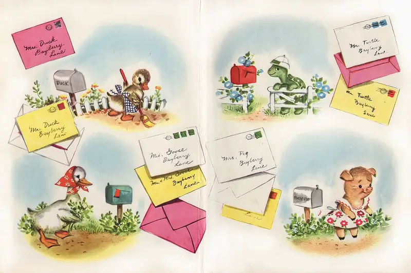
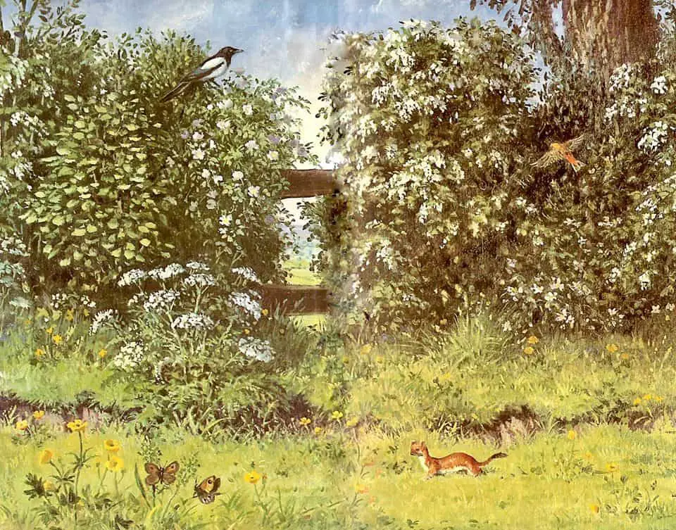

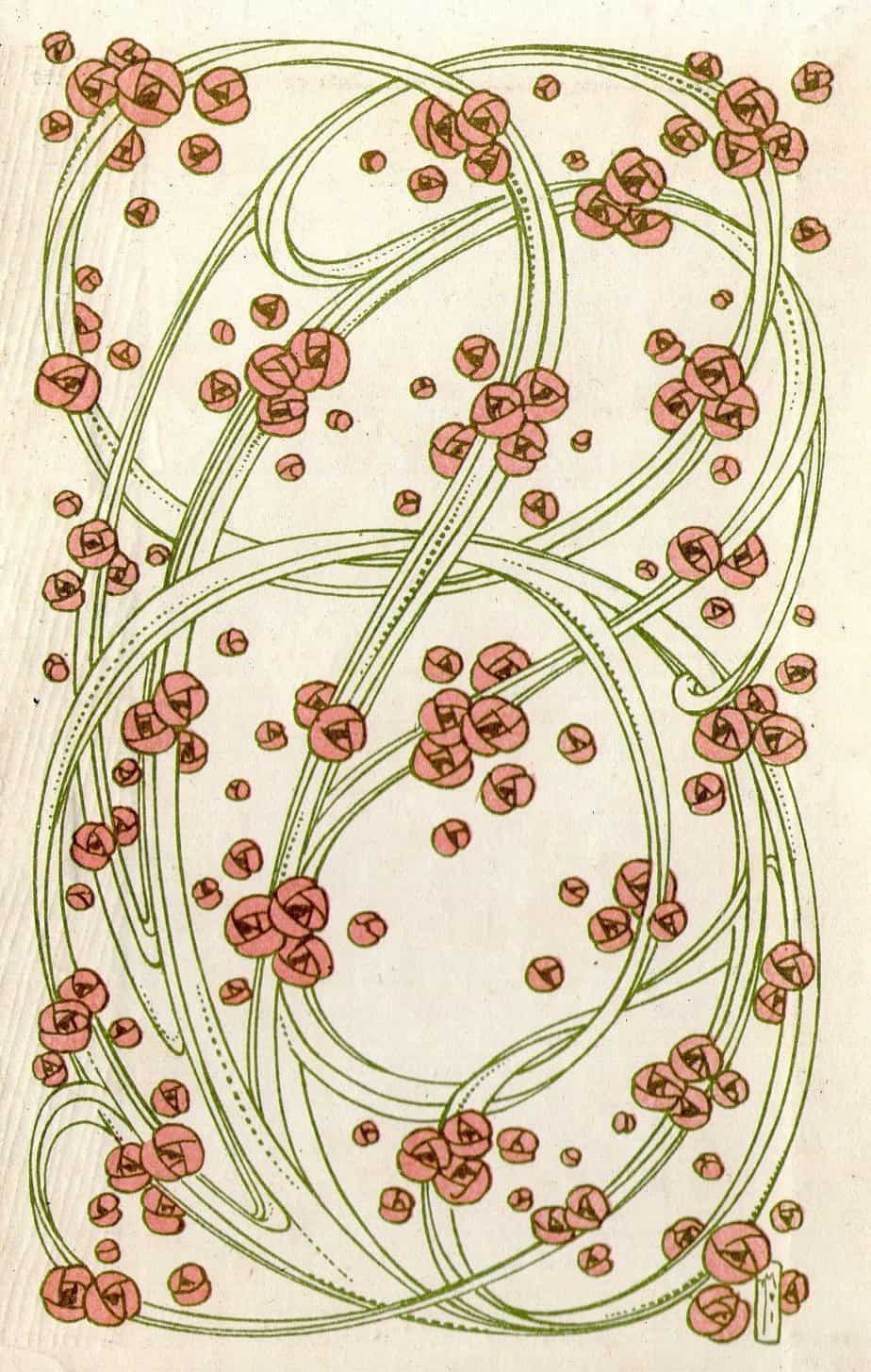
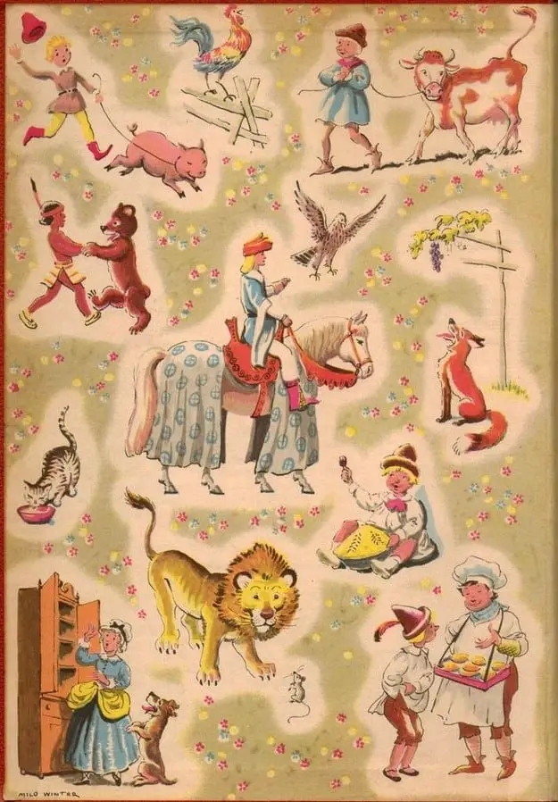
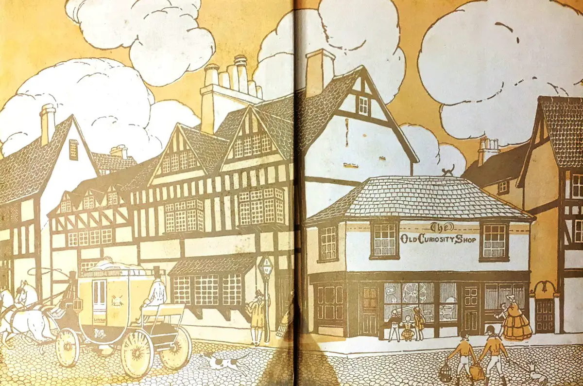
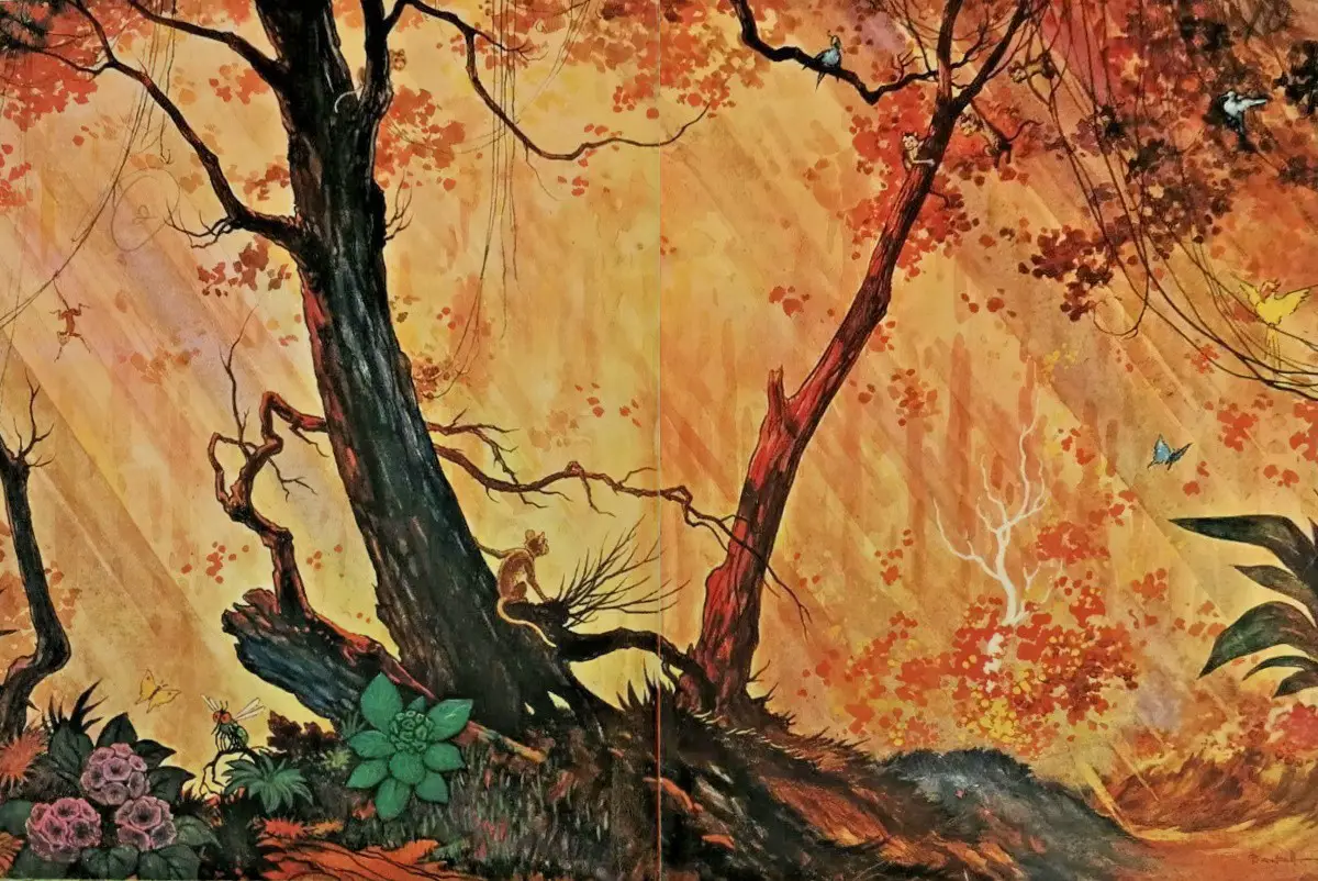
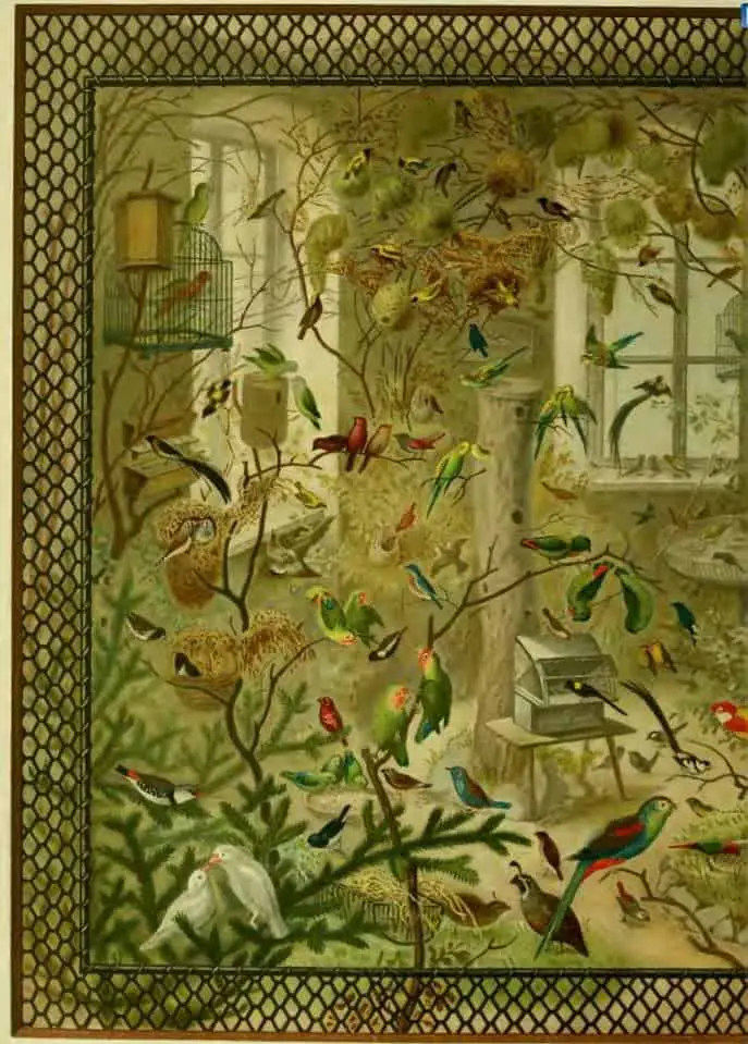
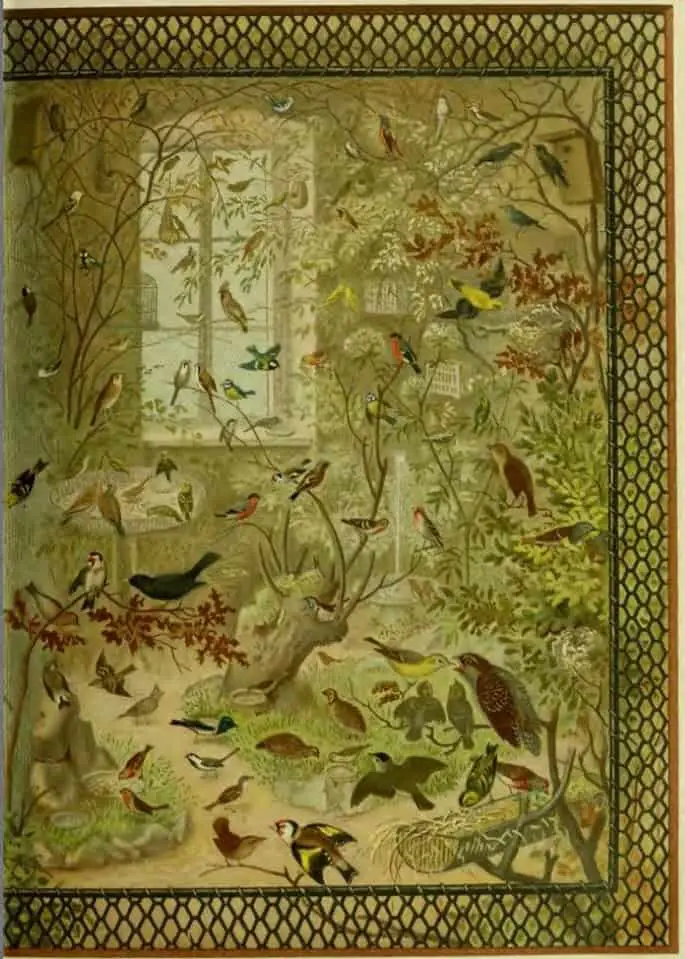
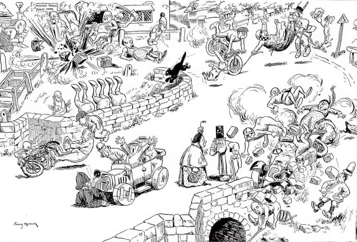
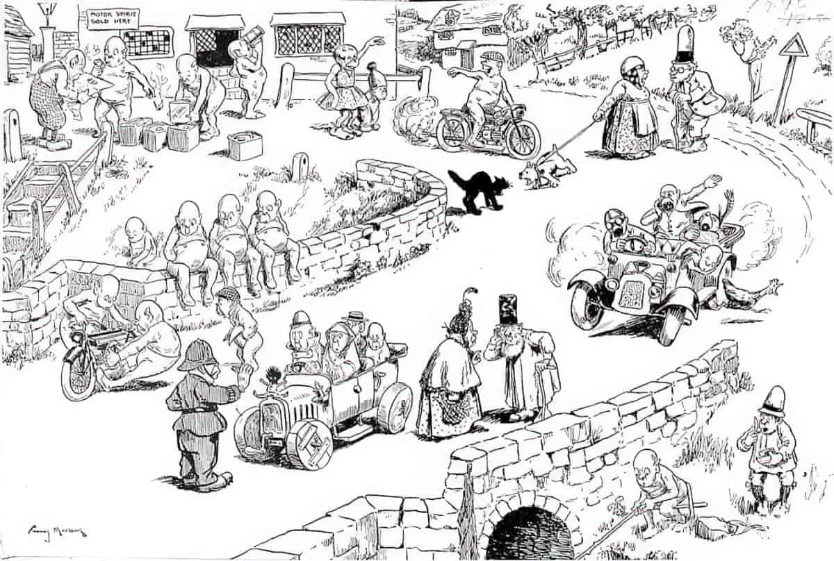
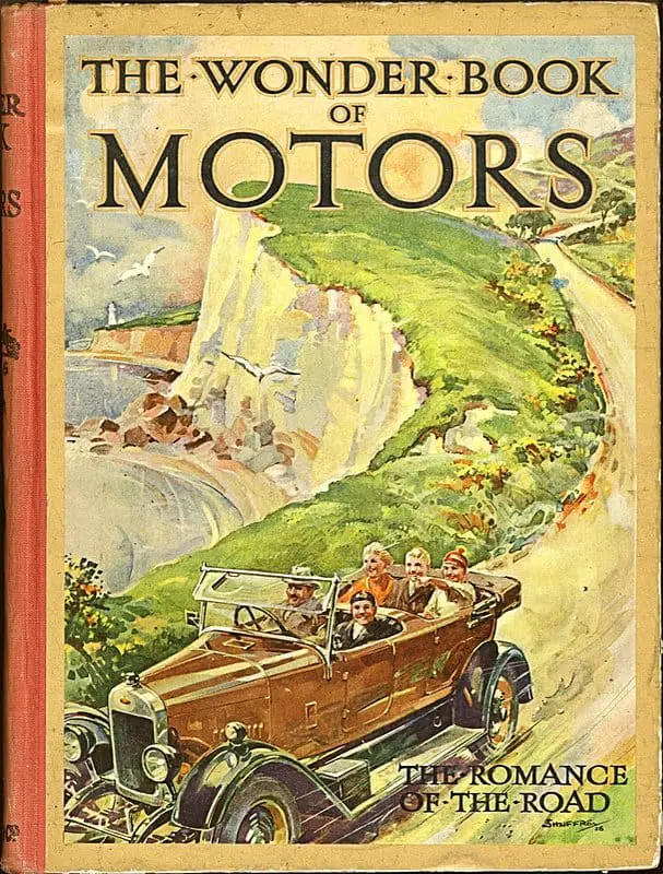
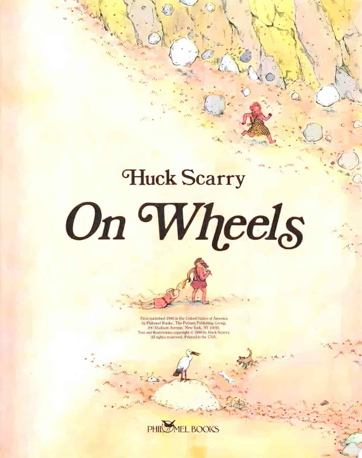
THE IMPORTANCE OF ENDPAPERS
ENDPAPERS CAN BE LIKE STAGE CURTAINS
Lawrence Sipe explains how endpapers are like stage curtains:
Endpapers, in particular, mark a movement from the public space of the cover to the private world of the book, much as stage curtains rising and falling mark the entrance into and exit from a drama.
ENDPAPERS AS SYNOPSIS
End papers can also be used to summarise an entire narrative. A standout example of that is Ugly Duckling illustrated by Jerry Pinkney (1999). There’s an illustration of a new hatchling on the front endpaper and an illustration of the adult swan on the back endpaper. Together, the endpapers say: This is the story of a small bird who bacomes a beautiful swan.
ENDPAPERS TO SHOW THE PASSAGE OF TIME
Endpapers can show the passage of time in various ways. Another example is The Napping House (1984) by Don and Audrey Wood. The front endpapers are a different colour from the back endpapers. (Darker at the beginning, lighter at the end.) This follows the mood of the story, which begins darkly and ends on a lighter note.
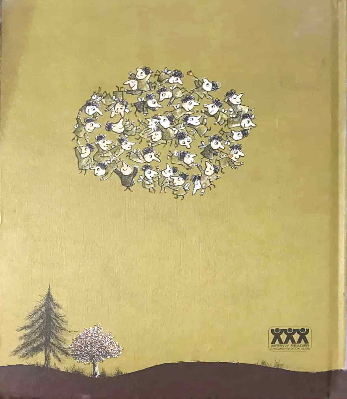
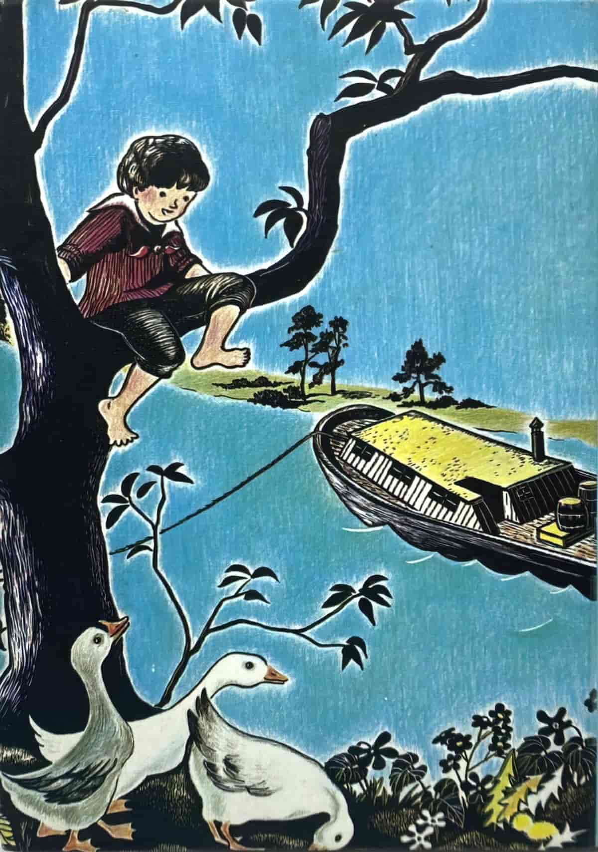
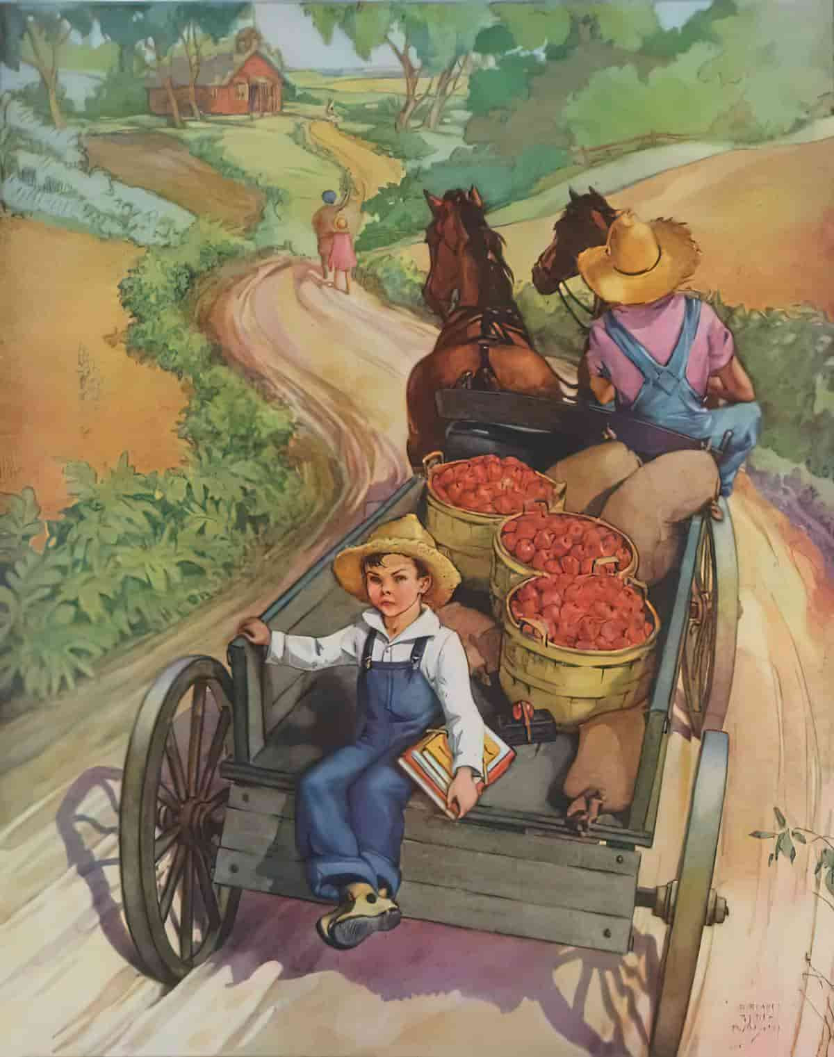
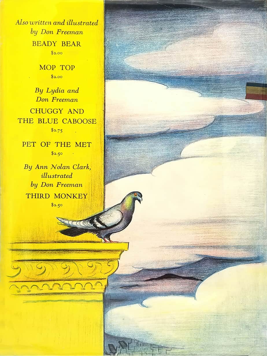
BACK COVERS



THE PERITEXT OF DIGITAL PRODUCTS
What might this mean for those of us creating picture book apps rather than paper products? Picture book apps have their own analogues to the peritext of printed matter. For example:
- an icon on the app store
- screen shots on the app store
- promo videos/trailers
- splash page
- title page
- navigation page
Of this list, the young reader will not necessarily see screen shots on the app store nor watch any promo video, so I can probably cross those off the list as examples of peritext. (I guess it’s called ‘epitext’.) As for the other features, any of those can be left out when it comes to an app. There is no physical cardboard, for instance, requiring some sort of endpaper, and so it can be tempting (due to memory and other limitations) to leave out something like a title page between the splash page and the main menu. A splash page is most often used in apps to advertise the developer’s company and to create a brand across a stable of products, without necessarily tailoring its look to the story in hand.
There is also ‘peritext’ which is specific to book apps:
- rate this app button
- credits page
- links to social media
- other products from the same developers
Some of this ‘peritext’ isn’t welcomed by adults who purchase picture book apps for children, though I’m sure a great many feel neutral about it, so long as it’s not obtrusive and click-baiting from the main menu. This isn’t an exhaustive list of peritextual possibilities. In an app, would a finger-painting activity or a match-the-words page counted as peritext?

Some questions for picturebook app developers are:
- How can we introduce our stories with ‘stage curtains’ in this new digital environment, where readers expect some sort of introduction to the story before it ‘begins’?
- How can we help the reader by making sure our peritext extends the story on every non-story page, even if it’s just a little?
- What is it about physical books which is best transferred — in some form — to a digital medium? And what can happily be left out?
- Is there anything we can do digitally which would improve upon the peritextual limitations of printed books?
Somewhat related:
When we discuss front cover designs, the pinkness of this or the blueness of this, we’re discussing paratexts. And, to be frank. there doesn’t seem to be much research about the impact / affect / effect of them.
Gendered Books In Children’s Literature
Paeony Lewis points out that when it comes to printed books, not all of them are as beautiful as they could be: “I think many hardback children’s picture books lack what I call ‘gorgeousness’.” This is worth mentioning in a climate where comparisons between digital and printed matter are inevitable.
FURTHER READING
Picturebook Endpapers: Resources for Literary and Aesthetic Interpretation by Lawrence Sipe
Header: 1975 THE WITCH’S HAT Irwin Dermer ILLUSTRATED Tony Meeuwissen front endpapers
