Some dreams, some poems, some musical phrases, some pictures, wake feelings such as one never had before, new in colour and form—spiritual sensations, as it were, hitherto unproved…
Lilith | George MacDonald
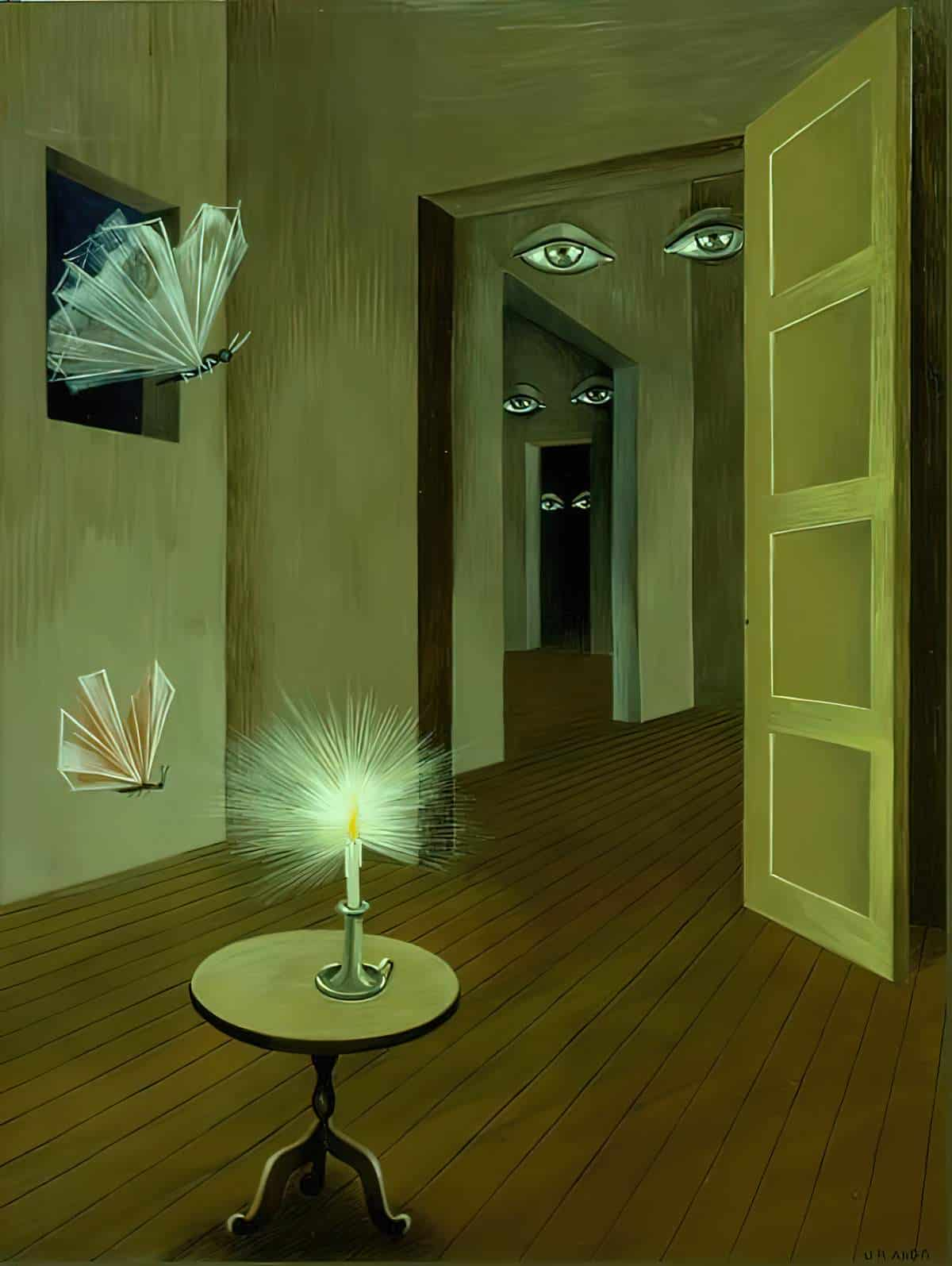
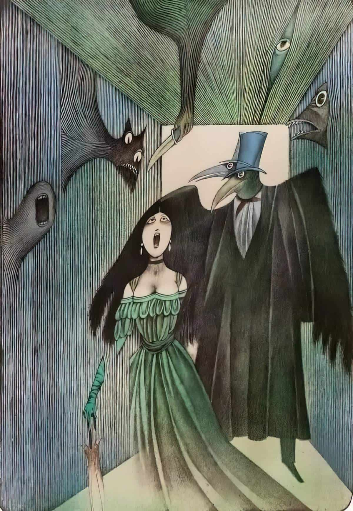
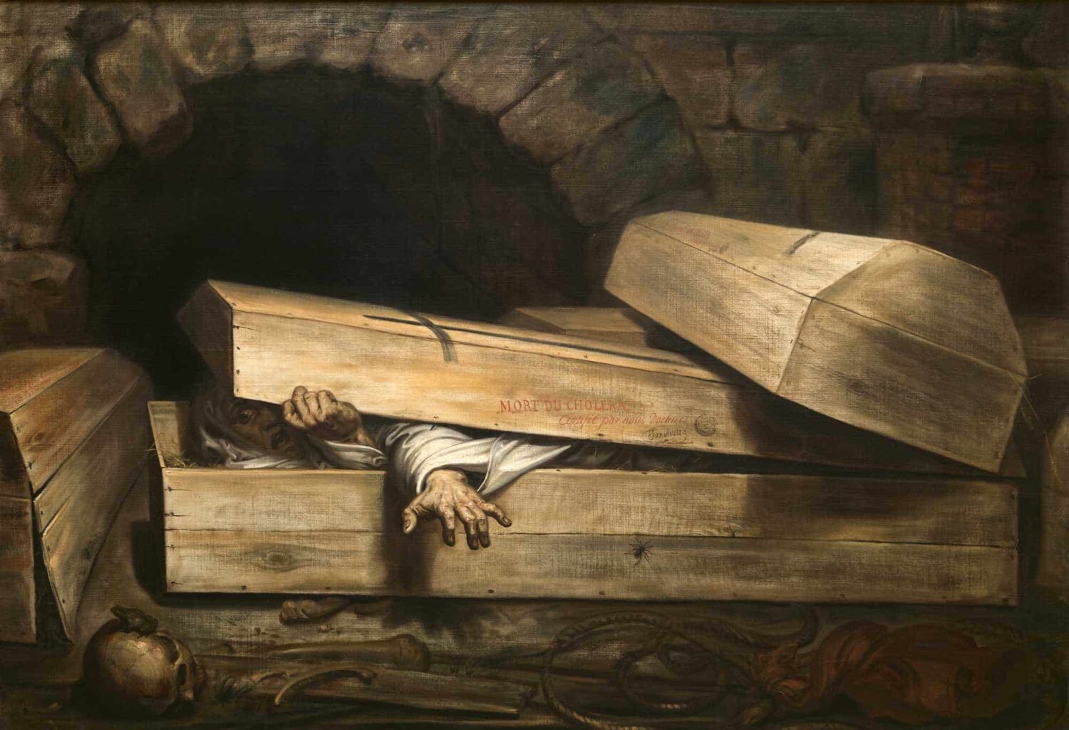
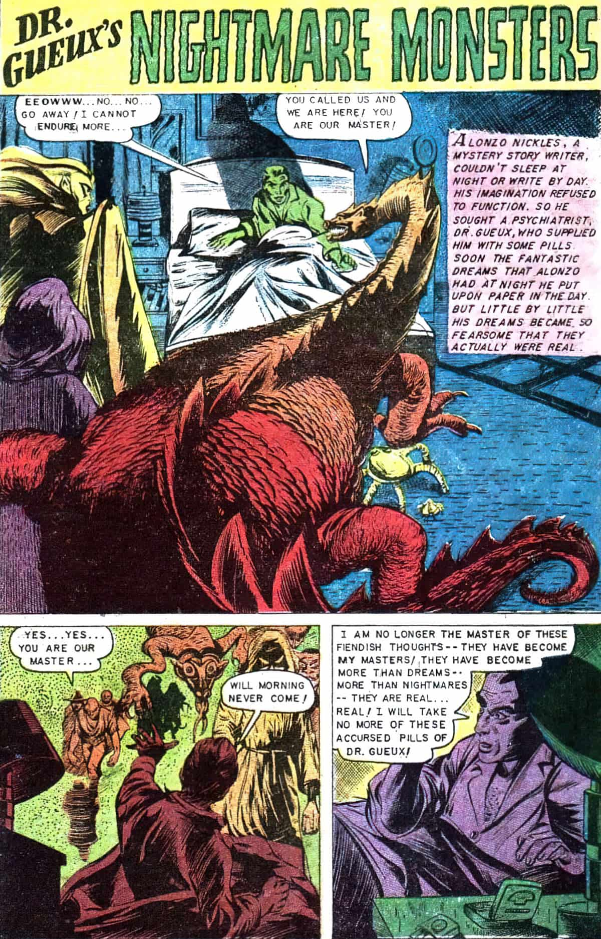
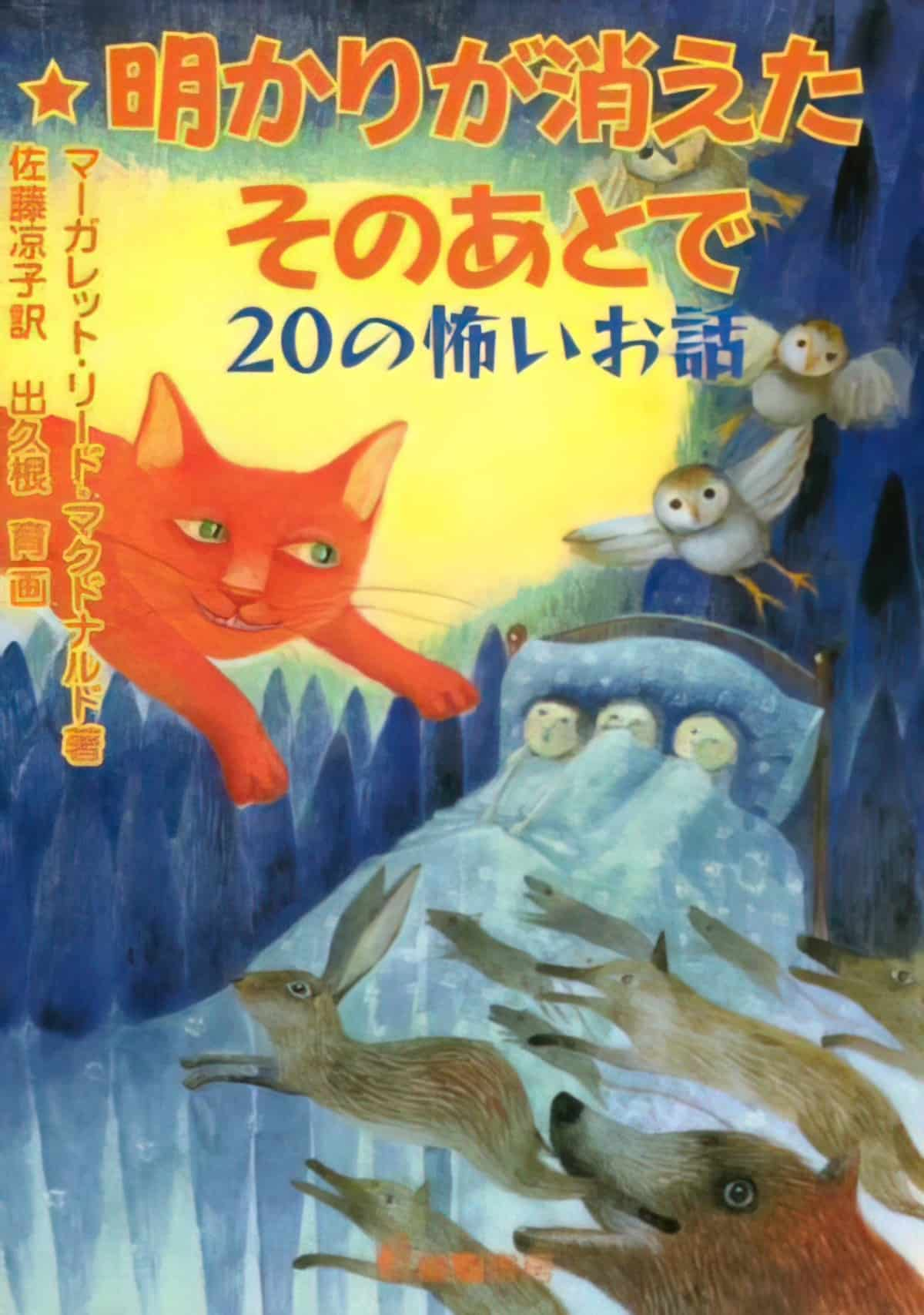
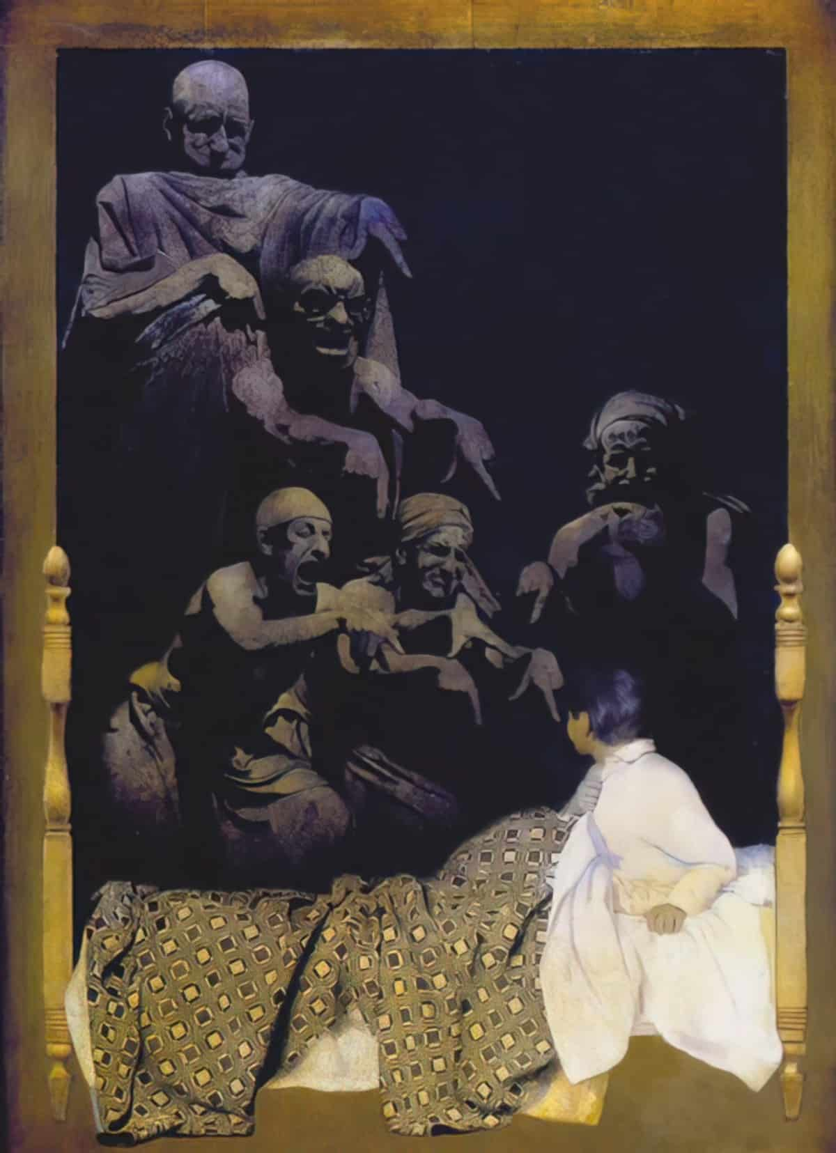
How does an artist offer the viewer a sense of nightmare?
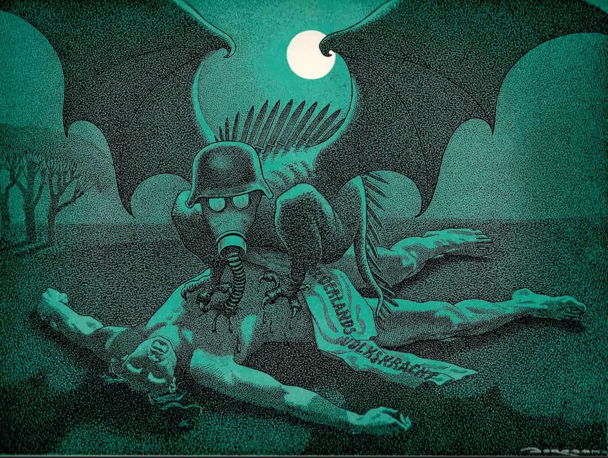
Desaturation
Over all, 12 percent of people dream entirely in black and white. … In the 1940s, studies showed that three-quarters of Americans, including college students, reported “rarely” or “never” seeing any color in their dreams. Now, those numbers are reversed.
NYT
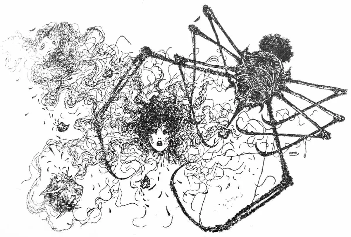
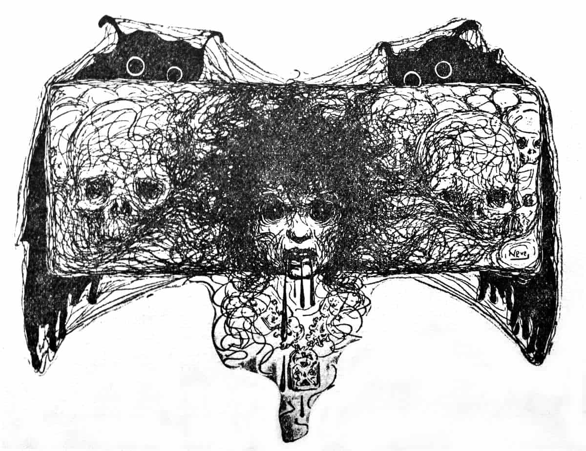
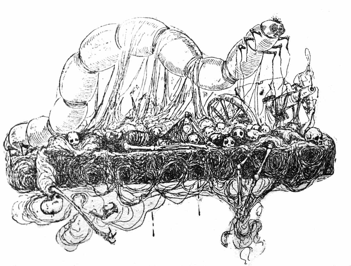
Note how quickly those numbers ‘reversed’. More interesting for artists: The perception that we dream in black-and-white. Regardless of what we actually see while we’re dreaming, the low light levels of night-time means the real world becomes desaturated, and we associate nightmares with the night-time. Artists can suggest a nightmarish quality by desaturating hue, or by working entirely in black and white.
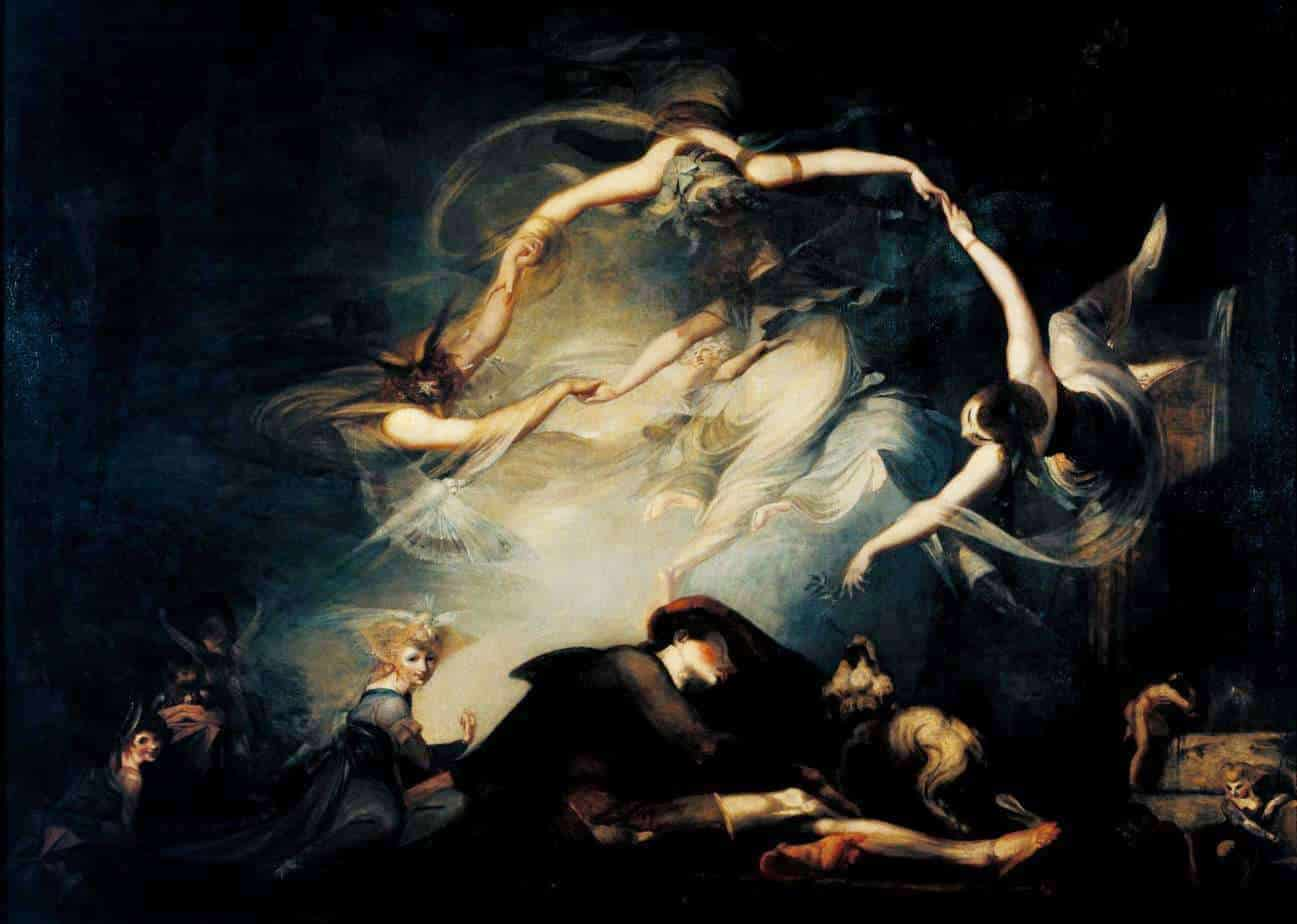
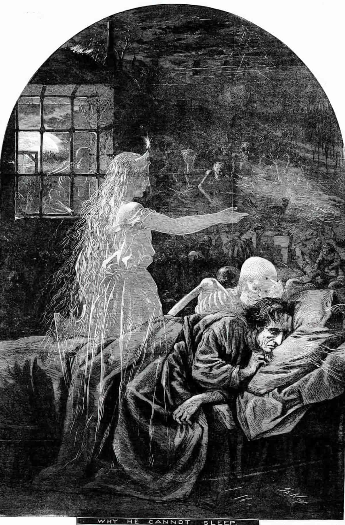
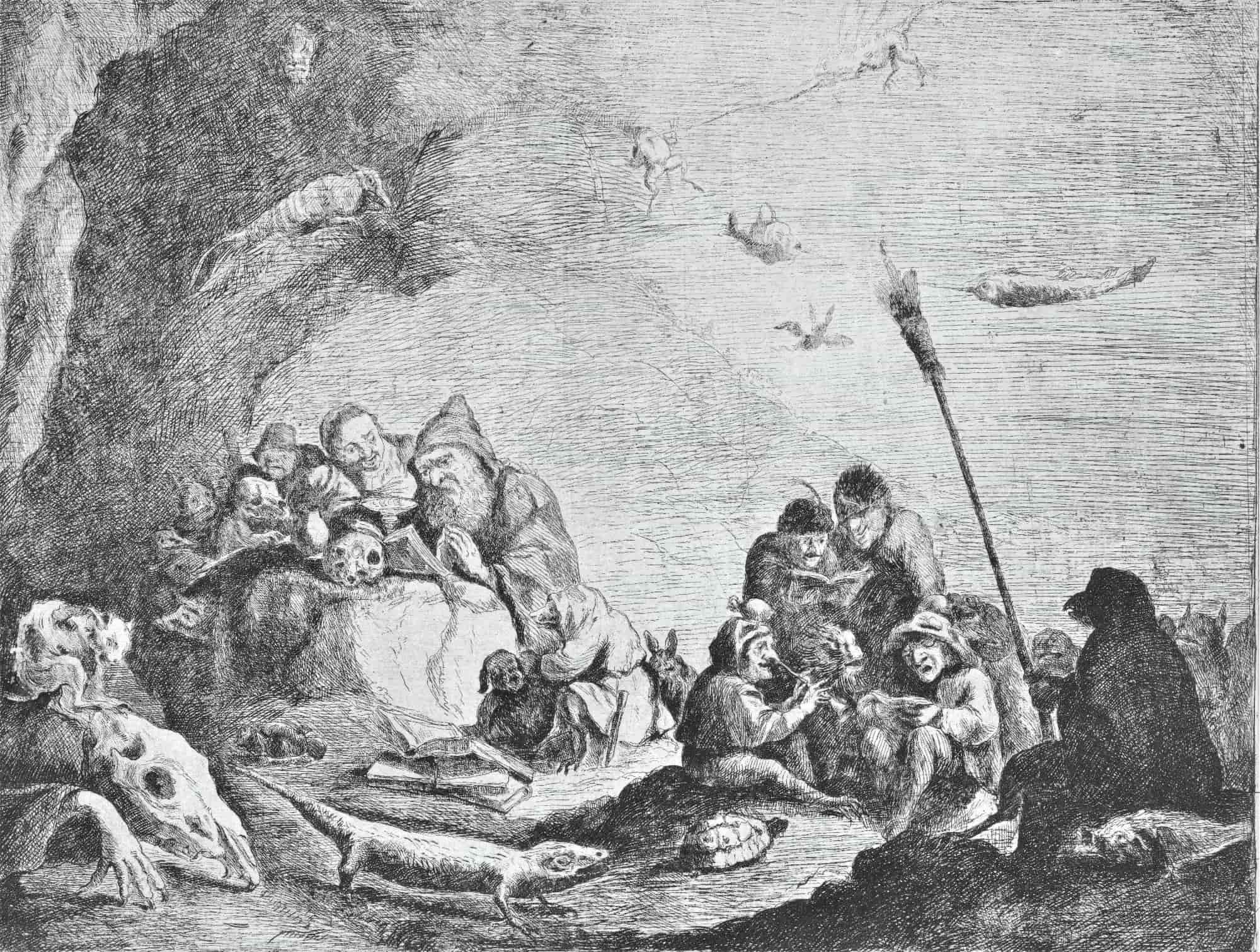
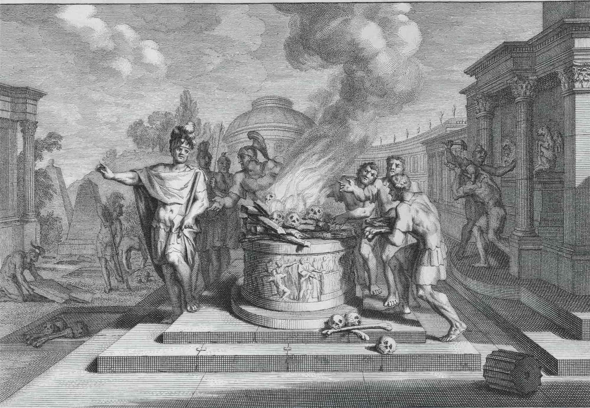
Black and white may work even better than greyscale to suggest a nightmare.
Red and Black
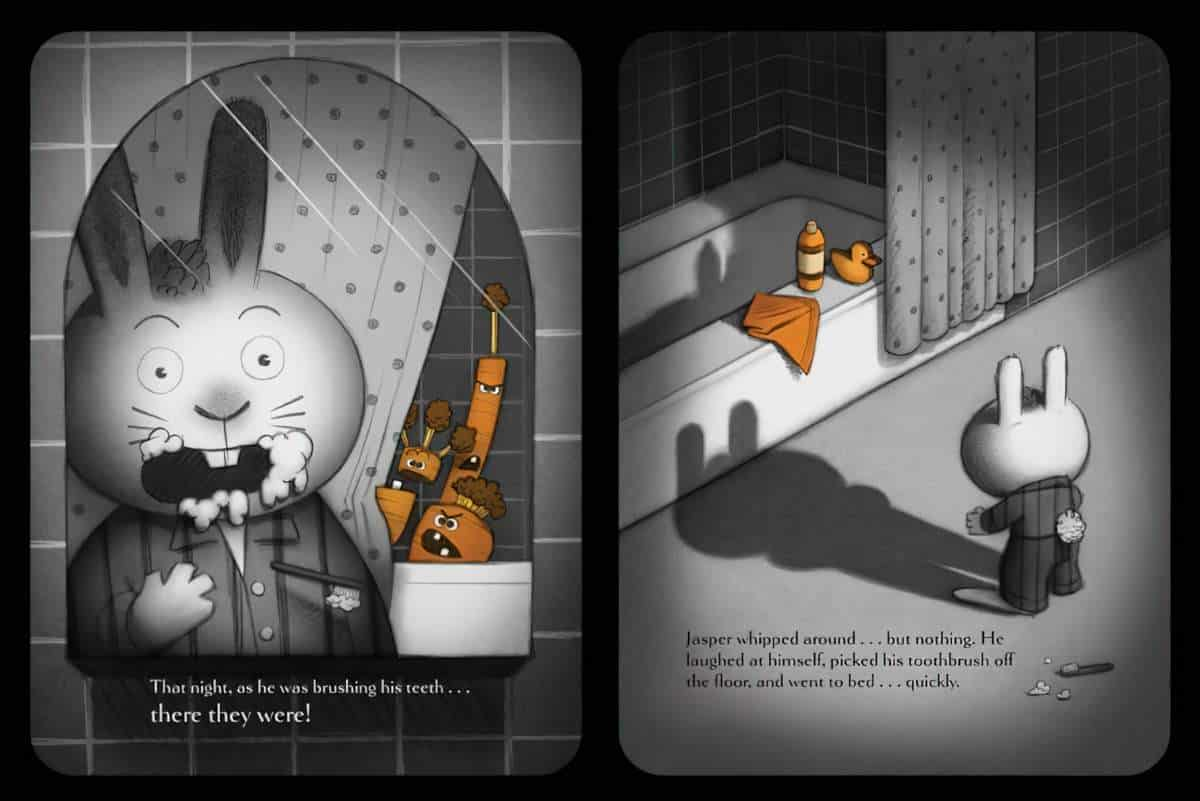
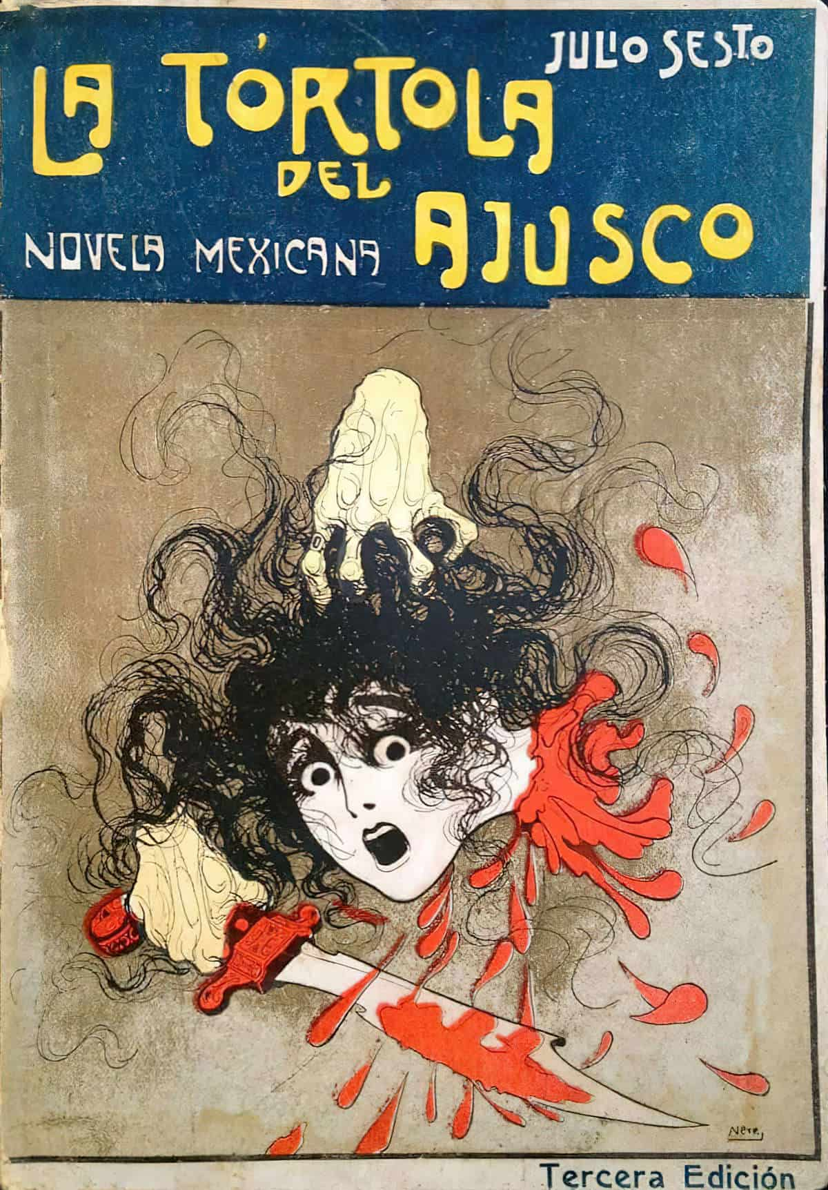
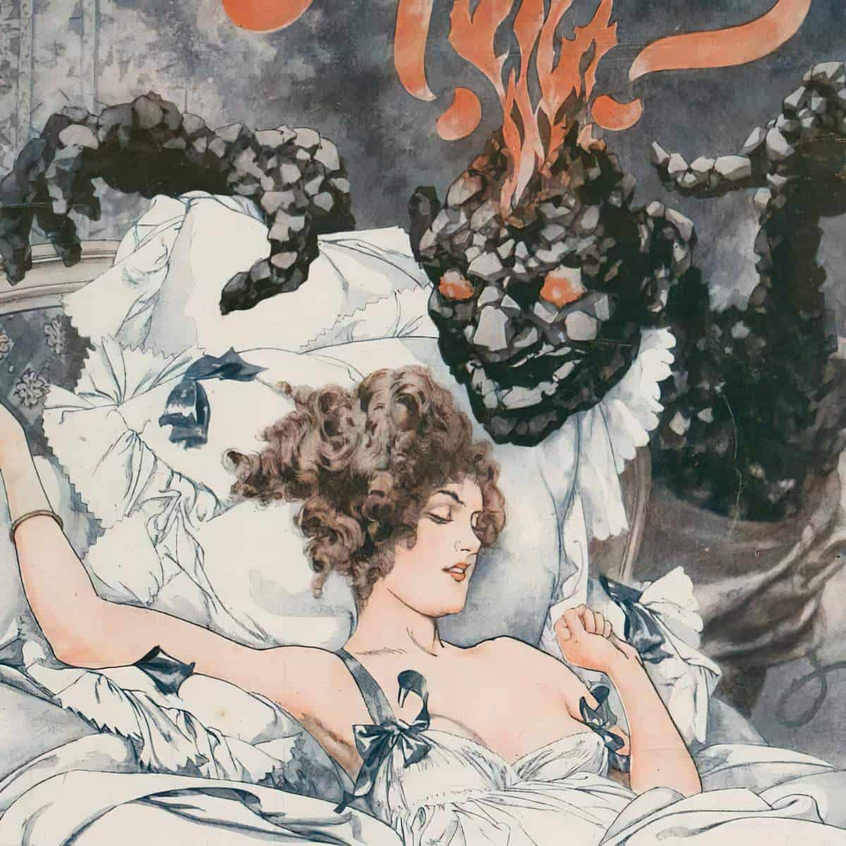
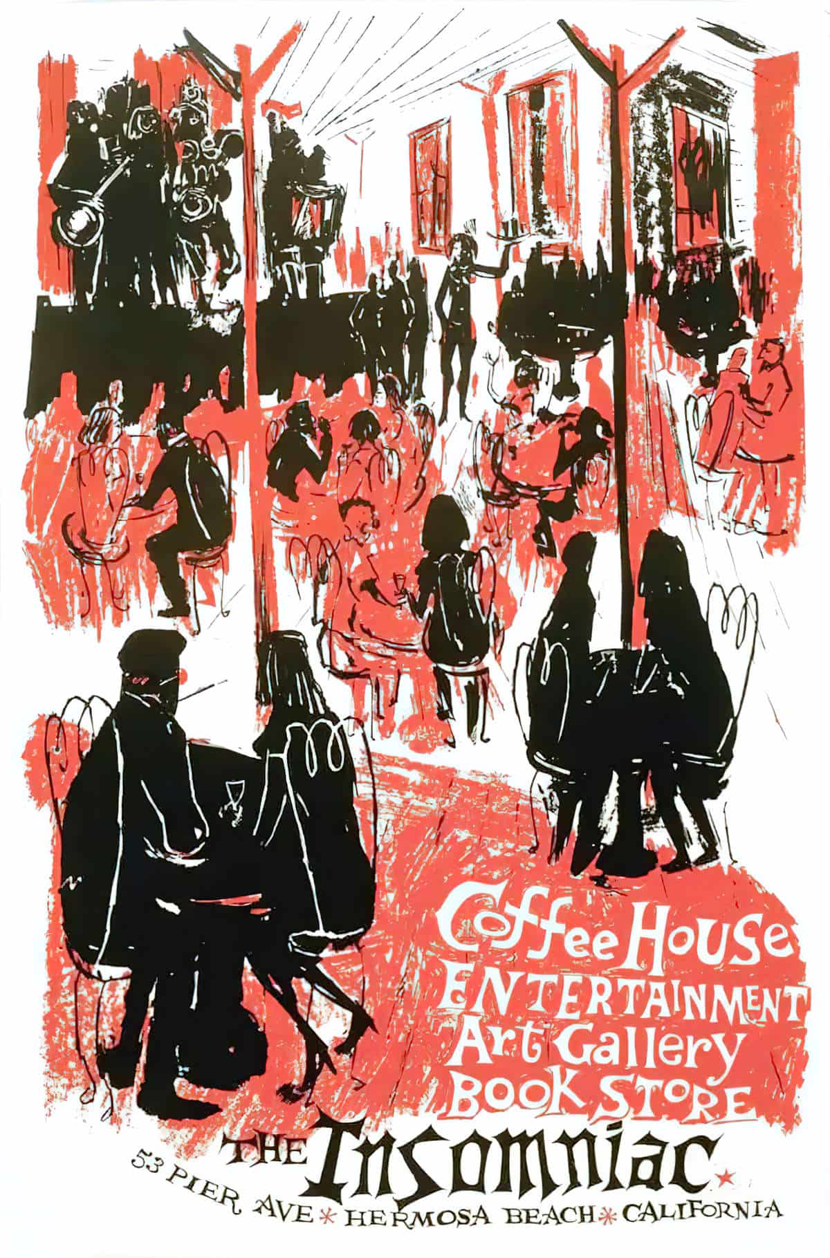
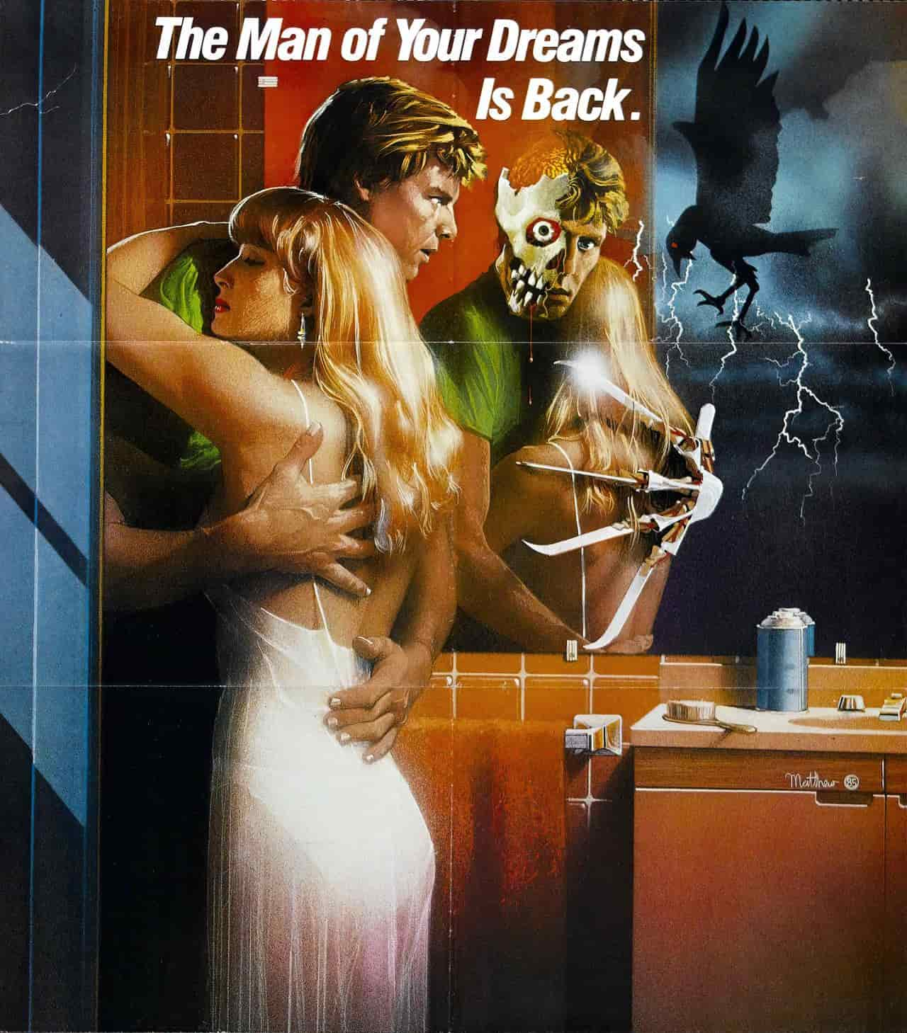
Another option is to pop the reds and remove every other colour. (Red being the universal symbol of blood.)
Tunnel-vision
The edges of the picture may be darkened, vignetted, or somehow curved/distorted.
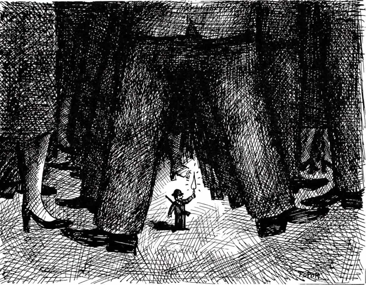
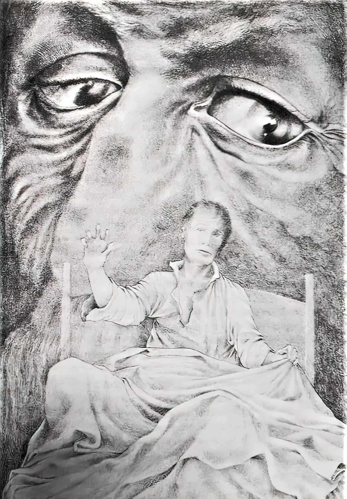
A Change In Scale
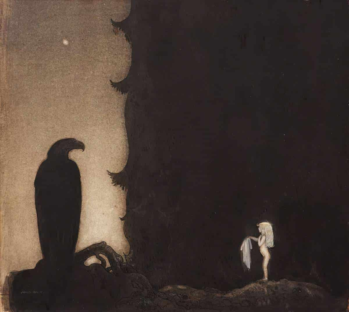
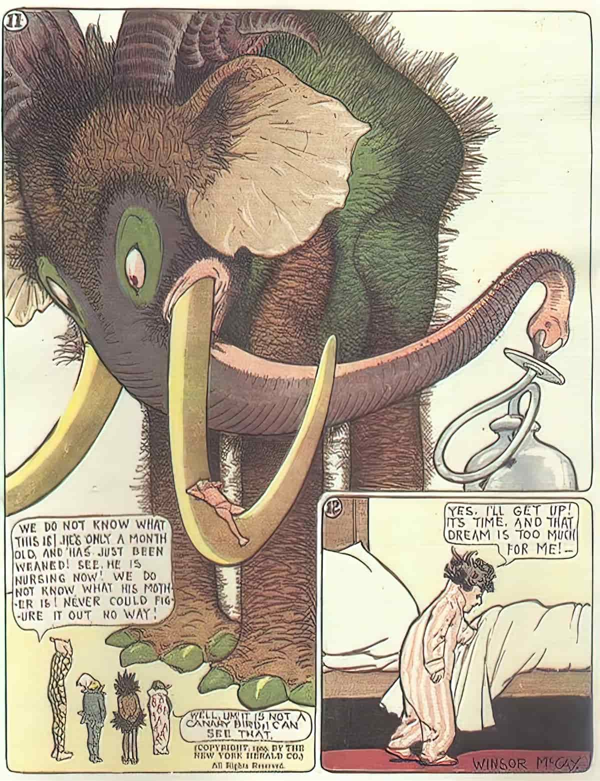
The Supernatural Melding Into The Mundane
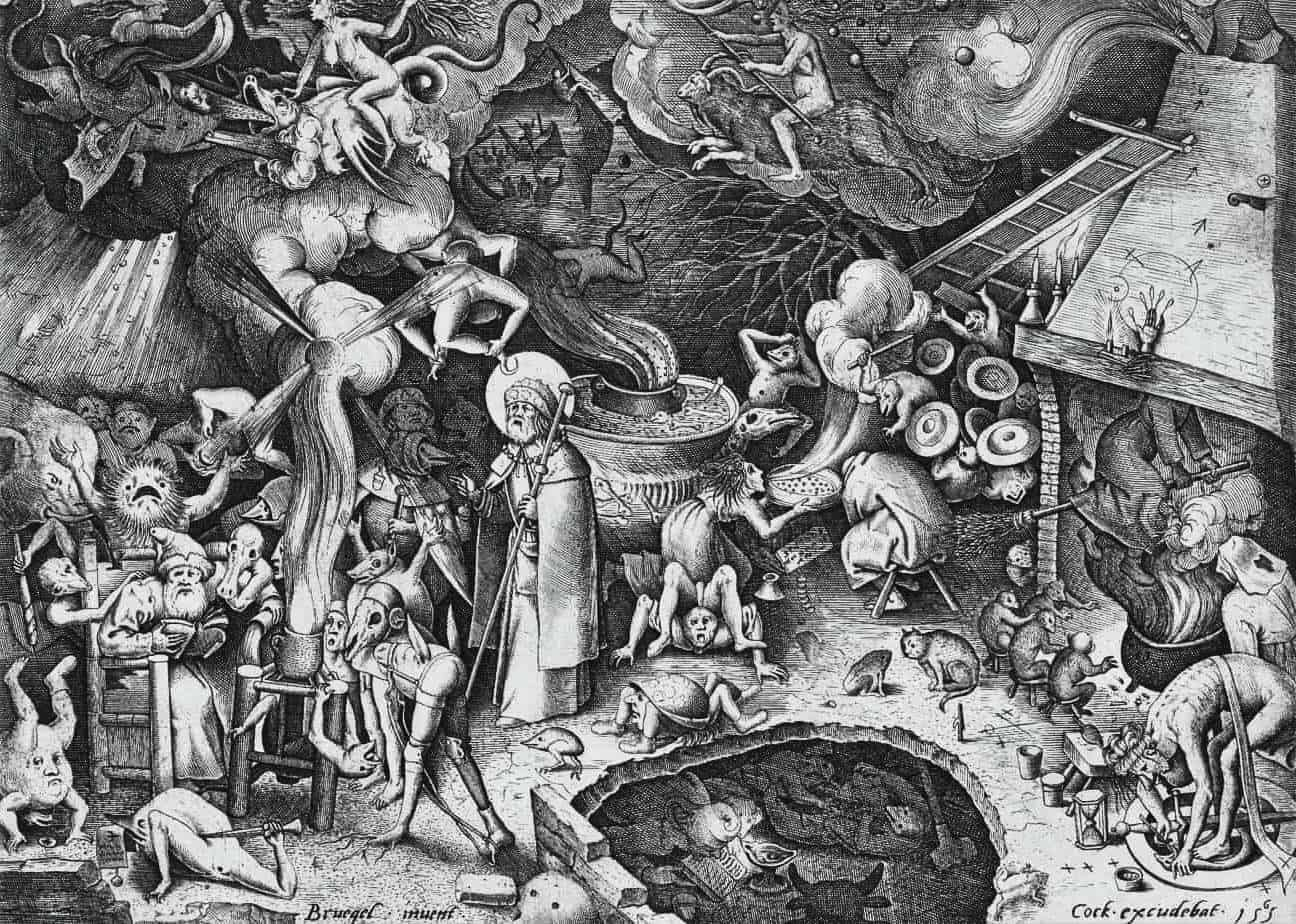
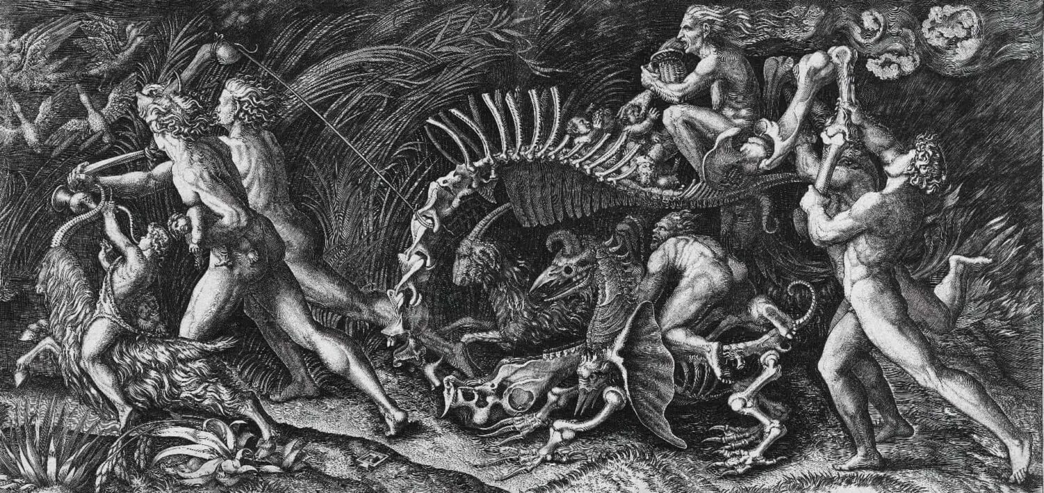
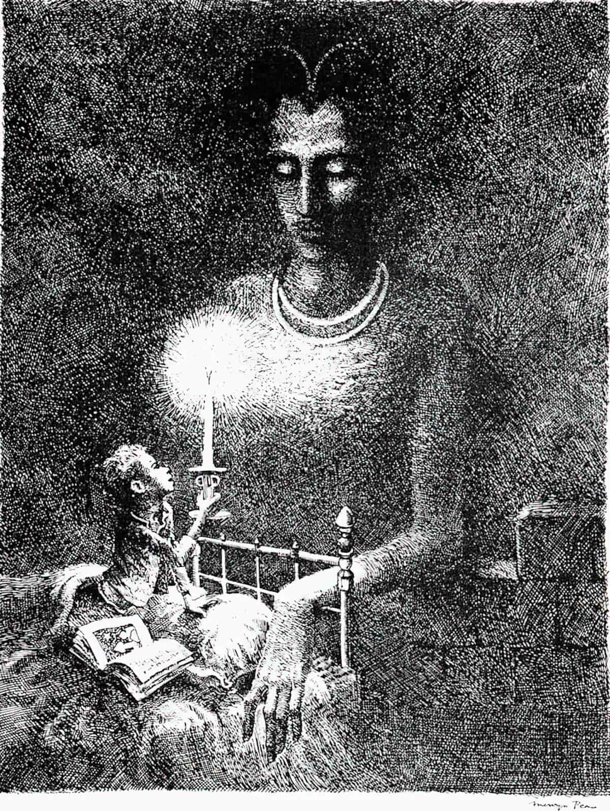
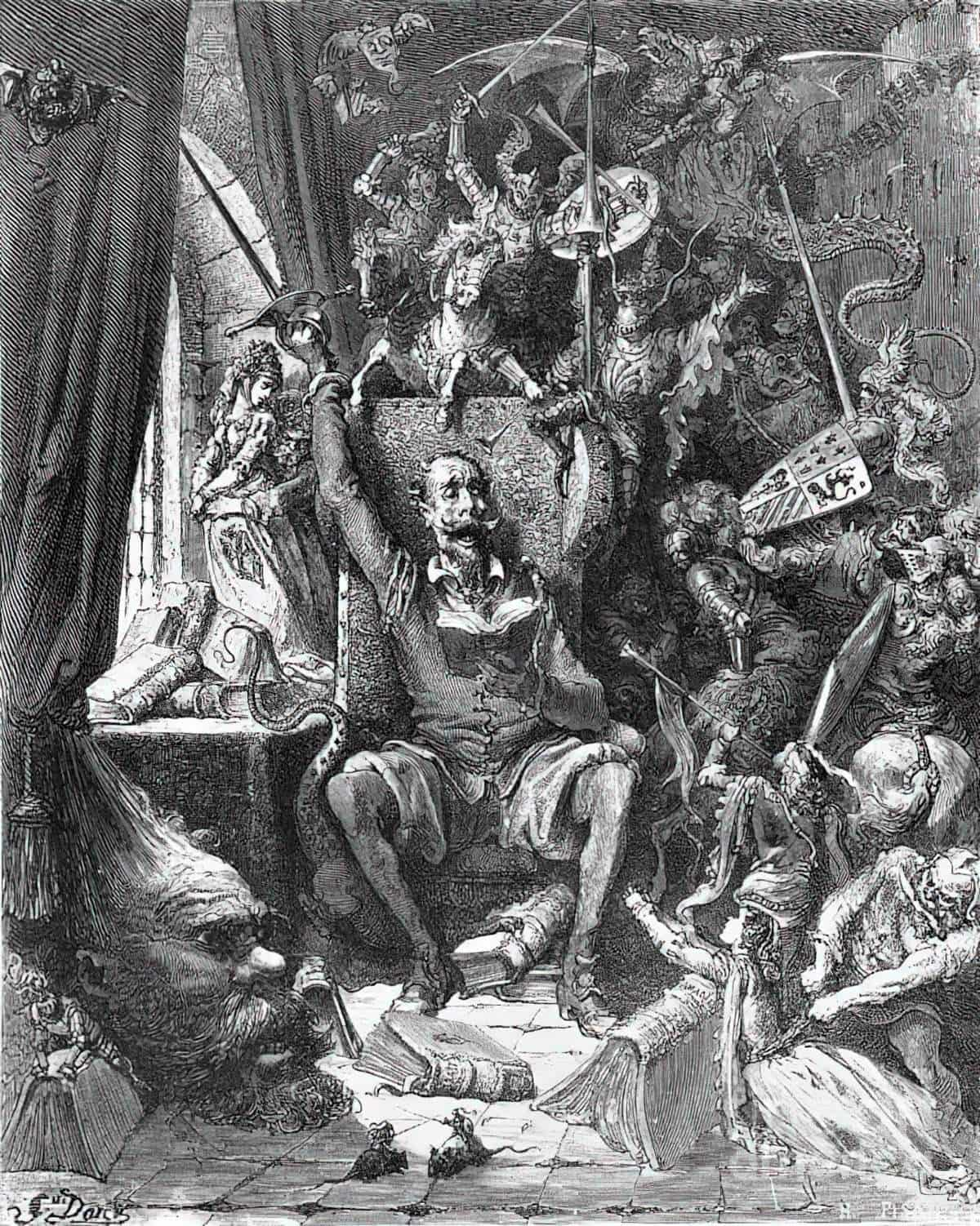
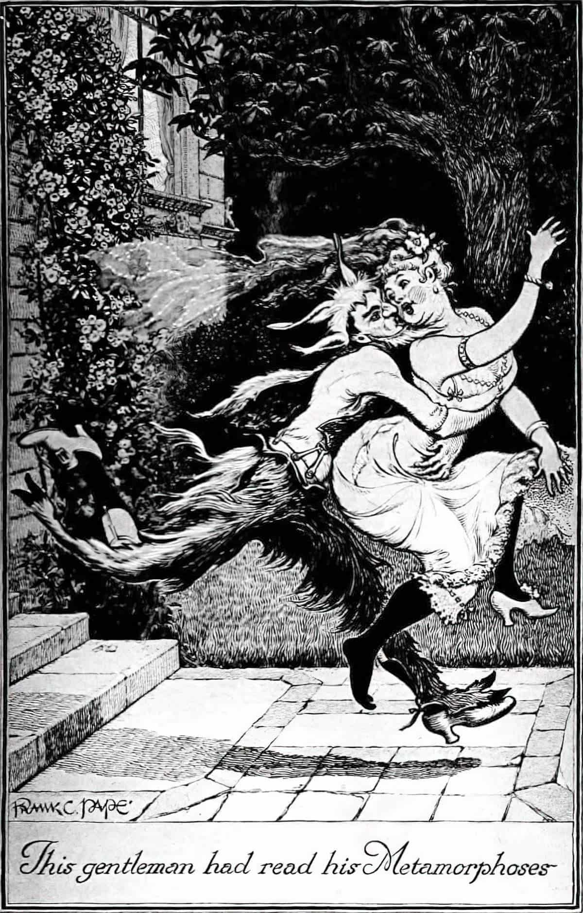
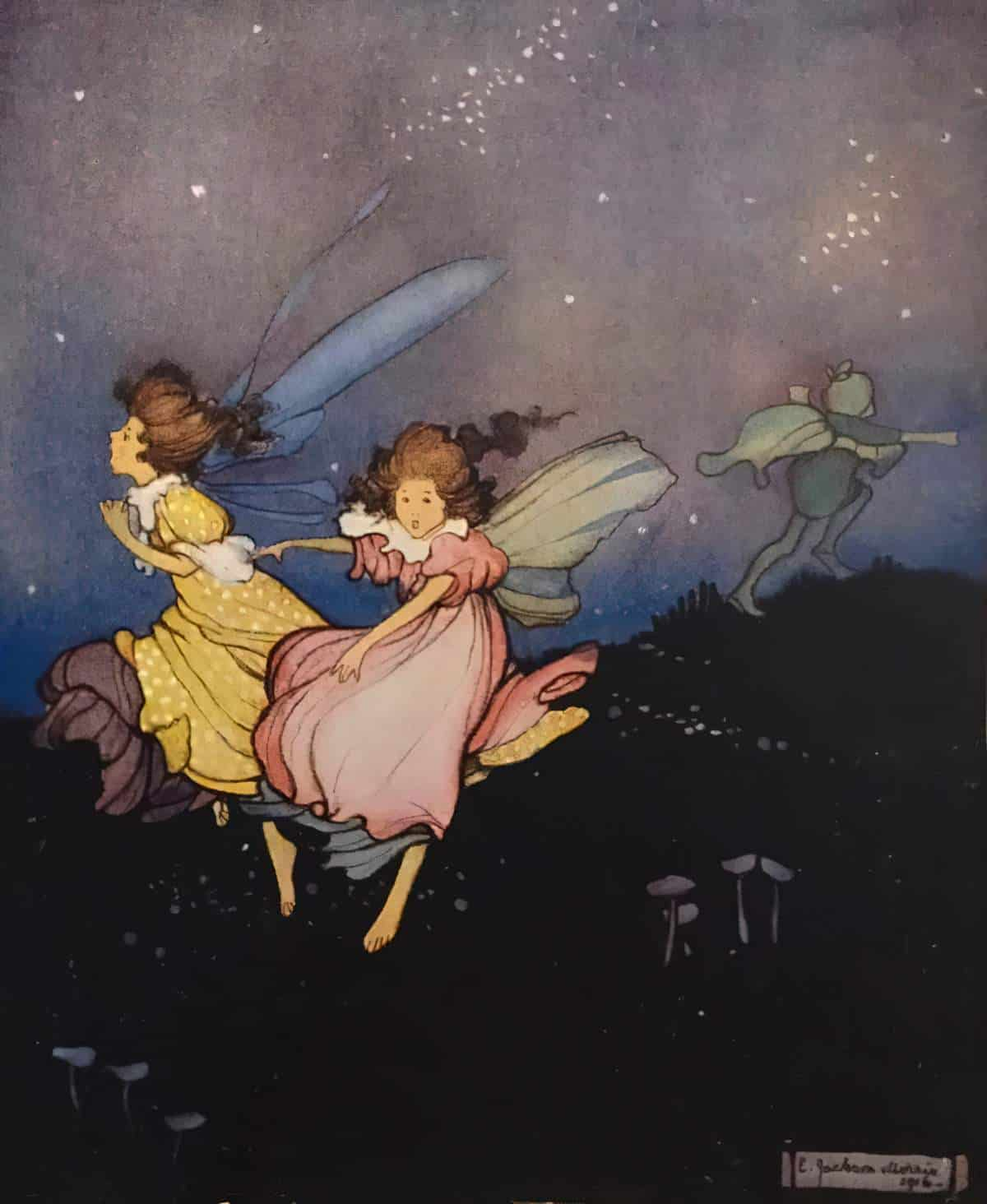
Suggestions Of Nearby Terror
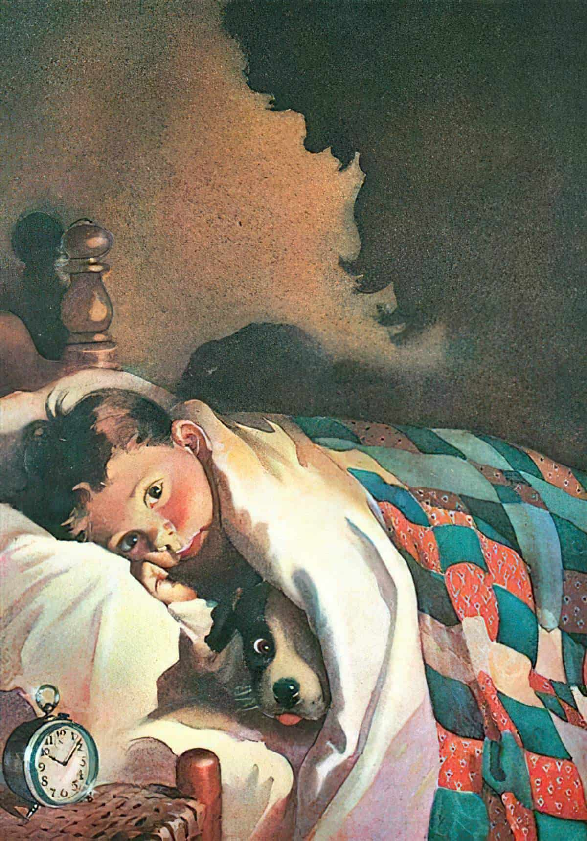
Shadows on walls are great for this. But really, anything only partially shown can work. This is the visual equivalent of that cosmic horror trick, in which the imagined monster is always more scary than the one you can see before you.
Subject Matter: Universal Symbols of Fear
- Darkness is a universal symbol of fear, and it comes from our (legitimate) fear of night-time. Witches have black cats and black cauldrons, as an extension of that particular fear. Children’s book illustrators need to be mindful of creating black characters, however, as a shortcut for villainy.
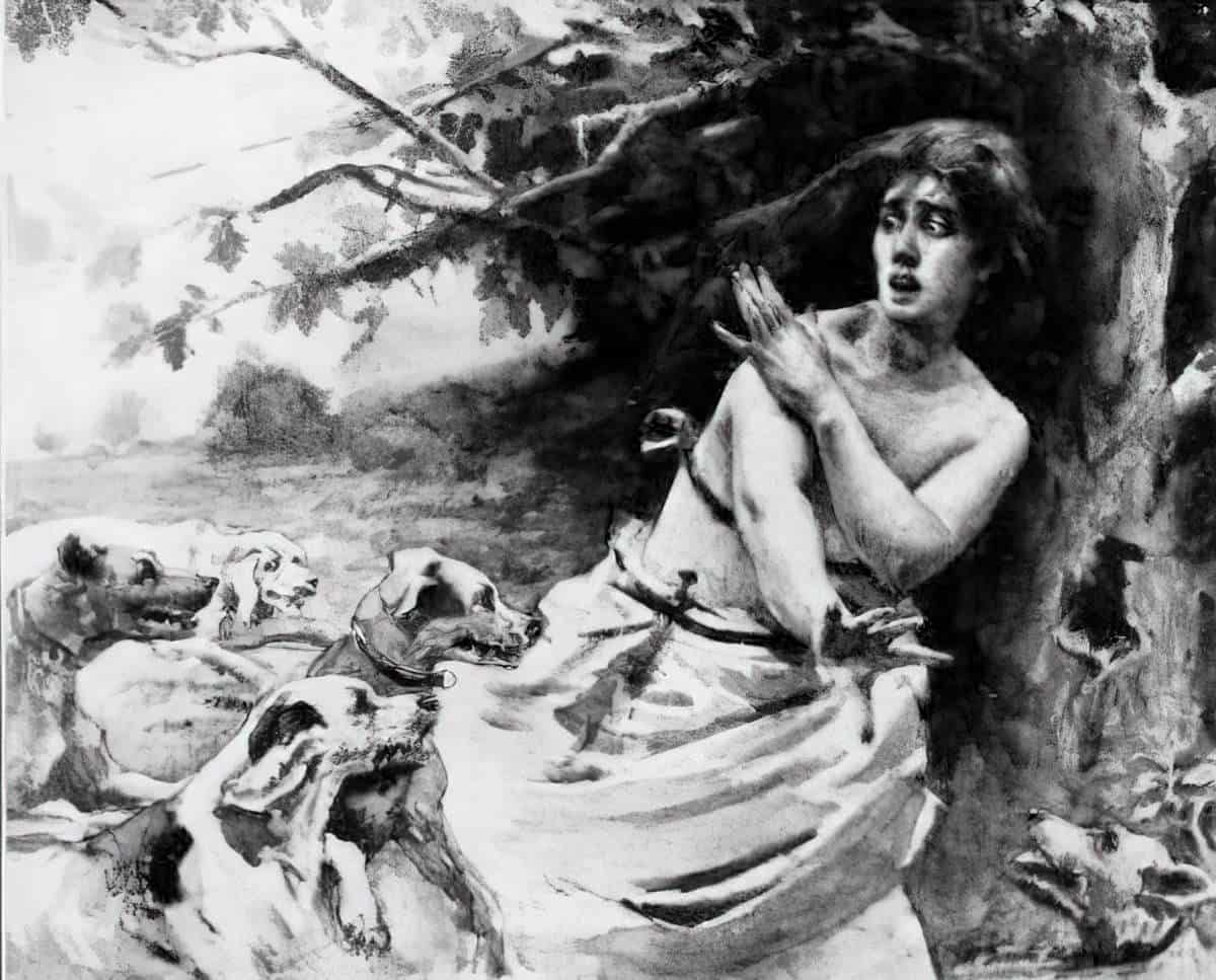
- Predatory animals, swooping birds, giant fish who swallow us whole
- Parents who abandon us, or judge us negatively as ghosts, watching from beyond the grave
- Getting lost in the world and failing to find our way home. (This fear explains the mythic structure that’s been dominant for at least the last 3000 years.)
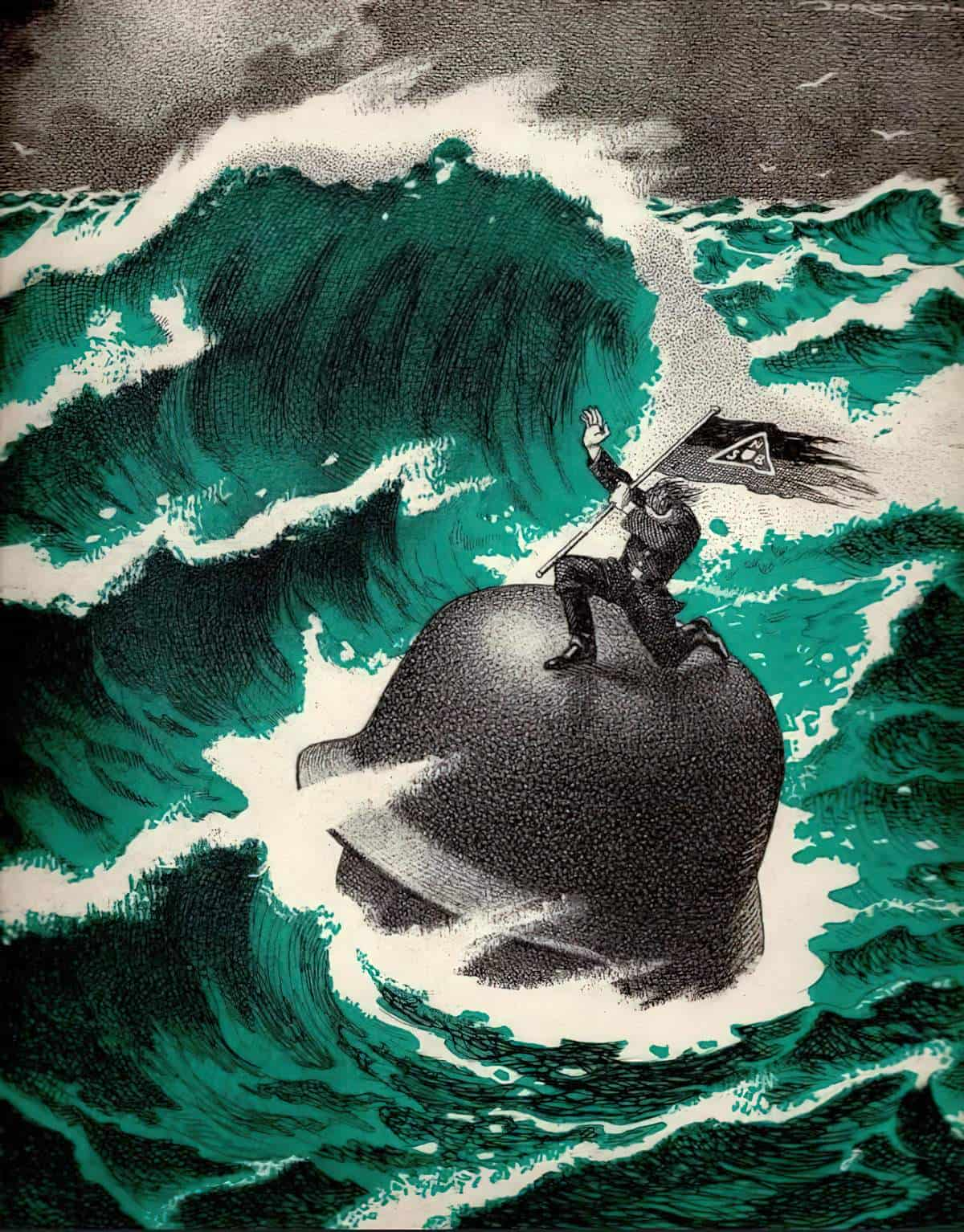
- Turbulent weather conditions such as storms
- Natural disasters such as flood and hurricane. As the population becomes more aware of the climate crisis, the nightmare of the tsunami is increasingly frequent in our nightmares.
- During covid, a common nightmare involves other people, and our inability to escape from unmasked crowds.
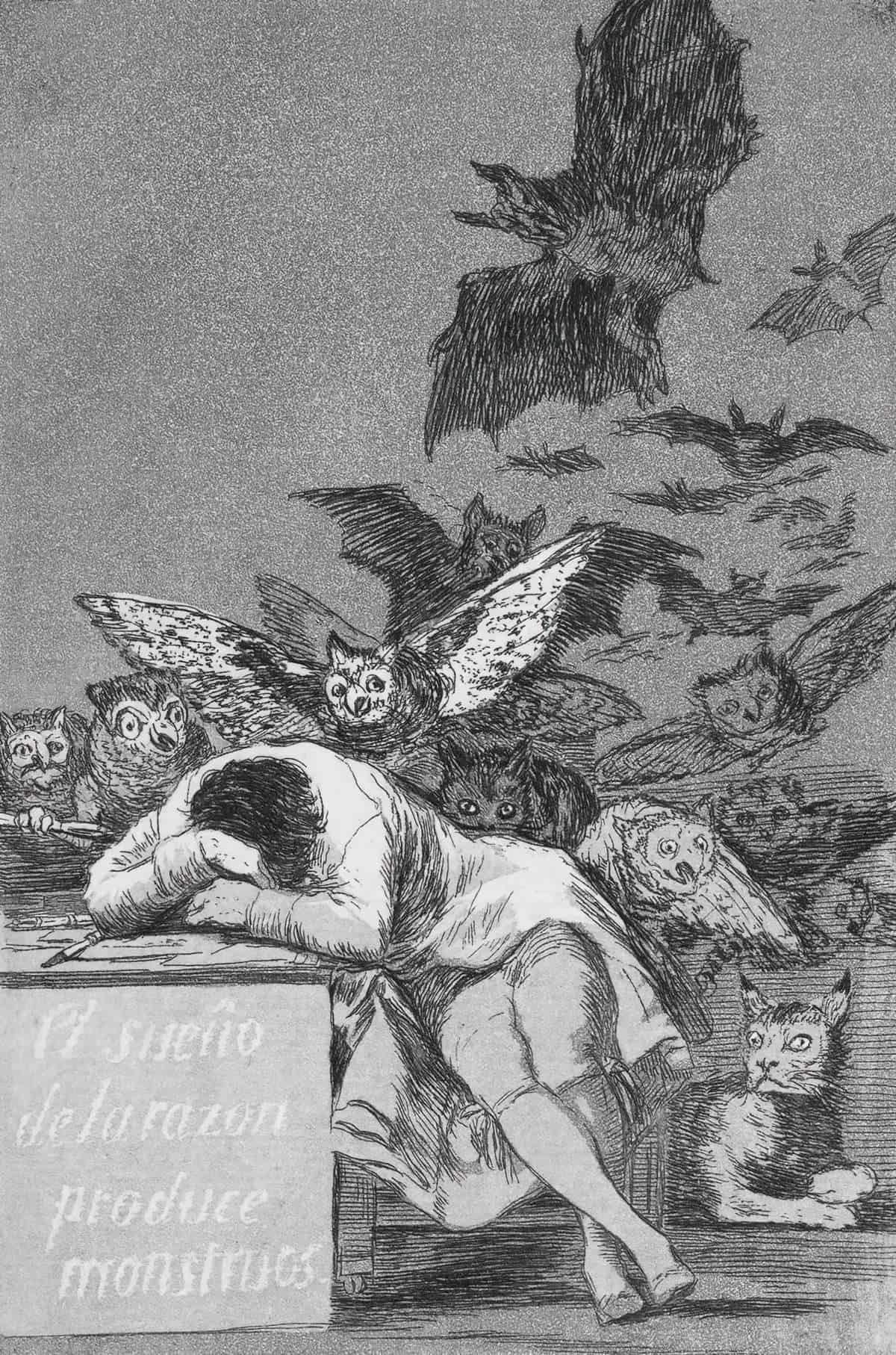
One of the most famous illustrations of a nightmare was completed by Francisco José de Goya in 1798. It’s called “The sleep of reason produces monsters”. The artist buries his head in his arms upon his desk while a collection of mostly winged creatures descend on him from above and behind.
See also: Why Did Francisco Goya Paint Witches? Francisco Goya’s grim and unnerving images of witches’ sabbaths and flying sorceresses hide an intriguing story behind them from The Collector,
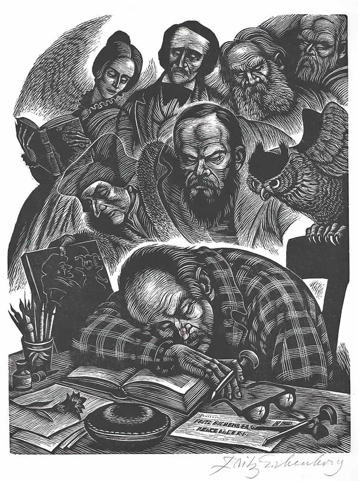
Almost 200 years later in 1976 illustrator Fritz Eichenberg created Dream of Reason inspired by Goya’s 1798 illustration. This was also a self portrait but instead of birds the artis is haunted all the writers whose work he illustrated. Behind him stand Dostoyevsky, Erasmus, Bronte, Poe, Tolstory, and Turgenev.
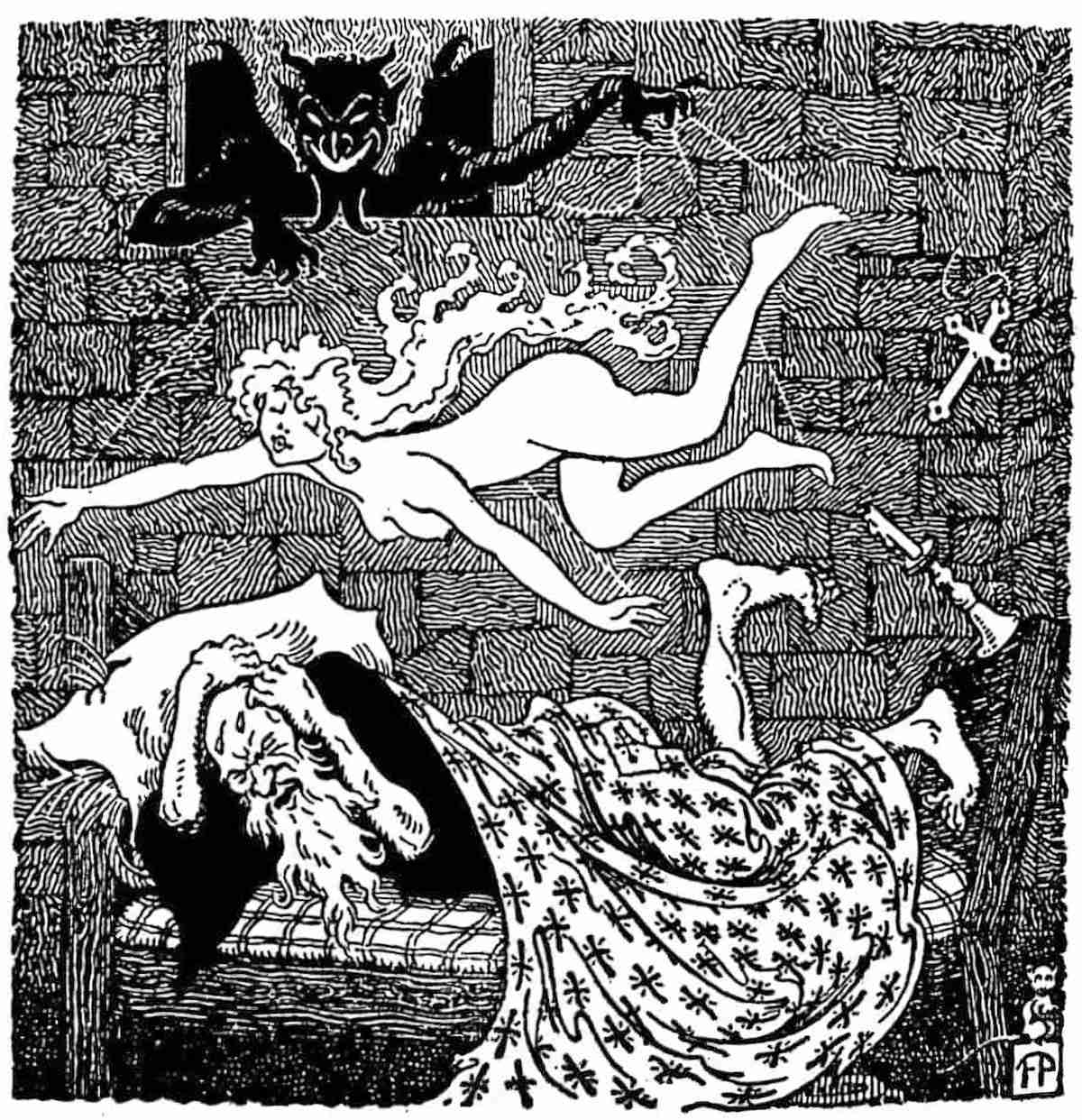
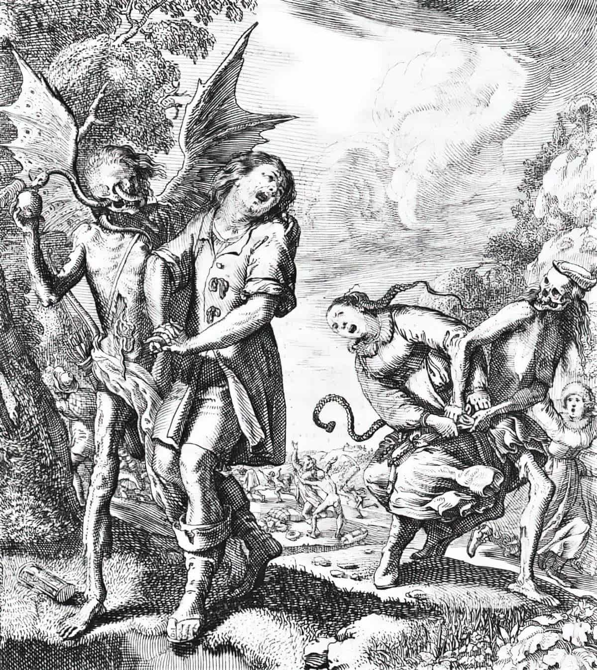
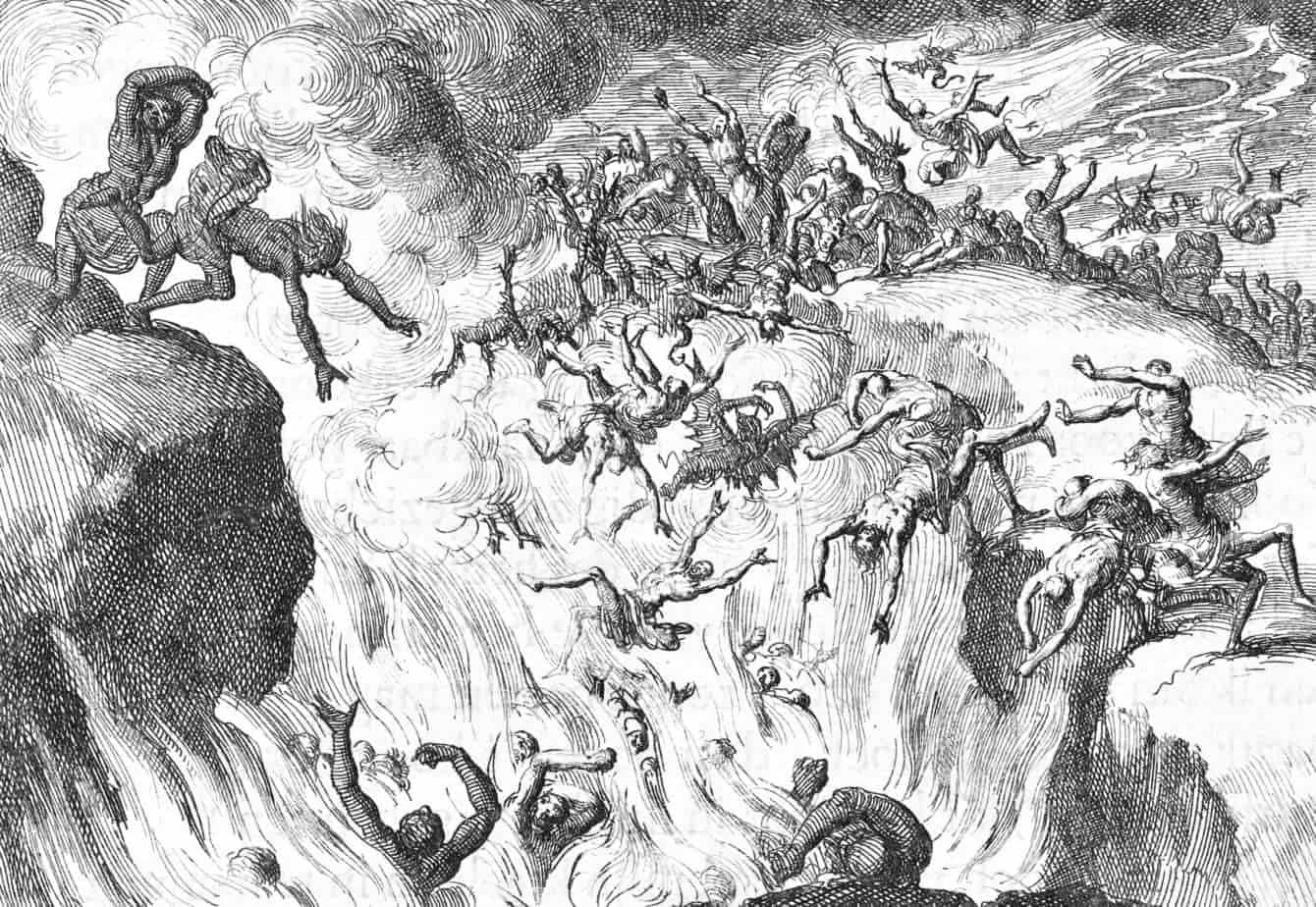
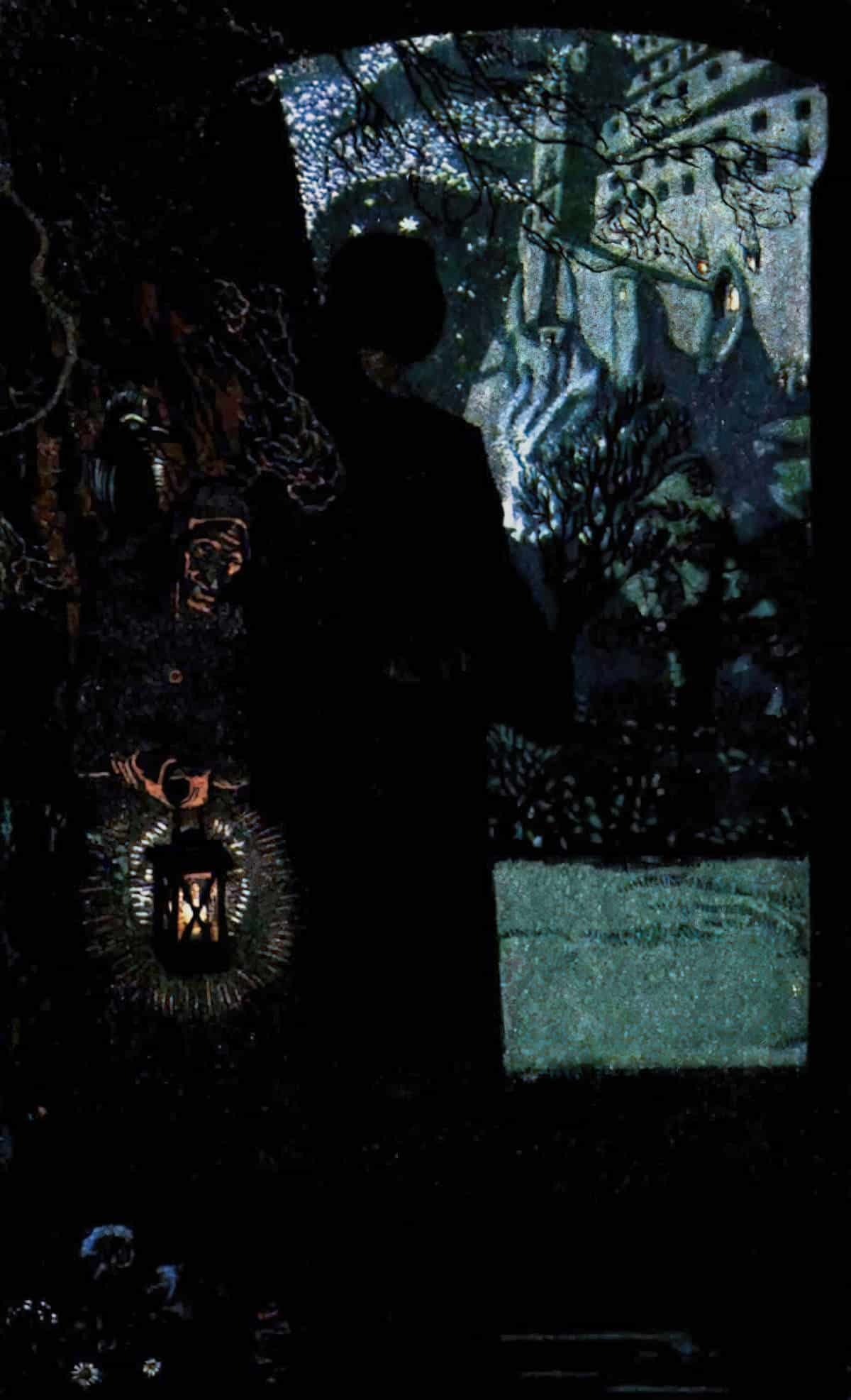
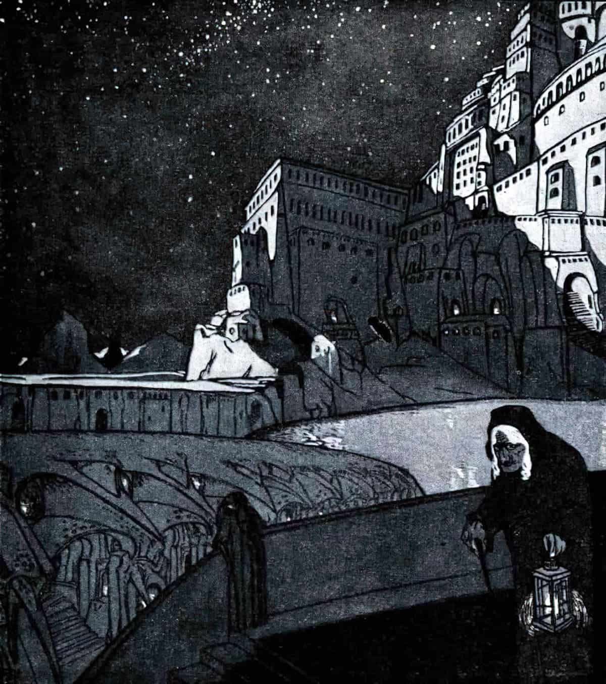
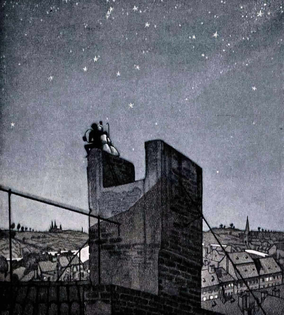
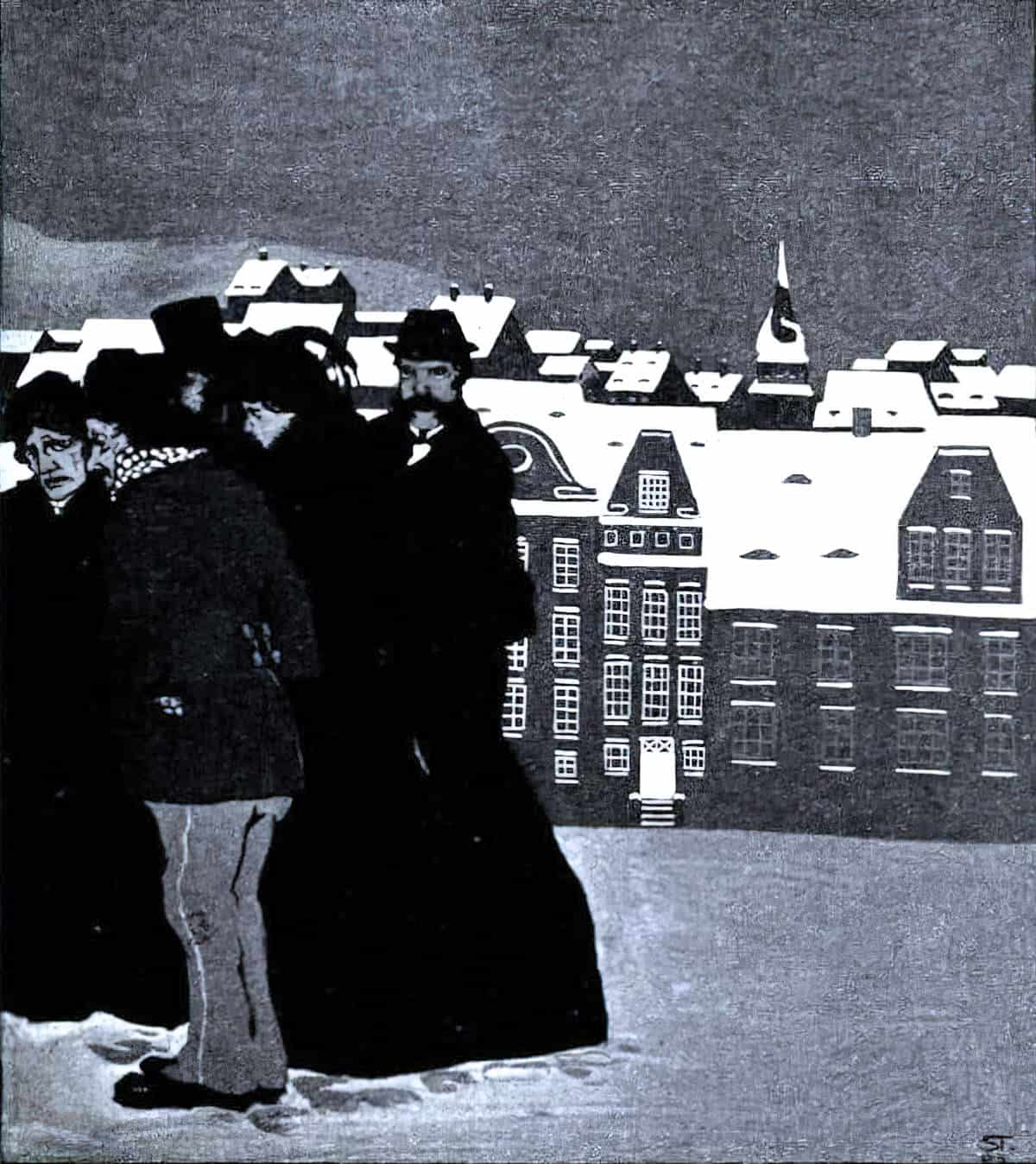
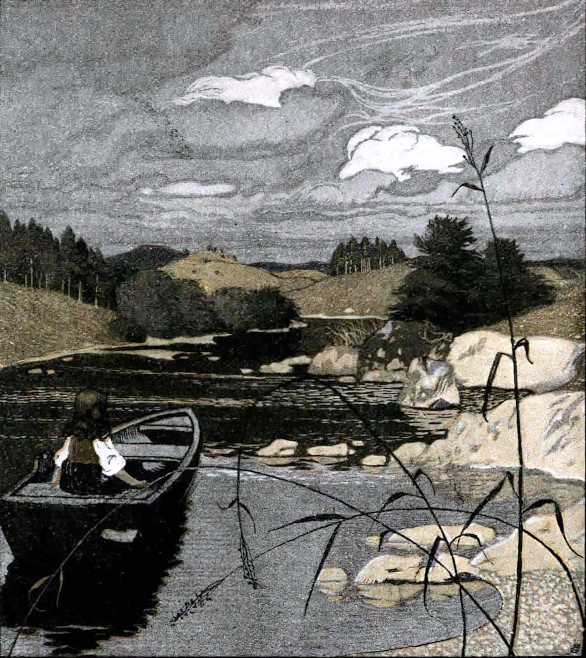
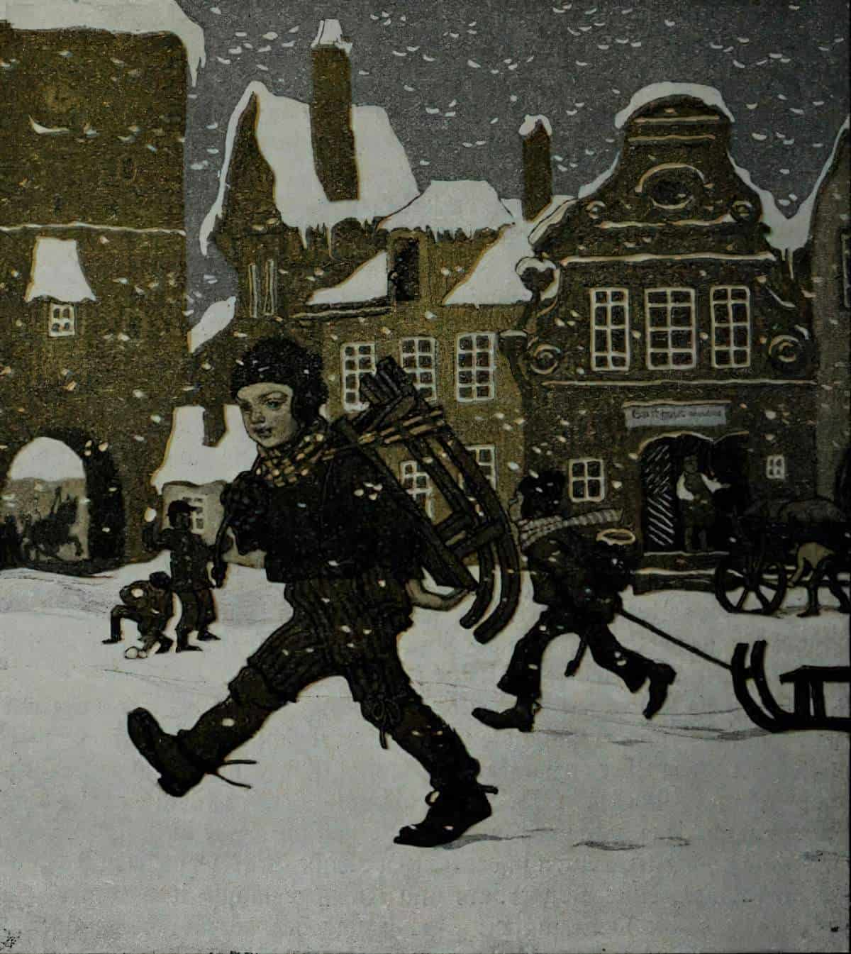
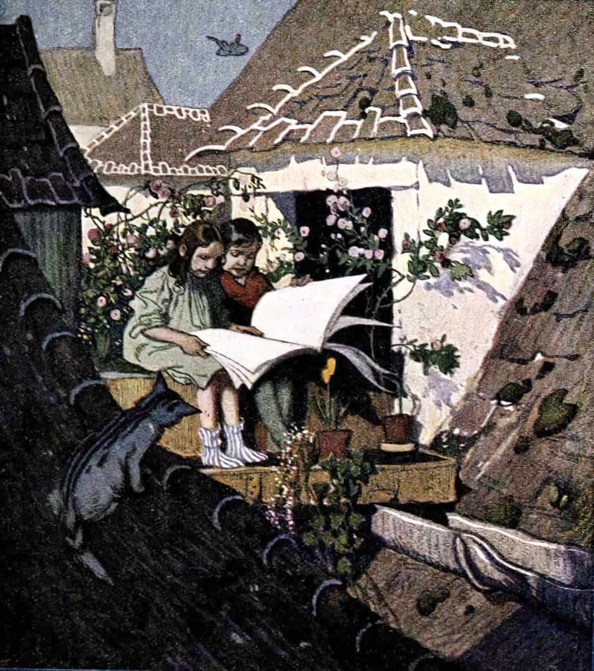
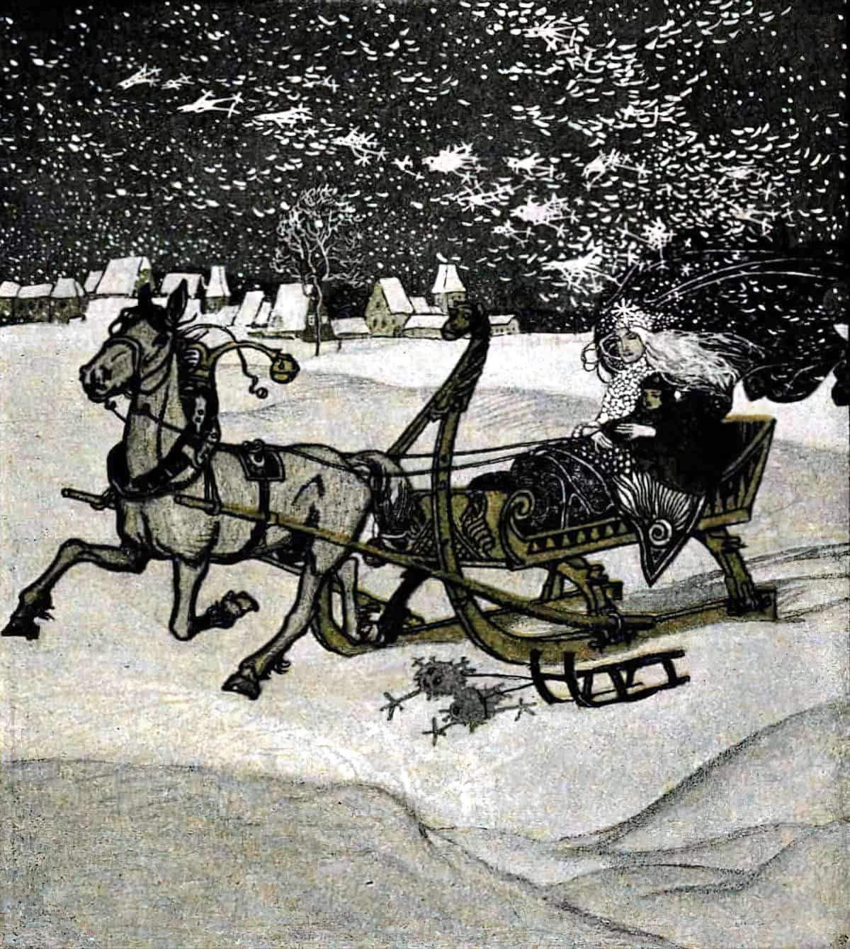
The wonderfully dark illustrations below are from by Franz Wacik and Hugo Steiner-Prag for ‘Andersen’s Märchen’, published in 1906.
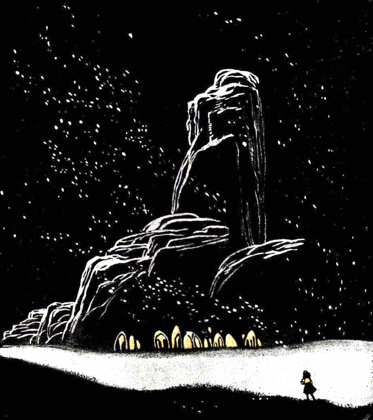
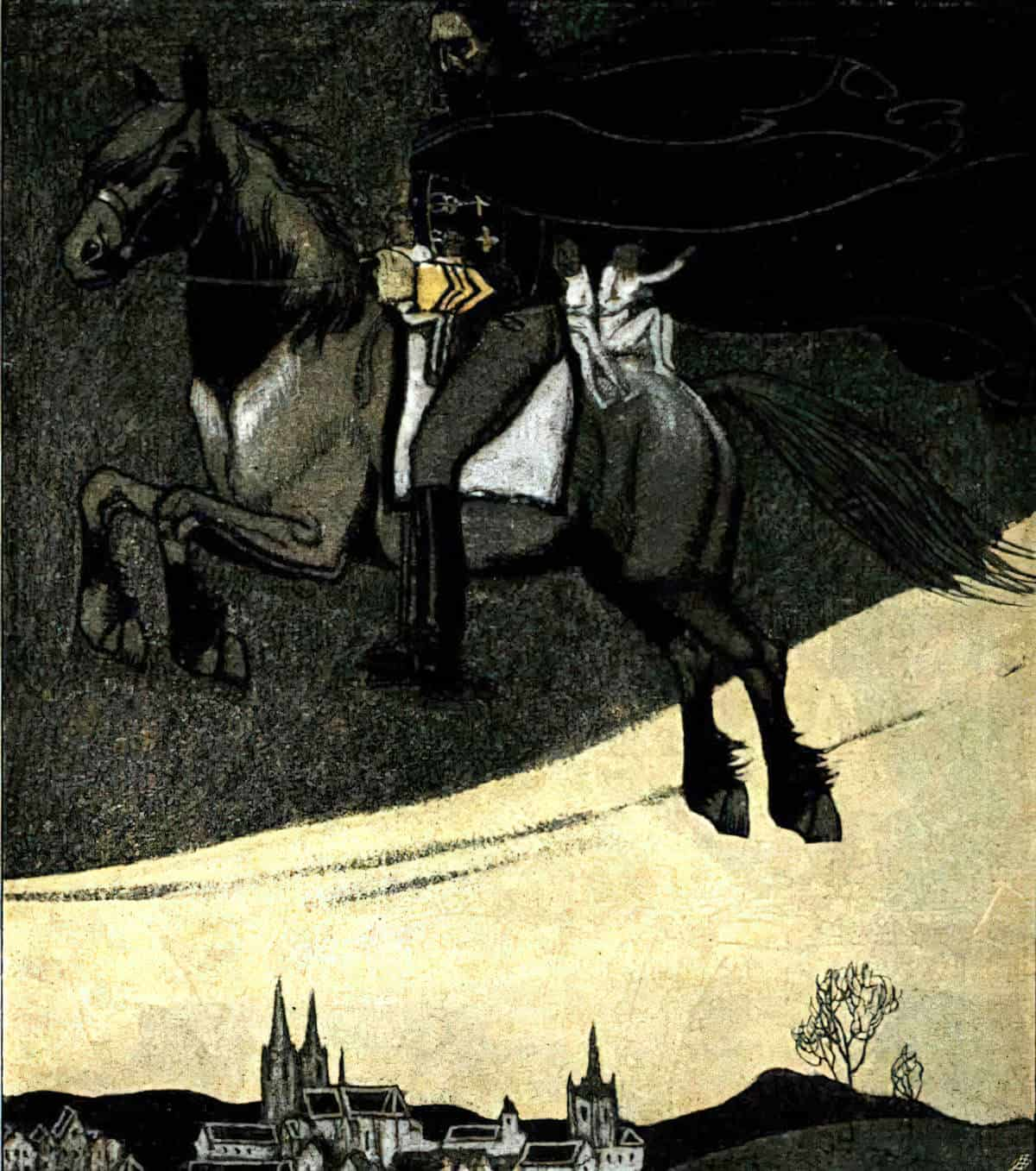
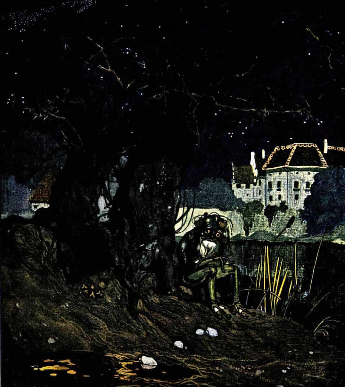
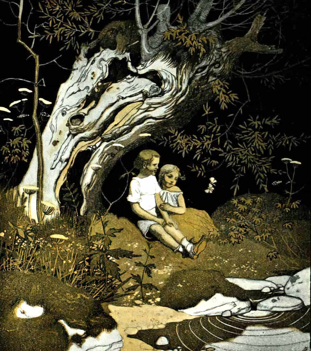
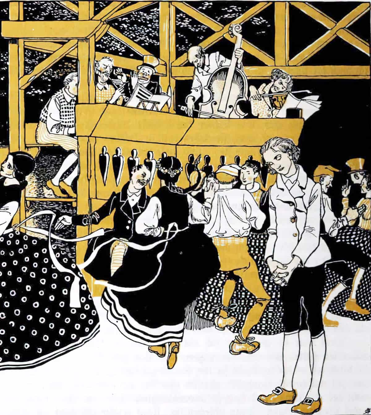
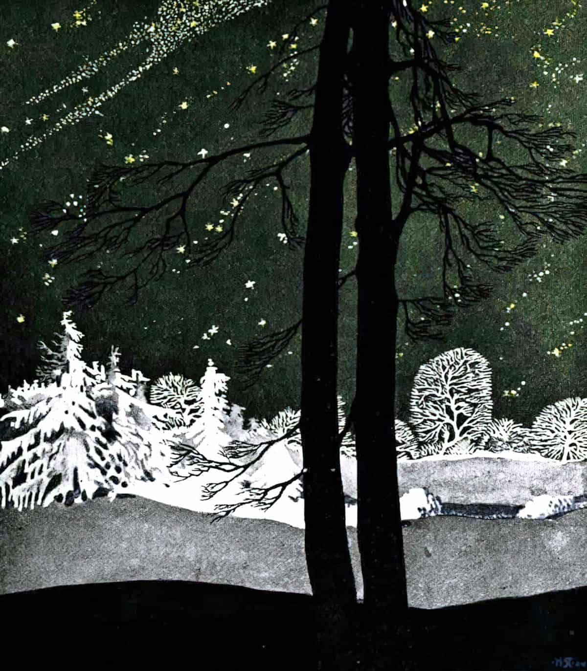
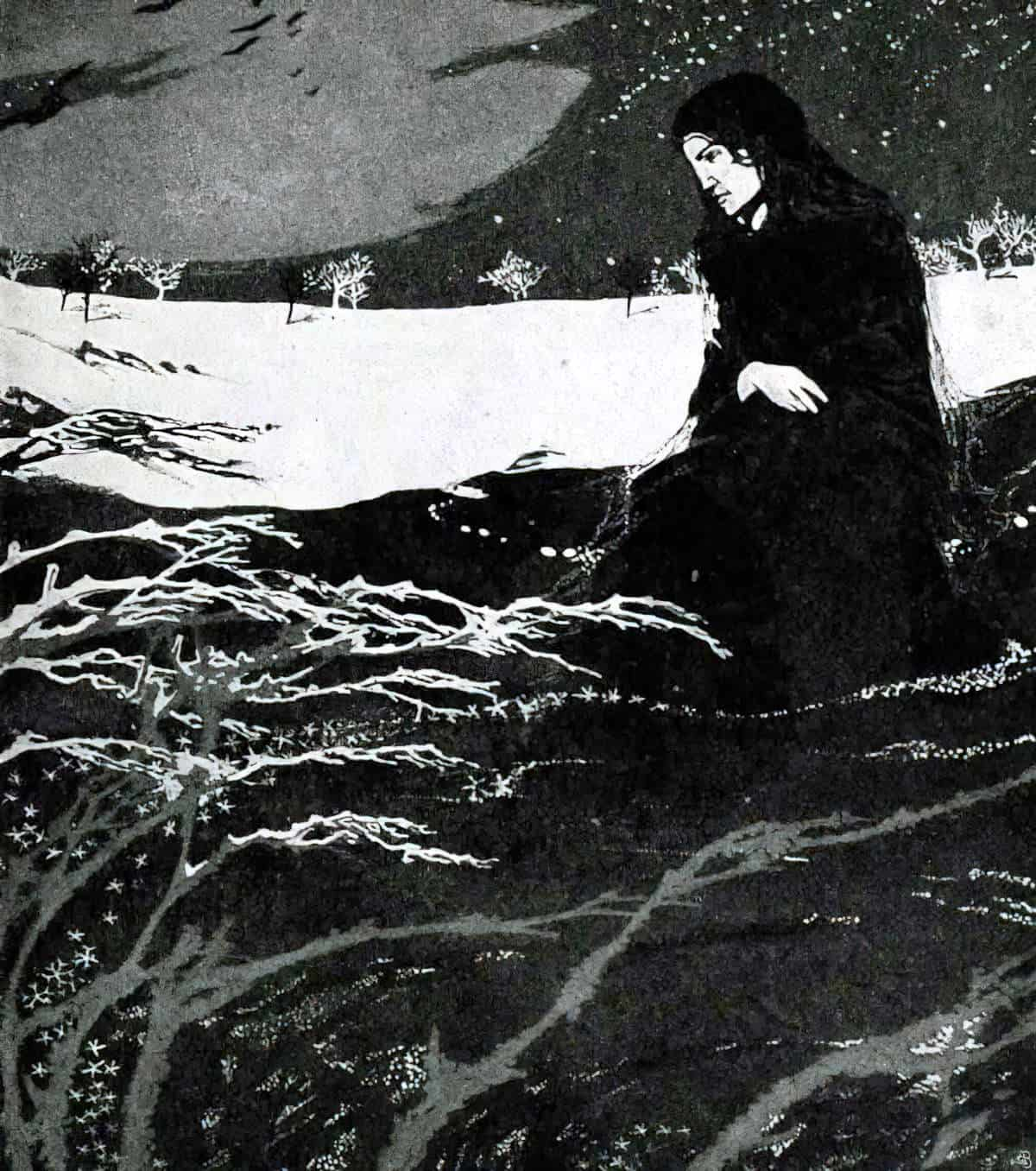
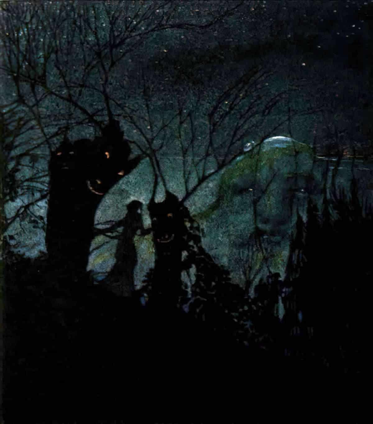
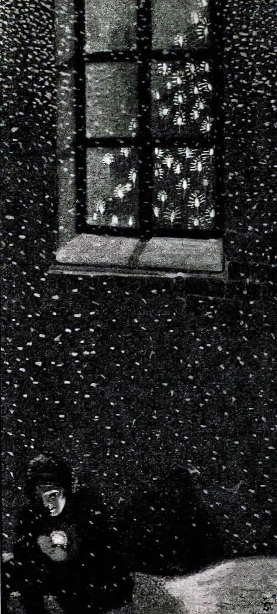
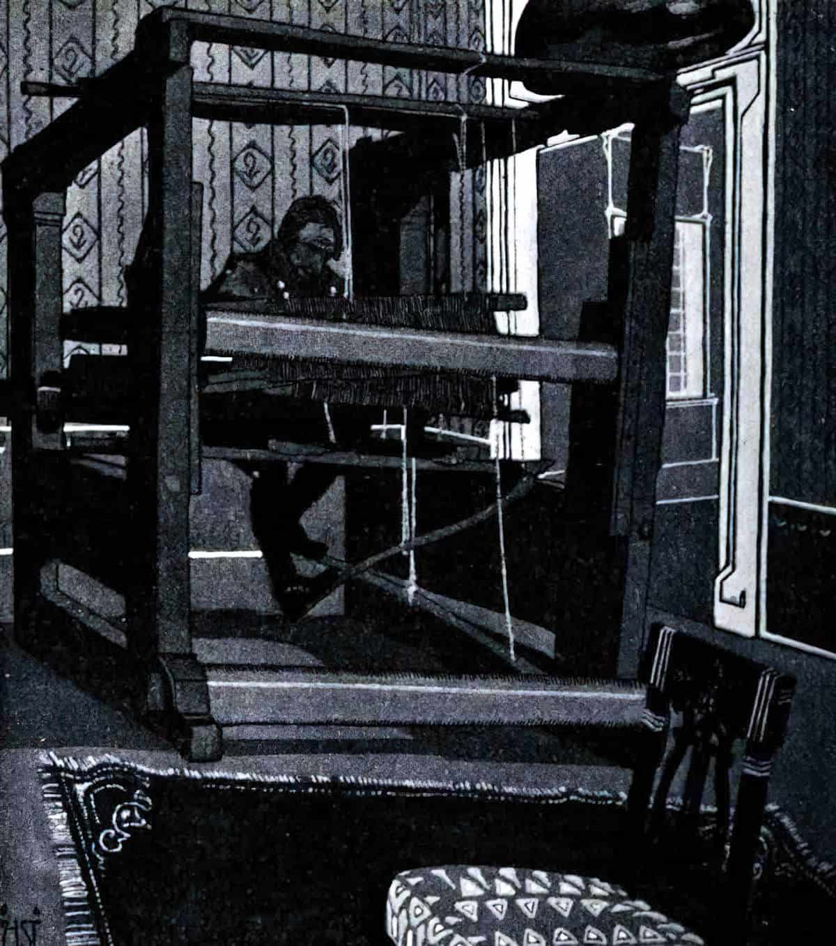
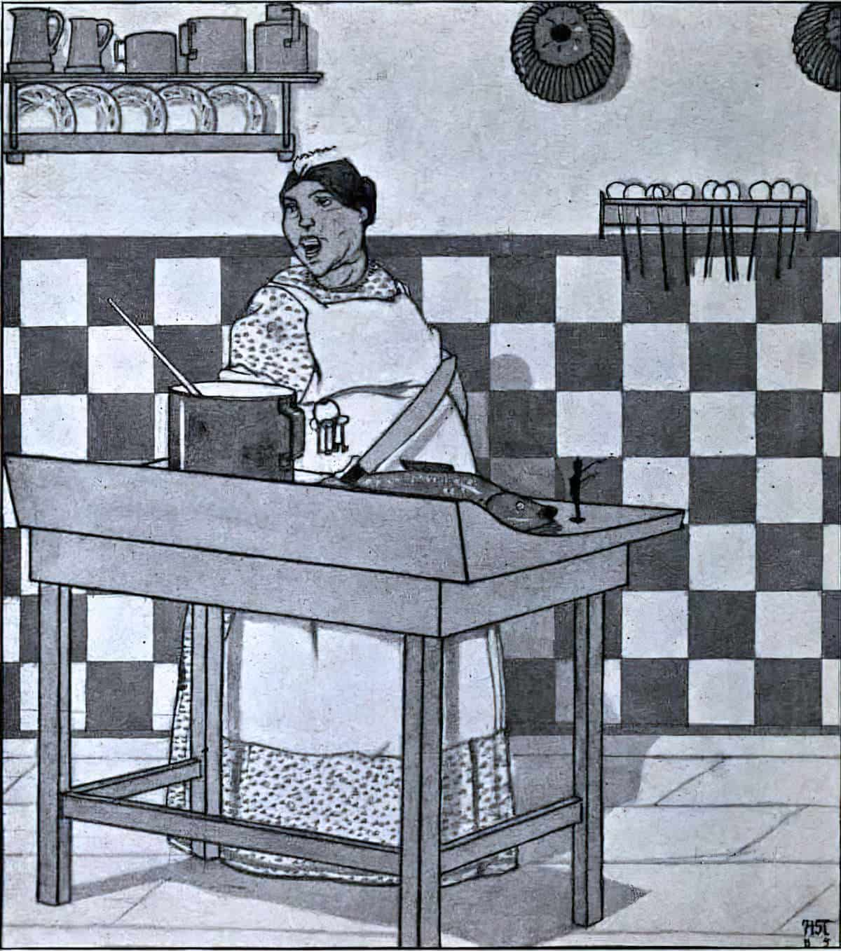
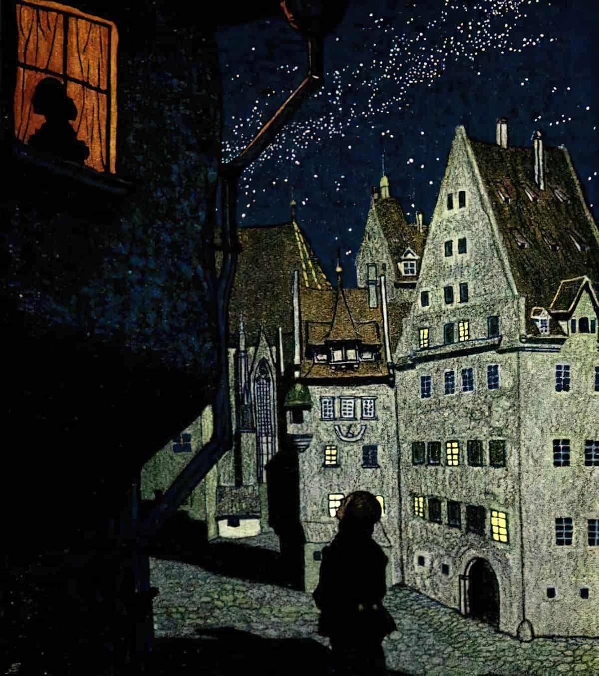
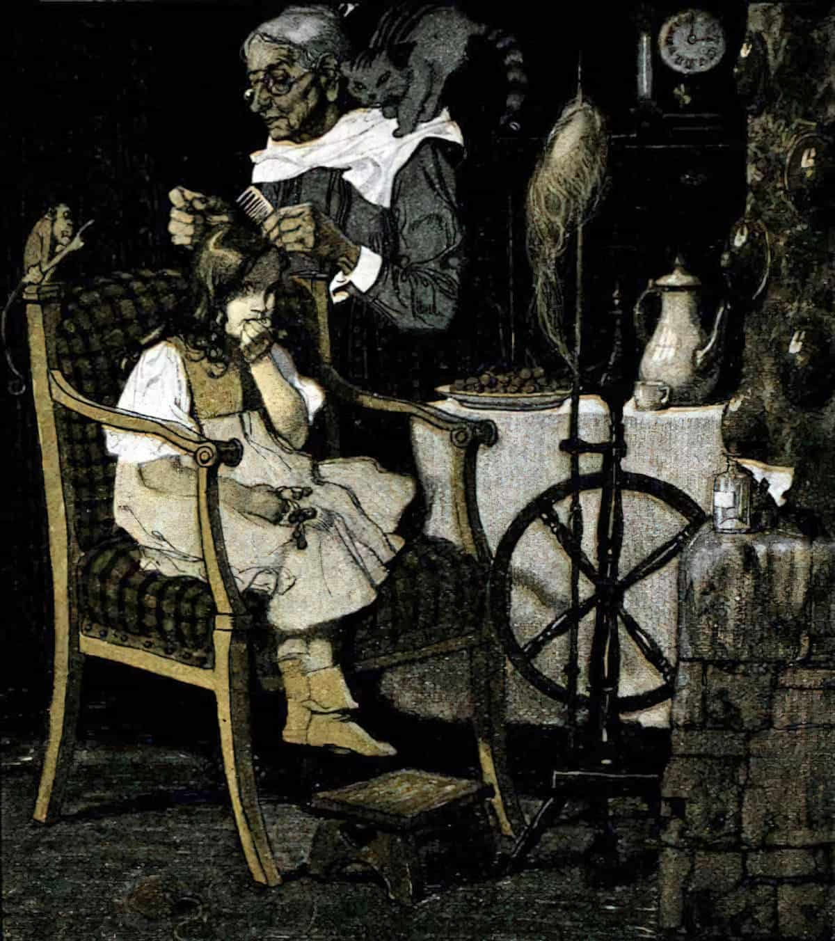
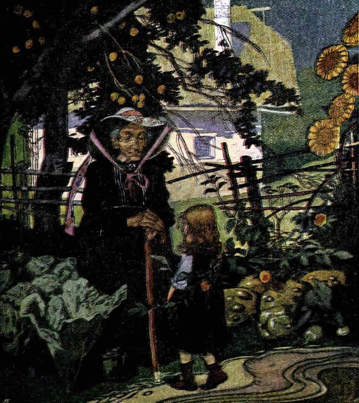
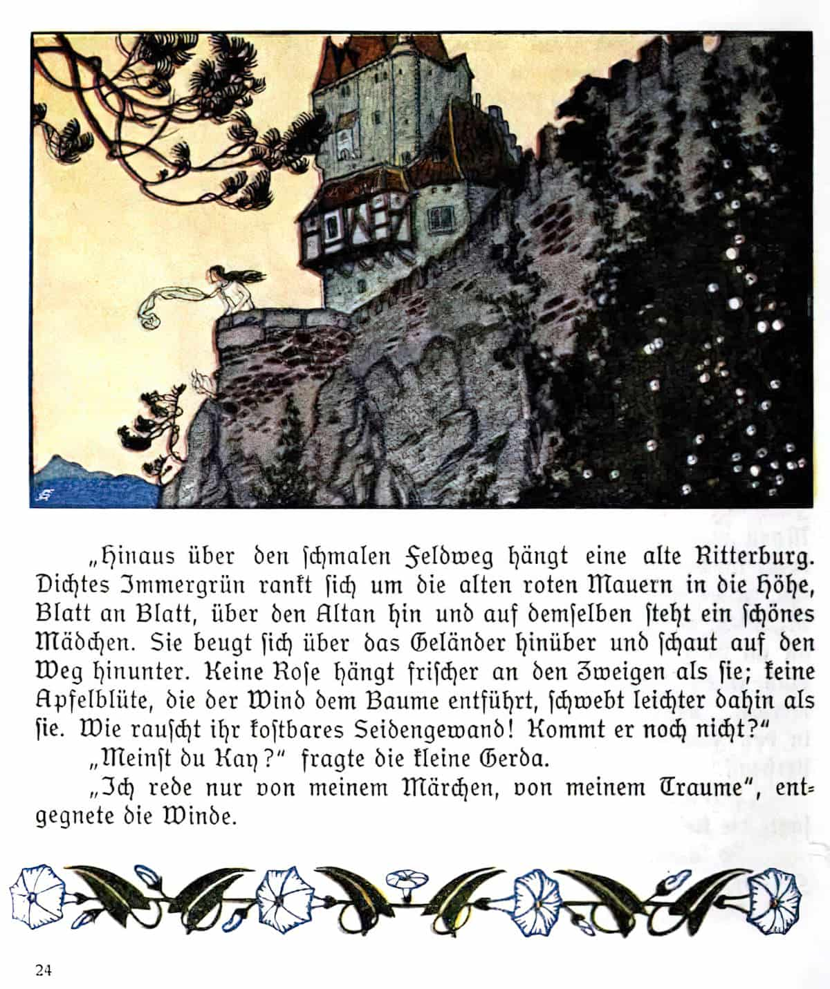
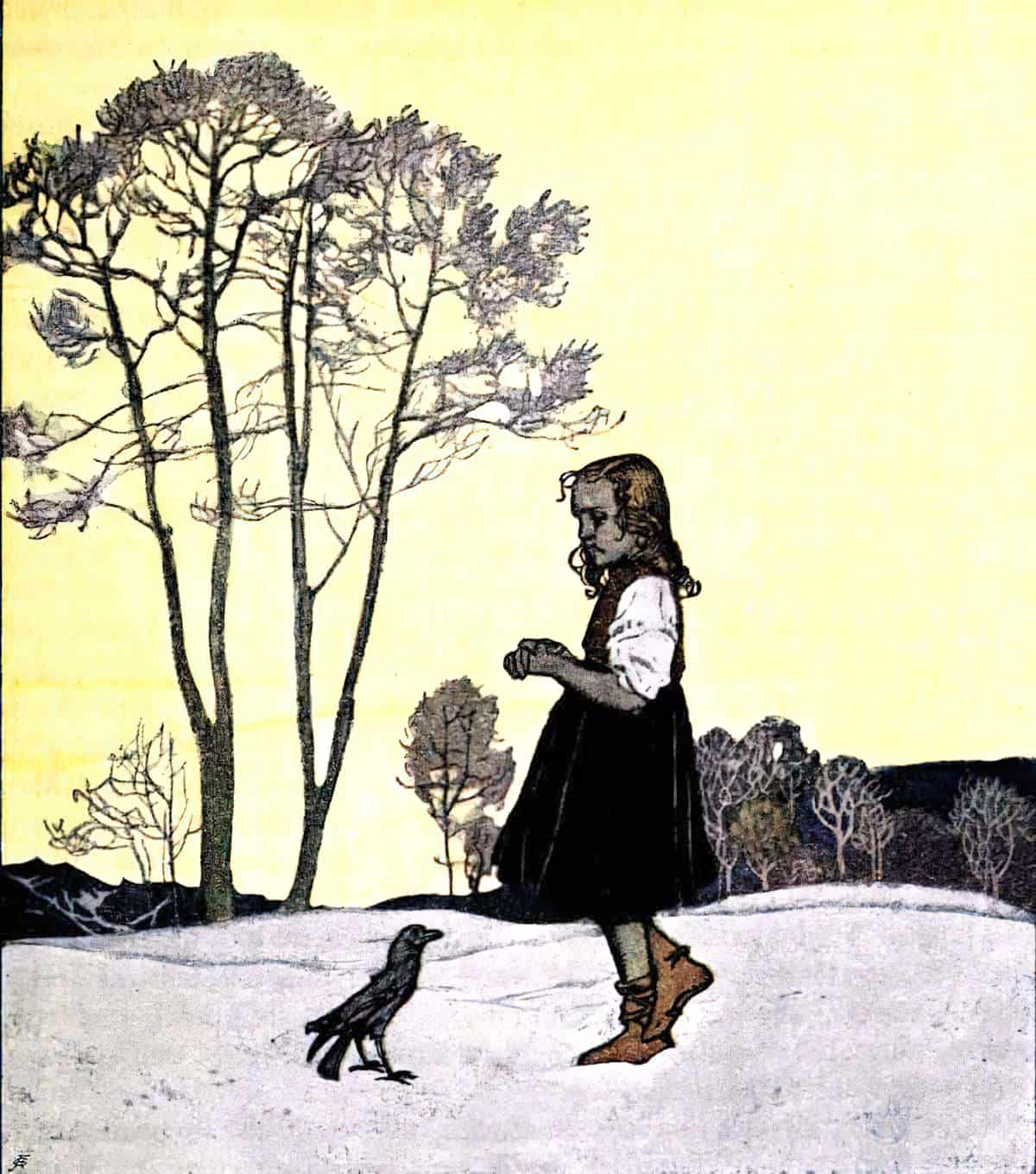
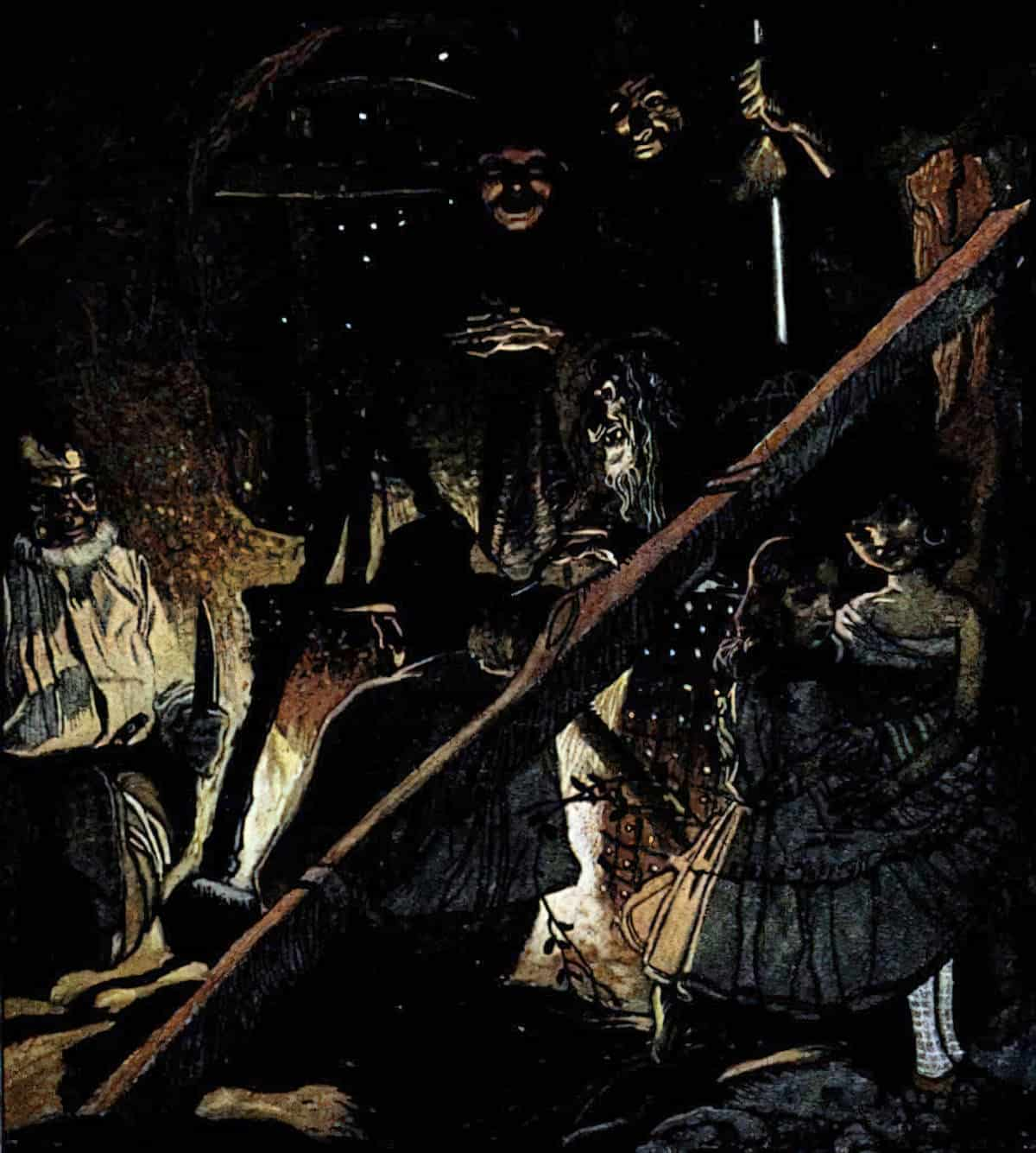
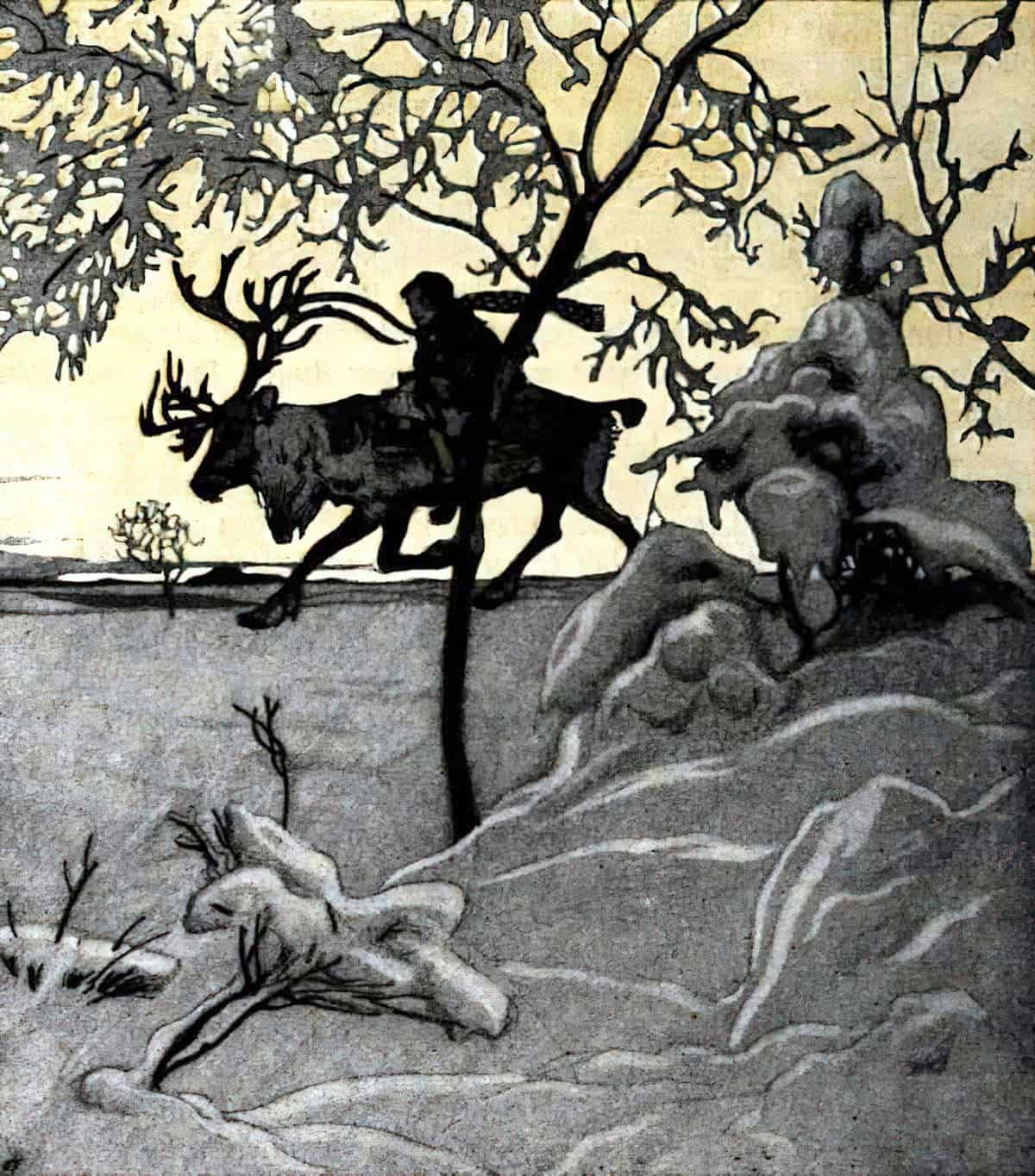
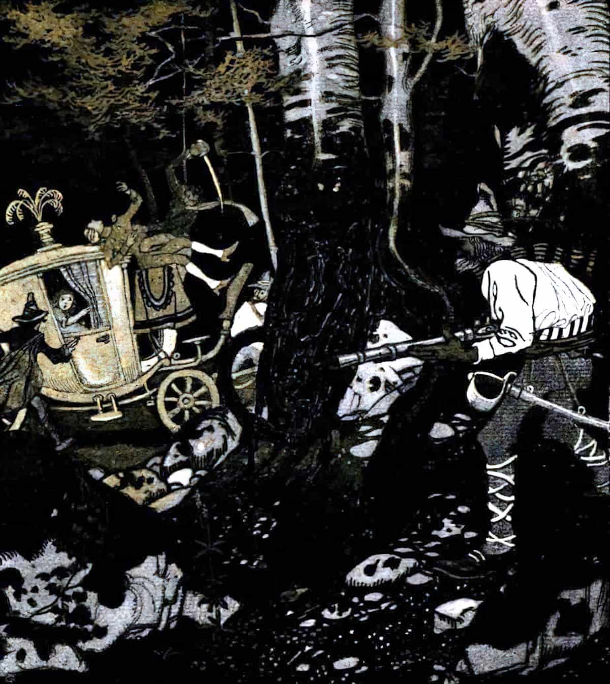
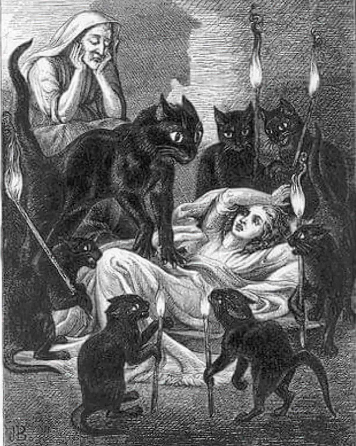
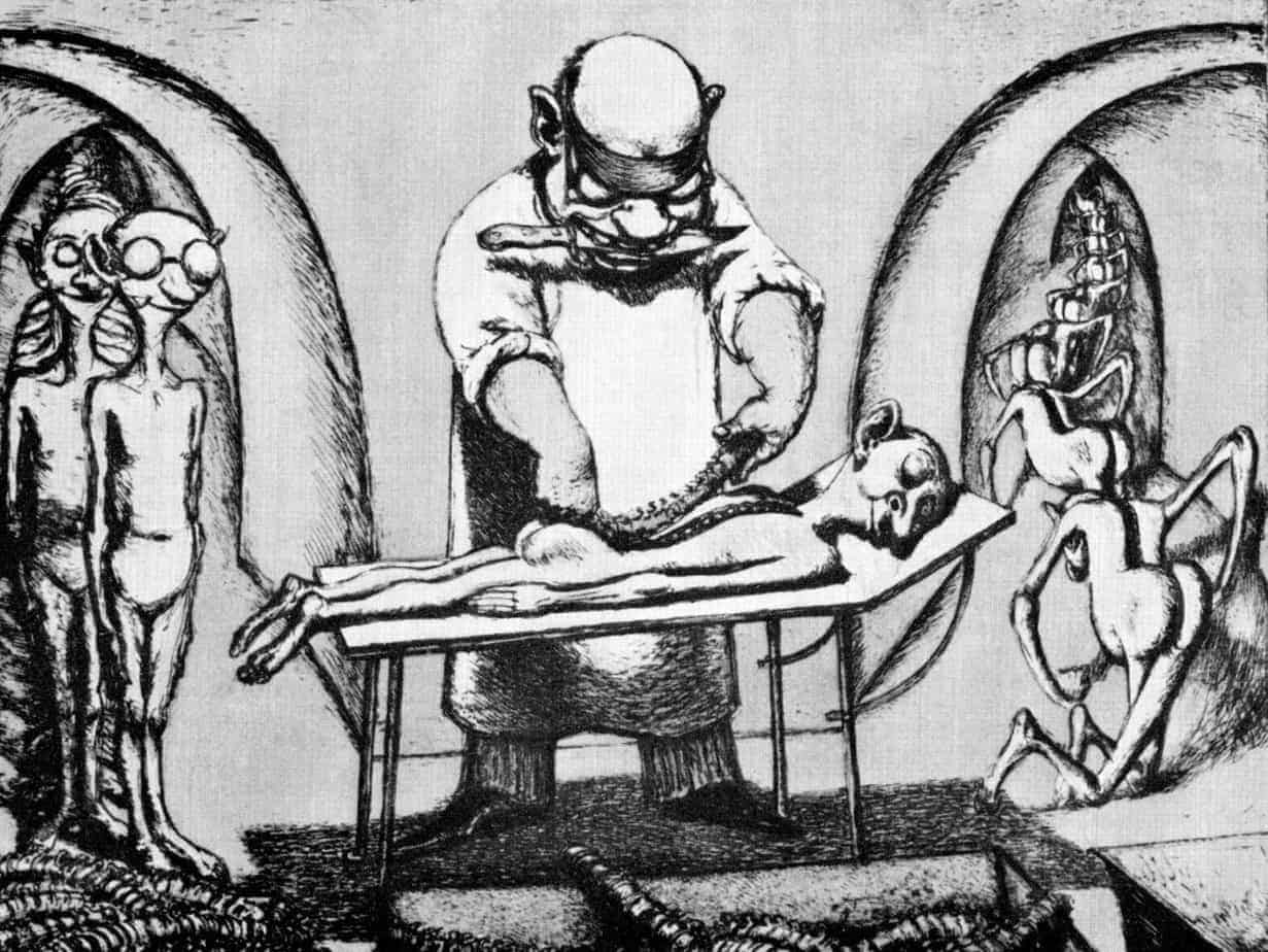
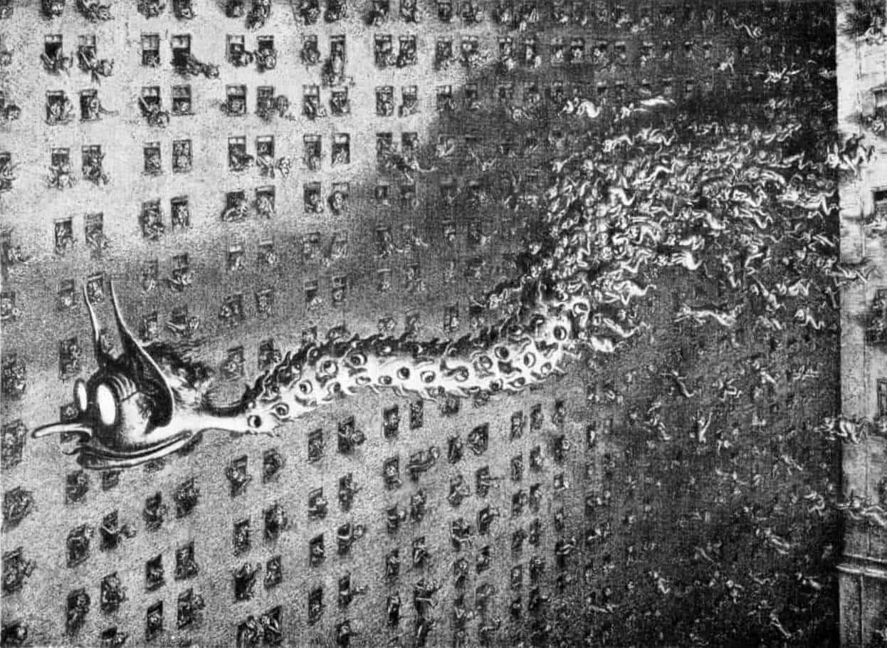
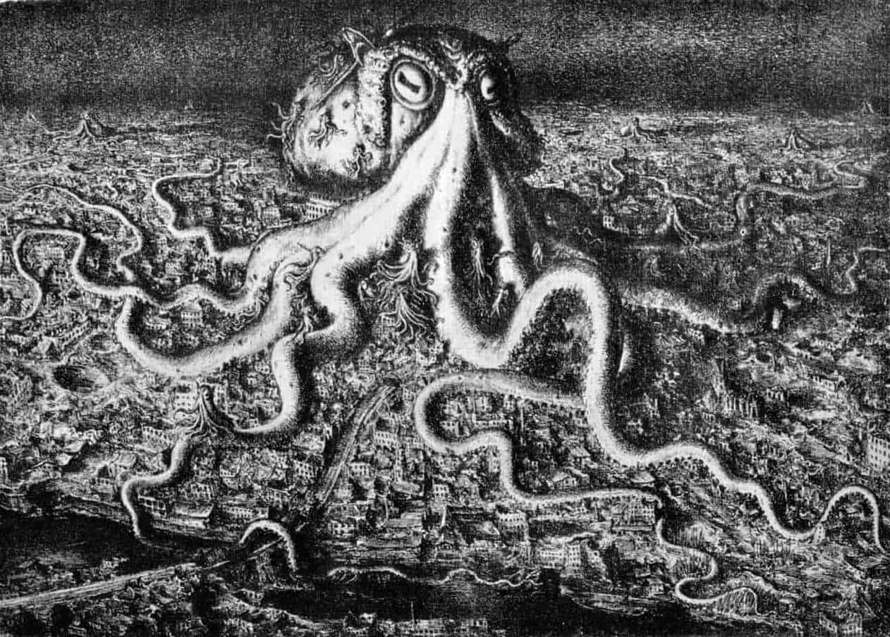
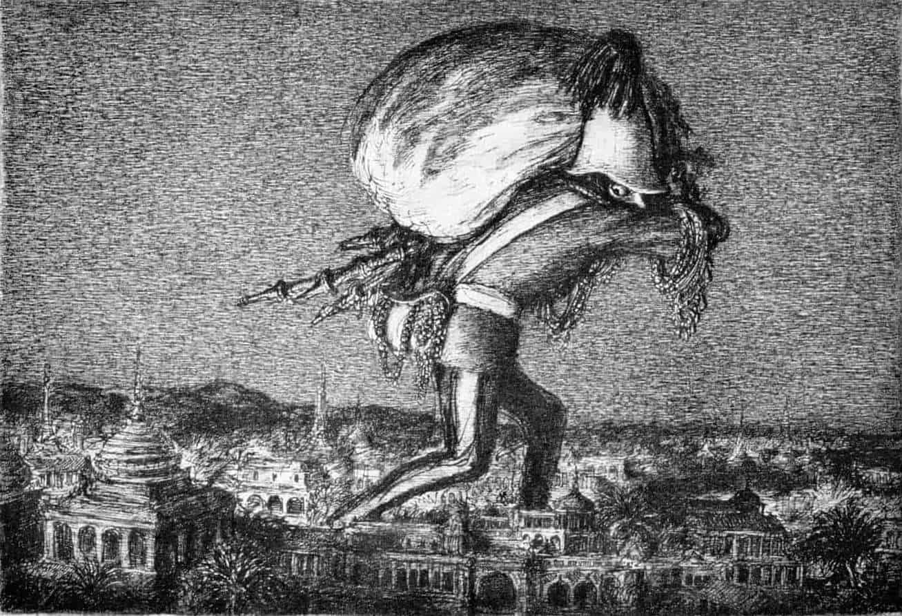
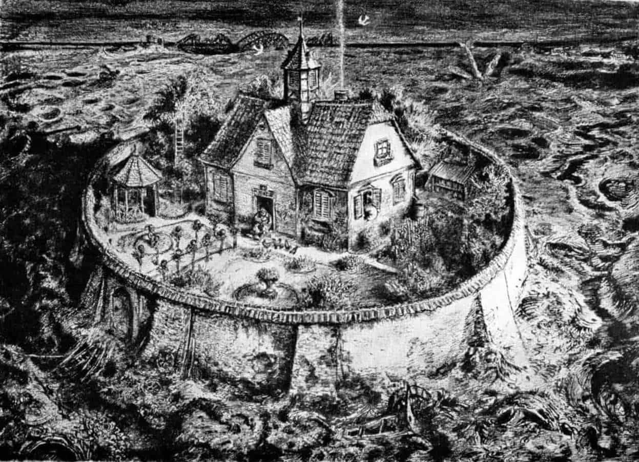
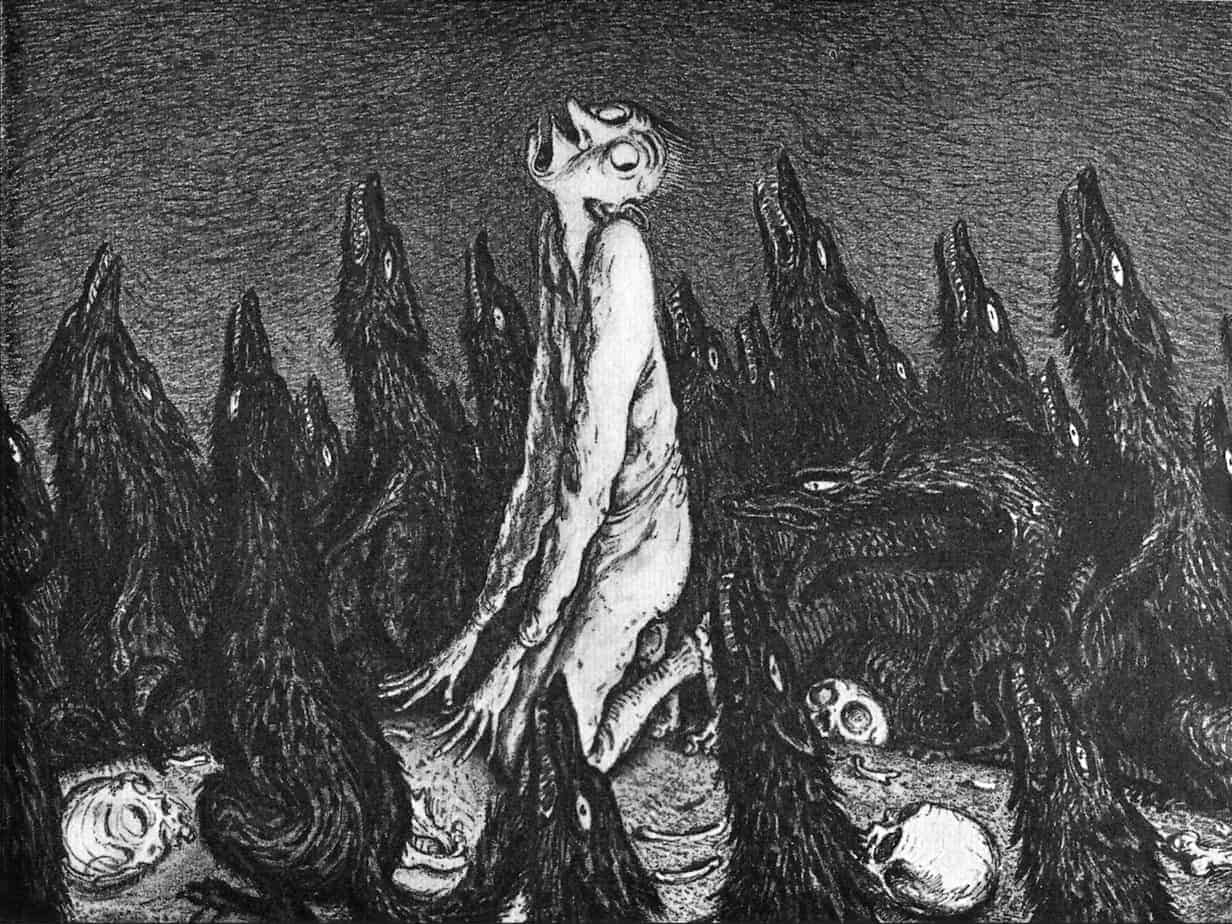
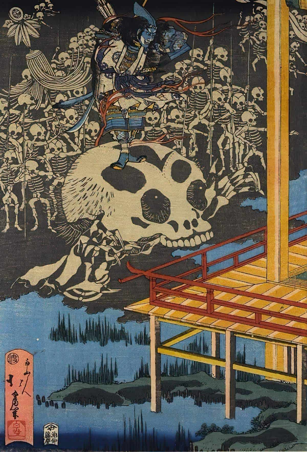
PICTURE BOOK NIGHTMARES
I can name a few picture books which feel like nightmares.
- Hansel and Gretel illustrated by Lorenzo Mattotti, who works in black and white (and no greyscale). The pages are almost entirely black, and the hatchings look almost like claws have been scraped across the page.
- Picture books illustrated by Armin Greder (The Great Bear, The Island, The City), all with a nightmarish plot and nightmarish illustrations to match.
- Anthony Browne’s postmodern horrors such as Into The Forest. Browne makes great use of framing, colour, universal symbols of fear and off-the-page horrors across his picture books.
- The Wolves In The Walls, illustrated by Dave McKean, English illustrator, photographer, comic book artist, graphic designer, filmmaker and musician.
Even cosy picture books often contain a nightmarish few spreads.
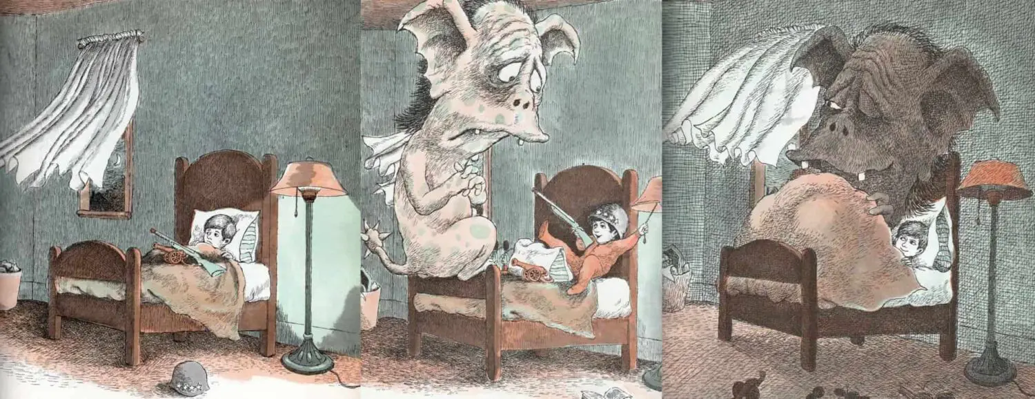
And nightmarish plots can be softened for preschool audiences. Of adult comic books, colorist Mat Lopes says this:
If the writer wrote a sad scene, you have to make it sadder. If the artist drew a creepy monster, you have to make it creepier.
Mat Lopes, comic book colorist
But Peter Brown, illustrator of Creepy Carrots, makes use of all the nightmare illustration techniques listed above while also softening the artwork for preschoolers:
- Cartoonish faces
- Rounded shapes
