Comic book artists and letterers give a lot of thought to where words might be placed inside a composition, though comic book letterers don’t agree with how ‘invisible’ the text should be. Some say that if the reader notices the lettering, the lettering is too much. Others argue that the lettering is allowed to get a little bit of attention, just not so much that it pulls the reader out of the story.
Something they all seem to agree on:
The reading order of the balloons [in a comic book] should be something that the reader doesn’t ever have to think about, not even for a split second — the eye should be automatically zipping from balloon to balloon, panel to panel, with ease; even if the artwork may sometimes make that more difficult, it’s not for the letterer to complain to the editor, it’s the letterer’s job to find a solution to the problem.
Simon Bowland, comic book letterer
Surely we can say the same of picture books. The reader should not have to work to follow the direction of text.
That said, most picture books are designed for preschoolers and adult co-readers to read together. When picture book illustrators (and their book designers) place text on the page they are assuming the reader is an experienced reader. I learned how to read Japanese starting at the age of twelve as a native English speaker, and because Japanese is often read up and down, from right to left, I have clear memories of how difficult it is for the emergent reader to train eyes to move from one line to the next. This is a skill that must be practised.
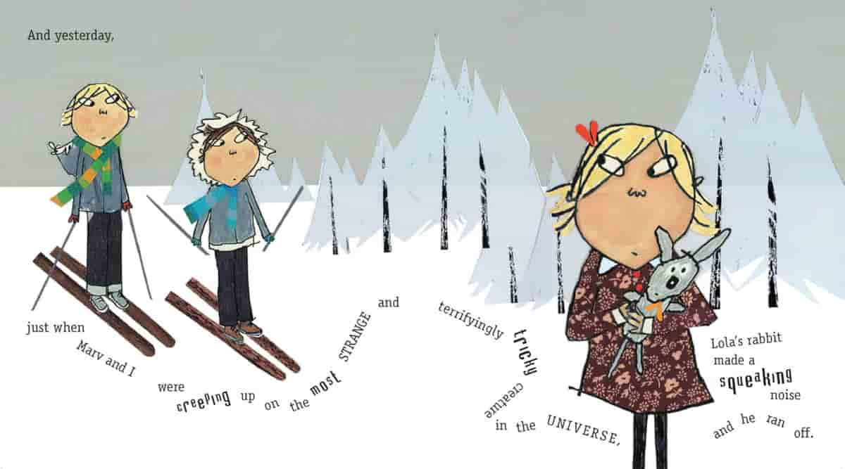
Even as a fluent adult reader of English, I sometimes encounter a picture book which pushes text placement and readability to its limits. Some of the artfully placed text in the collage-art picture books of Lauren Child challenge me. The text looks great on the page, but are clearly designed for adult eyes rather than five- or six-year-old eyes.
Evelyn Goldsmith suggests there is evidence to support the idea that “the placing of a picture to left or right, above or below the text, can affect the amount of time spent reading the text itself.
What do we look at first, the pictures or the text?
When reading a comic, you can’t usually read the text and the panel image at the same time. They exist on two different layers and you’ll switch between the two modes as you go.
PanelxPanel, the award-winning online magazine about comics
When text appears under an illustration, we tend to read the words after we have seen the illustration, because we usually look at a page from the top down.
Also, we tend to look at pictures first, because of their inherently attractive nature. Children are probably more likely to look at pictures first, and pre-literate children are certainly looking at the pictures. I’ve met adults who admit they have lost the ability to enjoy comics. Once they become highly capable readers of text, and achieve the state of ludic reading, it’s difficult to train the brain to slow down and adequately read the pictures before turning the page.
‘The words’ or ‘the text’ when talking about picturebooks can also be described as ‘verbiage’.
In Western style picture books, it’s most common for words to be placed to the left of a picture, when the verbiage is separate from the illustration.
It is equally common for a complementary layout to be organised with the visual and verbal components adjacent to one anotehr veritcally in descending ‘layers’, either with image above verbiage, or verbiage above image.
Verbiage placed above the pictures place the reader in an ambivalent state: Should we read the words first, or look at the picture? This ambivalence can add tension for the reader at certain parts of the book.
Arnheim argues that the upper part of a composition always has greater weight than the lower part, an argument supported by Kress and van Leeuwen. The material in the upper portion of a vertically organised layout has the function of ‘ideal’ as opposed to the lower portion realising the ‘real’: “For something to be ideal means that it is presented as the idealized or generalized essence of the information, hence also as its ostensibly, most salient part. The real is then opposed to this in that it presents more specific information (e.g. details), more ‘down to earth’ information (e.g. photographs as documentary evidence, or maps or charts), or more practical information (e.g. practical consequences, directions for action).”
If the upper part of the page is occupied by the text and the lower part by one or more pictures…the text plays, ideologically, the lead role, and the pictures a subservient role (which, however, is important in its own way, as specification, evidence, practical consequence, and so on.) If the roles are reversed, so that one or more pictures occupy the top section, then the Ideal, the ideologically foregrounded part of the message, is communicated visually, and the text serves to elaborate on it.
Reading Images: The grammar of visual design
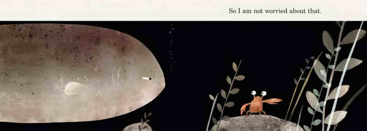
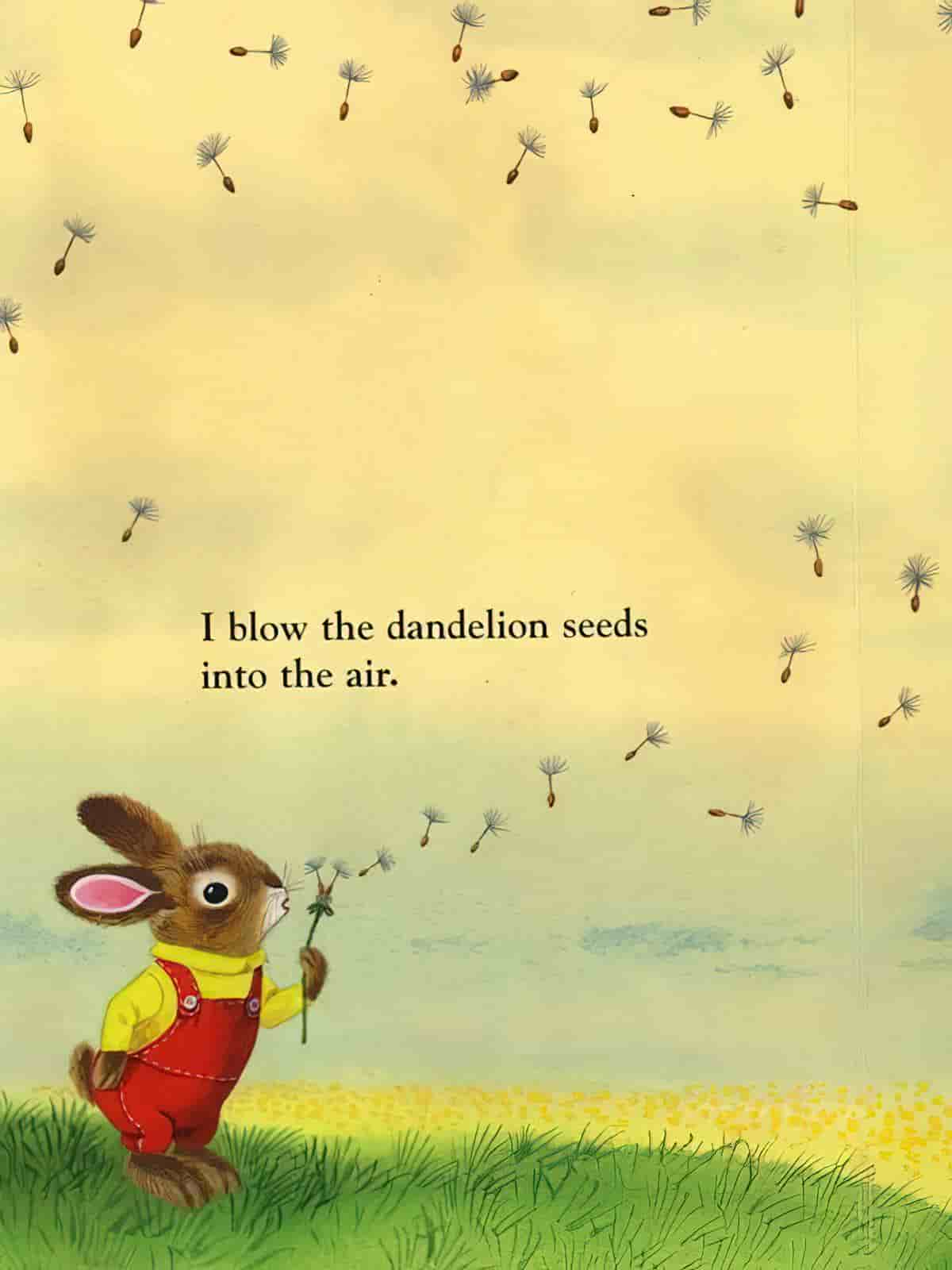
The two most common arrangements of Western picture/text in picturebooks: the text on the left side of a two-page spread with the picture on the right, or the picture on the top and the text on the bottom.

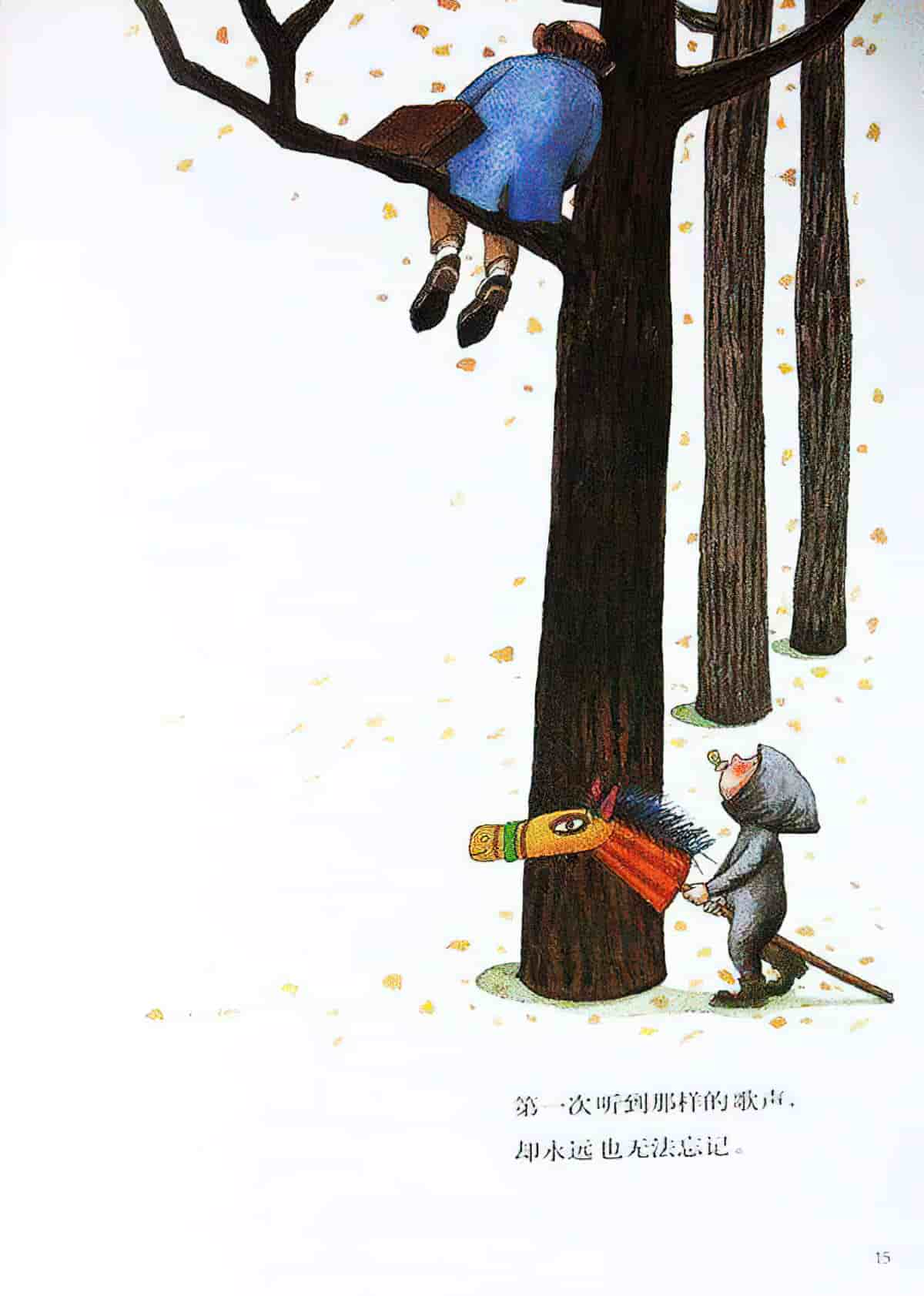
“The more frequent choice for a complementary vertical layout in a picture book is for the verbiage to come below the picture, and it is undoubtedly the image that most strongly claims our attention in that case. By contrast, where the verbiage appears above the picture it seems less easy to ignore the words.” (from Reading Visual Narratives.) There aren’t enough of such texts to draw a strong enough conclusion though, so let’s just say the dominance of the text is most closely related to how much there is of it. If the pages are covered in text, obviously the text is not going to be ignored.
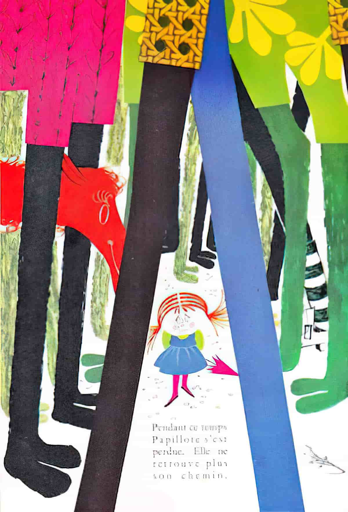
But more unusual arrangements are possible to create strong narrative effects.
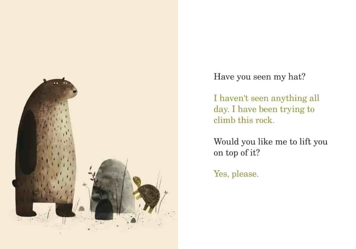
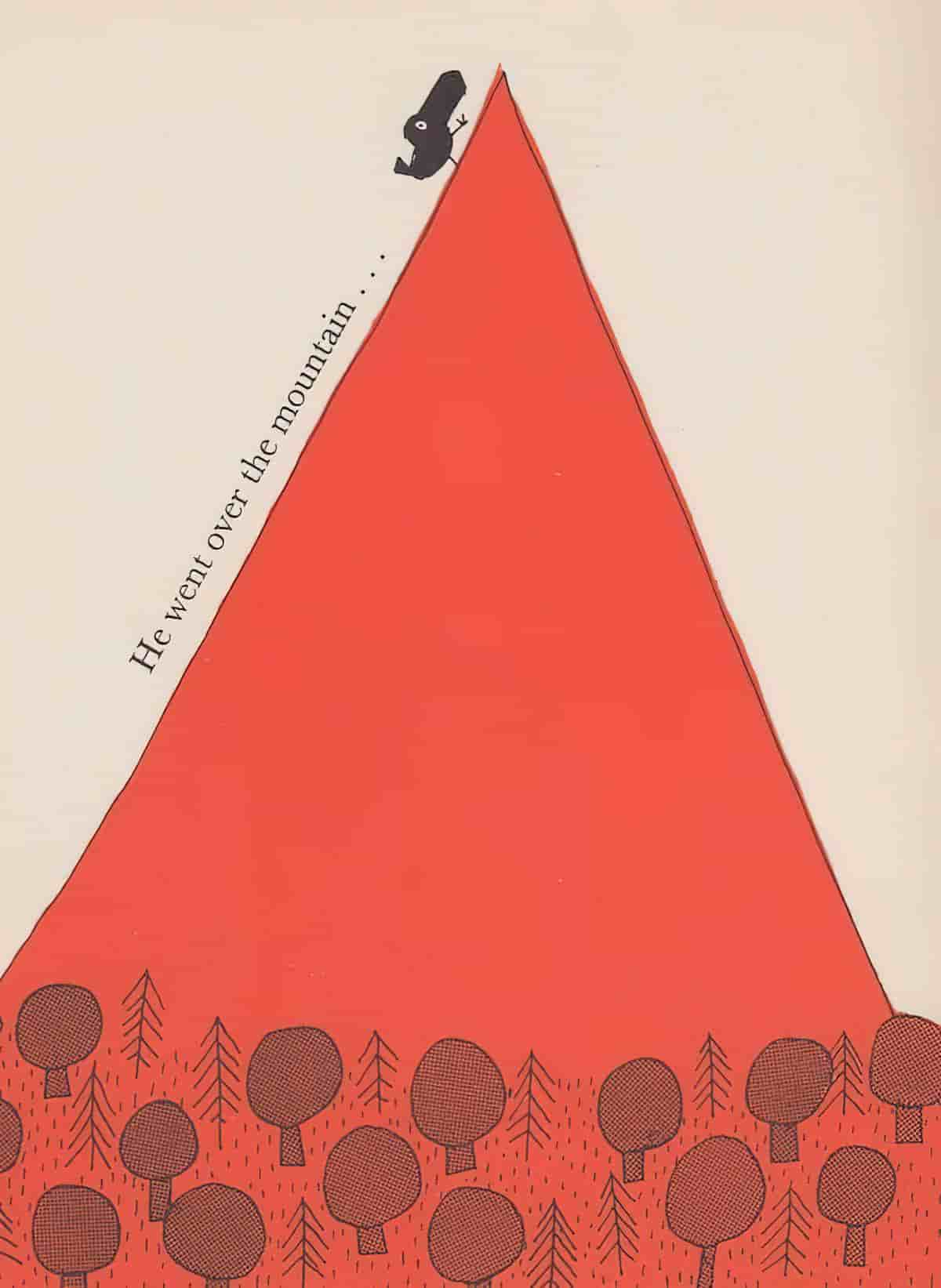
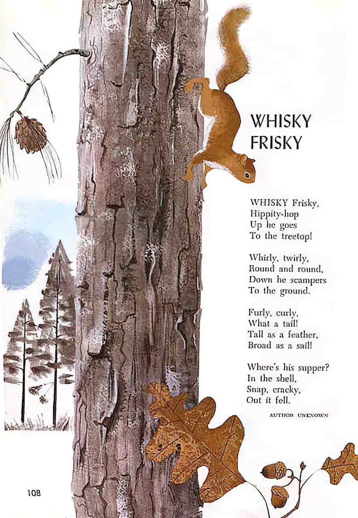
So far I’ve been writing about ‘complementary’ layouts. What about when the verbiage is a part of the picture itself? ‘Intratext’ is the word used to describe words on signs, food package etc. But when the narrative is placed somewhere inside the picture rather than on a separate page, or somehow demarcated from it, we might say the text and picture are ‘integrated’.
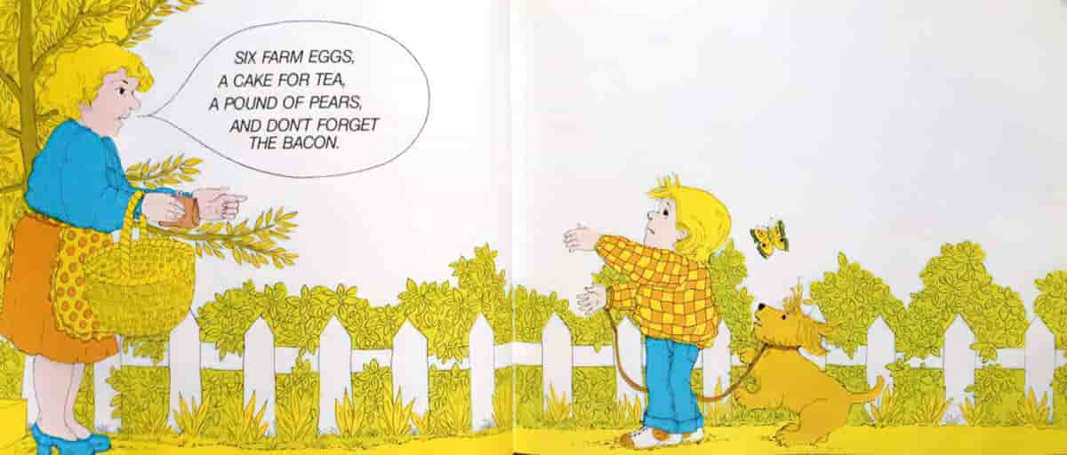
Sometimes the text appears inside a speech bubble. An older example is Don’t Forget The Bacon by Pat Hutchins. This technique clearly comes from the world of comics, and is increasingly popular in bestselling picture books comprising nothing but dialogue. The Pigeon series and the Elephant and Piggie series by Mo Willems are best-selling contemporary examples of picture books which utilise the speech bubble, and other comic book techniques.
Sometimes non-speech items are projected e.g. onomatopoeia and mimesis. Japanese manga feature much onomatopoeia and mimesis, which is often retained (and not transliterated) when adapted for the English speaking market.
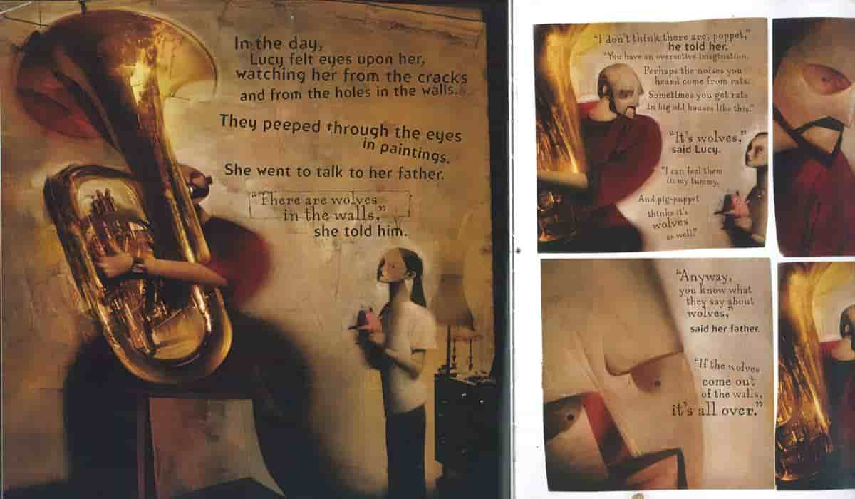
One way of giving text more integration with the picture is by ‘decontextualising’ the picture. Commonly, decontextualisation happens when characters appear on a white background. White is the most common choice, but the scenes from Wolves in the Walls below are part of a dark story for older children and the white background, too, has been replaced with darker textures which look like pages from an ancient text.
