How does the binding of a book affect reader expectations? What about the size?
The actual individual appearance of of individual books is just as obvious an example of how prior expectations control our responses to stories; it influences our attitude to the stories the books contain before we even begin to read them. We expect more distinctive literature from hardcover books with textured, one-color cover and more conventionally popular material from books with luridly colored plastic coatings. We tend to think differently about paper-covered books and ones with hard covers, and as a result we respond differently to the same story in different formats; what might seem forbidding and respectable in hardcover often seems disposable and unthreatening in soft.
The size of a book also influences our response to it. We tend to expect rambunctious, energetic stories like the ones by Dr. Seuss from large books and more fragile, delicate stories like those by Beatrix Potter from smaller ones. In fact, larger books do allow larger effects, while smaller ones demand restraint from an illustrator, lest they appear overly fussy; but these differences are as much a matter of convention as of technical limitations. We tend to read smaller books expecting charm and delicacy — and to find it even if it is not there — and to read large books expecting energetic rambunctiousness— and to find it even if it is not there.
Words About Pictures by Perry Nodelman
We shouldn’t underestimate the effect of binding and size. One disadvantage of book apps and ebooks is that the reader is not provided with any textural information, and the size is fixed according to the dimensions of the device.
That said, a universal book app created for iOS (for instance) may well be interpreted very differently depending on whether it is read on an iPhone, an iPad mini, an iPad, a Mac screen or projected onto a smart board.
THE SIZE OF RICHARD SCARRY’S BOOKS
Perry Nodelman points out that very small books and very large books are thought to be for the very young.
One of Richard Scarry’s characteristic animals, isolated from a pageful of similar animals in a large book and enlarged to fill a page by itself in a smaller book like Early Words, comes to seem peculiarly unenergetic. The rabbits in Early Words pose stiffly, and their faces never do anything but smile; yet the same figures, smaller and surrounded by many other similar figures involved in many different activities, convey an impression of intense activity. They can do so not just because the variety of different poses creates interesting tensions in the group as a whole that are not present in any one of its components but also because these smaller images do not arouse our expectation that faces seen close up will convey emotional information; we look at the same image differently when it is a different size and rightly find ourselves having a different response to it.
Words About Pictures, Perry Nodelman
The crowded pages of Richard Scarry’s books often show numerous animals involved in many different activities against a white background; and the meaning of the background adjusts in terms of the figures in front of it. The figures both float in space, quite cut off from each other, and also are related to each other by their shared background of white. So these pictures paradoxically both isolate every figure they depict and make it merely one of numerous equal objects in a group. That echoes Scarry’s usual purpose: to show the various individual objects or activities that make up a certain category. It also helps explain why his pictures tend to annoy adults, who are likely to find the discontinuities of the implied background disturbing. Children, less experienced in reading implied ground from the figures they view, may merely see Scarry’s figures as quite separate from each other.
Perry Nodelman
SEE ALSO


Tiny books for kids who like cute things
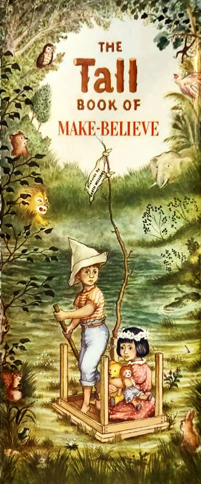
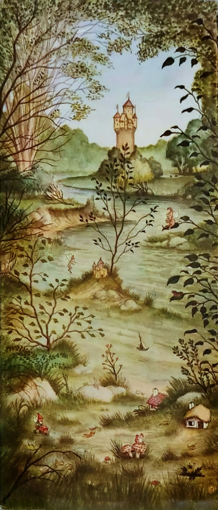
The Widow’s Broom and Queen of the Falls, both by Chris Van Allsburg, are examples of meaningfully long, tall format books. Allsburg even redrew the art for Queen of the Falls to make it tall and thin like a waterfall.
