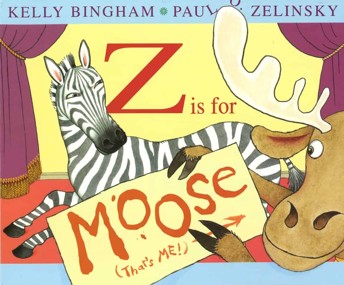
Kate de Goldi discusses Z Is For Moose on Radio New Zealand and has trouble not laughing. (This is what made me buy the book.)
There is something inherently funny about a moose. Is it the bulbous snout, or the slightly onomatopoeic name? (I’m not sure what real-world sound the word ‘moose’ makes, but it should, shouldn’t it?)
See also: Inherently Funny Animals in which the moose is still the funniest, precisely because there’s no reason for him to be.
WHAT HAPPENS IN “Z IS FOR MOOSE”
In order to fully appreciate this book, the reader should be familiar with the standard ABC picture book. This is kind of a parody of that. Using the framing story of a play, each letter is represented by an animal/thing which makes its appearance when the MC Zebra announces its initial letter. All are well-behaved, except for petulant toddler-like Moose, who can’t wait until it’s his turn.
(Side note: We assume moose is male — but how do we really know?)
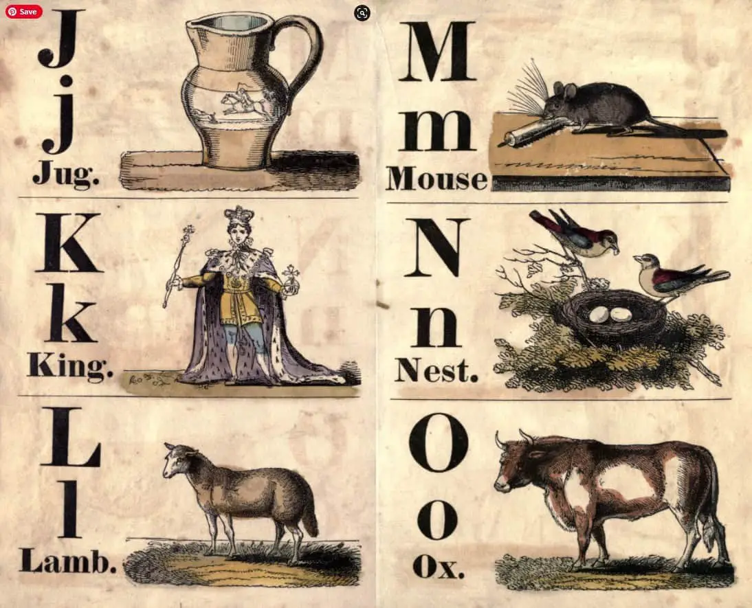
When the letter M is given to a mouse. The mouse is a common choice for abecedaries of yore. (E in the following book is an Elk, and a moose would be too similar.)
Moose throws a tantrum which is very funny. In the end, the emotionally competent Zebra realises his mistake and lets Moose have a turn on the final page. Which is surprisingly moving.
WONDERFULNESS OF “Z IS FOR MOOSE”
First some notes on alphabet books in general, from Nodelman and Reimer:
People usually assume that the purpose of alphabet books is to teach children the letters of the alphabet. Presumably, they see the picture of an apple, name it, and thus learn that the accompanying symbol “A” represents the sound that begins the word “apple”. The trouble with this theory is its assumption that visual symbols relate directly to specific words. Unfortunately, they don’t. One child might look at the apple and accurately name it ‘fruit’, and another child might accurately label the same picture ‘Golden Delicious’. In fact, rather than using the visual information to understand the verbal, most people treat alphabet books in the opposite way. They use their previous knowledge of the letter as a way of identifying the right word to describe the object. If the apple appears on the A page, then it’s an apple; if it appears on the F page, it’s a fruit. The implication is that alphabet books are not especially educational: readers have to know what the books are supposed to be teaching before they can make use of them.
The Pleasures of Children’s Literature
Reimer and Nodelman acknowledge that letter recognition may indeed result from these books and that letter recognition itself may be beneficial. They continue:
So if alphabet books don’t play a central role in teaching language skills, should they simply be eliminated? Our answer is no—because they offer pleasure. The books are a form of puzzle. They offer readers the run of figuring out what the connections between the pictures and the letters are. The same is true of number books. Readers who already know their numbers can have fun finding and counting up the objects in a picture to see if they match the accompanying number.
The Pleasures of Children’s Literature
Z is for Moose is therefore as much puzzle as ‘alphabet book’. How does Z stand for Moose? What’s behind those disrupted pictures? What’s happening behind the scenes, that which we can’t see?
Let’s not underestimate how very difficult it is to make an ABC/puzzle book which feels fresh, funny and original. It is very, very hard. But the bar has now been raised! What can we learn from the creators of this book?
The word ‘performance’ is part of this story in both senses of the word:
- A variety of standard ABC characters are putting on a performance
- Moose puts on his own kind of tantrum-performance when he realises he’s been overlooked.
For the reader, this makes for a story within a story — a work of metafiction. We are invited in on the gag. We are to enjoy not only the ABC performance, but also the performance of Moose.
Why does this work so well? Mixing up a linear narrative is perhaps the only way of turning something boring and oft-done into something entirely original. Also, there is a ‘second unseen audience’ here: A staged performance is by its very nature an important affair. So when Moose sabotages the whole thing, we know the stakes are higher than simply having had the story ruined for us, the readers.
Making Use Of Peritext
The best picture books always make use of the front and end matter, weaving it in as part of the narrative.
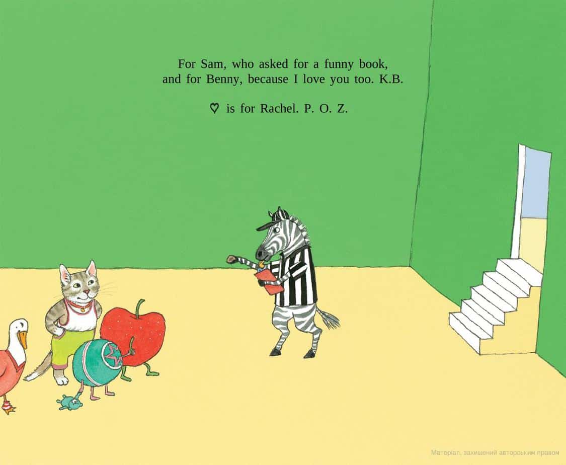
This is where the colophon and dedication go: Note how the entire cast is introduced wordlessly with a double page spread before the story begins. This is likely to be skipped upon first reading, but subsequent readings will allow the reader to dwell on each character, attaching letters to each.
And before this page, we are given more than enough information on the front end papers and title page to work out that here are some characters and they are going to put on a performance.
Partial Revelation
A number of children’s book illustrators/authors use the technique of partial revelation of a character or object, leading the reader through the book and creating suspense. Lynley Dodd does it in a lot of her Hairy Maclary books and Zelinsky does it here, with the zebra peeking his head around the corner on the A is for Apple page.
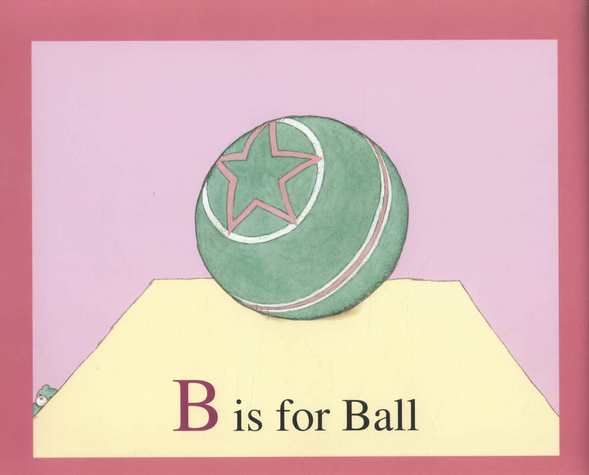
This technique is evident throughout the book. Who is that peeking behind the ‘stage’ on the B is for Ball page?
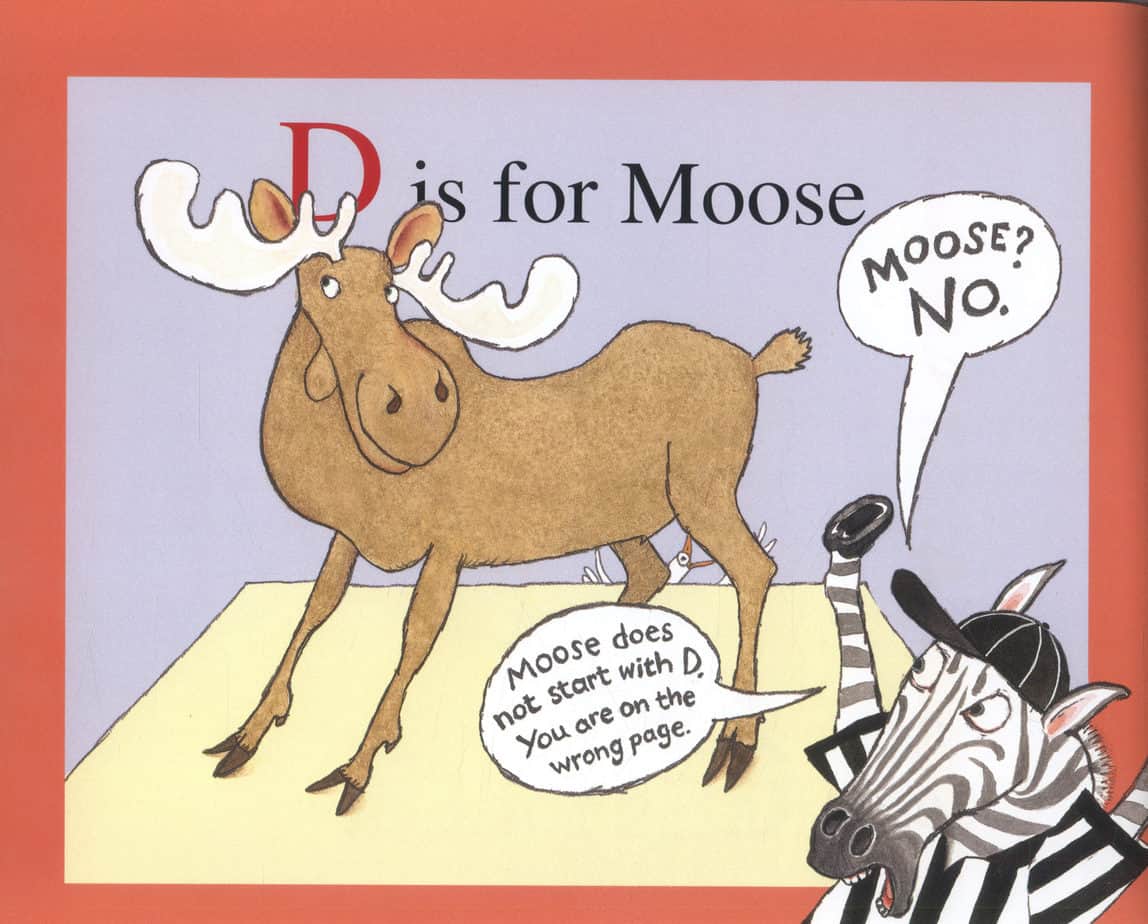
But this book utilises another form of partial revelation, in a way which at first seems counter-intuitive to makers of picturebooks: Parts of the information is covered up and is ‘unreadable’. I put ‘unreadable’ in quote marks because of course the reader knows what’s under the chaos, precisely because we are over-familiar with alphabet books, and so we know that if the ‘H’ is obscured by the enthusiastic head of Moose, we still know it says ‘H is for Hat’ because we can see the hat. This technique provides a ‘fill in the gaps’ cloze exercise for the young reader, though ‘cloze exercise’ makes the reading experience sound dull, when it is nothing of the sort.
Rule Of Three
It’s no accident that moose’s first intrusion doesn’t occur until the letter D. The rule of three works so well because it establishes a pattern. The reader needs to know that this is an ABC book, so the A, the B and the C are presented uninterrupted.
After that, notice that Moose turns up on D, and then on the letter H, after three pages and three letters in between.
But then the pattern is broken! Readers who know their alphabets will be expecting something big to happen on the letter M, and that’s when things really turn sour for poor old Moose, and so the 4 letters between Moose’s last full-faced intrusion make the M page feel especially dramatic.
Incongruous Humour
At its most basic, this is a straight-man, funny-man gag. As Kate de Goldi says on the podcast which made me buy this book, the Moose has the nature of a 3-year-old, looking forward to an event with unrestrained glee, then throwing a tantrum when he thinks he’s been overlooked. A character who has a tantrum is a fairly common way to present a Battle scene in a picture book. Young readers will relate.
Then there is the visual humour, which is very often composed of incongruous images: a moose in an ice-cream, a moose inside a kangaroo’s pouch. There’s the inherent funniness of the moose! My six-year-old finds Moose’s tail funny, for some reason, especially as depicted on the Y page.
Visual Gags
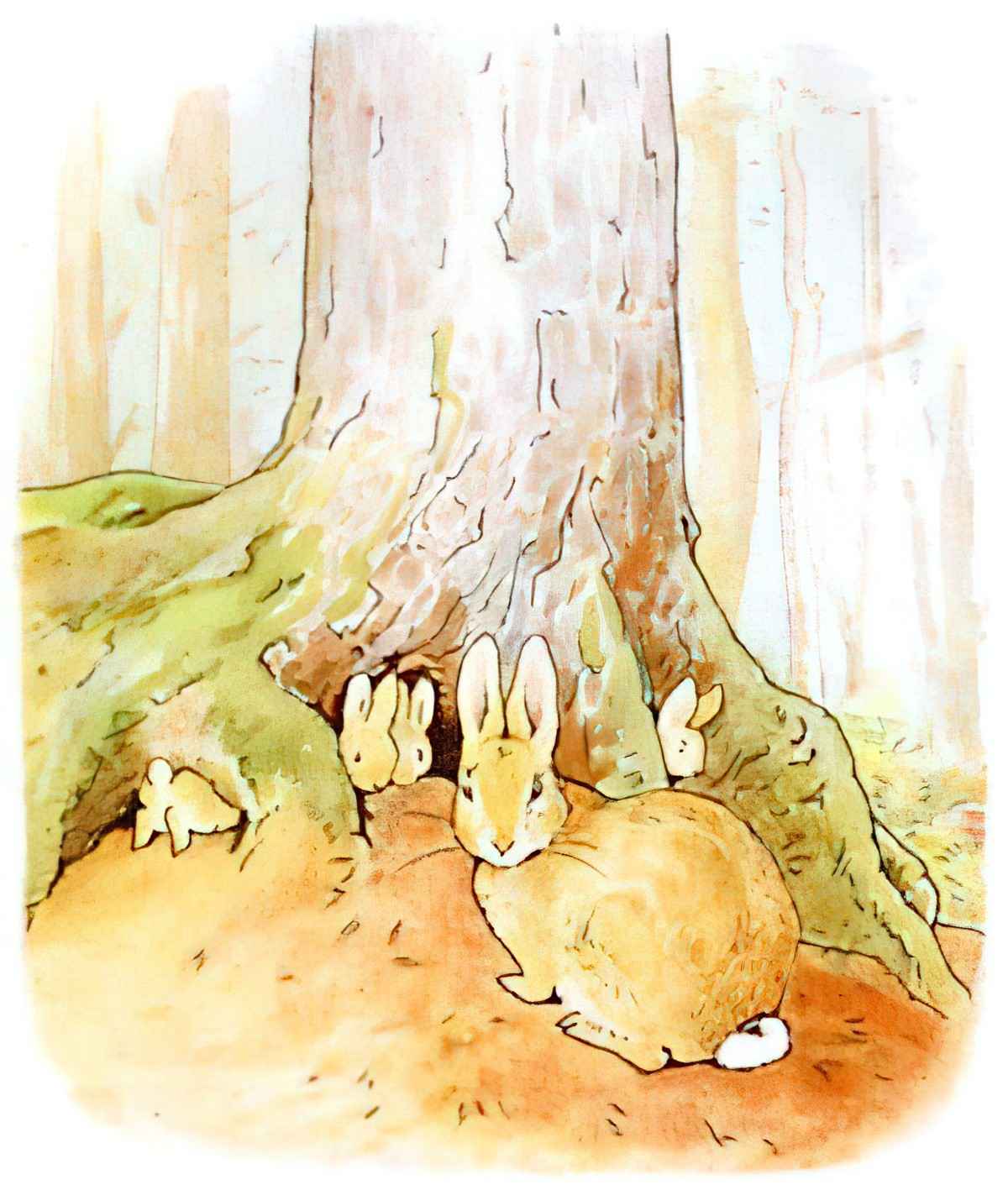
Then we have moose who has somehow managed to become part of the labelling on a jar, and the speech bubble coming out from inside the jar suggesting he’s in there too, and the way we can see both ends of his body even though there’s no way Moose is that long. (Note that this last gag was used by Beatrix Potter when illustrating The Tale Of Peter Rabbit.
Text-based Humour
It is particularly inspired that ‘mouse’ sounds so much like ‘moose’. Oh, almost moose! You almost got a go!
Then there is the full integration of text into the picture on the big tantrum page, in which moose steps all over the text which says ‘P is for Pie’ and ‘Q is for Queen’. Next, Moose pulls out his red crayon and scribbles out every word, replacing it with Moose. We don’t see this extent of picture/text integration in many picture books, and it really works here, turning the book into postmodern metafiction.
Dual-audience Humour
When zebra guards the truck so Moose doesn’t get the opportunity to destroy it, the cap that he has been wearing all along has been pushed around and now he’s wearing it sideways. For adult readers, the unconventionally worn baseball cap will be associated with truck drivers.
Purposeless Accoutrements
I’m not sure what to call this exact form of visual joke, but when a zebra wears a black and white striped shirt (on the V page) we laugh because such a garment is entirely unnecessary.
For more on humour in children’s stories, see this post.
NOTES ON THE ILLUSTRATION
Facial Expressions
Naive acial expressions are especially marvellous in “Z Is For Moose”. I adore the squinty eyes of the zebra, and I don’t think I’m alone in that because a squinty-eyed zebra graces the front cover.
The Various Art Styles Of Paul O. Zelinsky
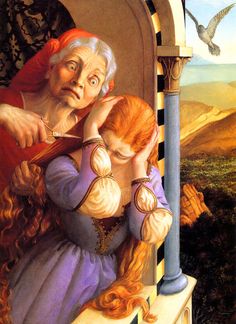
It’s worth noting that Paul O. Zelinsky has several main styles as an illustrator, and you wouldn’t necessarily pick him as the same artist! Sometimes he paints like an old master:
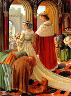
But even in this style, there is still a slightly hyperbolic element which make the illustrations suitable for children’s literature. Look at the facial expressions:
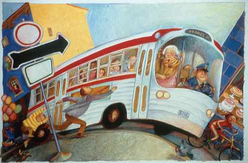
Sometimes Zelinsky adds even more of a comic book look to his ‘old master’ style. Here he has played with perspective to create the illusion of speed:
Next we have a looser style in which the strokes (of crayon? pencil?) are obvious. Now he makes use of solid outlines, closer to a comic book style. From Shivers In The Fridge:
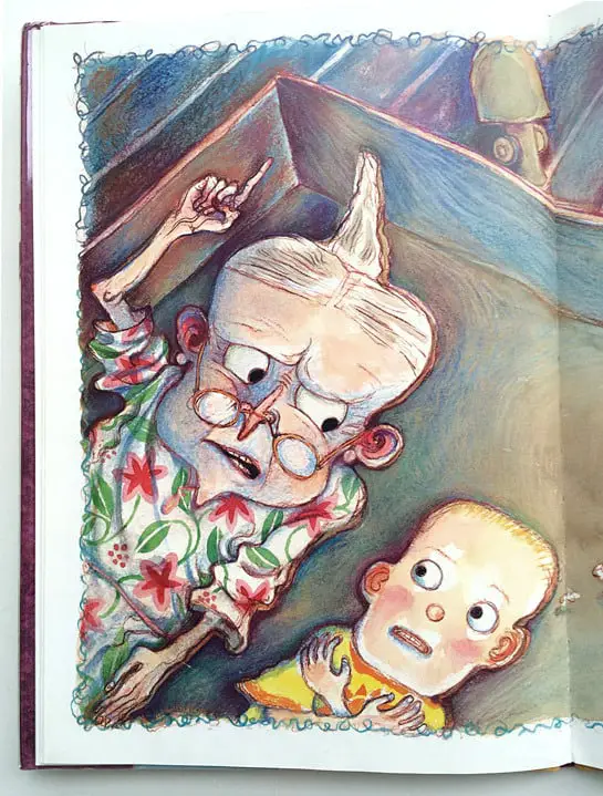
Pen and Oink asked about the colour of the outlines above, in which Zelinsky makes use of purplish/reddy outlines rather than solid black. He explains that he changed them in Photoshop after scanning them in, because
1. black looked too serious
2. the colours make the illustrations look a lot more lively.
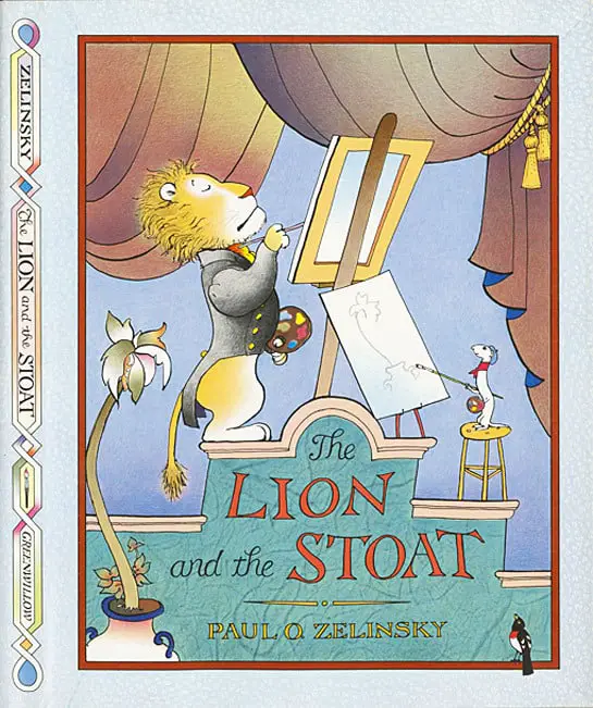
Then there is the truly comic style of Z Is For Moose, which we’ve seen before in The Lion and the Stoat:
I got to wondering about Paul O. Zelinsky’s process. How does he decide which style to use and when? I don’t know many illustrators who manage such a range of different styles. Most stick to just one — the trend is definitely towards specialisation (in everything, not just in illustration!):
From Pen and Oink:
PO: You use a variety of distinct styles that change from book to book. When an editor comes to you with a manuscript how much say do you have in the illustration style that you use for the book? Do they come to you and say, “Can you do this like Rumpelstiltskin?” or “Can you do this like Toys Go Out?”
Paul: I don’t actually think anybody’s ever asked that.
PO: Really?
Paul: I guess I’ve been lucky that way. Nobody’s said, that I can remember, please do this like that. I guess publishers have known from pretty far back that maybe they’d be surprised. And maybe they’d be pleased. I have reworked things when they weren’t pleased, but in those cases there’s been a discussion of why something wasn’t working and I’ve been convinced that they were right. That’s usually how it works.
PO: So once you’ve read the manuscript do you just start experimenting with different techniques?
Paul: Yeah, sometimes I know what I don’t want to do and that’s all I know. But it helps. If the story isn’t telling me where it wants to go then I’ll try different things. It’s pretty clear I like finding approaches to my books by thinking of art and the history of art. I think about those images more than about pictures by illustrators per se.
Paul doesn’t give much in that interview about exactly how he decides on which style is most appropriate for each assignment, though I suspect it’s not a particularly cerebral decision. One thing seems clear to those of us breaking it down:
- The realistic, old-master style is well-suited to illustrating fairytales.
- The cartoonish styles are well-suited to humorous stories.
STORY SPECS
- Kelly Bingham has also published several YA novels in verse. (Shark Girl series)
- Paul O. Zelinksy Wikipedia
- Published 2012 by Greenwillow Books (Harper Collins).
- This is one of those real crowd-pleasing hits with a genuinely dual audience. You can even buy a plush toy Moose.
Moose has his own Twitter account: @MooseThatsMe
COMPARE WITH
Trailer for Circle Square Moose
Paul O. Zelinsky requested a photograph of the night sky in Alice Springs for this book. He explains why he needs it here. I don’t think the sequel is as successful as the original. When trying to work out why not, I settled on the idea that, unfortunately for narrative, shapes don’t have a natural order to them, unlike the alphabet. It’s partly the unchanging sequence of the alphabet which adds to the suspense of the ABC book. The shapes book feels a lot more loose and meandering, though readers who fell in love with Moose and Zebra will appreciate seeing them again in a different context.
FURTHER READING
Is it the age of the Picture Book Moose? Is the Moose having a Moment? See also my take on This Moose Belongs To Me by Oliver Jeffers.
The child’s coloured gift book: with one hundred illustrations is an example of an early ABC book, now out of copyright.
