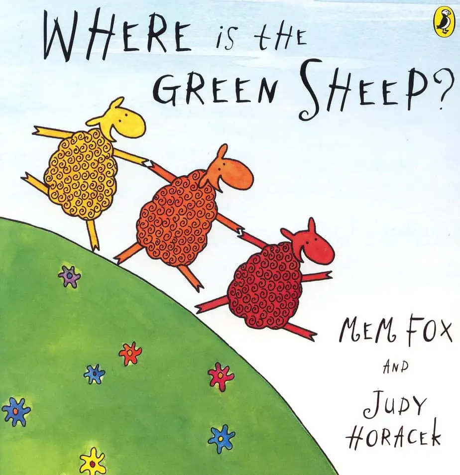
Where Is The Green Sheep? is an Australian picture book written by Mem Fox and illustrated by Judy Horacek. I know many preschoolers who count this as among their favourite books. It has certainly been a favourite around here, and my daughter has memorised it.
Part of the magic is to do with the fact that this is a book which encourages dialogic reading.
The process of having a dialogue with students around the text they are reading. This dialogue involves asking questions to help children explore the text at a deeper level, including defining new words, analyzing the components of a story and being able to talk about the text.
STORY STRUCTURE OF WHERE IS THE GREEN SHEEP?
PARATEXT
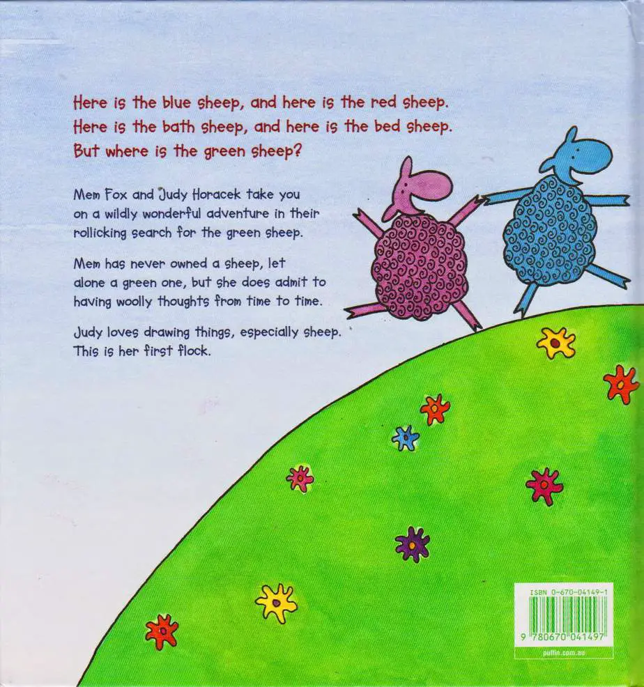
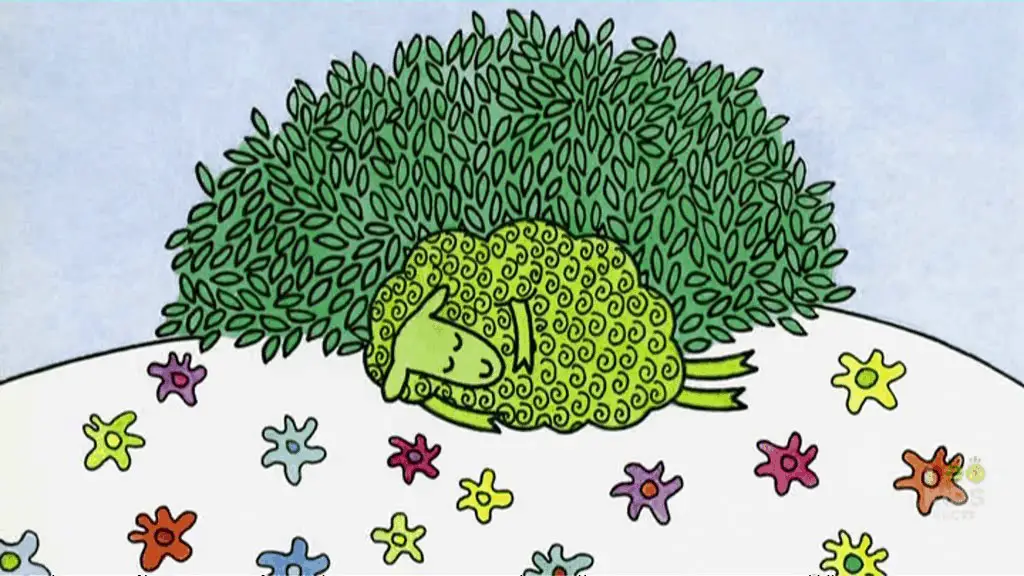
The reader is introduced to a number of different kinds of sheep (making use of various simple adjectives), but at various points asked, ‘But where is the green sheep?’ The green sheep appears on the final page, of course. The sheep looks green because it is fast asleep under a green bush.
The Anthony Browne example below is from Look What I’ve Got (1980).


WONDERFULNESS OF WHERE IS THE GREEN SHEEP?
First, there is the simplicity of language. Some (more complex) picturebooks introduce young readers to new situations and, as a consequence, to new words. This book is a real ‘comfort’ read. There will be very few words a 3 year old doesn’t already know. I’m guessing this is the reason my own daughter managed to memorise it, and it makes an excellent early reader, too, as emergent readers will be able to memorise the sentences and then connect them to the text.
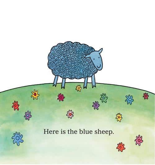
Sometimes when reading a picturebook I think, ‘Gosh, who would have thought of that, and isn’t it clever?’ This book has that effect on me. Mem Fox’s brilliance as a writer for children comes from her ability to see the world in a slightly off-beat way. Of course a sheep sleeping under a bush looks green, but who else would have thought of it? This is exactly the way a child thinks, before learning that no, the sheep is still sheep-colour — the bush is distinct but green.
That said, for all we know the inspiration to make the sheep green due to the bush came from the illustrator. But since I have to guess I’d say the author and illustrator worked quite closely on it. The nice thing about the final page is that there is nothing in the text which mentions the bush. Any mention of a bush would be redundant, since there’s a picture of one.
NOTES ON THE ILLUSTRATION
This was the first book illustrated by Judy Horacek, who has since gone on to illustrate more, including Good Night, Sleep Tight and The Story of Growl.
Horacek’s illustrations are full of bright colours, and the shapes are outlined in black lines. Notice that board books also tend to make use of this illustration style — I think I heard that young eyes are better able to focus on pictures with clear delineations in form, and this book has me wondering if children prefer this style of illustration even after their eyes have become accustomed to subtle gradations of colour. Or is it that older children have learnt that illustrations done in this style have been created just for them?
Children respond very well to humorous faces on animals, especially. The faces of the sheep are two dots for eyes and a curve for a mouth. The open mouths sometimes offer more in the way of expression on these sheep. (Many anthropomorphised animals in picturebooks are drawn with eyebrows even though animals don’t have eyebrows simply because it’s difficult to convey the full range of human-like emotion without them.) Here, the personalities of the sheep are conveyed mainly via their body language. A red sheep does a ‘handstand’ on top of a hill, using only one leg. (See picture above.) The humour of this is amplified because we’ve just been shown a blue sheep standing like an everyday sheep, in a paddock. The blueness of it is ridiculous enough. In other words, the ‘ridiculousness’ of the illustrations build up gradually, with the sheep starting off more sheep-like, progressing into being more human-like, and eventually ending up in ‘tall-story‘-like situations such as standing on the moon.
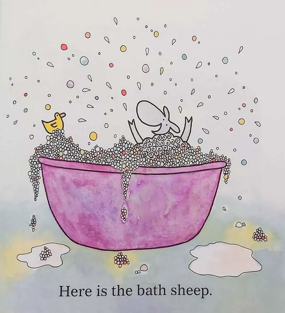
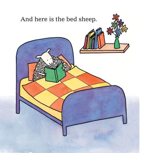
So not only do sheep have baths like people, they are also literate!
When adjectives are introduced they are exaggerated for humour. The thin sheep is a very thin, unlikely looking creature; the wide sheep is equally unlikely.
Each sheep in this book looks happy. There is a real carnival feeling running all the way through.
My daughter’s favourite page is what I will call the ‘Where’s Wally Sheep page’, just before the end, in which we are shown an entire page of sheep: playing in a sandpit, flying with angel wings, wearing a tropical fruit hat, eating a birthday cake etc.
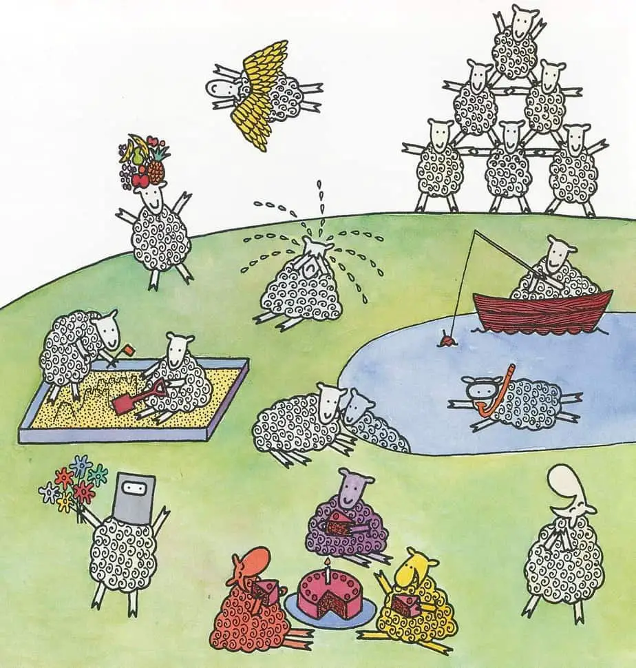
My kid likes to use her fingers as legs and make a play out of walking around the scene, joining in with the cake-eating scene, wishing the sheep a happy birthday. It was me who introduced this possibility to her on one reading, and now we must linger every single time. In effect, this is a ‘look’ page, similar to a page of Richard Scarry’s lookbooks, and is designed to be gazed at for a while before reaching the climax. Interaction occurs when the child and adult co-reader are given the opportunity to ask questions: ‘Why do you think that sheep might be crying?’ Despite the simplicity of illustration and language — and perhaps because of it — this story reaches far beyond the page, extending into the reader’s imagination.
SPECS
Published by Penguin imprint Viking, Australia 2004.
FURTHER READING
Simplicity wins the day. Margaret Wise Brown was another author who mastered simplicity of plot to great effect. A standout example is Goodnight Moon.
Many picture books have the pedagogical function of teaching opposites. (Some more successfully than others.)
