This Is Not My Hat by Jon Klassen shows that toddlers can cope with the horror genre.
“Jon Klassen’s darkly humorous illustrations are a joy to behold. Deceptively simplistic, the expressions and events that he captures, which range from the sublime to the sinister, are utterly wonderful.”
The CILIP Carnegie and Kate Greenaway Medal judges’ commentary
Someone on Goodreads called this a “hard-boiled crime thrillers for toddlers”. This is fairly apt description! Below I will refer to a number of 1 and 2 star reviews of this book on Goodreads, because these reviewers say something interesting about what adults think is good for children, and what should be kept from them. Committees who award big prizes are a lot less conservative than many book buyers, but I fear it’s the book buyers who drive the market.
PLOT OF “THIS IS NOT MY HAT”
A little fish steals the hat of a big fish when big fish is napping. Little fish thinks he has got away with it. He plans to hide in the reeds. Unfortunately for little fish, the big fish works out exactly what has happened and finds him in the reeds. The reader never knows how it ends exactly, but I figure the big fish eats the little fish up.
It’s interesting to read the 1 and 2 star reviews of this book on Goodreads, because there you will find parents who don’t approve of such morbid tales for children:
But who would I recommend this for? For a “scared straight” morality tale about the wrongness of stealing? I don’t feel like traumatizing children.
2 Star Review
Others take issue with the message it sends to kids:
In this book, a small fish steals a hat from a big fish and, although he knows it is wrong, thinks he can get away with it. What kind of message does this send to kids? It’s ok to steal if you don’t get caught! There is a conscience though. The big fish EATS the little fish and gets his hat back! What message does that send? If you steal something from someone the person has a right to kill you?
– 1 Star Review
Stealing is ok——I think not! This is NOT a book to be shared with anyone other than the trash! How very sad the committee accepts and medals a thief! The insanity must stop somewhere. This storyline is NOT ok! Perhaps some will try to explain the parameters of the medal again to me. I know the parameters – I don’t know why the committee would choose this book knowing full well many people will purchase it just because it is a winner.
– 1 Star Review
Any book that engenders such strong reactions in parents must be a good one, in my view.
– 1 Star Review
From Klassen himself:
The bear [from I Want My Hat Back] can’t talk to the rabbit and can’t reason with him. So the only thing he can think of doing is to eat him. I’m not endorsing it but it’s what you can feel like doing! I like the fact that the hat abstracts the idea. The object doesn’t need to be a hat, it could be anything. We just need a motor for the story. In This Is Not My Hat, the morality is slightly more overt because the fish states his case: ‘I know it’s wrong to take the hat but I’m going to do it anyway.’ You don’t know whether you’re supposed to be rooting for him or not. The reader has been with him all the time and that’s a more complicated emotional scenario: are you going to feel bad when or if he’s caught?
I think the book does have certain ideas about morality but not ones that the characters are necessarily aware of. As the reader, you’re part of that process. When I was little, I didn’t need books to name those lessons so I don’t use a narrator or a verb like ‘she whispered’ or ‘she said angrily’. It frees things up and you have to look to the pictures and the font colours for emotions. … But this is a hard argument to make, especially in the United States, where they think that if it happens in a book, then the author has endorsed what goes on there.
Jon Klassen’s Visual Narratives
WONDERFULNESS OF THIS IS NOT MY HAT
VOICE
I love the voice. There is nothing adult about it whatsoever. This is the voice of a naive youngster. The little fish speaks directly to the reader — the reader is in on a big secret. The little fish’s conscience eventually kicks in. He knows it’s wrong to steal someone’s hat but he justifies it to himself. (Non sociopathic) readers will be familiar with this kind of stream of consciousness and will identify with the little fish. But we identify equally with the big fish, who has had something stolen, after all. Modern picturebooks are devoid of moralising, and this voice is a wonderful example of such a tone.
AMBIGUOUS ENDING
It is difficult to pull off an ambiguous ending in a picture book simply because there are so many readers out there who won’t stand for it. I admit looking and looking into the reeds trying to find where the little fish was still hiding and, you know what? He’s definitely not there. He’s either too scared to come out or he’s been eaten. When I asked my daughter what had happened to the little fish she said, ‘Dunno’ and at first I thought it was because she hadn’t engaged with the story and didn’t care, but she rushed off and wrote her own picture book, which just happened to star a big fish, so this book definitely resonated with my six-year-old.
INCONGRUOUS HUMOUR
The thing about humour is, it will never catch everyone. Kirkus described Klassen’s earlier book I Want My Hat Back as ‘cynical on wry’ and this one could be described that way also. One thing that almost always works to get little kids laughing is incongruity: Mum wearing Dad’s shoes, dogs smoking pipes, that kind of thing. Klassen makes use of incongruous humour here, too, not only with a fish wearing a hat (haha) but with a huge fish wearing a little hat that’s obviously not for him. In my mind, this big fish has already stolen the hat from a much smaller fish. This is a wry comment on the food chain which parents can shield from children as long as they like, but they’ll never shelter them from it completely.
NOTES ON THE ILLUSTRATION OF THIS IS NOT MY HAT
MINIMALISM
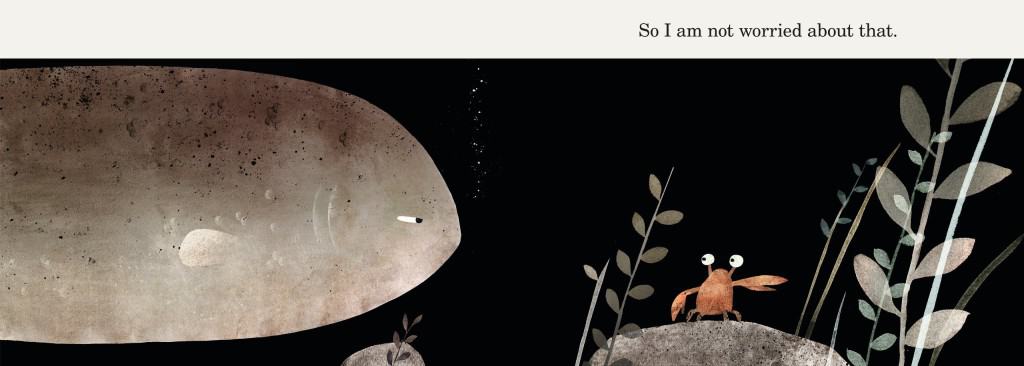
This is a minimalist picture book, not only minimalist in words but in illustration:
A few consumers don’t like such minimalist books:
The story is really simplistic, even for a picture book.
1 Star Review
This Is Not My Hat stands out from a lot of other picture books because the background is black instead of white. (Six Feet Under flipped this same expectation by making use of fade to whites instead of fade to blacks.) How many illustrators would have even considered using a black background when the story is set underwater? Jon Klassen’s colour palette is as much a part of his distinctive style than anything else, and I suspect he is now going to stick to blacks and ochres. The shapes are wonderfully textured, with splatters and watercolour washes (which could just as well be acrylic or gouache for all I know).
(How else does this book feel minimalist? There’s minimal punctuation, also. Klassen explains that this was very much a deliberate choice:
It’s all about context. There doesn’t need to be exclamation marks. Let the pacing do the work.)
EYES
When personifying animal characters, illustrators very often put eyebrows on animals who don’t normally have eyebrows, because it’s difficult to convey the full range of human emotion without them. This big fish doesn’t have eyebrows – he has 4 different, very simple drawings:
- Asleep eye
- Open eye
- Open eye looking up
- Squinty, suspicious eye
Nothing else about the picture changes — these eyes say everything. Of his earlier book I Want My Hat Back, Klassen articulates the reasons for his design choice when it comes to animal expression:
The characters’ expressions barely change with just some movement of their eyes. If the rabbit is too characterised, then he becomes too cute. If he shows no reaction, then it’s okay to want consequences for him. When you’re a kid and you’re being picked on, this is the big question: what do you do when you actually find the person who’s done something wrong to you and they’re indifferent? Amoral. They’re blank.
Jon Klassen’s Visual Narratives
Looking at the illustration of eyes in children’s picture books – Paeony Lewis
Irony in picture books is often achieved when the pictures say something different from the words. This book is a perfect example of that. The reader knows the big fish understands what has happened, but the words come from the little fish’s stream of consciousness, and are in complete contradiction to the reality of the story. This serves to amp up the drama. The young reader knows what’s going to happen to the little fish. The ending is both satisfying and surprising, if only because we don’t often see death at the conclusion of humorous picture books starring personified animals.
STORY SPECS OF THIS IS NOT MY HAT
Pictures have a black background, so on most the text is laid over a white band at the top.
Landscape shaped book.
Marketed at level K-3
The Candlewick edition is 36 pages.
The FollettBound edition is 32 pages.
COMPARE WITH
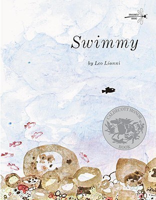
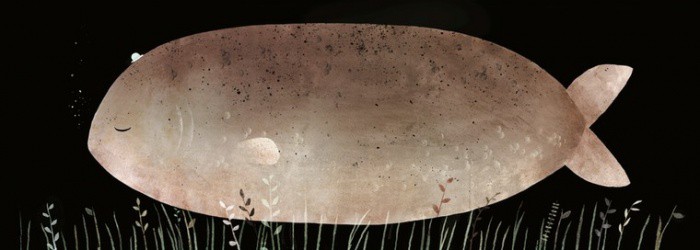
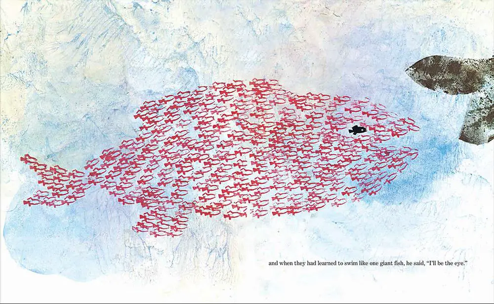
Deep in the sea there lives a happy school of little fish. Their watery world is full of wonders, but there is also danger, and the little fish are afraid to come out of hiding . . . until Swimmy comes along. Swimmy shows his friends how—with ingenuity and team work—they can overcome any danger. With its graceful text and stunning artwork, this Caldecott Honor Book deserves a place on every child’s shelf.
Another picture book with a retributive conclusion is The Story of the Little Mole who knew it was None of his Business by Werner Holzwarth and Wolf Erlbruch.
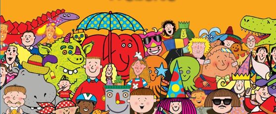
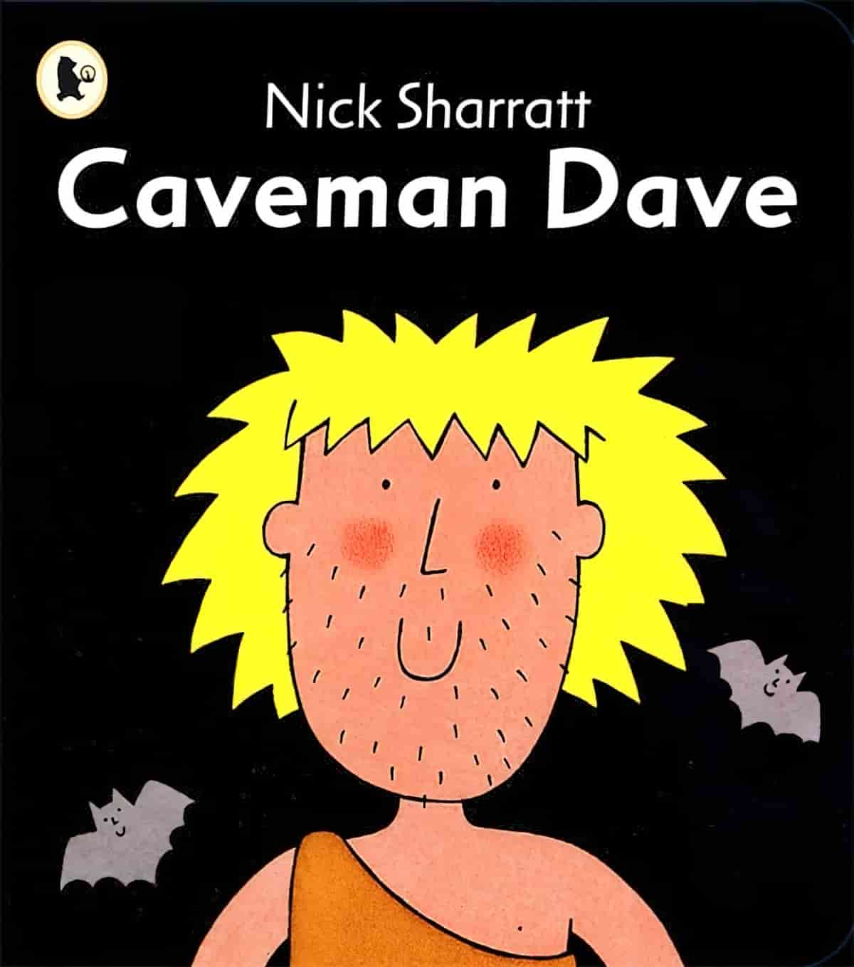
Another illustrator with a distinctive colour palette is Nick Sharratt, who works closely with Jacqueline Wilson.
A lot of picture book artists start off as painters, but Sharratt’s style has not evolved from that tradition, and you don’t find subtle references to the world of fine art. He doesn’t go for a painterly look; his pictures are arresting in their almost schematic simplicity, and he favours strong flat colours. He speaks directly to a young audience – his pictures are easy to read and humour is his first concern.
Books For Keeps
Jon Klassen’s art background is quite different — he studied animation and has worked as a concept designer in film (notably Coraline). There is definitely a graphic design/fine art feel to Klassen’s art — you could hang these pictures in an upscale restaurant or dining room and they wouldn’t look out of place. What these guys have in common is distinctiveness of style.
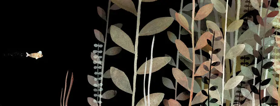
Some adults don’t think this art is ‘for children’. Another 1-Star review on Goodreads comments on Klassen’s colour palette, which brings up an interesting expectation among some adults and many children, who have been trained to understanding that most brightly coloured things are designed for them:
I didn’t care for this book at all, and it is not a book that I would read to any children. The pictures were all dark and not very fun colors. Jon was trying to show that it is not okay to steal someone else’s belongings. The thing is, he could have done this by having bright fun colors so children would be more apt to want to read this book.
See Also
7 Questions Over Breakfast With Jon Klassen
A Pinterest board collection of picture books in which someone gets eaten
Other first person picture books
If you enjoyed the art in This Is Not My Hat, check out artwork by Philip Giordano.
