**UPDATE LATE 2024**
Neil Gaiman is an abuser.
If this is news to you and you’re skeptical, here is a link roundup.
Tortoise was the first (semi) mainstream outlet to give voice to one of Gaiman’s victims. Unfortunately, Tortoise is funded and owned by a notorious anti-trans bigot, so even though I listened to the series and the individuals involved did a great job, I don’t want to help promote bigotry.
Have you ever had something living in your walls or in your roof space, or cellar?
Apparently the story was inspired by his own daughter, who heard rats in the walls at night. (So do we — they’re actually mice…) Hearing rodents in the walls isn’t all that uncommon. And rodents are most active at night. It really is quite disturbing to hear two a.m. scrabbling right behind your head: You’re not quite sure they’re rodents, they’re so close to you, yet you can’t see them. And it’s not easy to do much about them, either. You have to wait for them to come out and eat the bait you’ve placed elsewhere.
A PICTUREBOOK FOR OLDER READERS
There are few picturebooks for older readers, and even fewer published today, with children encouraged to read chapter books earlier than ever before. This picture book is longer than your typical toddler-targeted picturebook and is aimed at readers who might otherwise be reading a chapter of a chapter book. Themes are commensurately dark, under the assumption that an older reader can cope, and isn’t necessarily going to wake up at midnight from nightmares.
There’s a good reason why this book is a bit longer: It’s an example of the horror genre in picture book format.
Am I the only one who thought this is a mishmash of H.P. Lovecraft’s “The Rats in the Walls” and the classic wolf-riddled admonitory bedtime stories like “Little Red Riding Hood” and “The Boy Who Cried Wolf”?
Goodreads reviewer
Does Gaiman’s story have anything to do with Lovecraft’s The Rats In The Walls? That is a story set almost 100 years ago in a renovated castle. This is a modern, warm house with modern technology such as computer games, and a 1950s mother figure in the kitchen making jam. What could possibly go wrong? In Lovecraft’s story he gathers a posse of experts from England who know all about medieval stuff and they find a terrifying grotto below the basement which is the scene of a horrendous ancient civilisation in which creatures (including humans) were kept in cages to be eaten by an army of rats.
While I don’t think this picturebook has all that much in common with Lovecraft’s story, there are some tropes common in horror:
- The hero hears strange goings-on but no one else in the house believes them.
- The strange goings-on happen in the middle of the night.
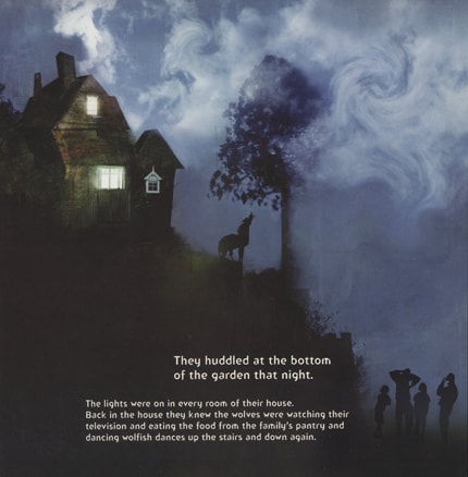
- Though Lucy lives in a modern, suburban house, the long shot of the house at midnight shows us it’s perched atop a bit of a hill and now it looks like a castle. We can well imagine that this house has a vast, labyrinthine basement full of terrors.
- Lucy has a beloved pig puppet whereas the narrator of The Rats In The Walls has a beloved black cat. (The pig functions as a kind of ‘Companion Cube‘ — a trope in which the character uses an inanimate object as a security blanket — being too close to an inanimate thing is a sign of madness in horror.)
- There’s a grizzly scene — skeletons of unlikely creatures in Lovecraft; faux-grizzliness with wolves with jam around their mouths in Gaiman and McKean
But there are very big differences, given the target audience:
- Lovecraft’s story is about descent into madness; the picture book is the active imagination of a little girl
- Lovecraft’s conclusion is without hope; Wolves in the Walls is a circular story book — at the end we find out that the story will repeat itself, this time with elephants.
- Lovecraft’s skeletons and chimeras are truly terrifying; the wolves in the picture book have very humanlike interests (playing video games and eating jam), and are just as scared of humans as the humans are of them.
See: What Is The Horror Genre For?
In horror, light and dark are especially important.
Light = good.
Dark = evil.
This dichotomy is expertly exploited by the illustrator.
WOLVES AND HORROR AND CHRISTIAN SYMBOLISM
We also have wolves, which Christian thought — upon which western horror is based — has turned into villains. Wolves lead you towards the devil. Traditionally, at least. There’s a recent turnaround, now that wolves are endangered and we know more about them. Spoiler alert: Healthy wolves don’t hunt people, which ruins the entire plot of White Fang. These days you get picture books in which the wolves are the goodies, for example The Three Little Wolves and the Big, Bad Pig by Eugene Trivizas and Helen Oxenbury.
See also: Wolves In Children’s Literature
NOTES ON THE ILLUSTRATION BY DAVE MCKEAN
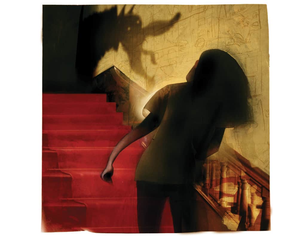
Some illustrators share their styles with many others. Not so with Dave McKean, whose dark, spooky, yet patchwork style is unique. How to describe the artwork? In bulletpoints, I guess, since it’s a tall order:
- Scenes are a mixture of photorealistic images (perhaps parts cropped from photos), line drawings and off-kilter textures. In other words, the pictures form a ‘chimera’, mixing reality with fiction. But which part is fiction and which is true? That’s the freaky part.
- The collage effect is achieved by making no attempt to ‘line edges up’ or position textures so that they match real life perspective. A boy lying on a rug has realistic hair, an illustrated body, and the rug he lies on is a texture which doesn’t come out the other side of the boy’s body where you would expect it to.
- A palette knife tool is used to suggest movement and also that a character is an inextricable part of the setting. In the picture above we see the knife applied to the girl’s hair.
- Digital artists working in a more photorealistic style often make use of the multiply blend mode in order to make a many-layered illustration look cohesive. Here we have what looks like a glaze or coloured-wash. The pattern of the aforementioned rug extends right across the carpet; what makes it look like a rug is that it is a circle of different toned wash.
- Photorealistic objects (or, photos) are also distorted with a palette knife, or digital equivalent. An illustrator such as Lauren Child also makes use of (stock?) photos in her illustrations to completely different effect. (Her childlike representations of Charlie and Lola look even more naive by contrast.)
- The eyes of McKean’s characters look super spooky. Eyes are always important in illustrations of people and animals. Although dots for eyes are very common in picturebooks, when dots are used for eyes on more realistic (generic tending towards naturalistic) looking characters with that photorealistic hair and those contoured faces, we are reminded of the button-eyes of Coraline, or of dead birds we found on the ground as children, since the eyes are first to rot.
- While the human characters and scenery are drawn in semi-naturalistic style, the wolves look like drawings of yesteryear, with black, sketchy outlines only. The humans are a part of the child reader’s world whereas these wolves are creatures from an ancient folklore. We are encouraged to forget the fact that wolves would never be found inside a house.
- The crumpled paper background and dirty texture overlays lets us know that this is a story from an earlier time and the crumpledness equals some sort of frantic gesture.
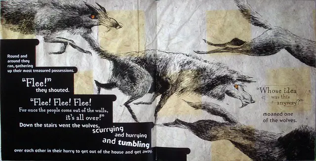
- When colour is added, it’s not necessarily in sync with the ink outlines. For example, a wolf rendered in outlines has a yellow splodge of paint in the eye area, and a square of semi-transparent green overlaid on its body. The wolf is neither square nor green; why this artistic choice? The wolves are coming out of the walls in the same way the colour is coming out of its rightful place. Worlds are blurring together.
Values
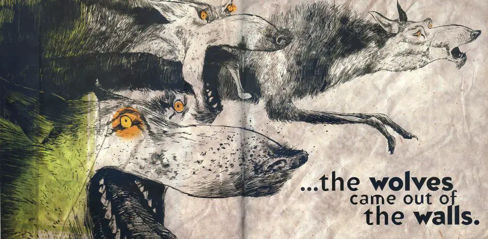
Here’s an interesting project, completed by someone at Deviant Art: re-creating a double-spread of a picturebook in black and white only (values). Doing this would no doubt leave you with a good sense of page layout, and I guess that was the aim of the task:
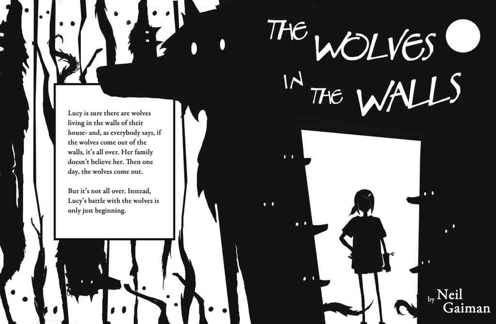
Font Choice and Placement
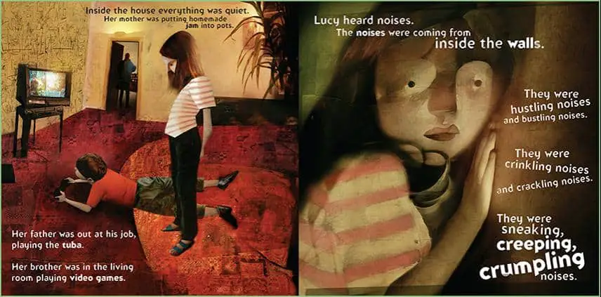
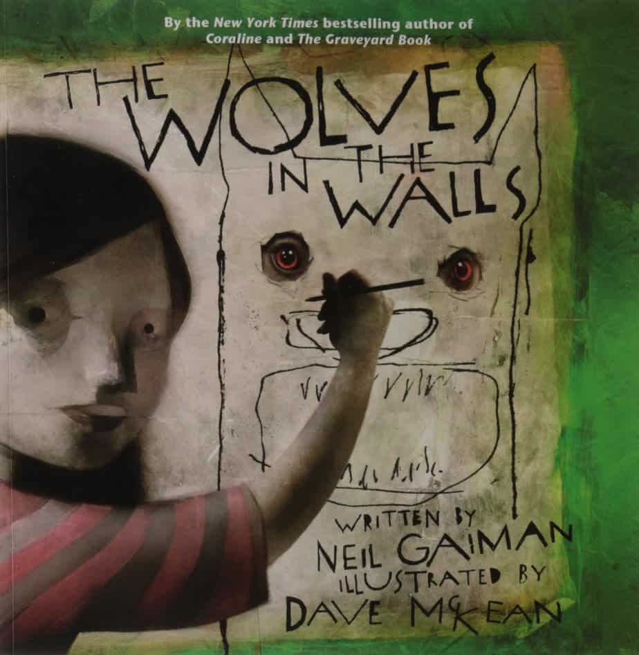
The placement of the text suggests terror and unease, askew on the page. There is also a variety of fonts. The font on the front cover looks like the scrawl of one crazed individual, perhaps one possessed by werewolves. Dialogue is rendered in a typewriter, serif style. It all works well together. Note that both of the interior fonts are quite different. It’s no good picking two that are basically the same.
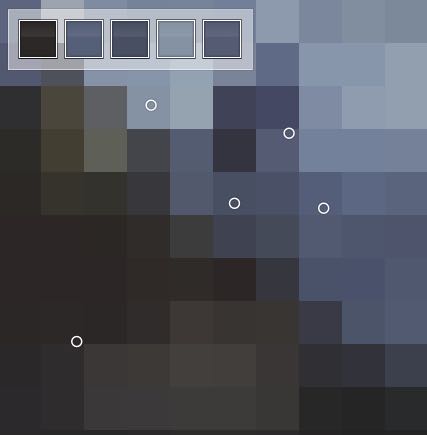
Colour Temperature
This is by the by…
But on the front cover we see the creators credited very specifically: Written by Neil Gaiman and Illustrated by Dave McKean. If you are an illustrator (especially) you’re probably aware of the unfortunate tendency to credit the writers of picturebooks but not the illustrators, who bring as much (if not more) to a story than the writer. Some picturebook creators do not like the word ‘author’ in relation to picturebooks, because a picturebook is ‘authored’ by both the writer and illustrator. In short, perhaps this method of crediting a picturebook’s co-creators is about to catch on? I hope so.
