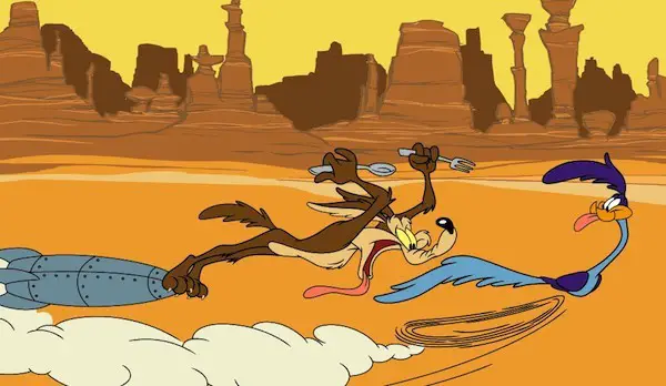
The glance curve describes a Western reader’s tendency to read a picture from left to right. This affects how illustrators compose scenes.
In relation to the perception of visual art, the German psychologist Mercedes Gaffron (1908-93) argued in 1950 that Western viewers unconsciously followed a basic perceptual path in looking at two-dimensional perspectival representations—a left-to-right movement — running upwards from the lower left foreground, across to the right, into three-dimensional depicted space. We become aware of this phenomenon only when an image is laterally flipped. It is not clear how this is related to physical eye movements. Wolfflin had already argued that there was a general tendency for the (Western) viewer to follow a visual path from the lower left of the picture, first going up, then going down (perhaps a tendency in Western art to assume such a path), but he had focused on the picture plane rather than related it to pictorial depth.
A Dictionary of Media and Communication by Daniel Chandler, Rod Munday
Perry Nodelman makes use of the term ‘glance curve’ in relation to our reading of picture books:
In a discussion of how pictures seem quite different if we reverse them photographically and look at their mirror images, Mercedes Gaffron suggests that we conventionally look at pictures in terms of “a certain fixed path which we seem normally to follow within the picture space”. Gaffron calls that path the “glance curve” and suggests that it moves from the left foreground back around the picture space to the right background. Because we look first at the left foreground, we tend to place ourselves in that position and to identify with the objects or figures located there: “we not only feel that the objects represented here are near to us, but also that they have greater importance to us. People represented here belong to our side in the figurative sense of the term, in contrast to the people on the right side“. In fact, the protagonists of many picture books — the characters we are asked to identify with — do tend to appear on the left more often than not…In illustrated versions of Little Red Riding Hood, the young girl almost always stands to the left of her mother in the first picture—at least in many versions of the story in which the first picture shows mother holding up a finger while she offers her daughter instructions.
Perry Nodelman, Words About Pictures
Honestly, this is something I hadn’t noticed particularly, but it’s funny how things sink in regardless. When I illustrated a re-visioning of Little Red Riding Hood, I indeed had placed Lotta to the left of the mother, although this particular retelling does not include the ‘mother holding up a finger’ scene that Nodelman describes. I’m not sure what this says, exactly, except that everything we’ve ever read is obviously an influence, because things get embedded in the brain without us knowing it.
Sure enough, a cursory glance tells me Perry Nodelman is right, and why have I not noticed it before?
Matthew Cordell’s Wolf In The Snow is a much more recent revisioning of Little Red Riding Hood, demonstrating that this layout is still very much used, because it is effective.

Gila Monsters Meet You At The Airport is an interesting example because these opponents exist to give the reader a parallactic view of two places, using two very different points of view. The effect is to help young readers challenge their own preconceptions.

In The Fog, the scene where humanity really sees the importance of nature is so central to the story that it’s used for the front cover.
The scene where the mouse meets the Gruffalo is another example, but illustrator Axel Scheffler has made it look 3D with inclusion of the tapering path.
I’m guessing part of the reason why a child protagonist situated to the right seems more daunting is because of the ‘chasey’ nature of it; pages are turned from left to right, and typically in picture books, the child character leaves safety, has an adventure, meets with peril and returns home to safety. A child on the right means that no one is propelling/chasing the character forward.
Nodelman offers other examples of ’empathetic character placed to the left’, and mentions Rosie’s Walk. At first glance, Rosie is the empathetic character — after all, the book bears her name — but Nodelman argues that because the fox is consistently drawn to the left of Rosie, then it is actually the fox with whom the audience is encouraged to empathise. This is the fox’s story. I liken that to Road Runner, in which the Road Runner is indeed the title of the show, but the poor old coyote engenders sympathy.
Of course, none of this suggests that the empathetic character is always placed on the left in picturebooks. Nodelman has noticed that:
- If this rule is a thing, then if an empathetic character is placed to the right, the reader senses that the character is in peril. Where The Wild Things is a good case study in this technique.
- Once a dangerous event is over, the positioning of a protagonist on the right might in fact suggest rest rather than tension, particularly in the last picture in a book. This is because the last thing we look at signifies an ending.


