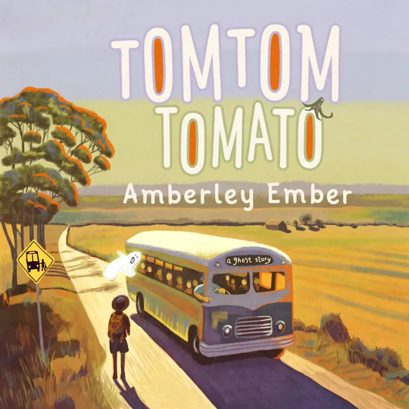
Do you remember being a child and instantly drawn to anything brightly coloured and cartoonish? You learned very early that if something was done in that style, it was made for you. You may also have come across media done in that style which was not for you — perhaps your mum or dad prized a Japanese manga out of your hands, or similar — because you picked it up assuming it was for you, just because of the style.
The way characters are illustrated in picturebooks can loosely be categorised into three main styles, as described in Reading Visual Narratives: Image analysis of children’s picture books by Painter, Martin and Unsworth.
I’ve picked my own examples mostly from the popular Ladybird series, because over the years this same publisher has printed many variations on the same stories.
When deciding which category look carefully at:
- eye detail (One of the most effective indexes of realism in texts. Minimalist categories often have just a dot and an eyebrow. Occasionally pupils are given more volume through suggestion of an eye socket. Sometimes you get under-eye shading or wrinkles to indicate age or fatigue. At the other end of the scale, naturalistic illustrations sometimes even have individuated eyebrow hairs and we’ll see eyelashes on both the top and bottom of each eye.
- head angle
- facial expressions and proportions
- variation in colour palette
It’s worth pointing out that even in the minimalist and ‘generic’ styles, the issue of skin-colour doesn’t go away. Even today, most so-called generic characters are to be read as a version of ‘white’. The generic character is also a boy, especially in the minimalist styles, where girls are coded with eyelashes, long hair and feminine dress, often pink and frilly.
Sometimes you’ll find a variation in style within a single picture book. Anthony Browne has done this, for example, in Gorilla. Marilyn Monroe is easily recognisable as an individuated Marilyn Monroe, but the girl character is the generic Every (White) Girl.
Caricature and Hyperrealism
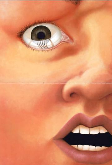
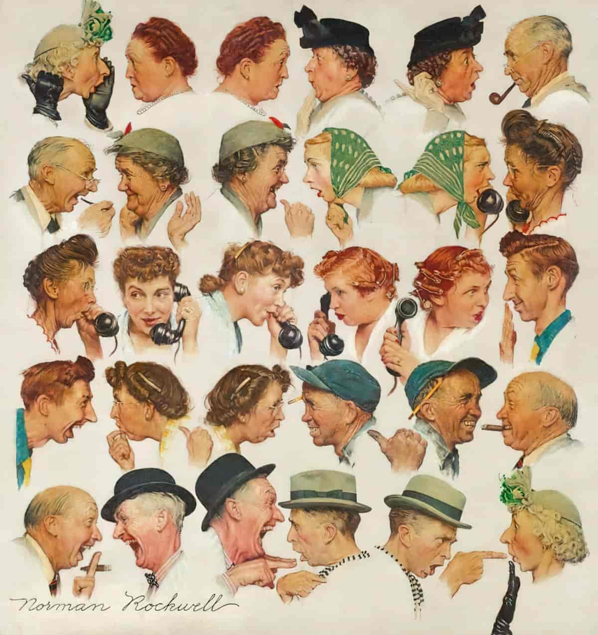
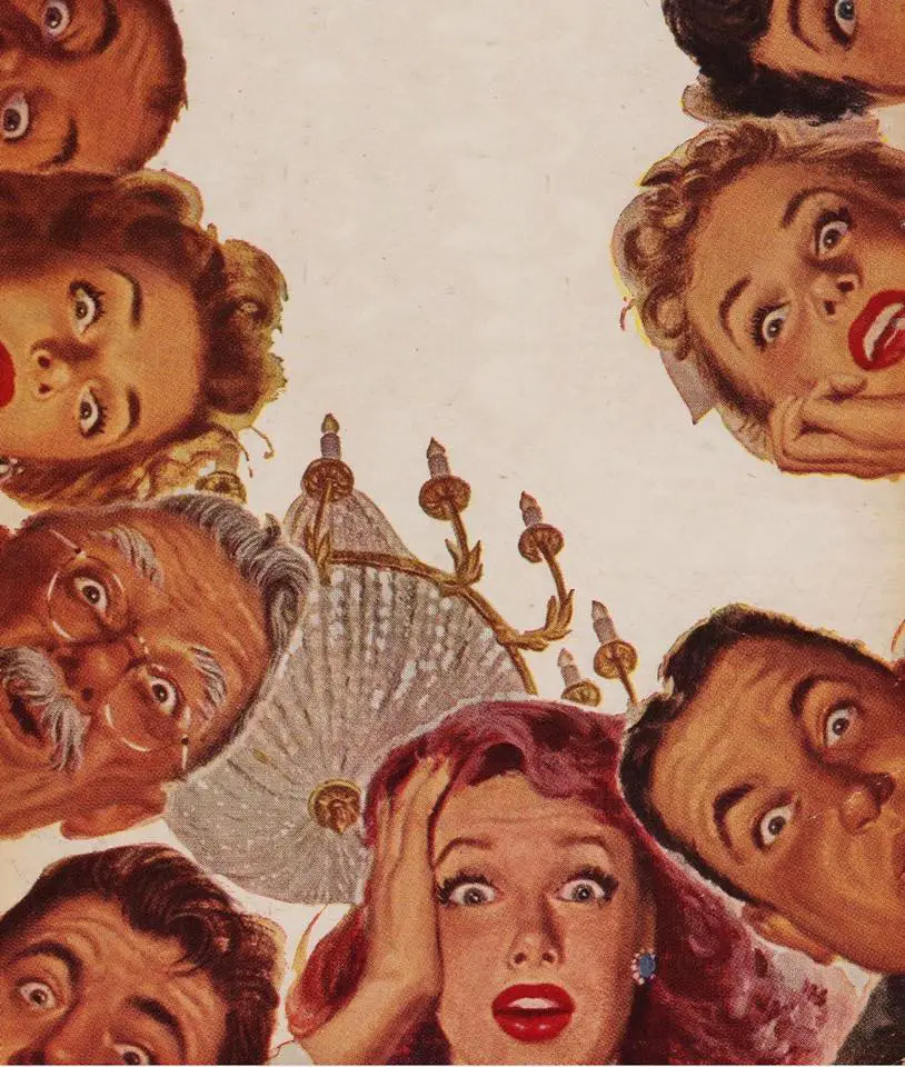
We could hypothetically include two more categories to the ones below: Caricature and Hyper-real. Hyper-real illustrations such as those in The Watertower (Crew and Woolman, 1994) can make use of hard edges and very strong contrasts of light and shade to create their own kind of eerie reality. This style of illustration gives an otherworldly, SF feel to a work. In a hyper real style readers are encouraged to see the characters as ‘other’ rather than to feel sympathy.
MINIMALIST
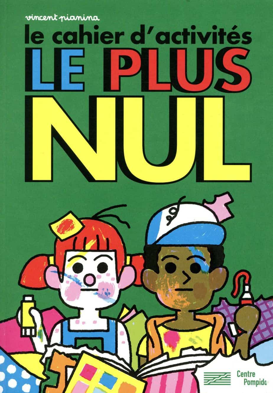
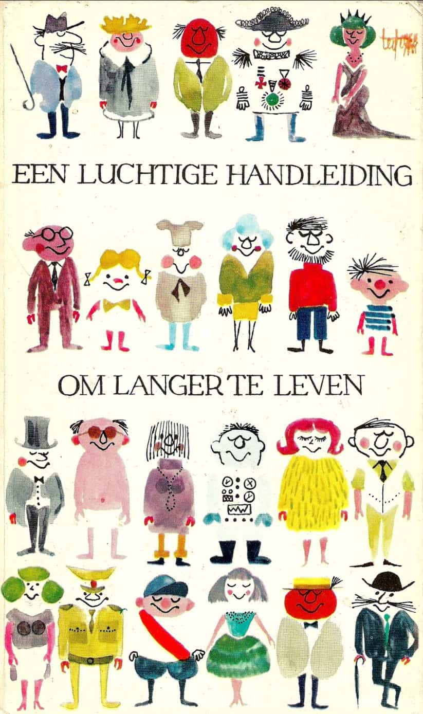
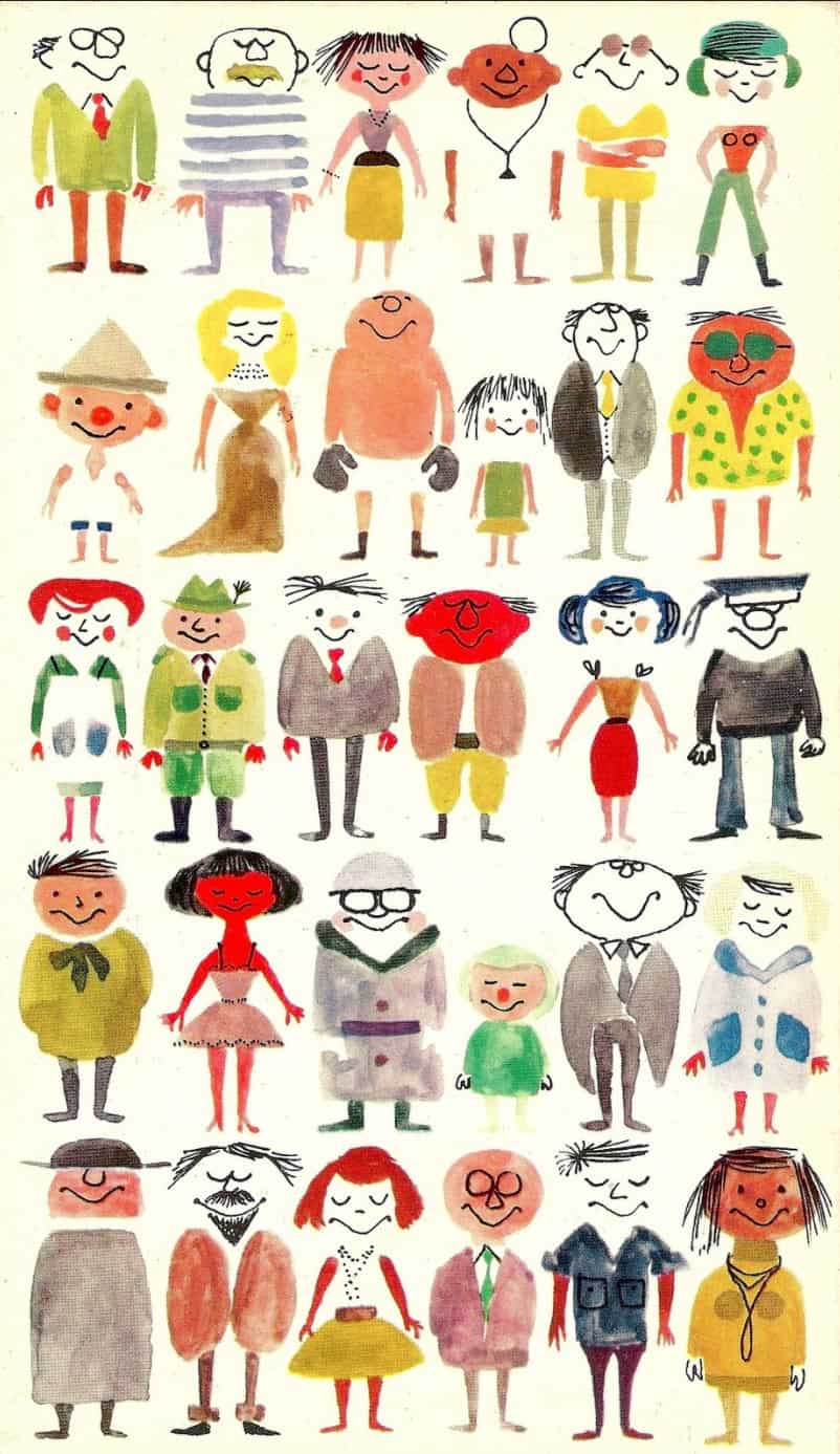
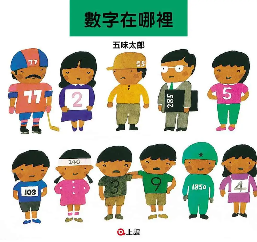
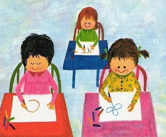
This is the most iconic and generic style. Emotions will be exaggerated on the face focusing on happiness or unhappiness. Ironically, since we see this style in books for the youngest readers, the reader needs the highest level of interpretive powers in order to understand the emotions in these illustrations.
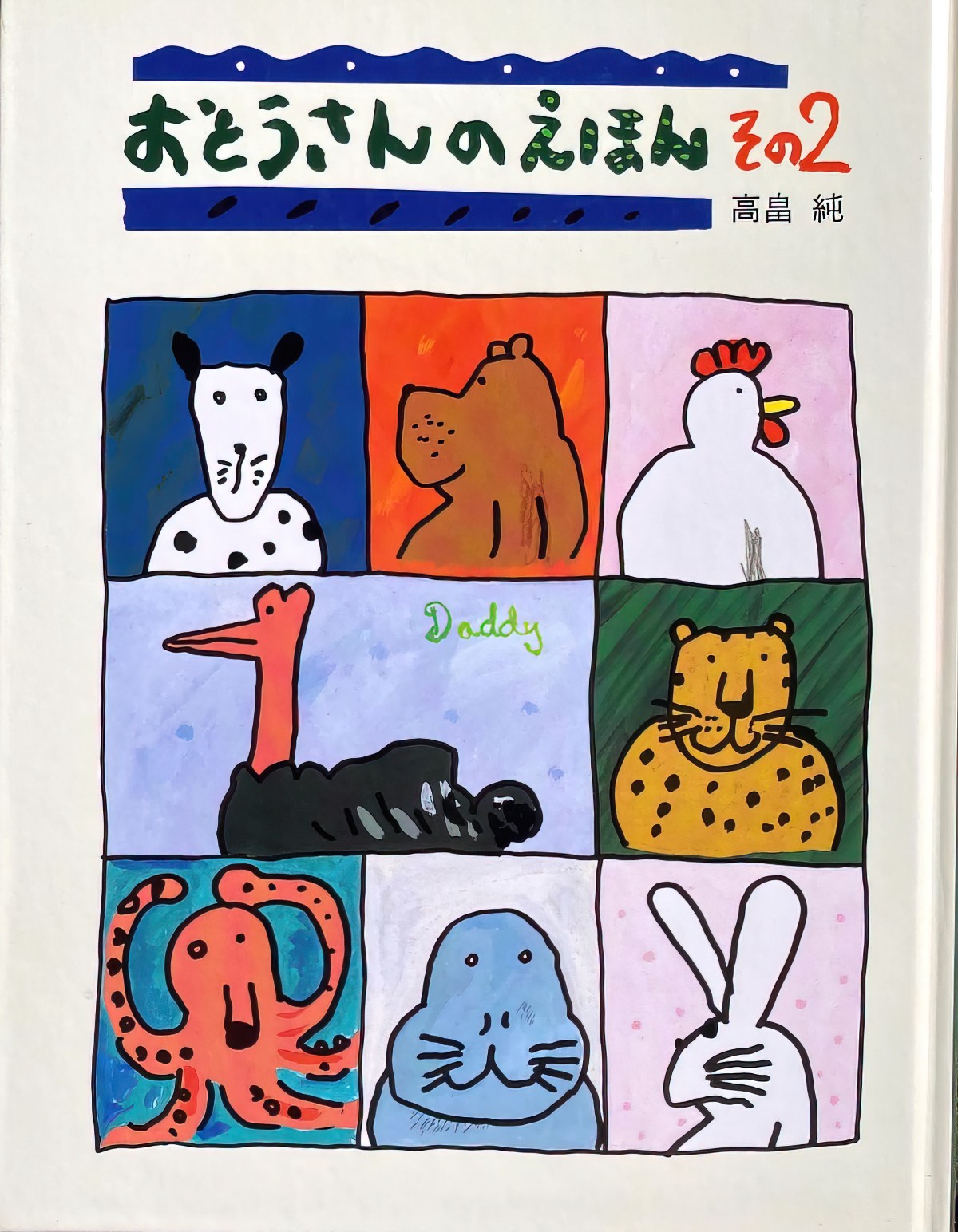
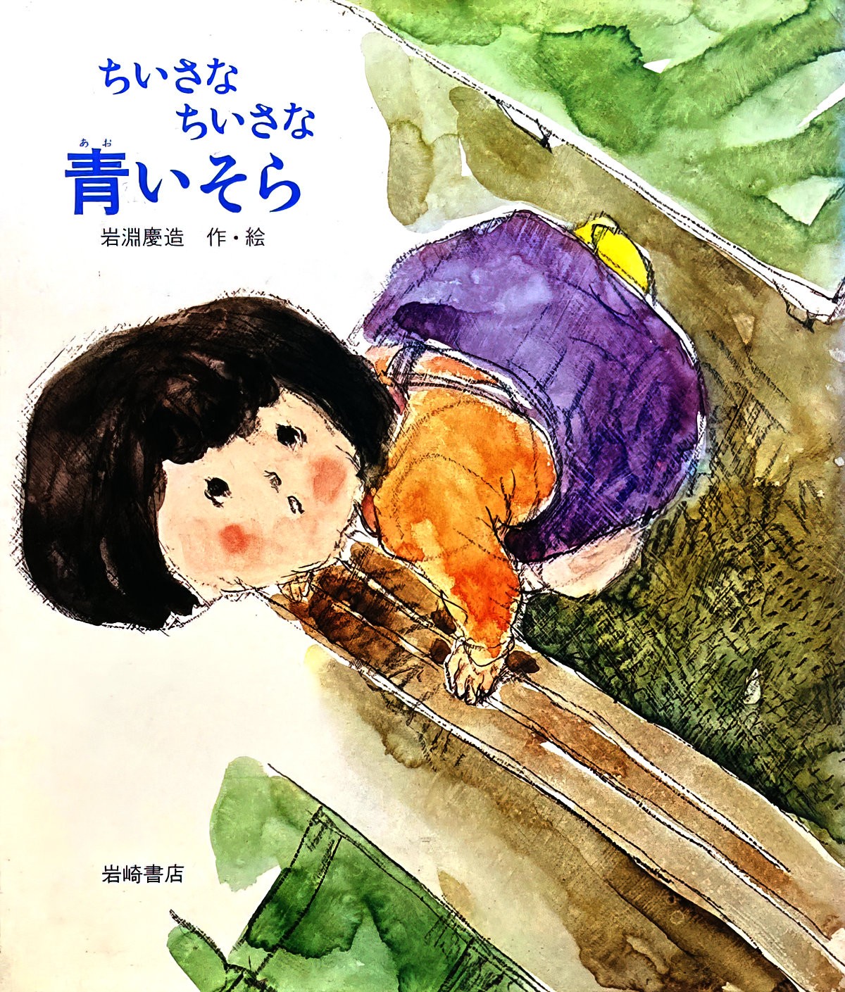
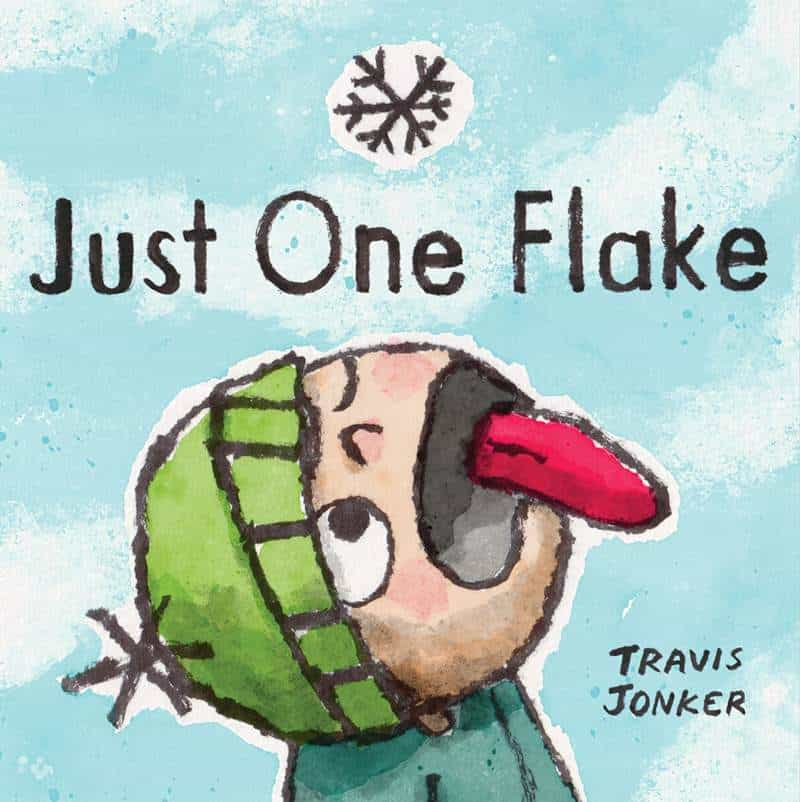
Typical Function: Well suited to social commentary, in which the reader remains detached from the characters. Also well suited to humorous stories.
Reader Engagement: Appreciative. Some emotional distance.
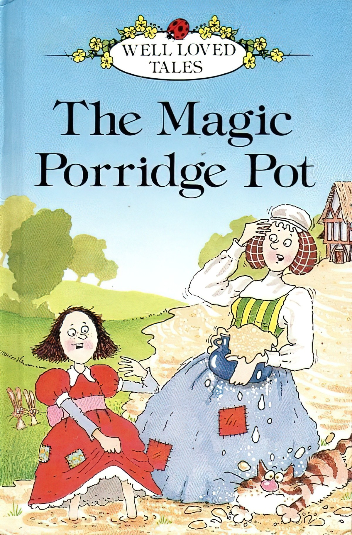
The face on the girl above could easily belong to a boy — she has been coded as a girl with her long hair and pink/red dress. Her facial expression is actually a bit ambiguous. Is she happy about all that porridge, or is it something else? The cat is clearly a caricature of surprise, depicted in motion, and the rabbits in the background look surprised. The body language of these characters is pretty simple — the arms are arranged in the way of childlike illustrations rather than as they would appear ‘in real life’. It’s difficult to describe the minimalist style without sounding as if minimalist illustrators are somehow lacking in skill, but in fact this style is perfect for a wide range of stories.
Even in minimalist character illustration, it’s often to the storyteller’s great benefit to include sclera in the eyeballs (the whites of the eye, rather than just dots).
If you look at human eyes in contrast to other animals, the sclera or white part surrounding the pupil is far larger. In most other species, the pupil takes up most of the eye. This is to obscure their eyes from predators. But for humans, a larger sclera allows us to notice the direction of each other’s gaze quickly.
Why is it you can sense when someone’s staring at you?

GENERIC
This style is more detailed than the minimalist category. There’s a wider range of emotions depicted, and not just in the face but in the whole body. The mouth will be more expressive, with corners that can be pressed/pursed/pouted/tightened towards the teeth. This is the style you want if you want the potential for the widest variations in ‘vigour’.
Generic illustrations are good for eliciting empathy from readers, who are supposed to see themselves in the picture.
Typical Function: Injunction. This means the child readers are expected to see themselves in the protagonist role and to ‘be/do like this’. (Don’t think of ‘injunction’ in the legal sense, rather from the Latin injungere ‘to enjoin or impose’ — the young readers are invited to join the characters, or to impose themselves upon the story.)
Reader Engagement: Empathic role identification. Recognition of common humanity. Characters are of the ‘every man’ type.
The eyes on this illustration from a more recent magazine version of The Magic Porridge Pot shows an exaggeratedly large head to emphasise the girl’s youth, but she has eye sockets and eyelashes and we can see that she is calm and interested in the porridge. There is quite a lot of detail in the background, illustrated so that the reader lingers on the page rather than simply existing to symbolise ‘kitchen’.
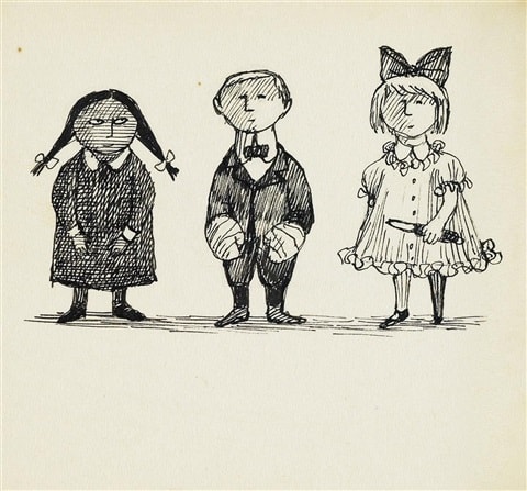
In another version of ‘generic’, you wouldn’t be able to pick them from a police line-up of people going by the same description, but their emotions are a little more nuanced than in the minimalist style.
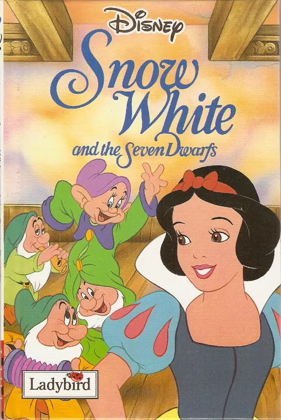
The flat colour palette of this version is down to the fact it’s a still (or using artwork from) the film version, in which early animators only had the resources to animate flat colours, though backgrounds have more detail as they don’t need to be showing constant movement. Each character here has slightly different eyes to differentiate them from each other.
NATURALISTIC
This is the most subtle, restrained and nuanced type of illustration. expressions can be read much more as those of real people, though you may notice if you read The Magic Porridge Pot that there is also the potential for ‘staged’ looking poses, as if the illustrator has used human models who aren’t great actors.
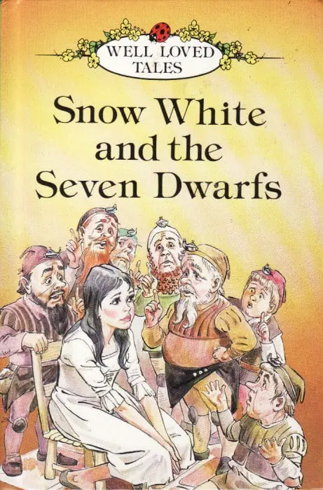
This style is more common in books for older readers, though it’s interesting to note that in the 1970s the Ladybird editions of well-loved tales were in this style, even though they were for young children. Perhaps the adult co-reader was being catered to in that case. The ‘read-it-yourself’ versions were not naturalistic.
This style is also more commonly found in stories with serious themes. It’s important in such stories that readers can accurately read characters’ facial expressions and body language.
Typical Function: Ethical Inference. This means the story invites reflection — we infer a lot from the pictures.
Reader Engagement: Personalising. Readers are called on to relate and respond to depicted others as ‘real individuals’.
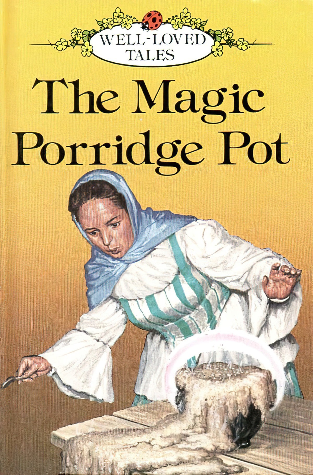
The mother in The Magic Porridge Pot looks like a real person, acting for the stage.
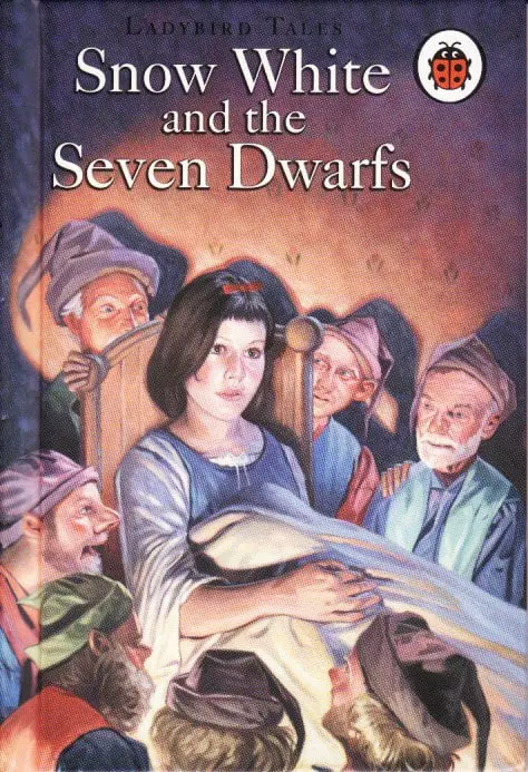
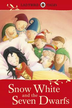
This Snow White looks like a real person. The dwarves look slightly caricatured but only because they’re from a magical kingdom — you could still pick the models from a line up. The danger in these naturalistic illustrations is that when the eyes are too detailed you end up wondering what on earth Snow White is looking at ‘off-screen’. (Also, what’s that under the blanket?)
MANNERIST
Another word I’ve seen, describing fine art, is ‘mannerist’. For instance, the work of Anne Bachelier, whose work draws from mythological and fairy themes, ‘fashions otherworldly creatures with mannerist creatures who inhabit eerie yet magical worlds.’
The following is from Visual Arts Cork:
As a whole, Mannerist painting tends to be more artificial and less naturalistic than Renaissance painting. This exaggerated idiom is typically associated with attributes such as emotionalism, elongated human figures, strained poses, unusual effects of scale, lighting or perspective, vivid often garish colours.
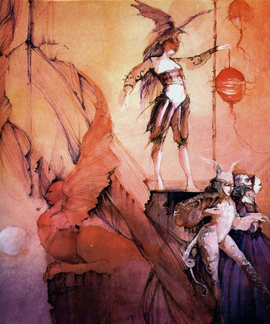
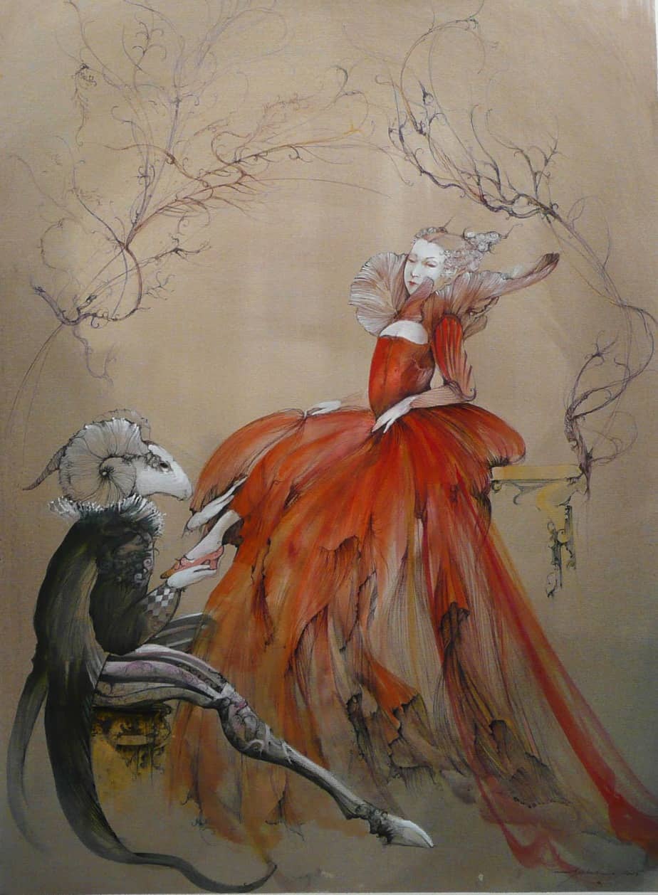
This style of art is well-suited to melodramatic narratives. Perhaps it’s all in the poses. These mannerist characters look as if they think they are the centre of the universe, which is of course how people did think during this period. This style of art is also well-suited to art in which characters undergo some kind of transformation, which is why Anne Bachelier illustrated Alice’s Adventures in Wonderland. Her phantasmagoric illustrations were perfect.
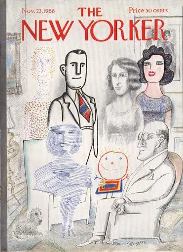
The illustration for the New Yorker cover in the header is by Saul Steinberg, 1968.
