In picture books as in all illustration, the artist can use light source and shadow to create atmosphere, or even to add to the story.
Complement this with my post on creating aerial perspective.
OVERLAPPING SHADOWS
Overlapping shadows tend to suggest the power of the objects that cast them over the objects they overlap.
Perry Nodelman, Words About Pictures
Nodelman offers as example Errol Le Cain’s clever use of shadow in Beauty And The Beast. In that book, the Beast has an unusually shaped shadow which overlaps the father’s foot. This tells the reader that the father is afraid of the Beast.
LIGHT SOURCE
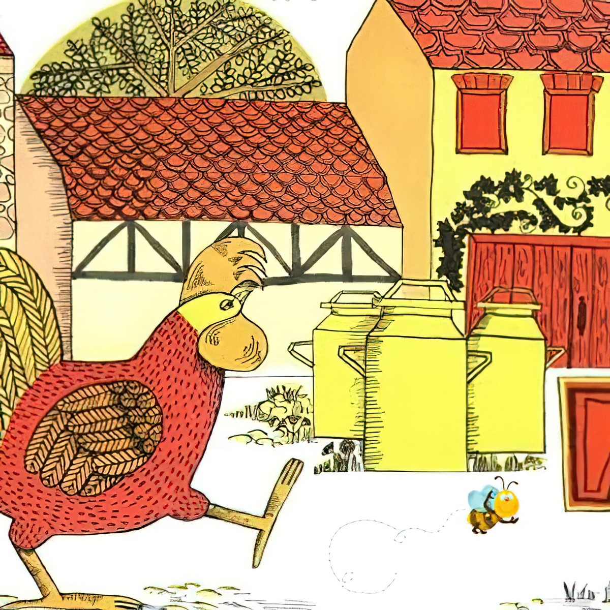
That shadows can cause overlap effects suggests the importance of light sources for creating relative weight and focus. Not all pictures imply a source either inside or outside the picture for the light that illuminates the scene—books like Rosie’s Walk deliberately avoid any hint of darkness, and everything is bathed in the same even, cheerful light. But pictures that do imply a light source focus our attention on the objects in the light—and, if it is depicted in the picture, the light source itself.
Perry Nodelman, Words About Pictures
The verso image
The light above the door highlights the text without even seeming to. The light coming from the TV should really be casting a different sort of shadow from the boy lying on the floor (the shadow should be cast behind him rather than in front) and the girl, who is emotionally distant from this otherwise cosy scene, casts no shadow whatsoever. The colours are warm and this could easily be a cosy living room scene, but the shadows at the edge of this room combine with the off-kilter perspective to create an uneasy atmosphere.
The light implied by pictures may come from sources both inside and outside the pictures. Like the bright lamps often seen in Nijinsky, an actual light source depicted in a picture draws attention both to itself and to what it casts light on.
For example, each of the lamps in the scene of a theoretically happy family evening nevertheless lights only one of the Nijinsky children, and so implies their isolation from one another.
The light that shines onto Brian’s face from an unseen but implied sun as he peers through a window in The Salamander Room emphasizes the way in which the window itself, its borders jutting out from the rest of the picture like a jet taking off, offers an opening into the bright and free world outside. An implied light from the rear of a picture places characters in front of it in shadow, and Human takes advantage of this to place the evil brothers in shadow throughout The Water of Life; but when the good brother first meets the dwarf, the light comes from the front and illuminates his face.
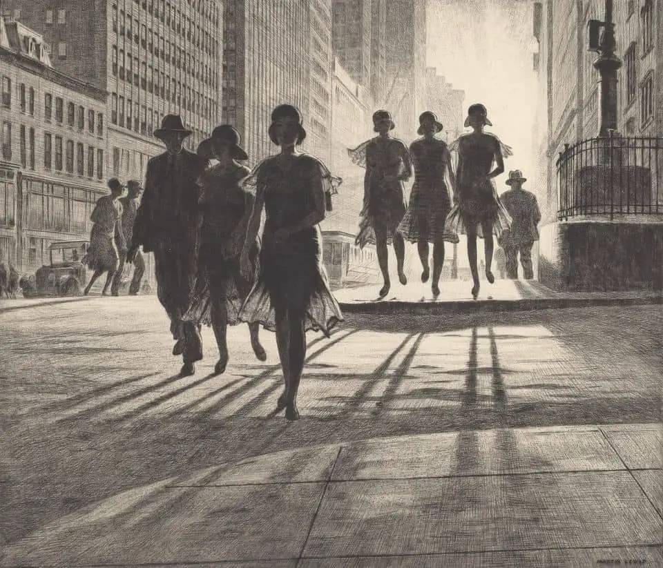
Viewers expect light to fall from above, and therefore variations from this convention, such as those Van Allsburg uses in The Polar Express and M.P. Robertson uses in The Egg, create an atmosphere of strange mystery.
The Pleasures of Children’s Literature by Nodelman and Reimer
The recto image
Again, heavy use is made of shadow, though we can’t see — or even guess — at any light source. The light seems to be coming out of the opaque wall. The reader senses that there’s something inside the wall (aided, of course, by the huge clue in the title.) The light sources throughout this book are unknown and illogical, but also foreshadow the story. The reader doesn’t know what’s about to happen but we feel appropriately uneasy.
Gyorgy Kepes [Hungarian artist and art theorist] suggests that we expect light to fall from above, so “every shift from this standard light condition is registered and interpreted by us as an exaggeration of spatial dimensions”.
Perry Nodelman, Words About Pictures
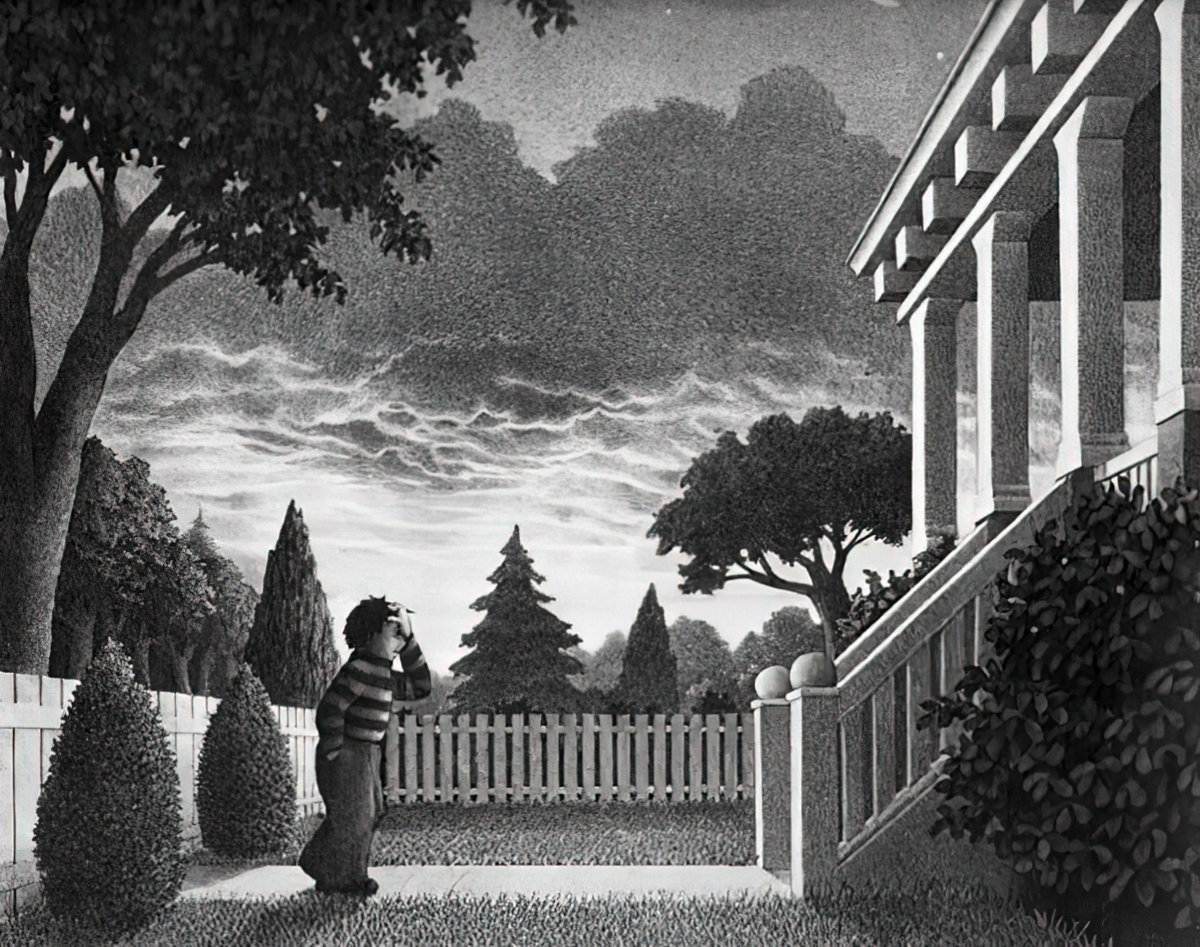
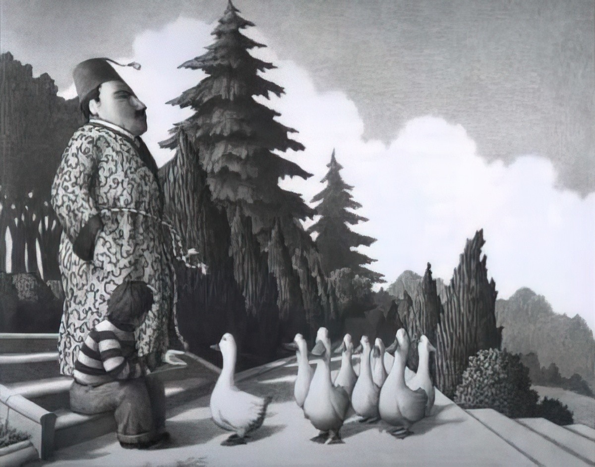
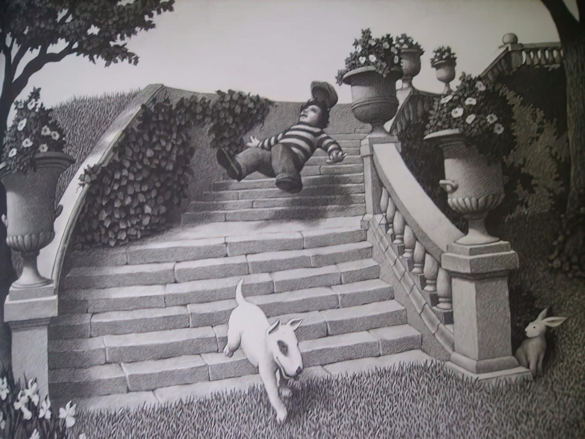
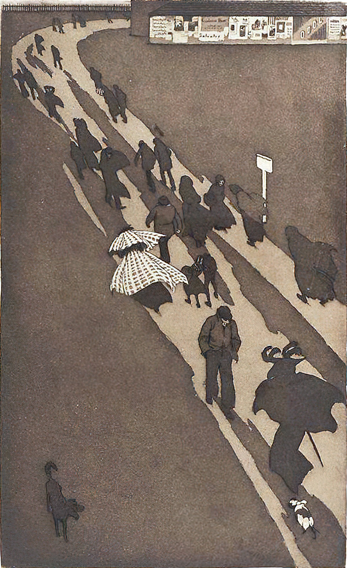
In The Garden of Abdul Gasazi, Van Allsburg switches the light source on each page.

OCCLUSION
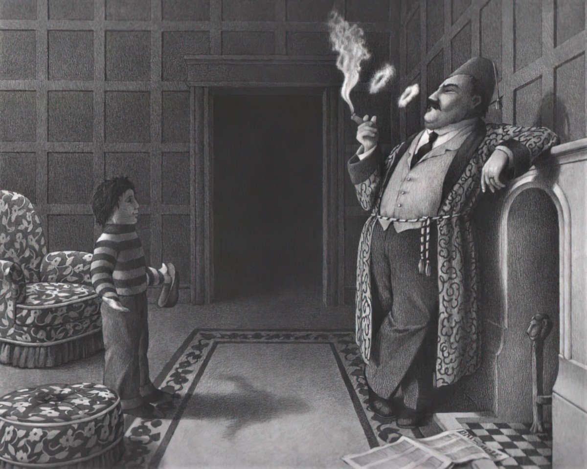
Occlusion always creates visual tension.
Rudolf Arnheim, Art and Visual Perception
What is occlusion anyway, when we’re talking about art, and not dentistry or meteorology?
Occlusion is rarely discussed as a major issue in art, yet it could be regarded as the major issue in depicting a three-dimensional scene on a picture plane. By occlusion is meant that in any view of a scene some surfaces are hidden in part by nearer surfaces.
Occlusion Issues In Early Renaissance Art
SHADOWS AS METONYMIC
First, what is a metonym? A metonym is a part that stands in for the whole.
- Suit for business executive
- The turf for horse racing
- Canberra for Australian politics
- The breast for motherhood
- The kitchen for home
In picture book illustrations, sometimes we see an image of a part and this, too, is meant to stand in for the whole.
A choice is set up between a depiction of a character that is complete (realised by inclusion of the head, which is so important for recognition) and a depiction that is metonymic (realised by only a body part, silhouette or shadow.)
Reading Visual Narratives by Painter, Martin & Unsworth
When does an illustrator show the whole thing and when to show only a part? The inclusion of a head with facial expression imparts more meaning, of course, than if you’re only showing a shadow.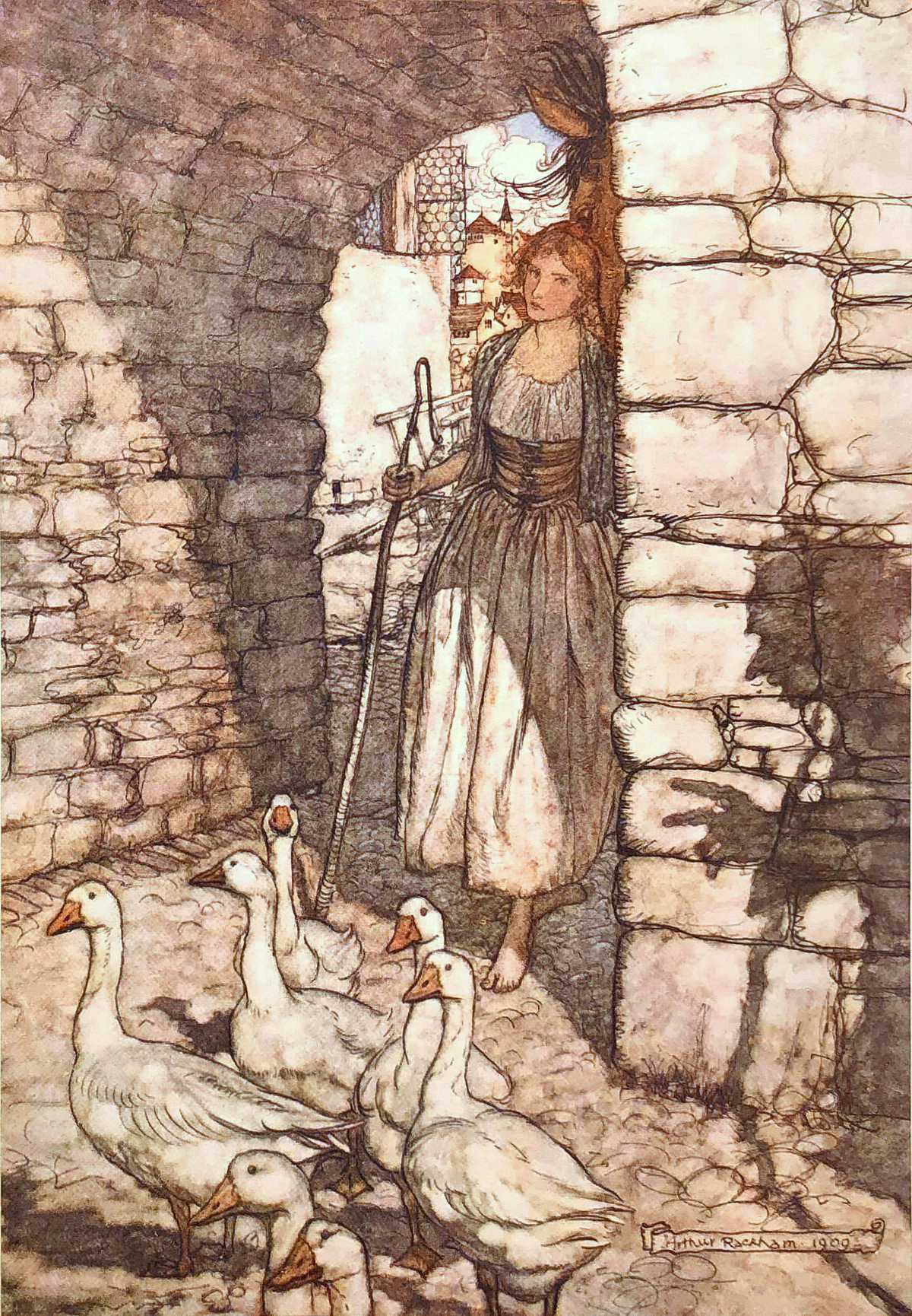
This choice is all to do with focalisation: What does the illustrator tell the reader to look at? But what else must we notice about the picture? Inclusion of someone’s shadow shows that although that character was there before, now they have gone. This cuts out the need for an interstitial image showing the character actually leaving.
Similarly, a verbal description of a character as an attractive young Australian girl with a healthy tan commits more meaning than one describing her simply as a girl.
Reading Visual Narratives by Painter, Martin & Unsworth
SHADOWS AS MORPHED REFLECTIONS
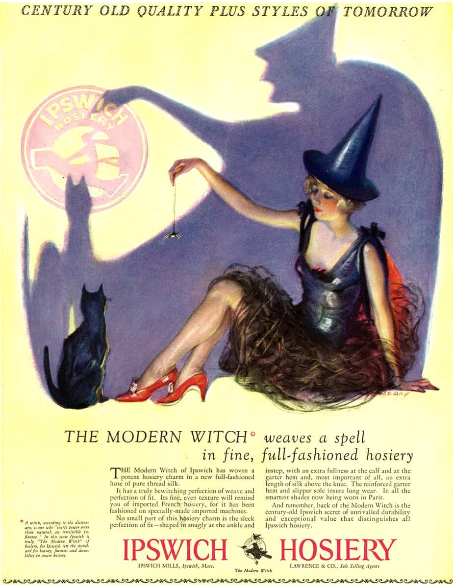
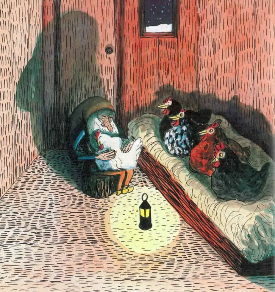
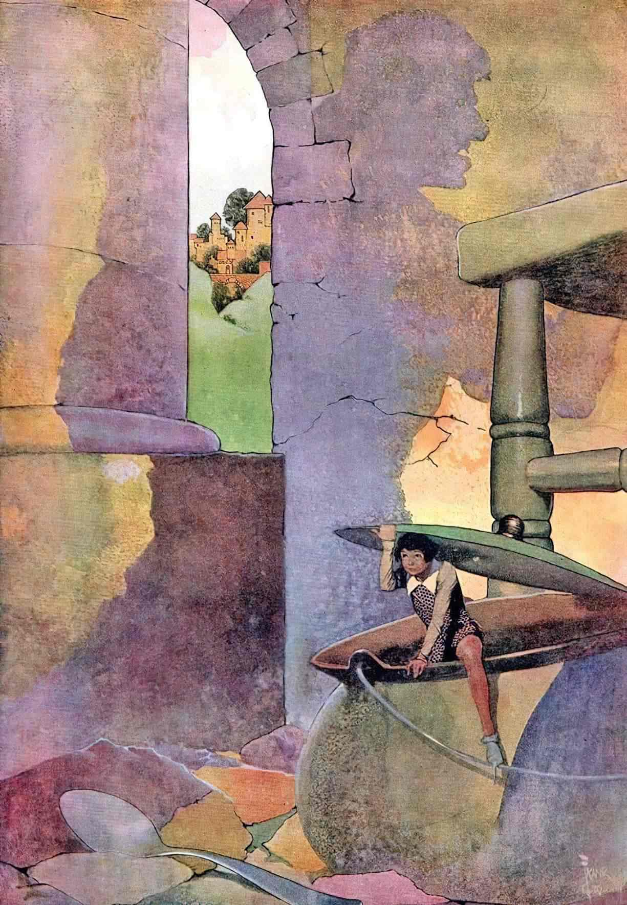
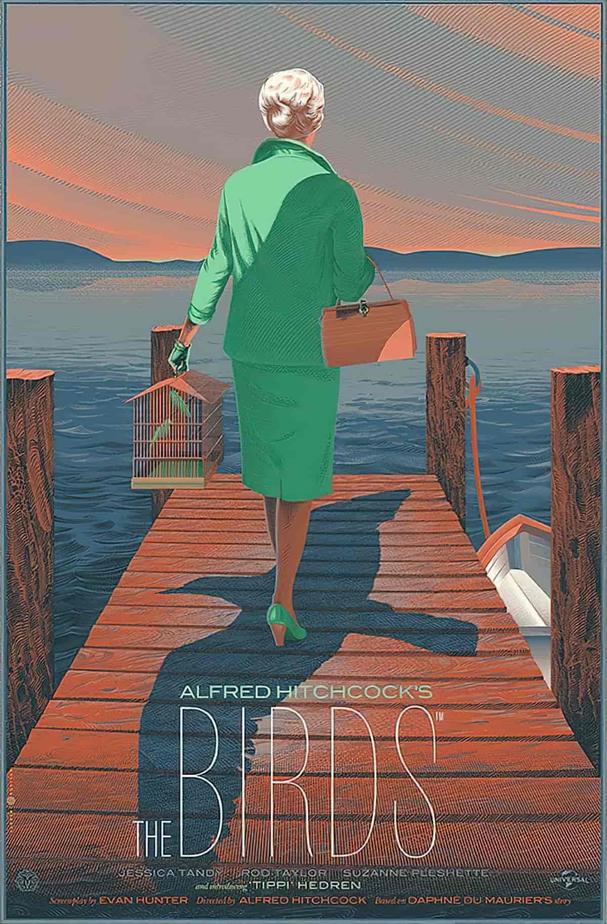
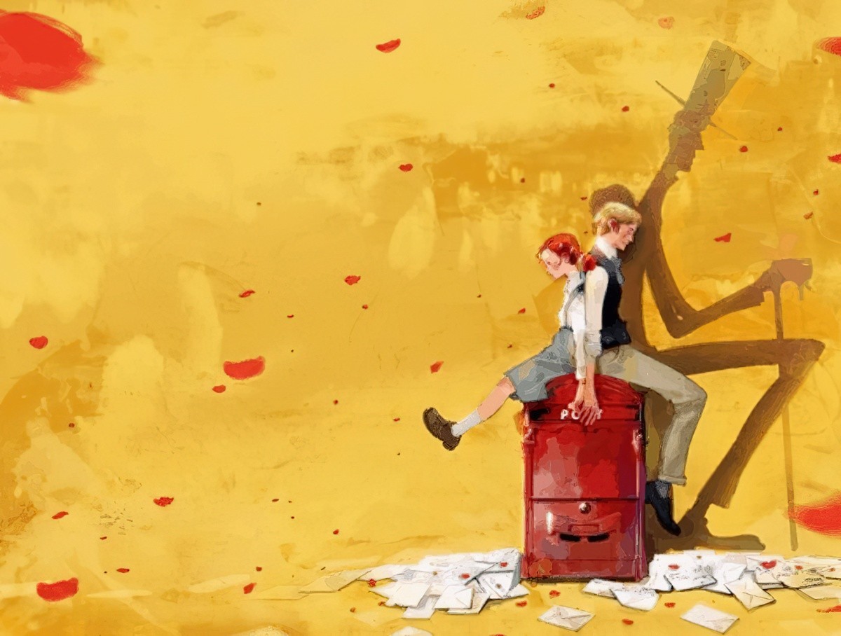
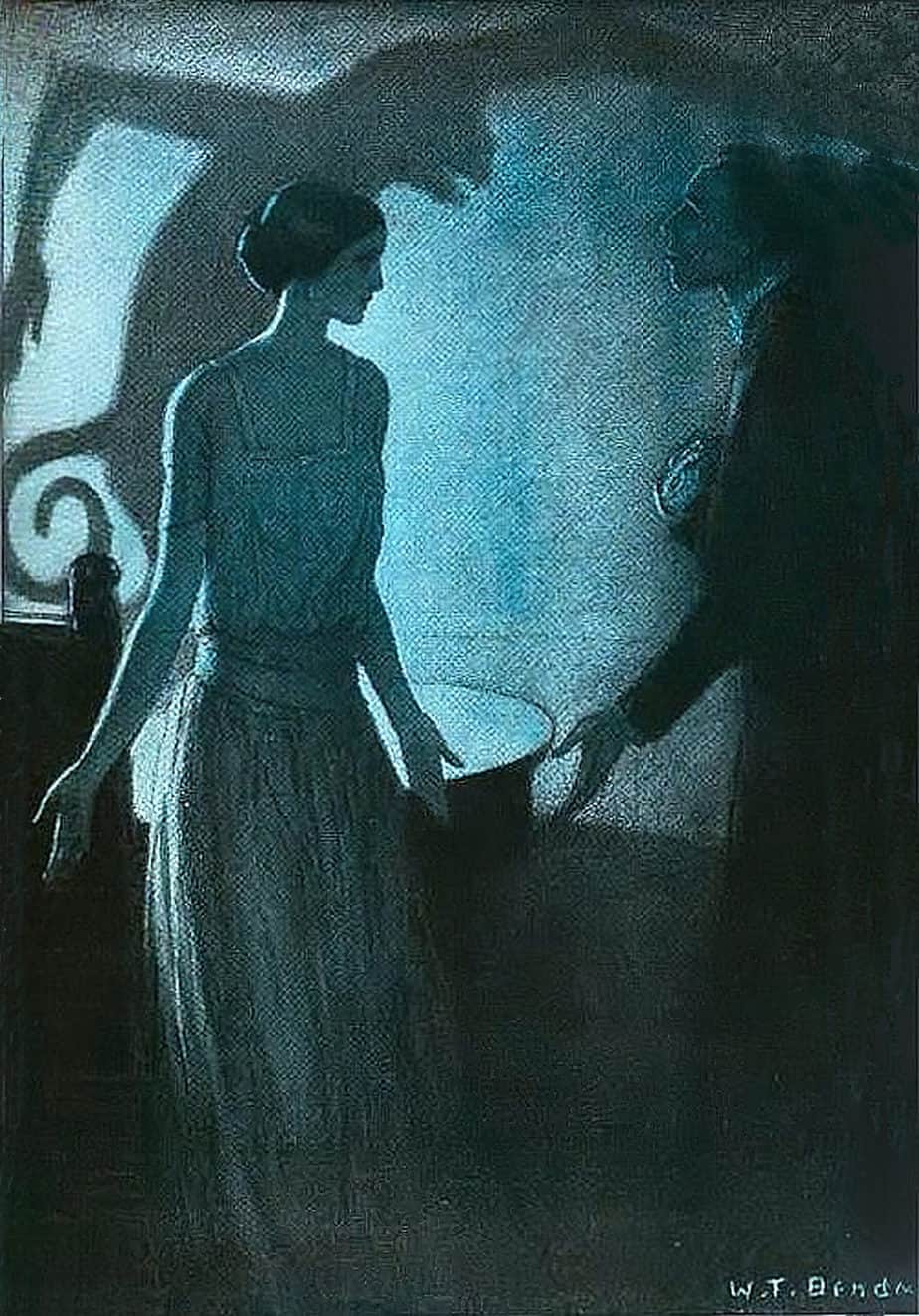
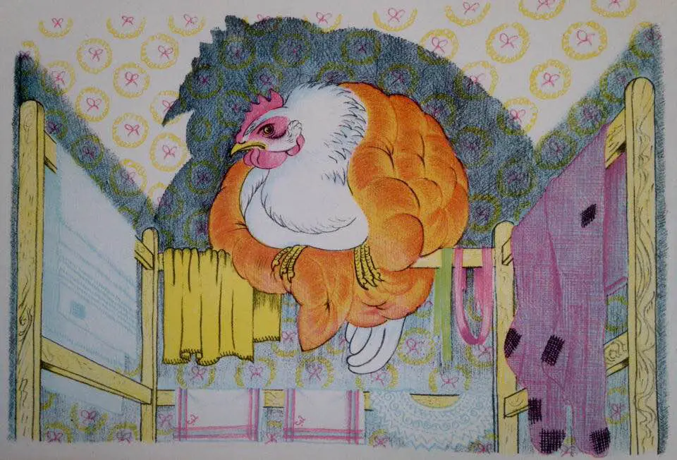
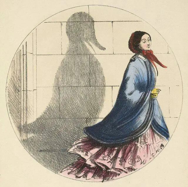
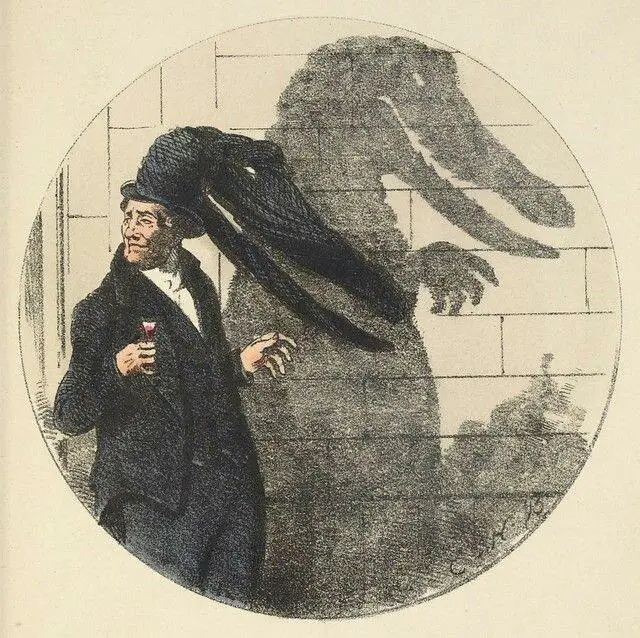
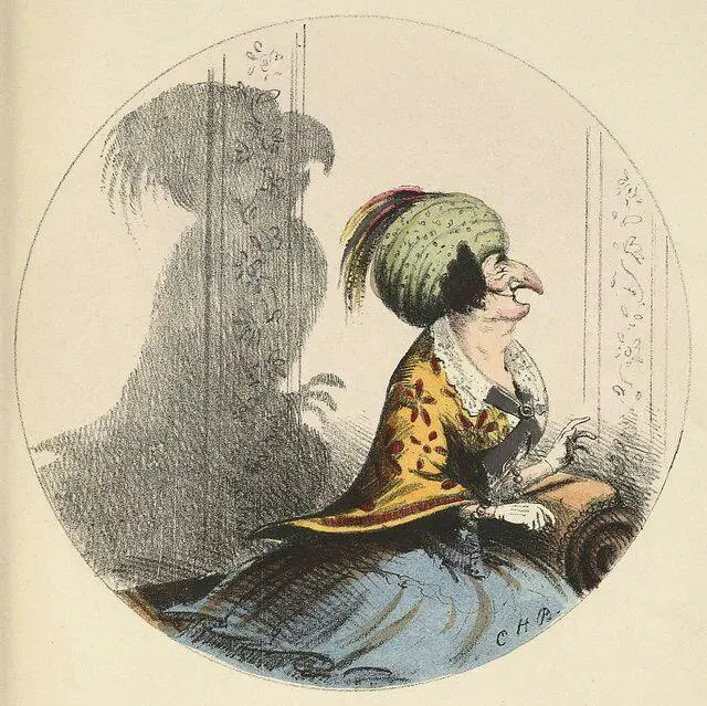
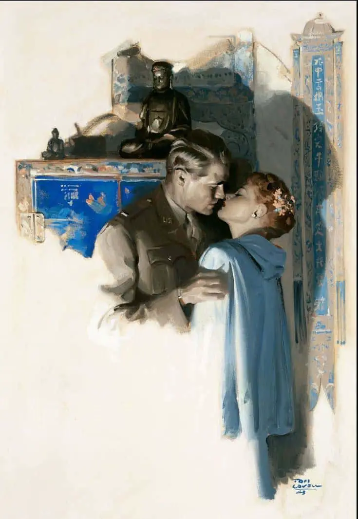
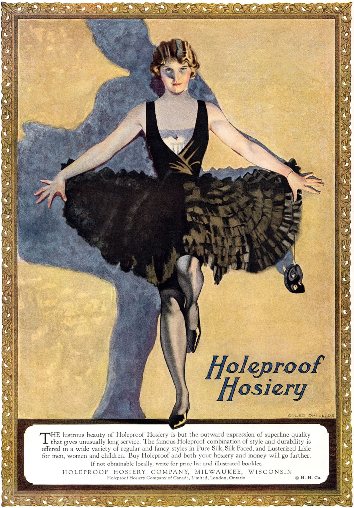
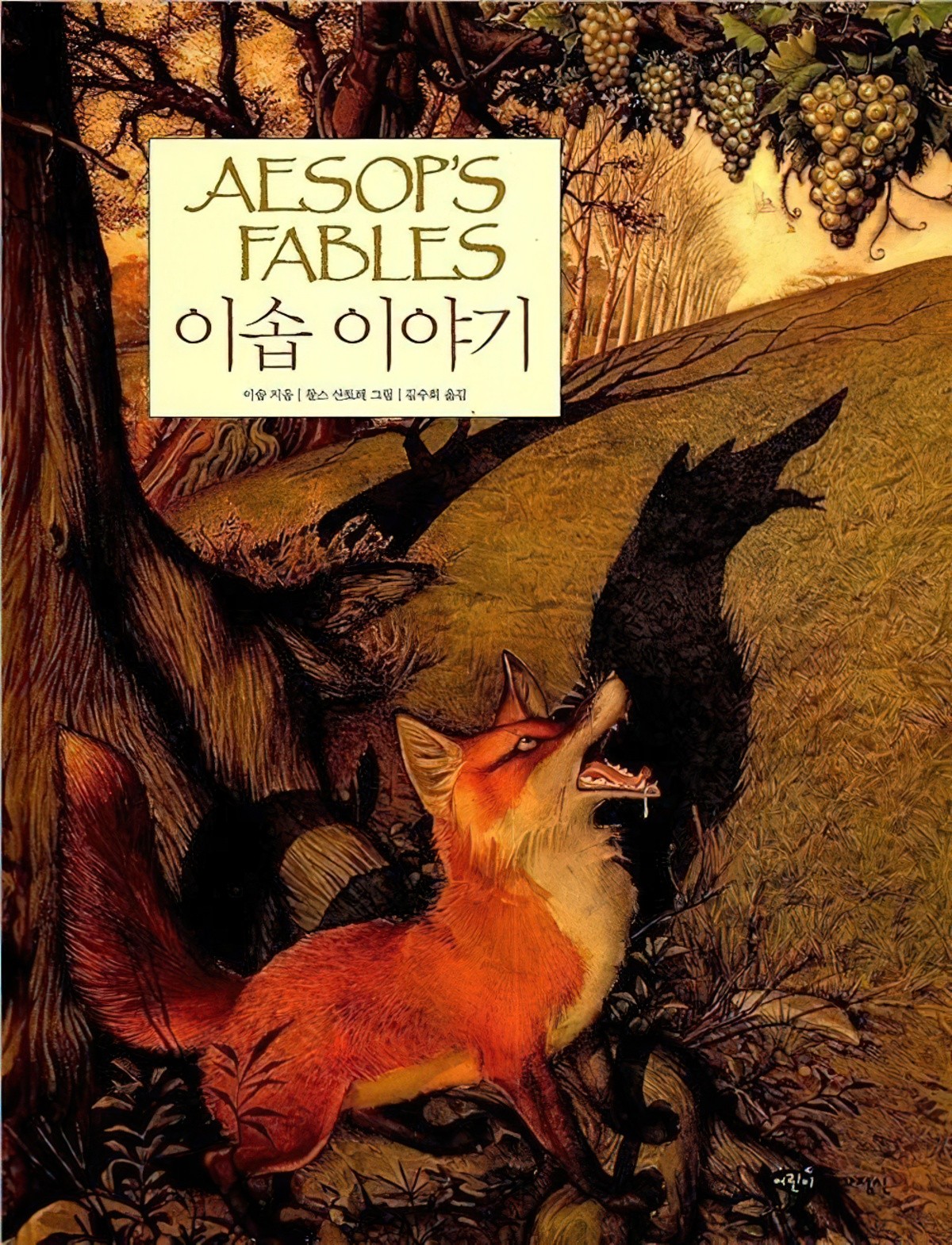
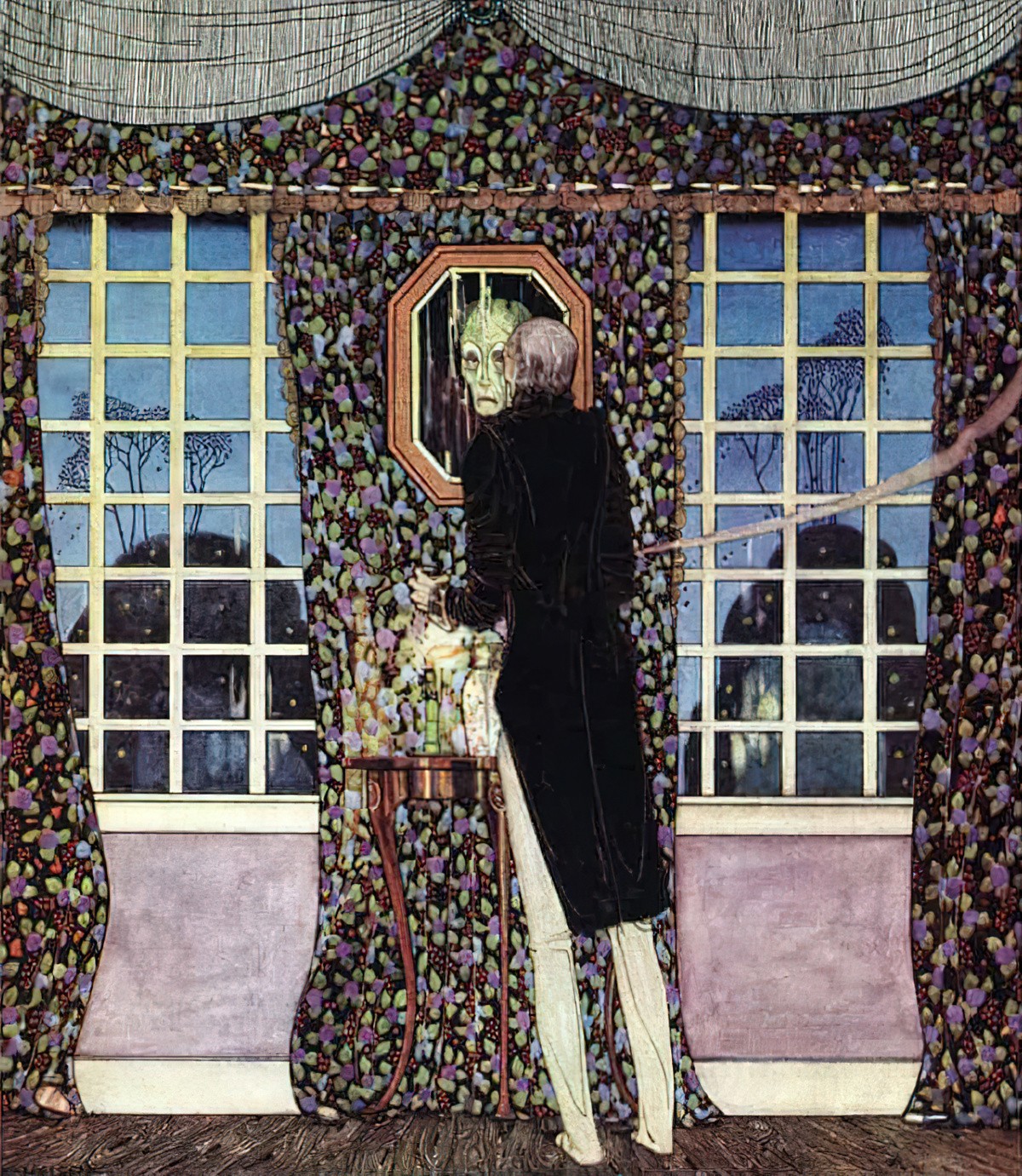
A trick sometimes utilised in picture books is seen in the two images below, in which the shadow cast differs from the person/object casting the shadow. It’s generally used for ominous effect, but could also be comical. I use it in our picture book app Midnight Feast to show how the main character is angry at being sent back to bed.
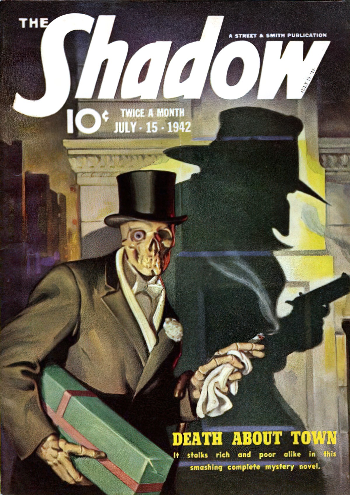
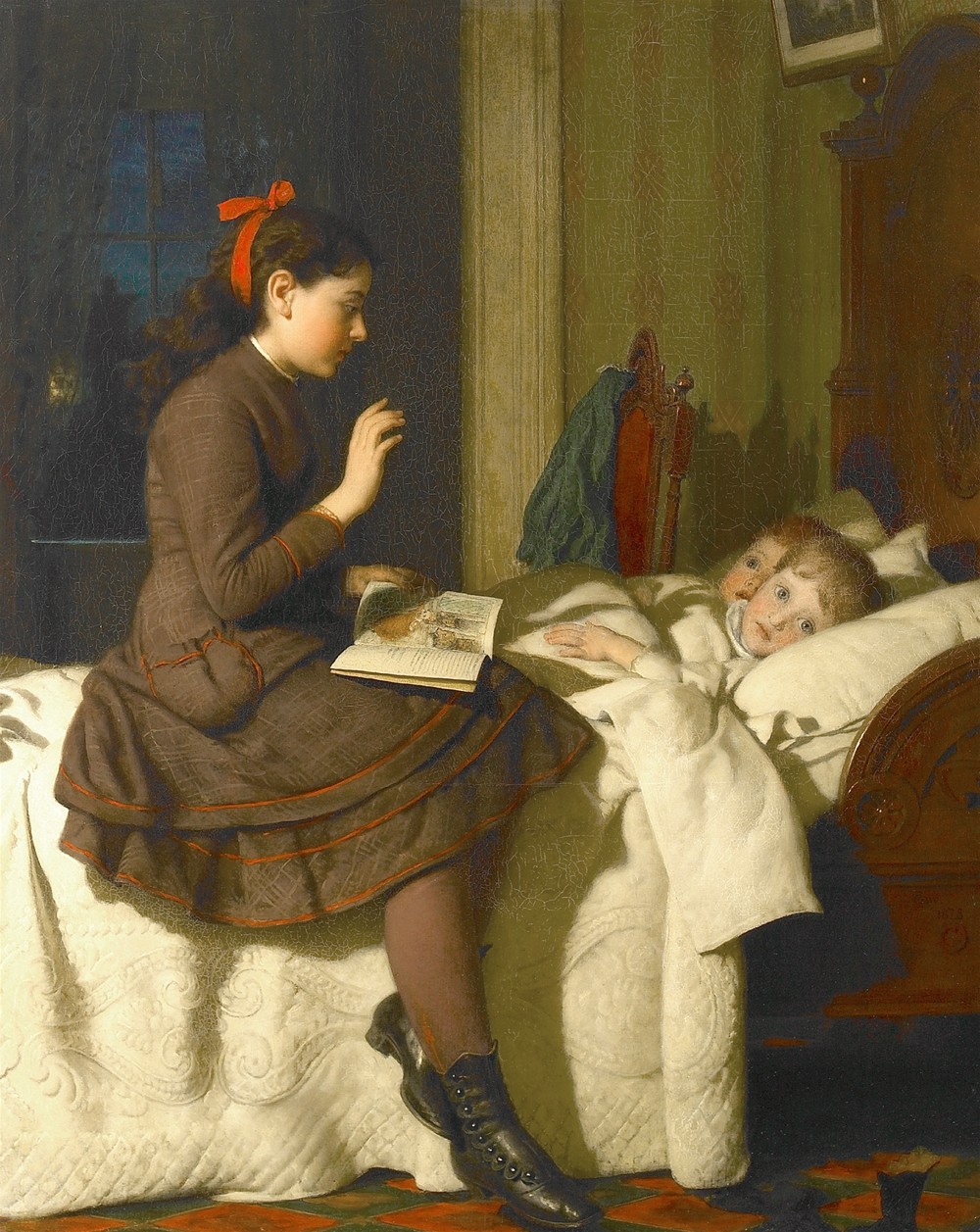
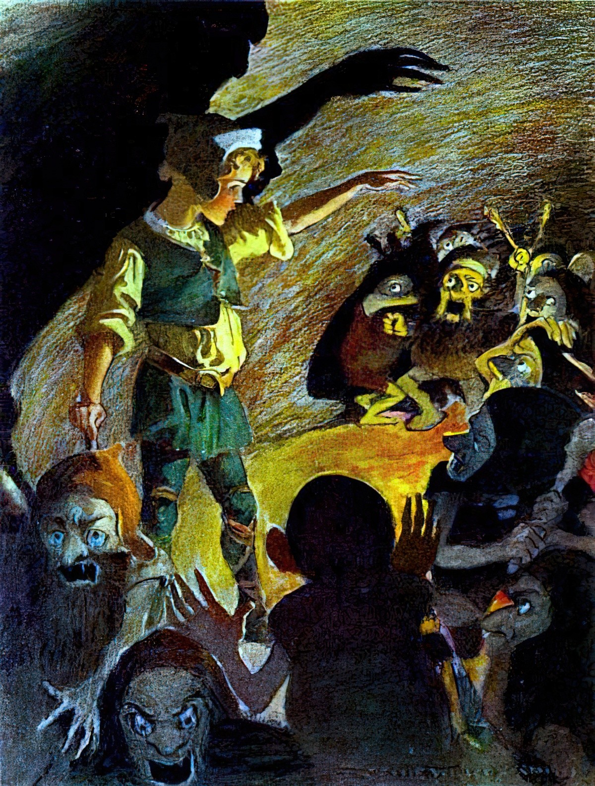
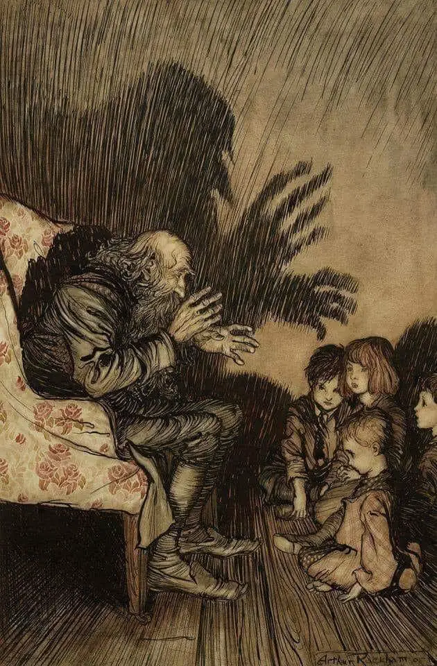
Shadows cast against walls in illustration tend to make a character look larger than life. This can be utilised to horror effect. Below, a big sister tells little brothers a bedtime story. The boys are clearly terrified.
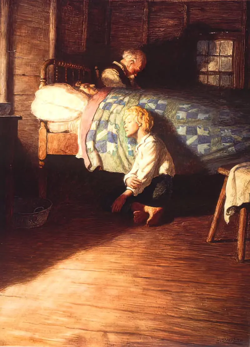
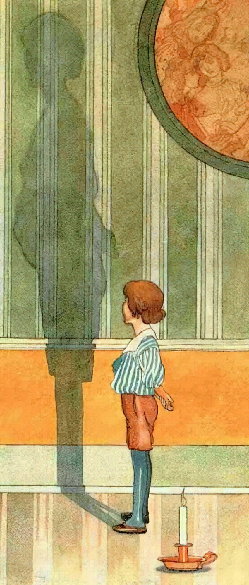
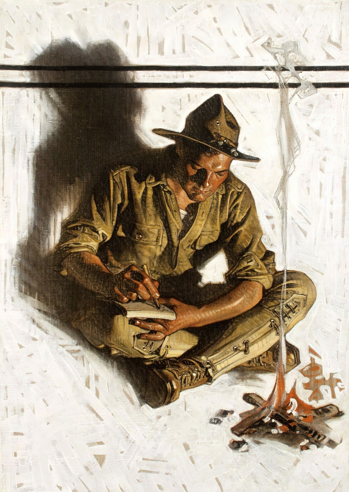
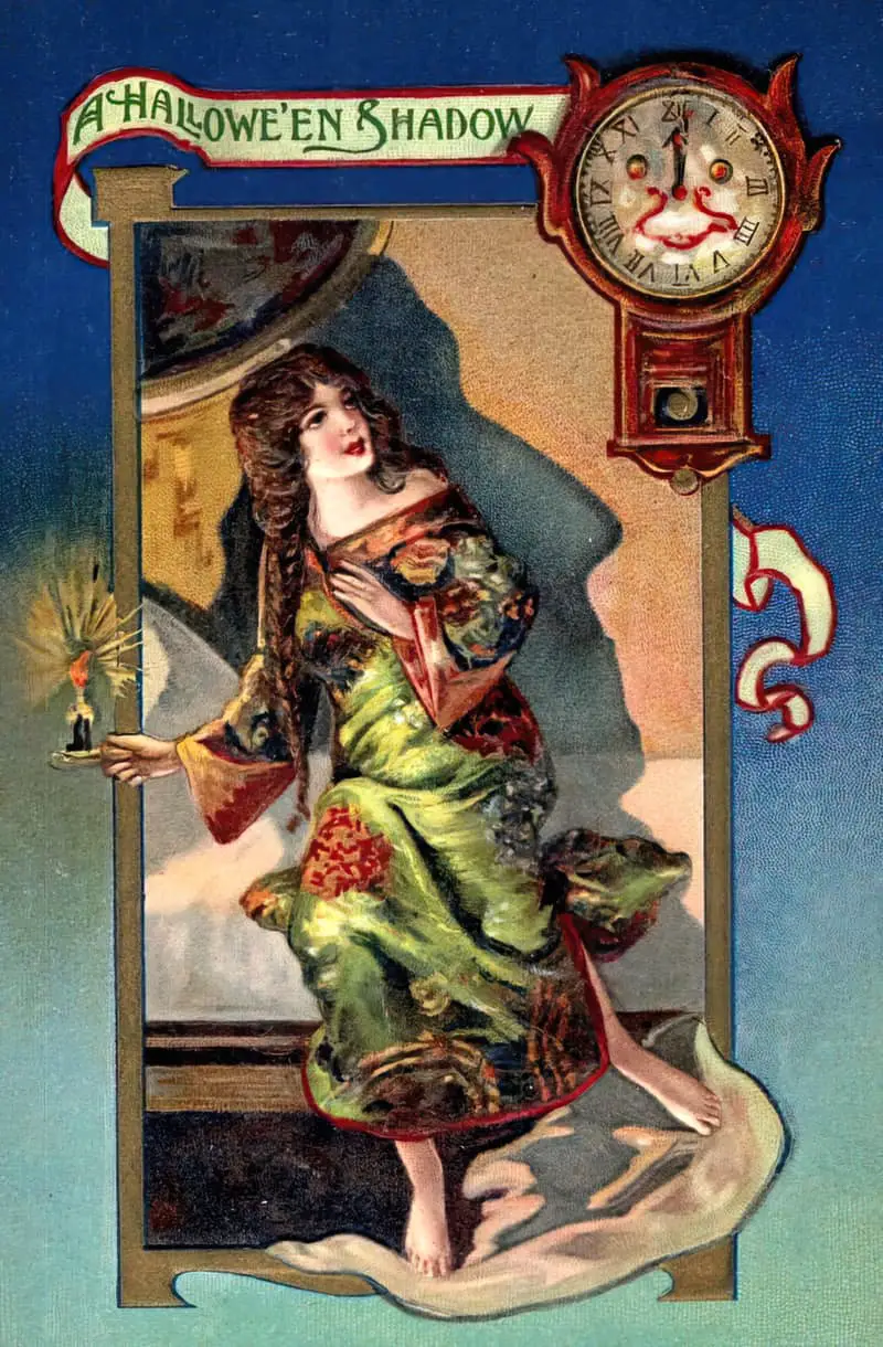
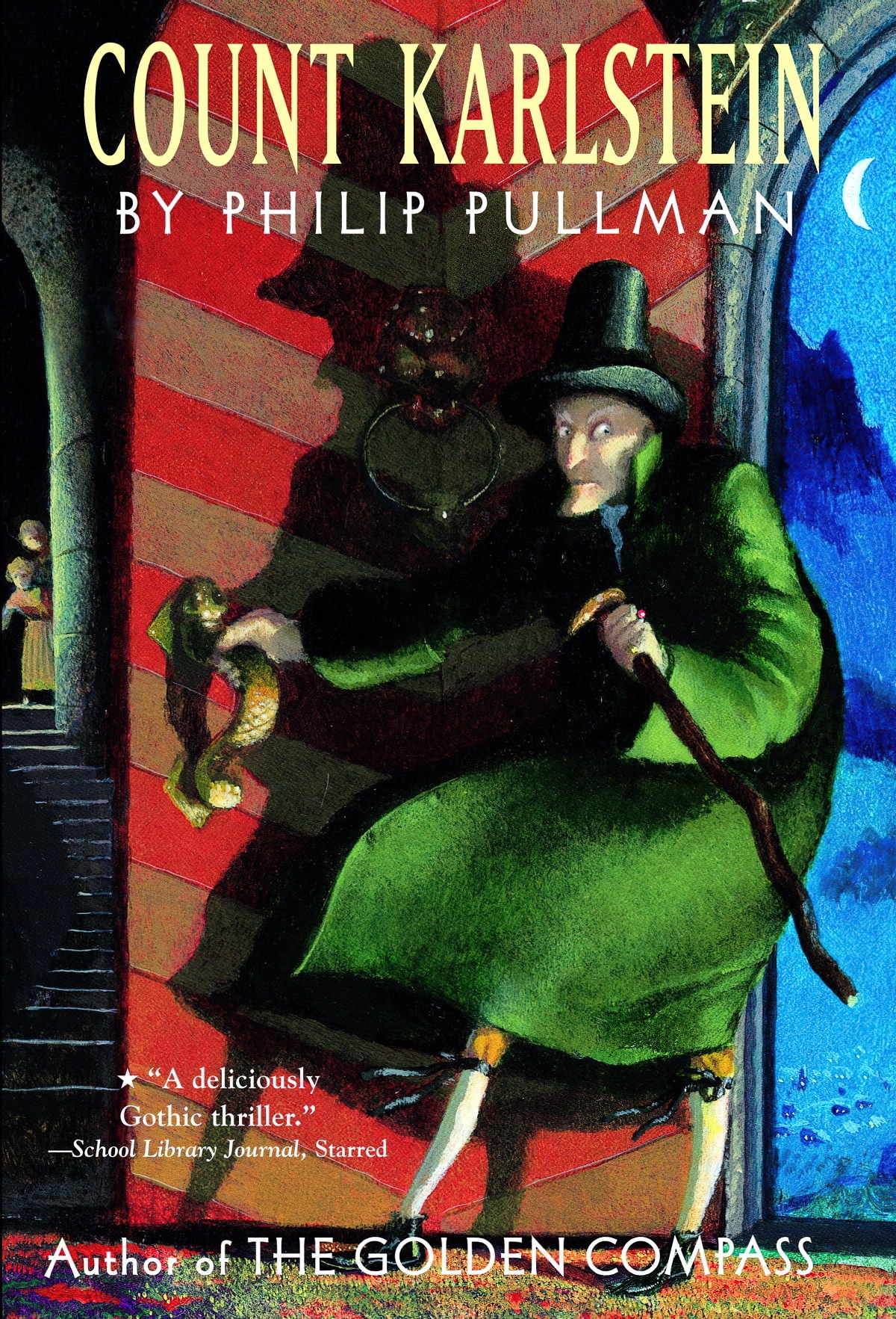
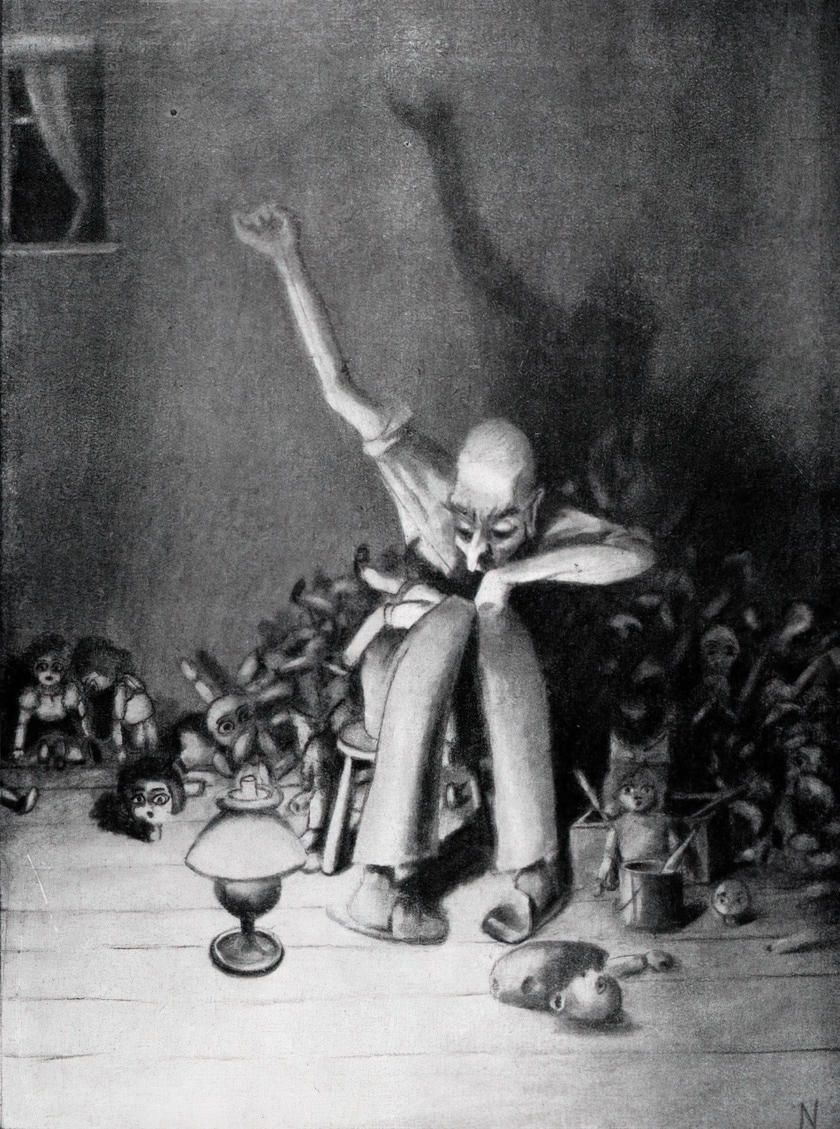
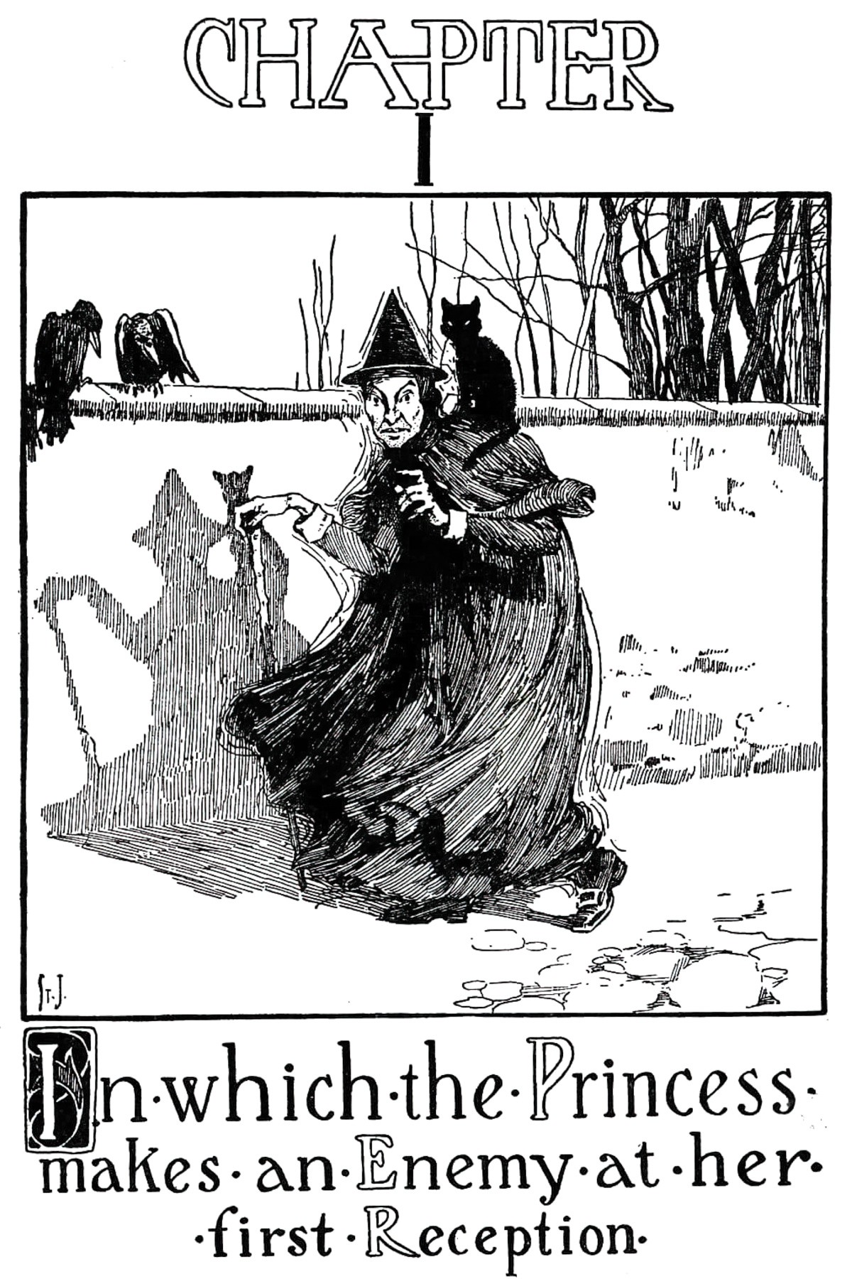
The shadow in the Arthur Rackham illustration below catches the eye more than the head of the man.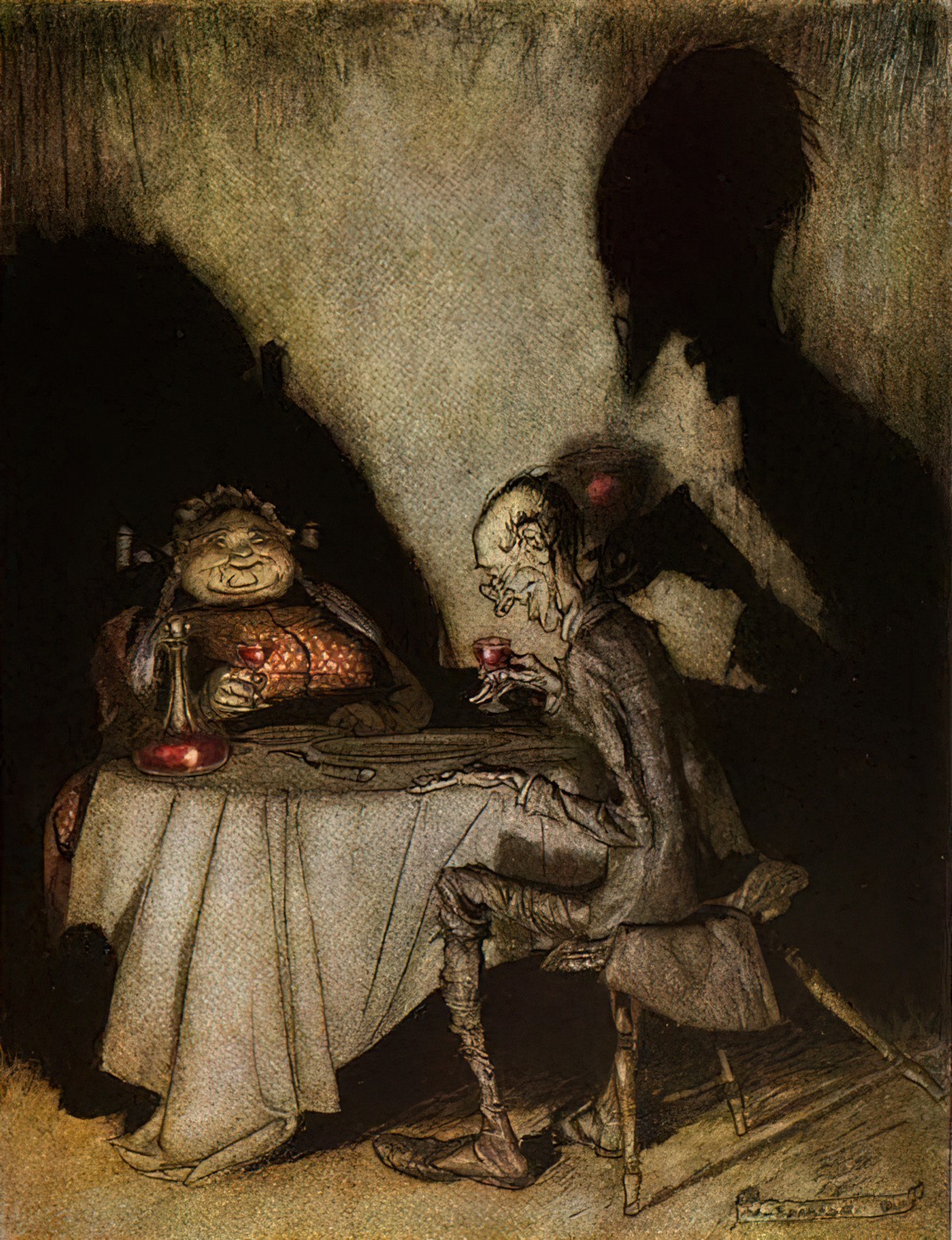
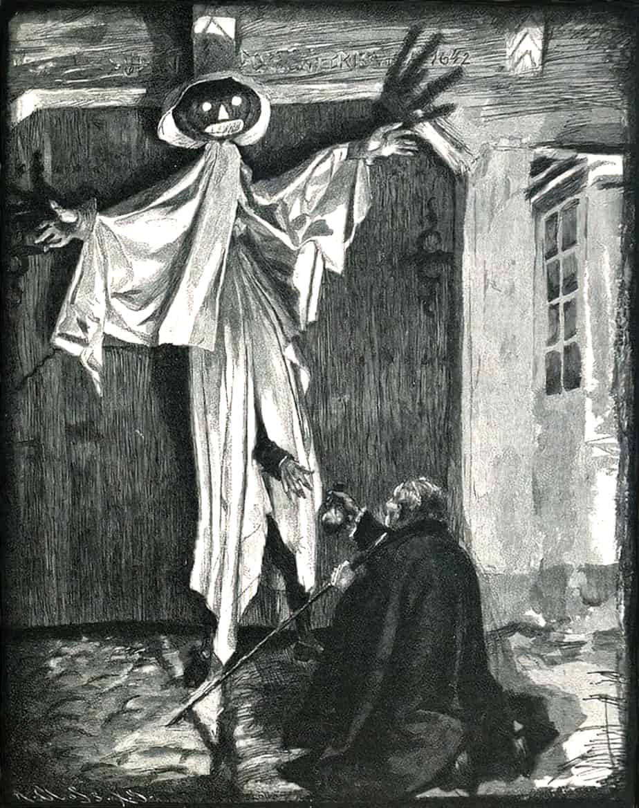
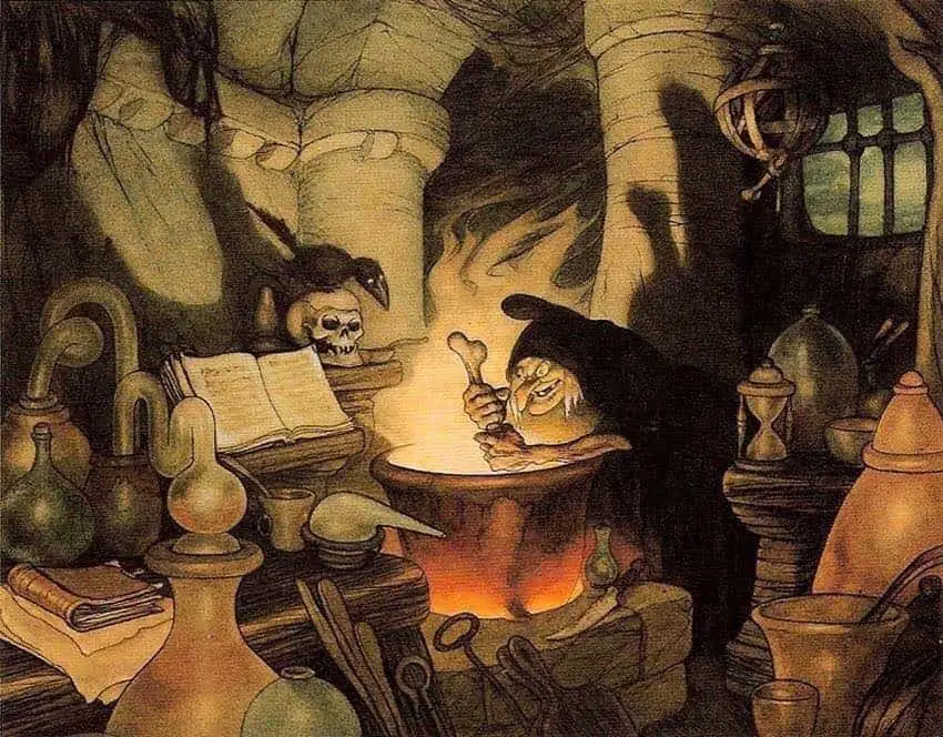
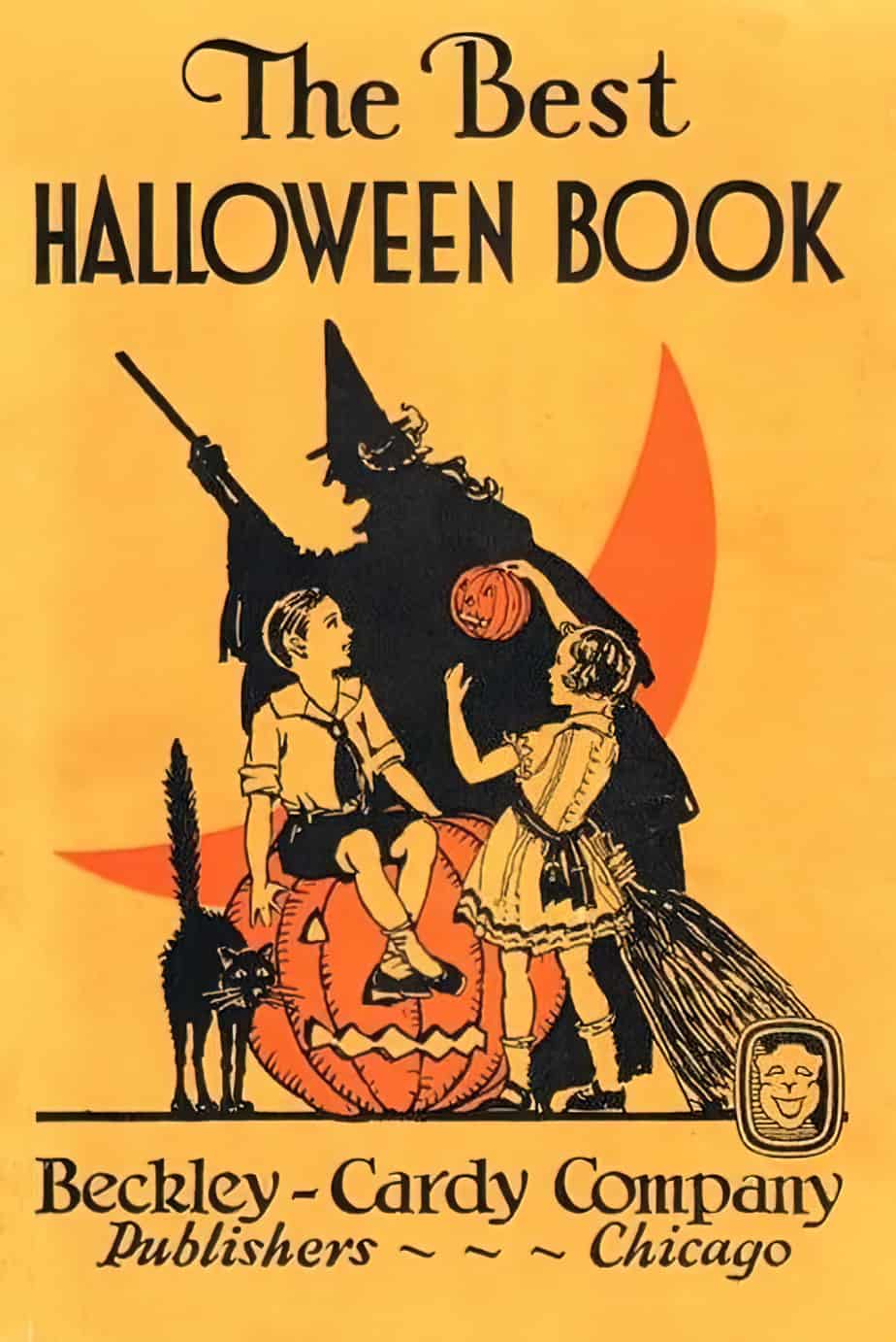
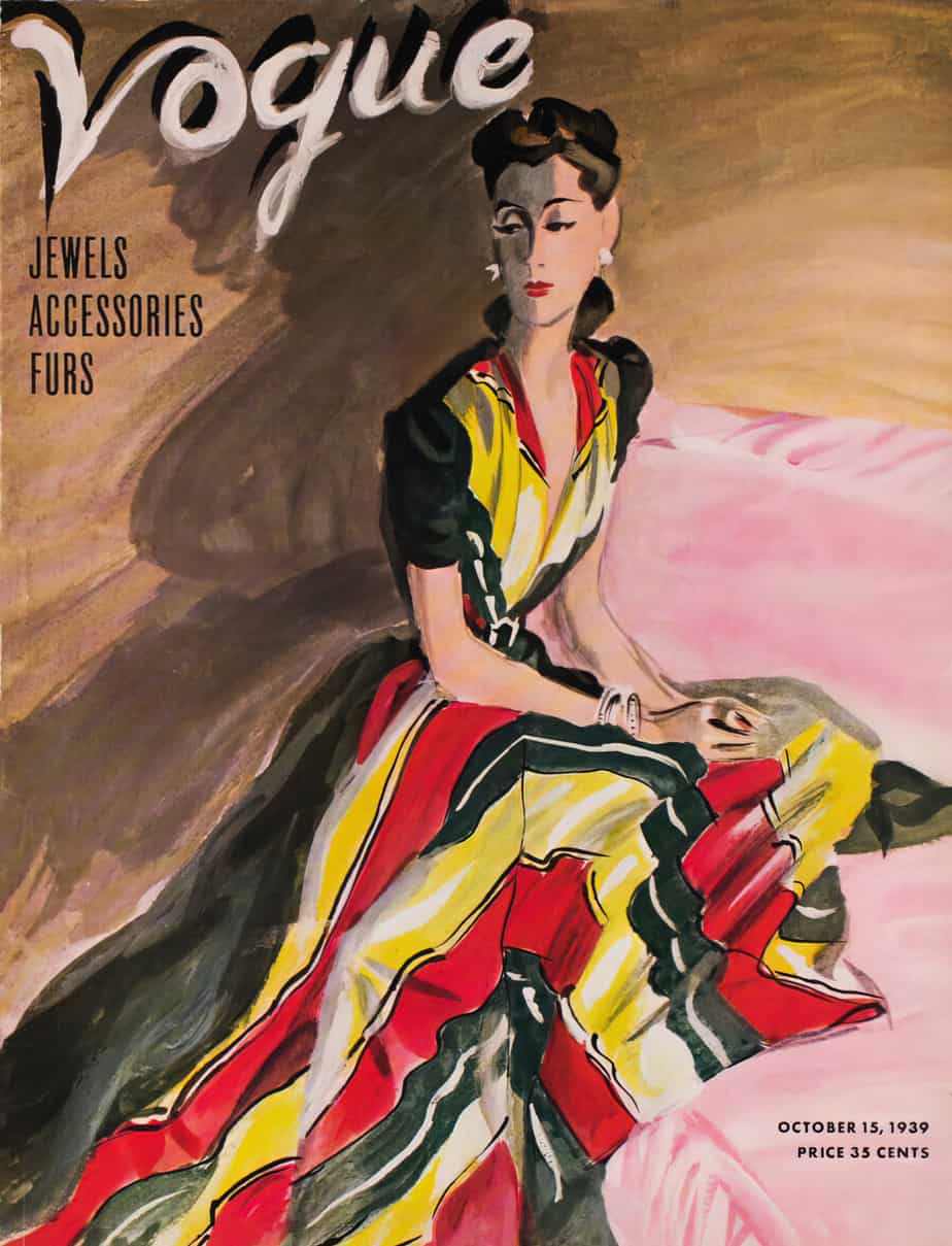
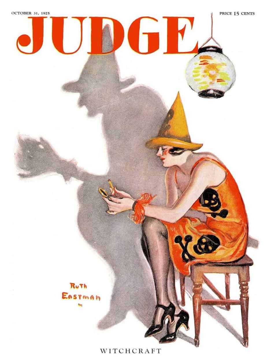
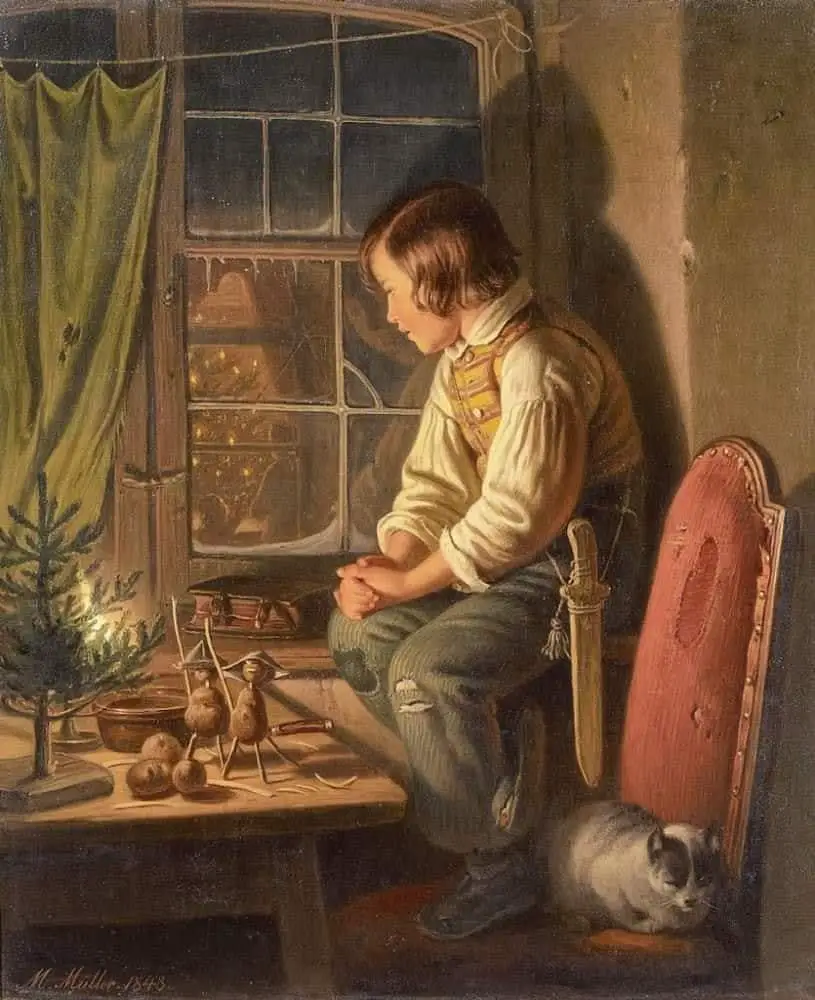
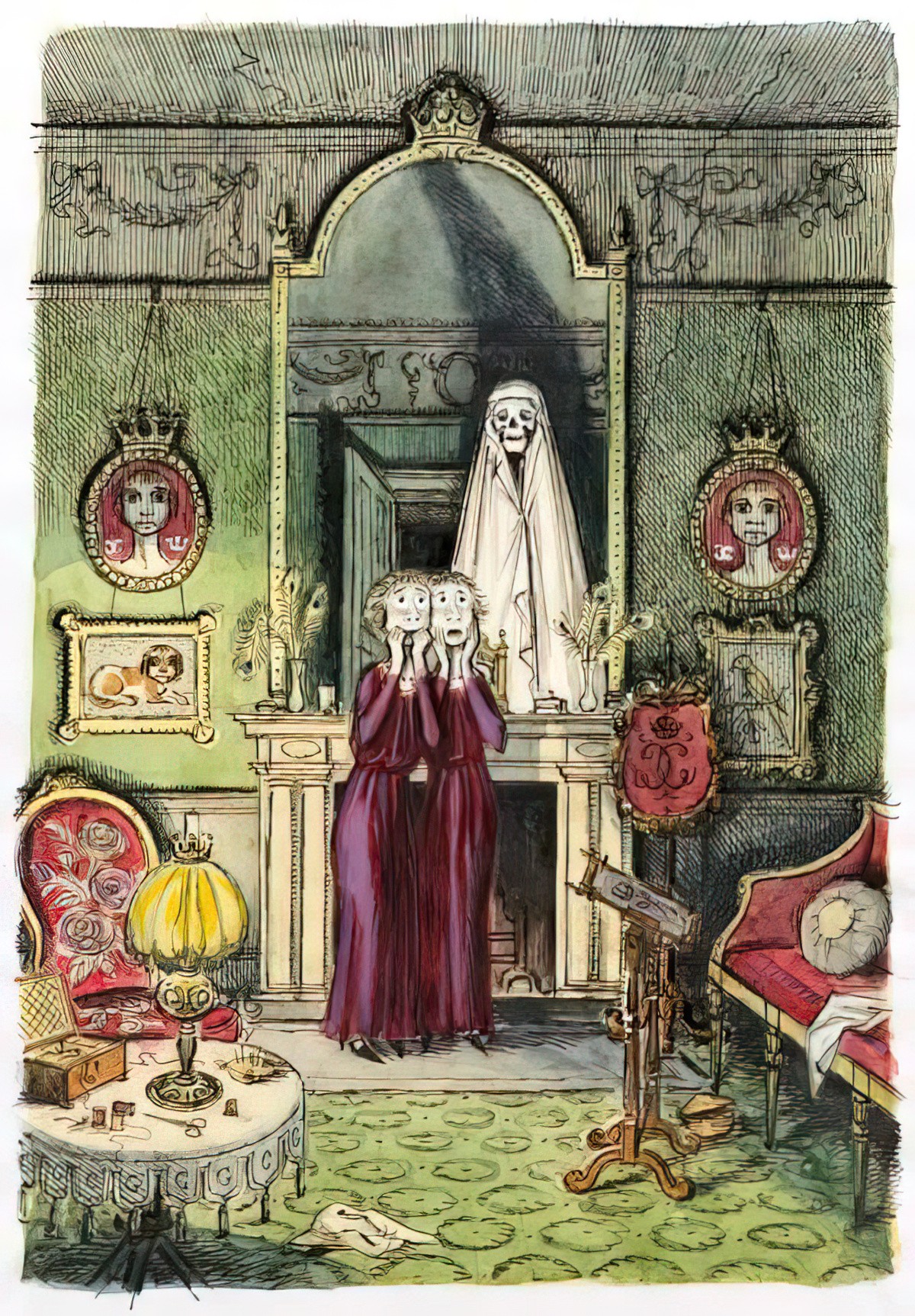
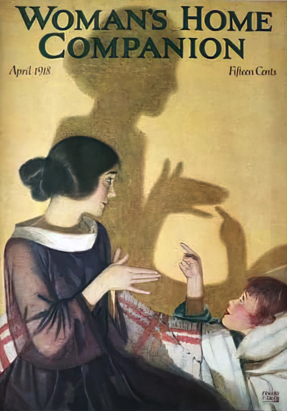
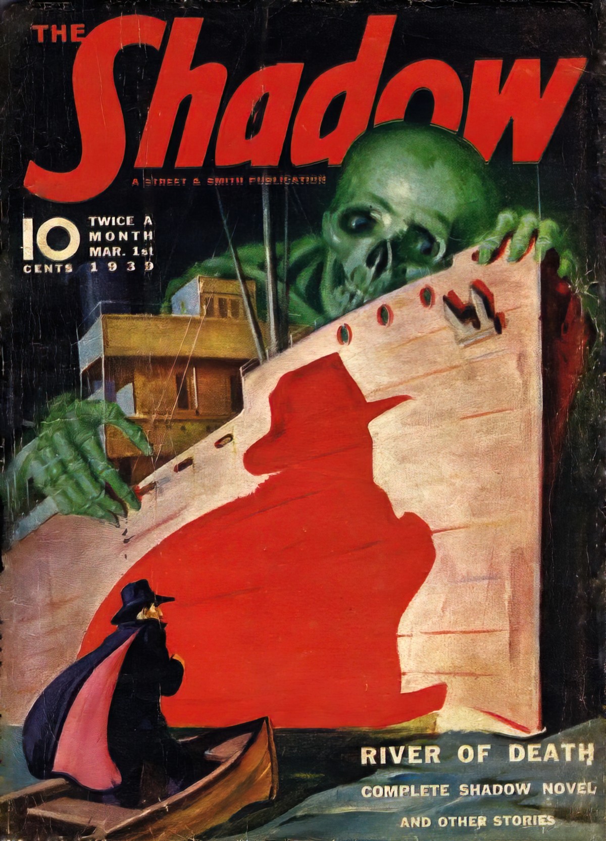
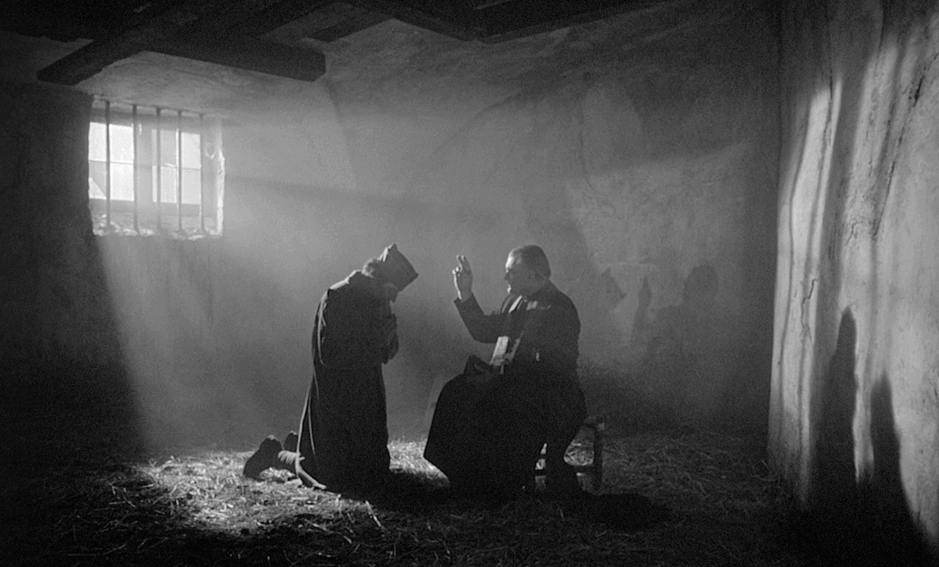
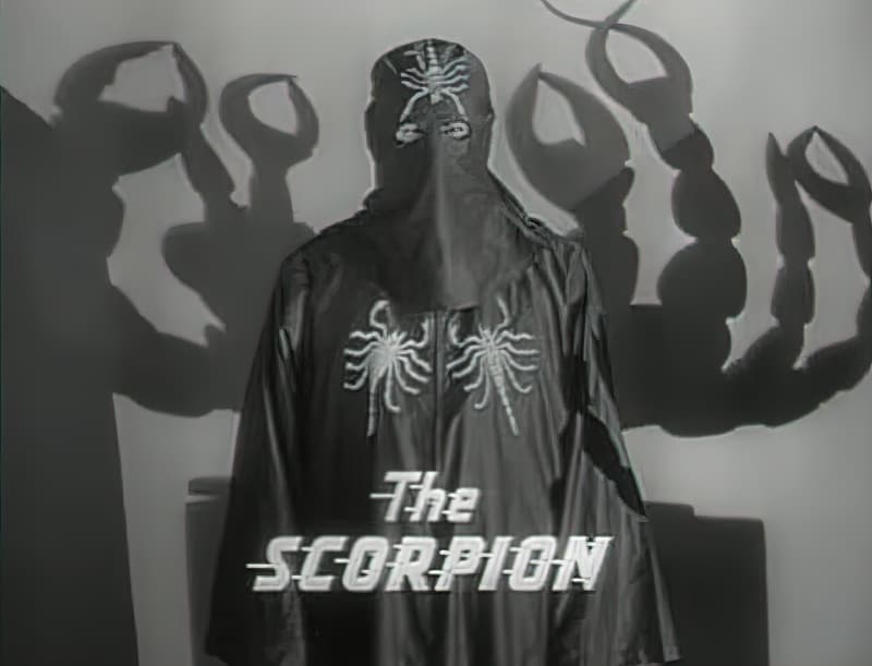
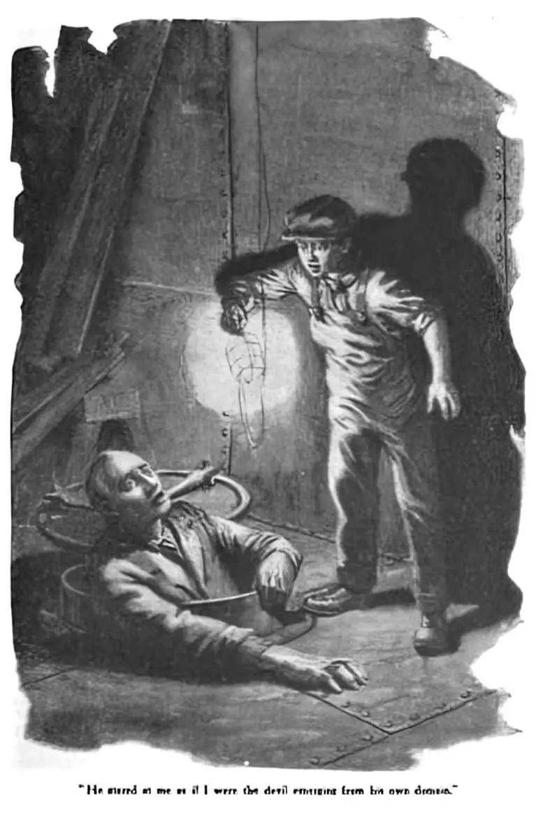
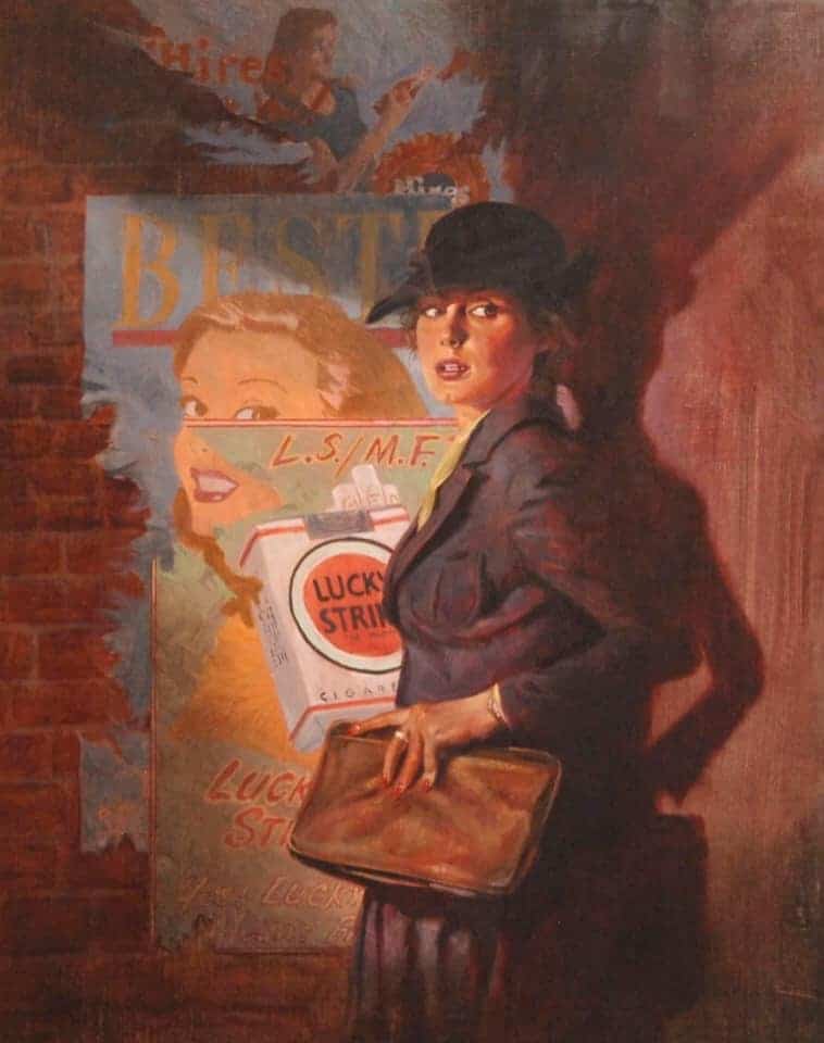
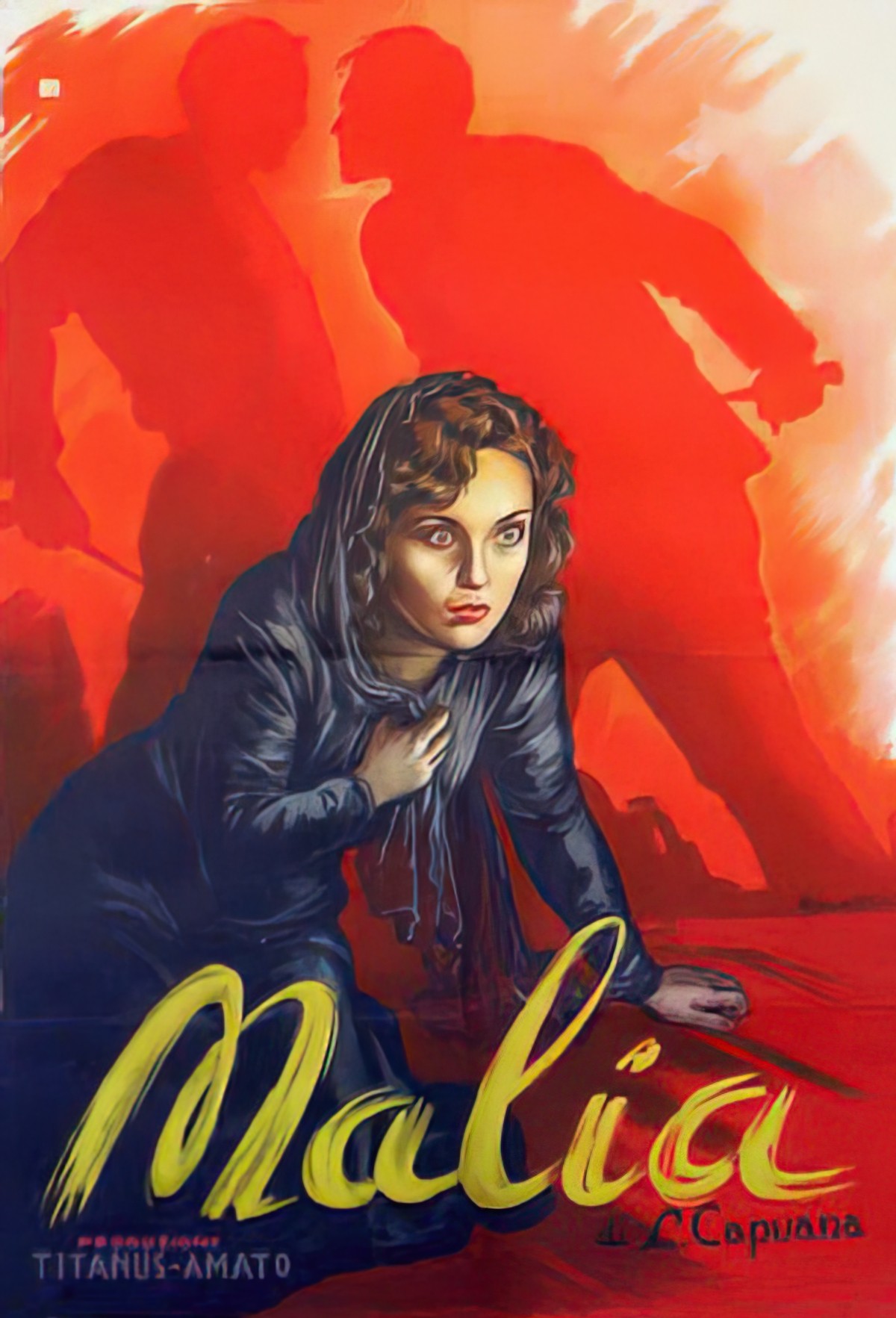
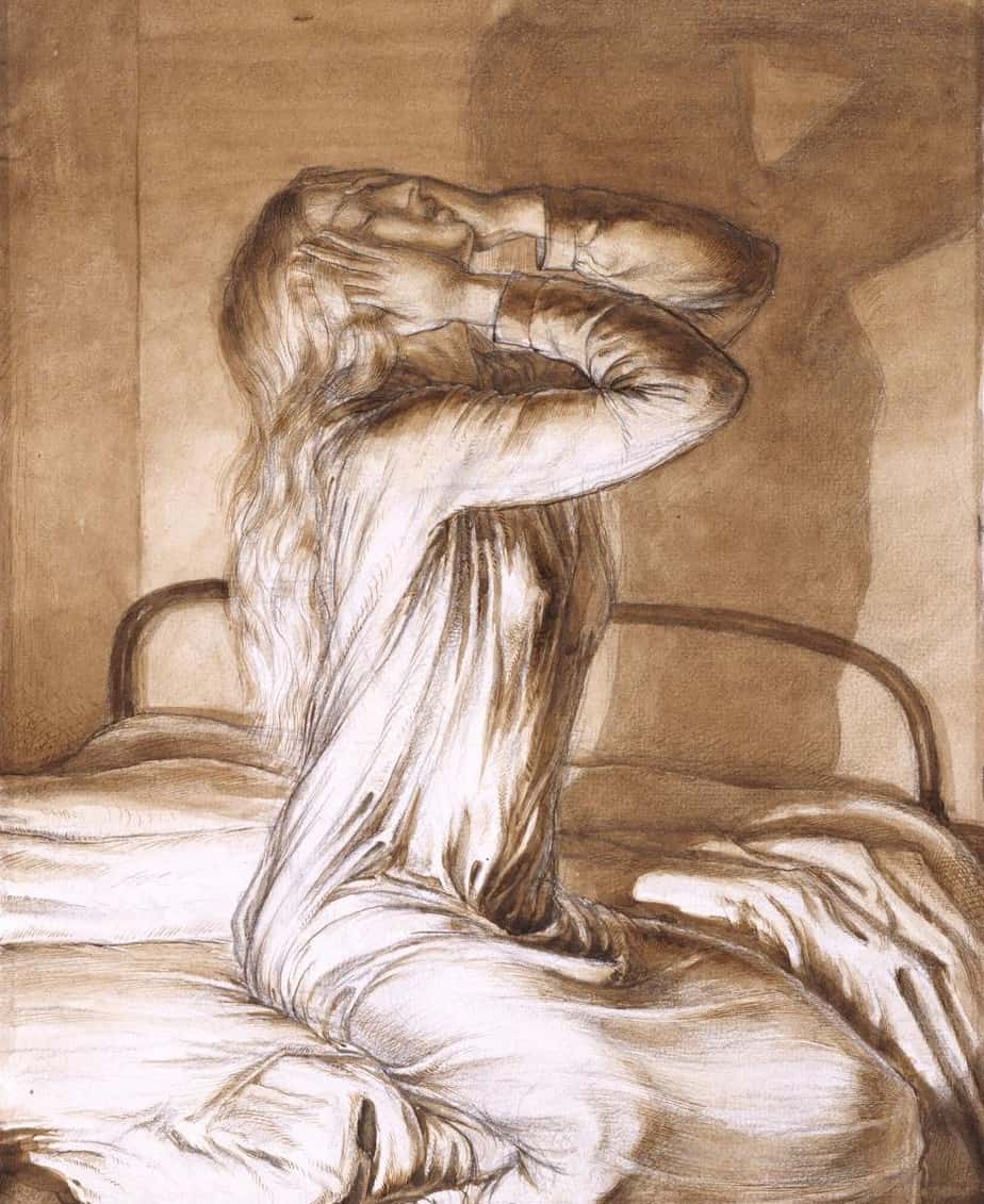
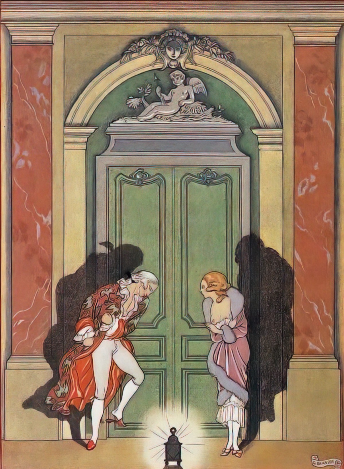
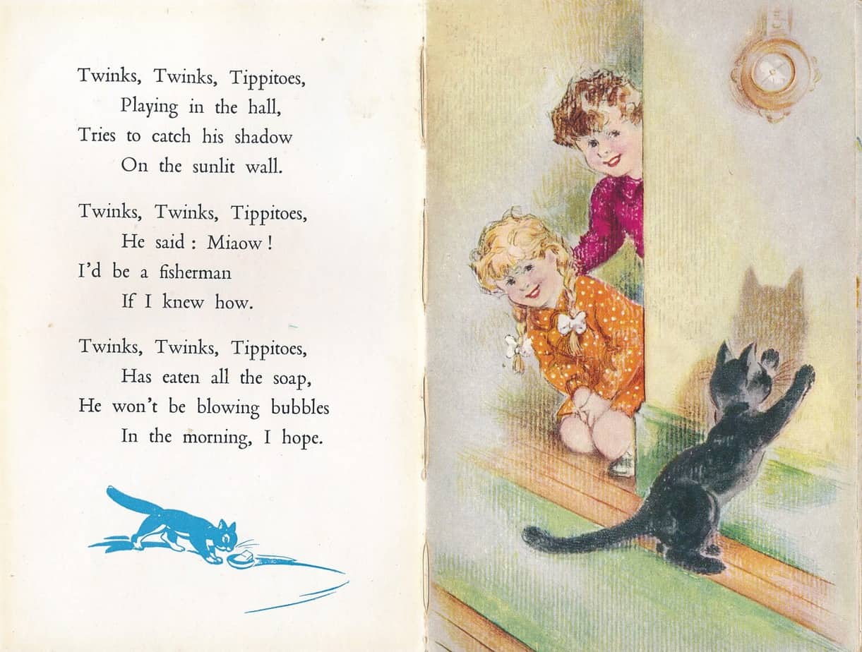
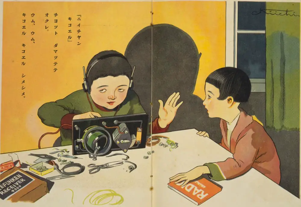
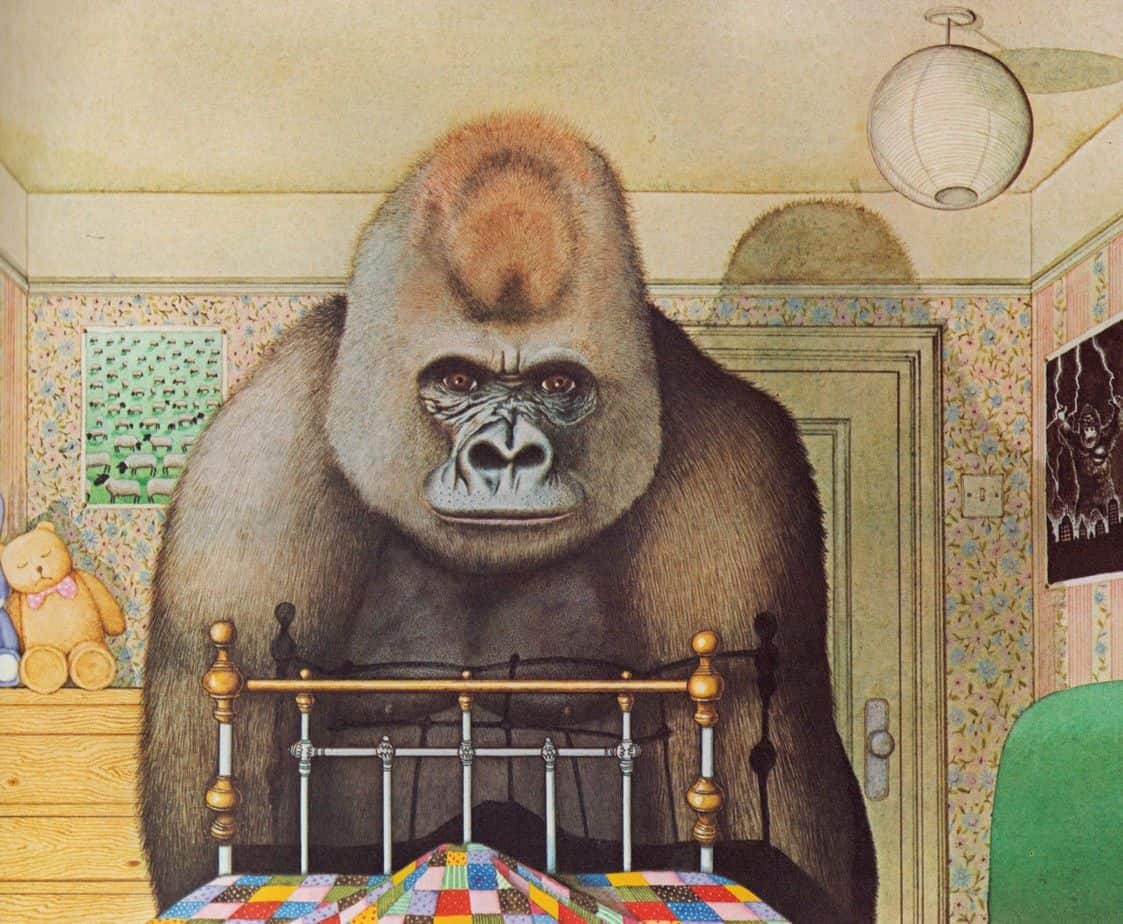
The shadows on the wall in the illustration below come from an unseen source of small man-like creatures on horseback. They may or may not be shadows.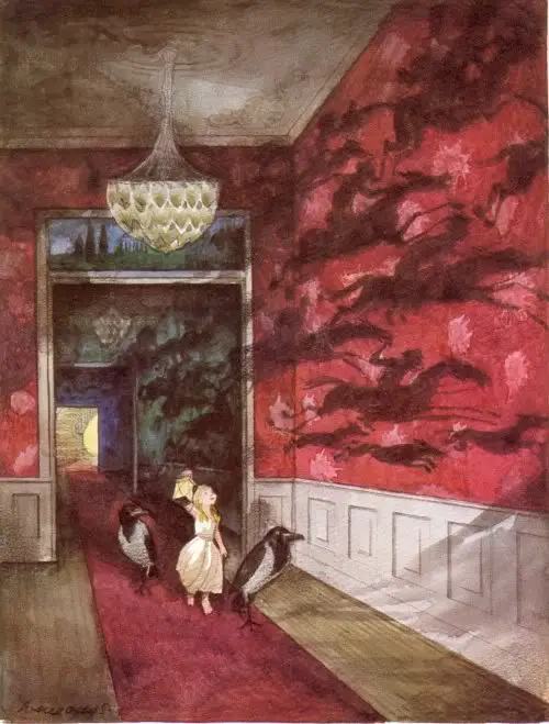
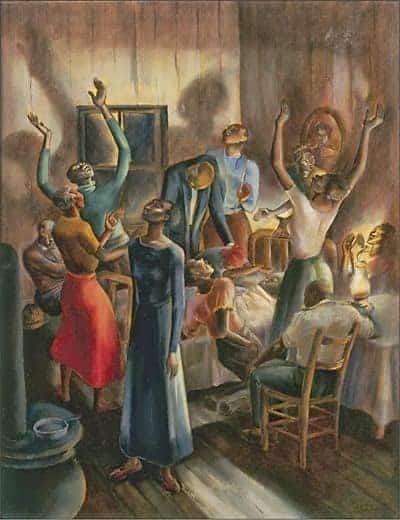
Shadows are used to comical (or possibly scary) effect below.
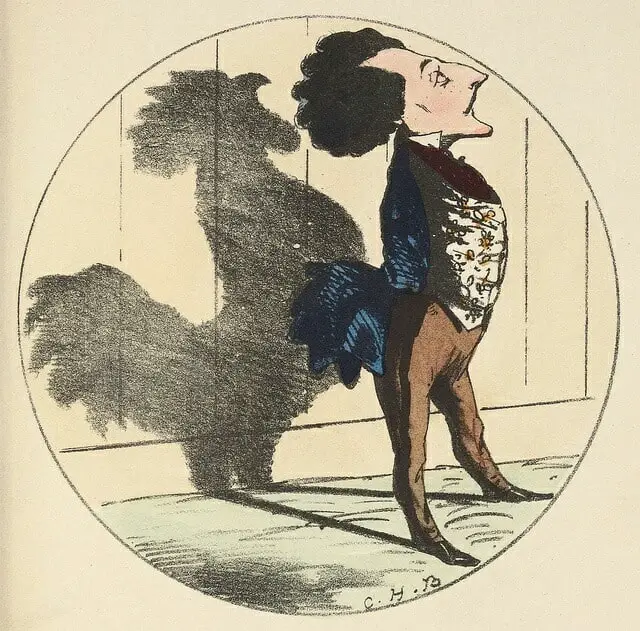
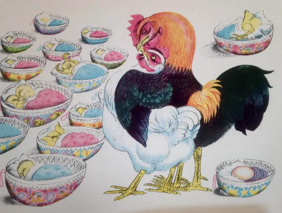
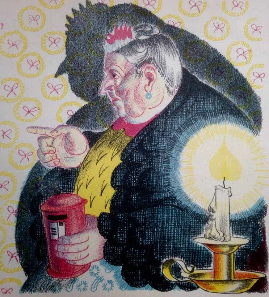
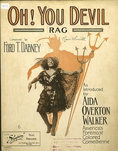
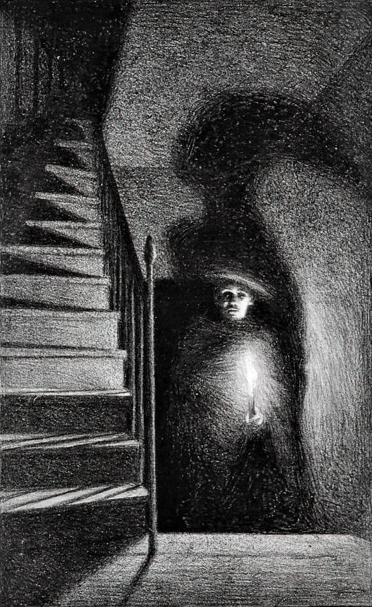
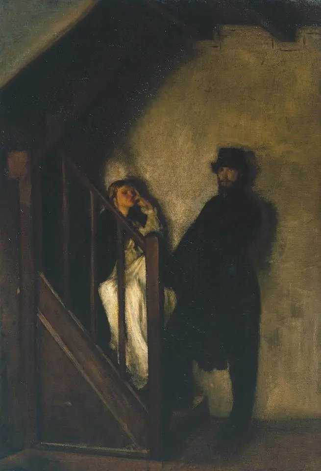
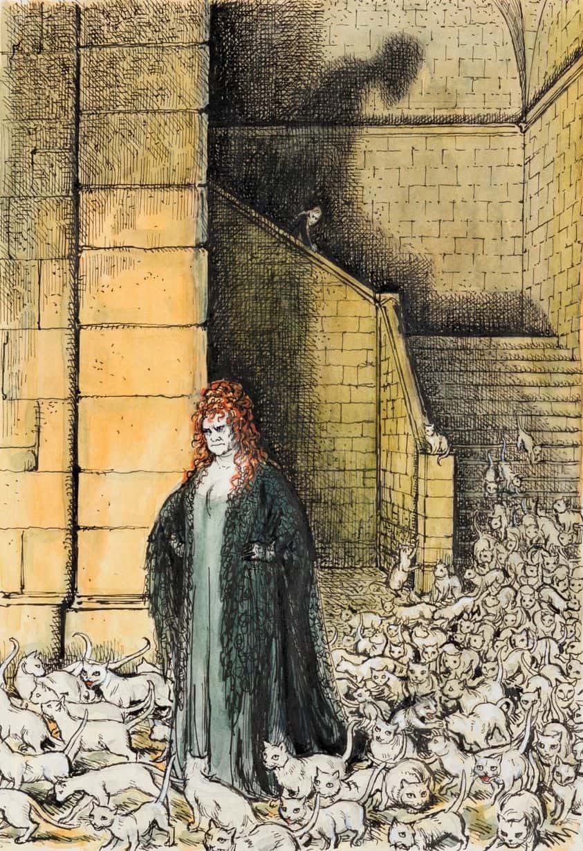
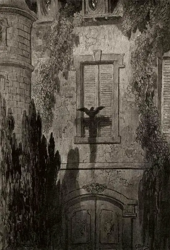
The shadow in the illustration below forms a dark frame around the characters, closing them in, enfolding them into the darkness.
Lighting and Space
Light isn’t just about illumination. The invention of artificial lighting caused artists to rethink their relationship with space.
Light usually suggests hope, renewal, or intellectual illumination. (Darkness implies the unknown, ignorance, or despair.)
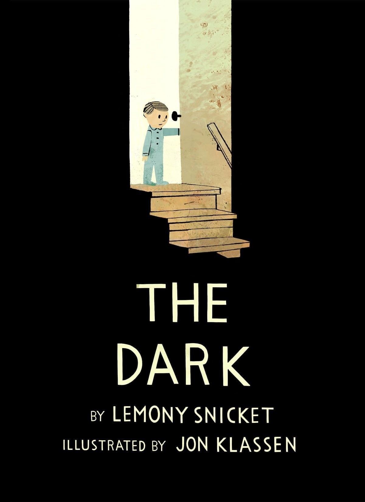
Pure black is rare in children’s illustration but Jon Klassen makes use of matte black in The Dark, which is about a young boy’s fear of the symbolic house at night.
In general, Jon Klassen makes much use of shadows to subtly frame the focal points of his illustrations. This is a technique reminiscent of 1960s illustration, found in animation such as 101 Dalmatians.
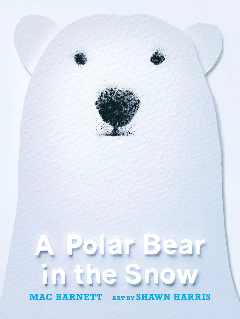
Follow a magnificent polar bear through a fantastic world of snow and shockingly blue sea. Over the ice, through the water, past Arctic animals and even a human…where is he going? What does he want? Acclaimed author Mac Barnett’s narration deftly balances suspense and emotion, as well as poignant, subtle themes, compelling us to follow the bear with each page turn. Artist Shawn Harris’s striking torn-paper illustrations layer white-on-white hues, with bolts of blue and an interplay of shadow and light, for a gorgeous view of a stark yet beautiful landscape. Simple and thought-provoking, illuminating and intriguing, this engaging picture book will have readers pondering the answer to its final question long after the polar bear has continued on his way.
