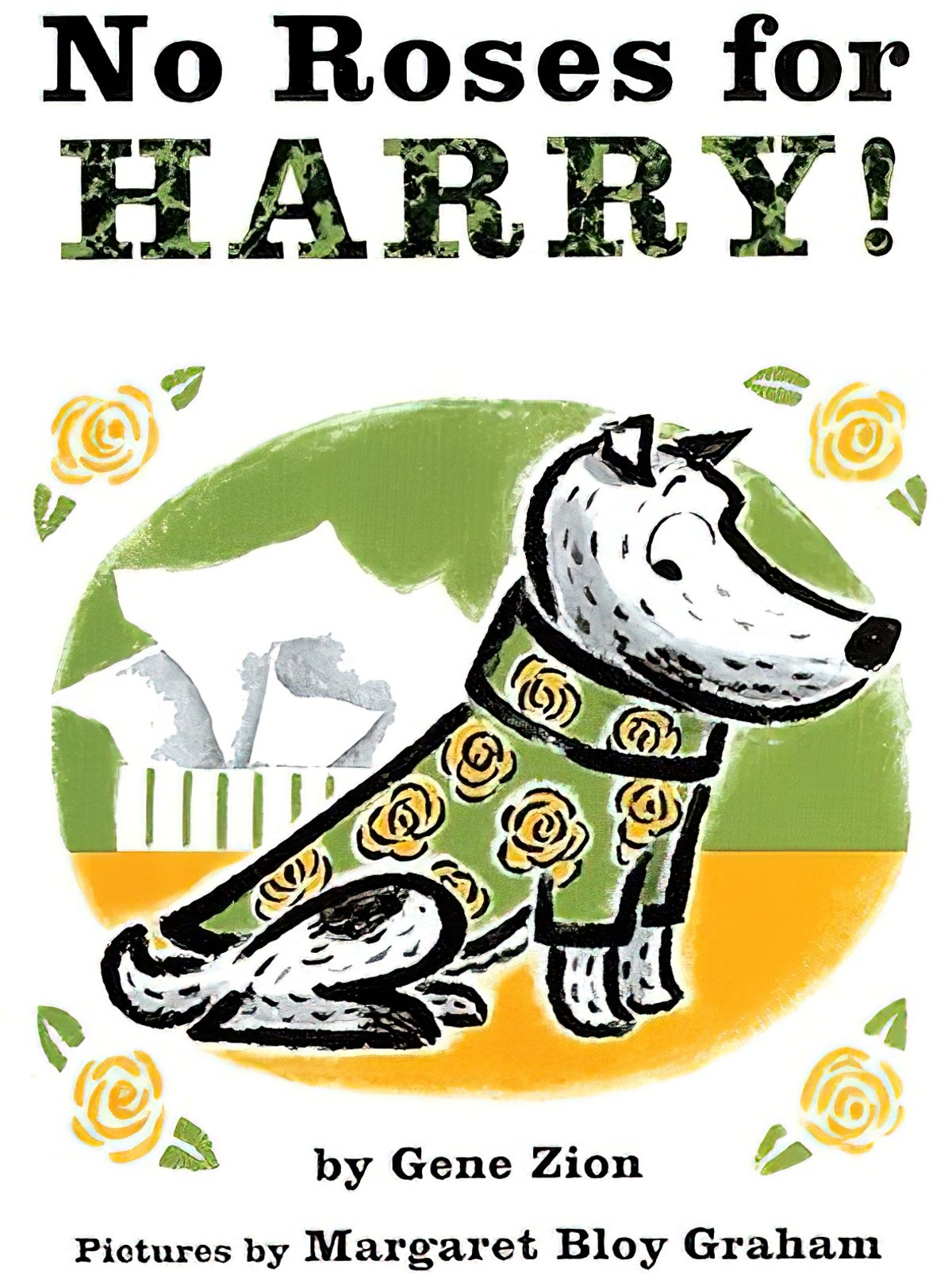
No Roses For Harry by Gene Zion and Margaret Bloy Graham (1958) is a sequel to Harry The Dirty Dog. I like this story less due to its increasingly outdated message about masculinity.

WHAT HAPPENS IN NO ROSES FOR HARRY
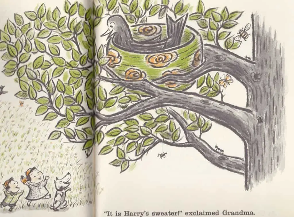
Human grandmother sends partly anthropomorphised pet dog a coat for the dog’s birthday. The coat has roses on it, and the dog does not like it. He goes to great lengths to lose the coat. It ends up being used by a bird to make a nest.
WONDERFULNESS OF NO ROSES FOR HARRY!
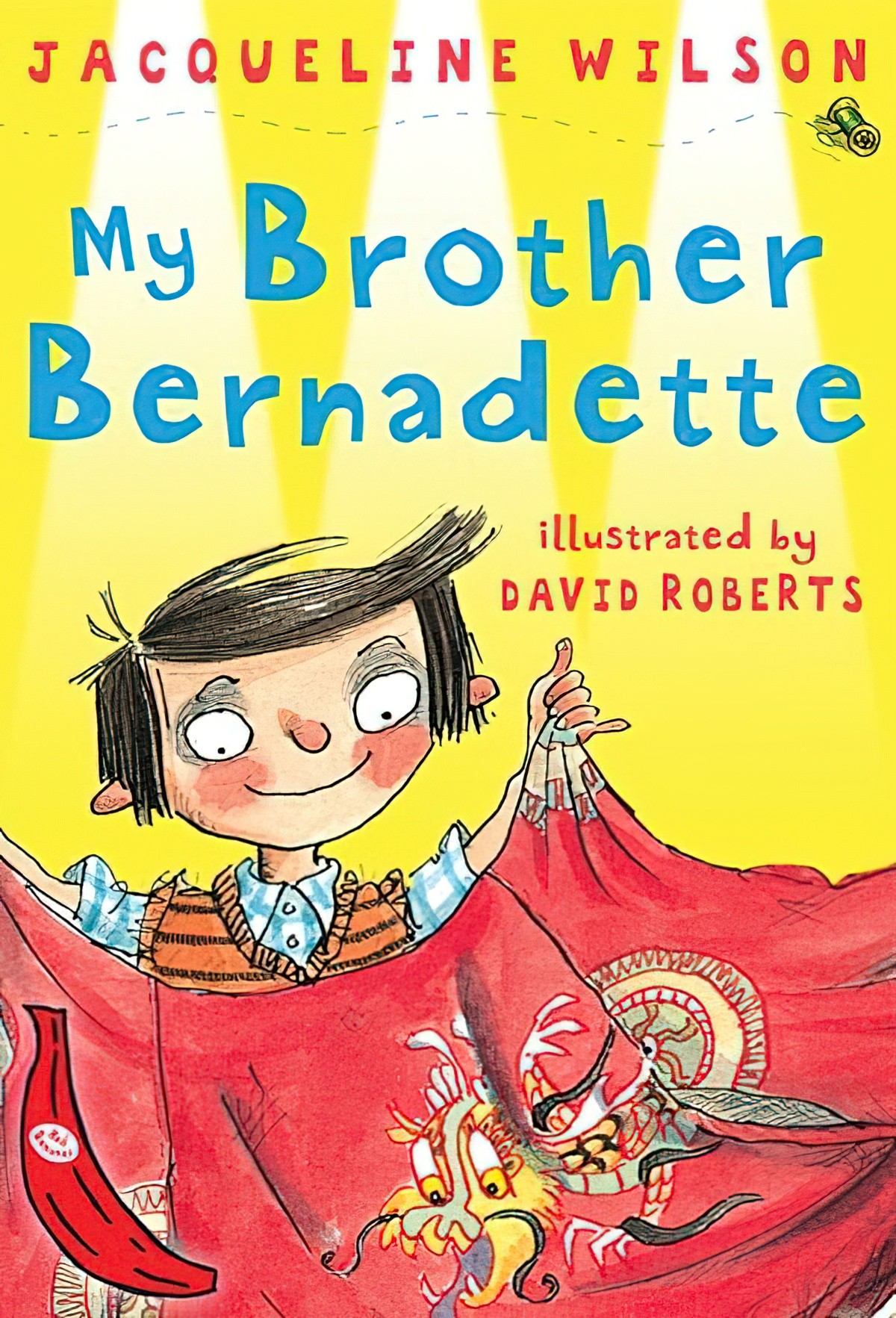
I feel I must preface this part by saying that the entire story is based on the ‘universal given’ that if a male character looks like a female character (ie wearing a sweater covered in roses) then this is an inherently shameful thing. This is an idea that you don’t see so much in modern picture books, and that’s a good thing. These days you’re more likely to end up with stories such as My Brother Bernadette (by Jacqueline Wilson), in which a boy or boy character dresses like a girl and manages to subvert reader expectations, with the message that everyone should be able to dress how they feel comfortable without judgement. In this way, the storyline of No More Roses For Harry is dated. A more generous, less feminist reading of this book has me believing that Harry dislikes the roses because he is a dog, and in my experience of dogs, they prefer the smell of cow dung and dead things found in the undergrowth. Then again, the degree of personification of Harry leads me inevitably back to the first reading.
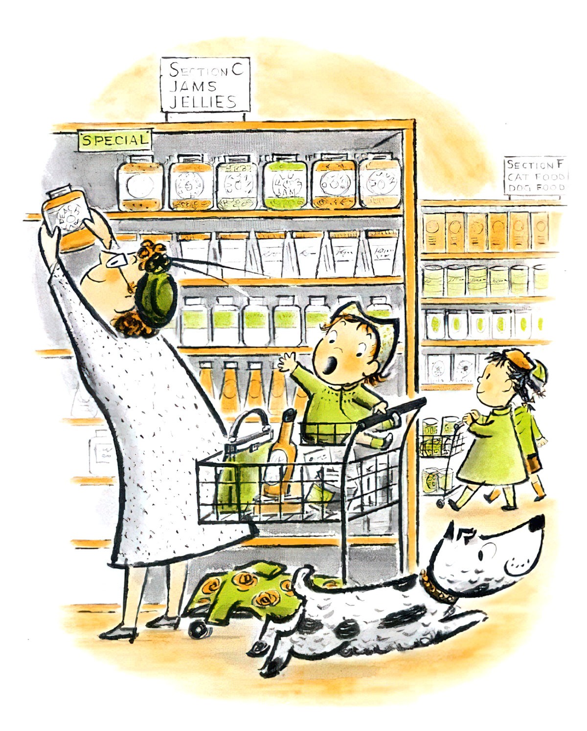
As is Zion’s storyline, Margaret Bloy Graham’s illustrations are ‘genuinely retro’. There have been numerous artists since who emulate this retro style by restricting colour palette and using paper and ink rather than a computer to recreate the feel of the fifties. But if you’re looking for a genuinely 1950s book, you get it right here. In this story you have the nuclear family, with a little boy and girl; you have visits to a 1950s style American department store; you see middle-aged women wearing fur stoles and 1940s headscarves.
NOTES ON THE ILLUSTRATION
If I had to pick, I’d say the illustrations of the Harry books are more masterful than the text. This observation is borne out by the fact that the illustrator went on to both write and illustrate many books, and two of her earlier books had won major awards. The writer ended his career after the Harry series. It would be interesting to know the extent to which the writer and illustrator collaborated on this project, because there are parts of the text which repeat information adequately provided by the illustrations. This of course is also an editorial thing, and leaves me wondering if it’s mainly modern picture books that have evolved to avoid this, because you don’t see it much in picture books published 2015.
Harry didn’t know it, but a bird was watching.
The reader can see from the picture that the bird is watching. Bloy Graham has positioned the bird in such a way that the reader can’t miss it, in fact. In modern picture books, I feel that sentence would have been edited out.
That said, there is some nice ironic counterpoint here and there:
When [Harry] got home, his friends were waiting to play with him. But Harry didn’t feel like playing so they left him alone.
This page shows three dogs sitting in close proximity to Harry, smiling at him and waiting for a response, showing that they didn’t exactly leave him alone at all.
Apart from black and white, the illustrations have been done with a very limited palette of — unusually — fluorescent orange and khaki green. I say ‘unusually’, because many picture books from this era, when ink was very expensive, have been printed in black and red, a more common colour combination. This modern edition, purchased 2015 in paperback form from HarperCollins, has been printed in off-white, yellowish paper, which makes the book seem retro, as if it’s been sitting on the shelf for a few generations already.
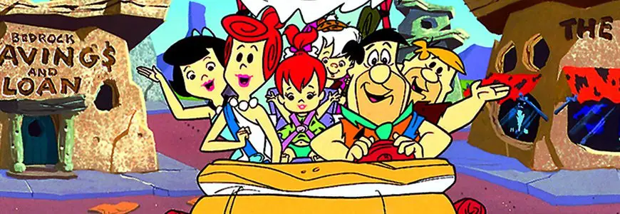
The drawings of the human characters remind me quite a lot of the Flintstones, and I believe it’s down to the black ovals for eyes.
When illustrators depict animals with human emotions, they often add eyebrows where there are none. Humans convey a surprising range of emotions via the eyebrows, and trying to draw a dog or a cat or a horse without them is very difficult.
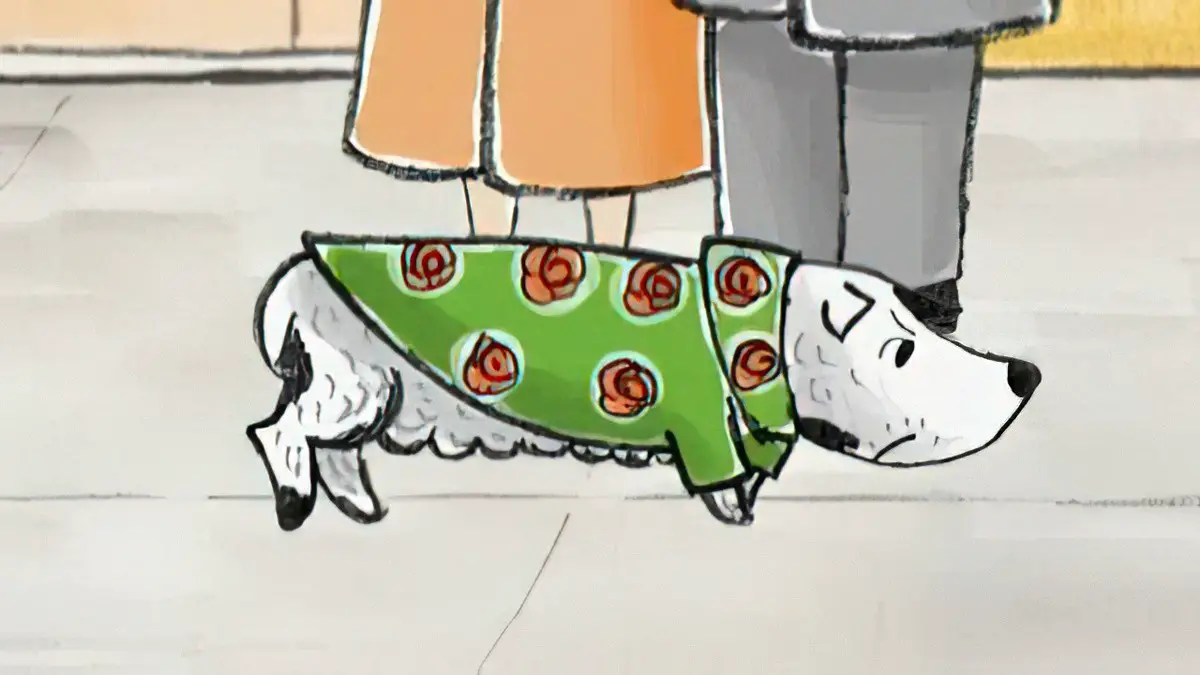
Then again, any illustrator who is going to create books with animal creatures had better be a good observer of animals. Below is a picture of Harry in typical shamed dog pose, with his ears down, looking up. Dogs don’t have so much whites in their eyes, so the eyeballs, too, have been personified.
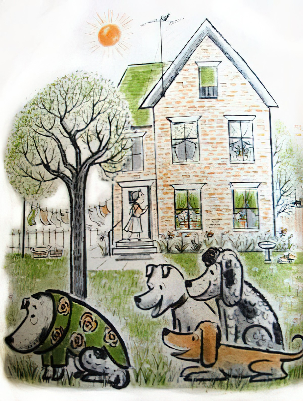
The facial expressions on the dogs add humour to the story. The humour is amplified because Harry’s cranky expression juxtaposes with the delighted faces of both human and canine onlookers.
There is humour again on the final page, in which Harry is wearing a sweater that has exactly the same markings as the dog himself. This visual humour is used to great effect in the must later Z Is For Moose, in which the zebra wears a zebra-striped shirt.
One plot knot the writer had was: How to have Harry lose the coat when it was tied onto his body? I feel this part of the story is its weak point.
When [the children and Harry] went into a big store to shop, the children took off his sweater and let him carry it. This was just what Harry wanted.
Unfortunately, we never see a picture of Harry ‘carrying’ his sweater, which lead my seven-year-old daughter to ask, ‘How would Harry carry the sweater?’ When she thought about it, she said, ‘Oh, I know how he would have carried it,’ but she didn’t let on to me how it would have been achieved, and now that the question has been posed, I feel completely in the dark on this matter. (If you think kids don’t notice things in picture books, you’re wrong! They’ll be reading the pictures better than their adult co-readers, who are by necessity and training, focused mostly on the words.)
Another small hole in the plot is that Harry runs home and the children, who accompanied him on the outing, are nowhere in sight. The dog and the children make it home independently, and not a word is mentioned of Harry’s running away after the bird who unravelled his sweater. However! I think this is something child readers can accept without too many questions.
STORY SPECS
All editions are 32 pages.
First published 1958, this is the second in the Harry series. (Harry The Dirty Dog had been published two years earlier.) There came another two after this.
Margaret Bloy Graham grew up in Canada but moved to New York to be an artist.
Gene Zion and Margaret Bloy Graham were a husband and wife team. There may well have been more Harry books had the couple not divorced.
After the divorce, Margaret Bloy Graham continued to illustrate and also to write. She came up with a new series of dog books. This time, the dog was called Benjy.
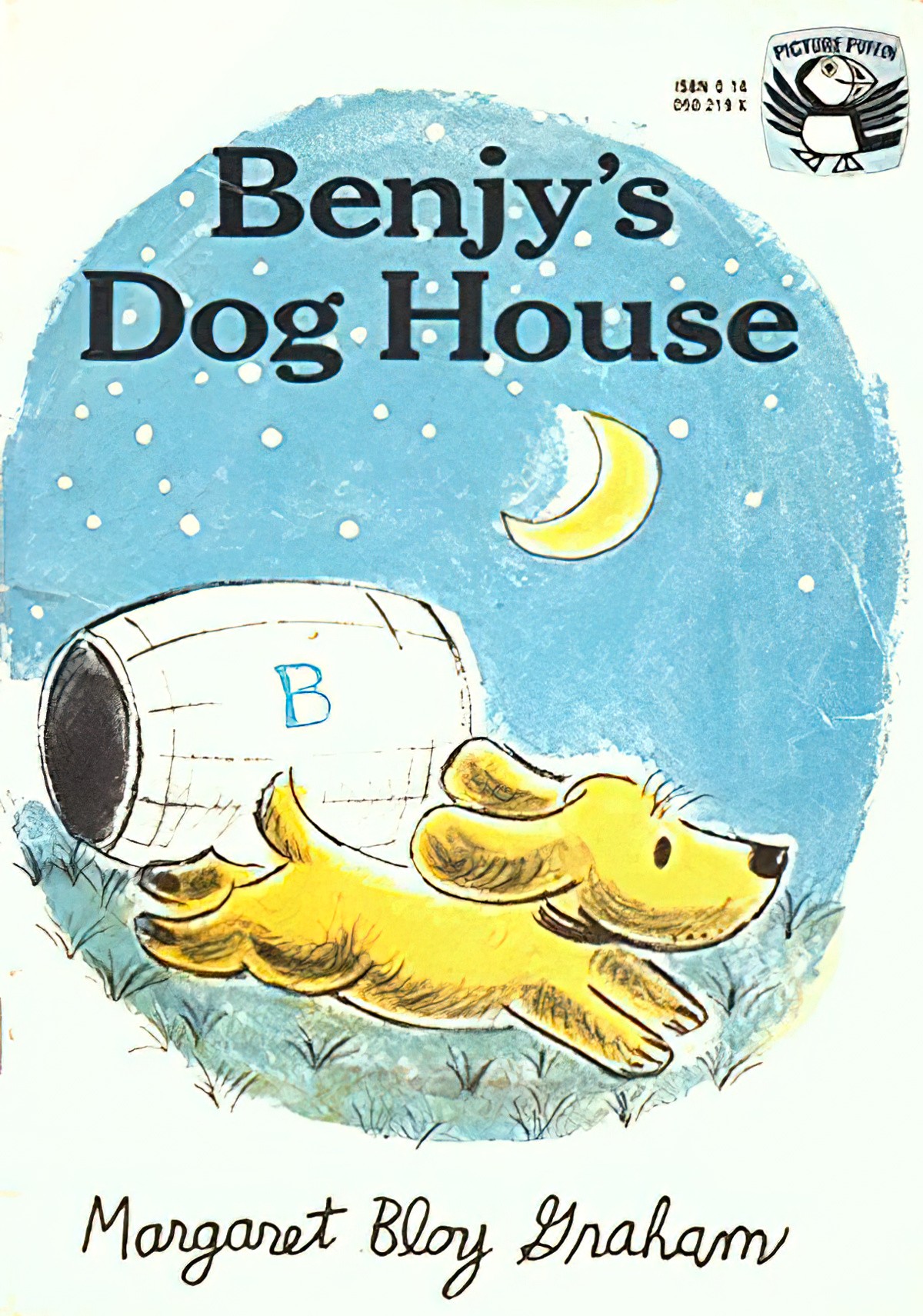
Bloy Graham was also awarded two Caldecott honors early in her career: All Falling Down, The Storm Book.
As for Gene Zion, he published no more children’s books after his divorce from Bloy Graham. He had been trained as a graphic designer.
Bloy Graham’s obituary in The Guardian
COMPARE WITH
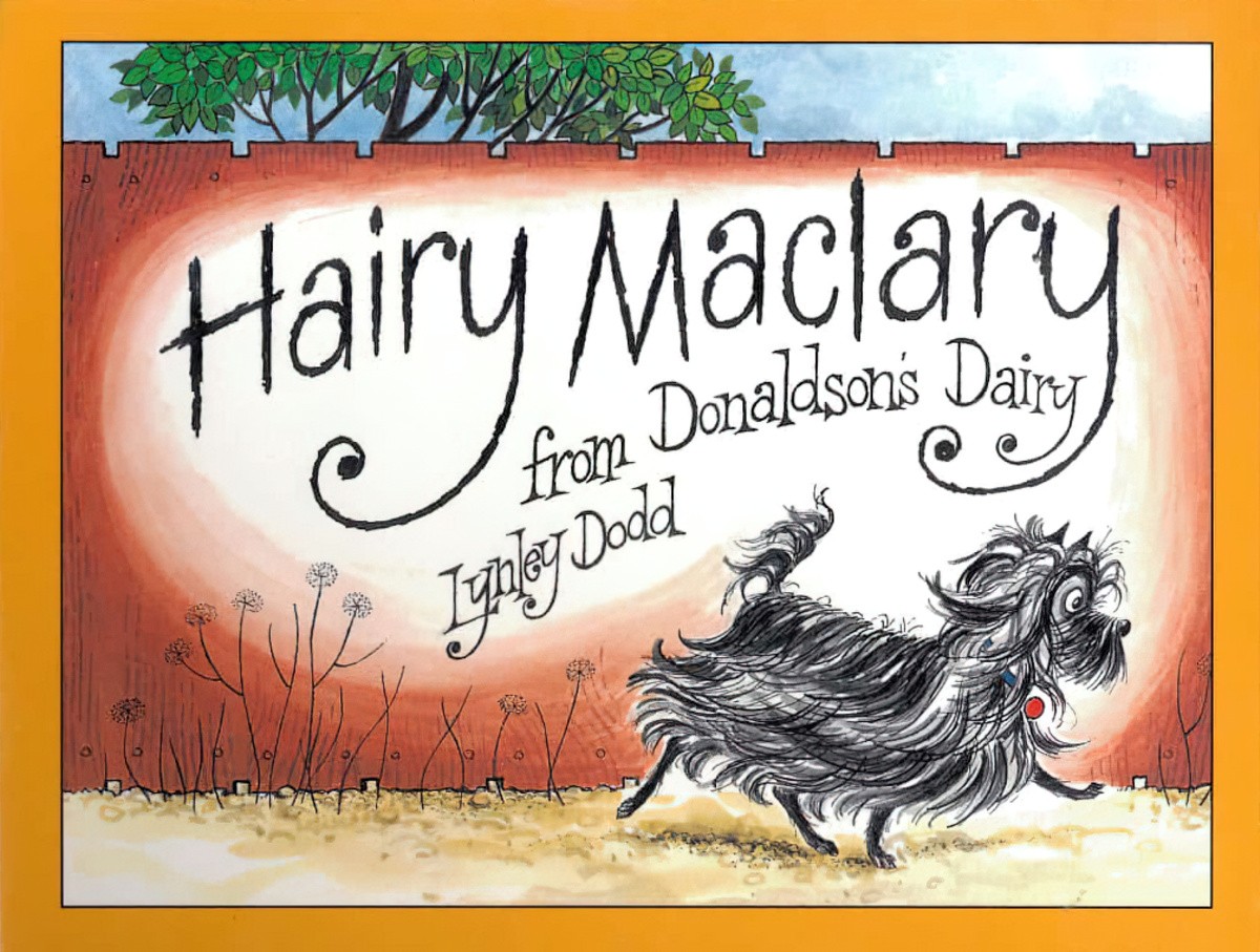
Zion and Bloy Graham’s Harry series is one of the ancestors of the very popular Hairy Maclary series by New Zealand author Lynley Dodd.
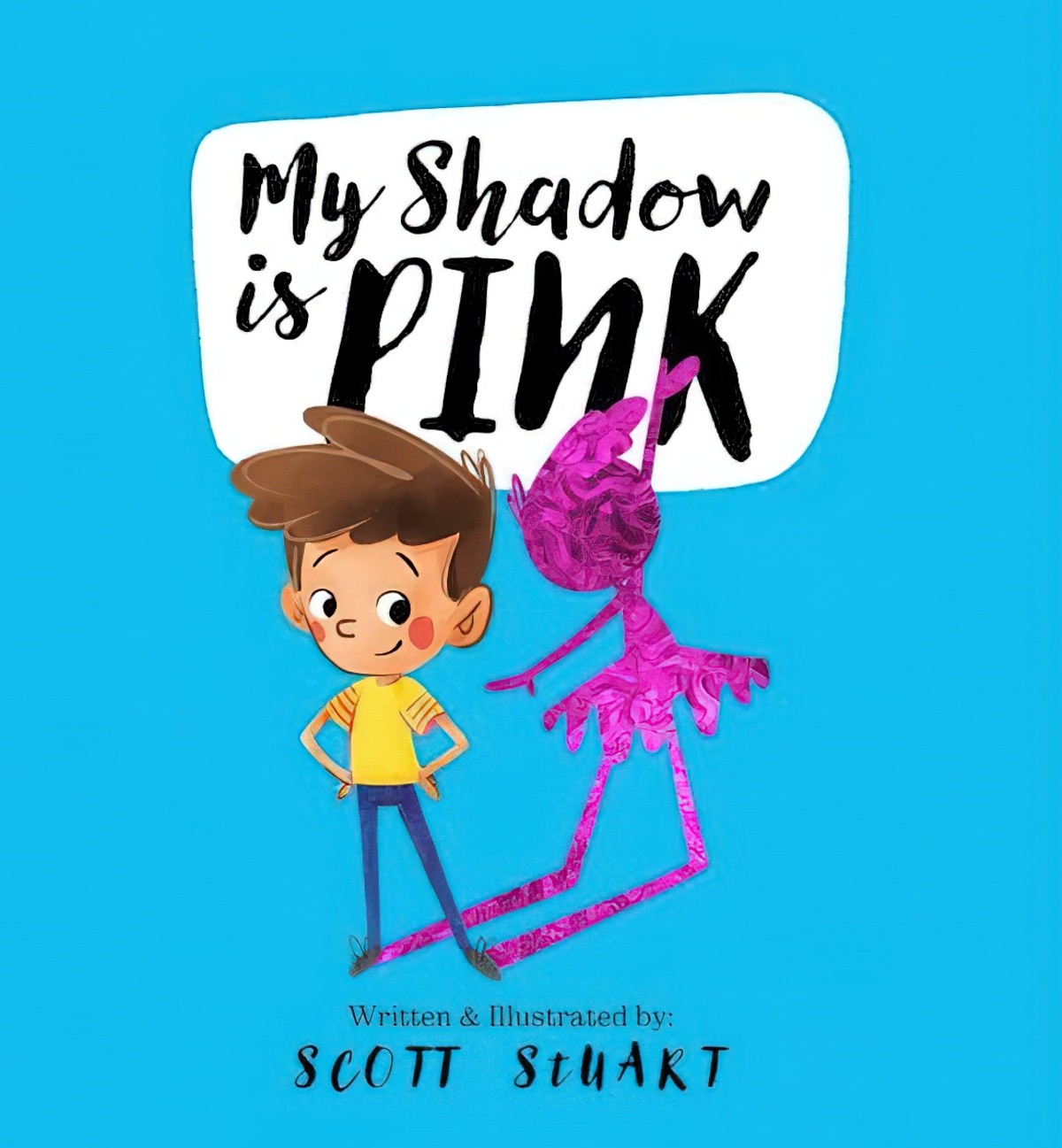
My Brother Bernadette deals quite differently with a boy who dresses in stereotypically feminine clothing. By 2001 children’s literature is seeing books in which attempt is made to ‘cure’ a boy of this cross-dressing problem. See also: My Shadow Is Pink, an affirming, Australian genderqueer picture book from 2020.
