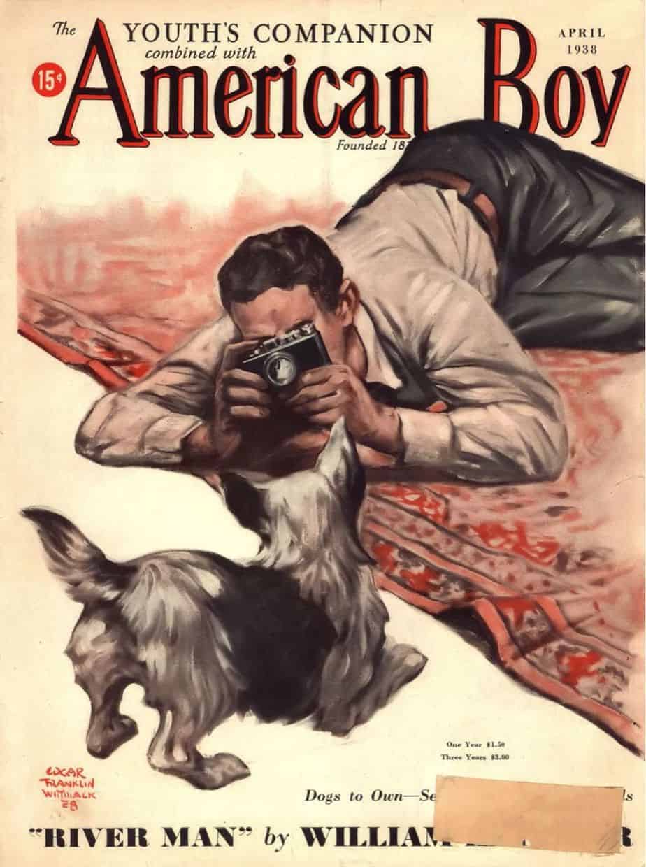
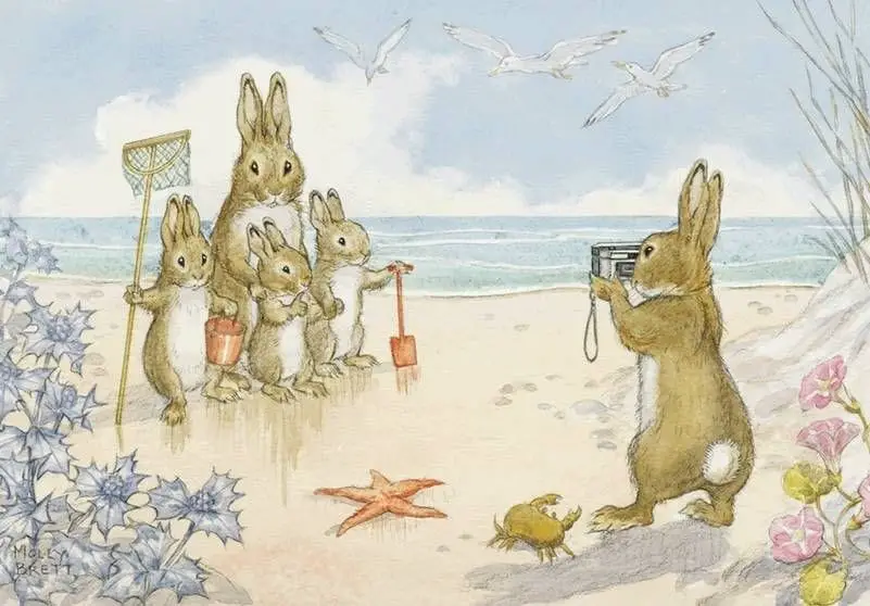
The first commercial camera is thought to be the daguerreotype, which changed art forever starting in 1839. To generalise, the function of painting changed after that. Before the camera, artists functioned as photographers do today; the skill of authentic reproduction was highly valued because there was no other way of recording something than to paint it in realistic, naturalistic fashion.
Stories themselves function as a type of lens. John Berger uses the lens metaphor when describing narration in his book What Time Is It?
Those who read or listen to our stories see everything as through a lens. This lens is the secret of narration, and it is ground anew in every story, ground between the temporal and the timeless. If we storytellers are Death’s Secretaries, we are so because, in our brief mortal lives, we are grinders of these lenses.
John Berger
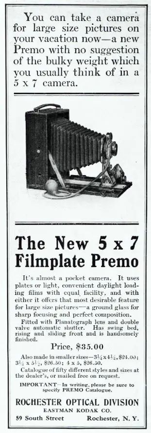
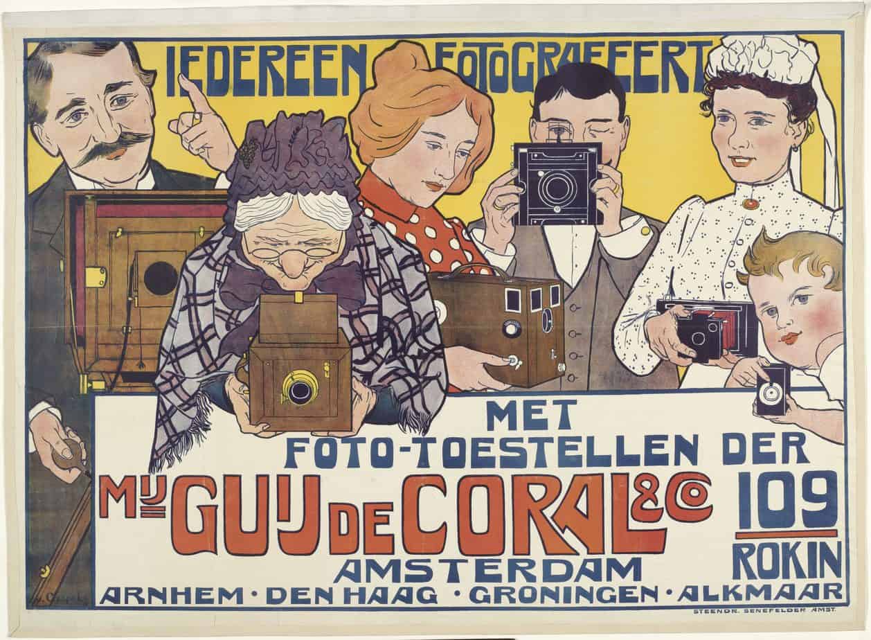
Again to generalise, the invention of the camera severed the link between realism and fantastical ways of getting something down on paper. Artists became more free to experiment with how they imagine the world, and to play around with visual imagery, metaphor, fantastical colours and so on.
Over time, photography also changed the artist’s view of what might be considered art. Photos were taken in an instant. Before, a realistic painting required careful conditions, probably a studio, and for both artist and subject, many hours of sitting still. Now, suddenly, subjects seemed caught in fleeting moments: unposed, natural, without intent to show themselves to an audience as objects to be gazed upon.
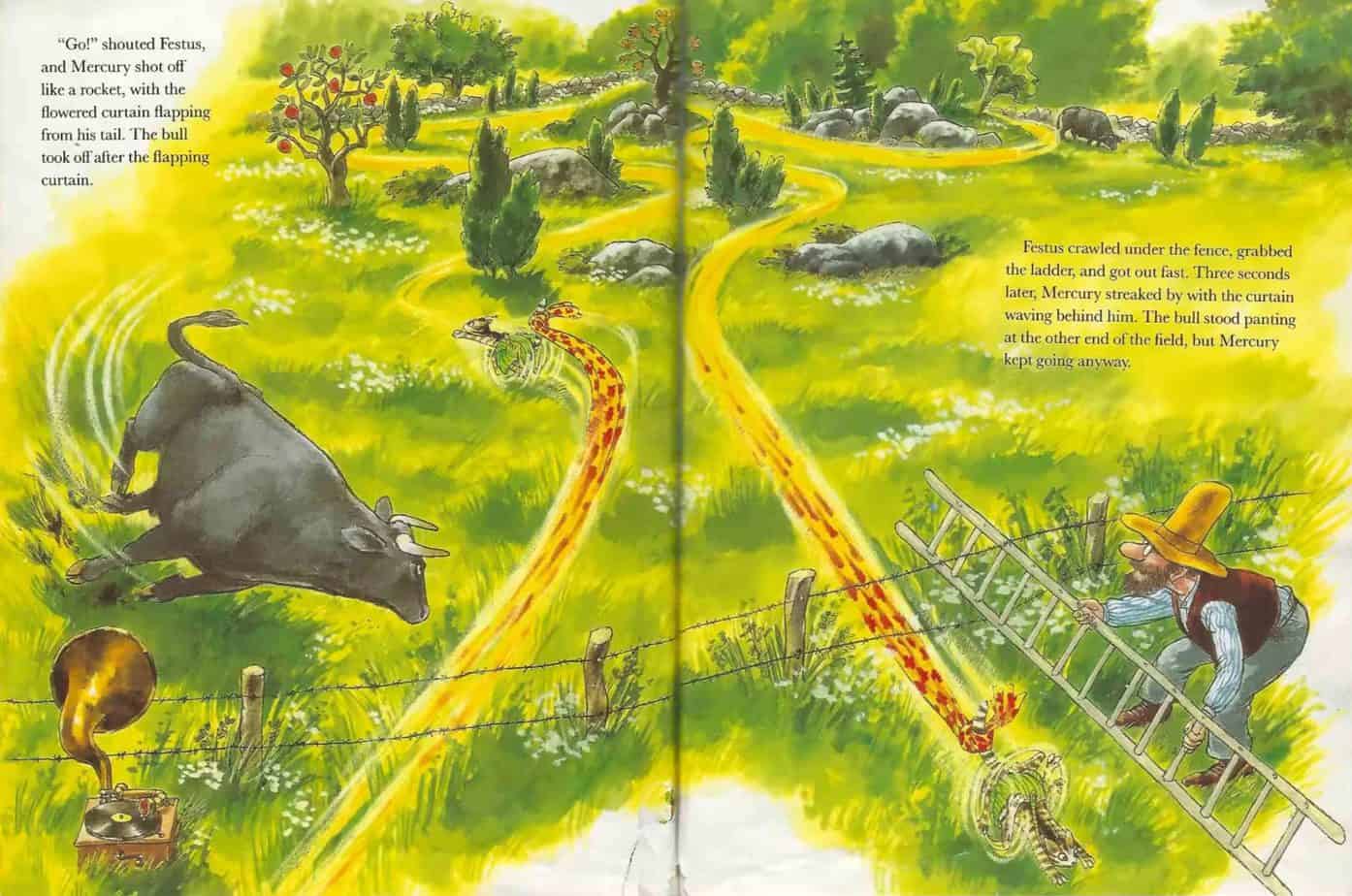
THE MOTION BLUR
[F]or many decades after the invention of photography, blurred objects represented inferior work, for we do not actually see fast activity as a blur, and people therefore did not understand the blurs in photographs. But now we have learned from photographs to interpret blurs as objects in motion, and the conventionality of conventions is confirmed by the fact that even illustrators now sometimes imply speed by drawing a blur.
Perry Nodelman, Words About Pictures
Our own illustrated book app Hilda Bewildered is full of illustrations which borrow from photographic conventions; indeed, that’s what the story is all about — surveillance. For more on that, see the close-reading notes, available as a link from within the app.
Today, artists convey motion in many different ways, some of them unthinkable before the invention of photography. I offer more examples here.
Below, one example from Pettson and Findus.
YELLOW MEANS FLASHBACK
Movies make use of this, too. Here is a flashback scene from The Cat Returns.
But why yellow? Where does that come from? It’s possible audiences from the early 20th century had no idea that yellow meant ‘earlier’. They probably did intuit that yellow meant ‘old’. But the convention only became established in popular visual literacy after colour film was invented.
Helping all this along nicely was actually a mistake: Kodak’s film manufactured in the 1970s was of low quality. If you’re like me and a baby of the 1970s, you’ll probably find your baby photos have yellowed badly. My parents’ baby photos are actually crisper and ‘truer’ than my own, though they are in black and white.
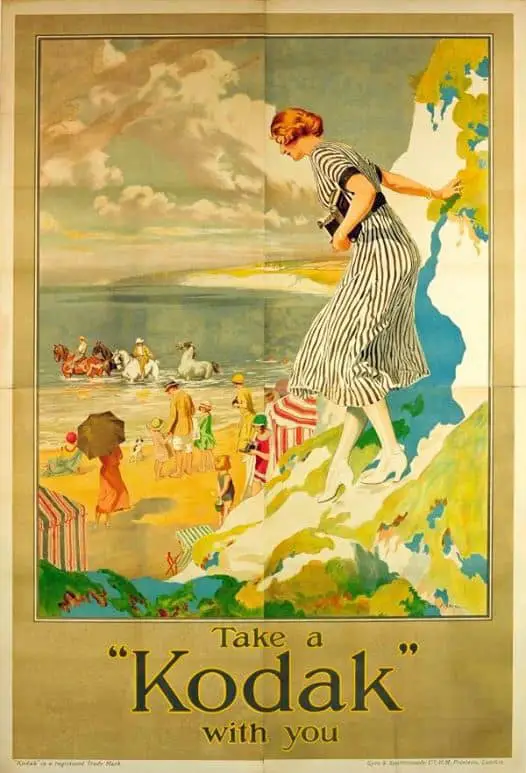
The ‘yellow = vintage’ trope continues into Instagram filters, where modern snappers often choose to add the yellow. As for me, I spent a significant chunk of time in Photoshop correcting my childhood photos!
This Lady Running Like A Horse Is Really, Really Good At Running Like A Horse
HORSE LEGS NOW LOOK ACCURATE
Sometimes the postures in which artists freeze their subjects to gain the most animated effect are not even found in the real world. Galloping animals like horses are often depicted with both fore and hind legs outstretched. Quadrupeds only adopt such postures when leaping and never when running. But the depiction of rapid movement requires the full extension of the limbs even when such extension is unreal.
Rudolph Arnheim, Art and Visual Perception
Before photography, artists were unable to imagine how a gallop looked mid-action. Horse leg simply moved too fast. This post is an excellent summary of how photography changed forever how artists depict horses.
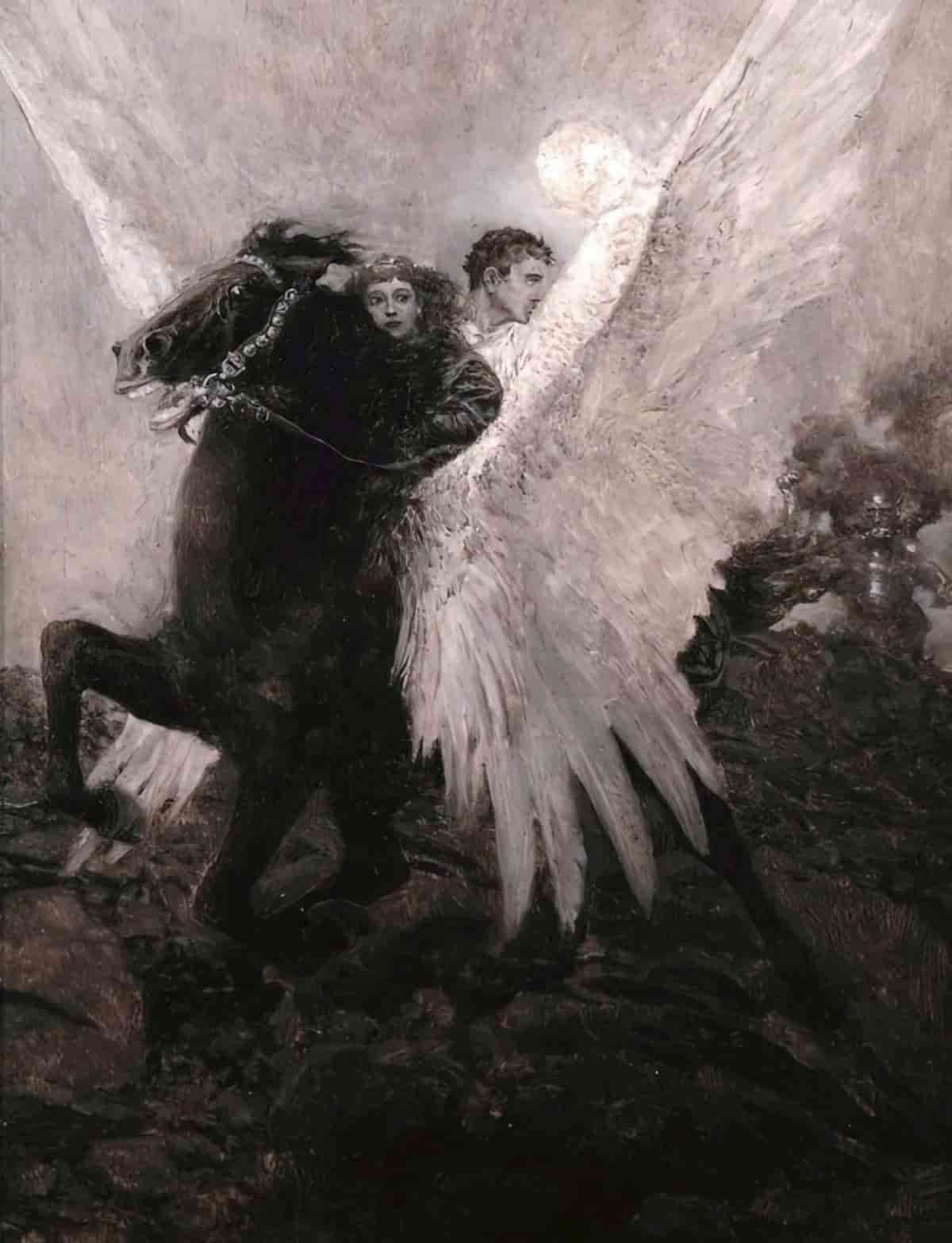
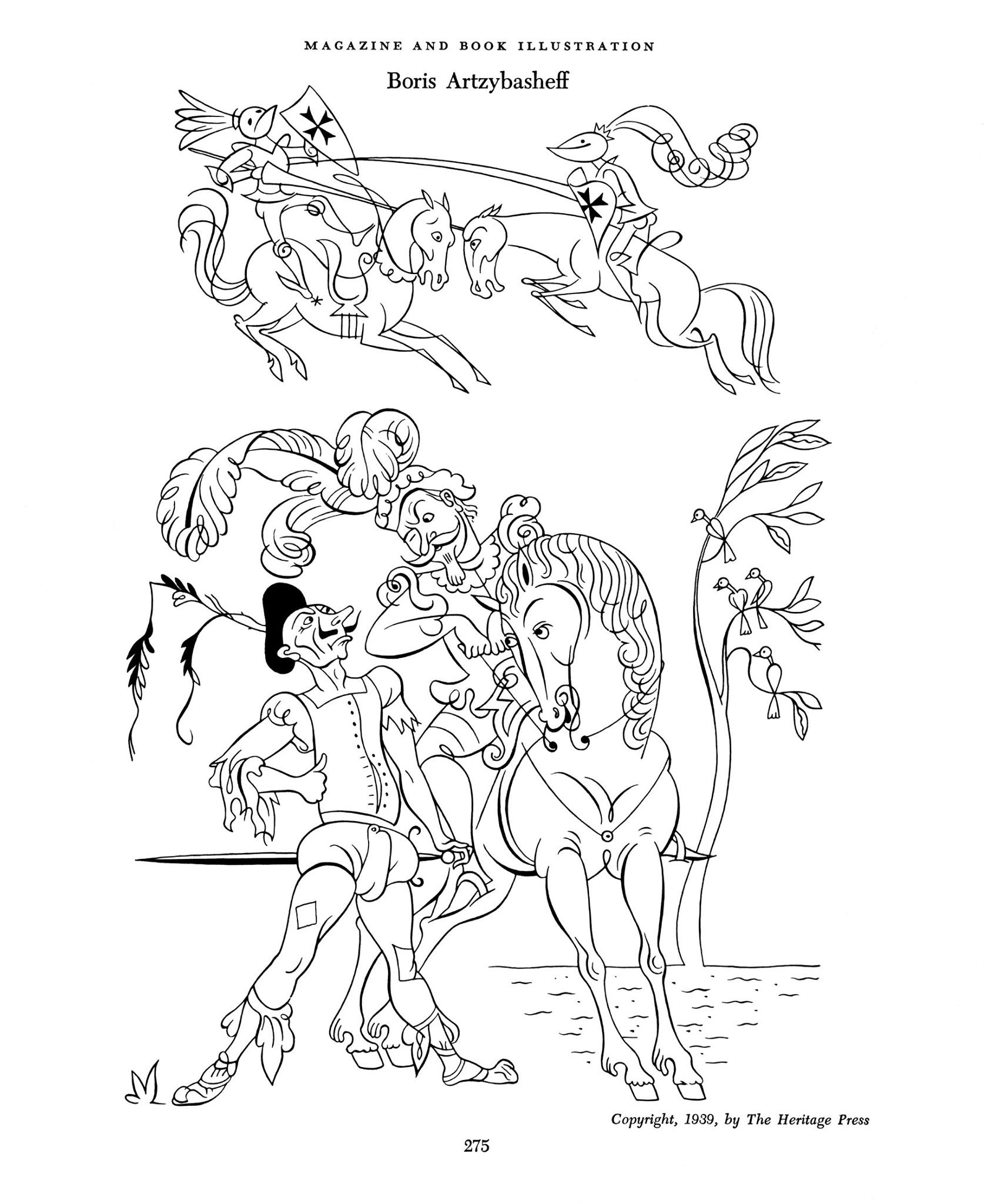
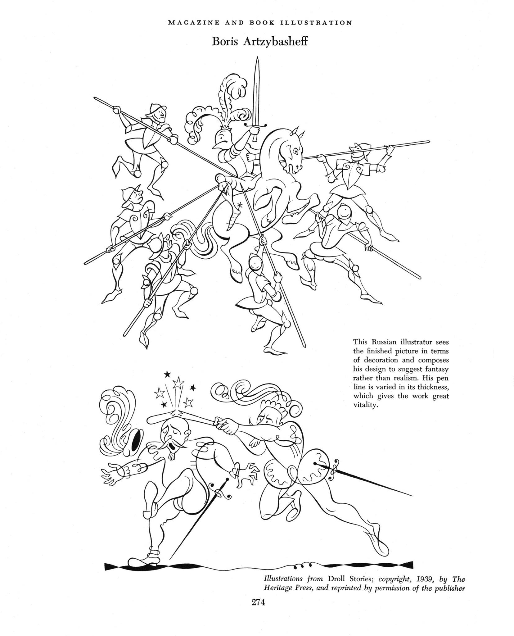
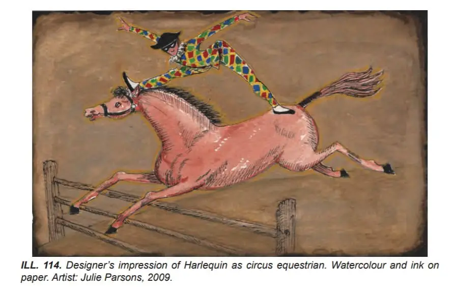
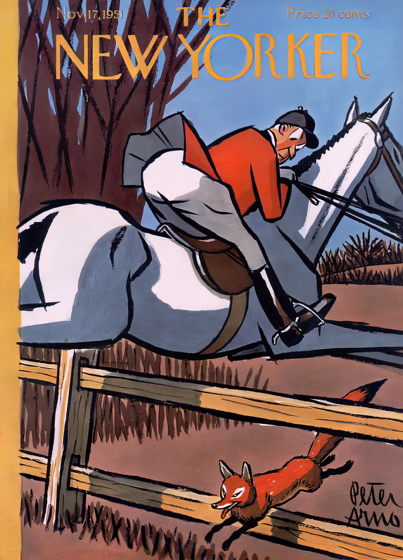
However, in the illustration below, artist Julie Parsons has clearly gone for a retro look (the Harlequin is 500 years old) and drawn a horse in the way artists used to draw horses, with front legs straightened while clearing a hurdle.
CORONAS AROUND LIGHTS
Wait for nightfall, turn on a light inside your house and look straight at it. Is there a big mass of light around the lightbulb? A bit, maybe. But it really is just a bit.
Take a photo of it. Better still, take a photo of the sun at midday. Now you can probably see nothing in the image except that big mass of white/yellow light. After the invention of photography, we started to see coronas more as objects.
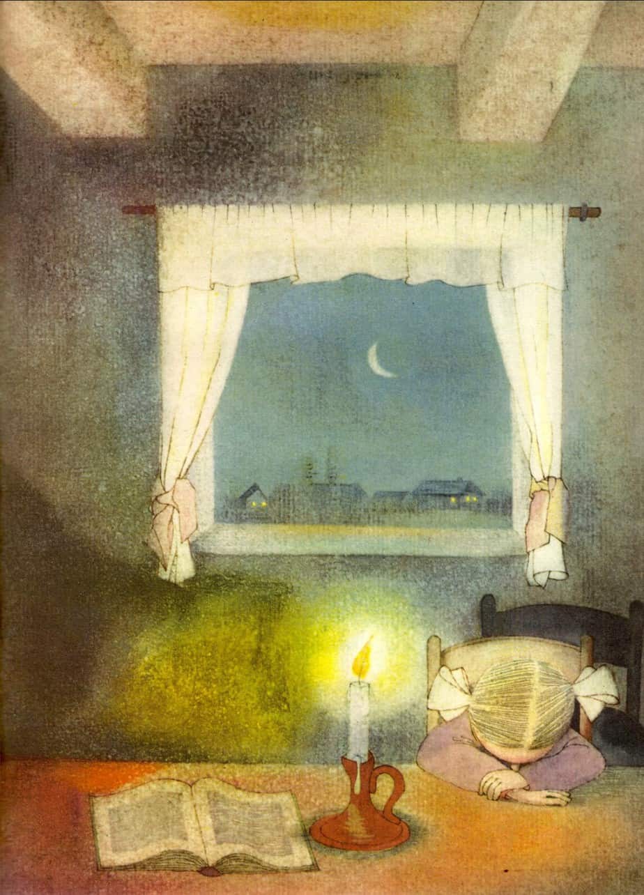
These days, illustrators can easily add digital sunflares and coronas, or paint them from nothing, and these orbs of light are often far more obvious than they would seem in reality. Partly this is to do with how illustrators must be constantly mindful of light sources, and speaking for myself at least, it’s fun to draw exaggerated light effects, and to play around with light and shadow.
Also see: various ways illustrators depict the sun. All around the world we see the same sun, but the ways of illustrating the sun differ culturally.
TIME LAPSE PHOTOGRAPHY
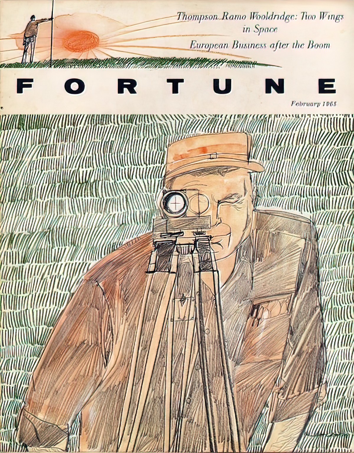
Time-lapse photography (aka chronophotography) influenced the Cubist and Futurist painters in the early 20th century.
In the 1940s and 50s Abstract Expressionists (e.g. Jackson Pollock, Robert Motherwell) pushed this trend about as far as it would go. Their paintings didn’t have much in common with how the real world looks.
The Abstract Expressionists were interested in expressing ideas, experiences, and feelings. They didn’t even try to create the illusion of a real space.
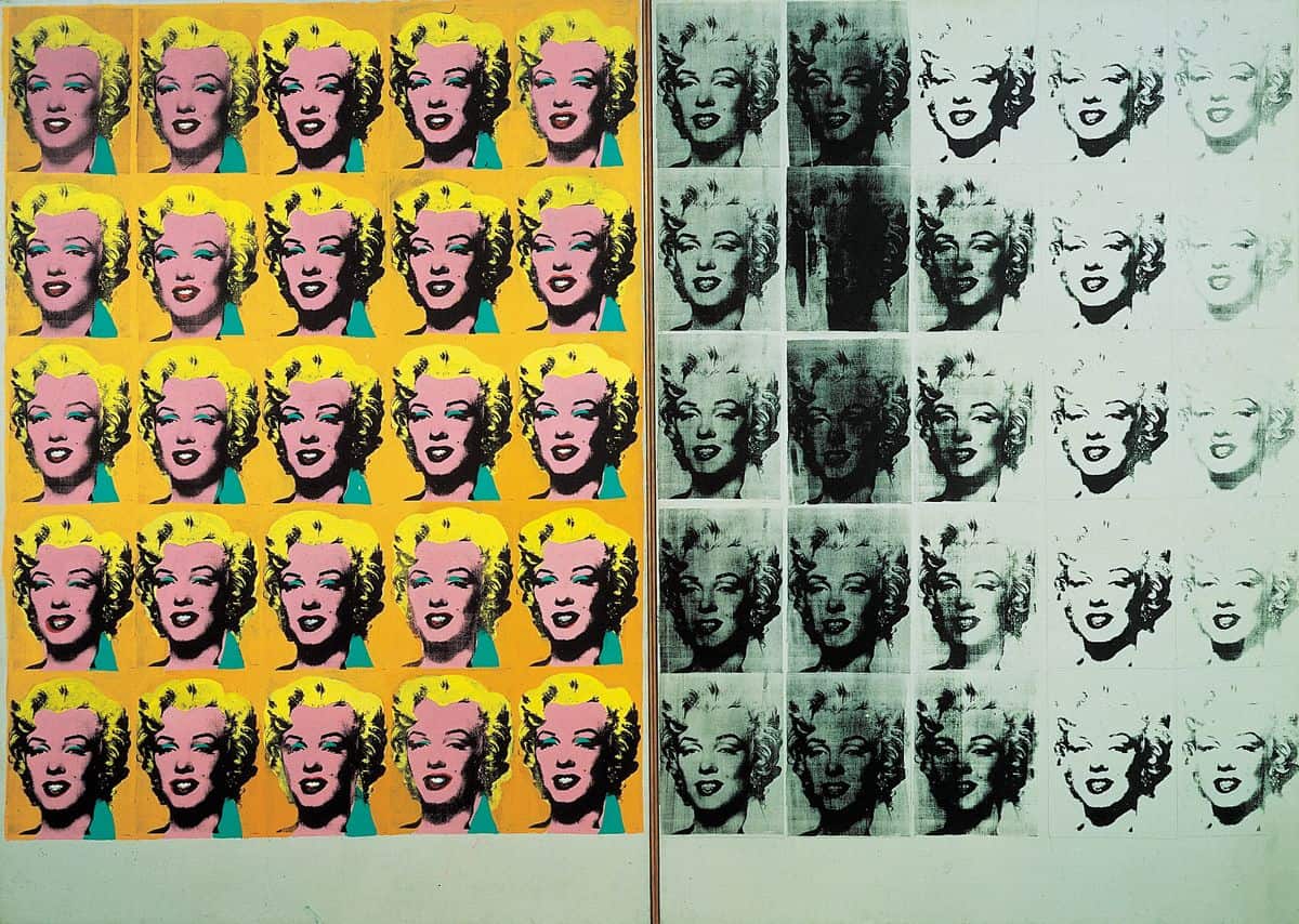
These artists changed painting forever, even for non-abstract artists. Take for instance Andy Warhol, who often repeated the same image across a painting. That looks kind of like a film reel, right?
Rauschenberg is a similar example of an abstract-influenced artist who made use of real images in abstract layouts.
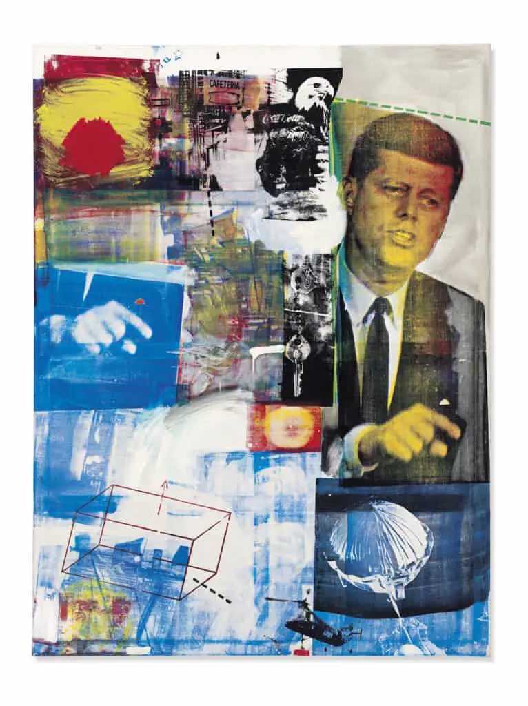
In a way, painters such as Warhol and Rauschenberg tried to incorporate images without returning to the earlier practice — rejected by the Abstract Expressionists — of creating an illusion of a real space. This was a different way of visualizing reality. It’s not exactly intuitive to think that Warhol and Rauschenberg were influenced by timelapse photography, but they were!
Here’s an Andy Warhol:
And here’s a sequence straight out of a children’s picture book:
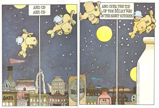
People who study Greek vases call that ‘Sequential Narrative Art‘. Have modern illustrators been more influenced by Greek vases, or by time lapse photography? These sequences are popular in picture books and even more popular in comics.
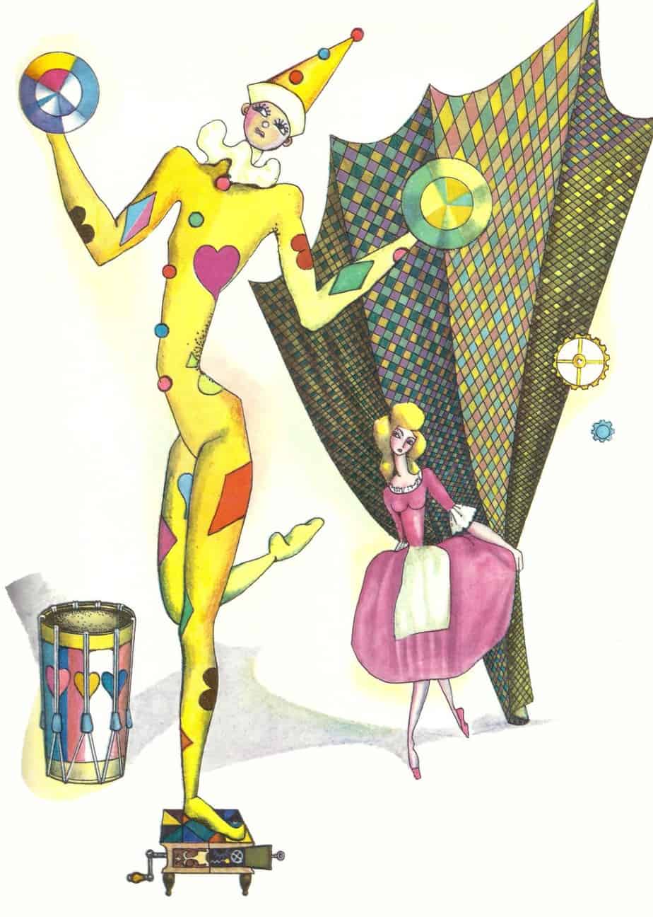
Abstract Expressionist art is wonderful for creating fairytale worlds. Fairytale worlds do not exist in real space, nor in real time, so many illustrators of fairytales (though certainly not all) work with layouts that actively reject any realworld notion of space/kairos/chronos.
Carnivalesque stories, likewise, dispense with realworld notions of time and space, so this more abstract illustration is perfect for carnivalesque picture books.
COPPÉLIA (1971) Milada Mikulová
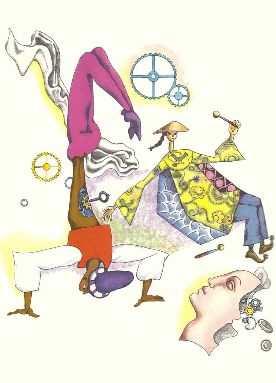
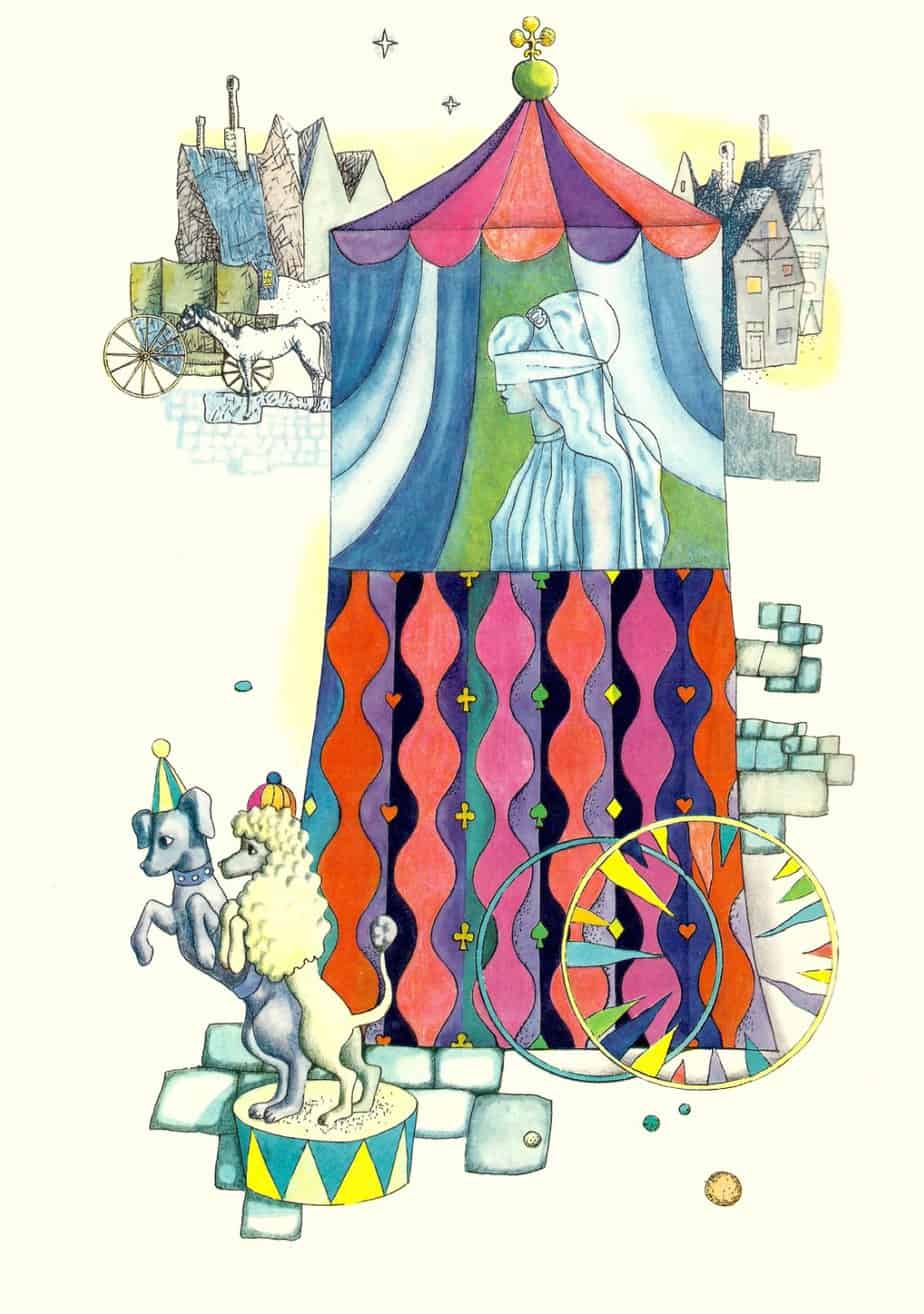
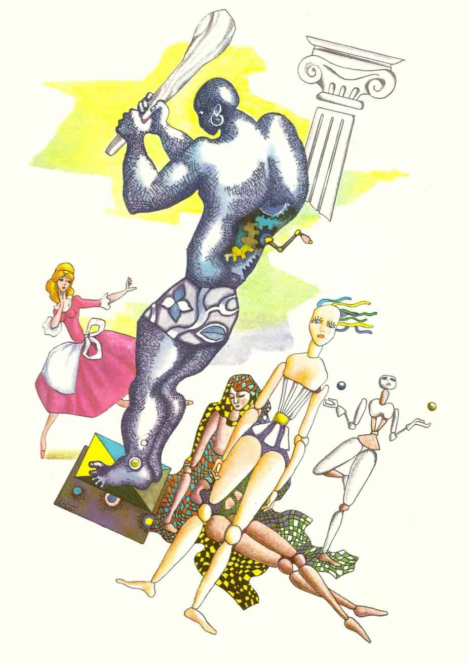
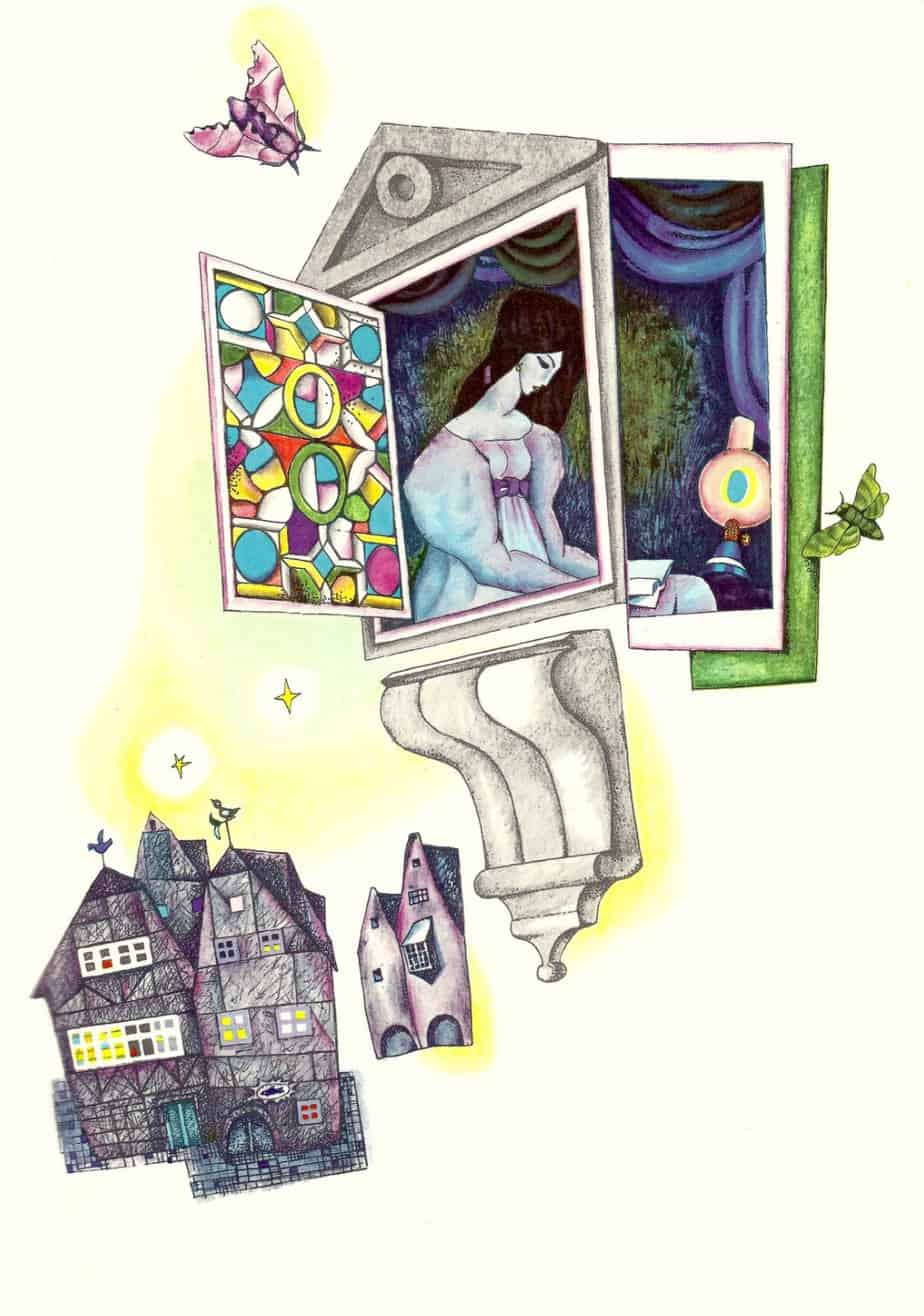
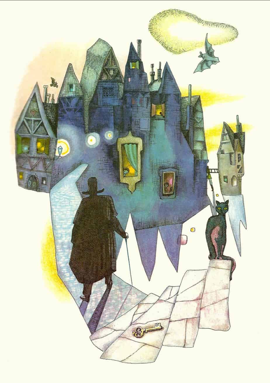
ELFENHEUVEL (1976) Robine Clignett’s version of THE LEGEND OF KNOCKSHEOGOWNA
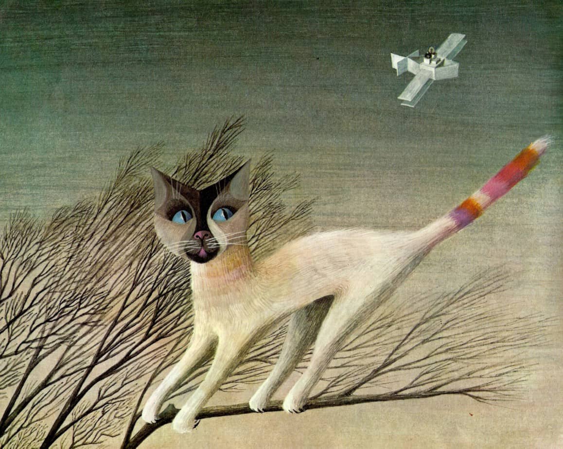
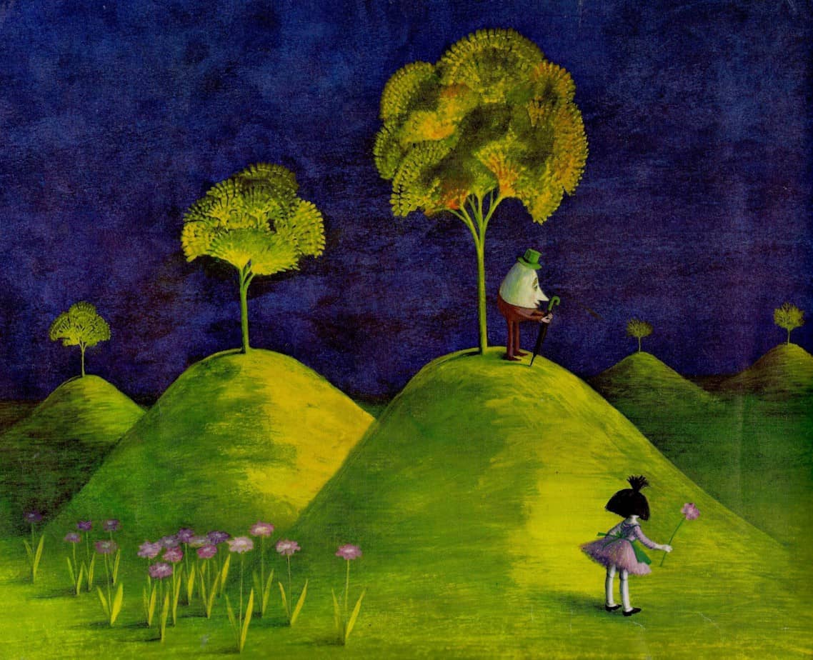
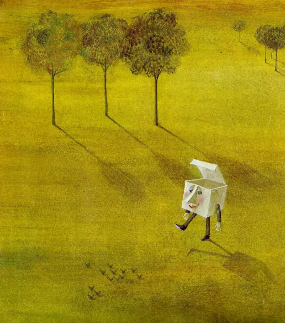
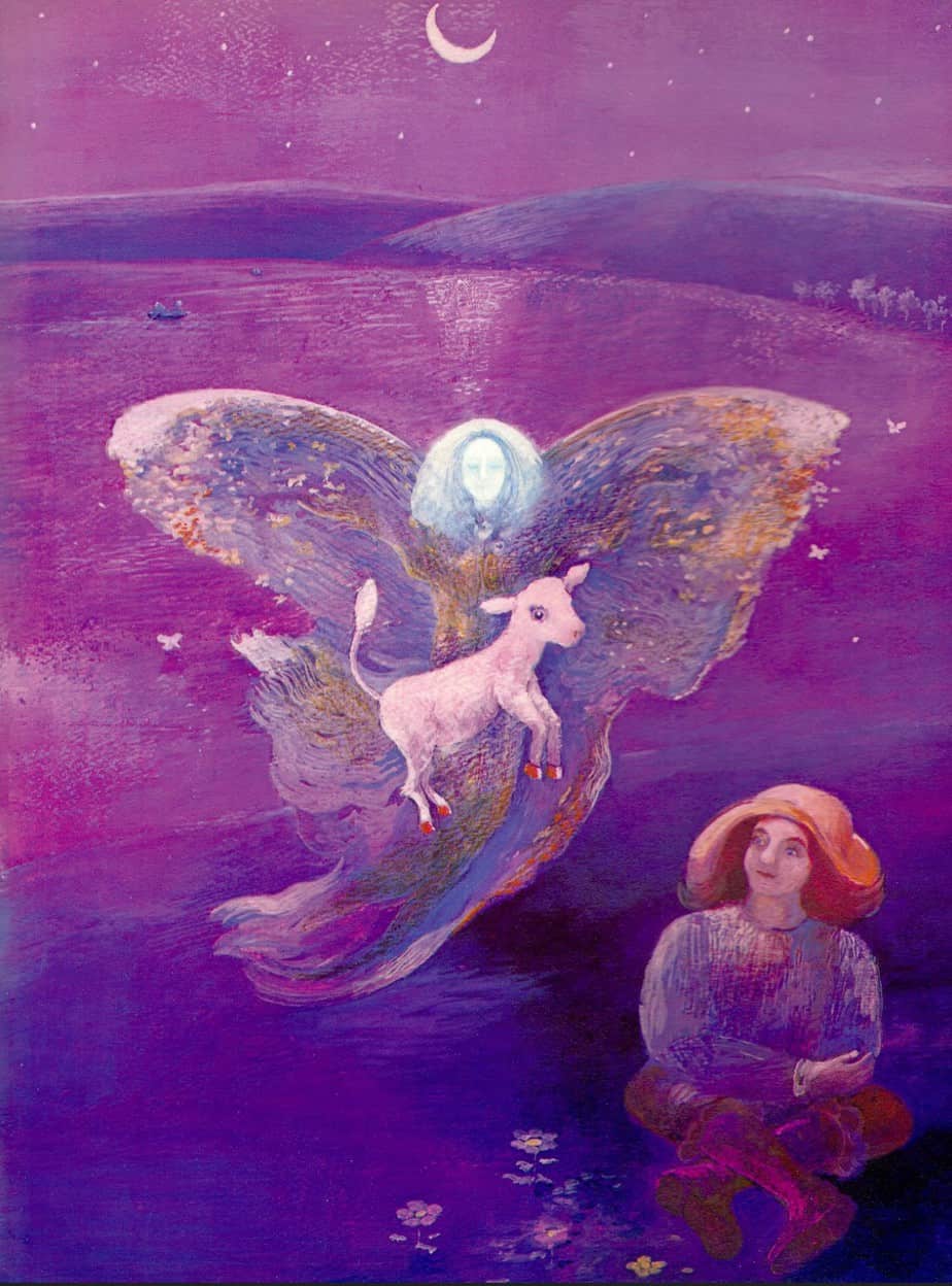
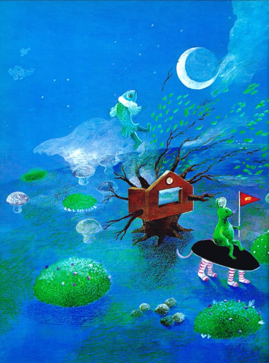
Was this style of illustration influenced by photography, or was it influenced by folk art? I think, from what we know of the Abstract Expressionists, both.
