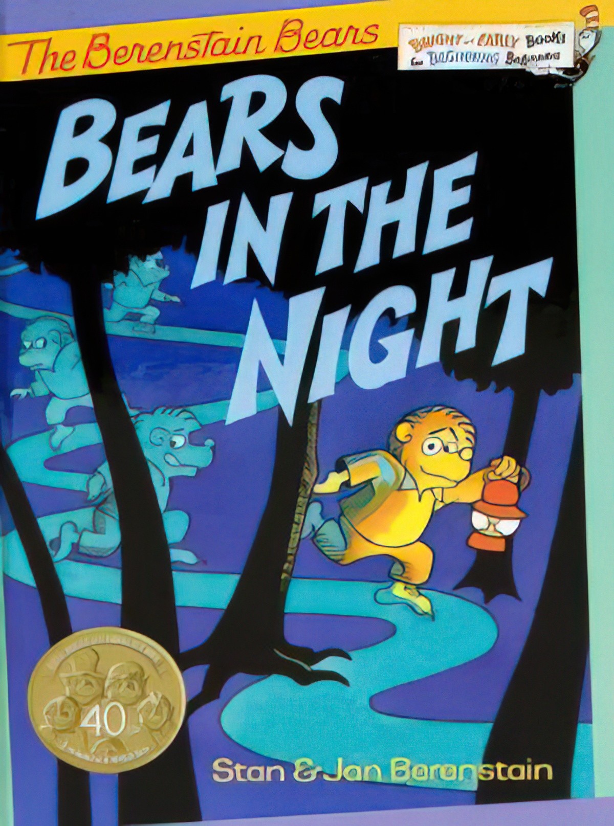
Anyone who has helped an emergent reader with assigned readers knows the difference between an interesting early reader and a ‘slog’. Bears In The Night by the Berenstains is an early reader with a focus on positional words. This book is an example of a successful early reader because the story is engaging and children will want to return to its fun creepiness over and over. This is achieved by:
- Creating an eerie story with just the right balance of scary and humour
- Creating words with wonderful rhythm and judicious use of repetition.
WHAT HAPPENS IN THE STORY
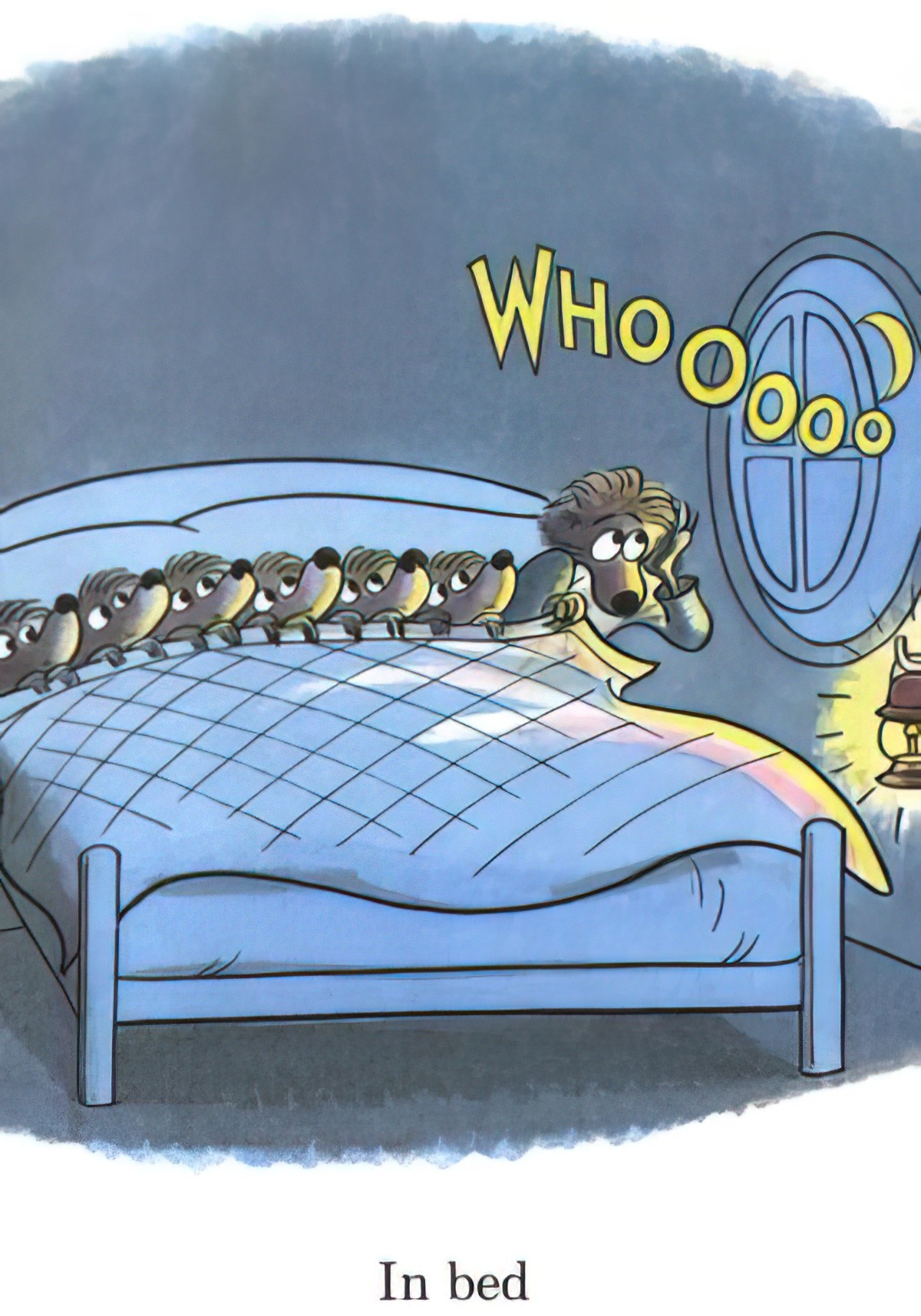
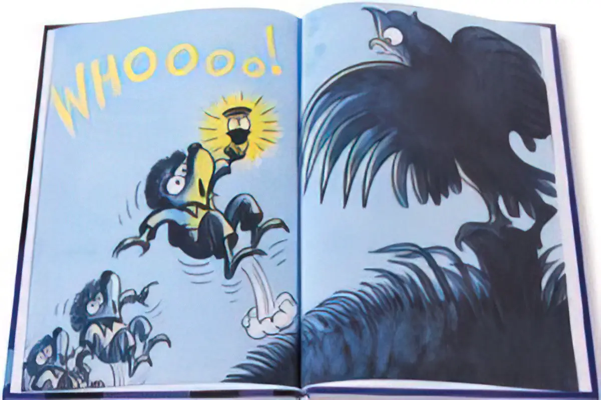
Seven bears are tucked up in bed together. They hear a ‘whoooo!’ coming from outside, so leave the safety of their bedroom to explore what it is. When they discover it is a big owl, they rush back home and get back under the covers.
WONDERFULNESS OF BEARS IN THE NIGHT
Picturebooks work best when the world of the story is exaggerated in some way compared to real life. On the very first page we see not just a young character in bed, but seven of them, all looking exactly the same.
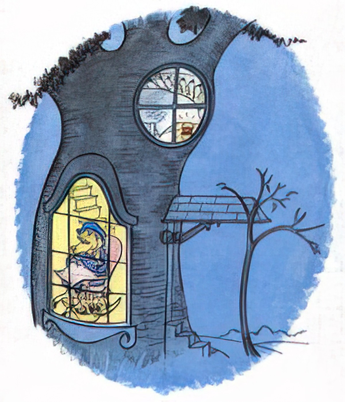
Creators of picturebooks must find the line between ‘too scary’ and ‘not scary enough’, settling upon ‘intriguingly scary but not nightmare inducing’. The Berenstains have managed a perfect balance, with an owl which seemed far more scary before the little bears and little readers know what it was, and a final page in which we see the mother for the first time, and seven little bears fast asleep. Downstairs, the light is on and the mother looks content, with a reassuring, cosy surrounding: sewing in a rocking chair.
It’s interesting how often mothers perform the comforting role in picturebooks. This story was published in 1971. We are starting to see a few more ‘fathers as comforting figures’ in picturebooks, but they are still few and far between.
As for the text, this is a story in which the words build upon themselves, and I tend to find these irritating if there is too much text to read over and over again. Regardless of how much children like it, so often it’s an adult co-reader who has the arduous task of reading these stories, and I have seen some particularly bad examples in my time, one of which recently ended up in the bin.
This book, in contrast, builds upon itself in the best kind of way, often by repeating just the first phrase in a sequence, next by compressing all phrases — mostly on one page. This is a good technique to use following a climax, because when familiar phrases are seen on a single page the reader naturally quickens the tempo of reading, adding urgency to the need to get back to safety. Another classic book which makes use of this technique is Hairy Maclary from Donaldson’s Dairy. The language in Hairy Maclary is more complex because the words carry more of the story, but the repetition works because the names of the dogs have such wonderful mouthfeel.
NOTES ON THE ILLUSTRATION OF BEARS IN THE NIGHT
This is almost but not quite a wordless picture book. Because there are so few words — and even fewer distinct words — the illustrations carry the vast majority of the story.
The choice to make stories about seven identical bear children offers advantages to the illustrator. We see a variety of facial expressions in the one scene, for example, without having to create a multiple of backgrounds which prop up a different, conflicting face. Also, when decoding picturebooks which show successive scenes, for example when a character gets ready for bed and we see several different ‘shots’ of the character, brushing teeth, putting on pyjamas and so on, young readers don’t always realise that each instance of the character is the very same character. This book avoids the decoding issue, and has a dual child audience of children encountering picturebooks for the first time, and a few years older when learning to read for themselves. These ‘crossover’ books are very useful to have on the shelf, because there are few things more satisfying for an emergent reader than to come back to an old favourite just a few years later and discover they can now read the words themselves (aided by general familiarity as much as decoding skills, perhaps). This gives confidence.
When illustrating night scenes, many illustrators for children do this by using blue hues rather than darkening the tone. This serves well to create a nightscape which gives the illusion of darkness but without the element of scary — blue hues in bright hues are the ‘night light of picturebook world’.
When you read the book did you notice the white space? Good white space goes completely unnoticed unless you’re looking for it. White breaks up the blue of the night time, and has several other roles here:
A place to put black text, which needs to be super easy-to-read
Allows for differently shaped scenes across multiple pages of the same dimension.
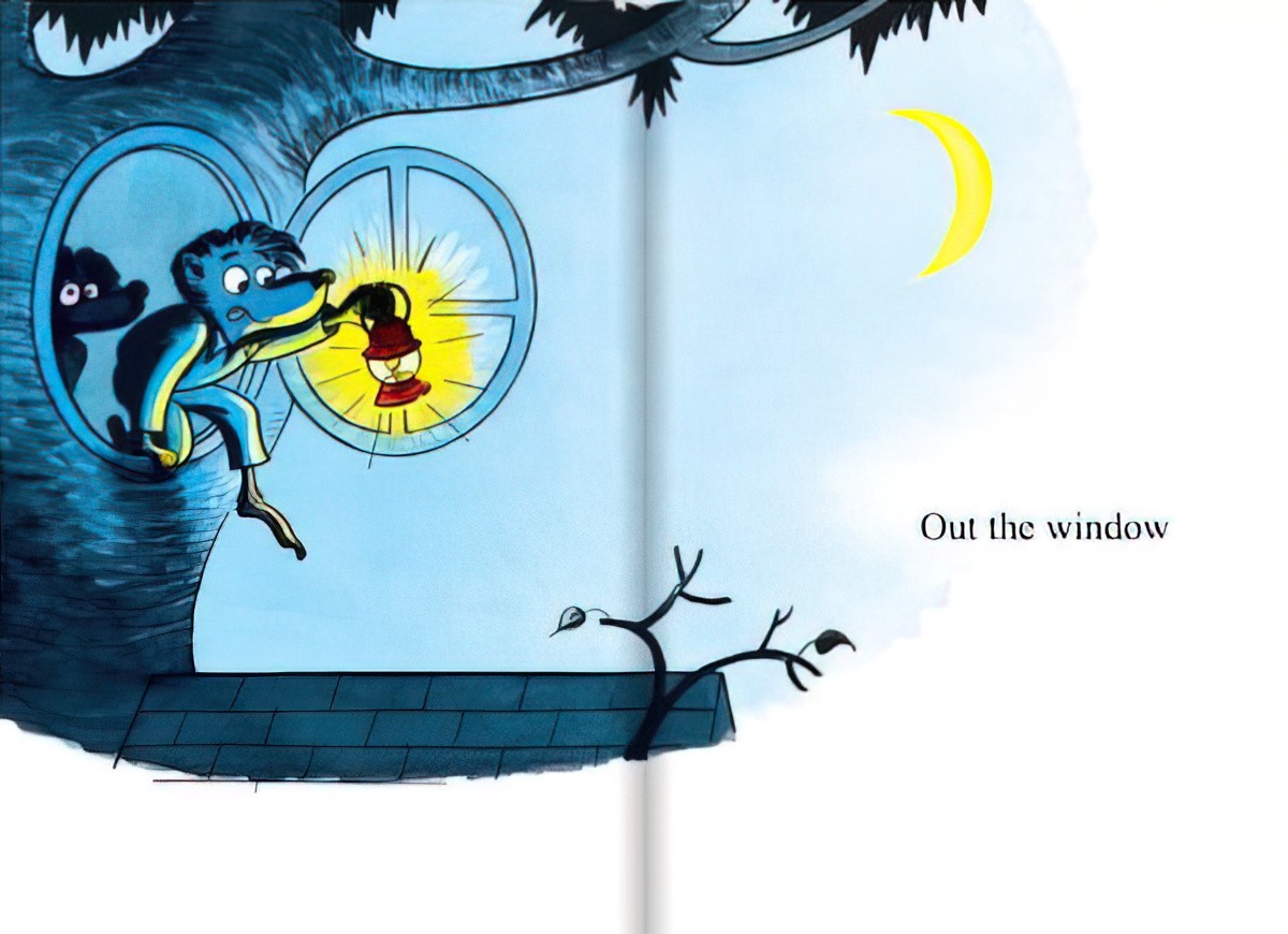
Though there is white space, these blue night scenes can look a bit flat unless there is a high-contrast lightsource. In this story we have a bright yellow lantern which provides a focal point of colour on every single page. The same yellow is used for a crescent moon. (Full moons are less common in this illustration style, more easily confused with the sun.) The intratext of ‘Whooo!’ is also yellow. Combined, this adds up to quite a few splashes of colour.
There are stock images illustrators make good use of to tell the reader ‘This is scary!’ The Berenstains have used:
- the darkness of night-time
- reflected light off the silhouette of the owl
- spider webs
- dark woods with sparse foliage and jagged branches
- ghost stories as a sort of hypotext for the ‘whooo’ of what turns out to be just an owl
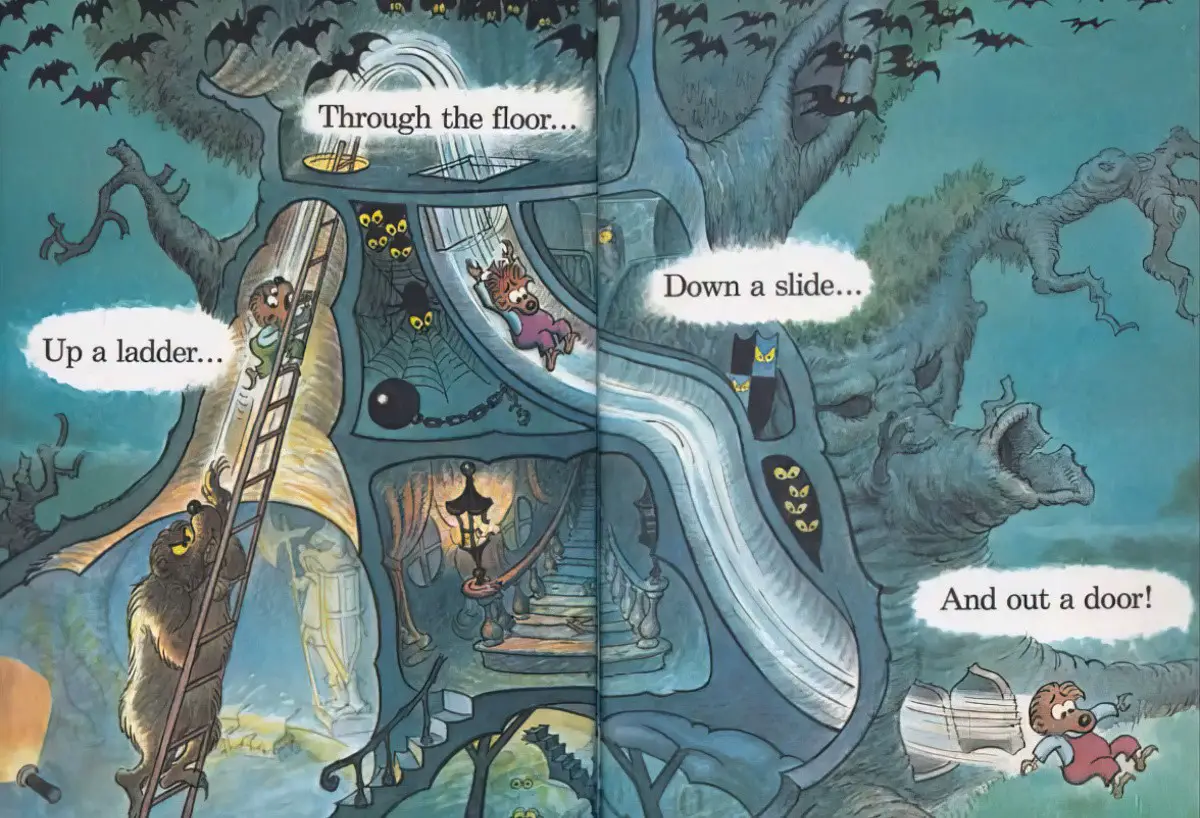
One of the challenges when illustrating this particular story would have been the page layout; specifically, the need to include vast landscapes on double-page spreads. The spreads build on themselves just as the words do. On the most challenging double spread we see a bear climbing out of a window, climbing down a tree, ducking under a bridge, running around a lake, walking through two big rocks and running scared through the woods.

The illustrator could have created a less engaging picture (though easier to illustrate) by drawing a series of ‘snapshots’. Instead, we see a birds-eye landscape view with compressed perspective.
STORY SPECS
- First published 1971 in Great Britain by William Collins Sons and Co Ltd
- Subsequently became a ‘Bright and Early’ book with the Cat In The Hat logo
- Our Picture Lions version has exactly the same cover on both the front and the back, which is an interesting choice for children who haven’t yet learnt which way a book opens.
- 15 double page spreads and a final ‘comforting’ page facing the colophon on the back cover.
COMPARE WITH
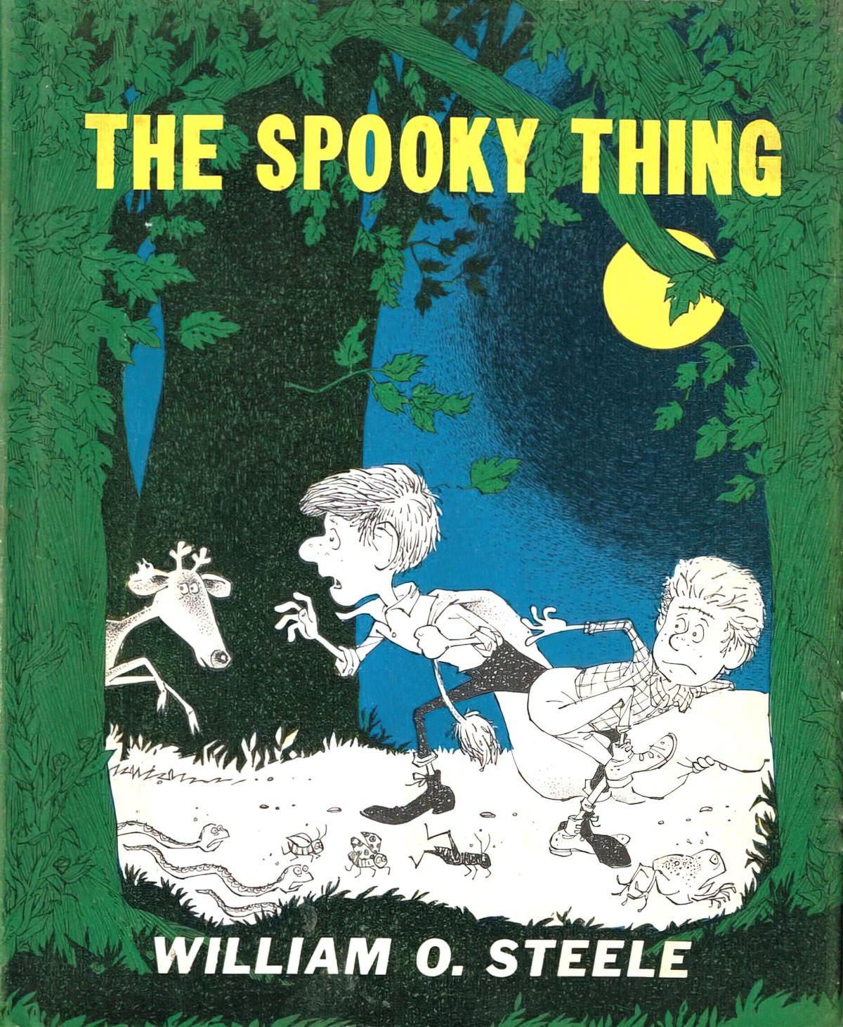
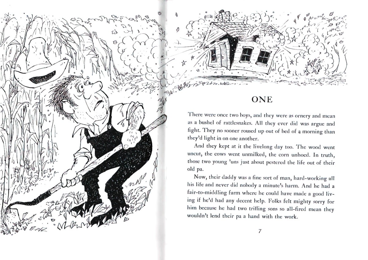
The Spooky Thing BY William O. Stele and illustrated by Paul Coker is based on an old Tennessee folk tale called Chicky Licky Chow Chow Chow. A father sends his two unhelpful boys out on a mission where they encounter a spooky thing.
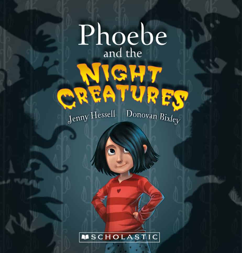
Phoebe and the Night Creatures is a much more recent book (also an Australian band) published by Scholastic, and stars a single girl protagonist who is scared to get out of bed to visit the toilet.
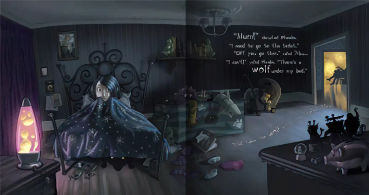
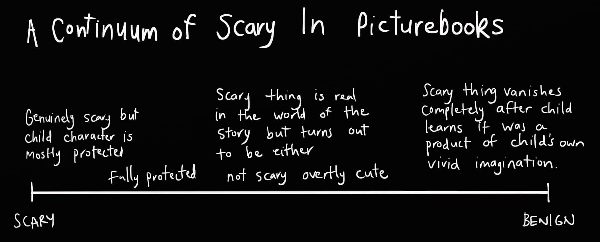
The mother in this story is a distant figure who appears at the beginning of the story and provokes Phoebe to become independent rather than as a comforting figure who appears at the end. Again, the scenery is a nightscape, but set entirely inside a house. Notice how a digital artist portrays night-time and intratext, and how the advent of computers has changed how we illustrate. Like Bears In The Night, Phoebe and the Night Creatures is a story that builds on itself, but in a different way. The climax comes later in the story, so the denouement is shorter. Scary things in picturebooks tend to fall into two categories:
- The thing wasn’t scary after all and
- The thing you were scared of was all in your imagination.
Or perhaps it’s best to think of picturebook scary things in terms of a continuum.
There are many ways of illustrating night-time, and nightscapes are not necessarily less bright and cheery than daytime scenes. See: Illustrating The Dark.
