I have conflicted views about Enid Blyton, but Thirteen O’Clock story is relatively free of the problems I (and many others) have taken issue with in these slightly more enlightened times. We still have a story in which a young patriarch-in-training helps an older female character out by tending to her minor injury and finding a lost cat, which some may read more generously as an example of feminine caring.
All that aside, this was one of my most favourite books as a preschooler — that lady sure knew how to tell a tale to children. Mine is the 1974 version illustrated by Tom Barling in very 70s style. The story itself may have been written much earlier, though Enid Blyton was writing right up until 1975, and it’s not easy to find the years in which specific short stories were published.
WONDERFULNESS OF THIRTEEN O’CLOCK
Enid Blyton was well-schooled in a kind of superstitious mysticism which she made great use of in her fantasy stories. Fairies, goblins, pixies, brownies, witches, portals into other lands… In this story, she makes use of a very old superstition surrounding the number 13. What’s the basic back story of this unlucky number?
- Oddly, superstition around the number 13 derives from various unrelated cultures around the world, not just one. This may have something to do with lunar-solar calenders, in which there are 12 point something ‘months’ per solar year. This gives a culture 12 ‘months’ plus a bit of a month (the thirteenth) per year.
- The number 13 may rather disturbingly be linked to a form of ancient misogyny: In ancient cultures, the number 13 represented femininity, because it corresponded to the number of lunar (menstrual) cycles in a year (13 x 28 = 364 days). The theory is that, as the solar calendar triumphed over the lunar, the number thirteen became anathema, because (obv!) periods are evil.
- In modern times, even people who actively avoid the number 13 probably don’t really think of that reason, but superstitious types still manage to find reasons to believe that there is something inherently wrong about the number.
Other authors have taken the number 13 and used it in a plot device for genres such as thriller and horror, but Blyton, in writing for children, pairs this rather sinister tradition with the childlike tradition of blowing dandelion ‘clocks’ in order to tell the time. (Blyton had no significant qualms about refusing to use literature as a conduit to a rounded scientific education.) In Blyton’s story, ‘once in a blue moon’ means that the moon literally turns blue.

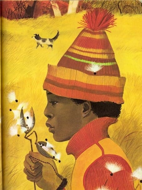
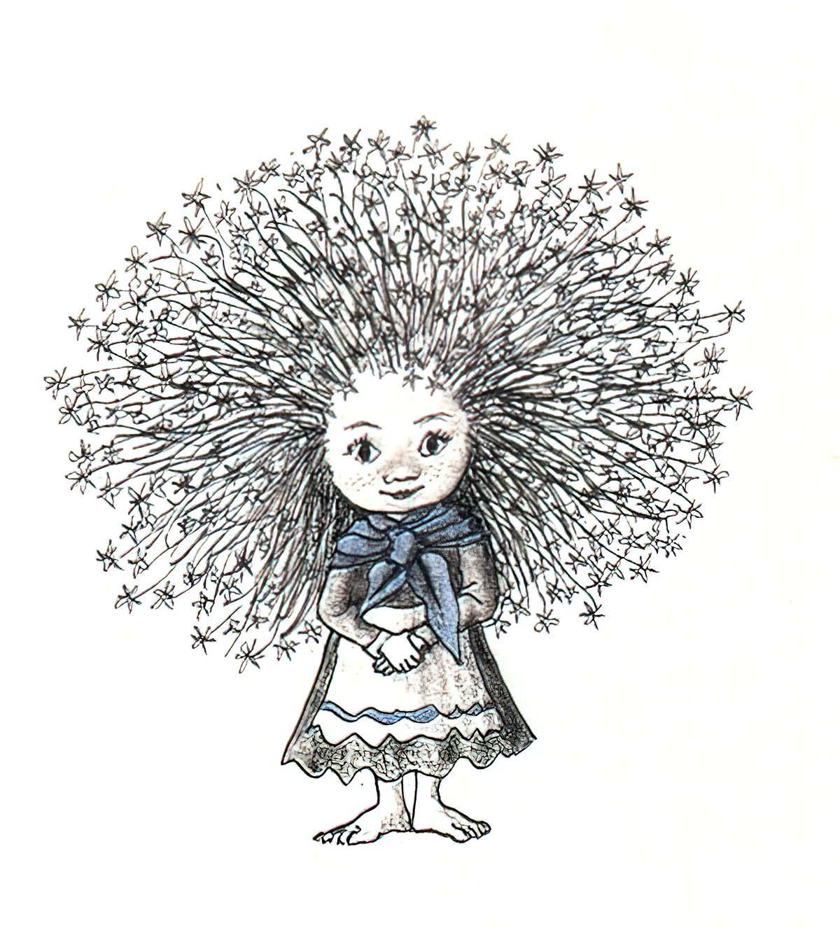
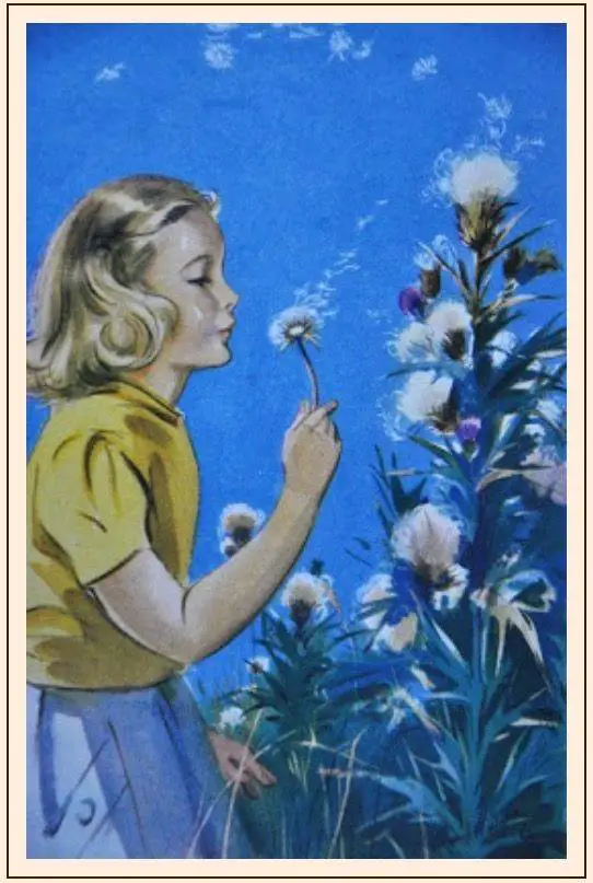
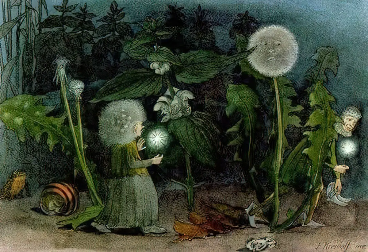
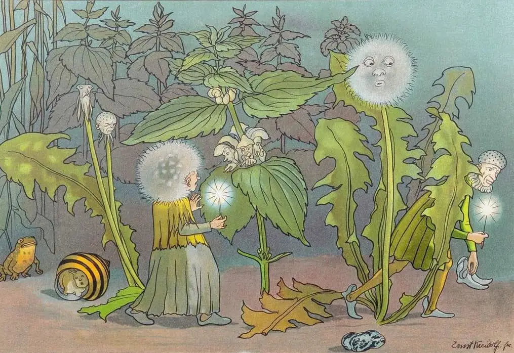
The thing I loved most about this book was the thing I also loved about the Faraway Tree series, in which Blyton’s wood whispers ‘Wisha wisha’ as the wind blows through the trees. This phrase gave me a deliciously thrilling feeling as a young reader. In Thirteen O’Clock, Blyton not only encourages word play with phrases such as ‘Hoona-looki-allo-pie’ but has created another marvellous phrase of frisson: ‘The witches are coming! The witches are coming!’ This had me hiding under my blankets.
NOTES ON THE ILLUSTRATION OF THIRTEEN O’CLOCK
What makes the illustrations in this book seem distinctively 1970s? The 1970s was a decade wedged between a time of great printing advancements, with the widespread introduction of colour printing in the 1960s, and the beginning of digital illustration used (at least for some parts of the process) by many illustrators working today. Illustrators were working in colour, but they were also drawing and painting by hand.
ILLUSTRATIONS OF THE 1970S
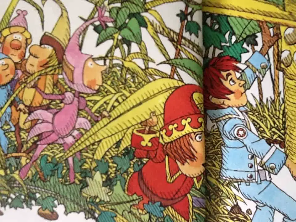
It was in the 1960s that a new type of picture book emerged — those in which illustrations dominated the text. This particular book isn’t one such example — in fact, this book is more accurately a richly illustrated short story, since the story can exist in its own right (and indeed does, inside various anthologies) without these pictures.
One thing that makes Tom Barling’s illustrations seem specifically 1970s is the strong use of line. Another illustrator working around this time was Pat Hutchins, who published Rosie’s Walk in 1968, just a few years earlier. In Rosie’s Walk, too, the influence of folk art is strong; line exists not only to add form and shadow to objects but also to act as a decoration in its own right. In Thirteen O’Clock, likewise, there is no attempt made at any kind of aerial perspective; leaves on a tree in the distance are depicted in detail, even though the unseen viewer is too far away from that tree to realistically perceive anything more than a green clump.
To provide some rest for the eyes, Barling was making good use of white space — as modern illustrators are still doing today — the roads and the sky are white, and there is an area of blank reserved for the text on every double spread.
ILLUSTRATING CLOTHING
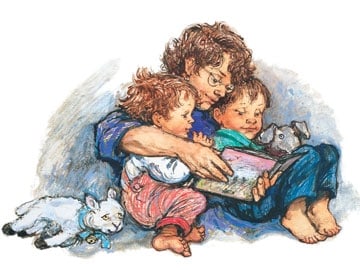
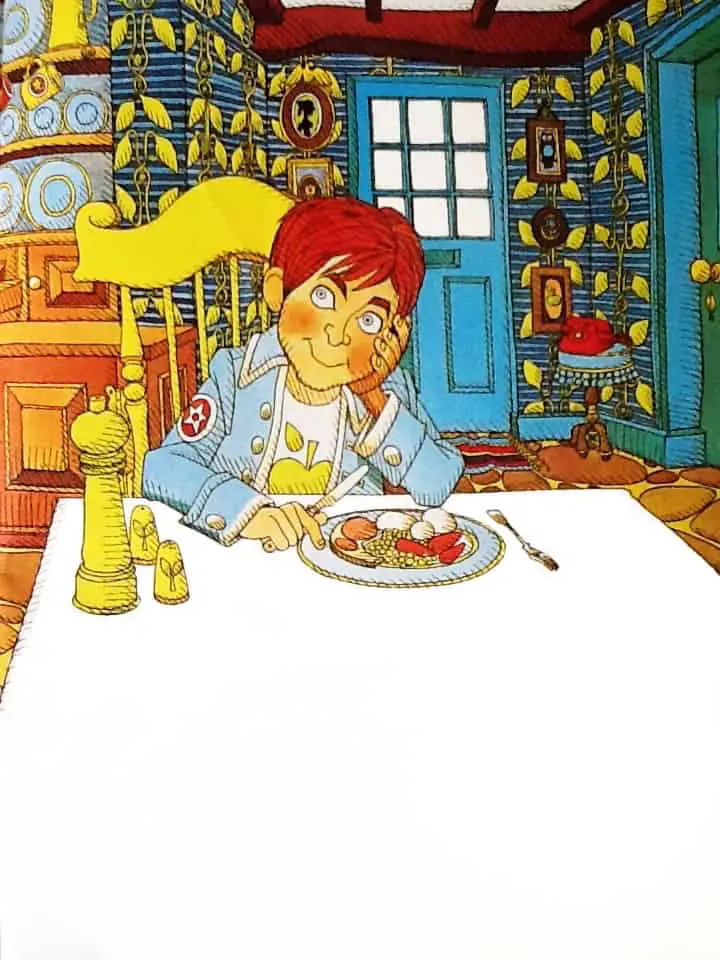
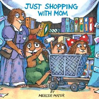
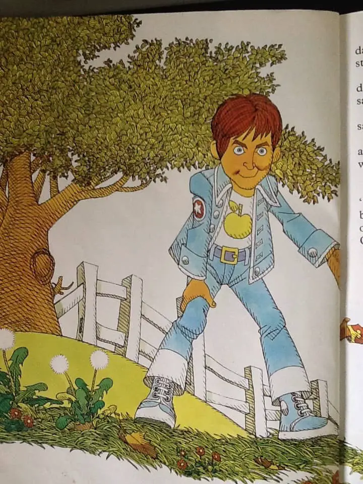
Tom Barling has of course dressed Sandy in 1970s fashion, with tight jeans that flare at the bottom and a wide belt. He wears his hair long (which happens to be in fashion again for adolescent boys, but isn’t always). It’s interesting to look at how various illustrators of children’s books deal with fashions of the day; if we dress our characters in clothing specific to the year or decade, this will place our stories firmly inside that decade even if the story itself is more universal than that. Is there an ‘unmarked’ wardrobe illustrators can use to avoid decade-placement as much as possible? Certainly, some illustrators rely upon stock clothing for their characters. Mercer Mayer is a good example of that. Though he has illustrated the Little Critter books over decades, his Mother Critter still wears a long dress and apron; the main character is still wearing pyjamas with an unbuttonable backside in them. Mayer’s characters are in fact middle class, 1950s, white America, and sometimes even stretch to Amish (for the mum) but for some reason a disproportionate number of illustrators hold onto lesser versions of this same milieu when illustrating modern books for children. I think it’s because we tend to idolise the era. (Hence Mad Men, which cleverly subverted our expectations.)
Is there a normcore fashion for picture books? Even Shirley Hughes, who places no value in creating Pinterest-worthy interiors or youthful faces (even in children) or dressing her characters up in high-fashion places her characters in a specific era: as Frances Spufford said of her Alfie series, the mother ‘is a frizzy-haired CND-supporting social worker from about 1985’. Though Spufford also points out that child readers won’t assume this about her. In fact, non-British readers — and readers who were ourselves children in the 1980s — probably won’t know this about her — I had to look up CND — fyi, it stands for Campaign for Nuclear Disarmament, which picked up in the 1980s as a backlash to the Thatcher years.)
ILLUSTRATING WITCHES
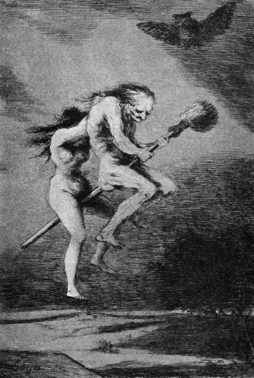
The historical view of witches is that they are not quite women.
You should be women,
And yet your beards forbid me to interpret
That you are so. (Macbeth, Act 1, Scene 3)
In art history, many witches are genuinely unattractive in a reproductive sense, either because they’re very old or because they make no effort to present themselves as alluring, and probably both.
By the 1970s, the nature of folkloric witches in the West had evolved to the point where witches were often depicted as feminine women, but the grotesque mismatch between unattractive essential witchiness is made more stark by their feminine style choices. Barling’s witches might also grace the pages of Dahl’s chapter book, The Witches, published about a decade later; their faces are asymmetrical and their noses and chins are masculine (transgressing gender expectations), but Barling’s witches wear lipstick and earrings, and have their hair styled into layered bobs.
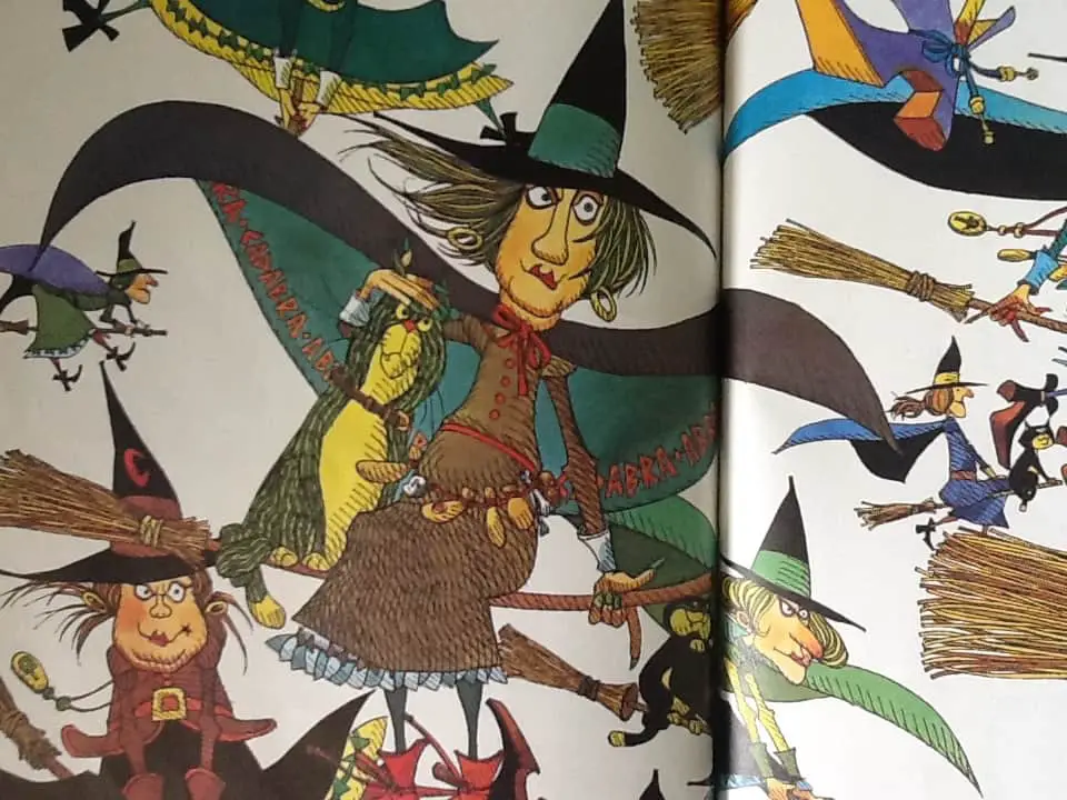
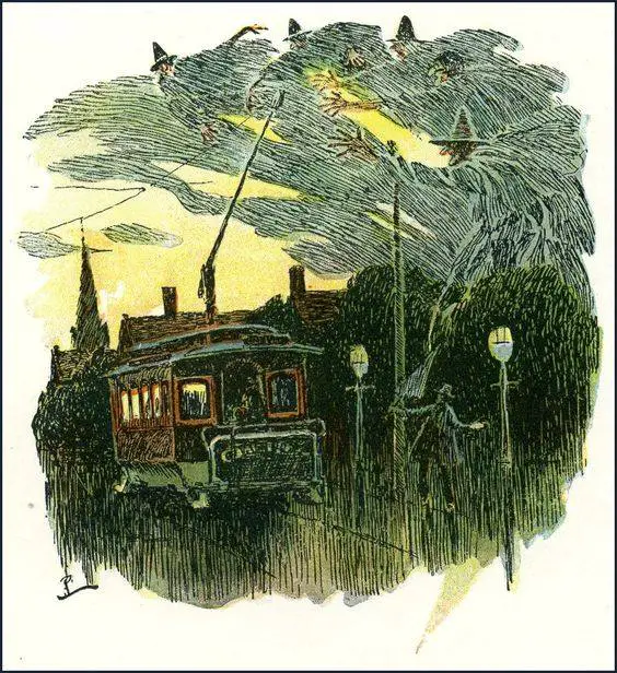
Though these witches are standard in any illustration of witches in picture books, I recently happen to have read Whipping Girl: A Transsexual Woman on Sexism and the Scapegoating of Femininity by Julia Serano, in which the author points out the extent to which femininity (and here, feminine accoutrements) is seen as an untrustworthy artifice, which is problematic for anyone presenting as feminine, but is especially problematic for transgender women. (I’m sure someone has done a study on witches and femininity in picture books. I’m guessing the witches of picture books are more feminine than scary due to the age of the target readership.)
Extratextual musings aside, Blyton’s imaginary world has no layers; everyone is exactly how they appear.
“I’m going to be nice to her. Besides she’s got a friendly face, rather like my granny’s — I’m sure she isn’t a bad witch.”
Indeed, the witches of this story are not nasty at all:
“You’re the cleverest, kindest boy I’ve ever met!” said the witch. “Most people are afraid of witches because they think we will change them into blackbeetles or something—but that’s an old-fashioned idea. Nowadays we witches are gentle folk, making magic spells that will do no one any harm.”
So there you have it: an anti-bigotry moral from an author who was quite well-known for her xenophobia.
THAT PESKY GUTTER
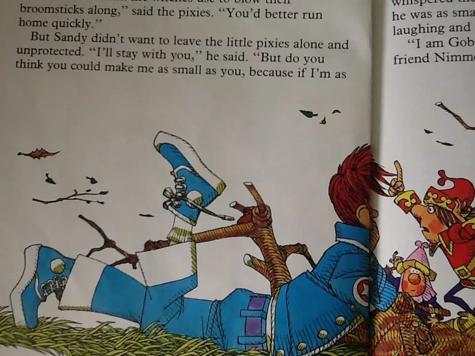
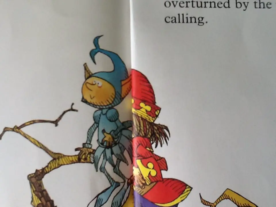
It’s clear reading this book in 2015 that publishers of picture books sometimes had a few lessons to learn in this new era of double-page colour spreads. It’s hard to find a professionally produced book these days in which the illustrator has been schooled in avoiding placing characters’ faces right where the gutter goes.
STORY SPECS OF THIRTEEN O’CLOCK
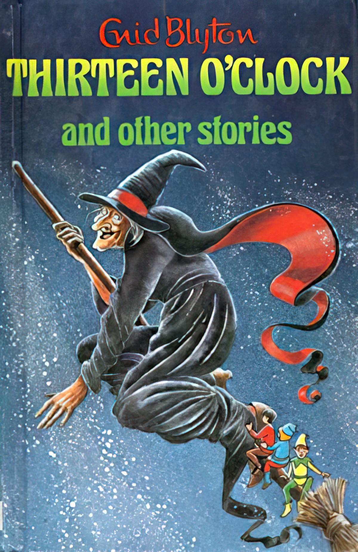
Thirteen O’Clock appeared in a number of different Enid Blyton anthologies, and is the title story of this one, which demonstrates its popularity:
Illustrator Tom Barling was born in 1936, and illustrated a few of Enid Blyton’s stories over his career. He had a varied creative life as author of eleven crime novels about gangsters. Tom Barling is also well-known as a comic illustrator and an animator on the 1973 TV series of The Addams Family. If you look for books hoping to find more of his illustrations, though, you’ll find most of them seem to be out of print.
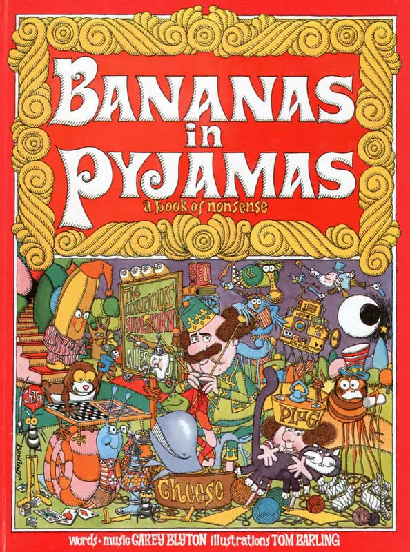
However, did you know that Bananas in Pyjamas is not just an irritating but super popular Australian children’s show but was originally a book written by Enid’s nephew, Carey? That was also illustrated by Tom Barling.
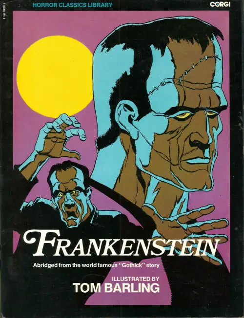
Barling also illustrated in an art noir style when required:
Comic book illustrators are required to draw from a variety of different, extreme perspectives. We see this skill a little bit in Thirteen O’Clock with a low-angle view of Sandy:
COMPARE AND CONTRAST WITH THIRTEEN O’CLOCK
There are many fantasy picture books (and chapter books) in which the child character goes off for an adventure, finds him or herself in a magical world, then goes back to the main parent (usually the mother) and is told that whatever happened is nonsense. But the reader is let in on the secret. Blyton’s authorial voice comes through clearly in the final paragraph:
“Eat up your lunch and don’t talk nonsense!”
But it wasn’t nonsense, was it? Sandy always puffs the time on all the dandelion clocks he sees now — perhaps one day it will be thirteen o’clock again!
The message here: Children, cling on to childhood, because the world of adults is devoid of magic.
This sort of plot might be contrasted with a book for children written by Richard Dawkins. The Magic of Reality is presumably an antidote to stories such as these.
The Magic of Reality is a fantastic book and I wish every child in the world would read it as they embark upon the study of high school science. But I think there is room for fantasy; clearly, some forms of fantasy are simply better done than others — fantasy which tells readers something about the real-world is the most valuable, and fantasy which urges children to believe in fairies even after the story is over is perhaps the laziest way of ending a story. However, Blyton was nothing if not prolific, and her stories were written in the oral tradition. It is therefore up to the adult co-reader to read this story with a nudge and a wink.
WRITE YOUR OWN
If fantasy stories for children are to do anything other than entertain — and pure entertainment is a satisfactory goal, no mistake — we must aim to pull readers out of a fantasy world with something to ponder. An io9 article outlines how reading Harry Potter has been shown to make readers better people.
…because Potter is continually in contact with stigmatized groups. The “muggles” get no respect in the wizarding world as they lack any magical ability. The “half-bloods,” or “mud-bloods” – wizards and witches descended from only one magical parent – don’t fare much better, while the Lord Voldemort character believes that power should only be held by “pure-blood” wizards. He’s Hitler in a cloak.
Robbie Gonzalez
Is this partly what makes the Potter books so popular, even though scholars of children’s literature struggle to put their finger on exactly why H.P. took off while many recent ancestors of the series which seem just as adeptly written muddle along with middling sales?
How to leave the preschool reader a better person by making use of fantasy in a picture book? That’s your ultimate challenge.
