-
Recoloured Images On Book Cover Design

Recoloured images can defamiliarise the real world and encourage viewers to see their own familiar worlds afresh.
-
Skeuomorphism in Book Cover Design
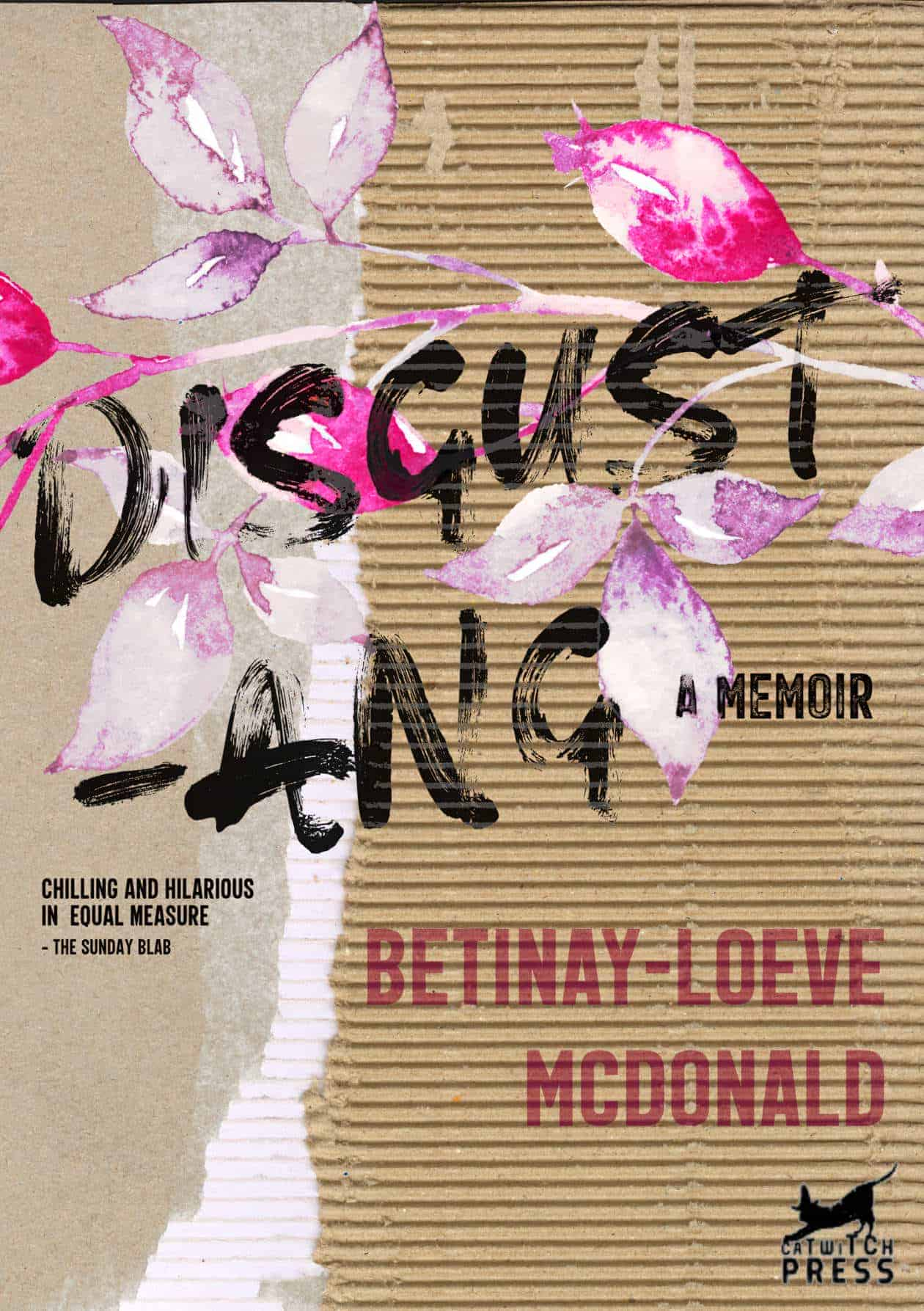
Skeuomorphism is the design concept of making items represented resemble their real-world counterparts. Paper folds, dog-ears, rips, holes, burns, scrapbooking collage, scrap cardboard, plane tickets, letters, post-it notes… These book covers are designed to look like derivative objects. A DAMAGED PRODUCT Some book covers look as if they’ve been defaced with scribblings and crossings-out: Book covers…
-
Transgender Jokes Which Are Actually Funny

So we’ve had decades and decades of jokes where trans people are the butt of the “joke”. This has extended to children’s media, where stories about gender transgression of any kind, but especially boys dressed forcibly as girls, have propped up the gender hierarchy by making it seem legitimately punishable to transgress. We’re in a…
-
Tricks for Writing A Lengthy Work

How do you write a lengthy piece of writing — a book, a thesis — without giving up? Various writers share tips and tricks. Here are a collected few.
-
The Hand-Lettered Look In Book Cover Design
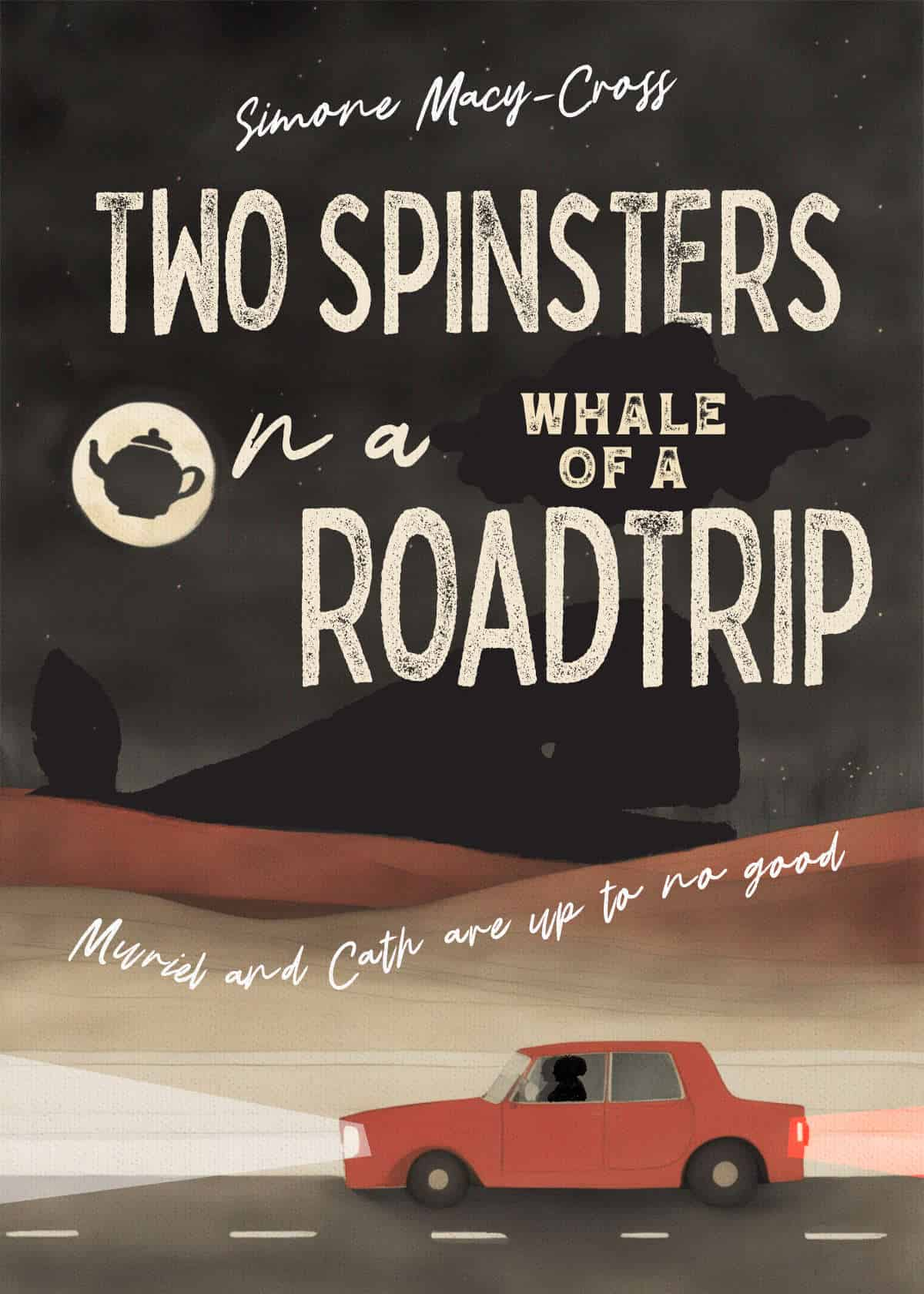
There’s a style of art and illustration, frequently seen on book covers, and I have no idea what to call it. Let’s call it the hand-lettered or hand-drawn look.
-
Book Cover Design With A Large Central Graphic
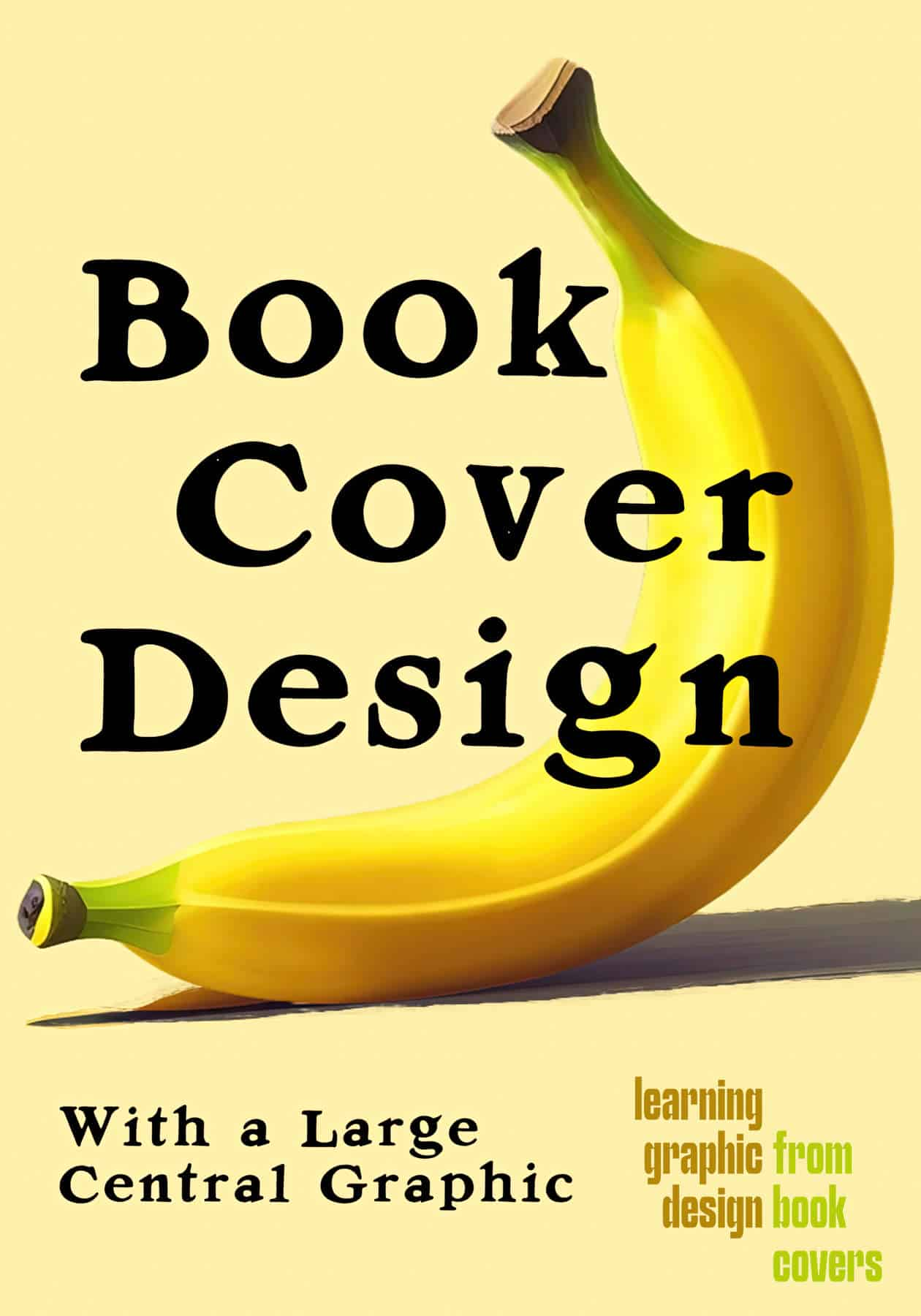
This book cover design layout is very common and does not call attention to itself. Still, I’ve collected a number of these covers for a compare and contrast.
-
Margins and Spacing in Book Cover Design
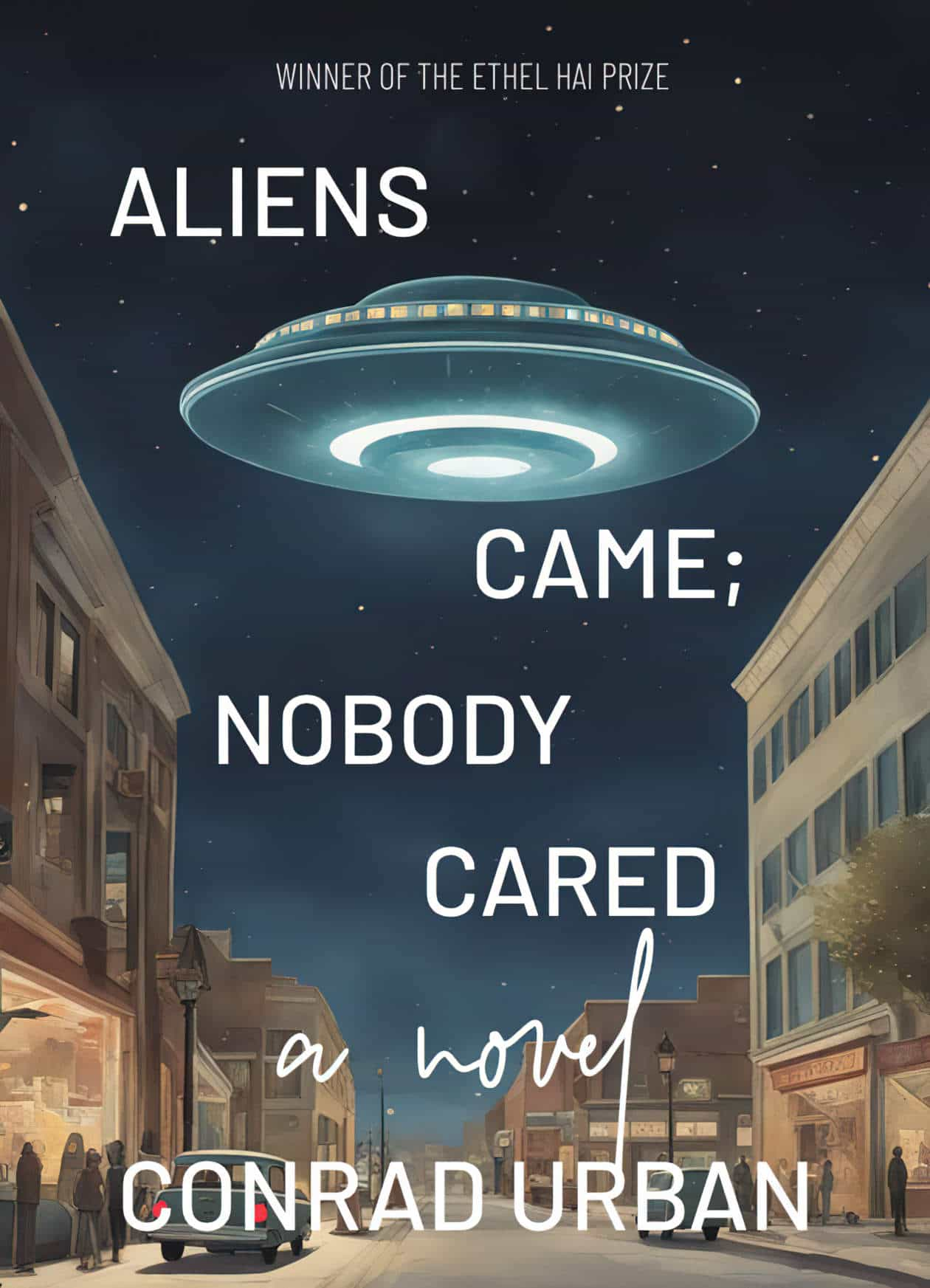
Let’s take a close look at how graphic designers alter margins, kerning and leading when creating contemporary book covers. First, by way of contrast, a small selection of book covers which are centre justified. Note than in all of these examples, the symmetry is broken by another stand-out page element, be it a marketing blurb,…
-
Blur and Glitch Effects on Book Covers
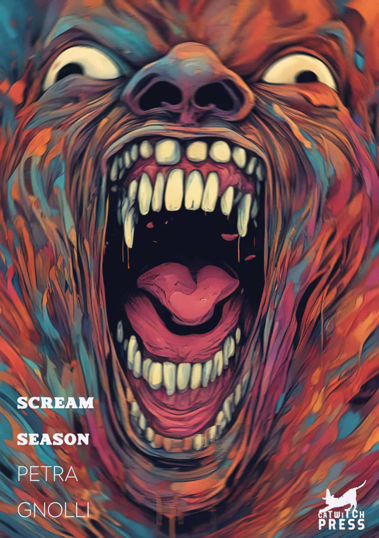
This is a collection of book covers which make use of blur, glitch and other distortion effects. The set of four Tove Ditlevsen book covers each exemplify a different kind of blur and glitch effect, so it’s nice to see them all together: Another trio: Here are some other examples of blur and glitch. These…
-
1960s-1970s Lettering in Graphic Design

A designer called Paul Bacon was influential in creating a mid-century look which is back in fashion.
-
Dear Marjorie: A Short Crime Story
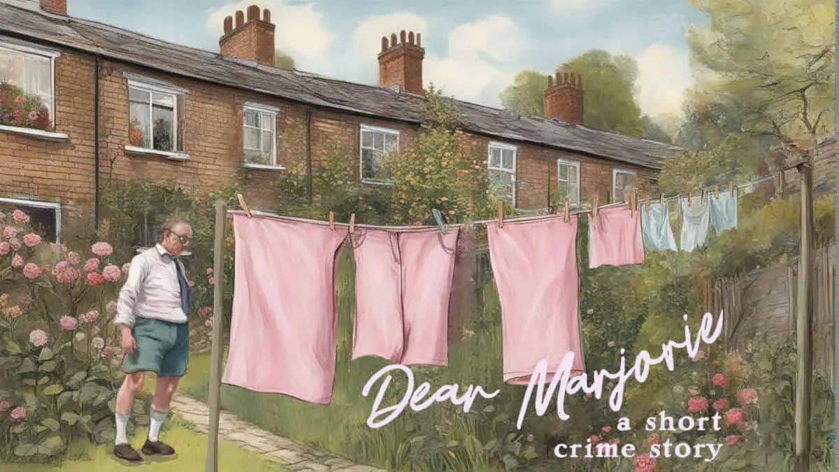
Dear Marjorie, I wonder if you’ve had much to do with law-enforcement. Twice now, I’ve had the experience of an official rat-a-tat-tat at my own abode…
-
Integrating Text and Images in Book Cover Design
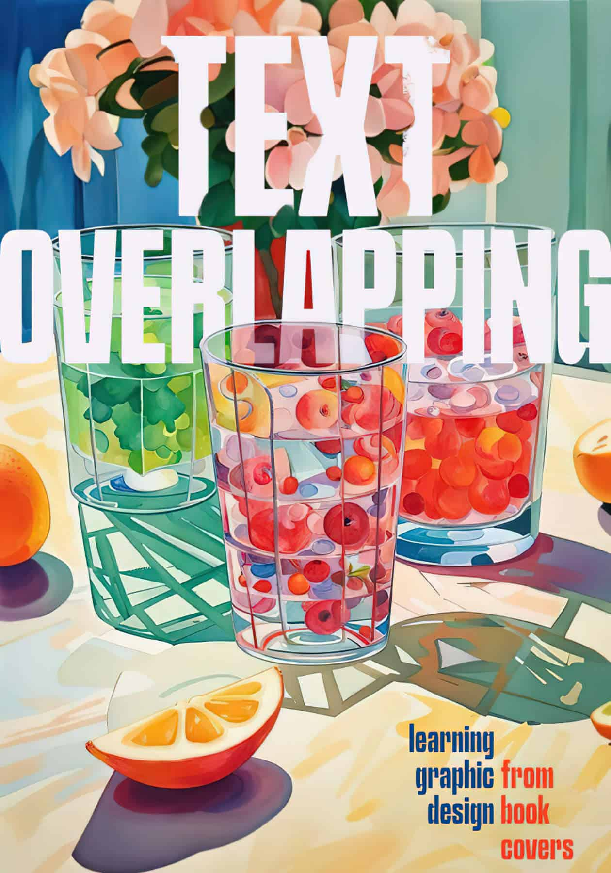
This is one of those low effort, big reward tricks which is so very common on professionally designed book covers but relatively rare on less attractive self-published books: The graphic designer integrates the text into the graphic in some way, often to create the illusion of depth.
-
King Midas: An Ancient AI Allegory
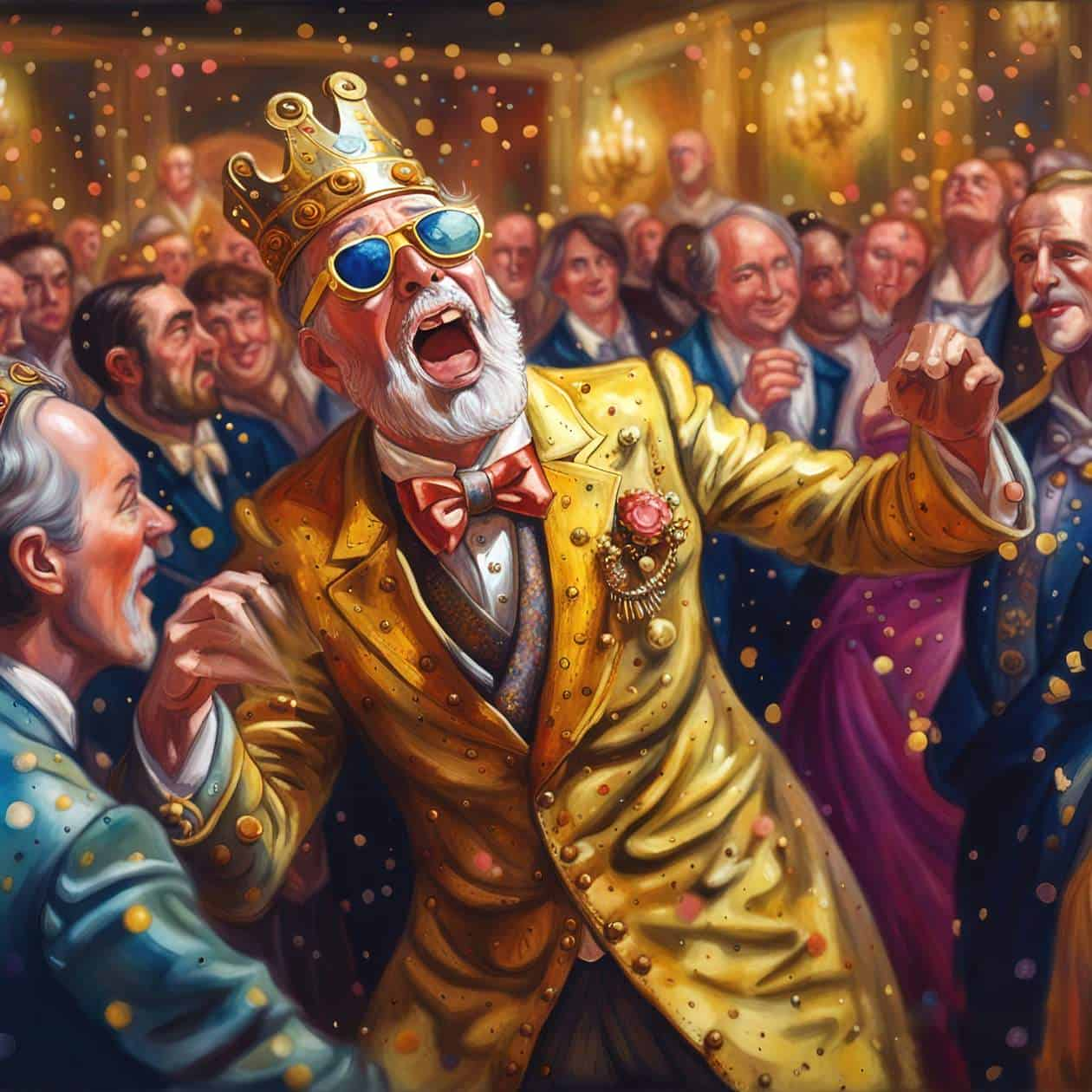
King Midas was a King of Phrygia, a dominant kingdom in Asia Minor from around 1200–700 BC. He thought quite a lot of himself apparently, and boasted that anything he touched would turn to gold. Perhaps he was speaking metaphorically, but he goes down in mythology as a supernatural character whose touch would literally turn anything…
-
A Little Journey by Ray Bradbury Analysis

“A Little Journey” is a 1951 short story by American author Ray Bradbury, first published in the August 1951 edition of Galaxy Science Fiction Magazine.
-
Fluorescent, Neon, Glowing Colours On Book Covers
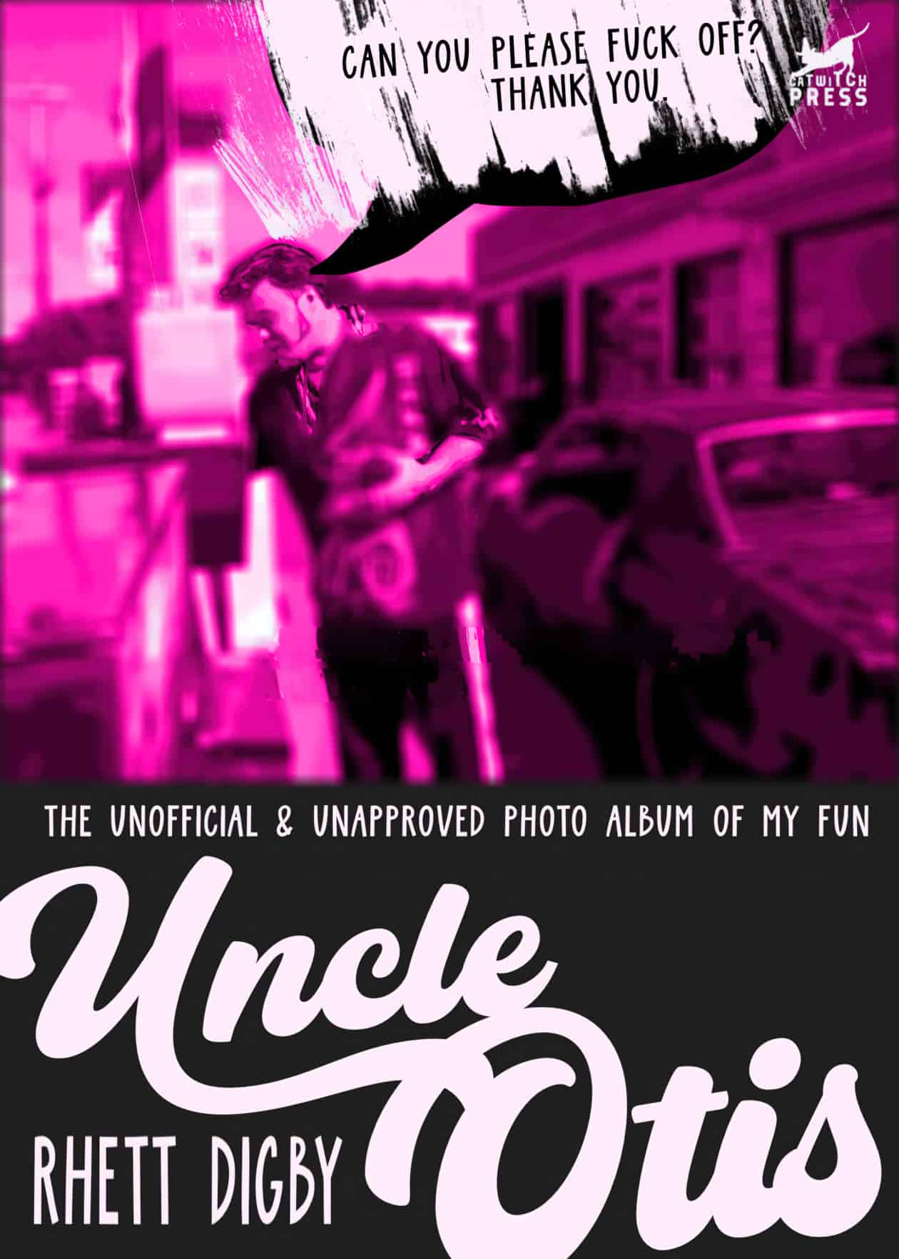
These contemporary book covers all utilise fluorescent, neon or glowing colours to eye-catching effect.
-
Literary Book Covers: Fauvism Blobs and Flat Design

I used an AI art generator to knock up some quick book covers, but I didn’t make books. I made boring supermarket items.