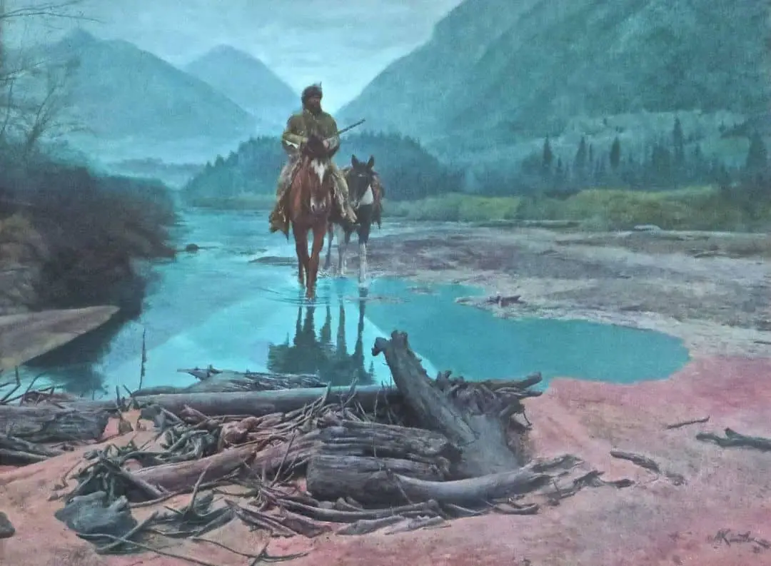
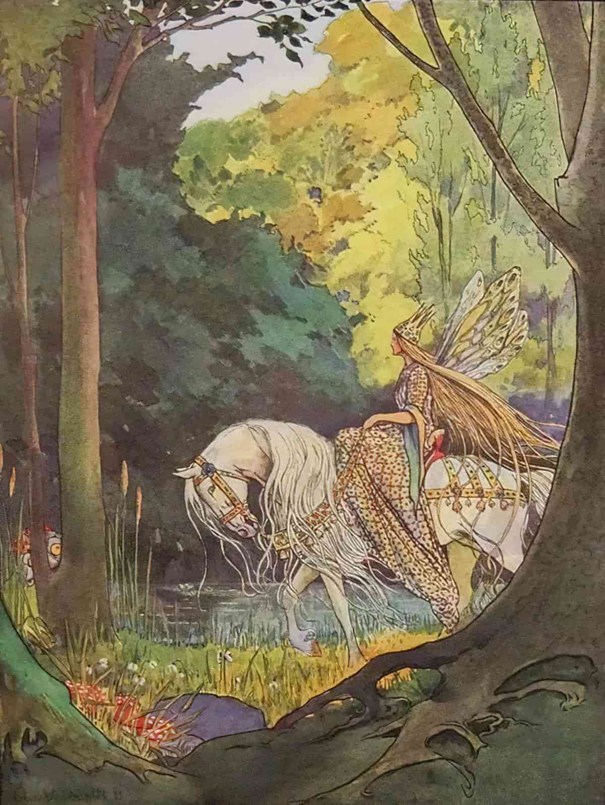
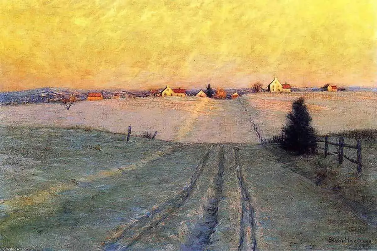
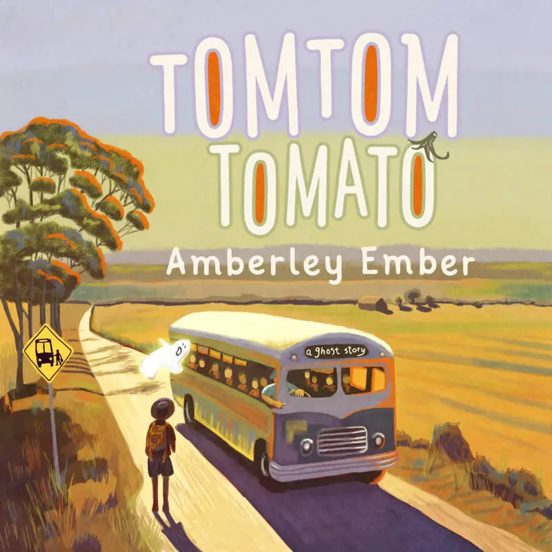
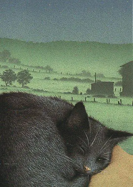
One way to add depth to an illustration: Plonk something big and interesting into the foreground. Extend the picture as far back as the situation allows, all the way back to the hills, with detail in the middle distance. Utilise aerial perspective.
This illustration of a sleeping cat is a perfect example:
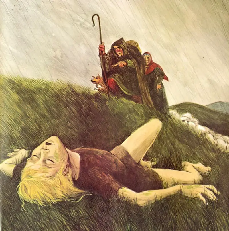
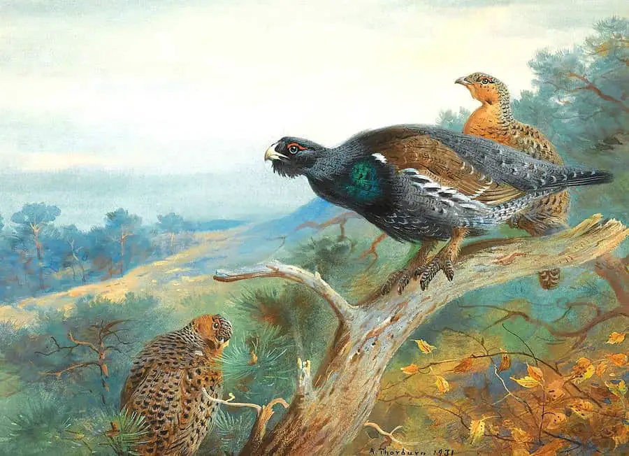
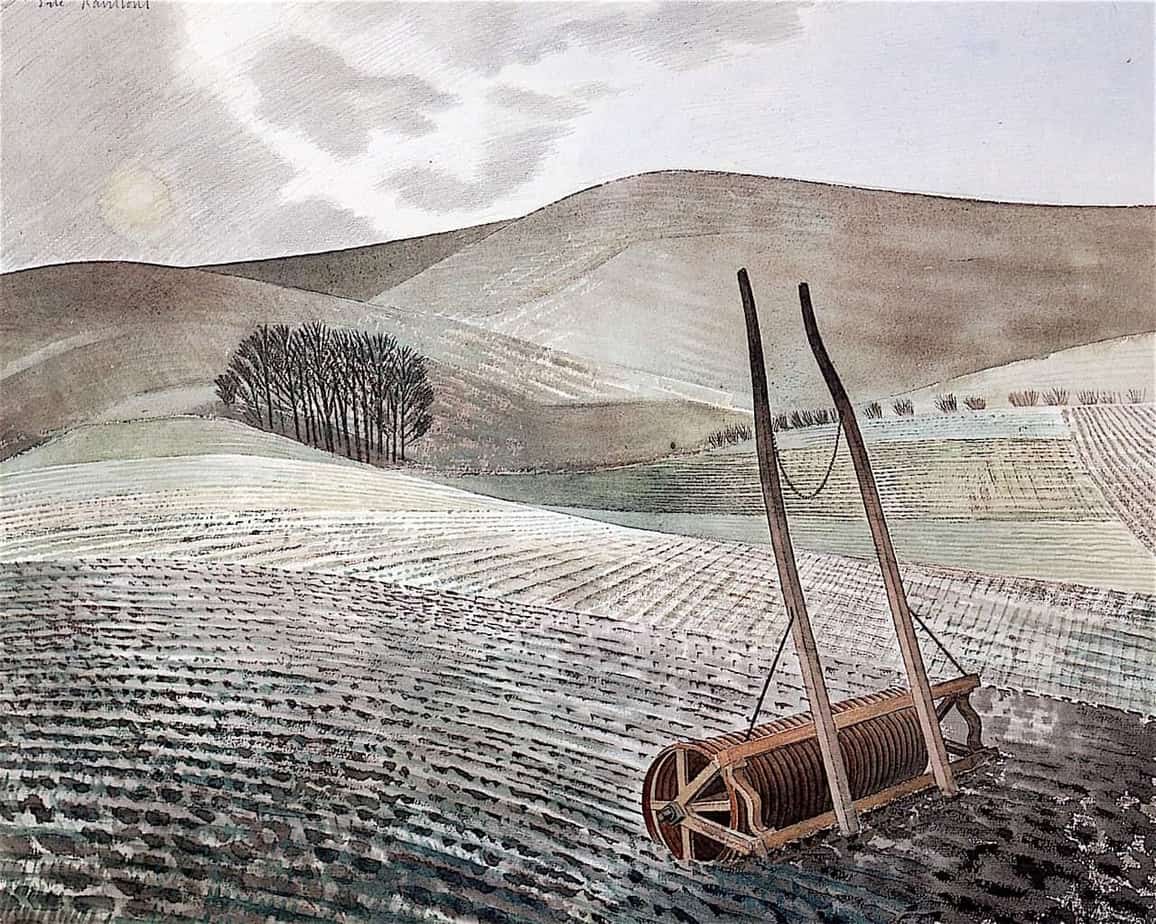
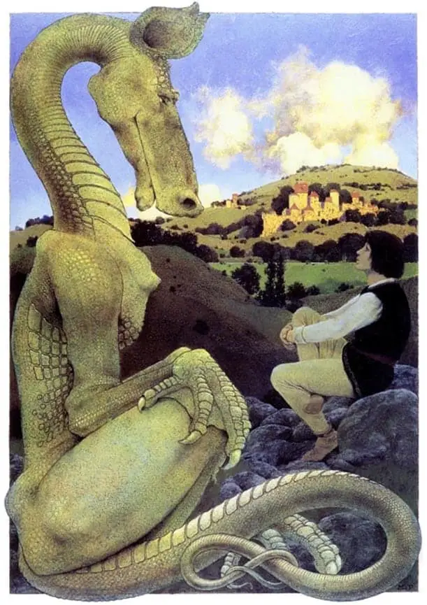
The dragon in the illustration below is doing double-duty as a decorative border, with its neck and tail curling around the left side of the page.
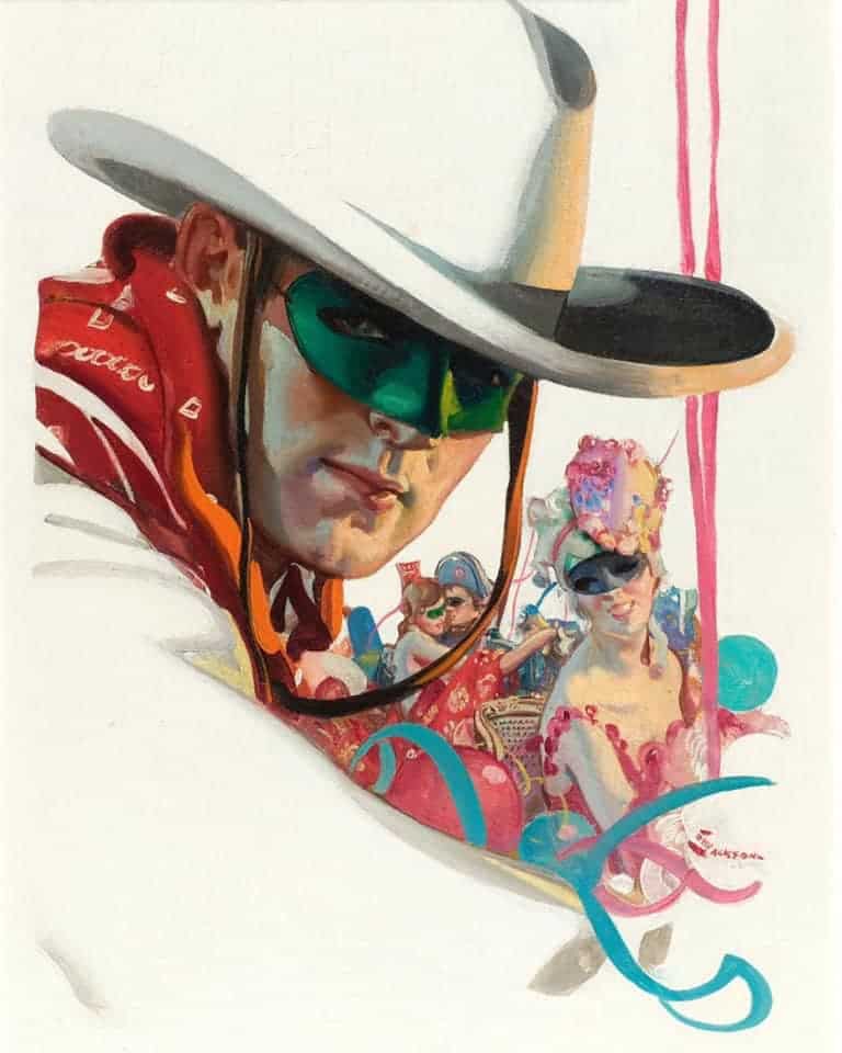
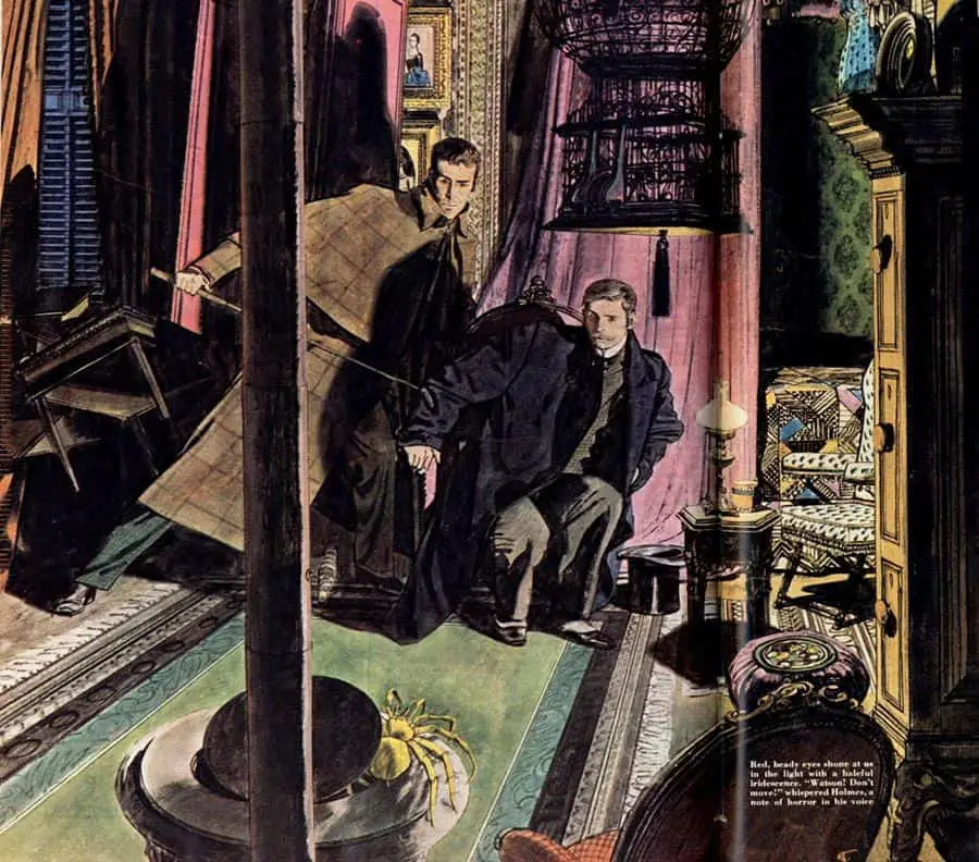
Often, the foregrounded object will be cast in shadow, or partially cast in shadow.
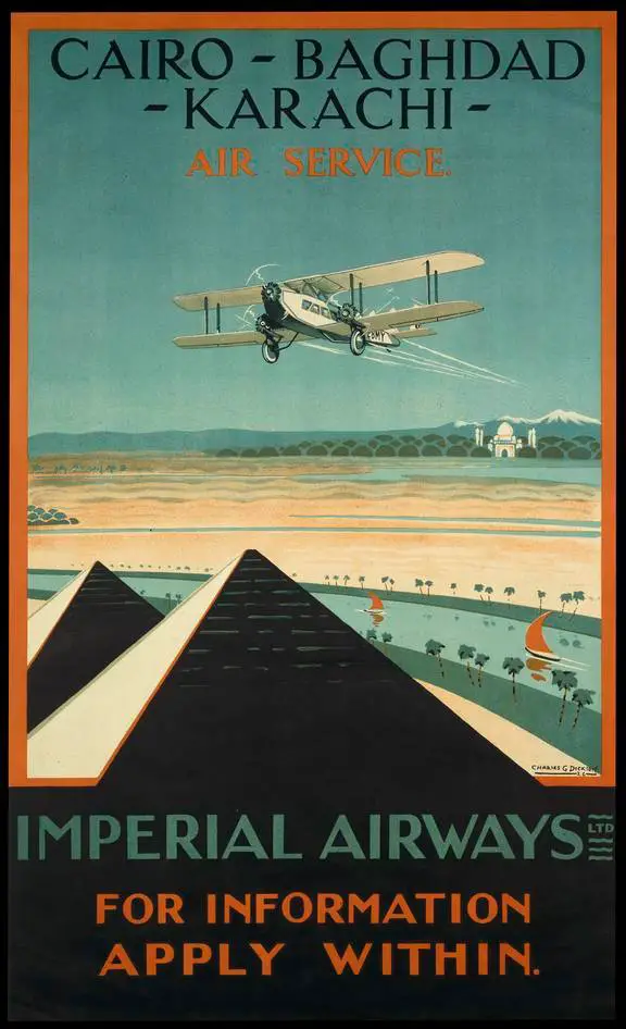
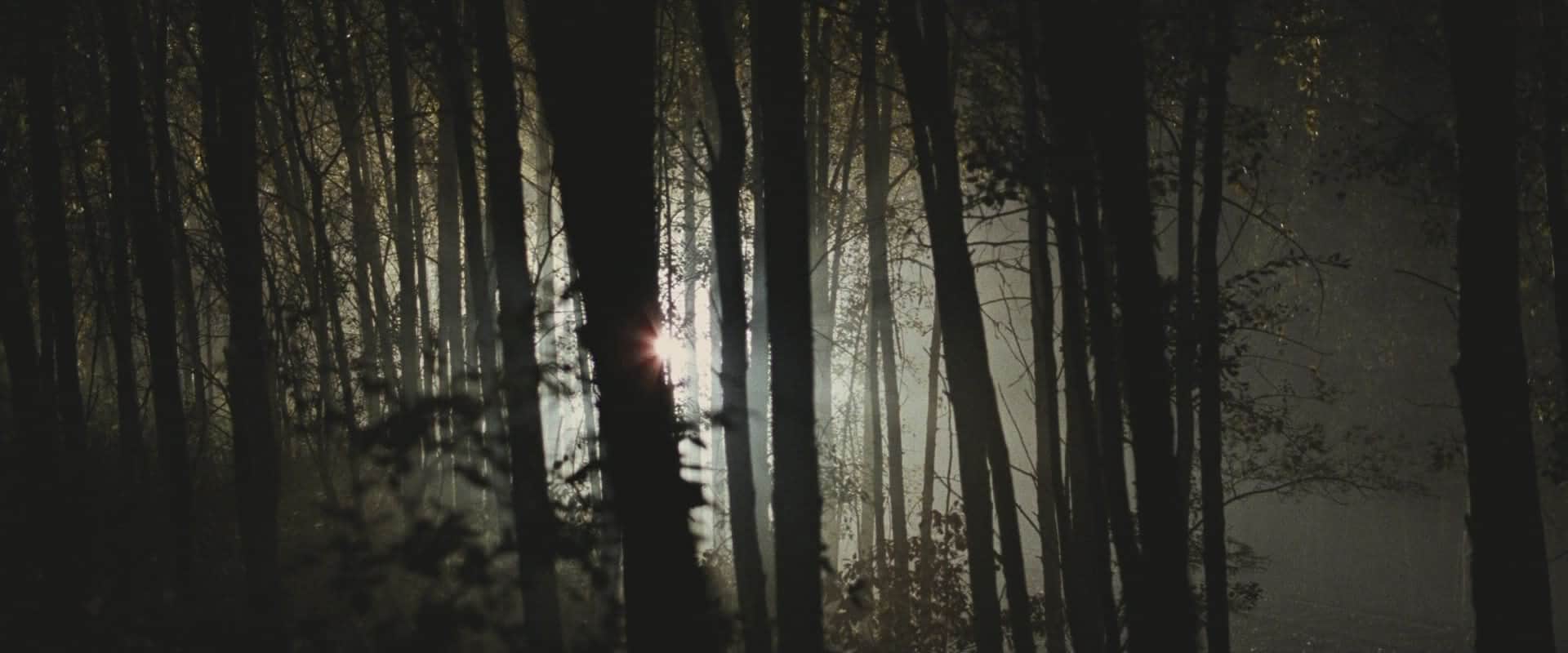
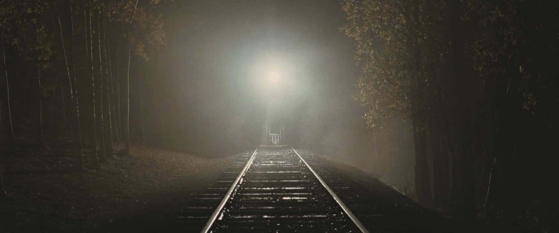
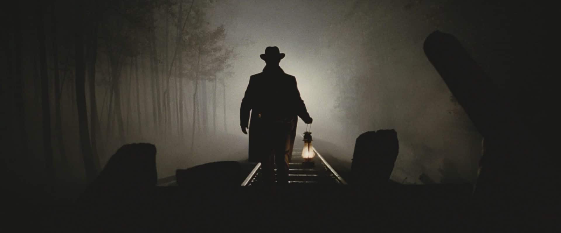
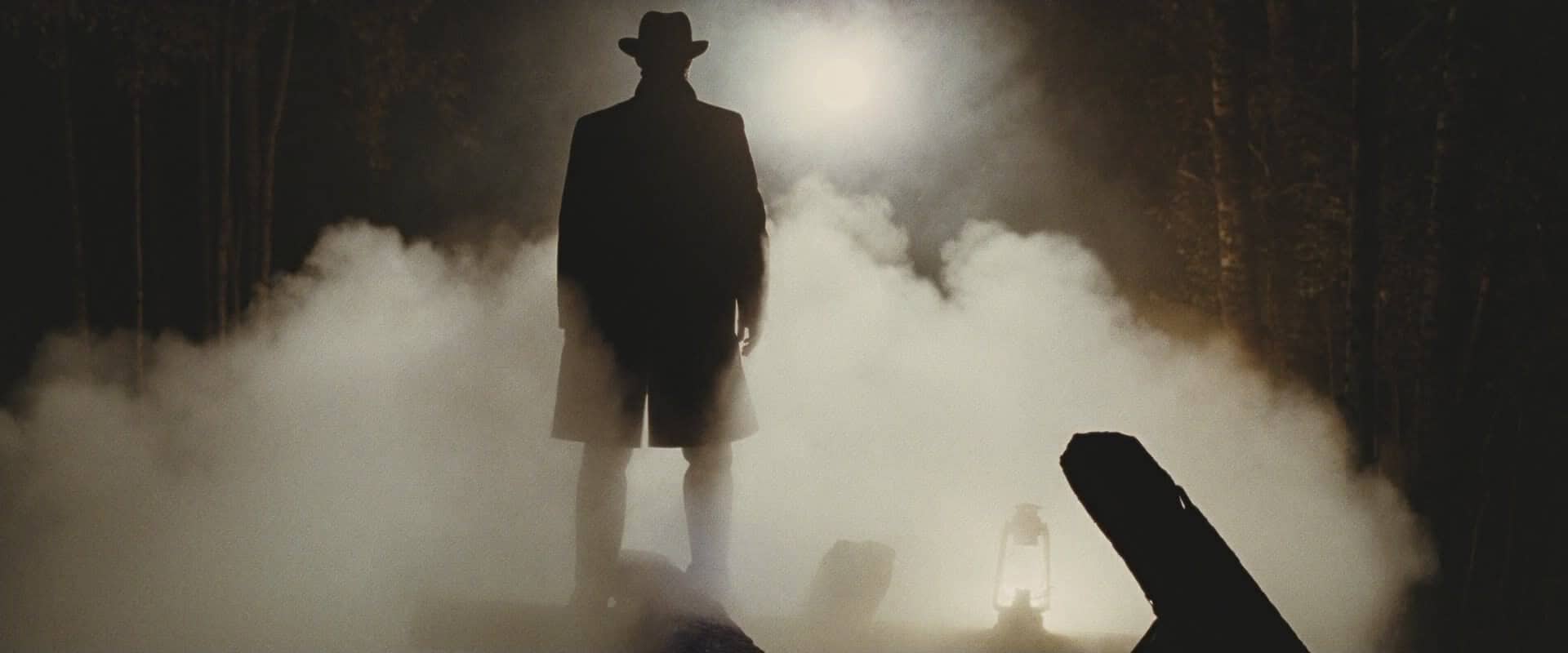
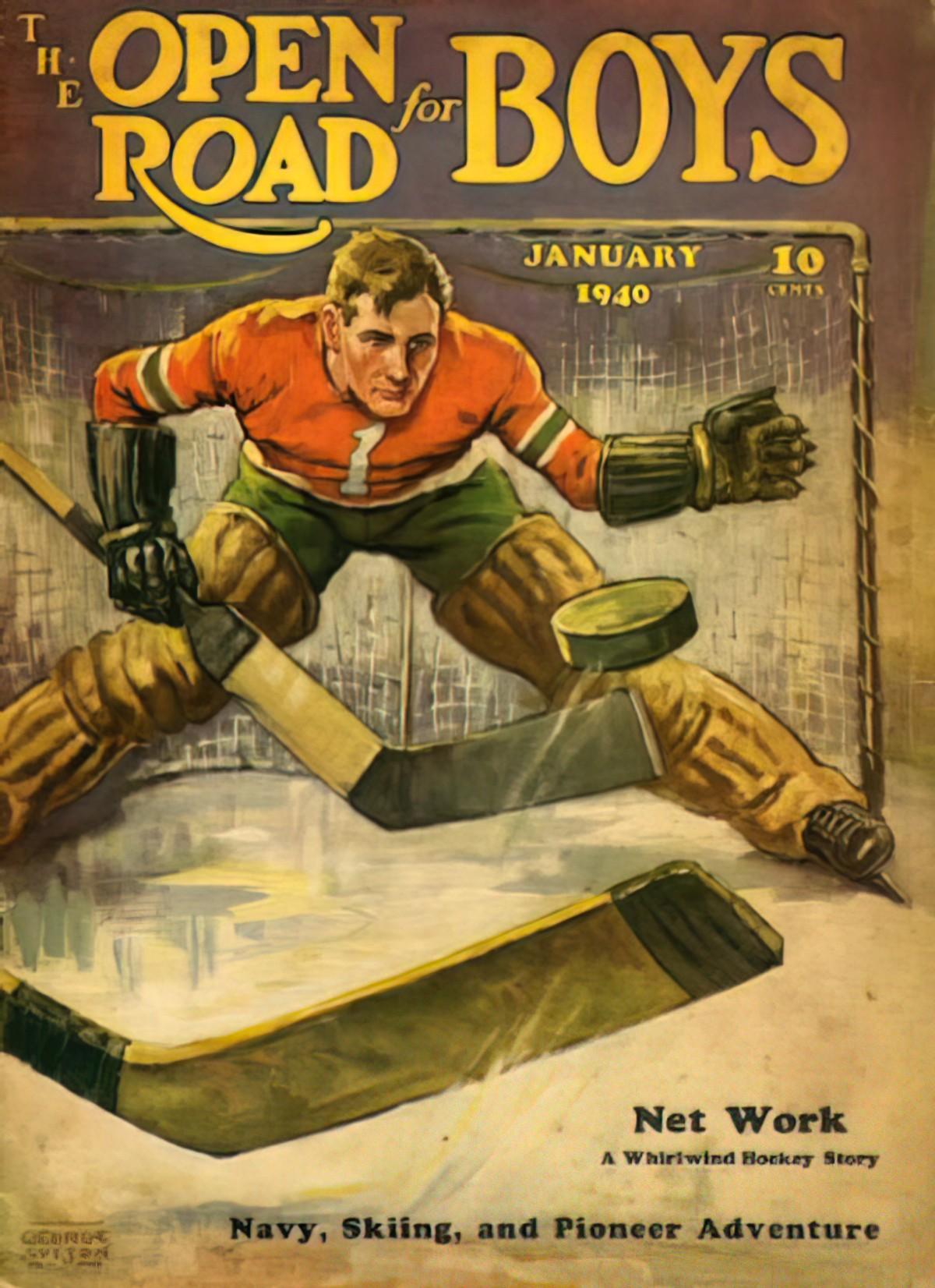
LEADING THE EYE TO A REVEAL
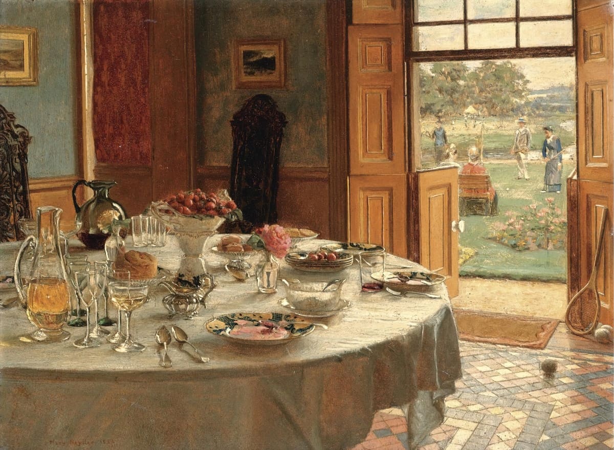
Spanish painter Ramon Casas was very good at creating detailed and interesting foregrounded subjects which lead the eye to something smaller but equally interesting in the background.
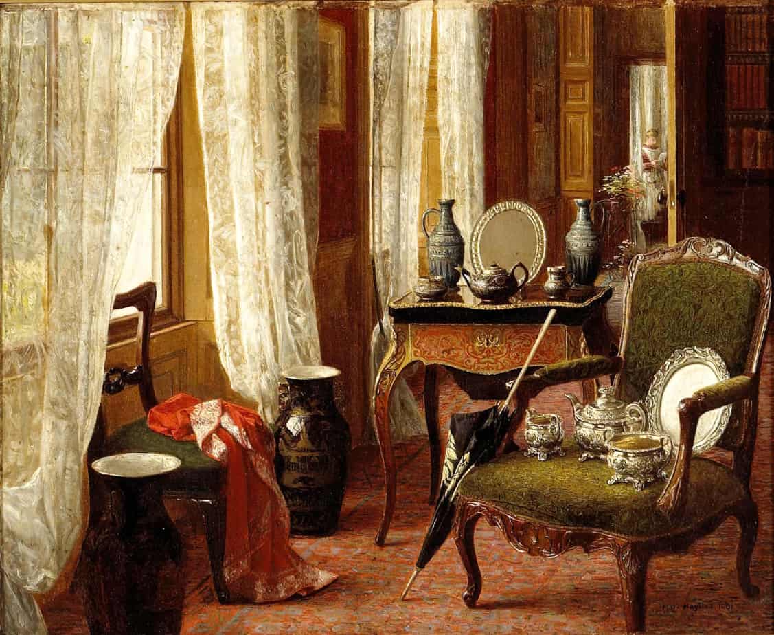
FOREGROUNDED OBJECTS AND HORROR
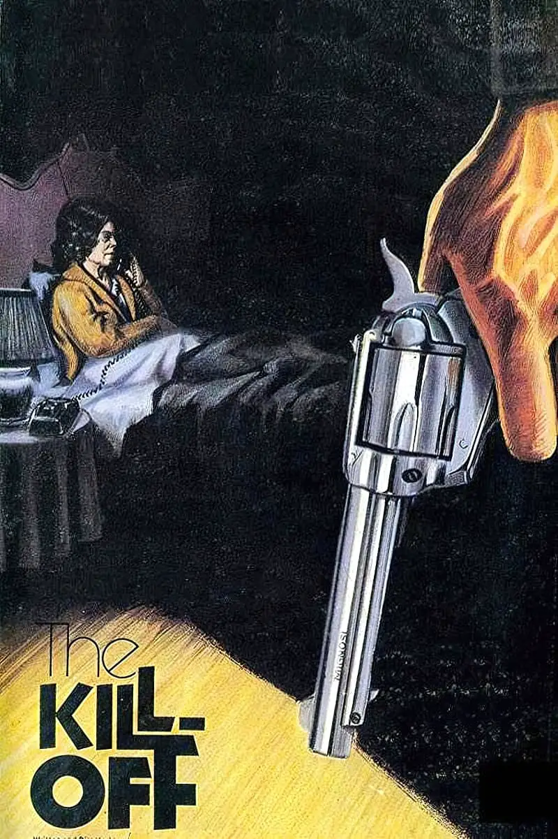
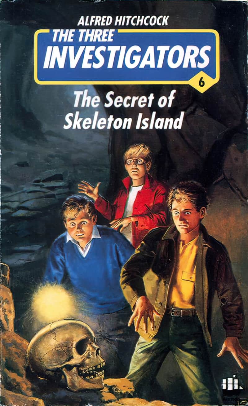
Before we start utilising this interesting page layout willy-nilly, it’s worth taking a look at the psychological effect on the viewer. By no coincidence at all, the large and foregrounded object is a particular favourite with illustrators of horror and crime genres.
Tentpole case in point, Tom Addams, who created many iconic paperback covers for Agatha Christie novels. A feature of these covers: An onimous object in the foreground.
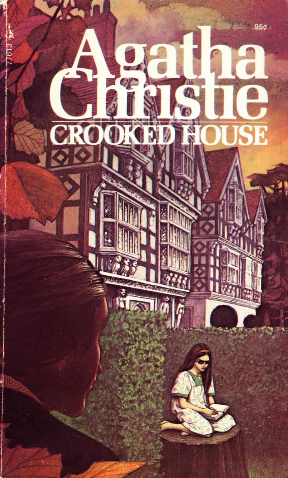
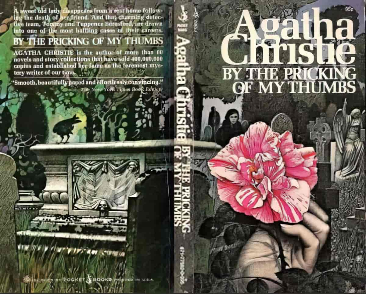
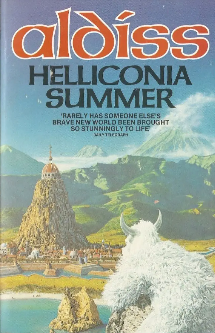
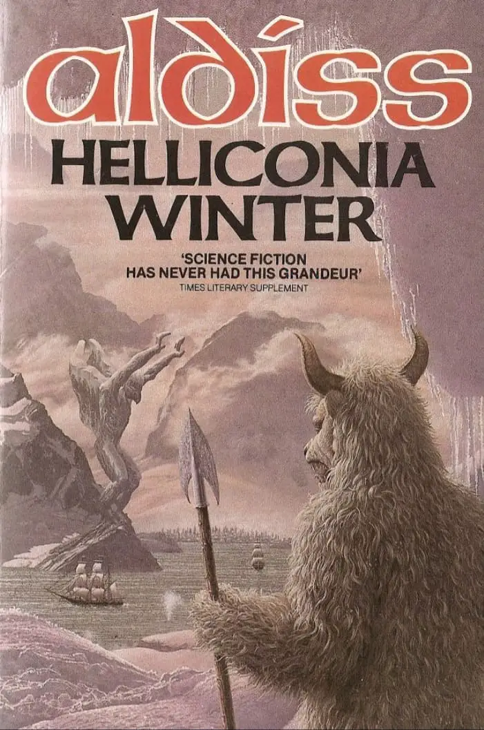
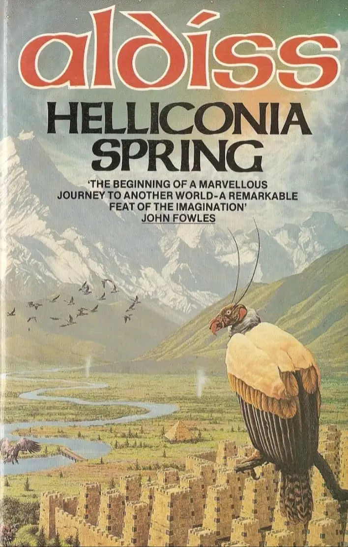
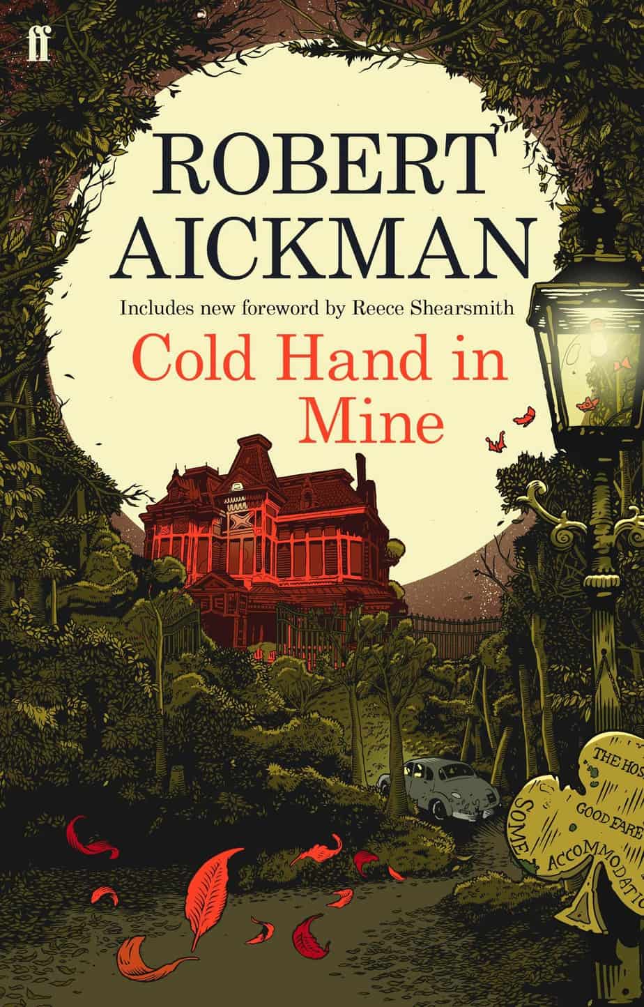
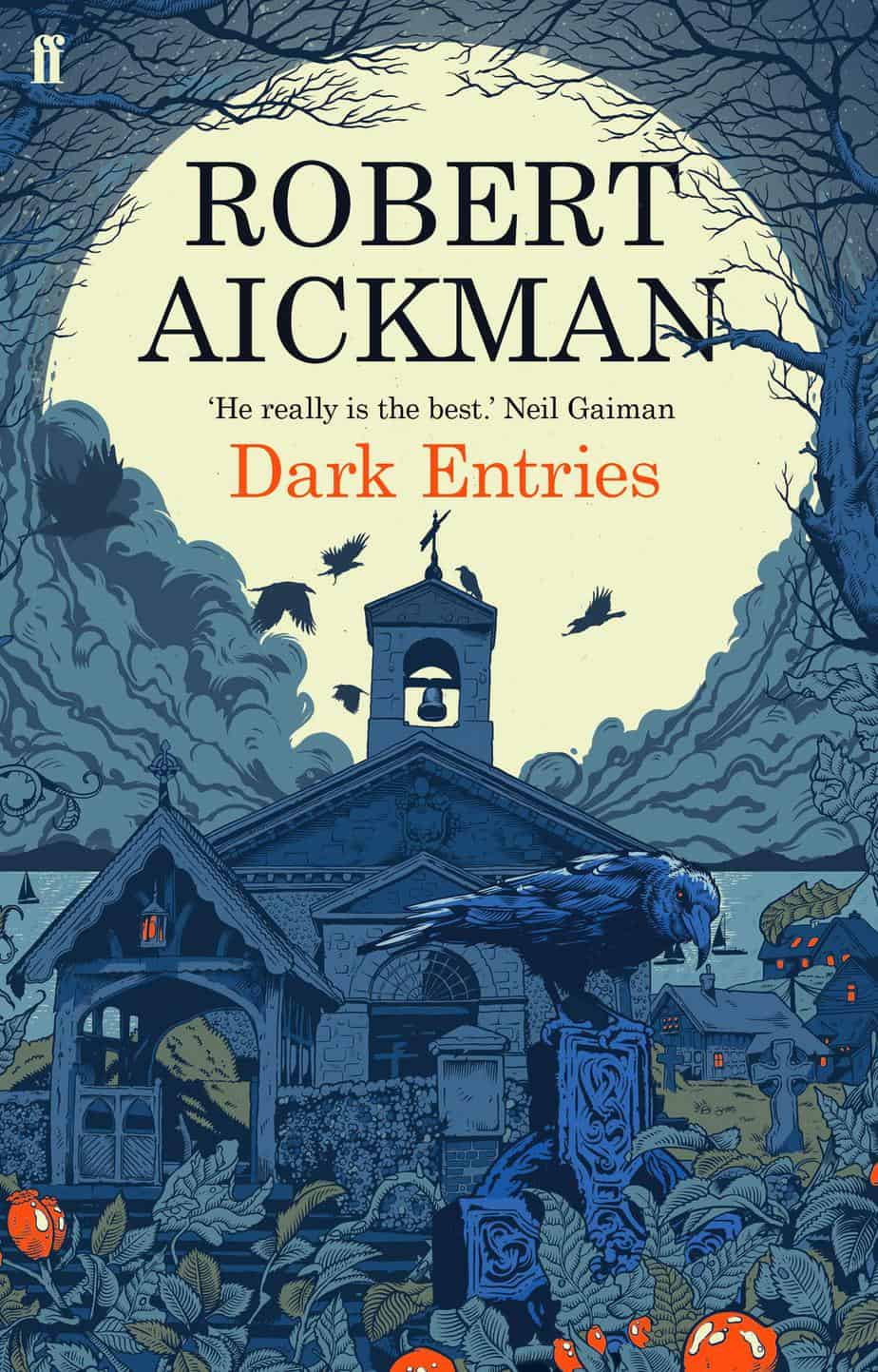
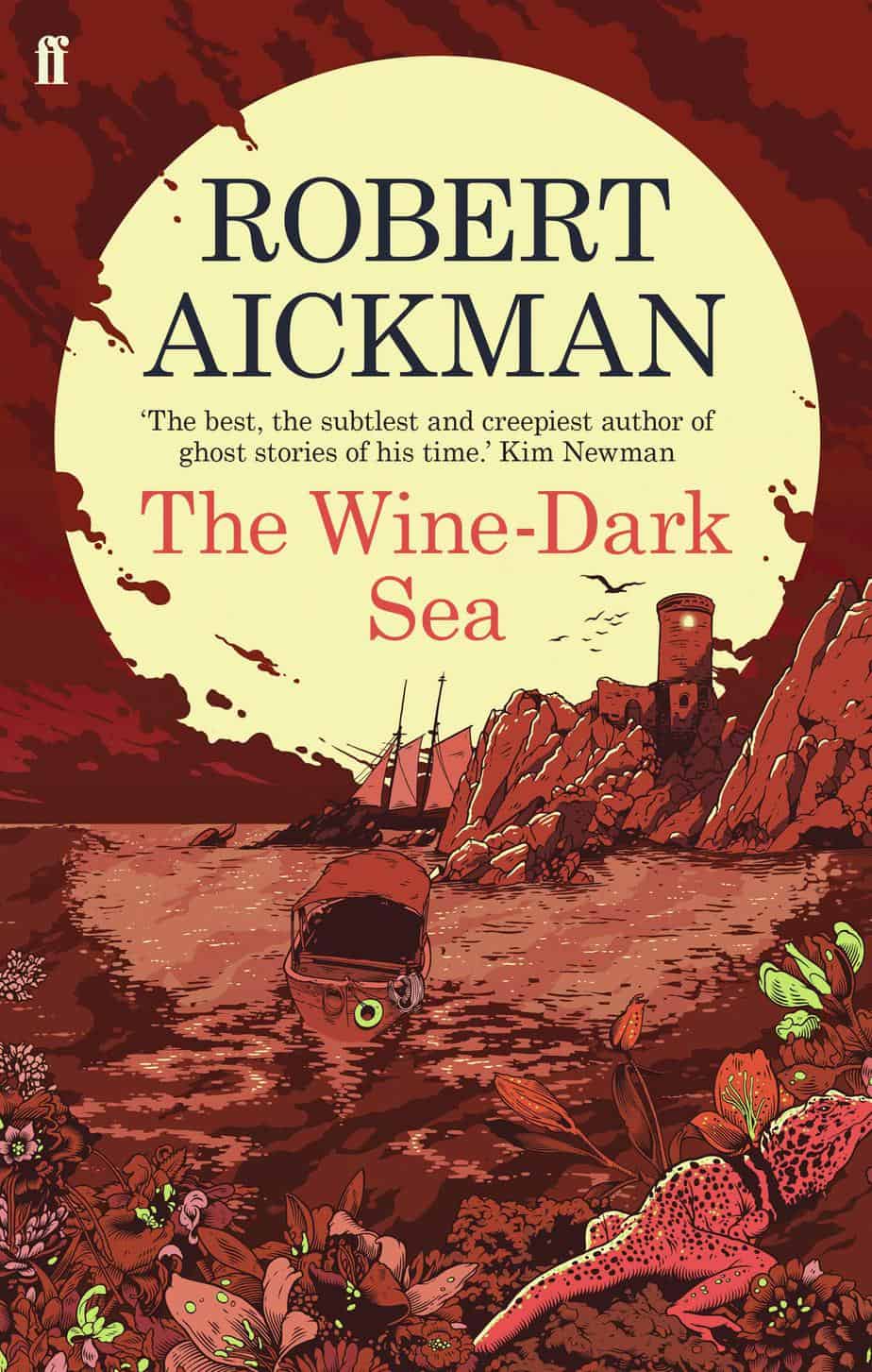
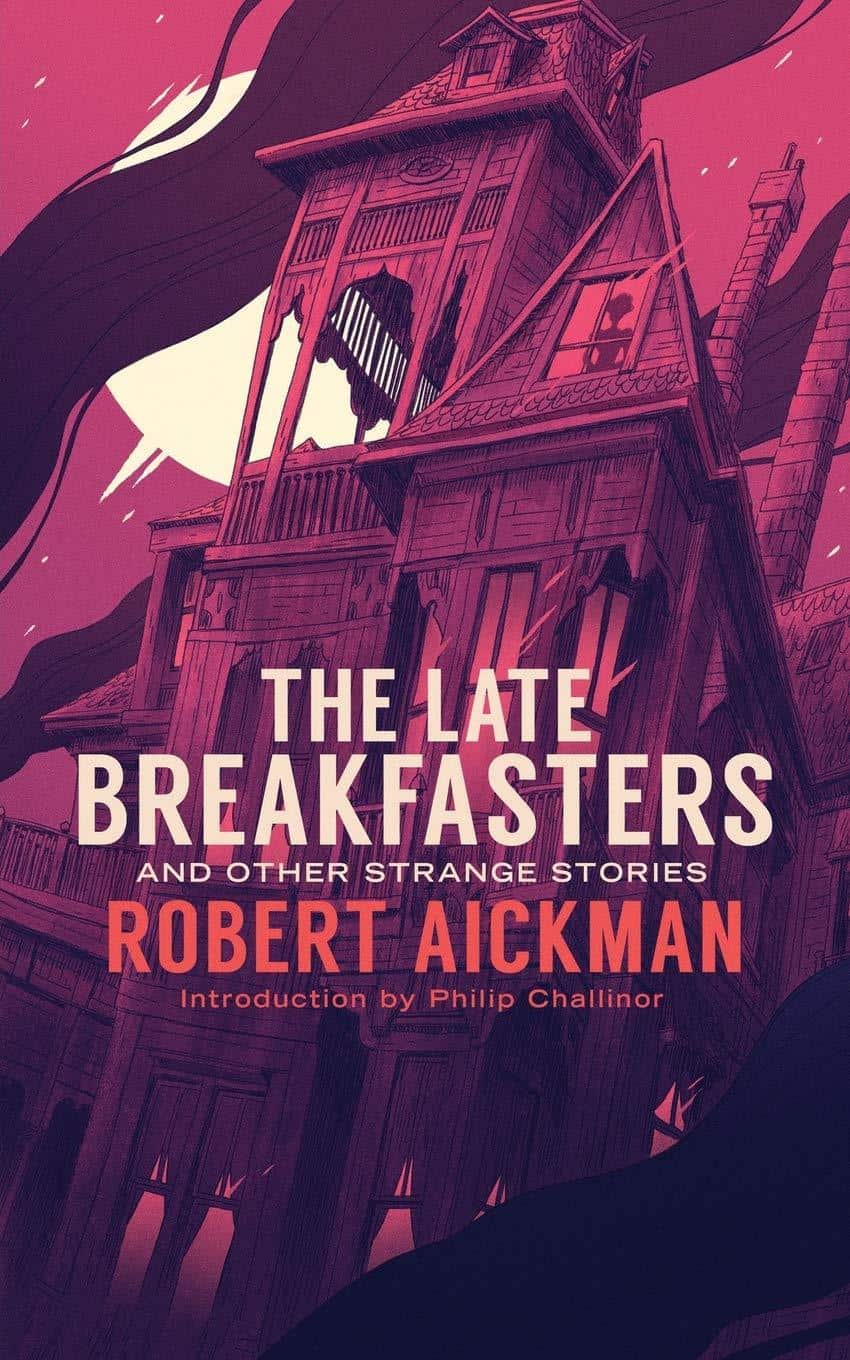
Faber reissued short story collections by horror writer Robert Aickman. They have fantastically creepy covers by Tim McDonagh. I love them for many reasons. I believe he’s utilising similar layout to the famous Agatha Christie paperback covers by Tom Addams, above.

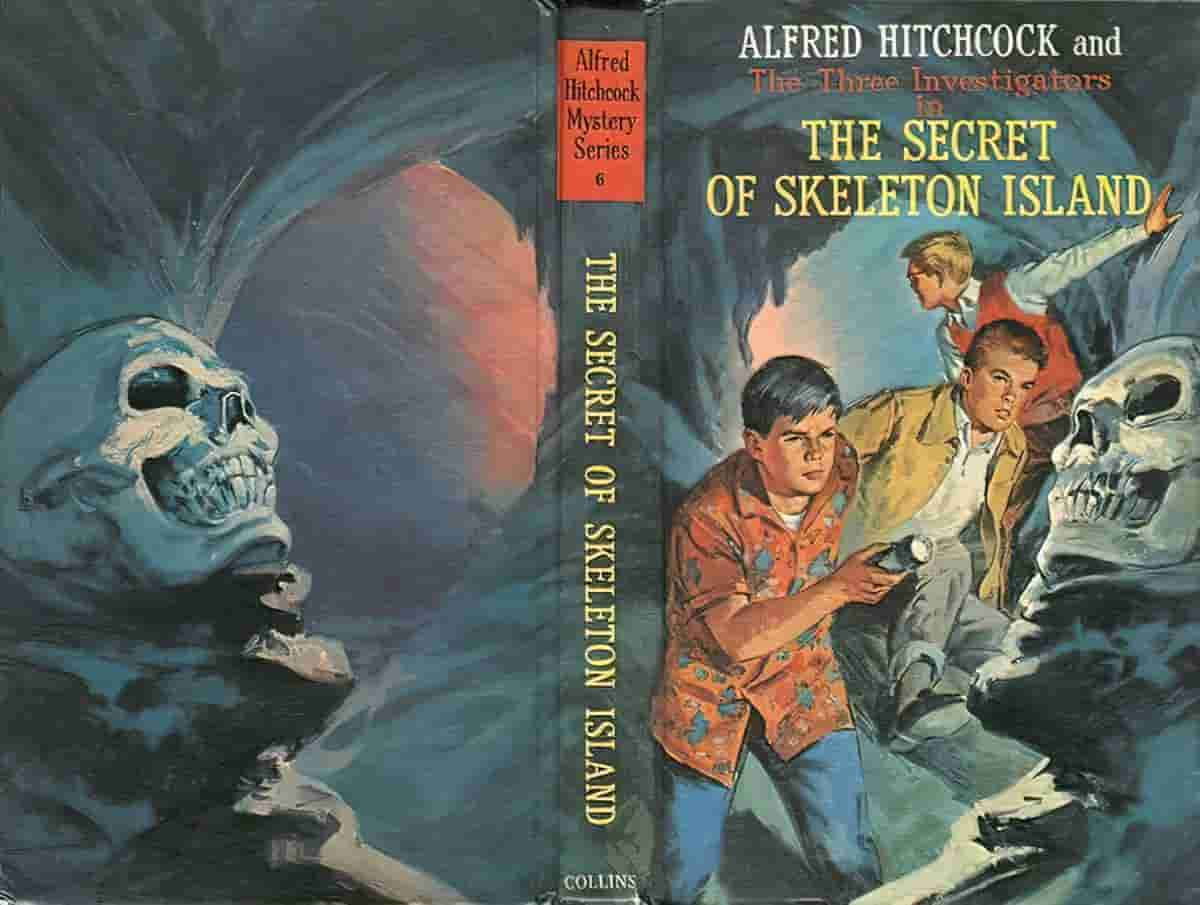
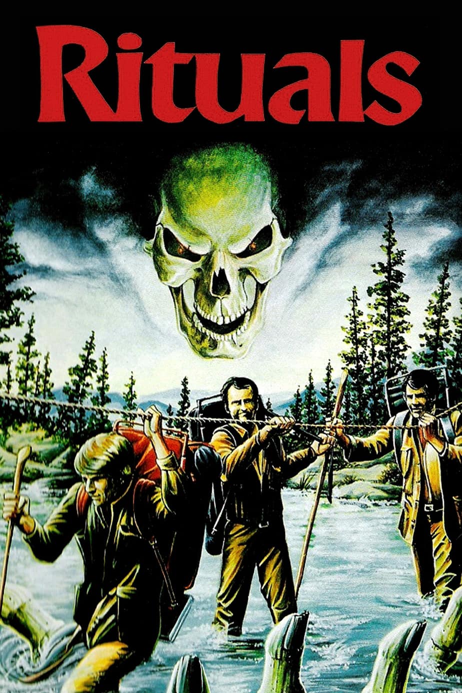
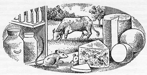
I mean, foregrounded obects don’t always lend a horror vibe. The image below is out of a cookery book. What’s the effect? As onlookers we feel privy to something normally hidden from view (mice).
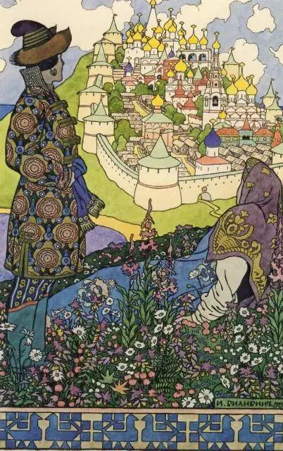
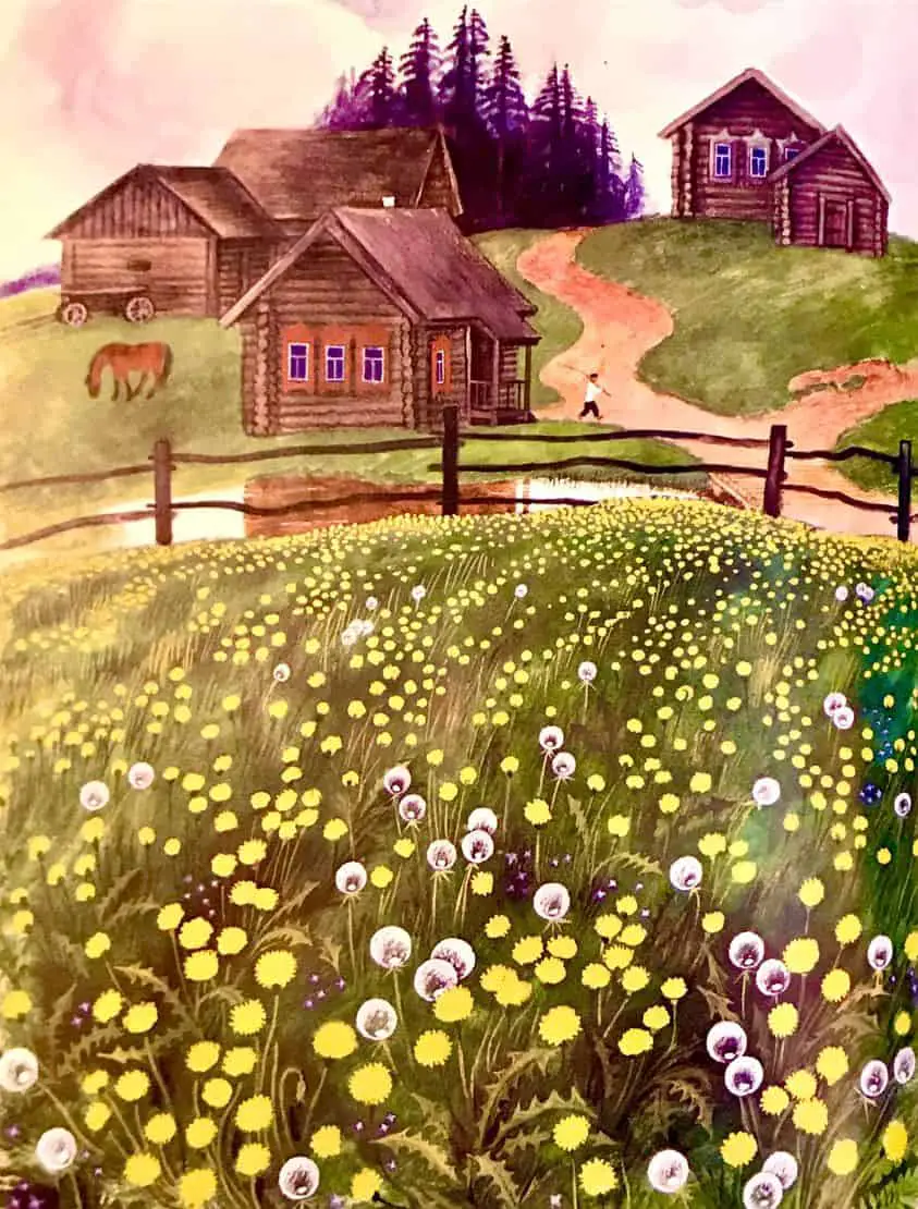
And the illustration below is a pleasant pastoral scene, right? The fact that flowers are in the foreground means nothing special, right? (Then why do I feel like something is hiding in the undergrowth?)
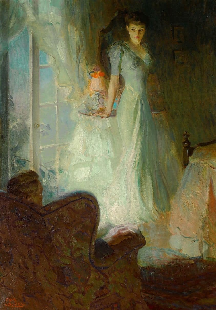
Is it just me, or is there something creepy about the dude in the armchair, sitting in darkness, voyeuristically watching the lit-up woman in a cheesecake pose? The man is functioning as audience, of course. We’re not meant to really see him, but his gaze directs ours.
FOREGROUNDED OBJECTS AT THE TOP
In all the examples above, the object in the foregrounds is at the bottom of the picture. What if a foregrounded image is at the top? (I choose not to ask ‘why’ of the following image of a rabbit crapping in the woods. I’m talking about the bird.)
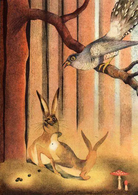
Did you even notice the bird? It seems to me that a foregrounded image placed at the bottom of an illustration seems more ominous than a foregrounded image placed near the top. Is this because of an idea from antiquity, that bad things derive from the underworld?
