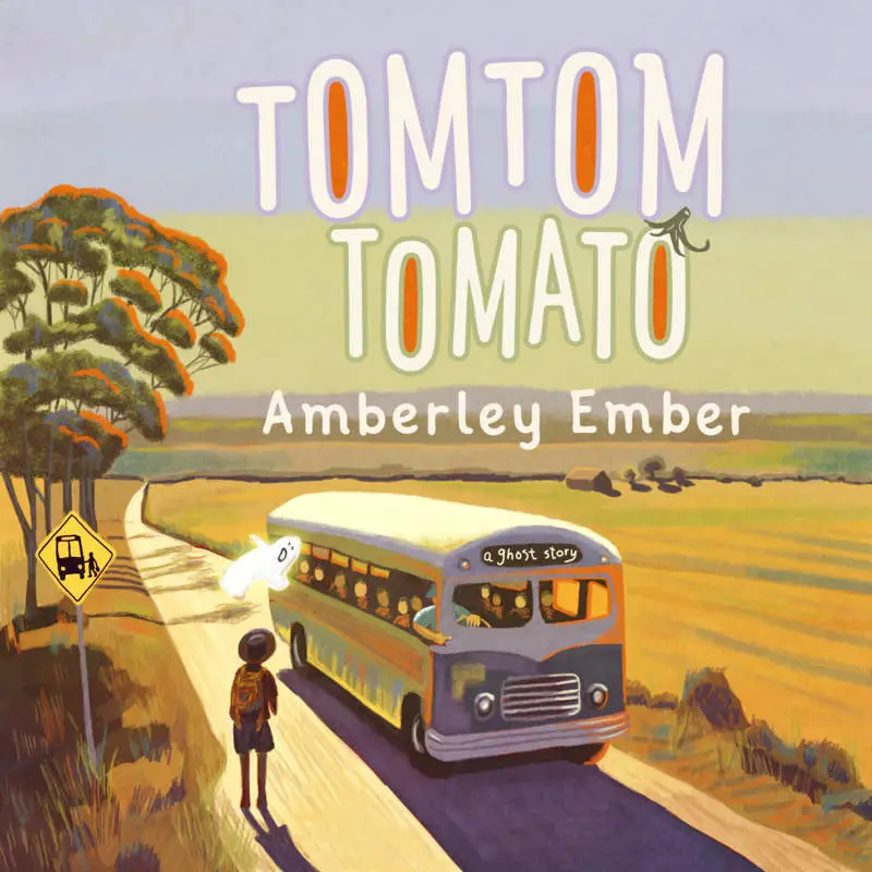
From what I can see, it’s more common by far to use a brush script or otherwise naturally slanting font than to use the italic version of a font on a contemporary book cover. Tilting upwards is also very common and lends an italicised feel:


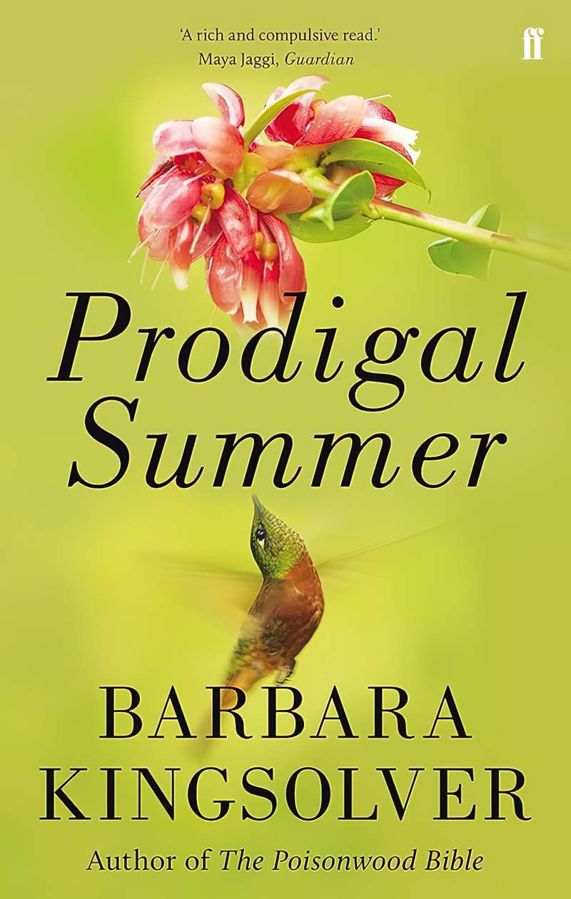
But here are some examples of italicised font: