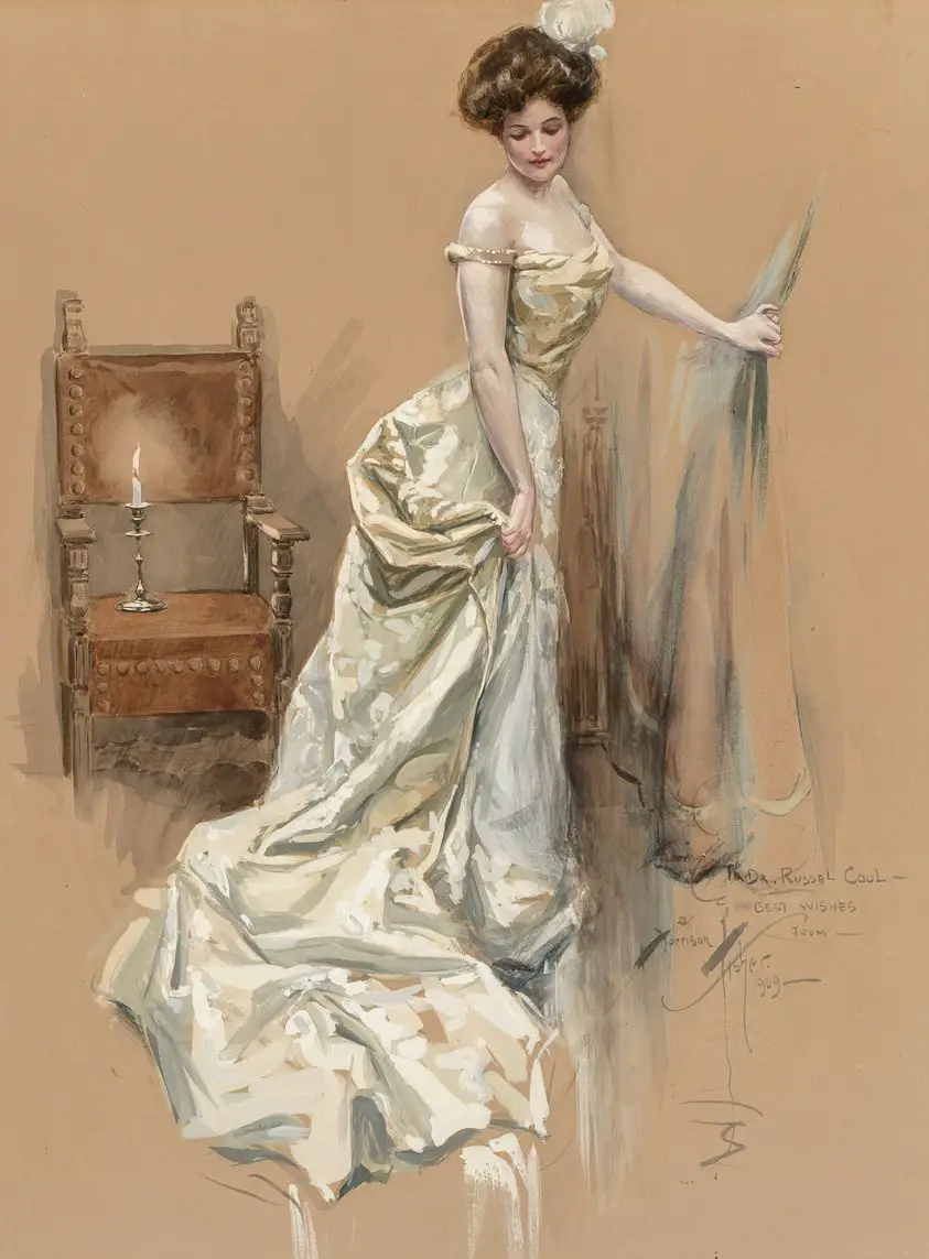
What you need:
- Fabric hue (colour)
- Shadows
- Highlight
The whiter the highlight, the shinier the fabric. For less shiny fabric, you’ll be keeping a bit of the fabric hue in with the white. The shinier the fabric, the crisper the shape of the white.
The illustration below is a perfect example of shiny vs non-shiny fabric rendering. The character on the left is clearly wearing non-shiny material, compared with the nemesis on the right.
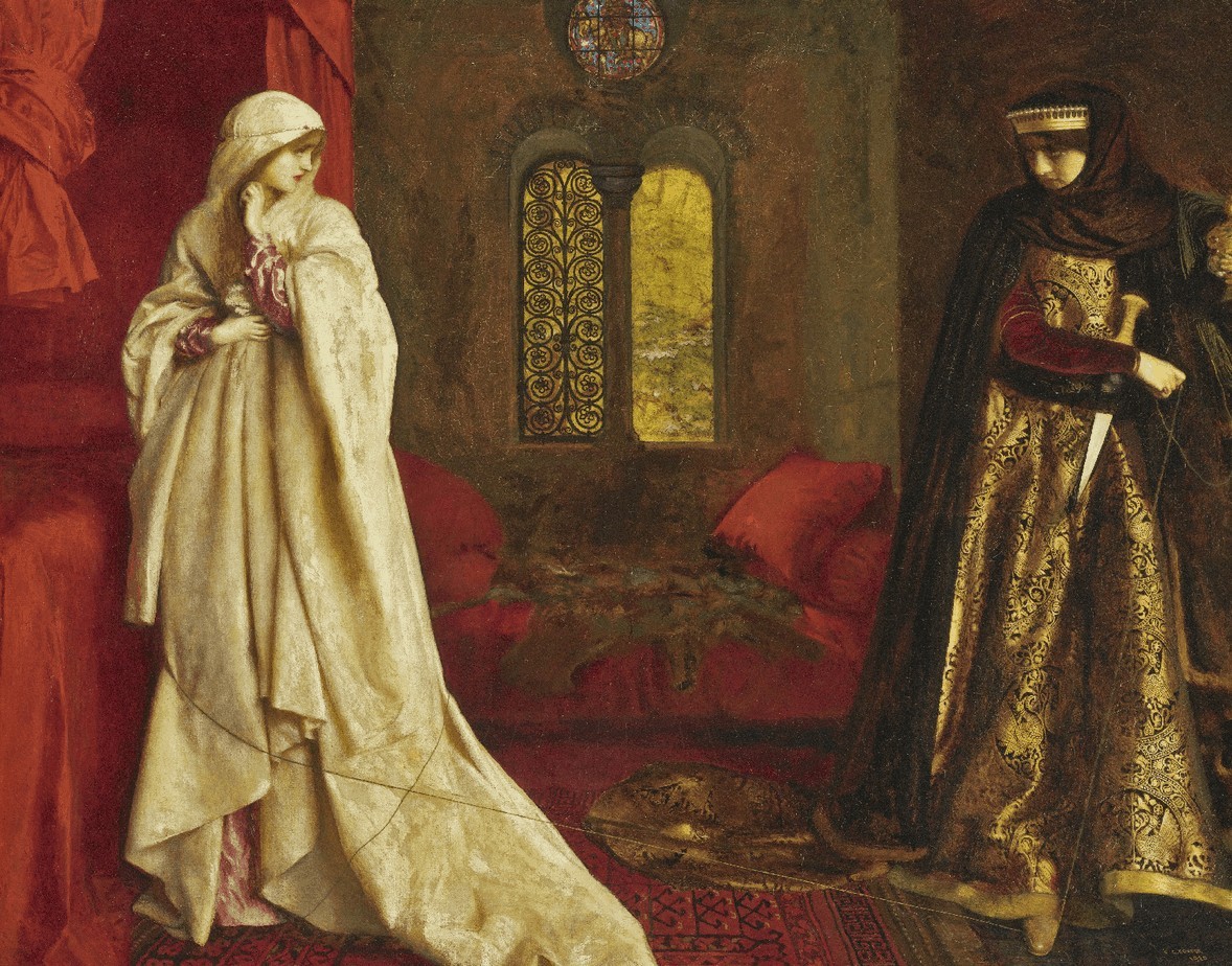
The difficulty in rendering shiny fabric isn’t so much knowing how much white to mix in, but where to place the highlights. Some artists find it easier to lay down shadows first. Others advise to lay down the lightest colours first then go darker. That’s personal preference, but whichever method you choose, you’re better off doing one or the other to basic completion first. (Note: if using a blending stick, definitely blend from light to dark.)
Another tip is to draw a temporary arrow on your canvas (or working drawing) to remind yourself of where the light sources are coming from.
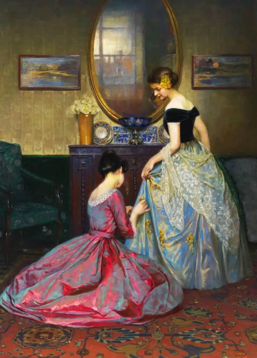
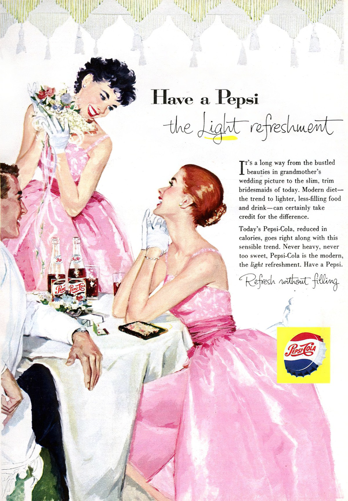
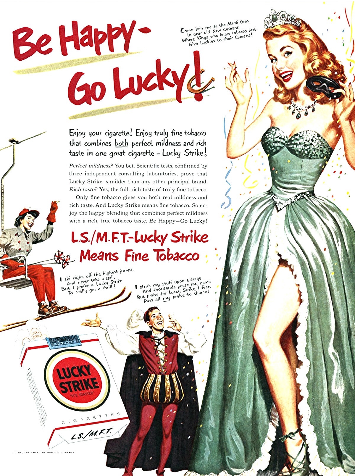
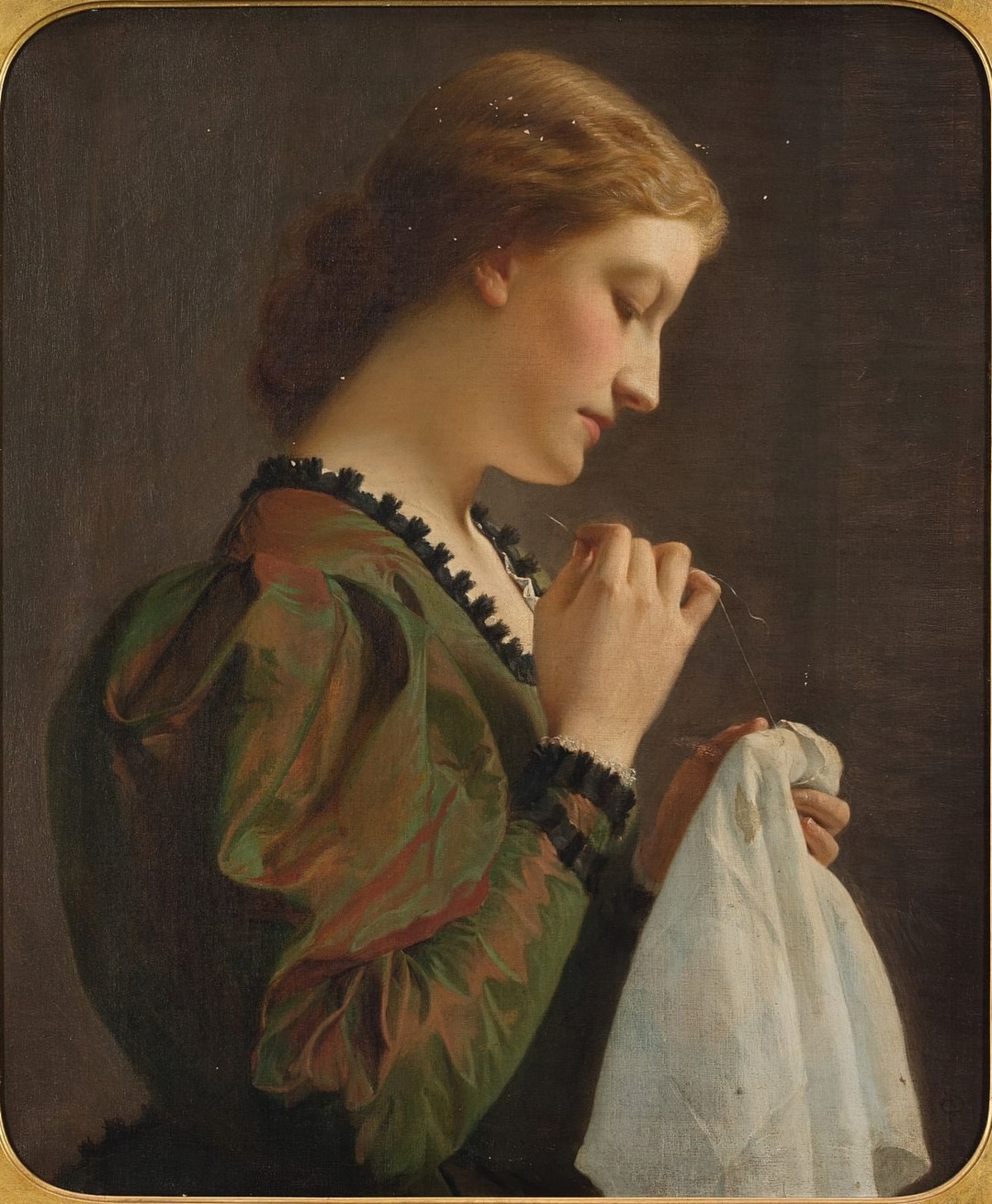
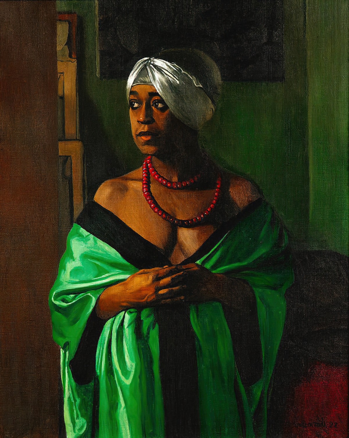
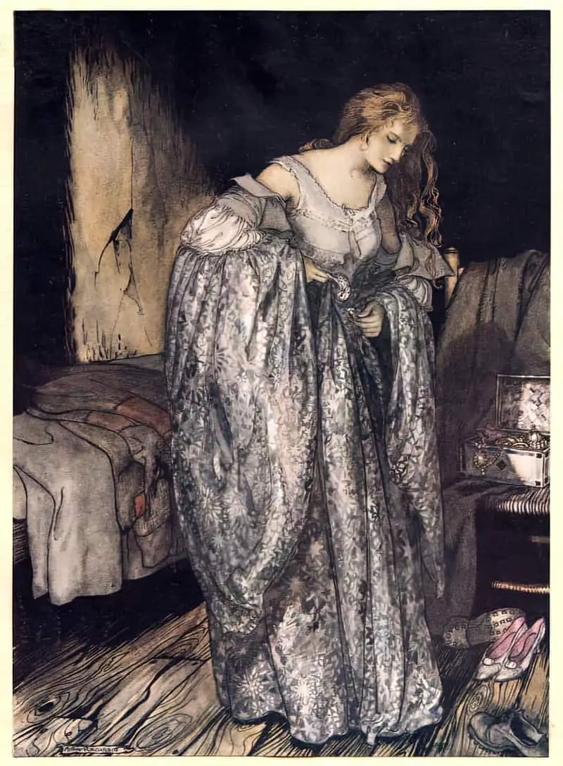
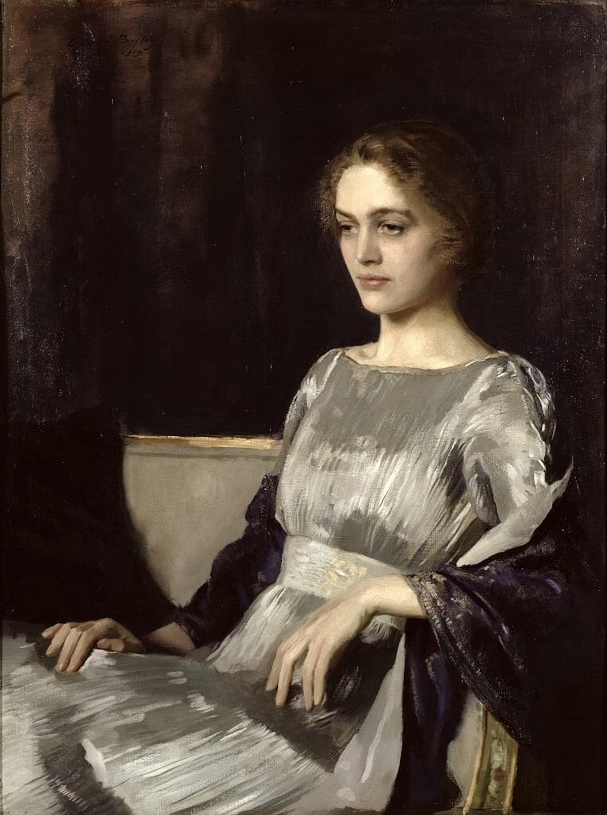
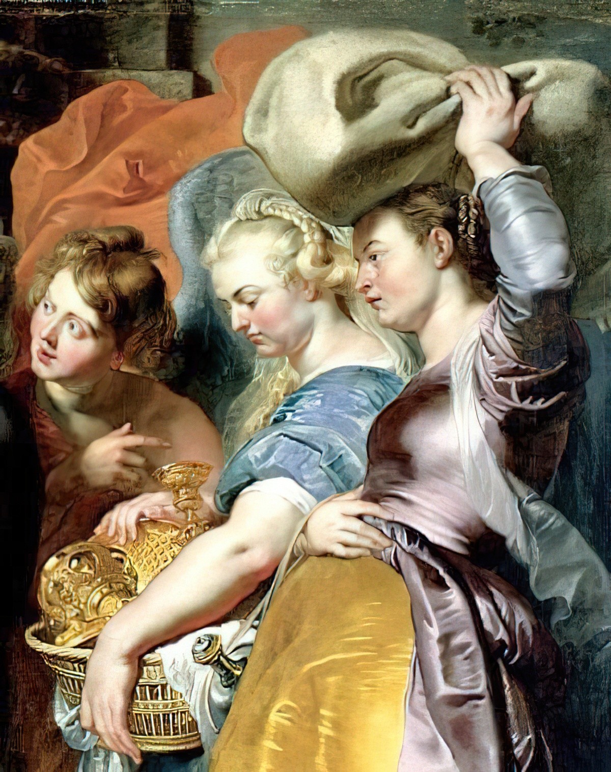
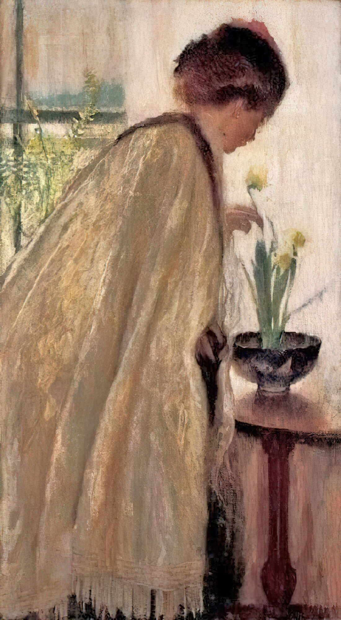
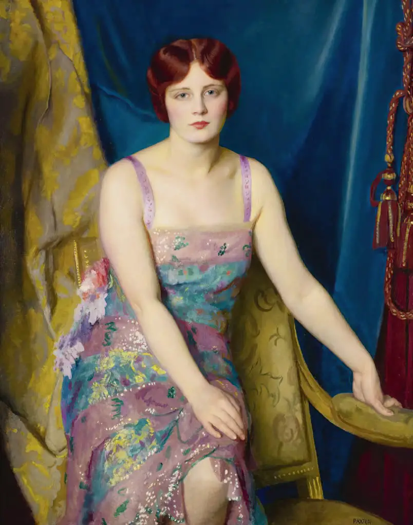
We clearly have velvet on the dress of the girl on the left, and some kind of satin fabric for the girl on the right.
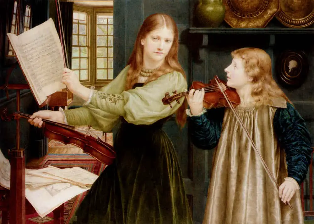
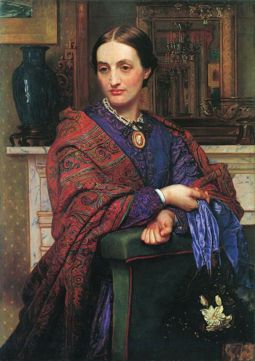
Below, shiny fabric and non-shiny fabric are both depicted. The difference is in the amount of white (which is not pure white, just a lighter shade of the blue).
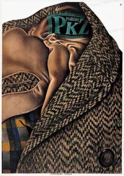
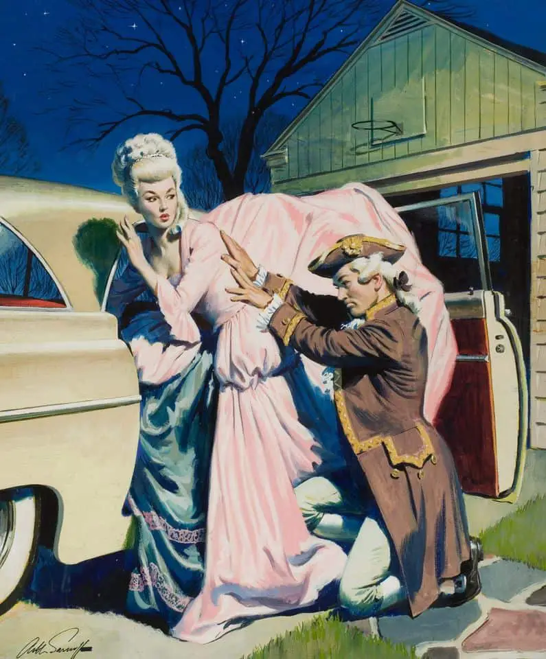
The shiny lining of the coat below contrasts beautifully with the large weave outer fabric.
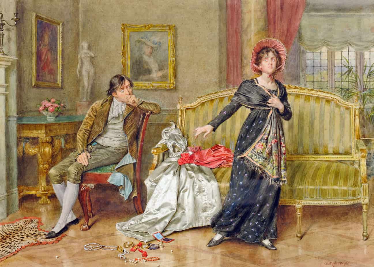
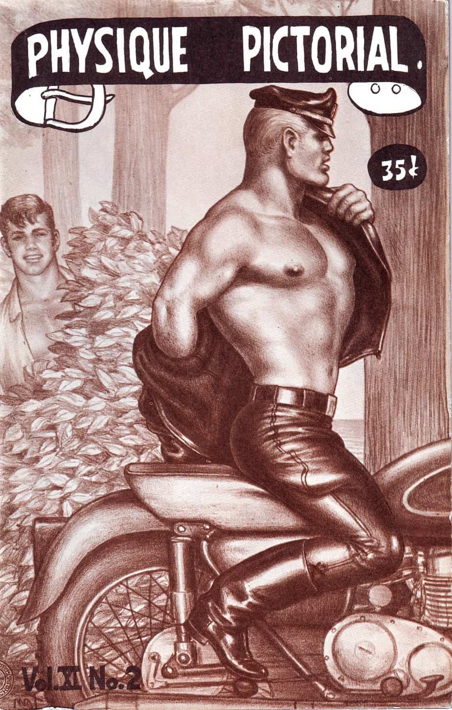
The discarded wedding dress is more shiny than the everyday dress the woman is wearing. The knees on the man’s trousers are catching quite a bit of light, too.
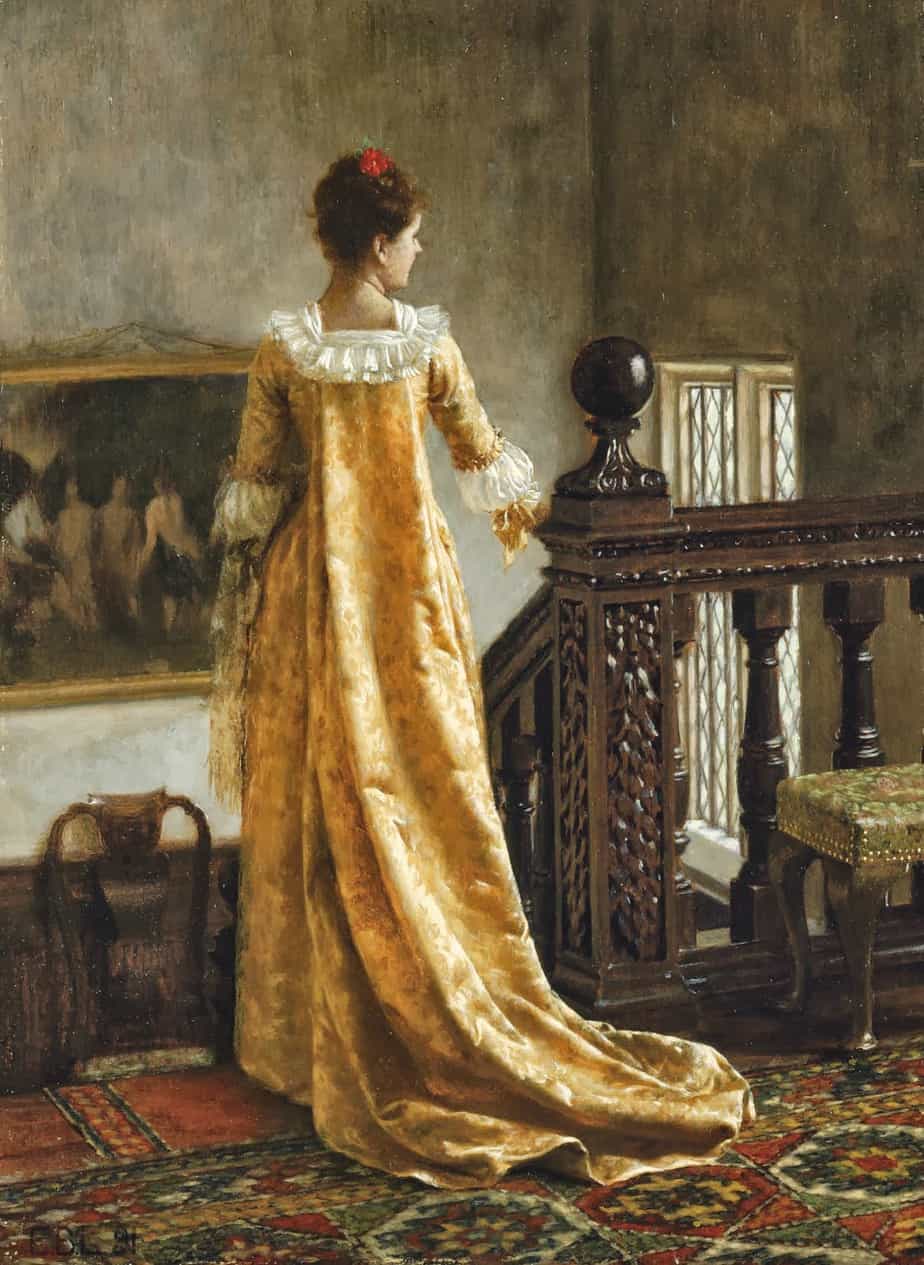
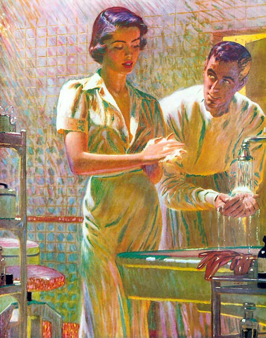
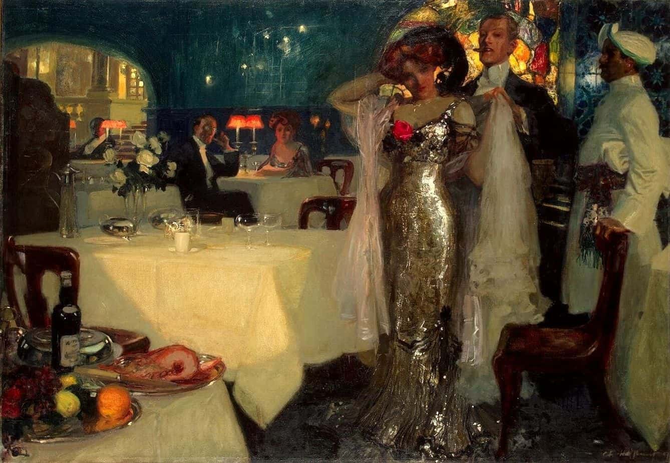
Edwin Georgi’s illustration below utilises very colourful shadows, which is what gives it that luminiscent look.
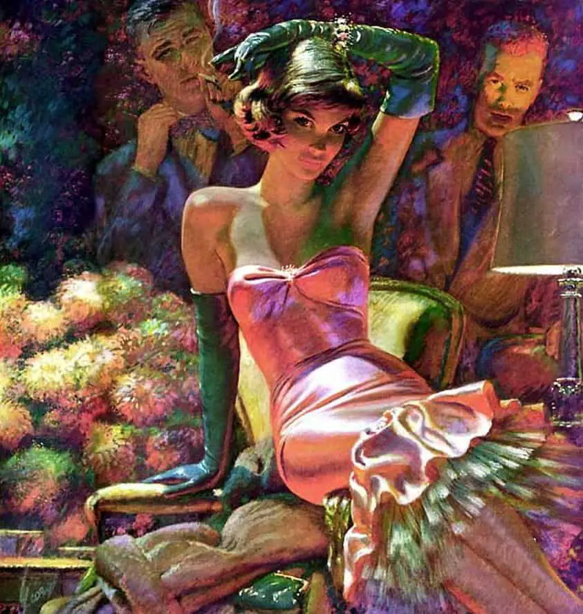
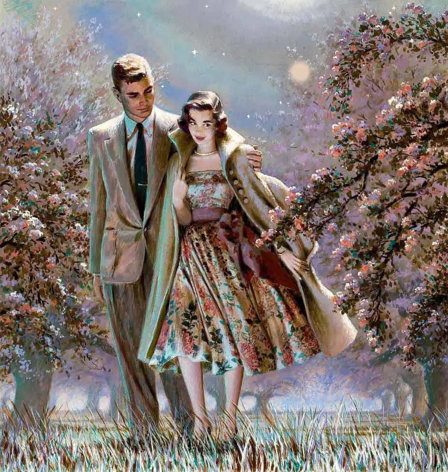
Fair to say, everything Edwin Georgi ever illustrated looked shiny.

The fur in the illustration below contrasts nicely with the dress underneath, which is clearly pearlescent.
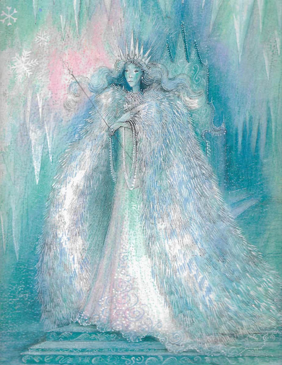
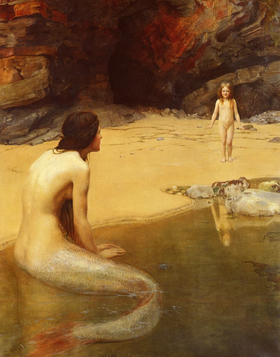
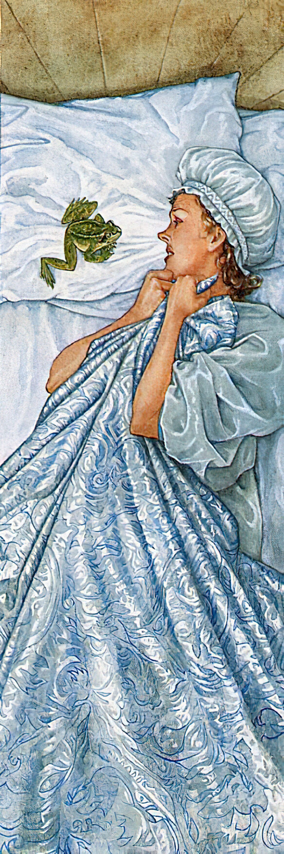
There is an overall luminosity to the slightly creepy image below. How is it achieved?
Header painting: Harrison Fisher (American, 1875–1934) Demure In Yellow Silk 1909
