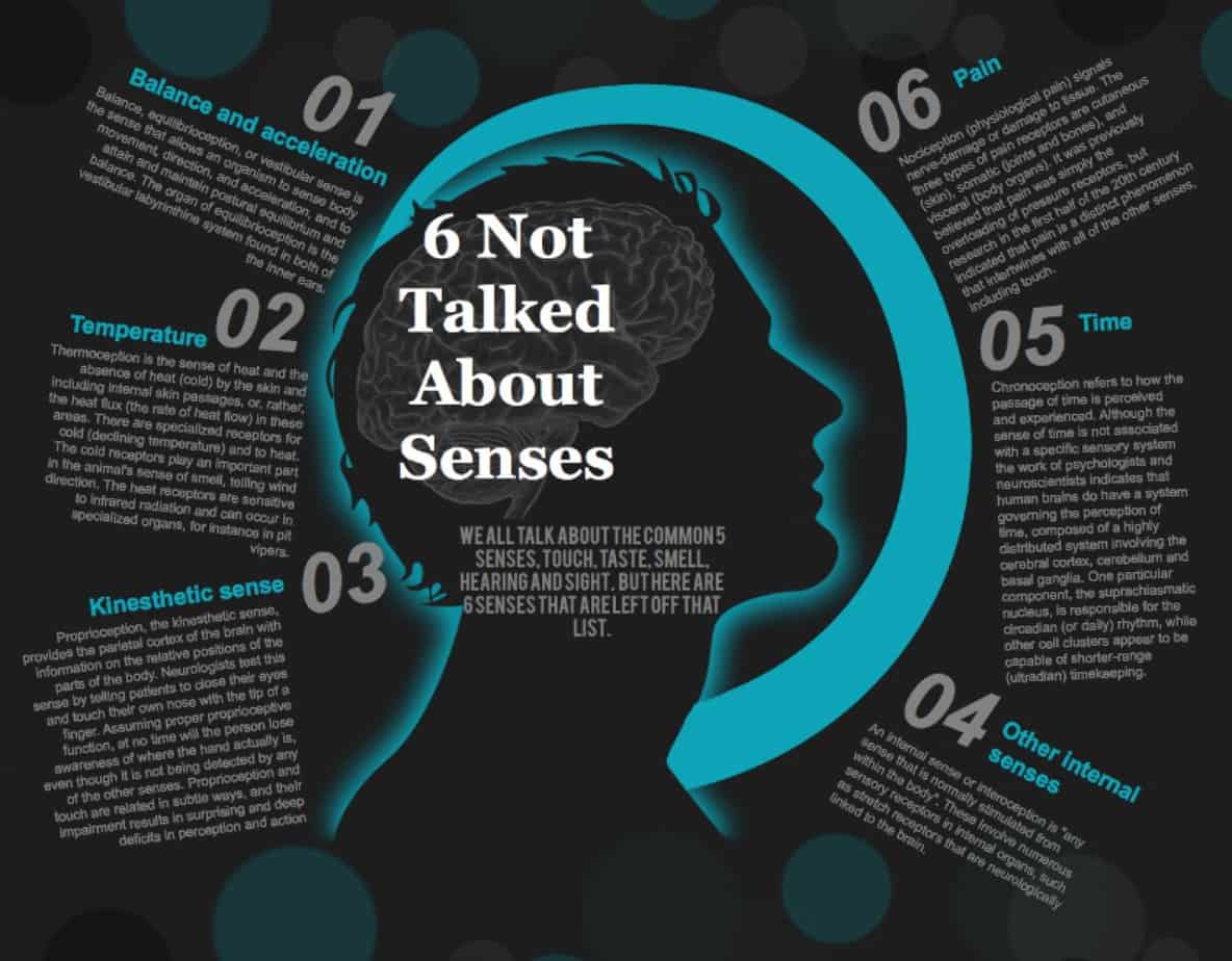
I’ve been thinking about ways in which a storyteller creates a sense of unease for the audience, but spatially. We might call this spatial horror. I’m talking about disorientation, dizziness, light-headedness, fear of falling, and various senses outlined in the graphic below.
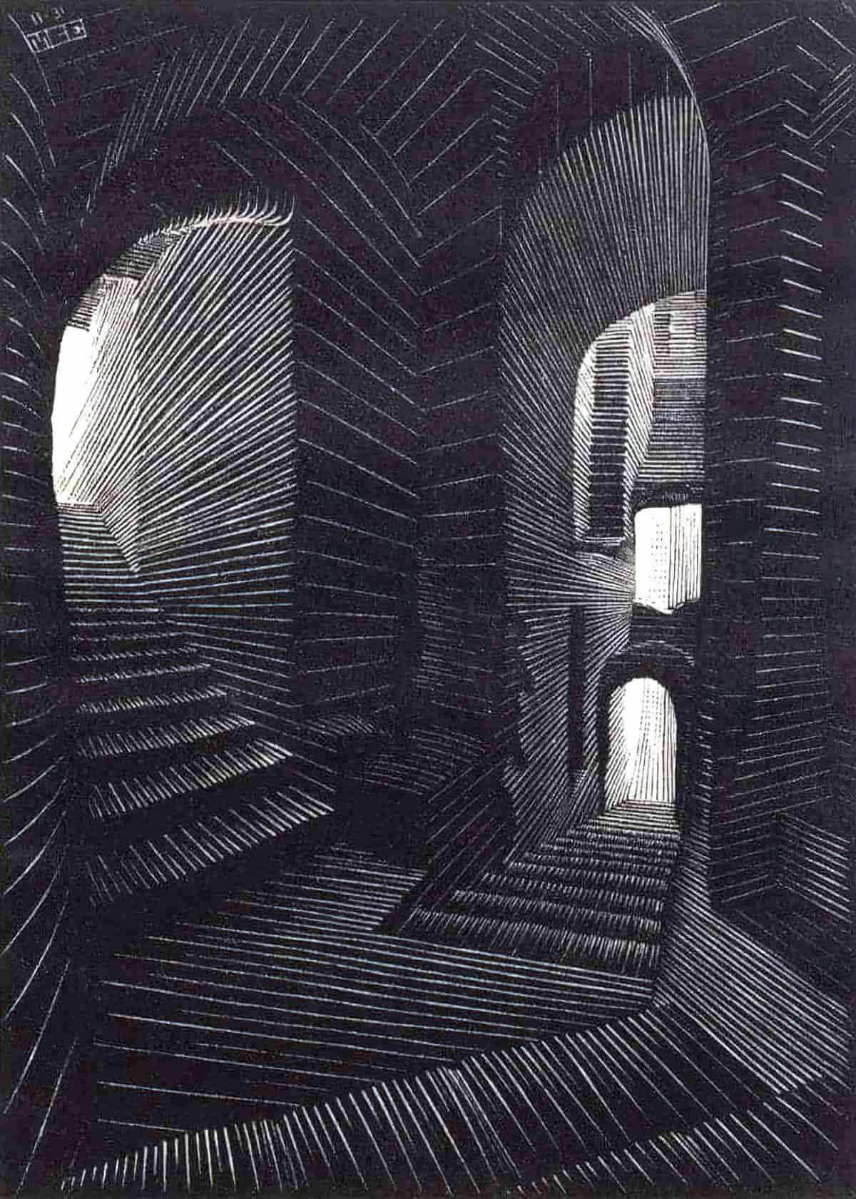
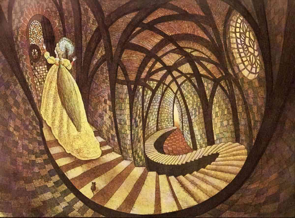
A visual representation of disorientation can be seen in an M.C. Escher painting. These are fascinating, but uncomfortable to look at:
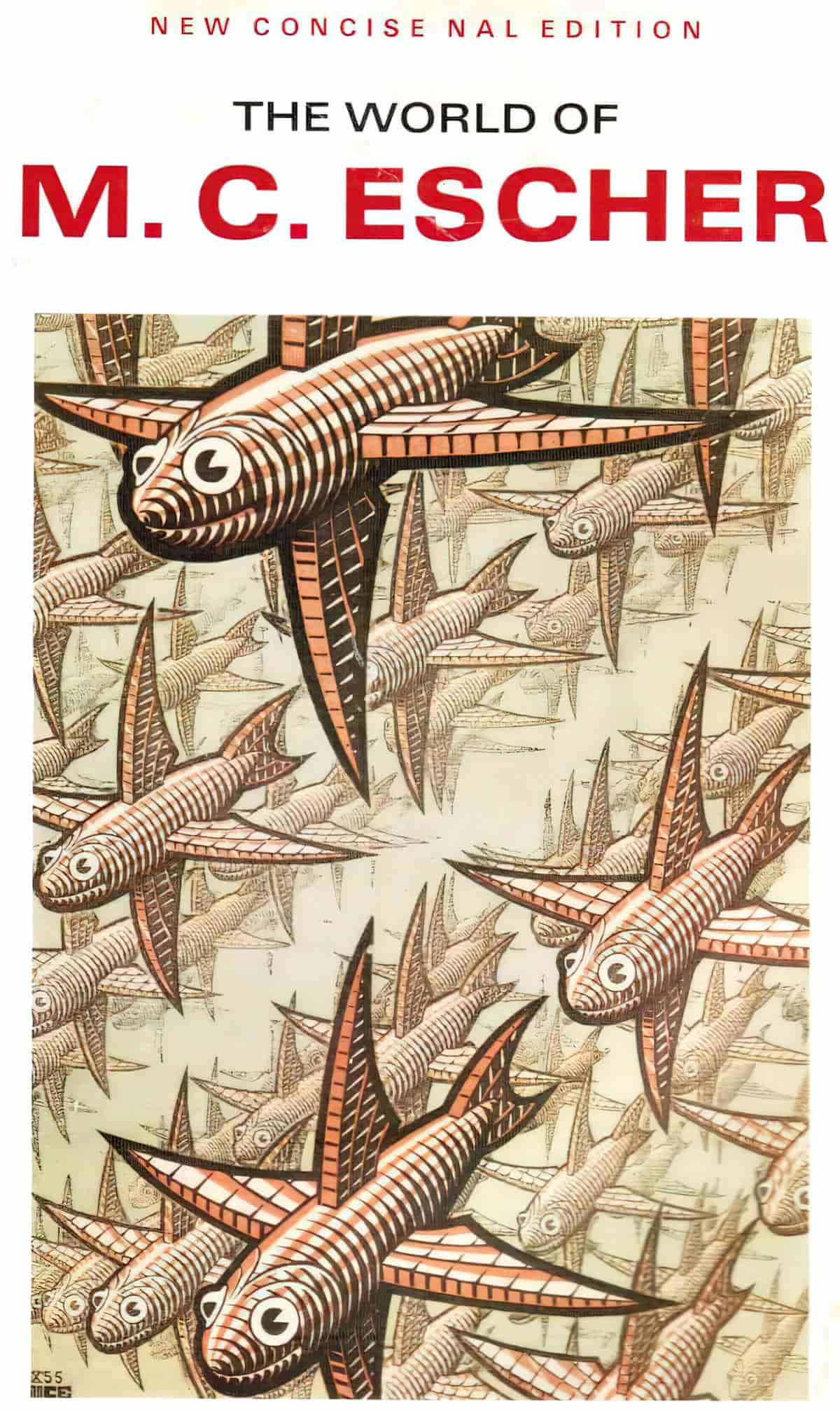
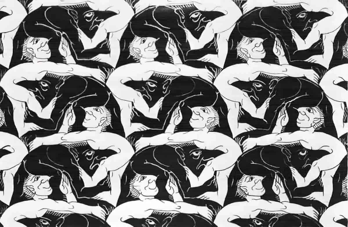
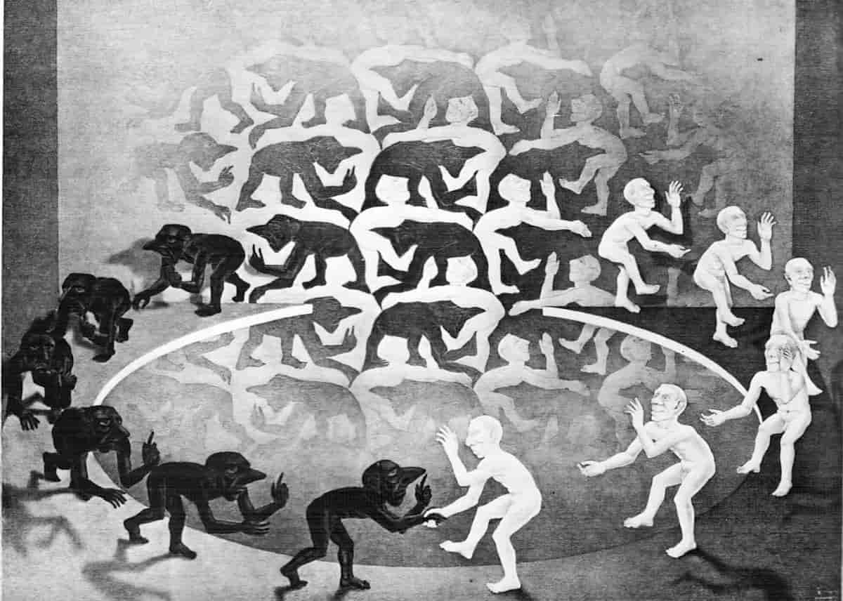
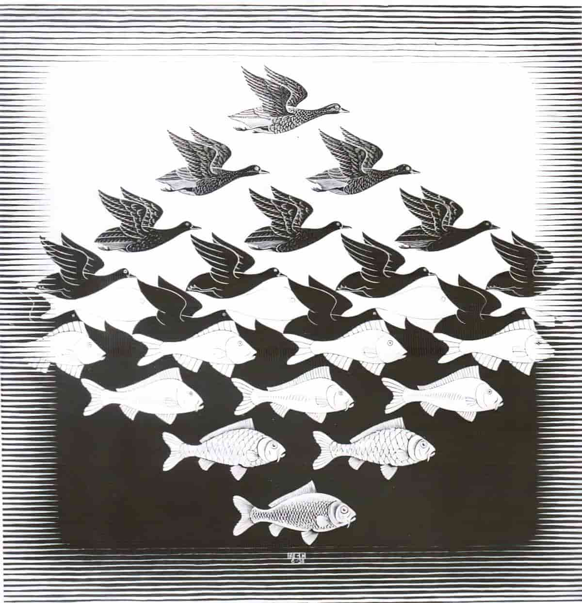
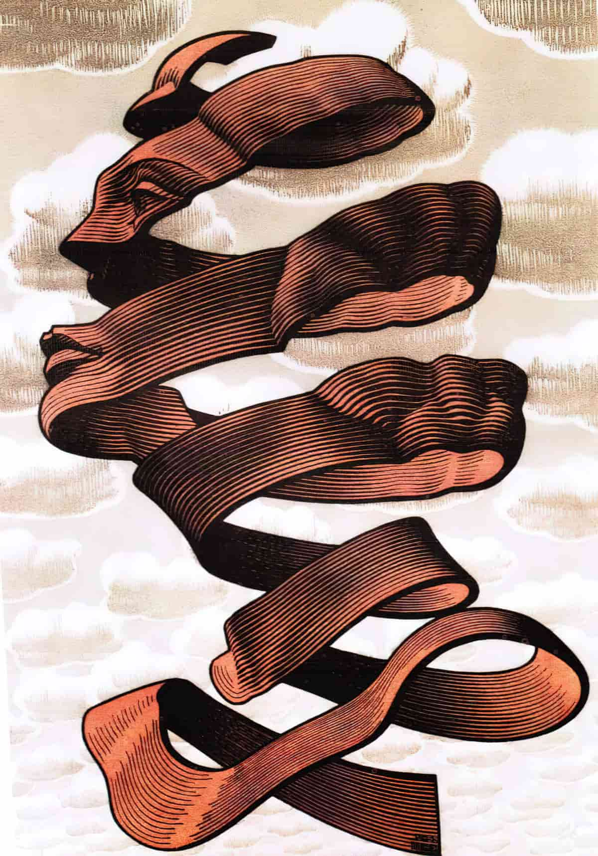
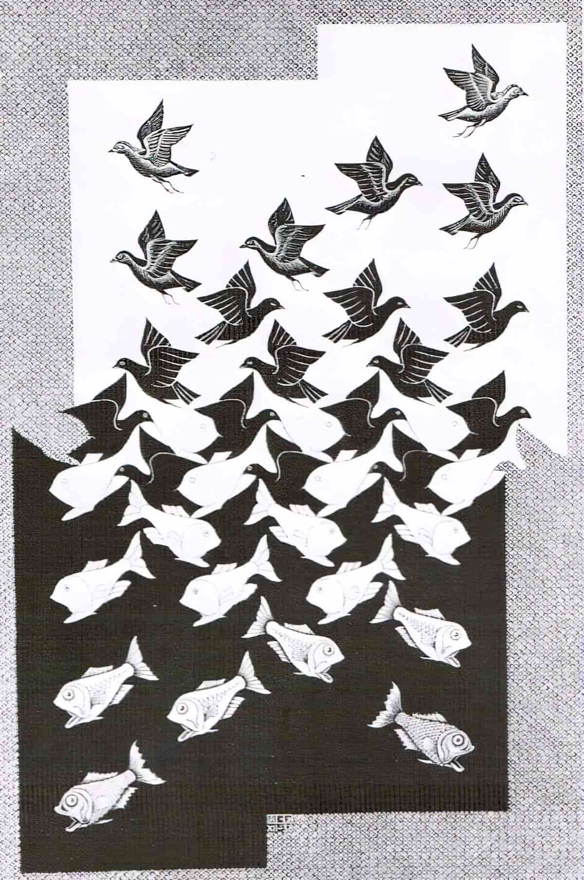
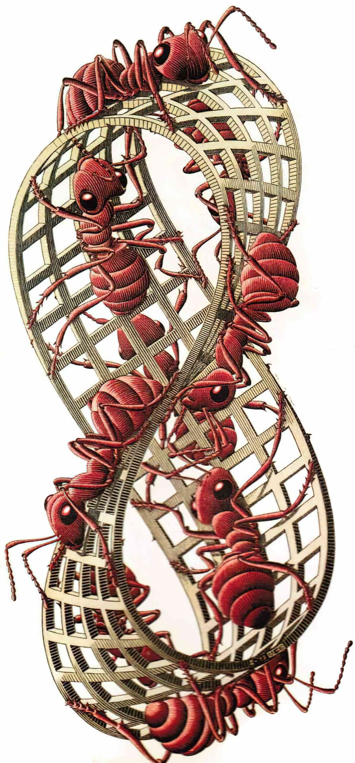
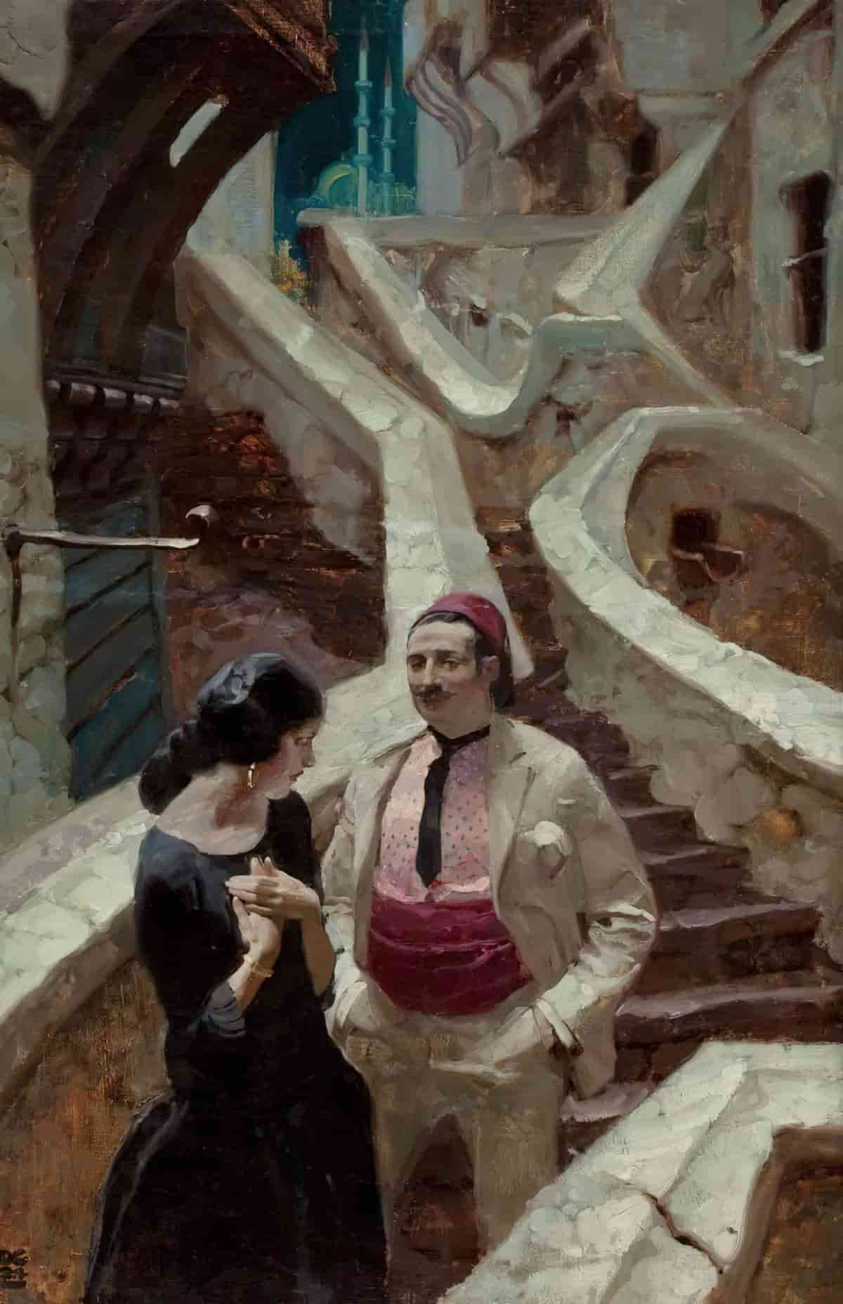
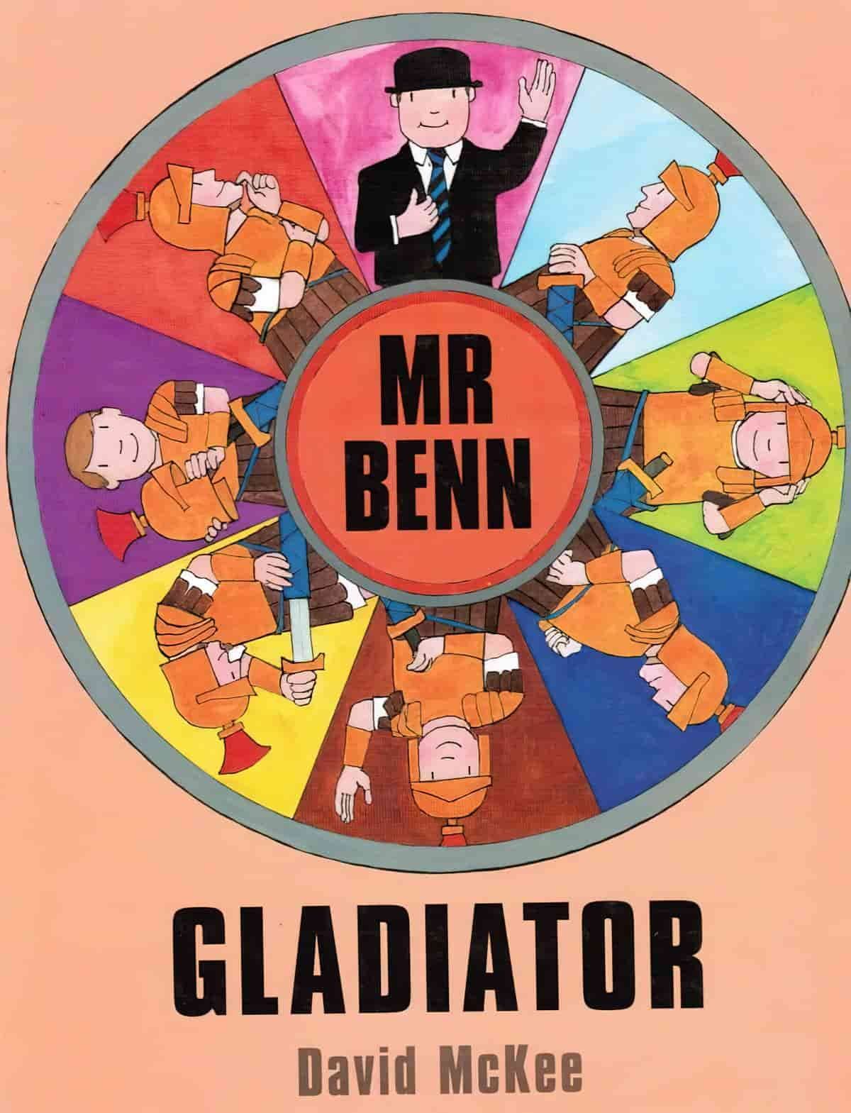
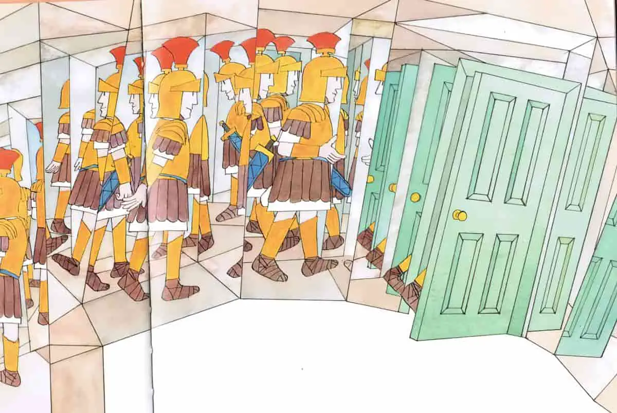
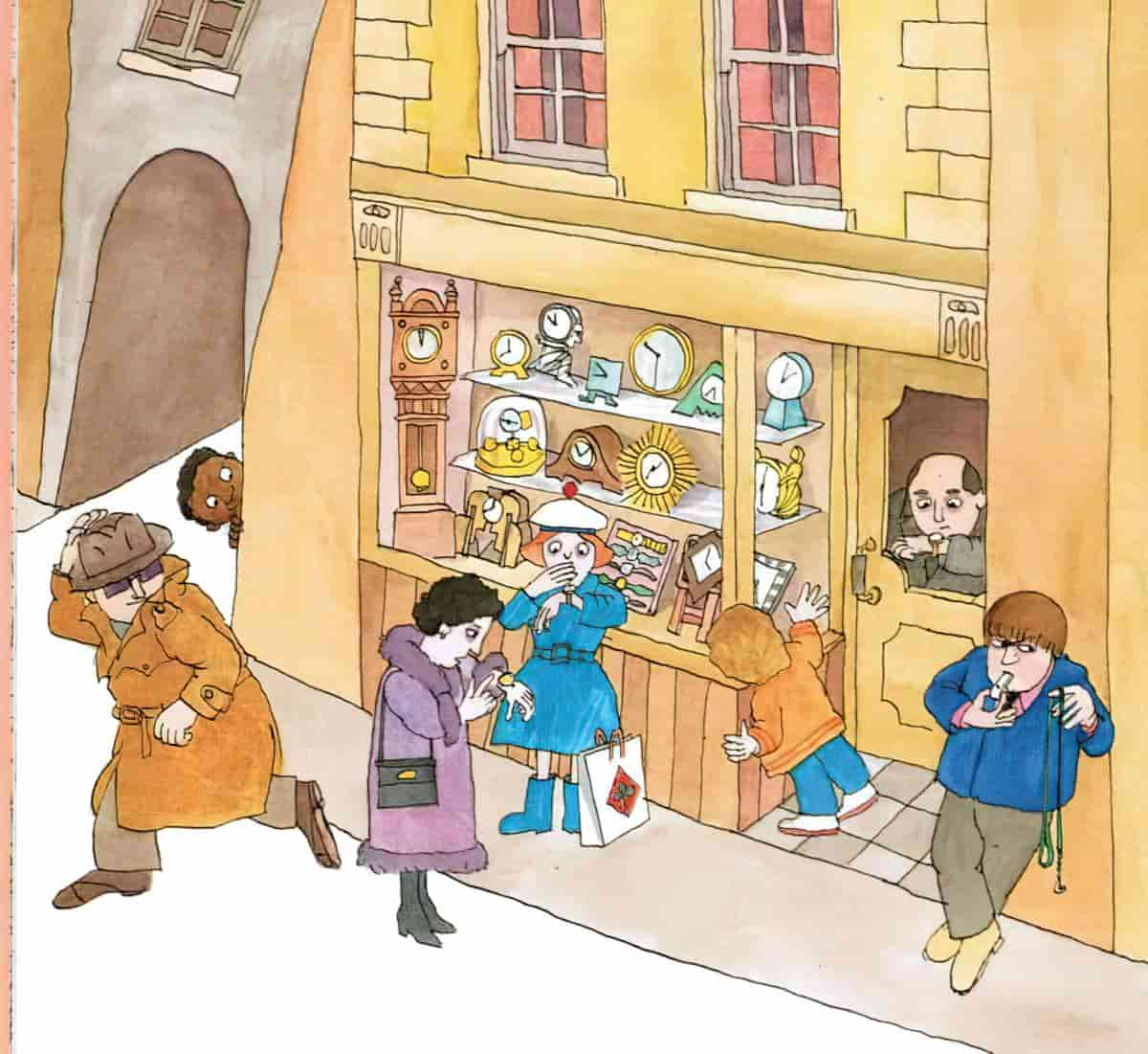
The picture book Gladiator by David McKee induces a topsy-turvy, spatially horrific effect in the reader.
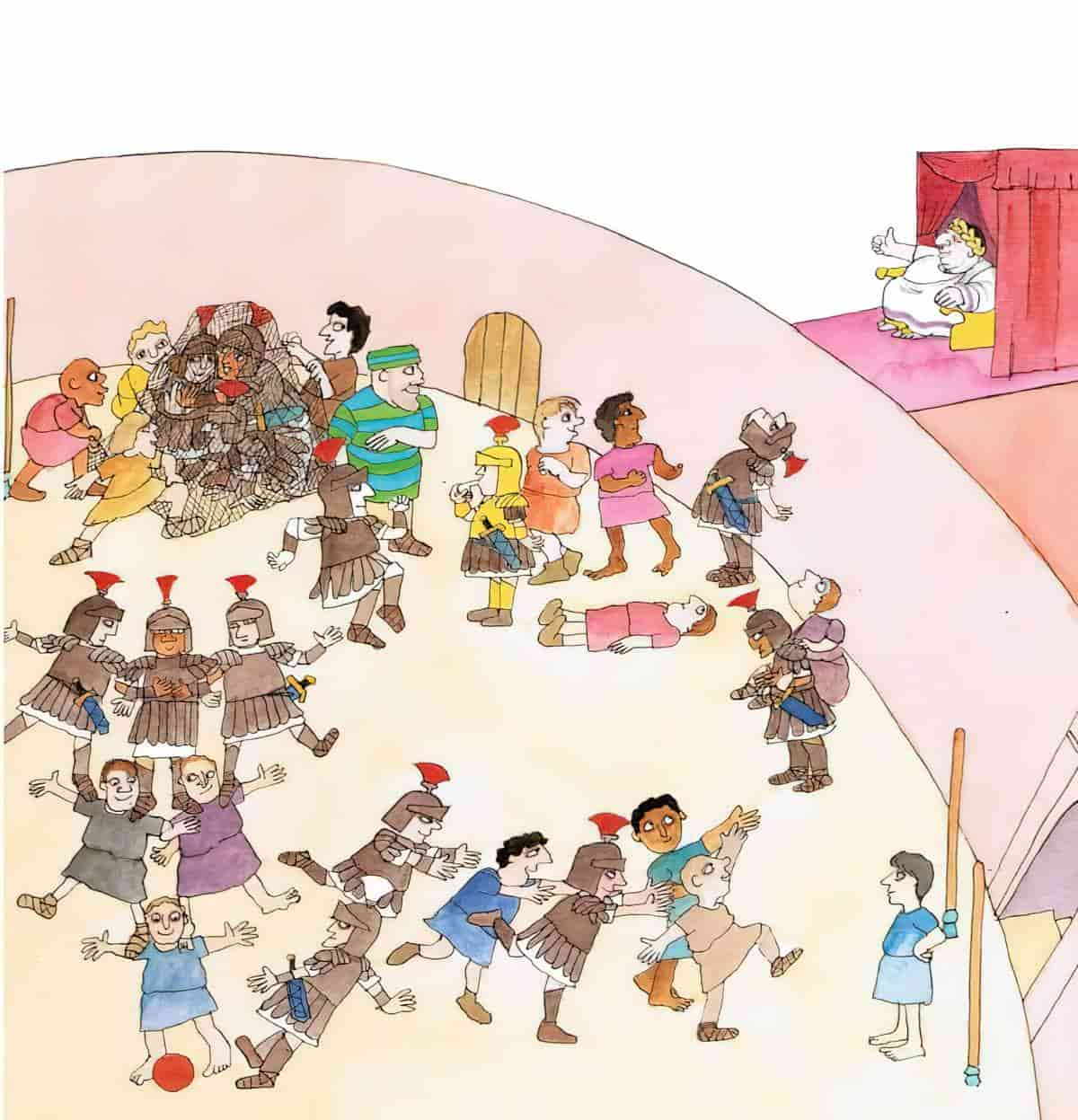
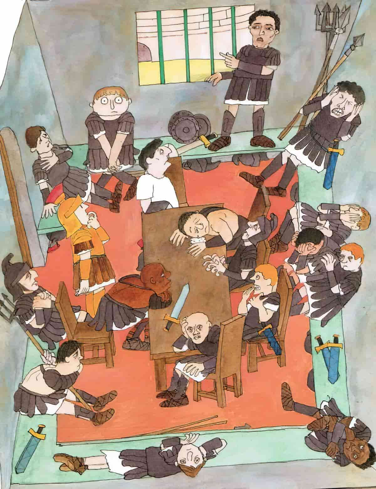
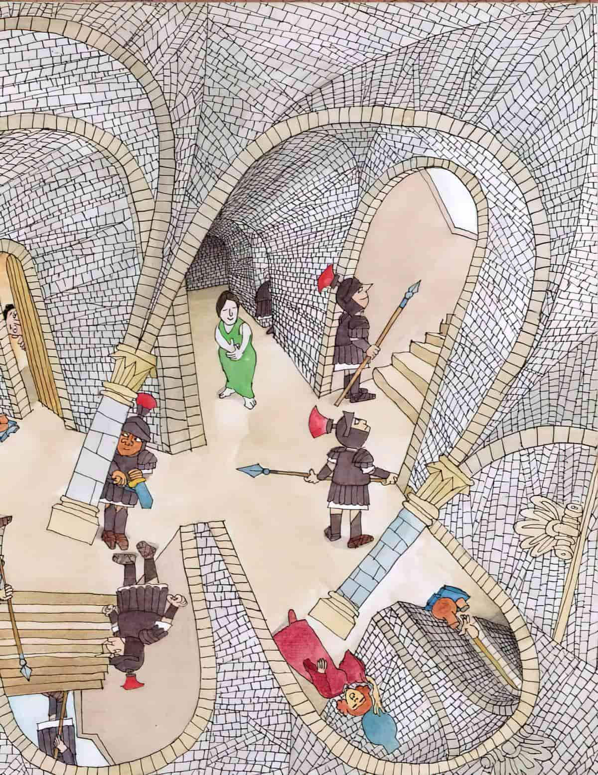
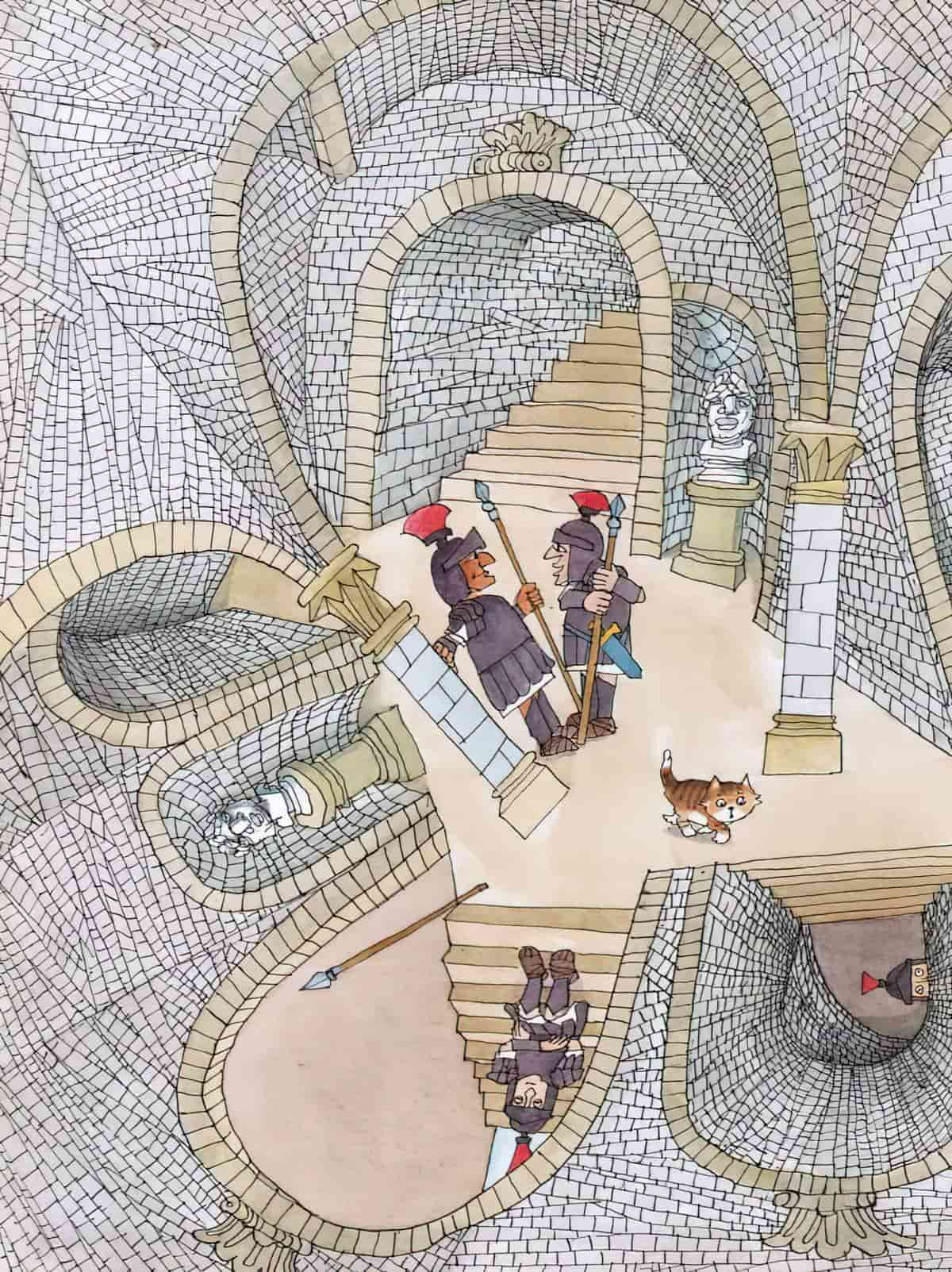
It’s possible to create an Escher effect in words.
Below is the BookRiot clip which got me thinking about spatial horror as a concept. Perhaps certain genres employ these techniques more than others, for instance horror, action and thriller plots. Likewise, science fiction often sends a character flying through time, perhaps through a portal.
But disorientation is a trick not limited to the horror genre, and applies to many types of stories, and across all types of children’s books. I have even noticed spatial horror utilised in picture books by Beatrix Potter. (I maintain that Potter’s stories are a genre blend including large dashes of unmitigated horror.)
On screen, camera work can do a great job of invoking certain unpleasant feelings, especially vertigo. I find the video below unpleasant to watch. That’s because I experience a common form of synaesthesia in which a jolt rushes through me. All the while, I know I’m only watching a stranger risk their own life.
This ‘jolt’ is more difficult to reproduce on the page (not that I would seek it out as a reader). But writers do employ varimous tricks to create various spatial discomfort for readers, usually to emulate the discomfort experienced by their sympathetic main characters.
Disorientation is generally a very unpleasant feeling. Why do that to an audience? Do it mindfully, with a reason in mind:
In secret societies, an old rule of initiation is: Disorientation leads to susceptibility. That’s why initiates are often blindfolded and led around in the dark, so they will be more psychologically open to suggestion from the rituals staged by the group. In storytelling, getting the audience a little off-base and upsetting their normal perceptions can put them into a receptive mood. They begin to suspend their disbelief and enter more readily into a Special World of fantasy.
Christopher Vogler, The Writer’s Journey
A stand-out short story example of general disorientation is “Trespasses” by Alice Munro. I’ve analysed it myself here. If you don’t mind some heavy reading, Nancy Easterlin has written a paper (freely available online) which goes into the exact ways in which Munro creates a sense of discomfort. Much of the discomfort derives from not knowing who the main character is, or who we’re meant to be following.
[A]s readers, our entire orientation toward a fictive environment is generally not simply analogous but isomorphic to our orientation in the material world. With so much current research in psychology suggesting that we are always thinking in terms of the relative orientation and physiological responses of our bodies, it seems unlikely that the body can be short-circuited in any meaningful way.
‘Who Was It If It Wasn’t Me?’: The Problem of Orientation in Alice Munro’s ‘Trespasses’: A Cognitive Ecological Analysis by Nancy Easterlin.
Alice Munro is a world class magician with words and in “Trespasses” she walks the high wire. Below I have collected some slightly less complicated writerly tricks.
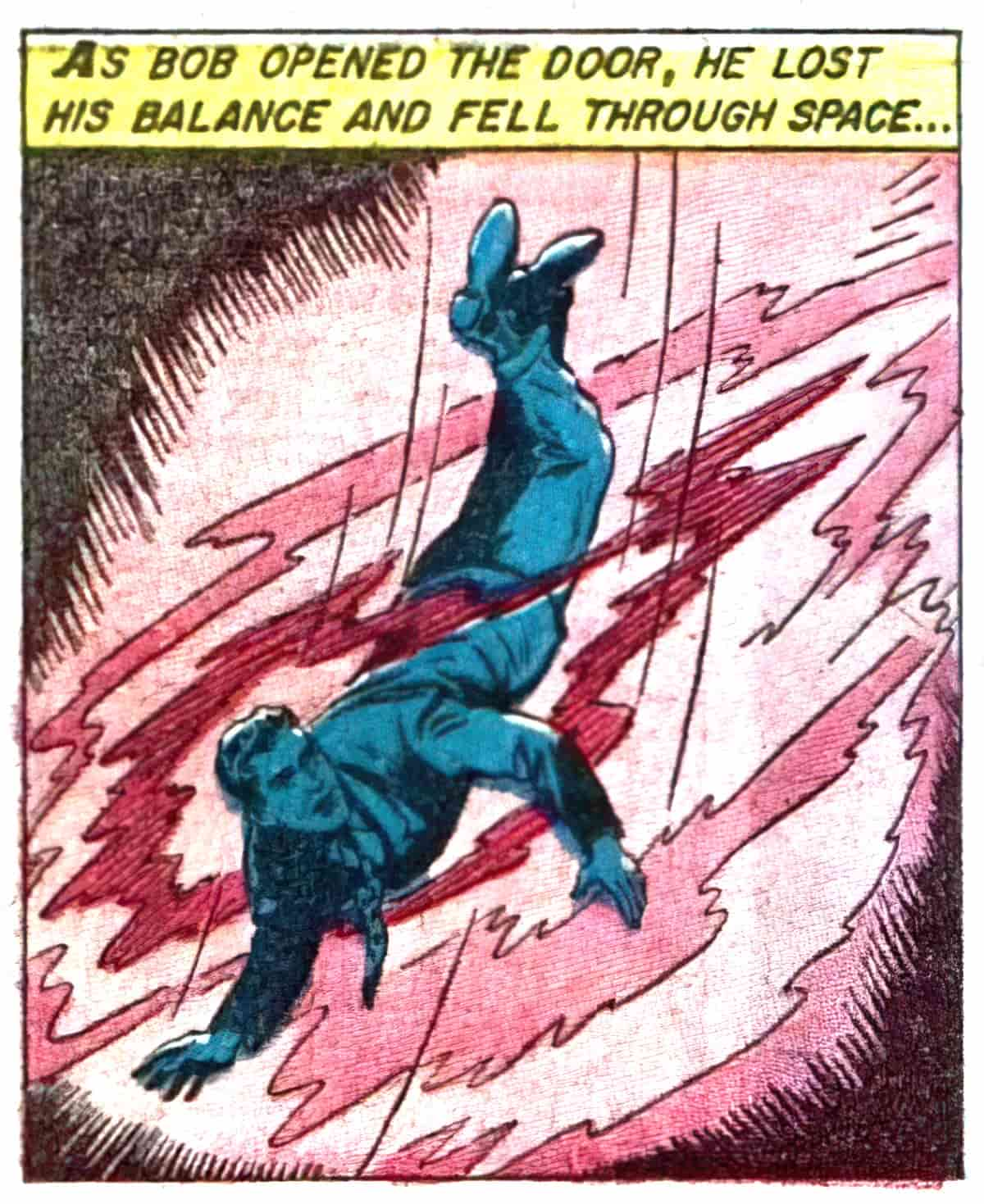
Throw your character around
The lights, the azaleas, the dresses, the pink faces, the velvet chairs, all became one beautiful flying wheel.
Katherine Mansfield, “Her First Ball“
The original title of Beatrix Potter’s “The Tale of Samuel Whiskers” was “The Roly-Poly Pudding”. This older title better suggests the spatial horror of a story in which our sympathetic main character is thrown around in various different ways. The victim of this story finds himself in tight spaces and eventually rolled up in dough.
The Looney Tunes cartoons are basically all about throwing their characters around. Children’s stories which emulate this kind of cartoonish slapstick might be playing around with this type of spatial horror, but often when we watch these scenarios play out, they’re not actually having an effect on us. We view them in one dimensional perspective, as long shots. It’s only when the (metaphorical) camera shifts that we might start to feel discombobulated. Spatial horror depends on high and low angles, and multiple perspectives.
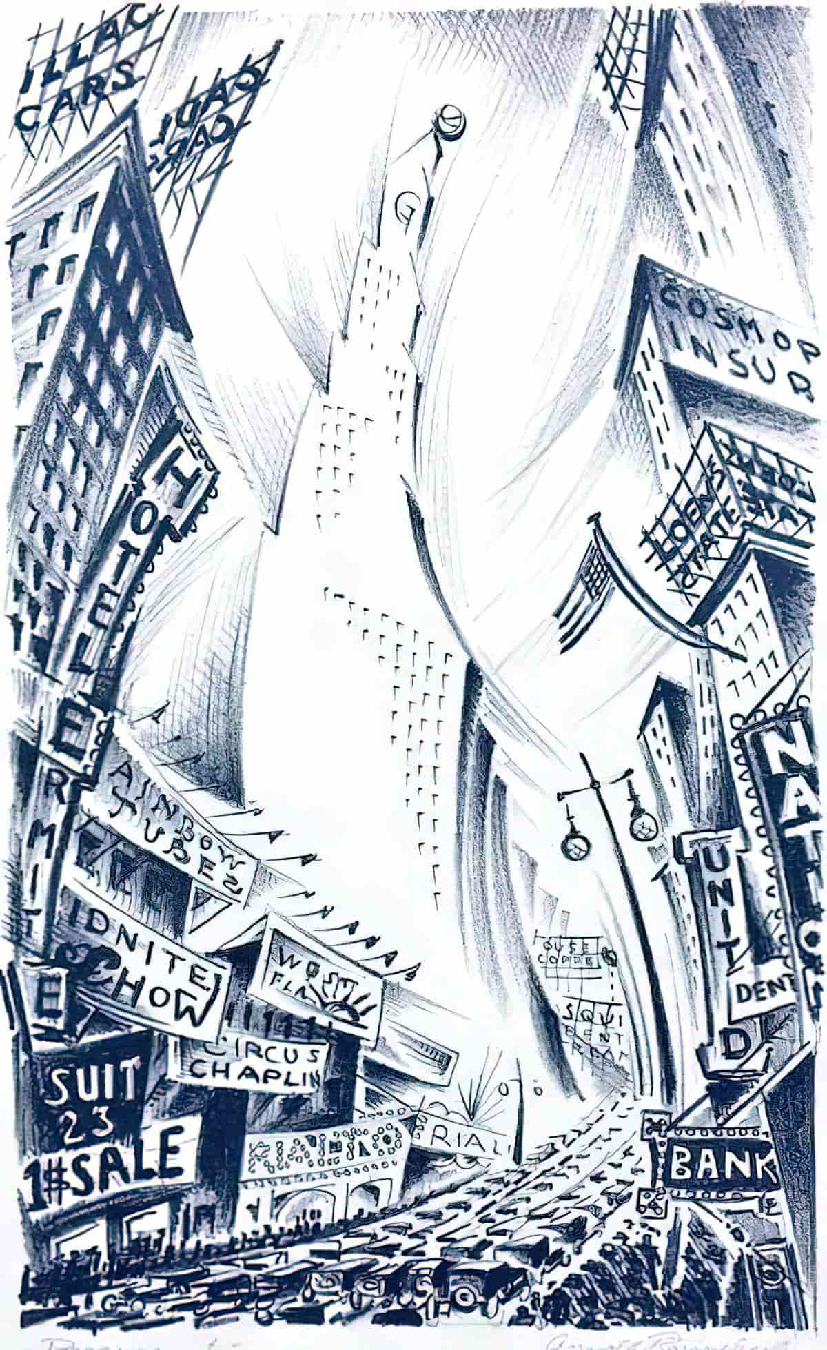
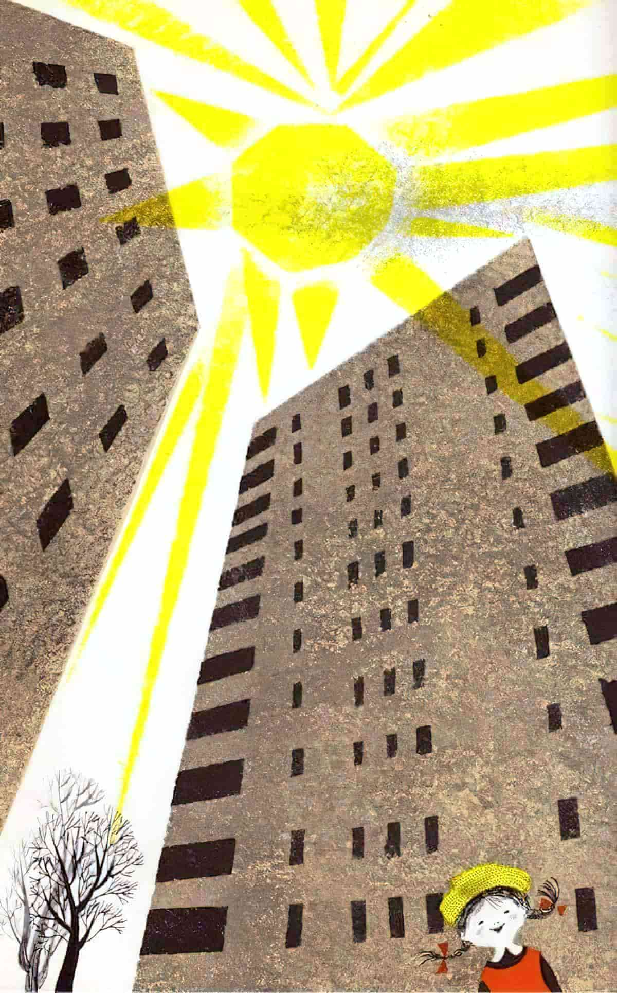
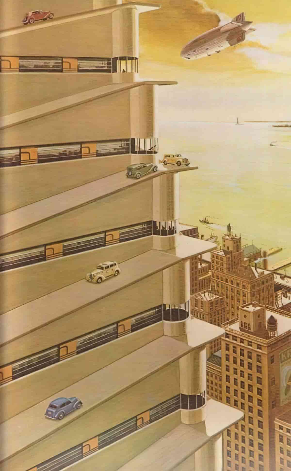
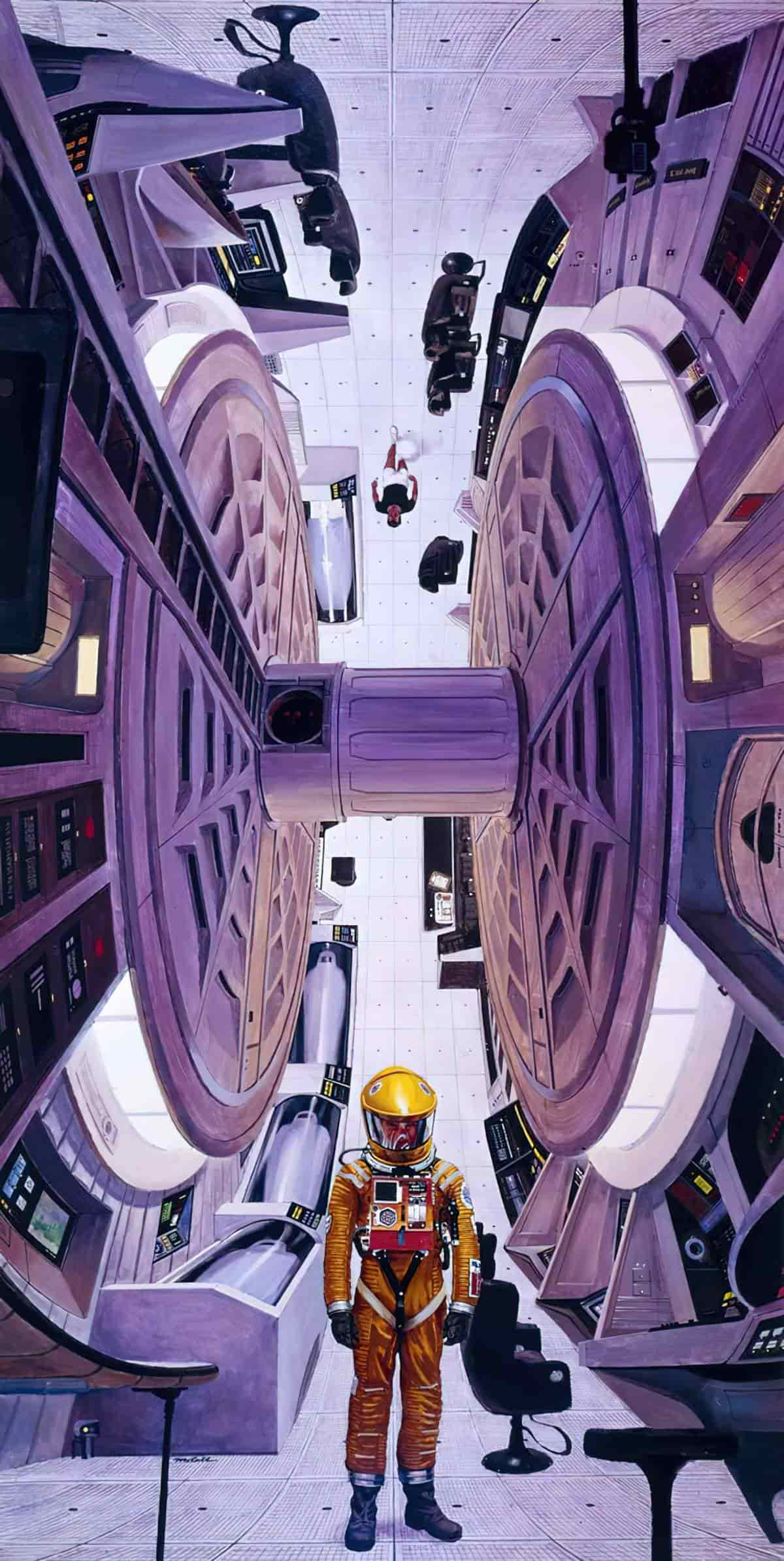
Three point perspective is far better at achieving a disorienting effect in the viewer, as shown in this three point perspective city, which almost seems to turn in on itself, creating its own miniature world.
Play around with differential sizes
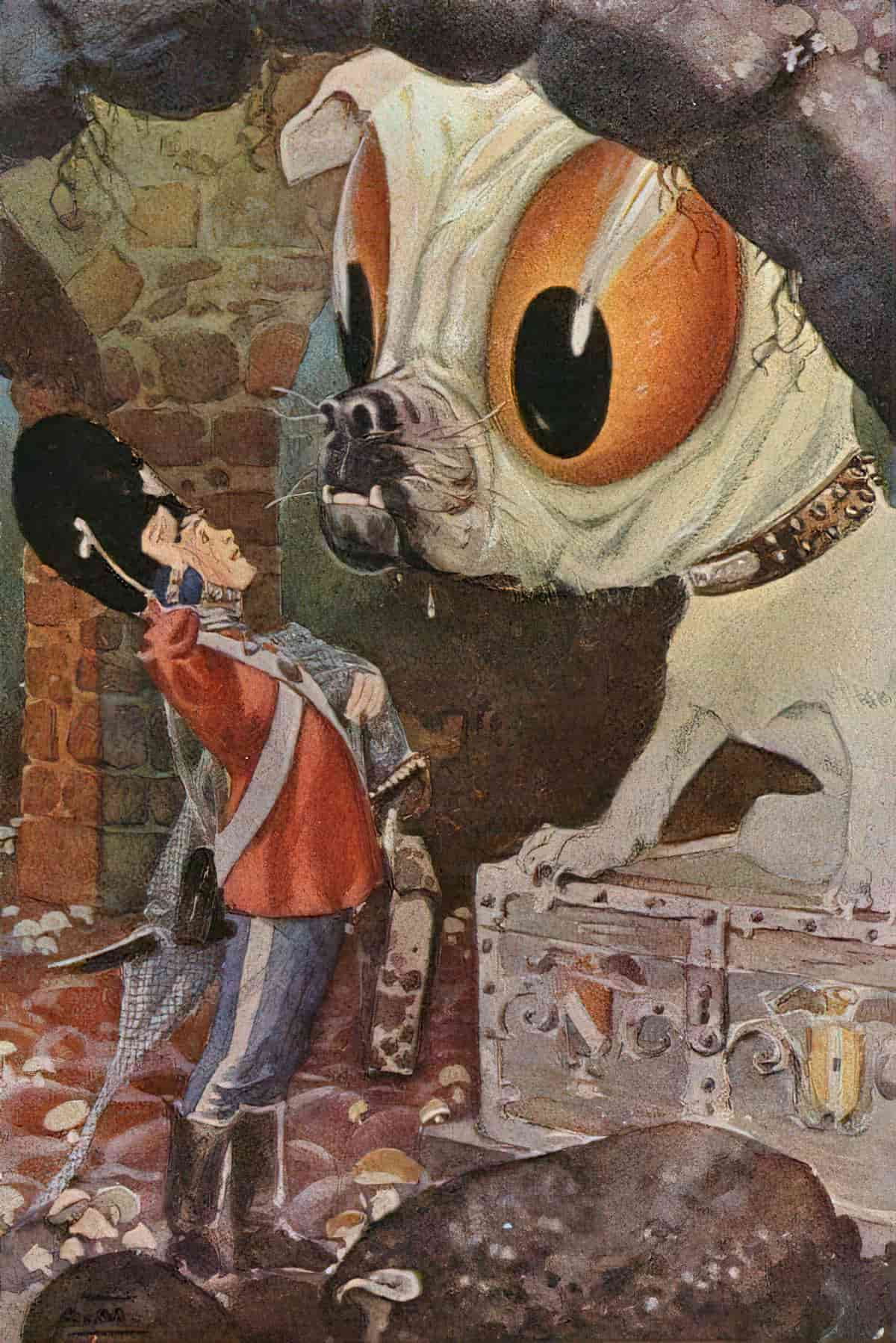
I’ve already written about this extensively in my post on Making Use Of The Miniature In Storytelling. Many of these tricks are utilised frequently by children’s storytellers — most often a character shrinks, or is small to begin with.
@alexrabbit
Evicting the Queen of England, there’s a new King in town! ##godzilla ##monster ##animation ##thequeen
Morphing in size is not limited to children’s fantasy. For a wonderful example of a lyrical short story in which the very setting seems to shrink as two characters explore their environs in a state of limerant love, see “Something Childish but Very Natural” by Katherine Mansfield. These two main characters are so caught up in themselves that their own lust for each other (in short, egocentricity) makes them feel so much more important than the rest of the world, which will surely bend to their will (until they realise it won’t).
In general, Mansfield loved playing around with spatial effects. This is connected to her recurring theme of retaining one’s individuality. Characters seem terrified of losing themselves, of being subsumed by the roles expected of them. Added to that, for Mansfield the self is porous, caught between a virtual past and a virtual future.
Create a whirlpool effect
Ilinx is a Greek word meaning ‘whirlpool’. This word is sometimes used to describe computer games that induce a sense of disorientation or vertigo. The term (as used in this context) was proposed by Roger Caillois as one of four game categories. In case you’re wondering, the other game categories are agon (competition), alea (chance) and mimicry (simulation).
Computer games, like movies, are great at creating a range of spatial horrors for users. How do writers create that feeling of being swept into a whirlpool?
One way of doing this is by using the vortex plot shape. I have written about this here.
Induce Claustrophobia
One of the most chilling sequences from a book/movie is in The Beach, when the main character swims through cave tunnels and almost runs out of breath before he manages to find a place to resurface. Tunnels in general deny us an escape route, and are therefore excellent for inducing fear, especially claustrophobia. The scene written by Alex Garland also features an excellent and dire ticking clock: The main character can only hold his breath underwater for a limited period of time.
For the ultimate claustrophobic spatial horror see Japanese manga, specifically The Enigma of Amigara by Junji Ito.
Get your character lost
It may have bee tiredness. it was late at night, long past midnight. The silence appeared so rich as to have a visual quality, a sparkle or hard gloss, and a thickness too, like fresh paint. This synaesthesia must have been due to my disorientation, for this was so famliar, lying here in the green field of her stare, feeling her smooth thin arms. It was so unexpected too. We were hardly at war, but everything between us was stalled. We were like armies facing each other across a maze of trenches. We were immobilised. the only movement was that of silent accusations rippling over our heads like standards. To her I was manic, pervesely obsessed, and worst of all, the thieving invader of her private space. As far as i was concerned she was disloyal, unsupportive in this time of crisis, and irrationally suspicious.
Ian MacEwan, Enduring Love, describing the feeling of being disoriented during an argument with your partner while in a heightened emotional state. The reader doesn’t know at this point whether the first person narrator is slipping into psychosis.
The Beach underground tunnel example scares me on multiple levels, and another layer of fear derives from being lost, perhaps forever.
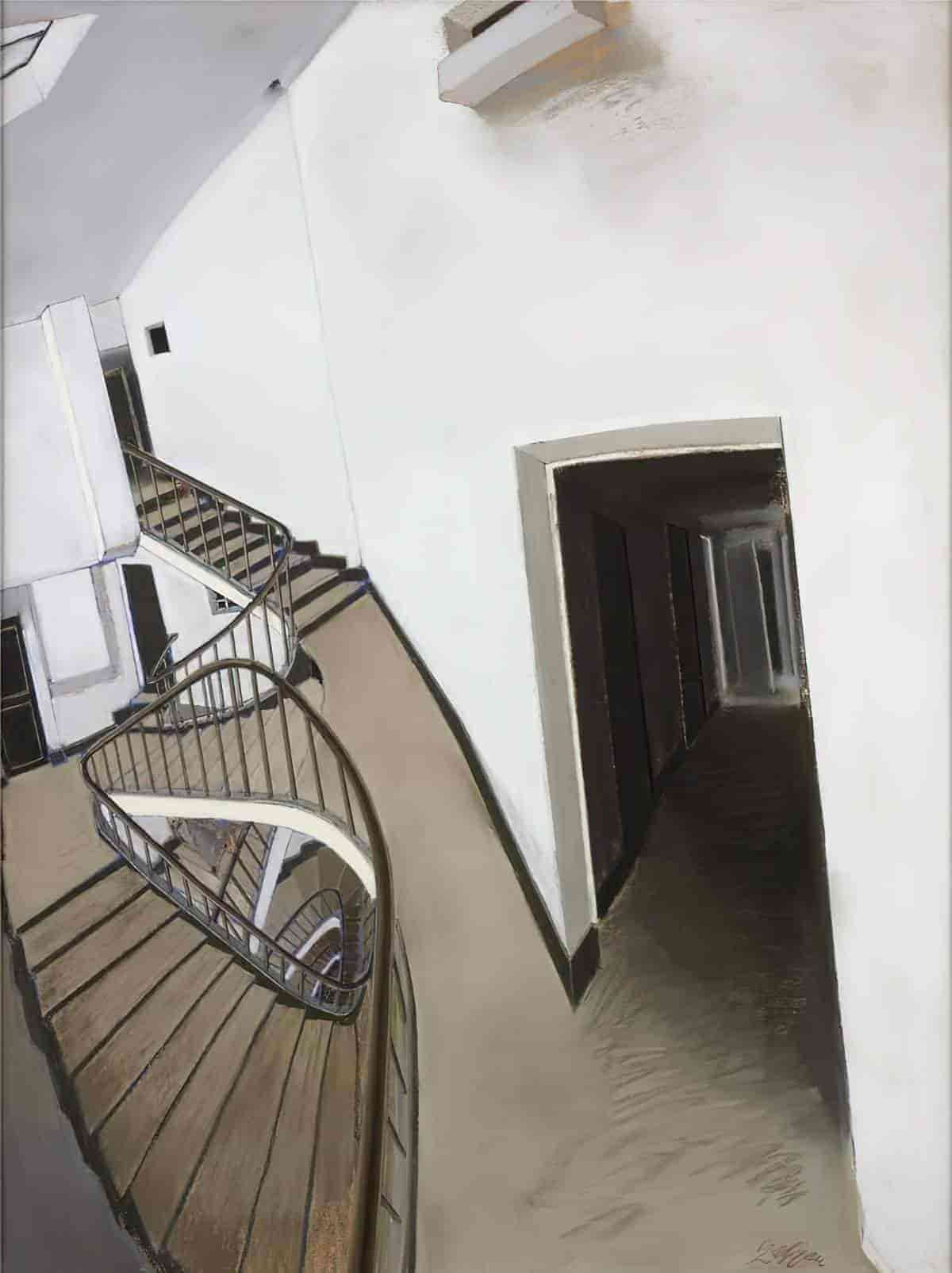
The mythic journey is especially useful in this regard because the main character leaves home and explores unknown territory. Bear in mind though, your characters can still get lost in their own suburbs, their own schools, inside unfamiliar buildings.
Technically speaking, frequent switching your point of view can help create a disorientated feeling in your audience. Even genuine cases of ‘head hopping‘ may have their uses, when done mindfully by the writer.
AN EXAMPLE OF SUBVERSION
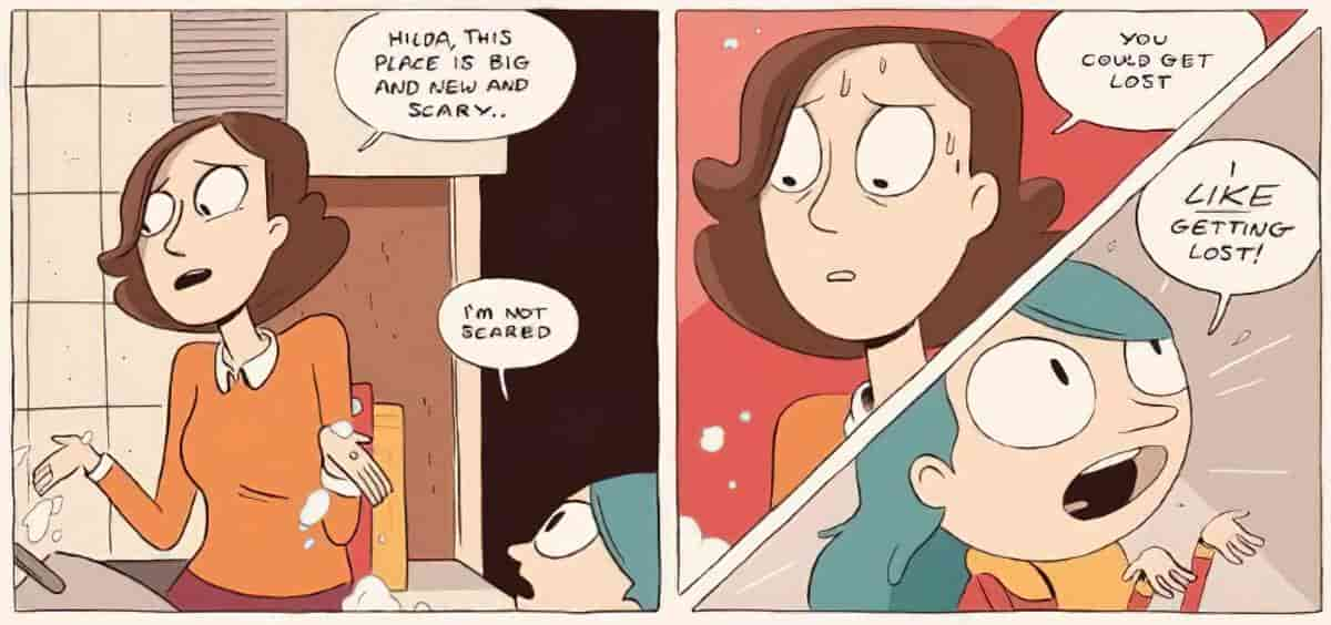
The Hilda stories by Luke Pearson (also a TV series) are cosy by intent, so even getting lost becomes an adventure, in a world where fantasy creatures are harmless, even the massive ones. The Hilda setting is also interesting because depending on the scene, Hilda the human girl is sometimes massive, sometimes tiny.
Put your characters in tight places
As if old houses aren’t creepy in their own right, the creepier thing about them is that you can get lost in them — not just in the rooms themselves, but in the spaces between.
The Rats In The Walls, as well as Neil Gaiman’s The Wolves In The Walls encapsulate this particular fear. A Lovecraftian fear of passages, corridors and spaces in between may be more common than I realise. Jeff Kinney even makes a gag out of it in Wrecking Ball (2019). Greg can’t stand the thought of creatures poking about in the walls, so his future dream house will be made entirely of glass. The illustration shows Greg sitting downstairs, looking straight through the floors into an upstairs toilet.
In Potter’s “The Tale of Johnny Town-mouse“, Timmie Willie He’s becomes horribly disorientated inside his wicker cage. Characters are especially prone to this type of spatial horror if they are tiny. Children, fairies and mice are so small they can get bundled up inside things and thrown around from movement, against their will, outside their control.
Another especially 20th century take on the ‘shut in a tight space’ kind of spatial horror comes in the form of sinking into quicksand. There’s a reason why this particular horror was popular in the 20th century.
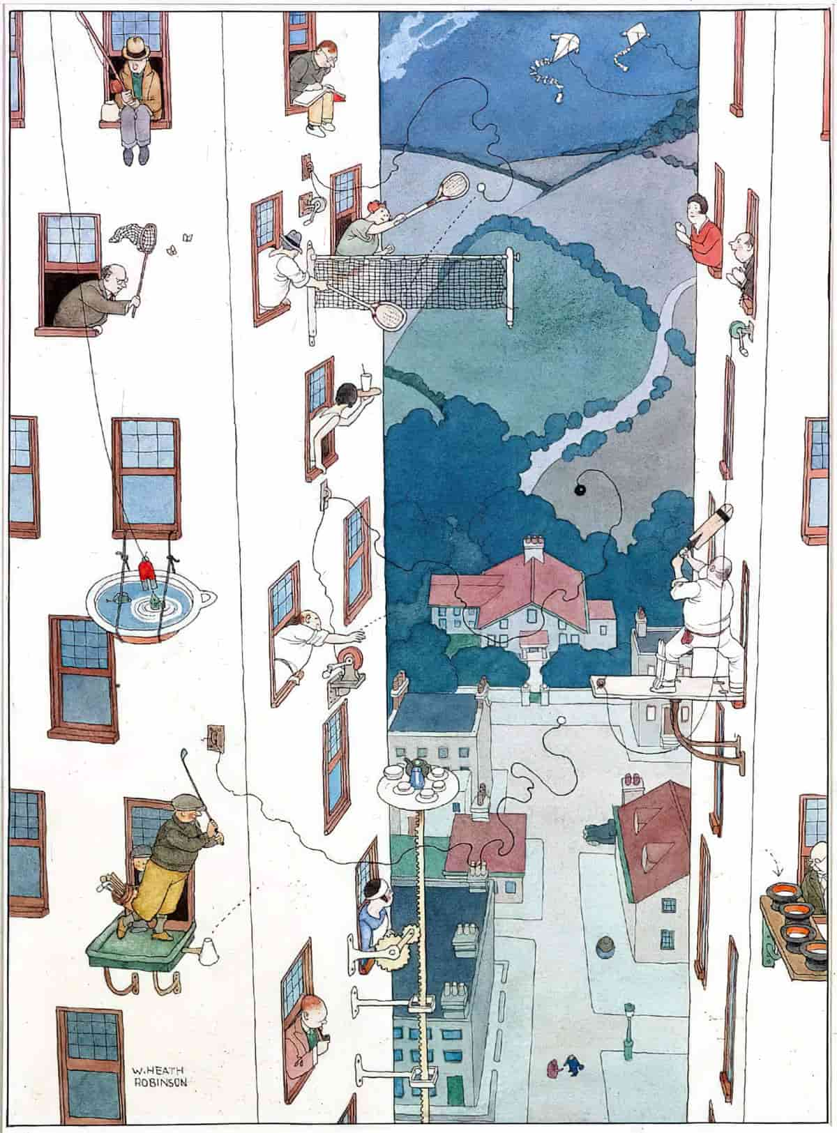
Put your characters in high, precarious places
Create a mise en abyme effect
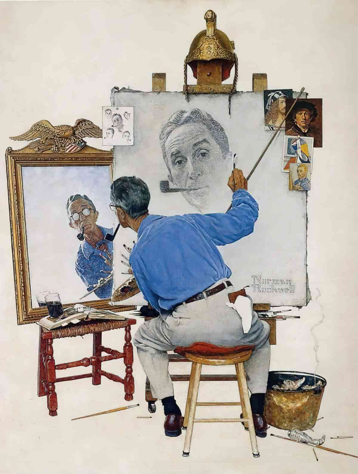
Why does it feel so strange to look into two mirrors facing each other? I believe it’s because we rarely get an insight into the feeling of true infinity. We are each bound to our single planet, to our single body, and our experience of all things is singular.
The Poorly Drawn Lines comic strip below combines two spatial tricks: the mise-en-abyme effect and the miniature effect. (Something gets smaller and smaller even as it goes on forever.)
For a literary example of the mise en abyme effect see Angela Carter’s short story revisioning of “Peter and the Wolf”. Carter also utilises the mise en abyme effect in her re-visioning of “The Erl-King“.
I have experienced the magnitude of infinity most acutely when reading popular astronomy. As you might predict from the title, Marcus Chown’s The Never-ending Days of Being Dead is a mind-blowing book in that regard. Sean Carroll also has a book about multiple worlds theory.
Related: The Droste effect, known in art as an example of mise en abyme, is the effect of a picture recursively appearing within itself, in a place where a similar picture would realistically be expected to appear, creating a loop which theoretically could go on forever, but realistically only goes on as far as the image’s quality allows. — Wikipedia

Induce the Overview Effect
The overview effect is a cognitive shift in awareness reported by some astronauts during spaceflight, often while viewing the Earth from outer space
Wikipedia
Writers have several ways of inducing this feeling in an audience. One way is to link ‘childhood’ to ‘the elderly’, giving the impression that life is seen from above, and that it is cyclical. Annie Proulx regularly does this as well, by opening stories which go back three generations (which happens to correspond to the length of time the human brain can cope with when it comes to caring about relatives). For a literary short story example of The Overview Effect see see “Prelude” by Katherine Mansfield. The symbolism around the aloe (the story’s original name) also emphasises this.
In her short story “Deep Holes“, Alice Munro creates an Overview Effect by Alice Munro turning Sally into a tiny figure within a vast landscape. We are seeing her from above, almost as if from the stratosphere. We are no longer involved in her life. This is how we leave her.
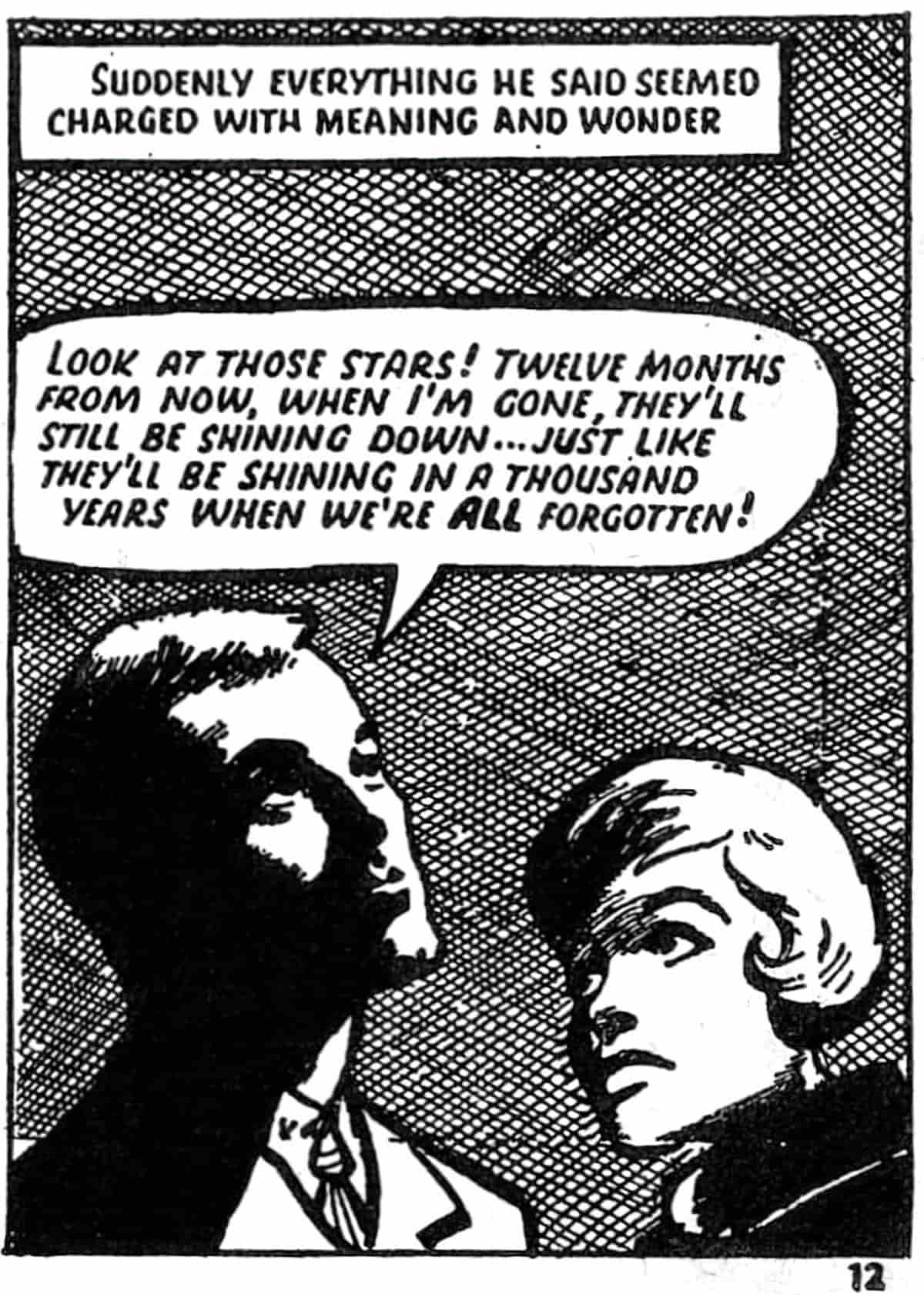
That’s why you’ll quite often find The Overview Effect as a story ending. Moving now to the realm of picture books, this is how Jon Klassen wraps up “We Found A Hat“. But this time the viewer stays on the ground, looking up at the characters rather than looking down. These tortoises have both acted morally after making a very tough moral decision (to share a single hat between them), and with this view from the ground, they now seem almost angelic. However, the small size of them against the backdrop of a huge sky nonetheless works to create an Overview Effect.
Philosophers use the word ‘sublime’ to describe this feeling of becoming one with something bigger as ‘sublime’.
In aesthetics, the sublime is the quality of greatness, whether physical, moral, intellectual, metaphysical, aesthetic, spiritual, or artistic. The term especially refers to a greatness beyond all possibility of calculation, measurement, or imitation.
Wikipedia
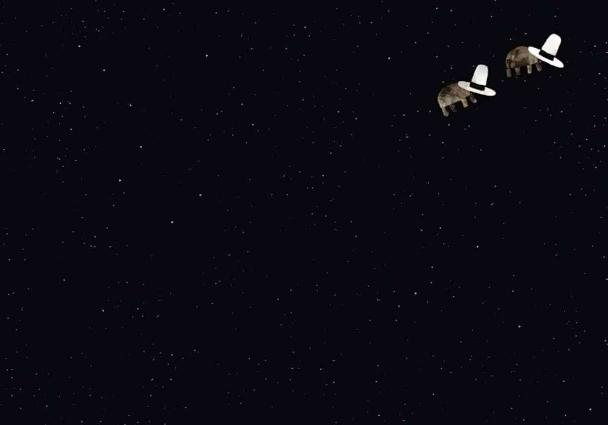
One of the strange things about living in the world is that it is only now and then one is quite sure one is going to live forever and ever and ever. One knows it sometimes when one gets up at the tender solemn dawn-time and goes out and stands out and throws one’s head far back and looks up and up and watches the pale sky slowly changing and flushing and marvelous unknown things happening until the East almost makes one cry out and one’s heart stands still at the strange unchanging majesty of the rising of the sun–which has been happening every morning for thousands and thousands and thousands of years. One knows it then for a moment or so. And one knows it sometimes when one stands by oneself in a wood at sunset and the mysterious deep gold stillness slanting through and under the branches seems to be saying slowly again and again something one cannot quite hear, however much one tries. Then sometimes the immense quiet of the dark blue at night with the millions of stars waiting and watching makes one sure; and sometimes a sound of far-off music makes it true; and sometimes a look in someone’s eyes.
The Secret Garden, Frances Hodgson Burnett
Another example of the sublime from (ostensible) children’s literature: the Pan chapter from The Wind In The Willows.
Apart from the very end, Overview Effects are often utilised at the Anagnorisis phase of a story (the part which comes after the Battle, in which the character learns something about themselves). This makes complete sense because when you learn something about yourself you are temporarily seeing yourself as if from afar, as if you are new to yourself.
For an excellent example of Overview Effect used at the Anagnorisis phase of a story see When You Reach Me, a middle grade novel by Rebecca Stead.
Margaret Wise Brown also uses The Overview Effect at the Climax of Goodnight Moon.
Strand your character in the middle of nowhere
The film Gravity opened by creating an Overview Effect. But as the action unfolded I felt more and more isolated. I don’t imagine I’d enjoy being off my own planet, not knowing which direction it was in. I think I might even flip out.
Space functions metaphorically in the same way as an ocean. So any story set underwater is good at messing around with our sense of direction. If we’re panicking underwater, we may not even know which way is up, which way is down.
Island stories, desert stories and journey at sea stories all induce spatial horror by encouraging the audience to see ourselves (via the characters) as tiny in the vastness of space and time.
Create the sensation of ‘too much’
Horror vacui
In visual art, horror vacui (Latin for ‘fear of empty space’) or kenophobia (from Greek for ‘fear of the empty’) is the filling of the entire surface of a space or an artwork with detail. In physics, horror vacui reflects Aristotle’s idea that “nature abhors an empty space.”
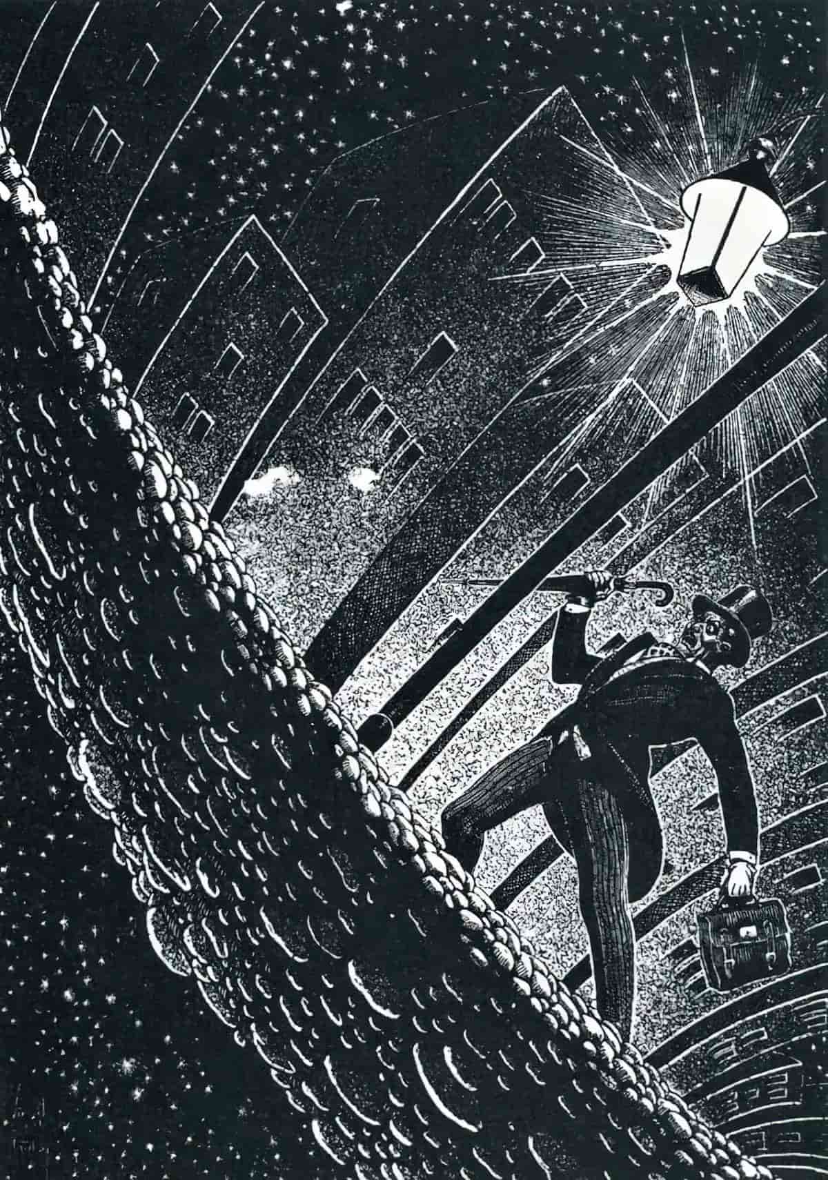
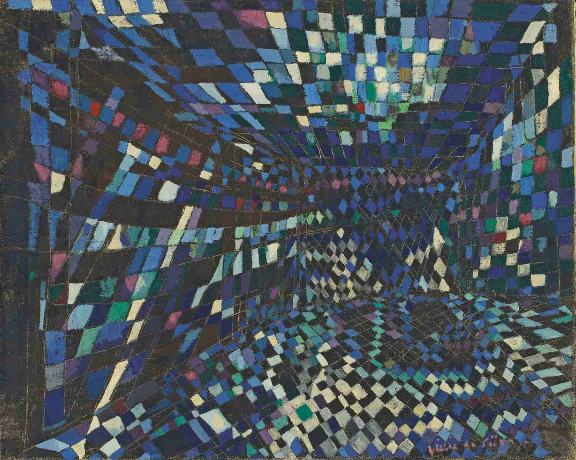
Header illustration: Maria Helena Vieira da Silva, Composition 1951 (1908-1992) Lisboa, Portugal
