Earlier this week I compared two similar digital art programs, Artrage 5 and Rebelle 3. Rebelle 3 has just been released. Those are my top picks for illustrators who don’t want to fork out the big (ongoing) bucks for Adobe products or for Corel Paint (which I didn’t like anyway, last time I used it).
Here are my thoughts on some other art software.

PROCREATE
If you have an iPad with an Apple pencil (so, an iPad pro or the latest one), Procreate is the way to go. My old iPad can’t support it, but apparently their latest update was amazing. Procreate has excellent gesture support. They’re setting the industry standard on that. There are illustrators who use Procreate and only Procreate to create professional work. There’s a lively and active Procreate community and plenty of brush specialists creating awesome resources for sale. You can even ‘go native’ on an iPad pro and get rid of your desktop if you want.
UPDATE: I have since started mucking around with Procreate on my new iPad and an Apple pencil. The interface is very nice, though I kept accidentally touching the sidebar. Shifting it over to the other side fixed that problem. (You get to choose set up for ‘left handed’ or ‘right handed’ — I’m actually right-handed but choose the left-handed set up.)
The big problem some Procreate users have right now: There’s no CMYK in the page set-up. That stops professional artists from using it, unless they’re creating solely for screen. I know professional artists are really wanting to go native with an iPad Pro and Procreate, so if this Tasmanian company is smart, they’ll sort that out very soon. Instead, they are telling users to just switch to CMYK from RGB in Photoshop or similar. This never works well.

PAINTSTORM STUDIO
Not quite there yet but amazingly impressive: PaintStorm Studio. Like Artrage, this is one man’s passion. That man happens to be Russian. He has not released an instruction manual (in any language, from what I can gather) and GOOD LUCK learning how the brush engine works through boneheaded experimentation, because his set-up is unlike anything you’ve ever seen before. Basically, every functionality has been rolled into the brush engine. Hard to explain until you see it in action. Fortunately, there are YouTubers who’ve published excellent reviews of PaintStorm Studio and your best bet for learning how that software works is to watch one of those. Paintstorm is officially in beta mode. It’s been in beta mode for ages. It’s amazing what the Paintstorm guy has done (mostly? entirely?) on his own, and he has made some really excellent decisions, taking the best of many different programs and pulling them into a new passion project of his own. The ability to pick up paint from lower layers is really awesome. He’s also taken Krita’s seamless pattern functionality (Krita calls it Wraparound) and for me, it was worth buying Paintstorm just for that. And also because I’d like to see that guy financially supported.
KRITA
Speaking of Krita, your free, open source alternative, I deleted that from my computer after discovering PaintStorm because I only used it for the wraparound functionality, and Krita is — at present — lacking naturalistic paint mixing capability. It does not work well on my old Mac.
In 2013 I bought Mischief on the Apple store. I was interested in its very unusual ability to create a never-ending canvas, and the ability to zoom in and in and in until you have a mise en abyme image. Look at one of their promo videos to see how cool that is. Thing is, I’ve hardly used it. I thought I’d use it for character design sheets and whatnot, where there is no real need to choose a certain size of paper, because you’re in total creative mode and you can hypothetically keep going every which way. I find the lack of margins strangely disconcerting. Turns out I’m old-school when it comes to margins. I like my paper to end. I am someone who gets lost at the mall. So if I need to drop pins to get back to where I was, I’m going to get hopelessly lost. Without even leaving my own desk! More to the point, the user interface never appealed to me. I didn’t stick with Mischief long enough to memorise the shortcut keys and now it’s just irritating. Mischief have not done anything obvious with their software since I first tried it, and though a professional artist can use any software and create excellent stuff with it, without naturalistic paint mixing, Mischief is not a contender for me. I would recommend Mischief to people (especially students) who love to make their own hand drawn mindmaps, because the one thing that pisses me off about mindmaps is, you always end up wishing you’d started somewhere else on the page. You won’t run into that problem with a never-ending canvas.
VERVE
Here’s another interesting but underdeveloped passion project: Verve, described as ‘experimental fluid dynamics fluid software. It’s completely free, but available only on PC. Verve has a band of loyal supporters on the forum, but the UI is very odd. If you keep playing, you’ll work out how to make certain effects on purpose (rather than by complete happy accident). If you’re into dragging needles over dye in water (I forget what that is called) then you’ll be impressed by Verve. My programmer husband contacted the developer about five years ago and asked if he wanted to collaborate on an iPad app aimed at the preschool set. We saw amazing potential for this gooey, squishy, sandboxy physics engine, which Taron says he stumbled on by accident. Taron wasn’t interested in a collaboration — fair enough — no one wants to give up their code that easily, especially since software physics belongs to the dark arts, and happy discoveries happen once in a lifetime, if you’re lucky. Taron replied that he has big plans for Verve, and plans to develop the UI himself. Five years later, nothing’s changed. We contacted him again a few months ago, but Taron says he still has big plans to develop the UI and is still not interested in a collaboration. He’s probably got a number of such emails over the last few years, and he’s probably been developing it quite a lot without making a release. However, I suspect Taron has missed the boat. Five years ago, the physics engine of Verve made your eyes pop. It felt really exciting. Through sheer hard graft and a whole heap of startup funds, other, bigger companies have discovered these physics engine secrets, knowing they were there to be discovered.
AFFINITY PRODUCTS
Affinity Designer and Affinity Photo are genuine competitors to Adobe Illustrator and Adobe Photoshop. If you’re migrating over, the thing that will disappoint you is that you can’t migrate all of your Adobe resources over. All of us have years worth of carefully curated brushes which are as individual to the artist as style itself. I understand why Adobe have gone subscription model, but they’re disproportionately expensive for most indie illustrators, whose paychecks have been decreasing, not increasing over time. If Adobe worked like some of the 3D software developers and charge subscriptions based on the size and income of the company, that would be fair. Also, everyone who pays for a creative cloud subscription seems to have a love/hate relationship with the products — ‘too bloated’ is a criticism you’ll hear time and again. Like Microsoft Word and iTunes, Photoshop needs rebuilding from the ground up. Affinity products do not suffer from that problem. They’re lightning quick, schmick and slick. Also a little buggy. Just in the last few months, I’ve been having more and more issues with Designer. I have no idea if it’s my computer or them. I suspect a bit of both.
There’s one issue with the eraser which renders Affinity Designer almost unusable for me at the moment, and now it’s doing something funky with pixels on the edge of a page. (I’ve got a workaround for the weird pixel thing — I turn every page into an Art Canvas.) Go to the forums and you’ll see regular users with laundry lists of bugs, all of which seem individual to each user, and which may eventually get squashed as new ones arise. I made a suggestion about the sticky settings for new documents and they appreciated the feedback. In their response they said they’re in the process of sorting sticky settings out. Not a lot of thought went into them. So that gives you some idea of where they’re at. They’re responsive on the forums, but like the other smaller players, they’re overwhelmed by their to-do list.
They’re also working on an alternative to Adobe InDesign, which I will buy, and be frustrated with. They’re already behind their original schedule (by about a year), saying they’d rather put out a stable program than a crashy one. If their previous track record is an indication, their next product will be fast and stable, but full of niggly little annoying things, at least for a while.
As for the user experience, Affinity Designer do a really interesting thing by separating their vector functionality from their bitmap functionality. It’s excellent for working with fonts. I love that you get live previews of blend modes as you hover over the selection before selecting it, which will improve your blend mode learning curve no end. (This knowledge transfers nicely to every other bit of art software.)
HOME DESIGNER ARCHITECTURAL 3D
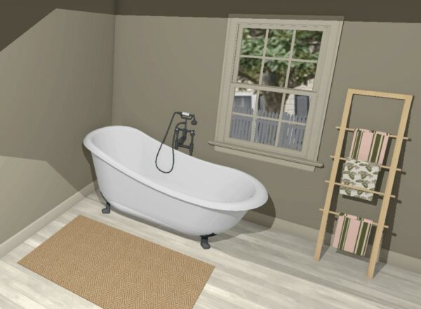
This bit of software isn’t cheap but it’s fun if you’re into that kind of thing. I treat it as a game. You build a house, put up wallpaper, furnish it with items from the library and then you can ‘walk through’ it, and even make a video if you like. You can view your house in dollhouse view, as a cross section, in watercolour, as vector lines, or with photorealistic textures. Bear in mind, you need a good graphics card for it to work properly, otherwise you won’t be able to toggle shadows and reflections at the same time.
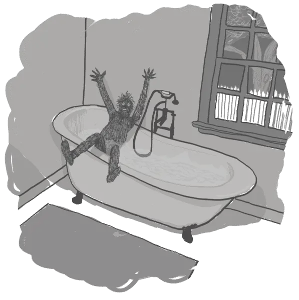
What’s the point of going to all this effort? Well, if you’re illustrating a children’s book (or series) set largely in a single house (e.g. something like Dogger or our own Midnight Feast), then you’ll be wanting the house to feel like a real house. There’s a huge benefit when you’re able to look down into a room or up at the ceiling from any angle. You can play much better with viewpoint when you’re taking screenshots of your model house. This is way more fun (for me) than mucking around with perspective rulers.
Home Designer is used by professional architects, though they’d use the more expensive version. I use the middle one, which does everything except fancy windows and unlimited storeys. There are much cheaper options available as apps. I started off playing around with a few of the apps that are out there and got addicted to building digital houses that way. I started to get frustrated that the apps weren’t as customisable as I wanted them to be.
As you’ve probably guessed, there’s a bit of a learning curve with Home Designer, but no more than your average game. I do find I have to relearn a few things if I haven’t been in for a while.
SKETCHUP
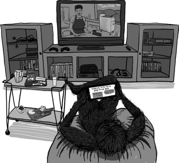
Speaking of 3D, art teachers will advise you to make a structure out of boxes, set up a lamp and learn how shadows work. The modern equivalent of that is downloading (the totally free) Sketchup Viewer, jumping onto Trimble 3D Warehouse and downloading some (totally free) objects that other people have uploaded and manipulating the objects in Sketchup. You can rotate most objects to any angle, and adjust shadows for time of day. Even if you can’t find exactly what you want to draw, it’s amazingly handy.
Below is an illustration I did utilising objects I found on Sketchup: The TV and the tea trolley are from Trimble 3D Warehouse. In Sketchup Viewer I angled them as needed. The deep fryer on the TV screen is from the 3D warehouse. I even modelled the food on the tea trolley on some 3D digital food. I still have to draw the character from my head, but that’s okay. I do find if I use real life examples — even models of real life examples — I get a level of detail in illustration which is absent if I’m relying only on images inside my head.
ON MY WISHLIST
If you’re into 3D models, there’s Poser from Smith Micro (creators of Rebelle). The free alternative is DAZ Studio, and some artists prefer DAZ Studio. DAZ is on my computer, but I find it intimidating. It makes me log onto my DAZ account every time I open it, and this has been giving me grief. I need to get over my reluctance to make use of an actual 3D software, given how partial I am to using 3D digital objects as reference. I wish I knew how to use DAZ properly.
Alternatively, I’m more and more interested in Clip Studio Paint, which in earlier iterations was called Manga Studio. (It’s a Japanese company.) Clip Studio is tailored to comics and cartoon creators, and is therefore excellent for graphic novels, but is also very good for creating a picture book. No matter the length of the project you’re working on, the program only loads one bit of the project at a time (the bit you’re working on), so you don’t get endless spinny wheel, which is what I’m dealing with in Apple Pages as I create a 200 page hybrid novel on my Mac.
I’ve been doing my homework and now I’m waiting for one of their regular sales:
- There’s a focus on line art. There are two different kinds of line correction, which you may like if you’re not someone who wants complete control over your lines.
- It’s also set up for easy filling. You set up a line layer as the fill layer and then draw rough outlines around objects. It automatically fills, with good gap detection. This makes filling a lot quicker than colouring objects in by hand. Colours can run under lines, which can be a cool feature if your lines are semitransparent. (Think Peppa Pig, where the outline colours are related to the fill colours, but darker.)
- The brush engine is very powerful — more so than Photoshop. You tag your brushes with search terms, which is an example of how this software expects you to create a whole heap of brushes (and can handle it). As an example you can do ‘tape drawing’ (also a feature of Affinity Designer) — drag out a brush to create a bunch of images that looks like decorative craft tape.
- It is stable. It doesn’t glitch or freeze — compared to other digital art software, and considering how intensive it is on your CPU. (Photoshop crashes more often.)
- ‘Transparency painting’
- Correction layers to fine tune colour, like Photoshop.
- File objects — create an object, put it on the canvas, but edit it separately — which edits them all, even though they’re already on the canvas.
- Sophisticated perspective rulers, as well as multi-point symmetry. Most programs have this. But Clip Studio also has a curve ruler, where you draw a curve then the pen follows it exactly. There’s also a parallel line ruler. Define a direction and everything else you draw on the canvas will run parallel to this guide. Think speed lines. Parallel curve tool is basically the same but allows you to draw a few curves that follow each other perfectly. Focus line is when you draw a curve, then everything you draw duplicates that line. The concentric circle is great for sketching a character’s head, if you are drawing that kind of art. You can draw any size circle you want, in any perspective (squashy, long etc.) If you know how to draw using six point perspective, you can.
- To transform an object, you don’t have to group those layers and then transform the group, as you would in, say, Artrage. You draw marching ants around the part you want to change, then tick the layers that will apply to the transformation.
- Massively, there is also a 3D library within the software and it looks very fun. It reminds me of Sims, the way you create a character and dress them and whatnot. You could technically use a Sims character as your character reference, but you’d be pretty limited by comparison, and the Sims body language is too specific to that game. In Clip Studio you create characters and pose them to look how you need them to look.
- Some of these things need to be paid for but there’s a lot available for free. (You do have to sign up for an account even for the free stuff.) The language and descriptions are in Japanese. There’s a translation tool in the library but Japanese doesn’t auto translate very well to English. (I knew there was a reason for that 10 years I spent learning Japanese. Finally, I may have found it.)
- Like Affinity Designer, this software allows for both raster and vector drawing (and erasing). While Affinity Designer focuses more on vector, Clip Studio focuses more on raster.
- It creates frames, which at first glance looks like a simple box, but the box is a layer mask. So basically, this software takes everything you need from InDesign, Illustrator and Photoshop, tailored to comic artists. You could also use these frames to make thumbnails for a picture book. The divide frame tool cuts an entire page into nice segments. You can resize these panels by dragging a control point and the other boxes resize automatically. (It works well most of the time.) Using this tool it’s impossible to draw in the wrong panel — it won’t let you. You can also hand draw boxes, as long as you do it in a single stroke.
- Automatically generated comic book movement conventions like streamlines and sunbursts. You can also use this tool to create rain. Screen tones are another big one. (Dots) You can edit these effects on the fly. You can create gradients and greyscale with these screen tones. You can turn these dots into lines/lozenges or any image at all.
- As you’ve probably guessed by now, the text tool in Clip Studio is awesome. The software automatically links the text to the bubble. It can also group different text bubbles together, realising they belong to the same ‘conversation’. Overlap them and they’ll join together. The software can link between bubbles automatically. The tail tool creates the call out. What you can’t do is layer effects applied to vector text. All you can do is change the size and stretch it a bit. In order to freely manipulate the look of text you do have to rasterise the layer.
- You can create your own groups of fonts, which is kind of like having RightFont within the software. You can sort your fonts into ‘dialogue fonts’, ‘effect fonts’ or project fonts.
There’s Paint Ex (full feature version) and Paint Pro (fewer features). The company has already switched over to subscription model for their iPad (pro) version of the software, in which it’s about $9 a month after a six month free trial, so I expect that’s where they’re going with their desktop software, too.
PASS-IT-ON ART ADVICE
I recently heard some advice for SCBWI members uploading their portfolios for consideration: Don’t make your influences too obvious. Apparently, art directors see far too many portfolios where the influence is obviously Disney and/or manga. A lot of artists who come to Clip Studio are there because of a love for manga and anime, which is cool, but it’s worth pointing out — something formerly called ‘Manga Studio’ doesn’t have to be used to create manga-looking art. As software makes it easier and easier to create art using 3D libraries, with perfectly symmetrical faces, it’s probably even more important now, to develop your own personal style, recognisable as only yours.
