How do illustrators convey motion when creating static images?
As a case study, we can’t go past Peter Rabbit by Beatrix Potter. Others have analysed her illustrations in depth. Although soft watercolours aren’t the usual medium for high action, life-or-death picture books these days, Potter successfully used soft watercolours to create excitement. It’s deceptive. Impressively, she created high action illustrations even without the comic book flourishes, without the slashes of primary colour, without the art noir techniques.
THE FIELD OF UNIFIED MOTION
Building a field of unified motion has been an artist’s tool for attracting the viewer’s attention. A unified field of motion keeps the image coherent, sustains the attention of the viewer and, invests the image with an enlivening spirit, “its Alive!” We pay more attention to active than inert subjects.
J.M.W. Turner took pride in his ability to suggest motion. He invested so much motion in his later works that viewers complained he sacrificed legibility. But, motion is more evocative of vitality than objects delineated in stasis. Turner’s fascination with motion inspired him to create his famous early 1844 locomotive painting, “Rain Steam and Speed”. The entire surface roils with clouds of movement.
David Dunlop
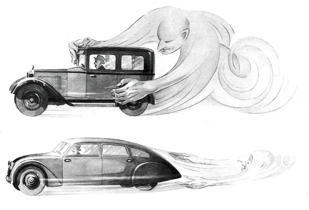
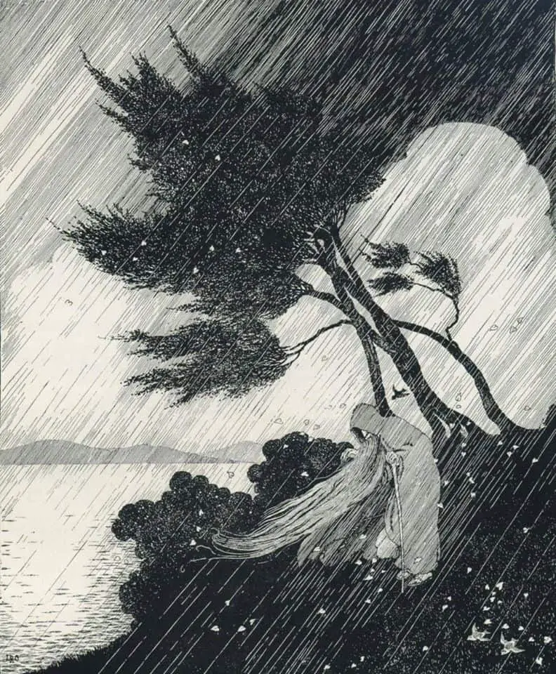
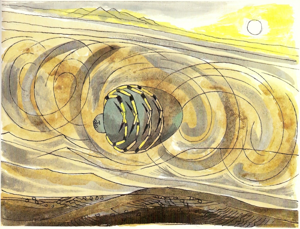
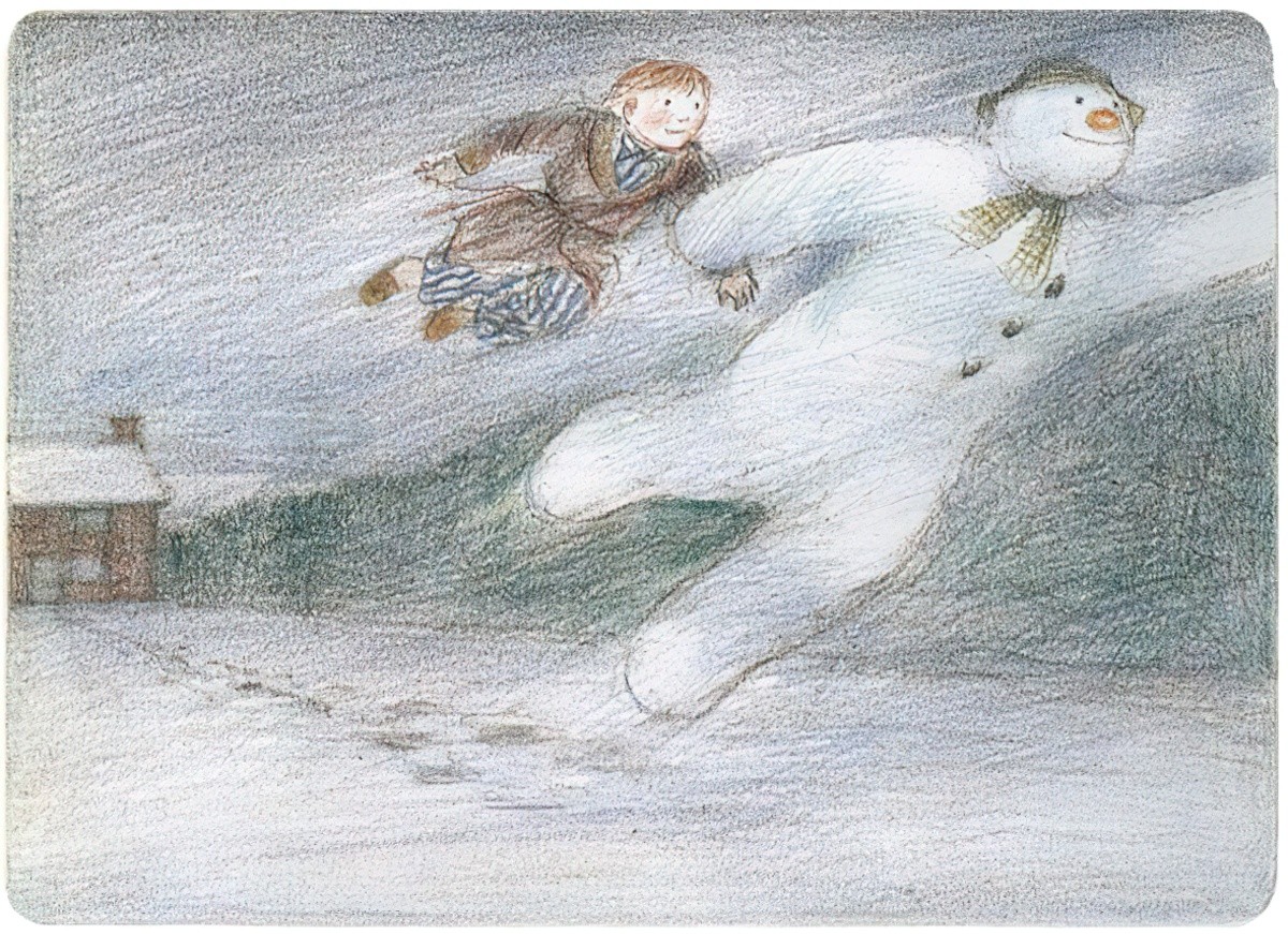
In his post, David Dunlop also talks about Degas and Van Gogh, and points out how natural weather events contribute to motion. Wind is one such event.
Rain is another, creating a natural sense of vertical motion, except of course when it’s accompanied by wind.
Back to children’s books, Blinky Bill is another interesting case study into motion, partly because koalas are famous for doing nothing all day (or appearing to). Yet Dorothy Wall created a story full of action. For young readers who knew koalas, this in itself would have functioned as a comic paradox.
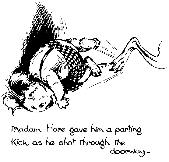
By 1933, the comic book conventions are established. Notice the motion lines of the kangaroo, of the items flying off the desk, and of Blinky Bill’s slingshot. The image of Madam Hare reprimanding Brer Rabbit is more interesting, because Wall has used a motion flourish behind the onlookers, who are still, to suggest drama. The black flourish itself looks like a massive motion line. Wall reuses this technique in the final blow, where Madam Hare delivers a parting kick. This time, Wall makes use of ‘pow!’ lines as well as that black, background flourish.
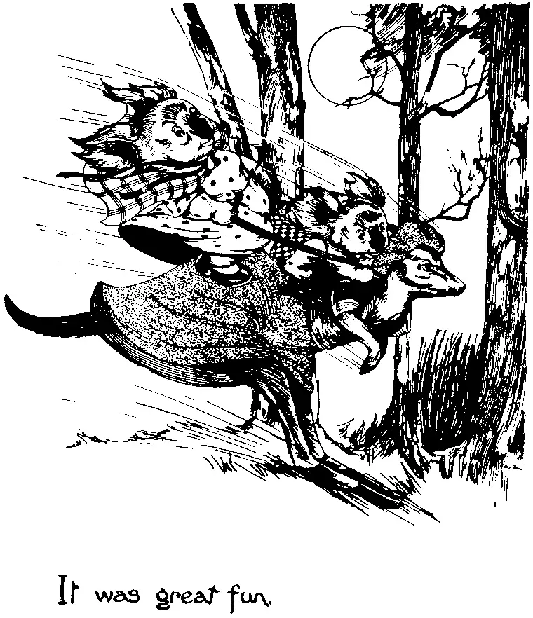
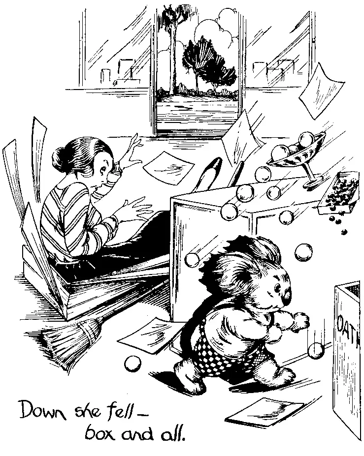
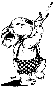
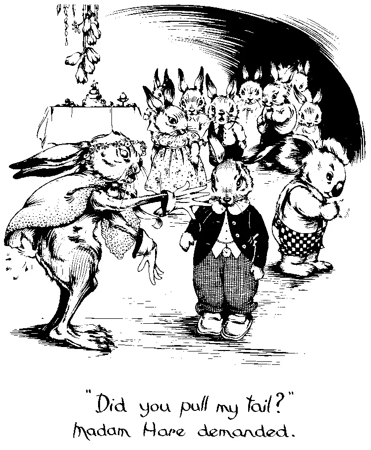
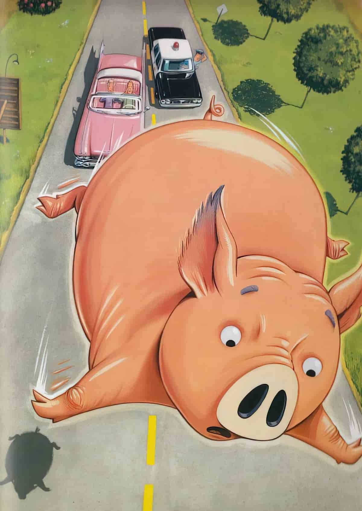
More modern children’s book illustrators also use comic book flourishes to suggest motion. In full colour illustration, the white brush stroke is aesthetically pleasing.
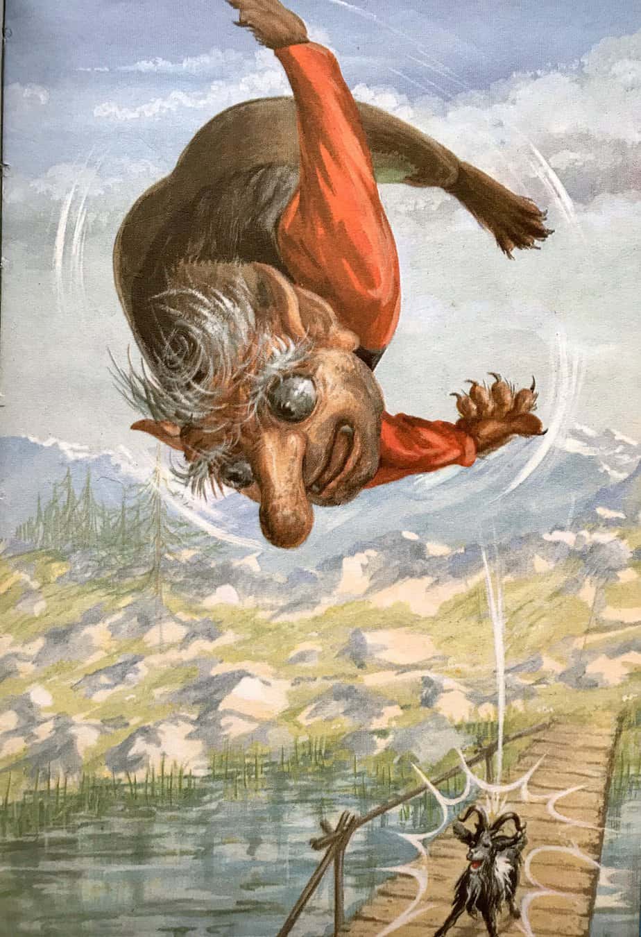
Chris Van Dusen also uses the interesting technique of bordering his characters in a thin corona of white aand/or yellow, to help them stand out against his beautifully detailed backgrounds. (Basically this is his way of dealing with aerial perspective.)
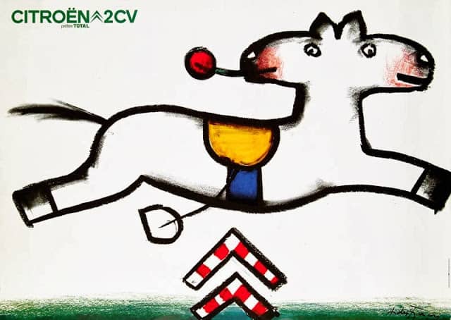
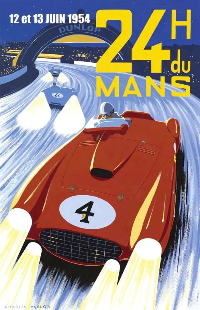
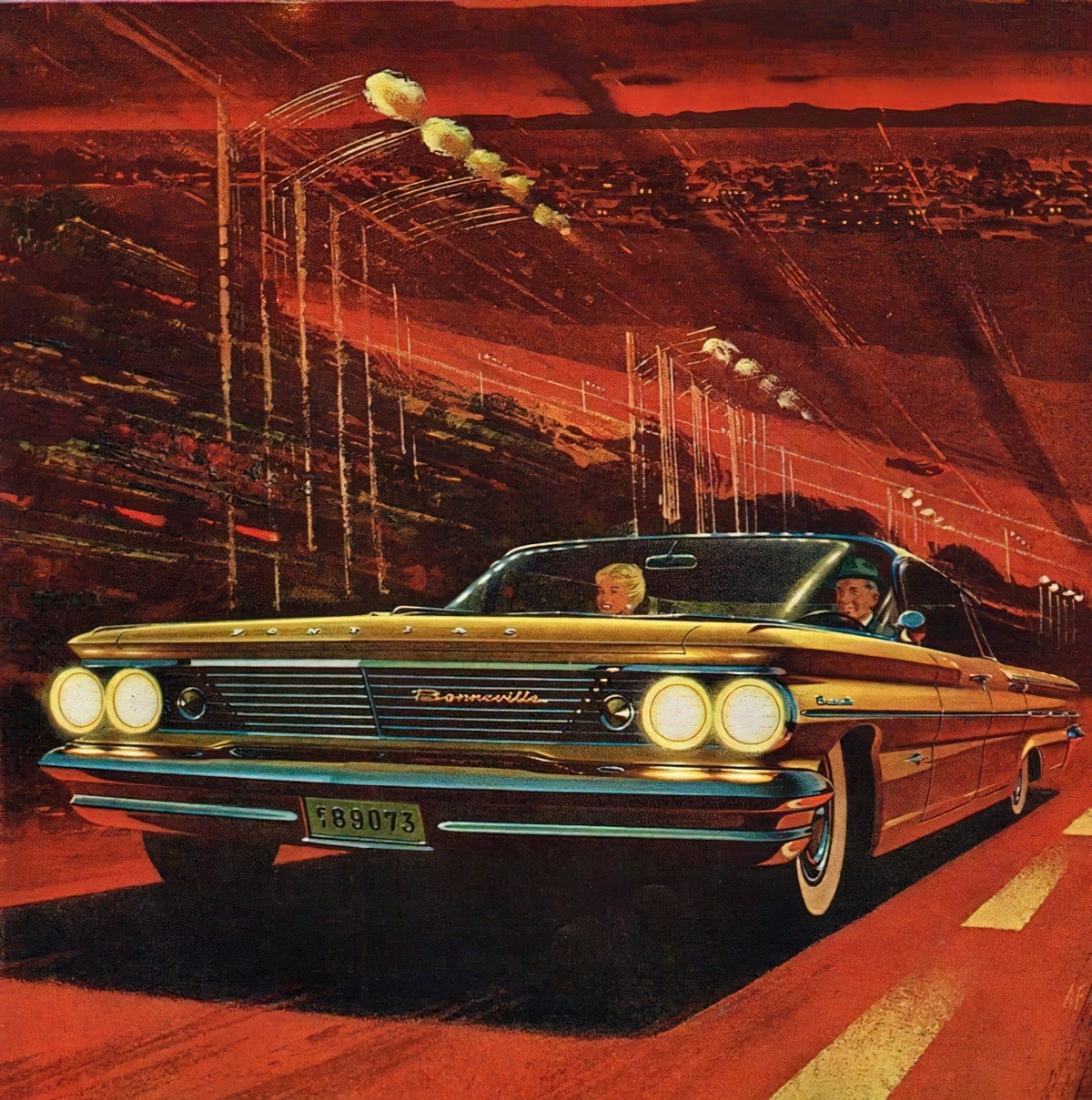
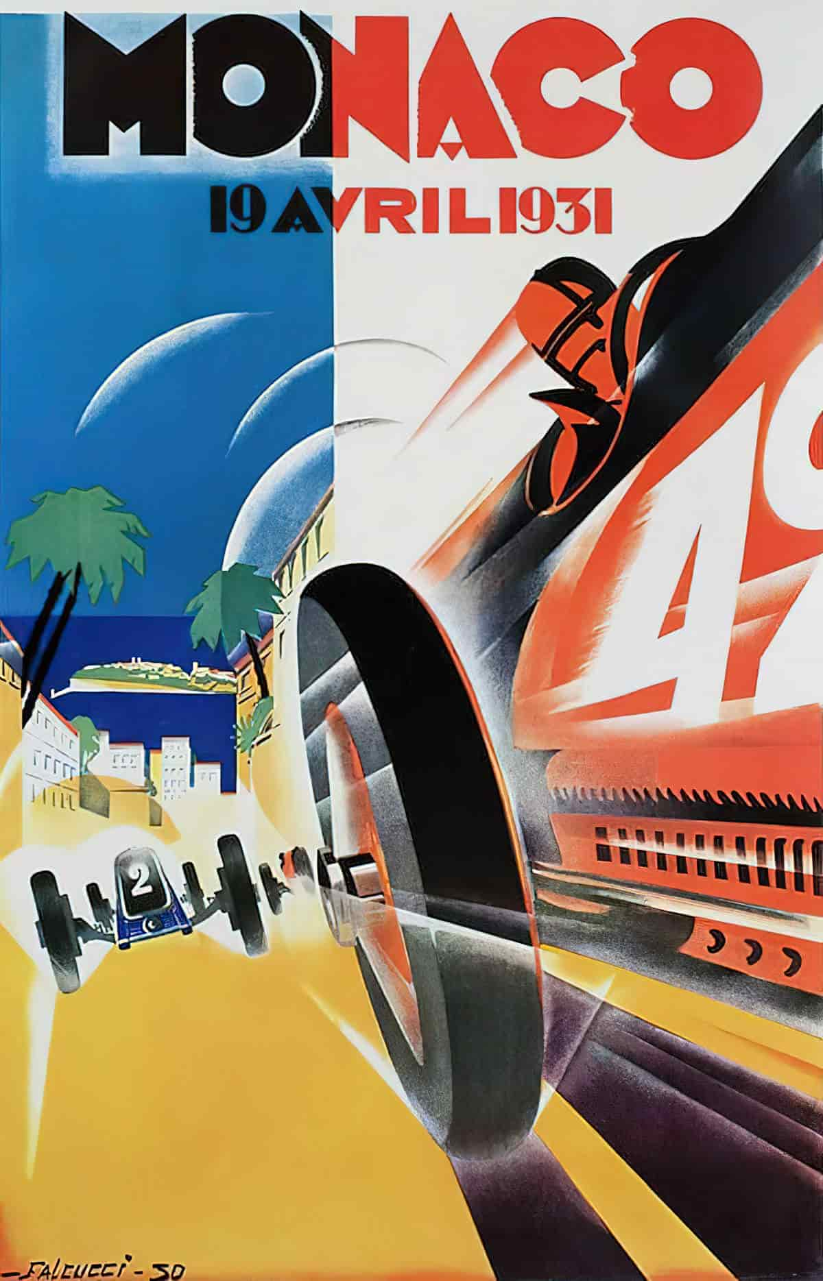
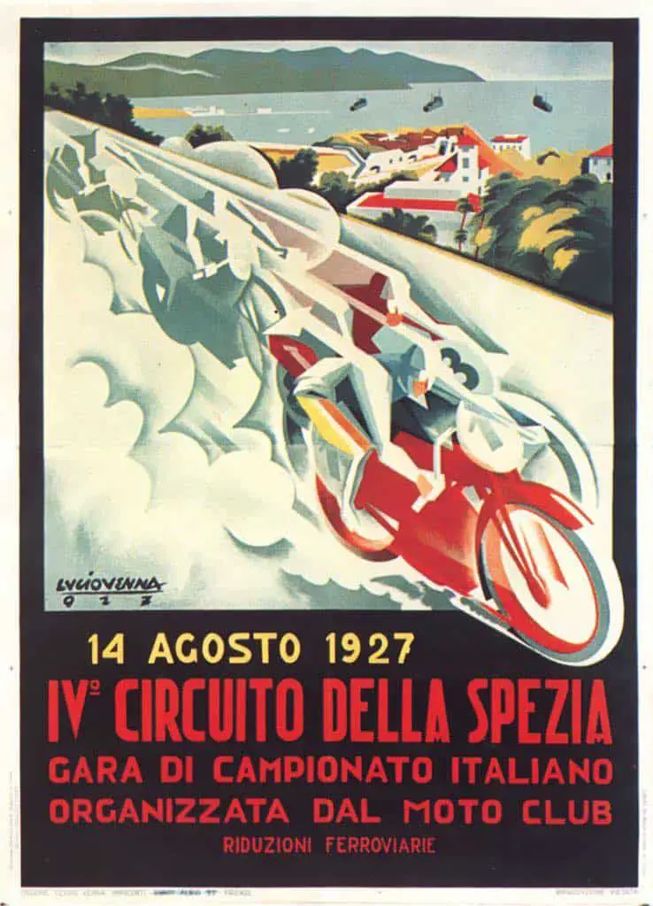
Mo speed, mo lines. The entire road in this poster comprises motion lines.
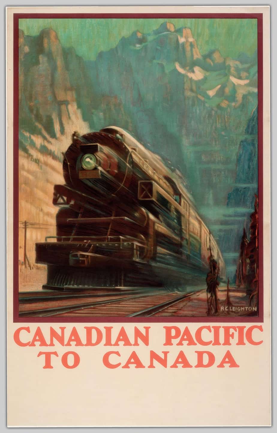
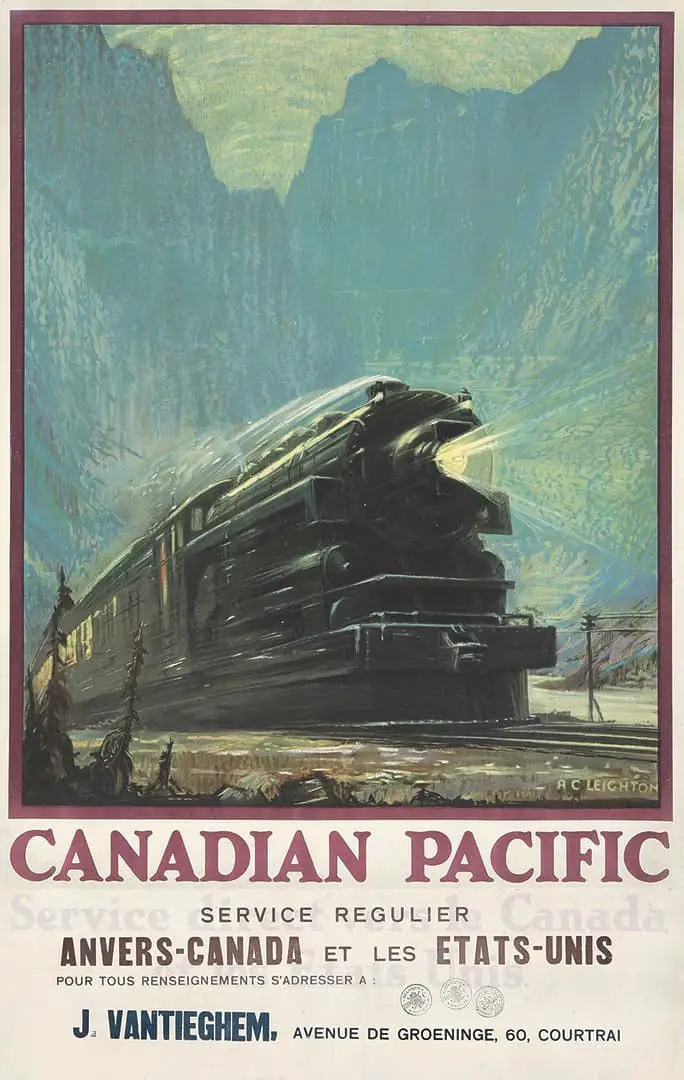
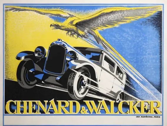
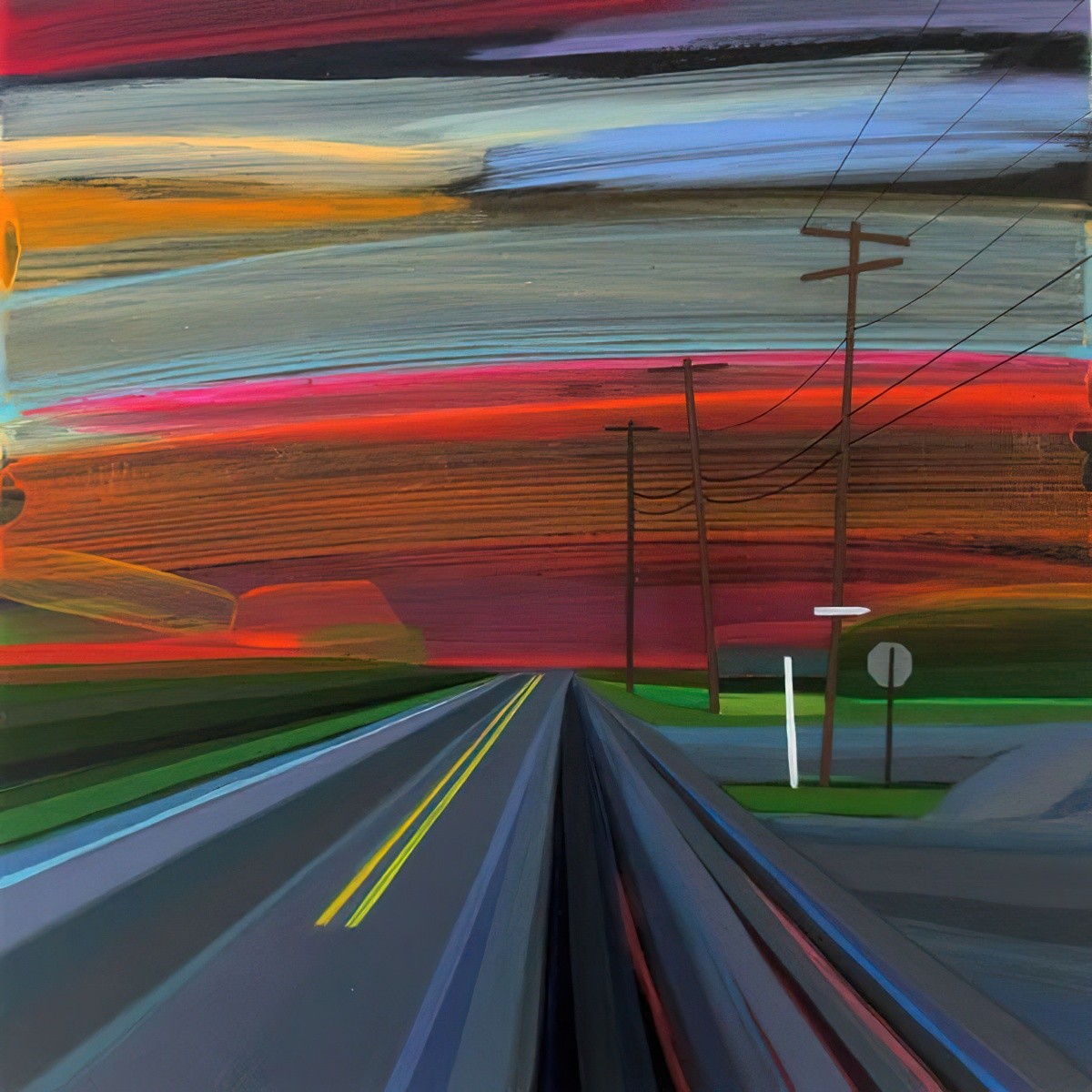
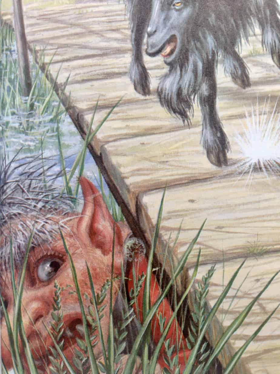
Back to Billy Goats Gruff and Robert Lumley. No motion lines here, but we do have a visual depiction of sound, which coincides with the goat trip-trapping across that bridge. This technique is especially widespread throughout manga, which originate in Japan — a language rich in onomatopoeia and mimesis.
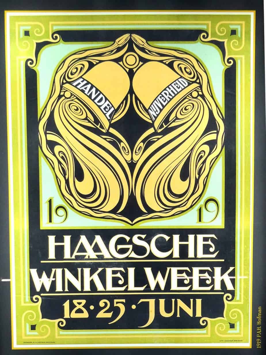
The Art Deco poster below uses decoration to double-duty as the motion of ringing bells and a visual representation of the ringing coming out of them.
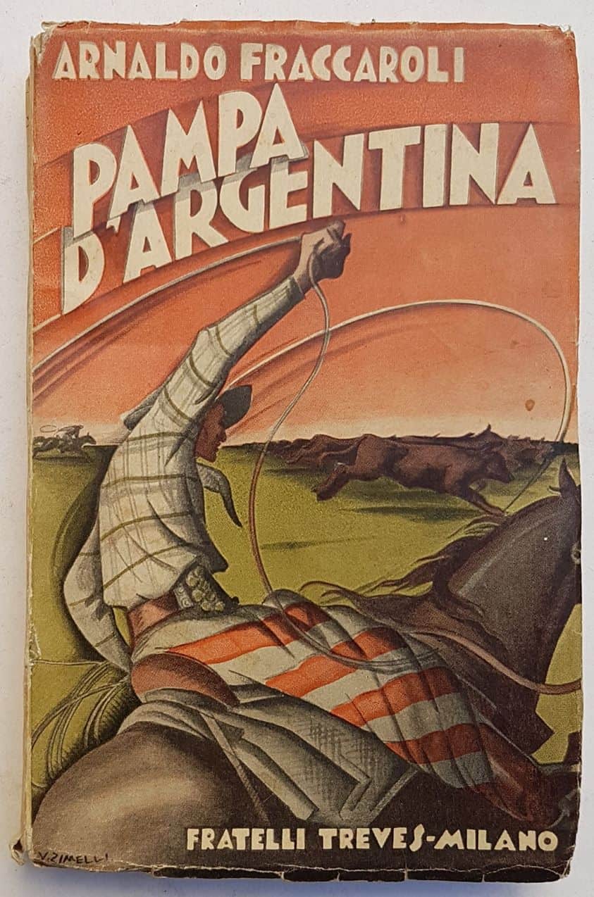
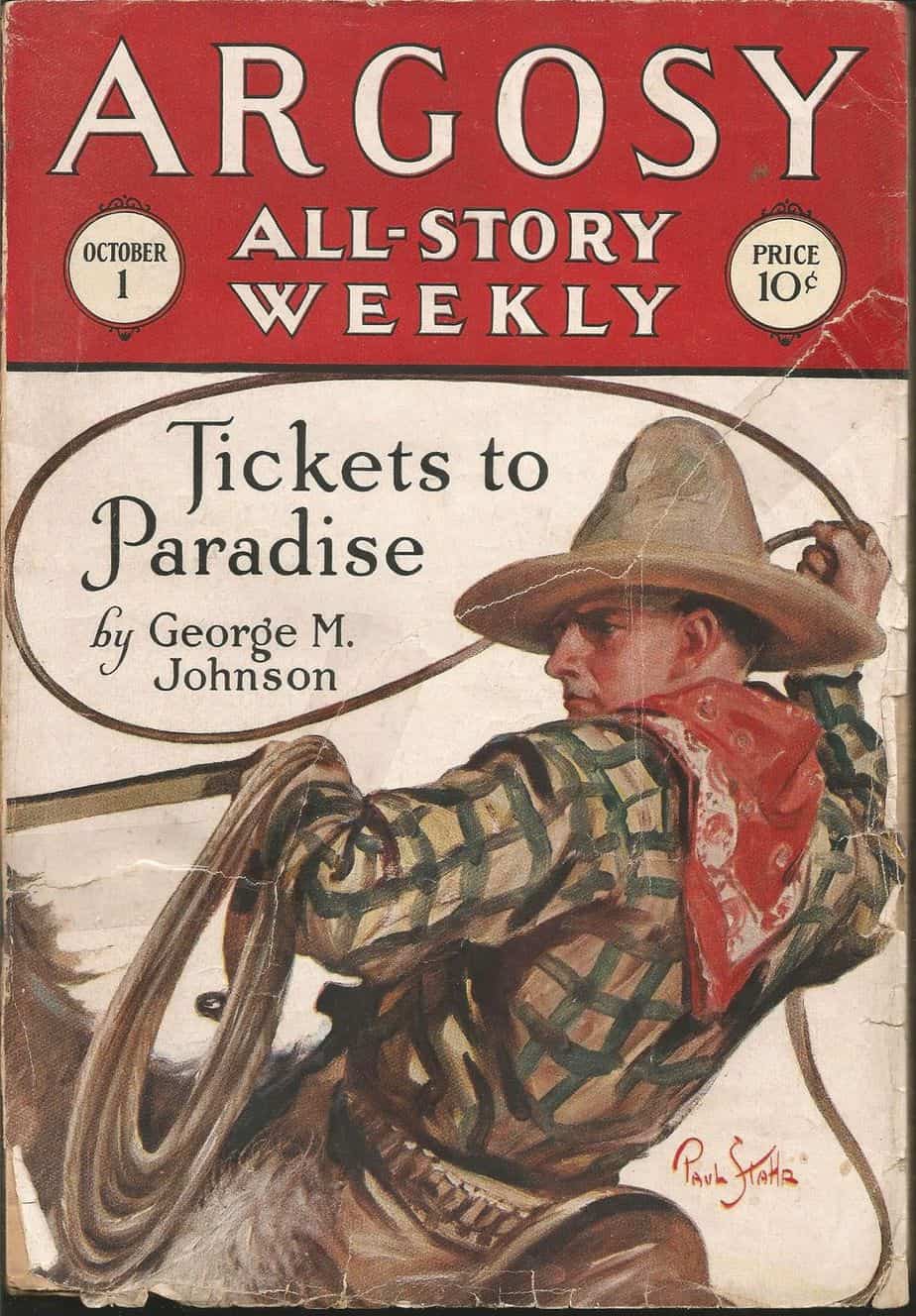
Certain objects lend themselves to motion, and in this case the motion of the lasso provides a ‘grid’ for the entire composition. This is an excellent case of typography helping out with the sense of motion.
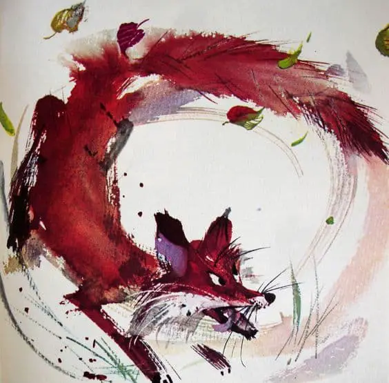
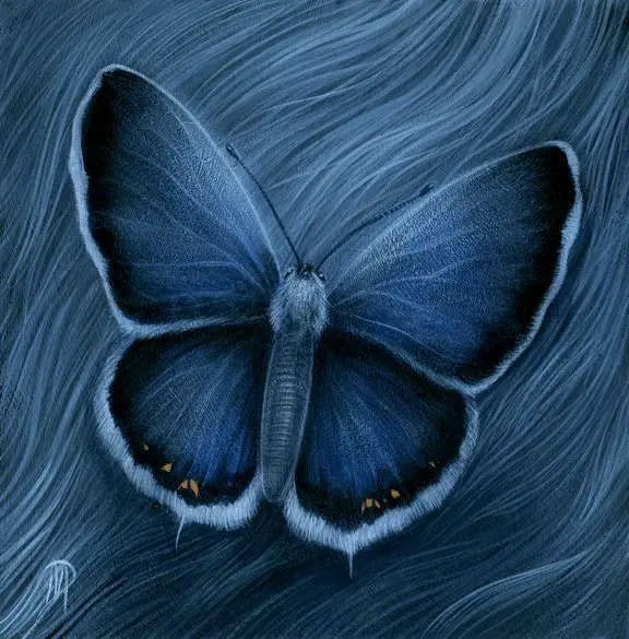
As Beatrix Potter knew, watercolour, in the hands of a master painter, is excellent for depicting motion. Even in the hands of a master painter, it always does its own thing, and this unpredictability is felt by the viewer.
TEXT AS MOTION LINES
DISTORTED BODIES
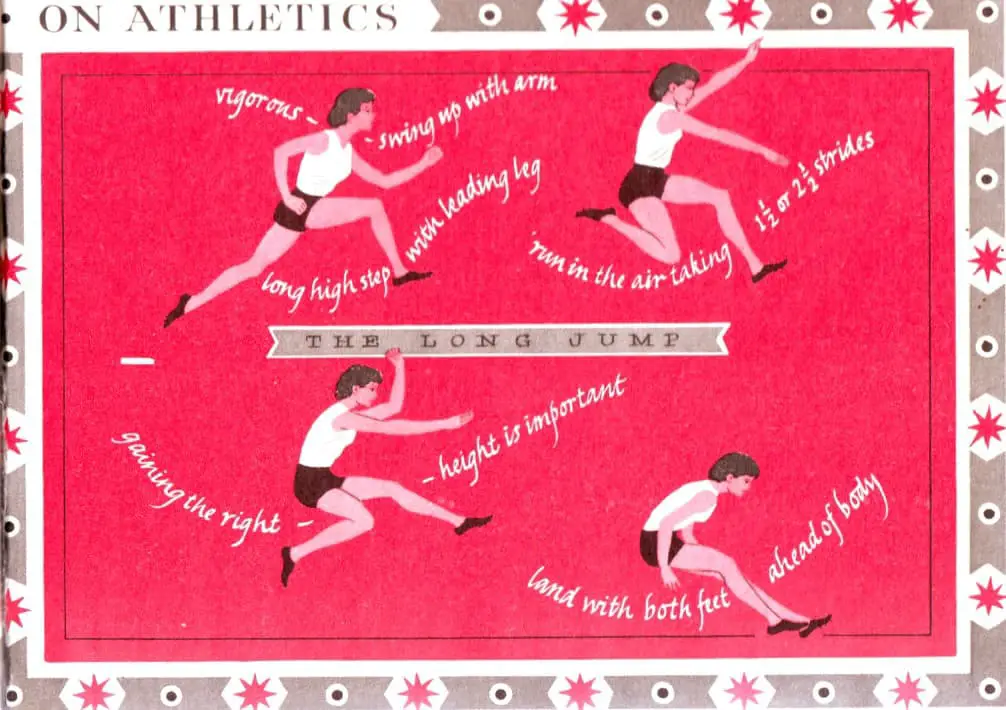
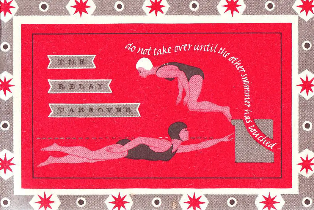
Distortion of bodies and even of objects is a…conventional means by which pictures convey motion. As Peter runs from Mr. McGregor in another picture in The Tale of Peter Rabbit, his head seems almost bullet-shaped, his ears apparently held down by air resistance, his body at an impossible slant that conveys great speed.
Perry Nodelman, Words About Pictures
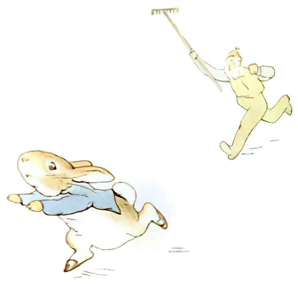
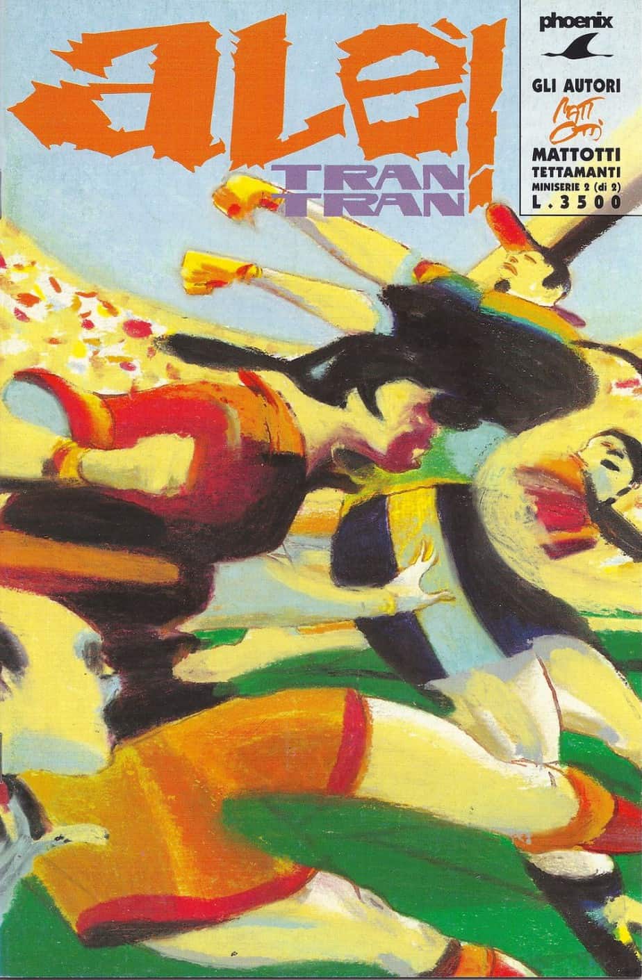
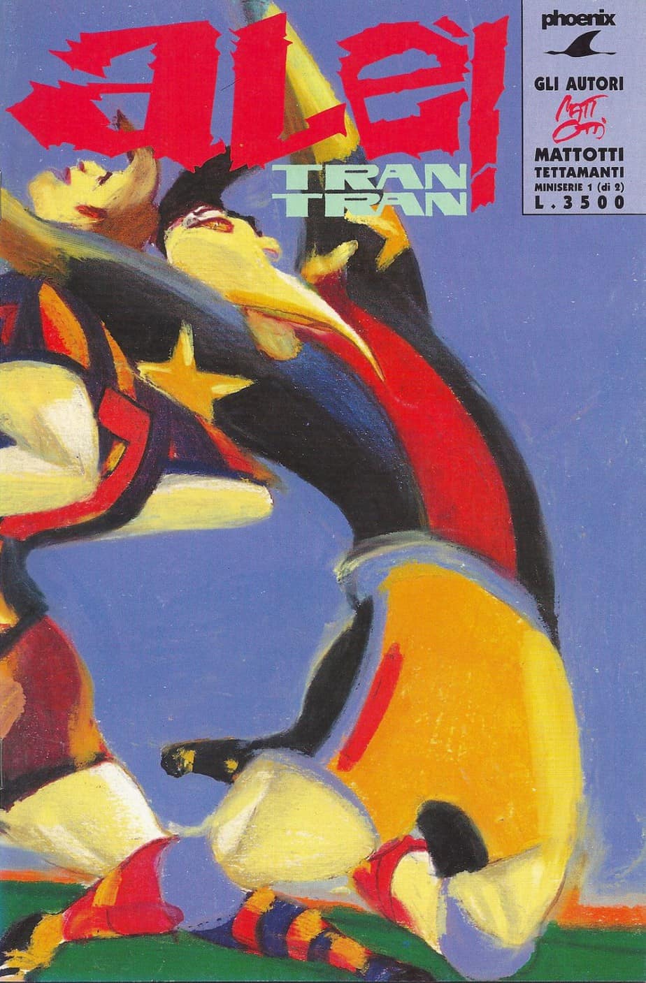
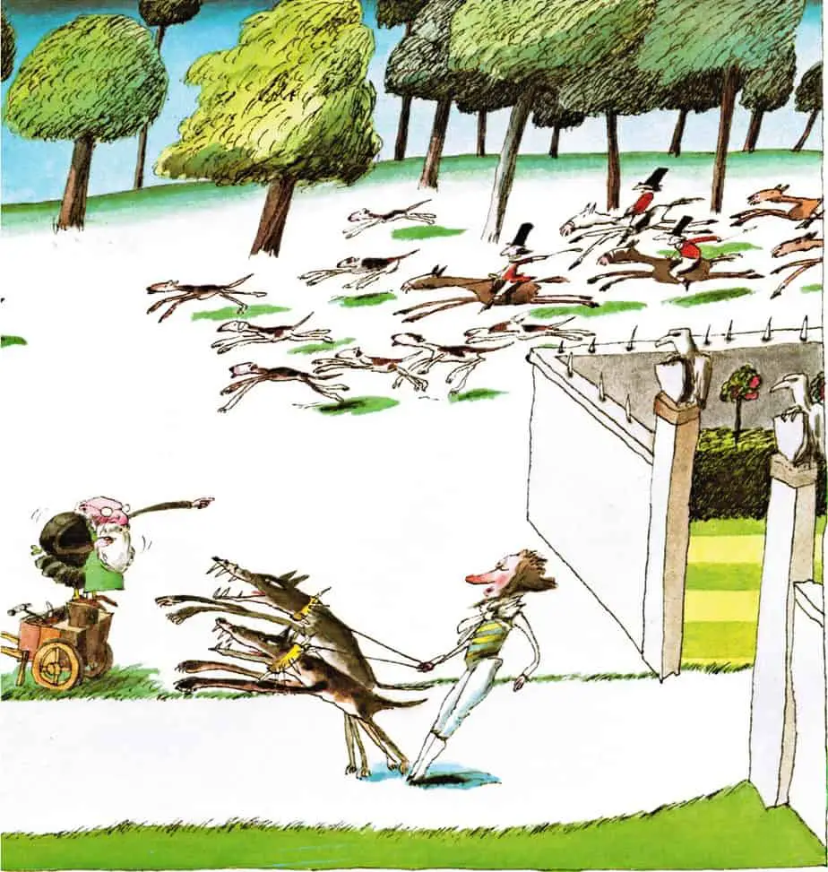
Below are more exaggerated examples of the same technique.
FABRIC IN THE BREEZE
Where characters wear loose clothing with billowing potential, illustrators can easily convey motion by simply billowing the fabric. (Actually drawing fabric in motion is an art in itself, however!)
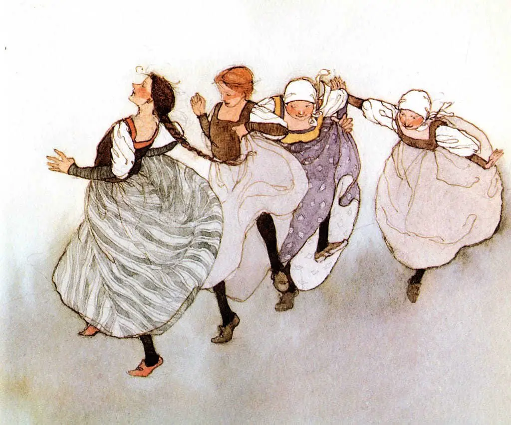
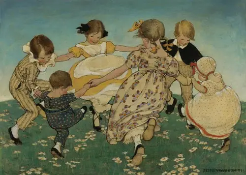
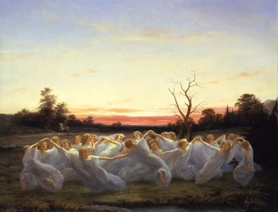
Where the fabric is not particularly billowy (ie. most clothing worn by masculo-coded characters), leaping and jumping is conveyed by inserting some space between the feet and the ground. It’s not entirely clear how high this guy is jumping as there’s no grounding shadow. (I conclude he’s flying more than jumping.)
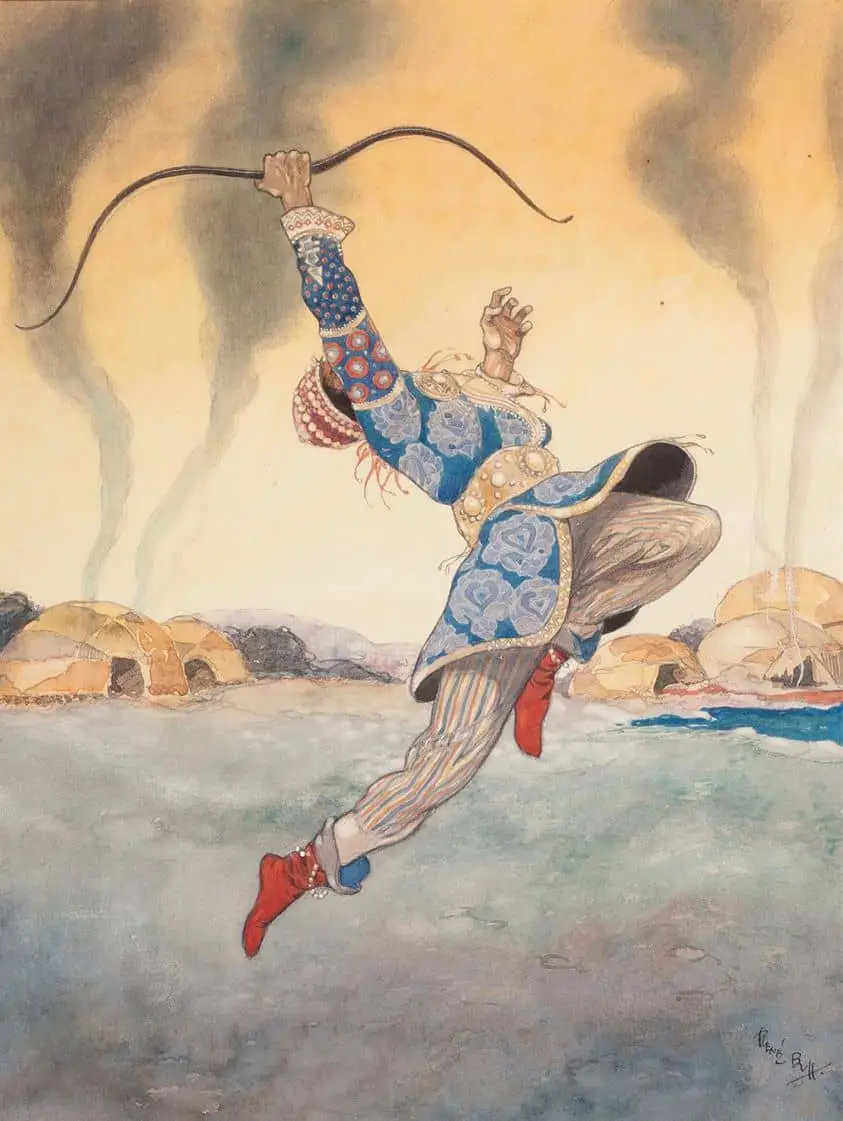
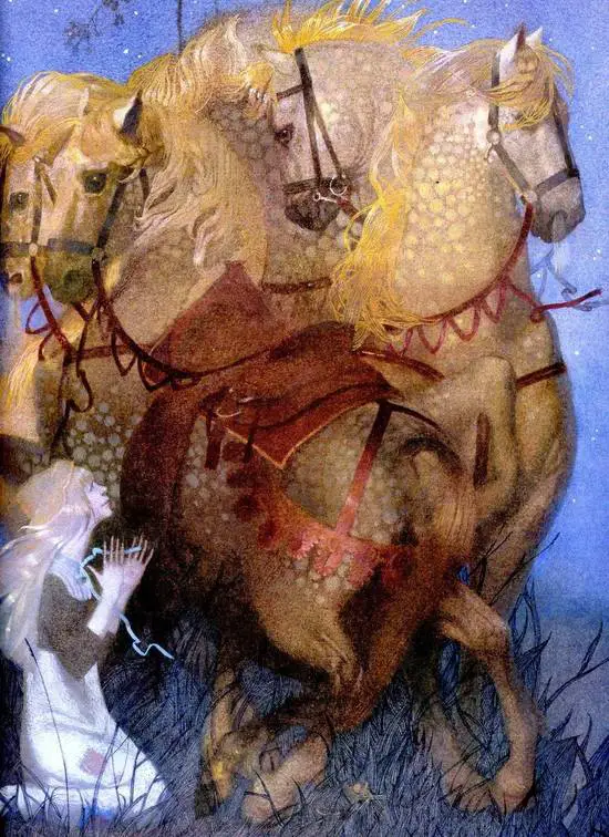
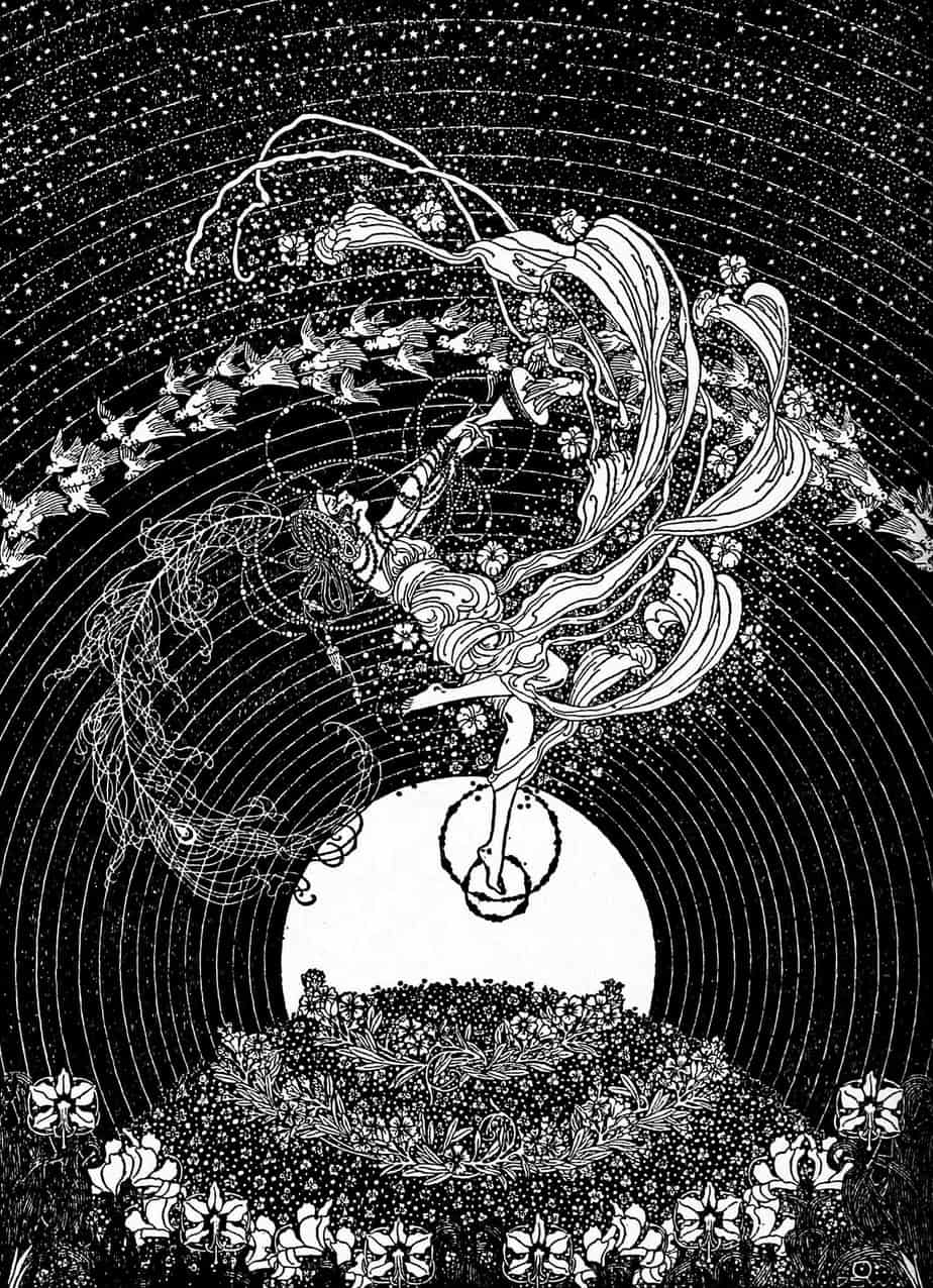
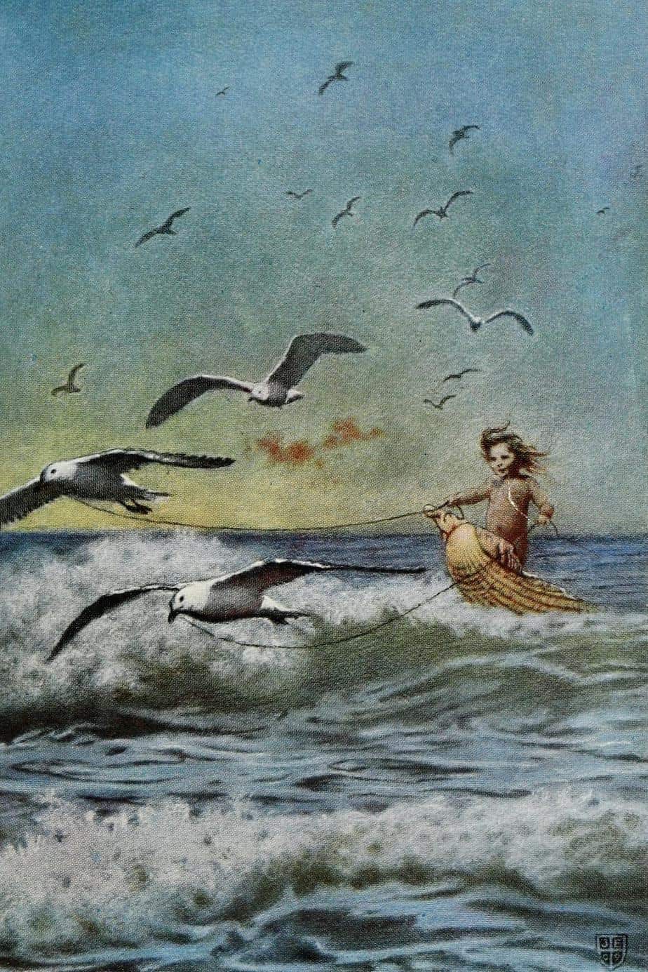
Long hair is as useful as fabric in the motion department. Birds are clearly necessary to the story in The Great Sea Horse illustration below, but birds in flight come in handy more generally for conveying a sense that the static world illustrated before us is alive. A bird with its wings in ‘m’ position cannot exist without constant motion. Ditto for humans in mid stride, and so on.
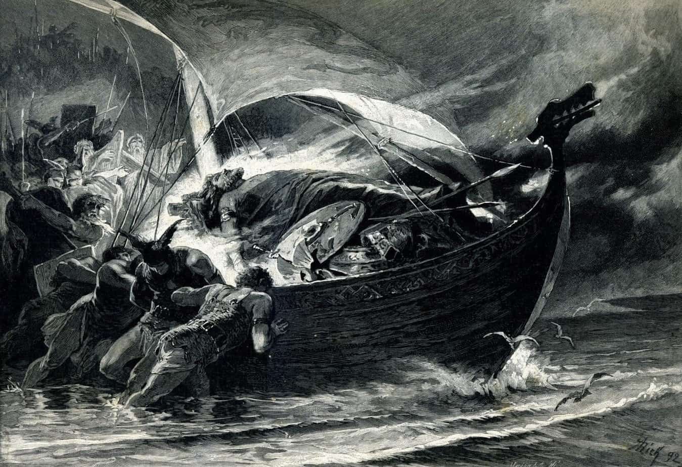
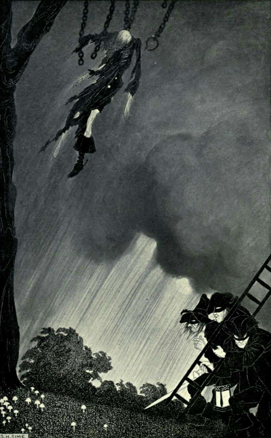
Skies, especially stormy skies, can be utilised to convey a sense of motion on the ground. This pretty much always results in a dramatic scene. Notice too how Alexander Zick makes use of birds in flight to indicate the motion and direction of the ship.
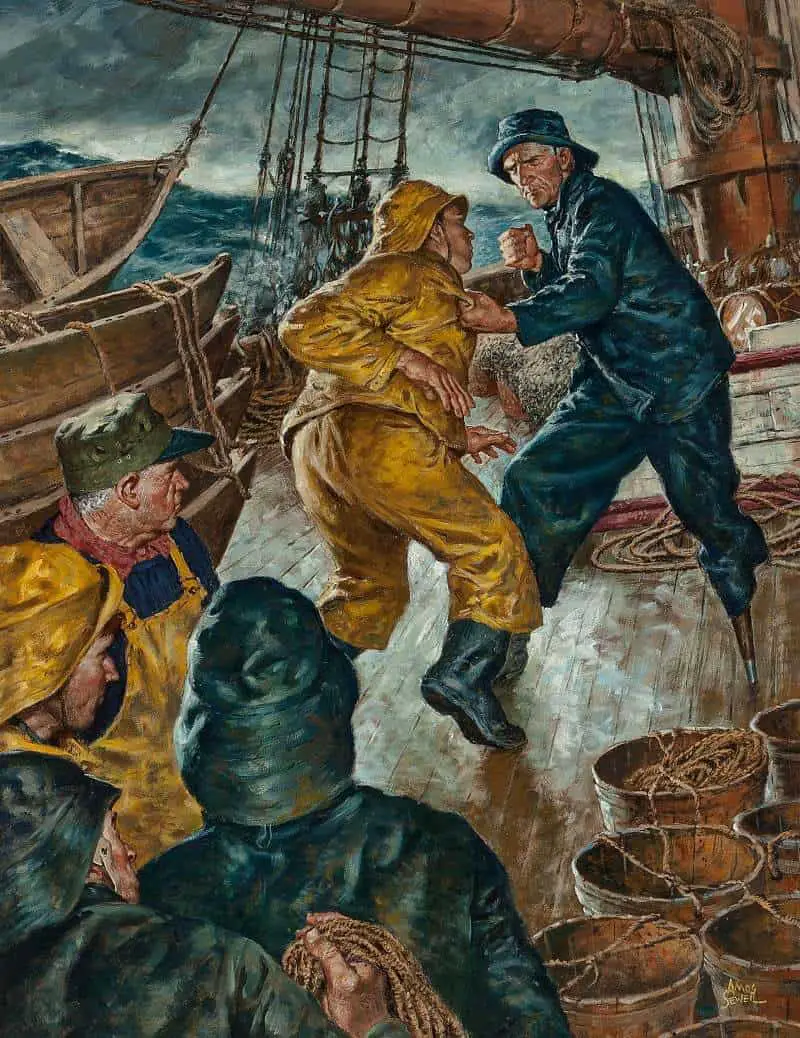
A fight scene, on a ship, during a storm. Peak motion. Notice that Amos Sewell also makes use of static onlookers (proxy for us). These static viewers serve to emphasise the motion they perceive (as well as lead our eyes to the fighting characters).
MOVING BUILDINGS
I’m not talking in this case about houses on legs, Baba Yaga style, though that’s one way of moving a building!
Is the building moving in each image below, or does motion solely derive from the movement of the viewer? It doesn’t matter, and in fact I think it’s both, in which case art does something everyday vision cannot achieve: a melding between object and perceiver.
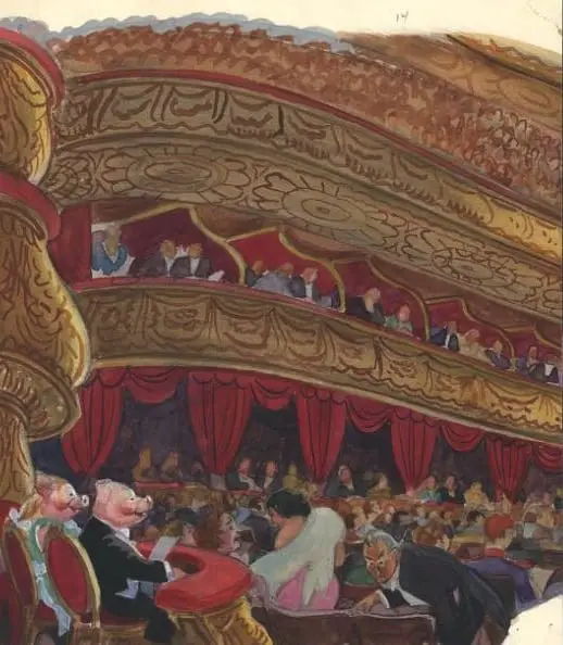
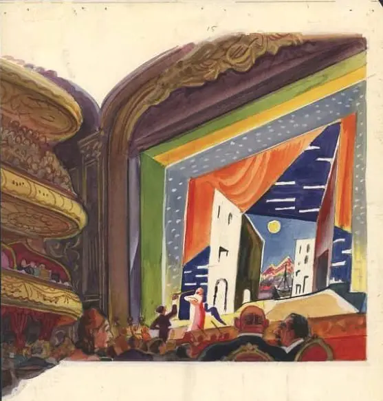
First we have an example of a music theatre from Gaston and Josephine, a French children’s book from the mid 20th century, illustrated by Feodor Rojankovsky.
In this double spread illustration, we can clearly tell the music has begun, because the interior itself appears to be in motion, with the people in the gallery dangerously tapering away, their seats sliding far to the right (at least they would be if this illustration conformed to the laws of perspective and physics).
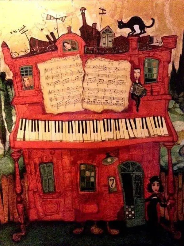
Otar Imerlishvili is ‘known for his whimsical scenes that depict daily life through the colored lens of innocence and wonder.’ This fantasy piano house is another good example of an illustration of music. You wouldn’t think it possible to illustrate music, which is an auditory experience rather than a visual one, but the magic of music seems to morph the visual world in synesthesic fashion.
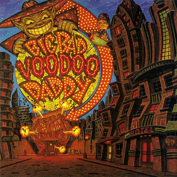
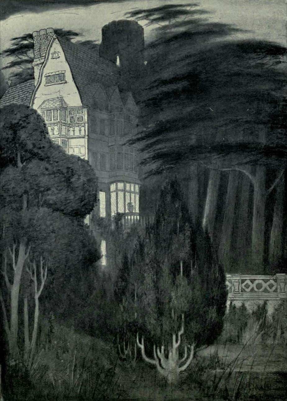
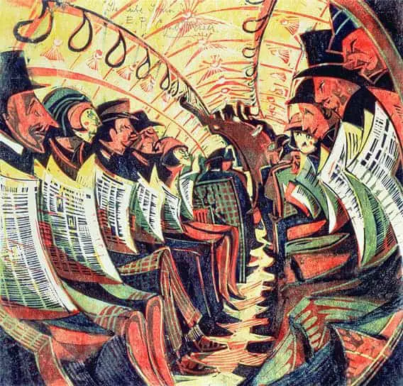
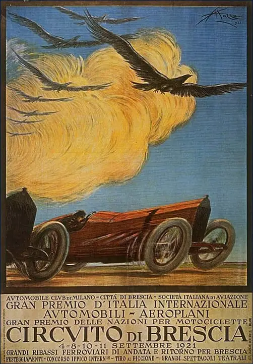
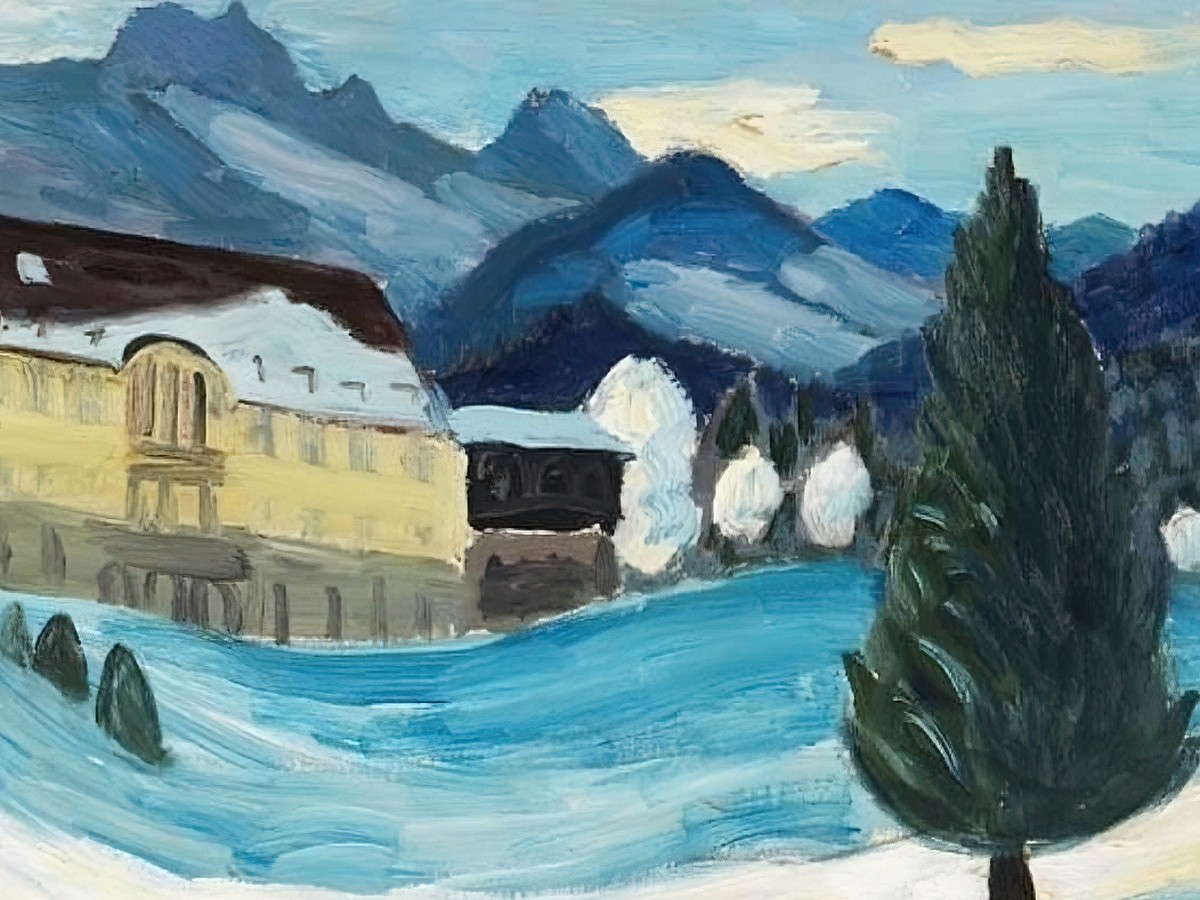
Below are more examples of the ‘liquify filter’, applied long before Photoshop existed. In all cases, the buildings and background seem to be in motion.
![Cover art for House Beautiful by Marjory C. Woodbury [1891-1964]](https://www.slaphappylarry.com/wp-content/uploads/2020/05/Cover-art-for-House-Beautiful-by-Marjory-C.-Woodbury-1891-1964.jpg)

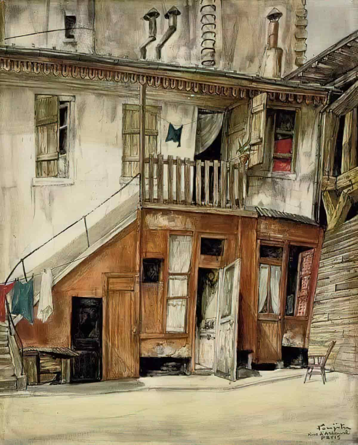
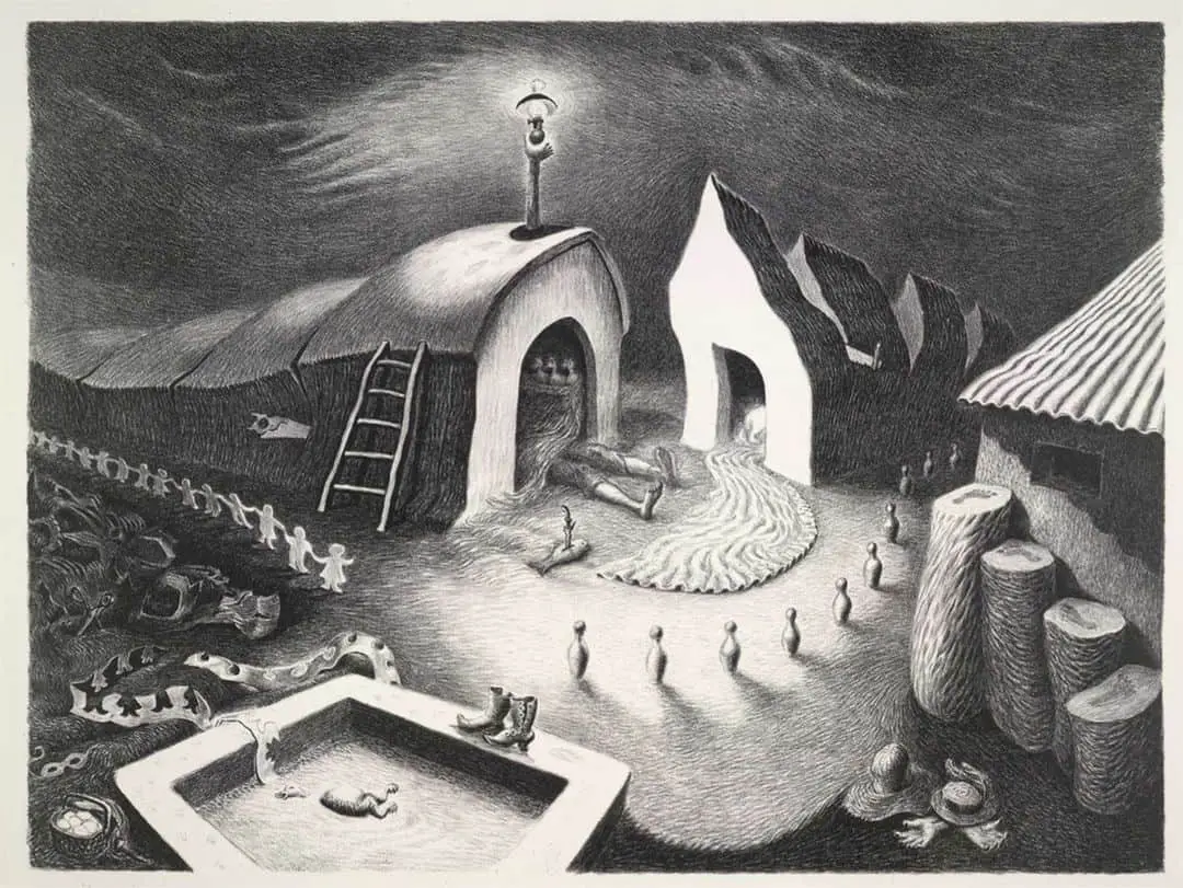
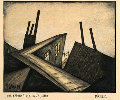
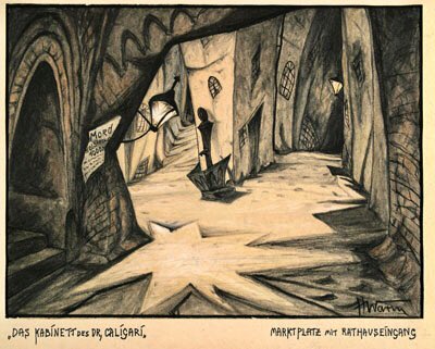
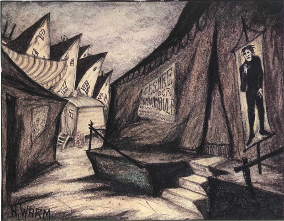
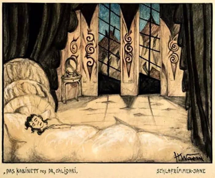
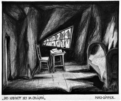
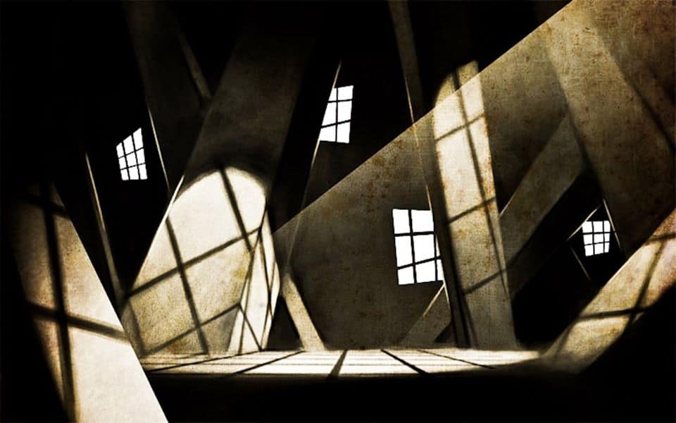
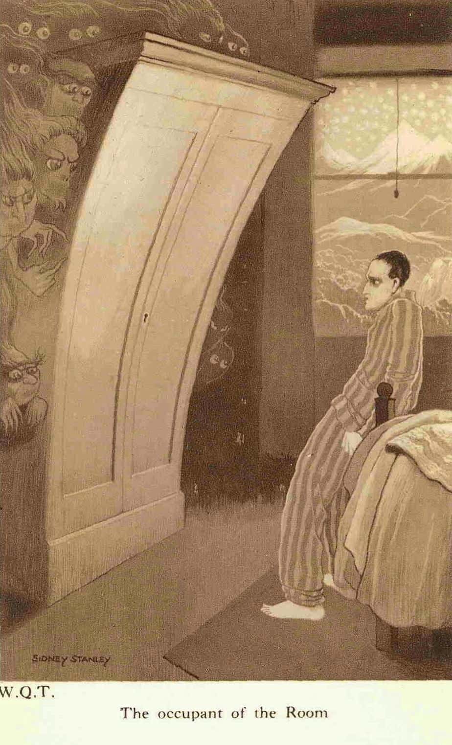
The ‘liquify filter’ on the house below is more subtle. The scrubby brush strokes on the trees work harder to convey a sense of motion. But the wavy lines and slightly off-kilter perspective on the house is still there, aided by the unlikely height of the building.
REPEATED OBJECTS
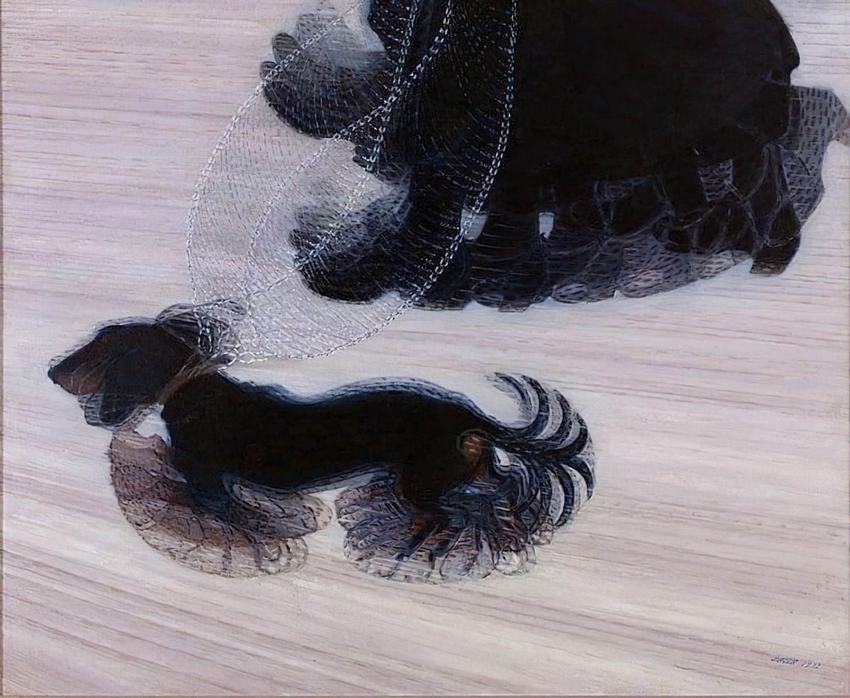
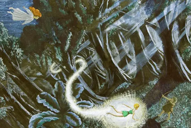
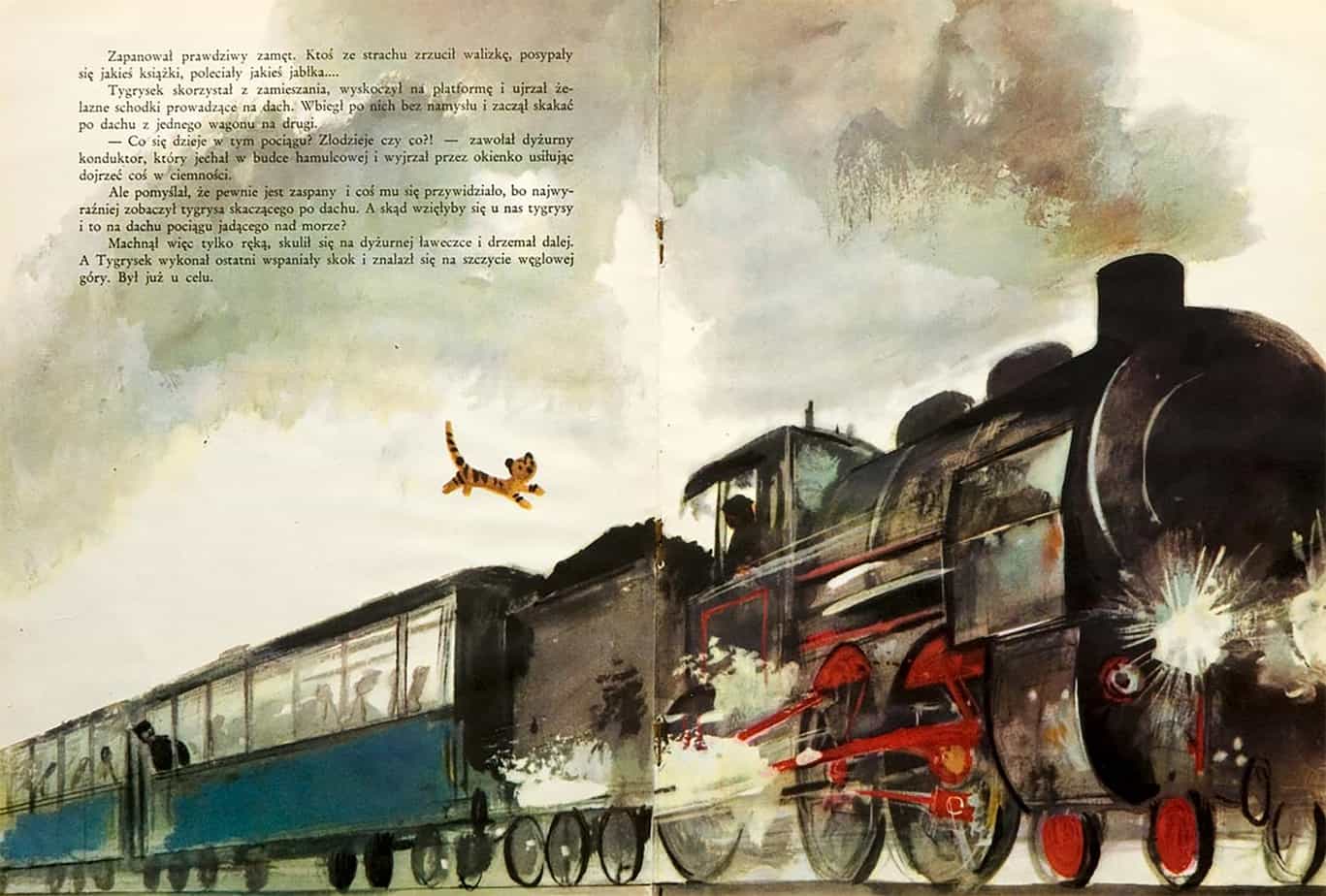
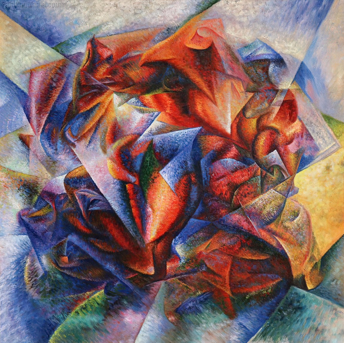
The poster below works a little like the continuous narrative art technique utilised by picture book artists to suggest a sequence of activities, only in this case it depicts speed.
INCLUDE ADJACENT MOVEMENT
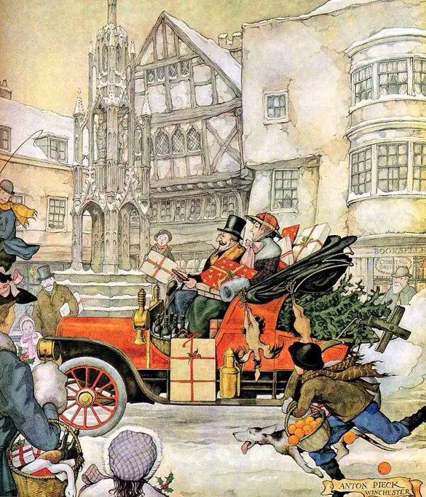
Sometimes there’s little you can do to make the moving object itself look like it’s moving. In the illustration of a moving vehicle below, Anton Pieck includes exhaust fumes coming from the rear of the vehicle, which is a cue that the car is moving rather than parked. However, it’s not quite enough. He includes the boy running alongside the car to show us that the car is in motion.
TILT THE HORIZON
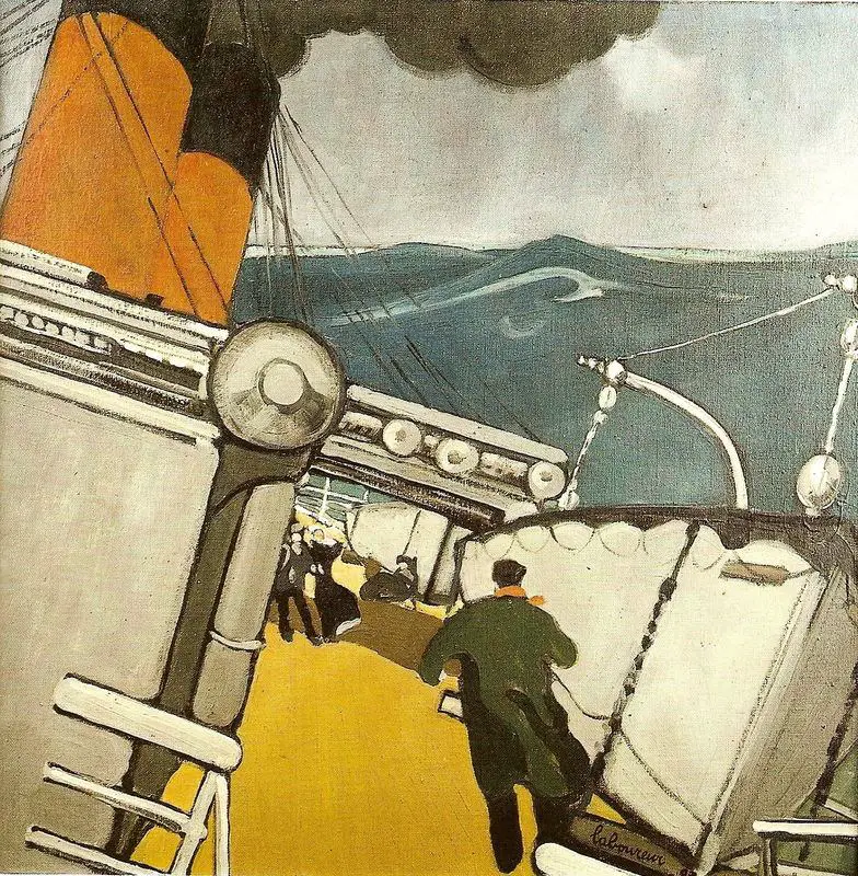
This illustration technique works especially well for ships. In the work below, the ‘horizon’ of the ship is tilted, but the actual horizon remains horizontal. It’s the mismatch which conveys the motion. I almost feel sick.
In Bernie Wrightson’s Frankenstein illustration below, the horizon itself has shifted. We view the ship from a distance, not as a passenger.
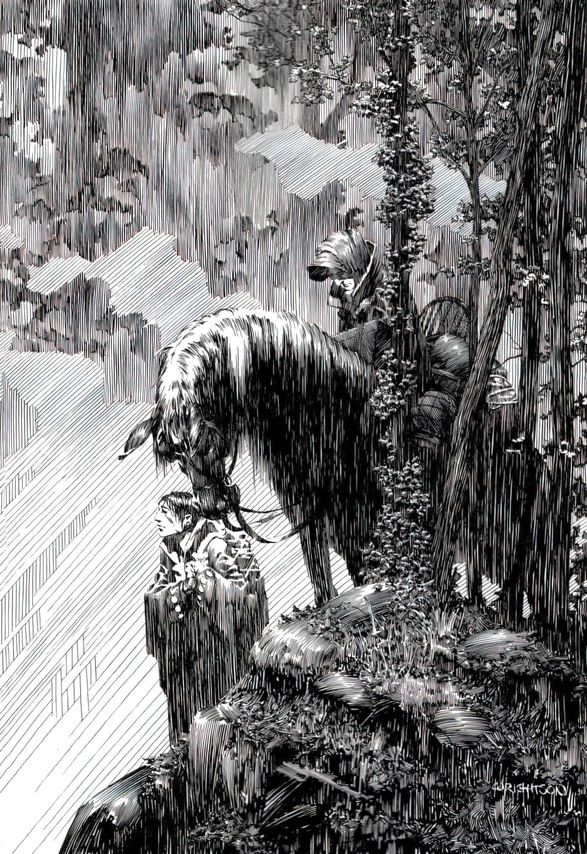
Below we have a non-seascape example of a tilted horizon. Storms and titled horizons go hand in hand. This comes in handy even if your ‘storm’ is pathetic (inducing pathos) rather than literal.
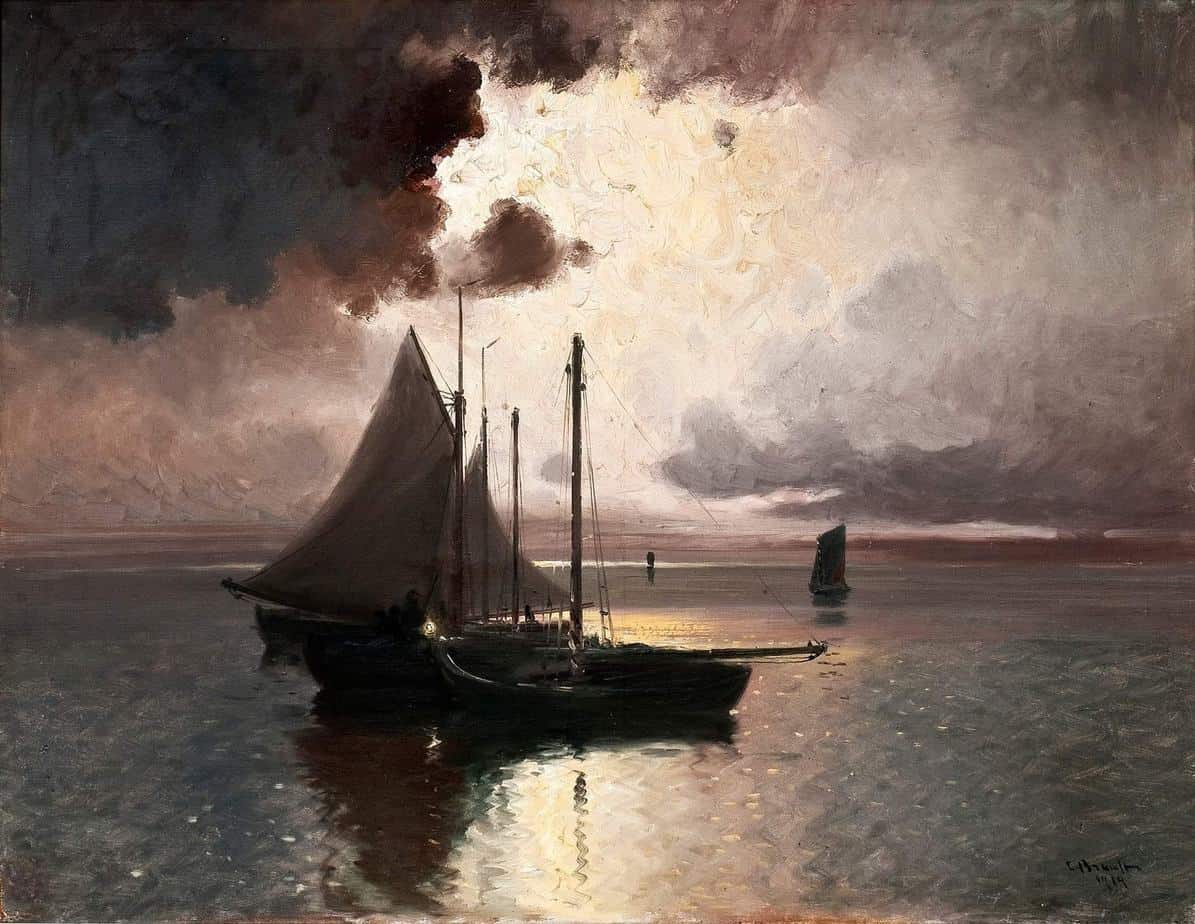
Contrast with the painting below, in which the artist aims for absolute stillness (and achieves it admirably) with a horizontal horizon, water almost like a mirror and a collection of three artfully arranged ships, differing in distance but nonetheless evenly spaced from the viewer’s perspective.
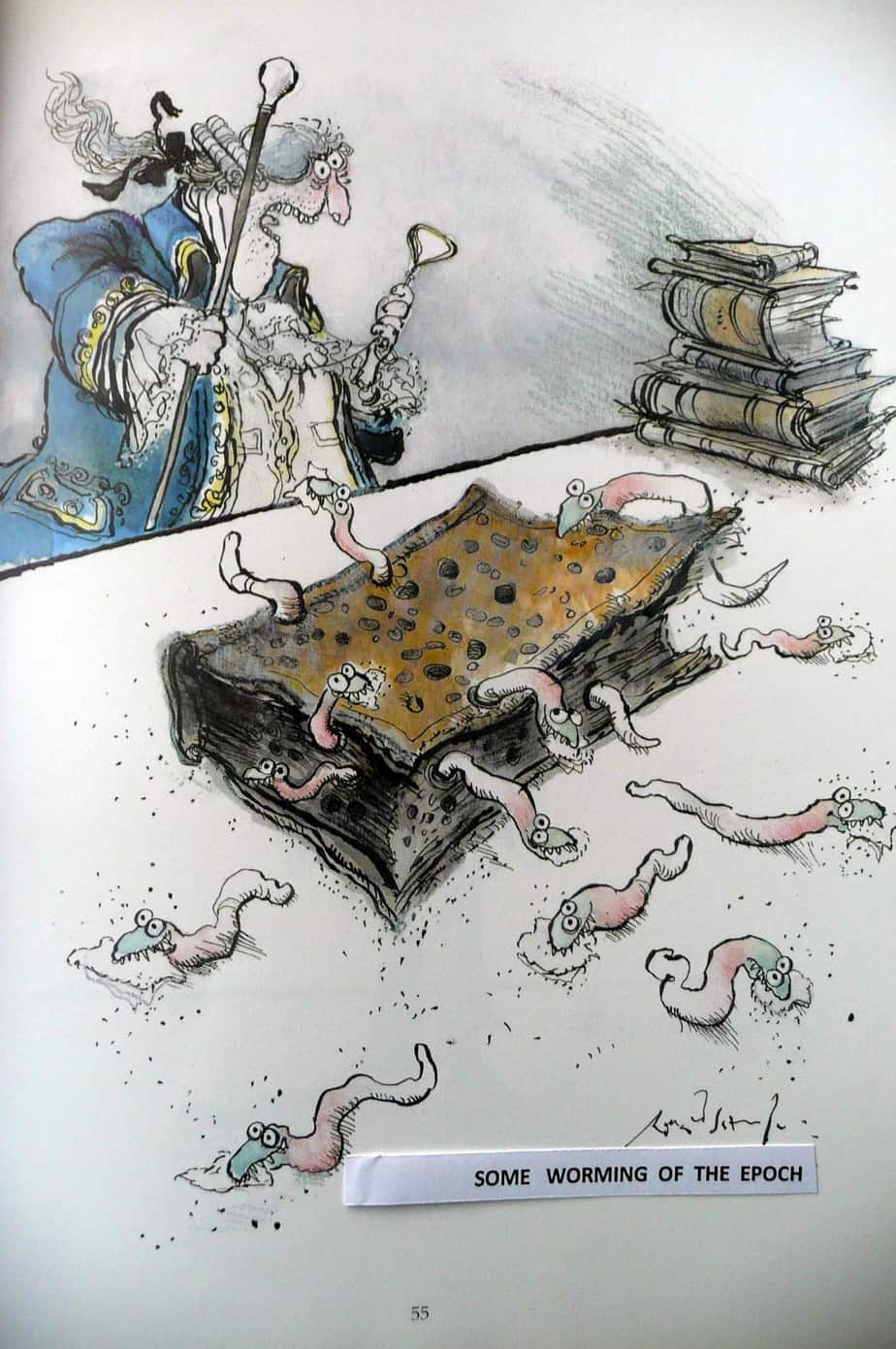
In Ronald Searle’s illustration below, ‘motion lines’ suggest the big stack of books has been plonked onto the table, In fact that stack of books is probably the only thing not moving. However, those scribbly lines give the illustration an overall sense of motion. ‘Motion lines’ aren’t always attached to the item that’s meant to be moving.
LEAVE THE SKETCHY OUTLINE INTACT TO SUGGEST MOTION BLUR
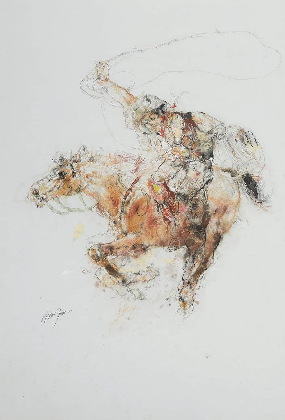
DOUBLE UP
Does this horse have two heads, or is it quickly looking backwards then forwards?
