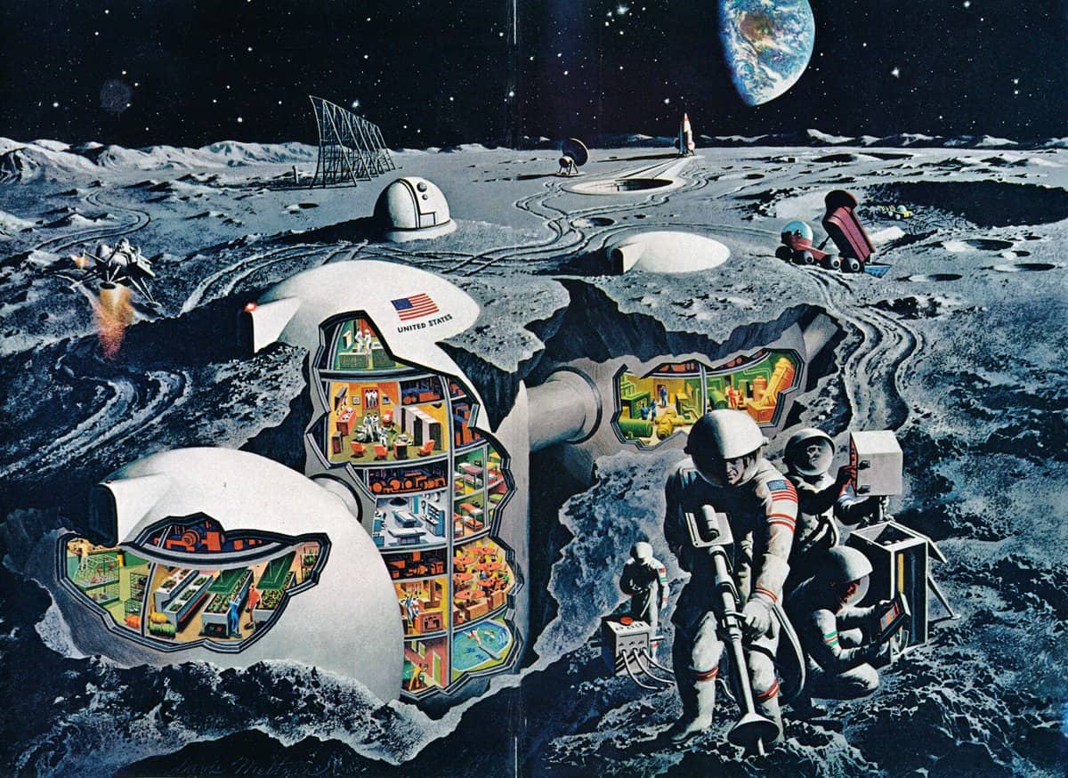
Cutaway illustrations are described by engineers and architects as ‘sectional axonometric’ drawings. They exist to show the viewer the inside of an object, with emphasis on its parts. In picture books for children, the cutaway illustration is quite often educational in its intent, for example to show the reader the inside of an object of building.
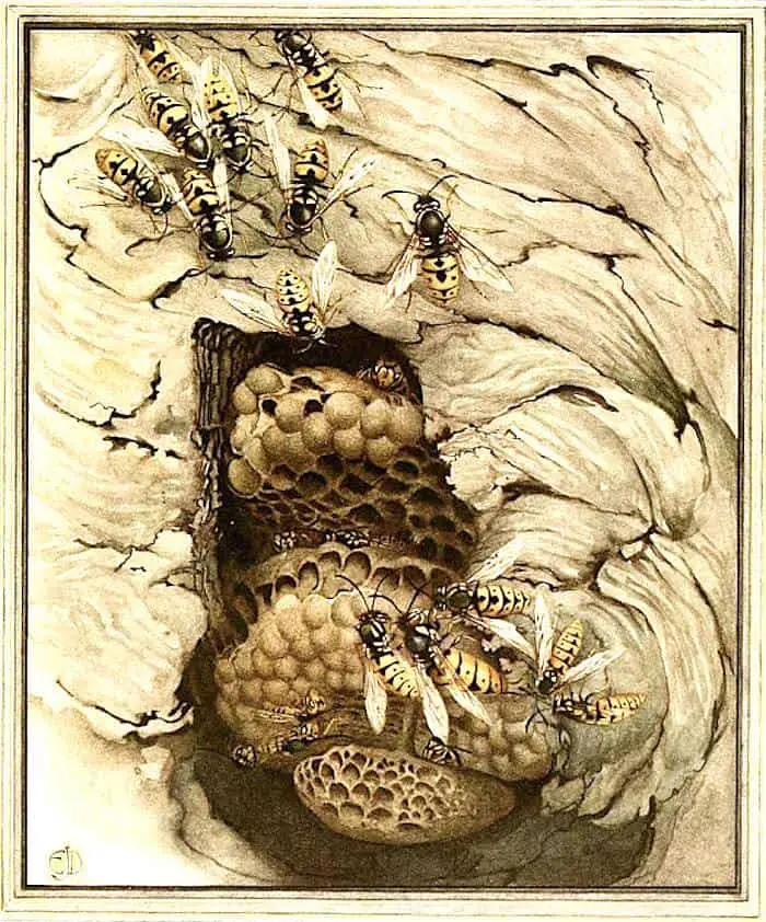
For example, the image below is a cutaway image of an insect nest, designed to show the viewer what it looks like on the inside — novel exposure of an otherwise secret space.
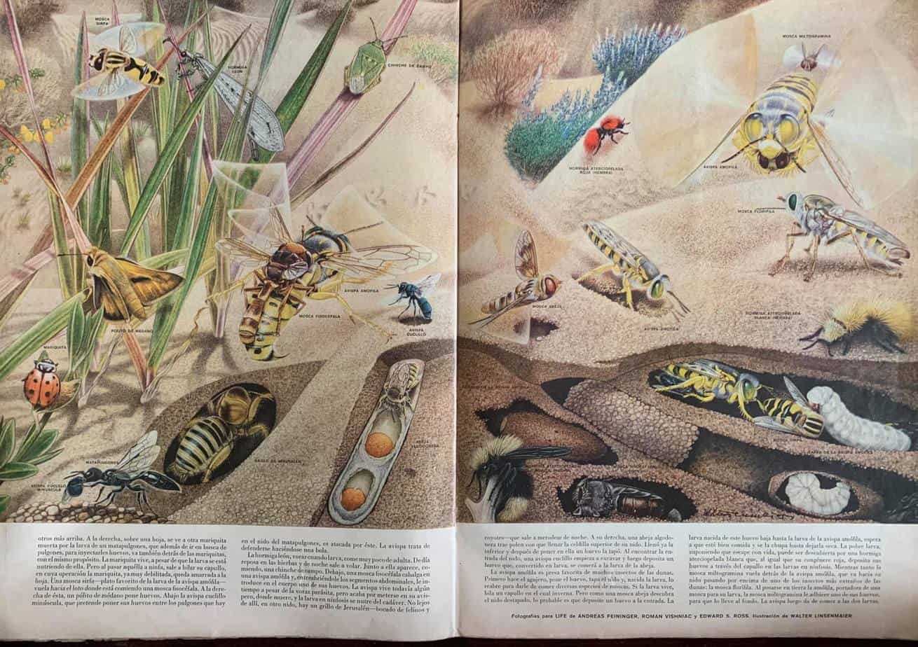
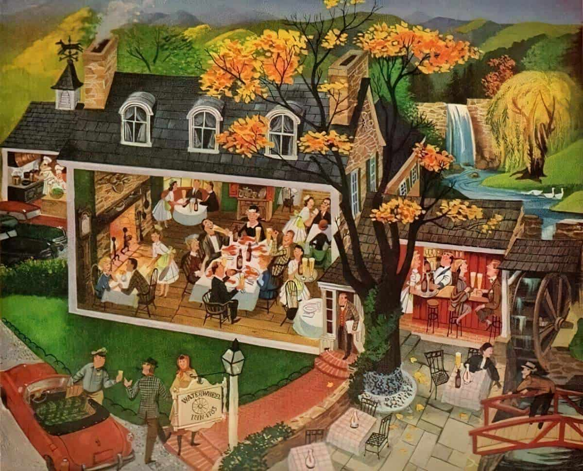
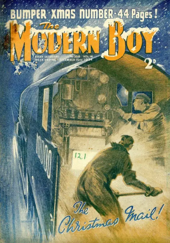
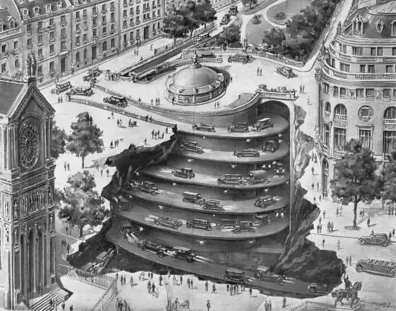
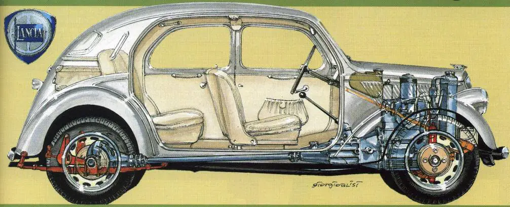
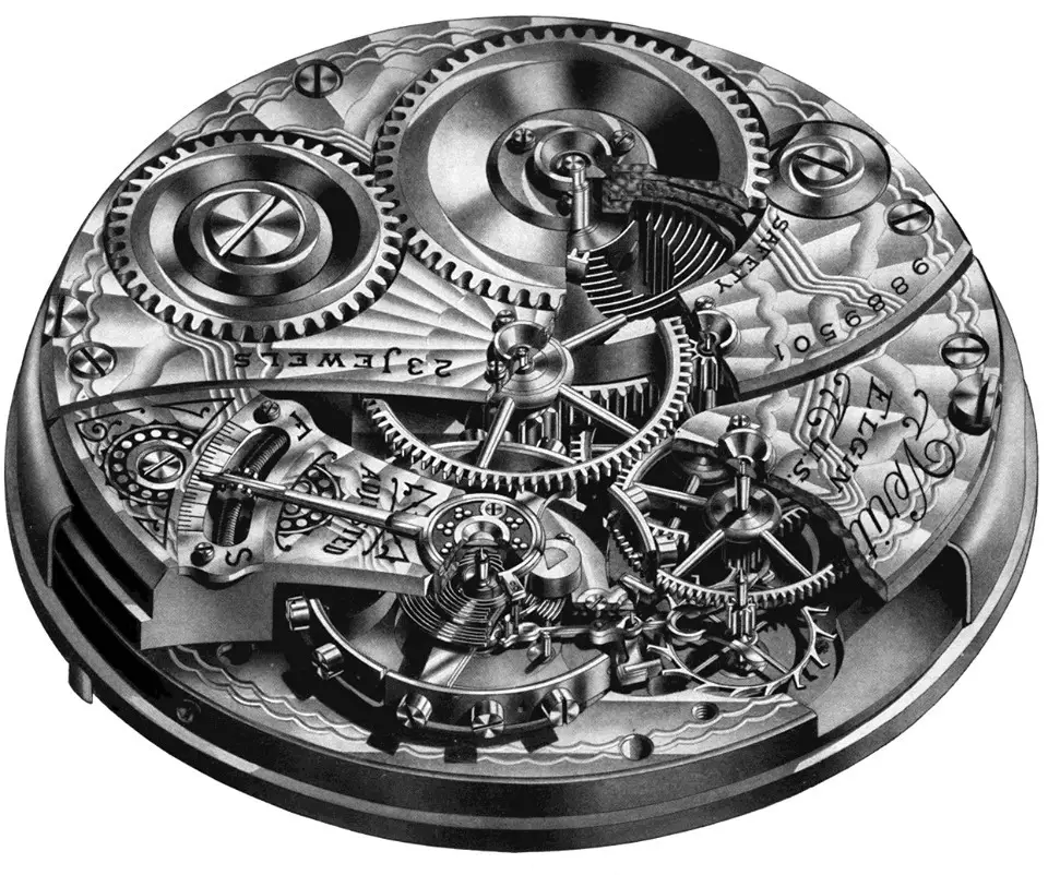
There was a time when cutaway illustrations were very popular for child consumption, and I guess that’s because they were so new and therefore impressive. You see them a lot in early to mid 20th century advertisements.
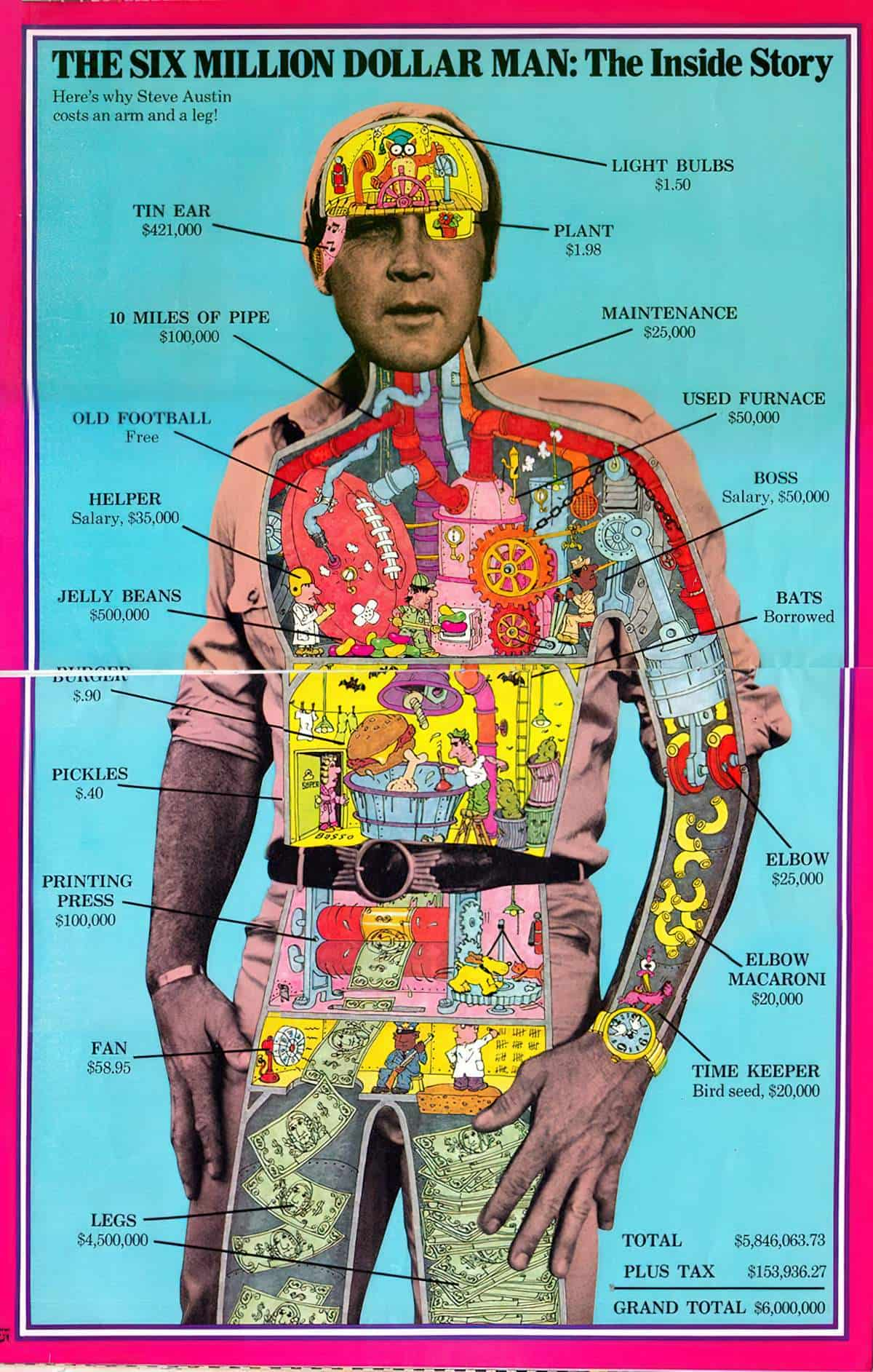
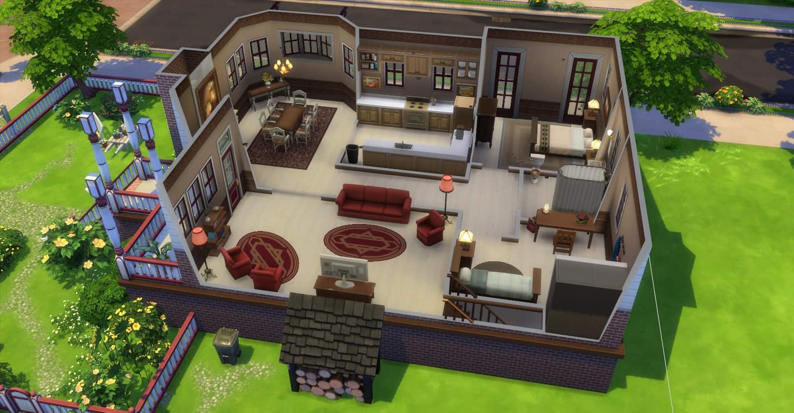
Popular computer games are all about the cutaway, normalising it, removing the ‘wow’. The Sims is all about the cutaway houses.
I also associate ‘cutaway’ views in games as necessary but bug-like features, for example when a character in a first person game approaches a wall, then partially enters the wall. This also happens in 3D architectural software when moving the camera about. It’s called ‘glitching through walls’. This game phenomenon is visually unappealing and I think it removes some of the romance of the cutaway house.
Though the golden age of the picture book cutaway seems to have passed (for now), it’s much easier for illustrators to create these images, even with no formal design training. A familiarity with popular 3D design software affords anyone the reference material to go to town with cutaways. But perhaps this is precisely why the cutaway is less utilised now; because it is less special? Or perhaps the proliferation of images in our culture has stripped away the feeling that we are afforded a glimpse into a secret world.
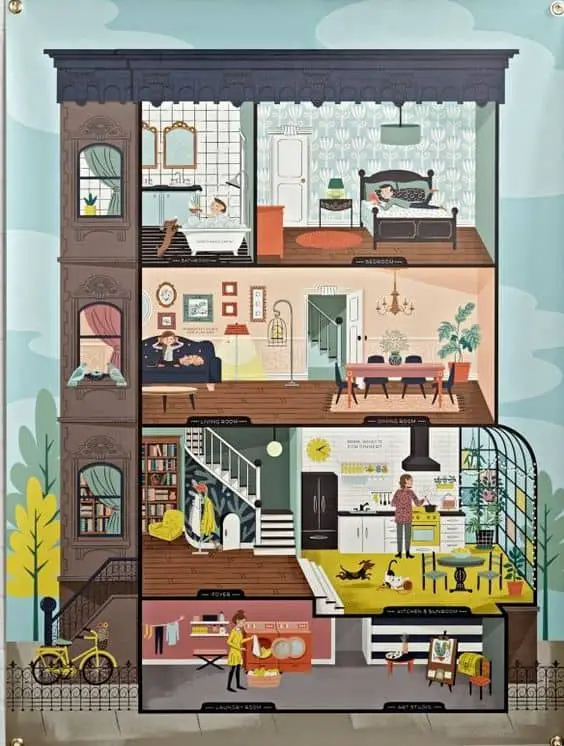
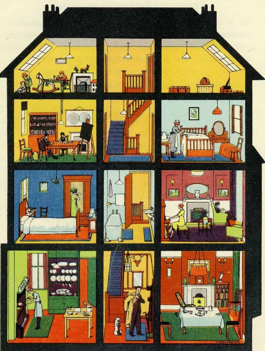
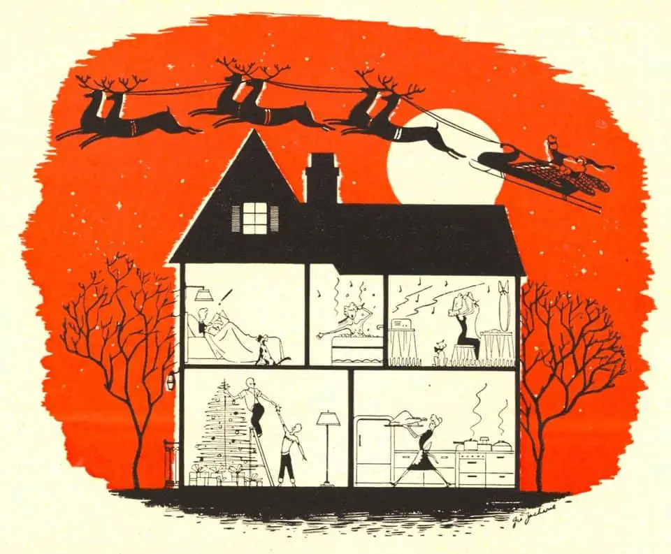
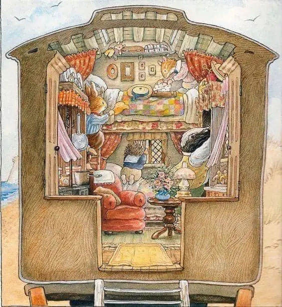
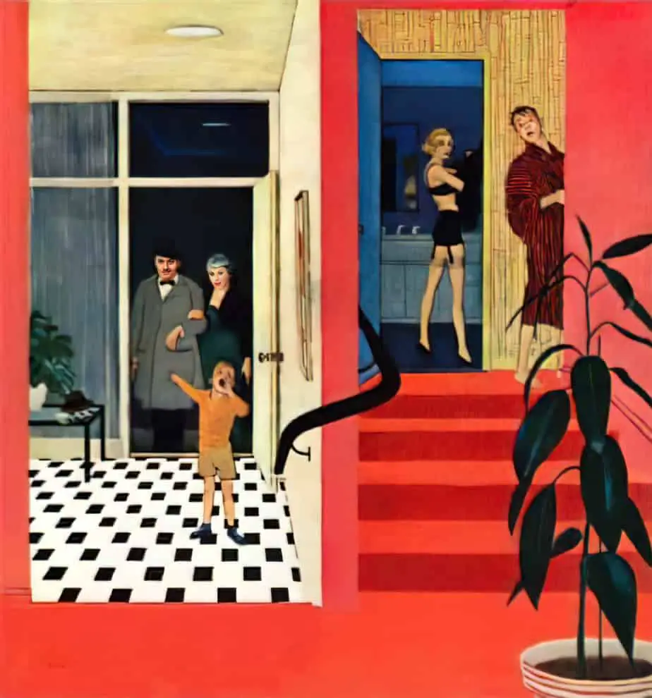
In any case, I remain in awe of a good cutaway illustration. The most simple and therefore the most suited to a retro style are these one point perspective dollhouse cutaways:
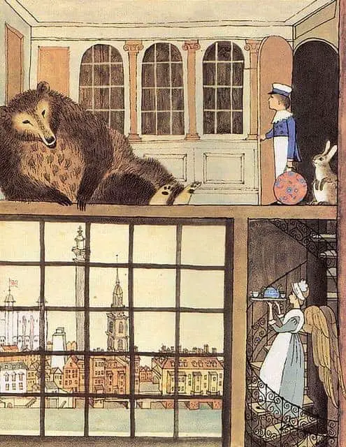
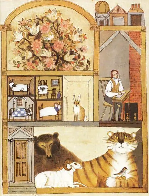
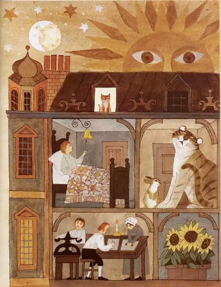
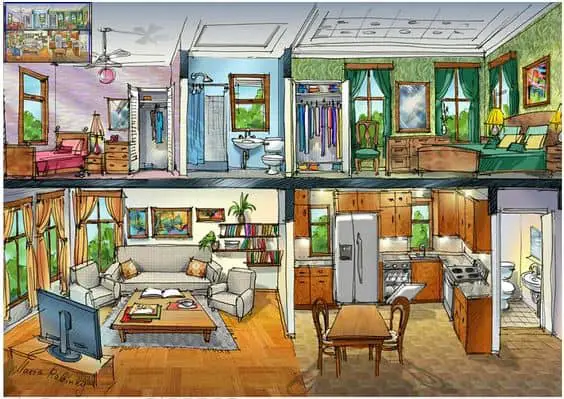
The illustration below is created in two point perspective, which lends a modern complexity.
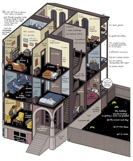
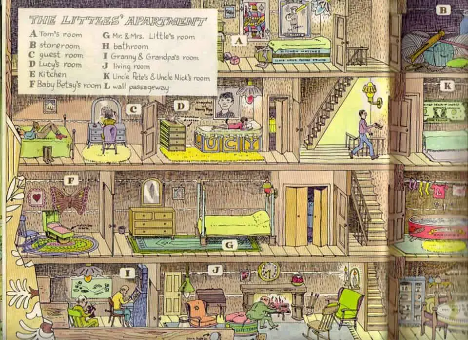
Modern software allows designers to create the ‘exploded axon‘. In these exploded diagrams, not only do we get a cutaway, detailed and 3D view, but each item is separated out. In the fascinating image below, Chris Ware has taken elements of exploded axons and applied a comic book style. These images are from a graphic novel called Building Stories (2012).
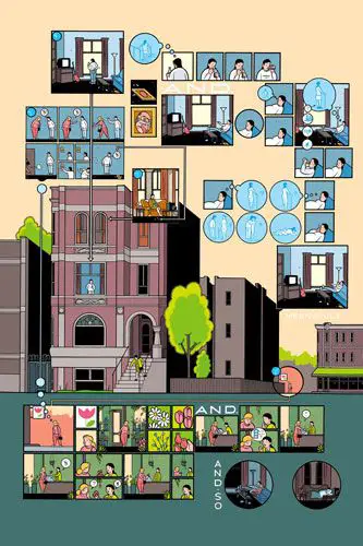
And here is a three point perspective example.
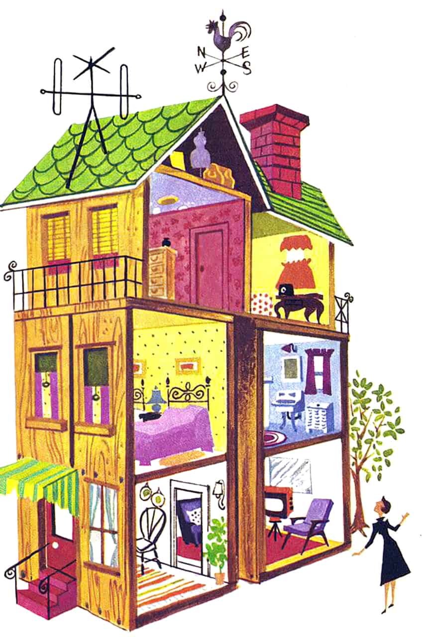
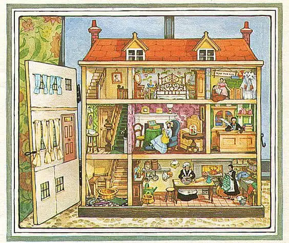
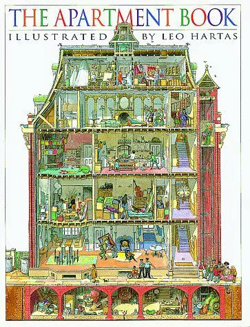
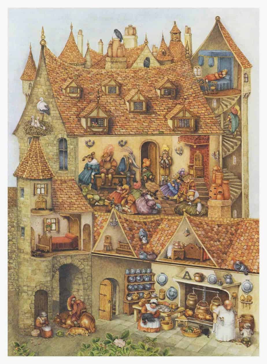
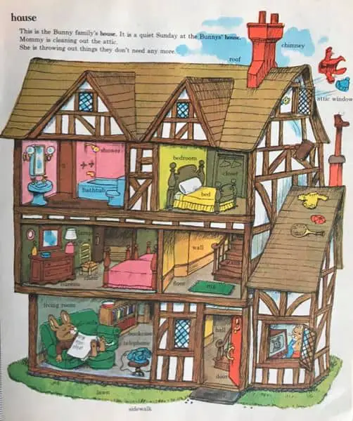
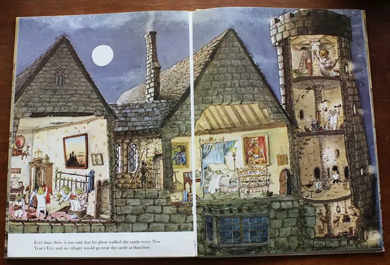
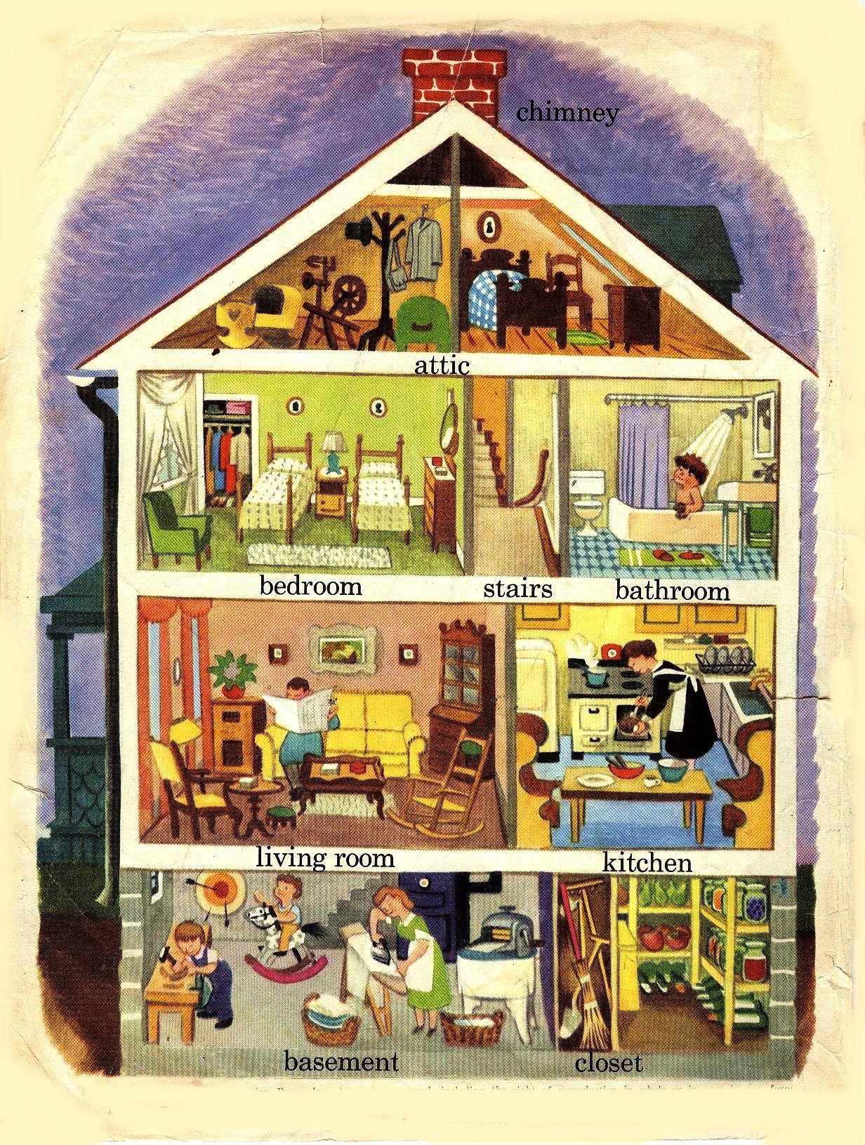
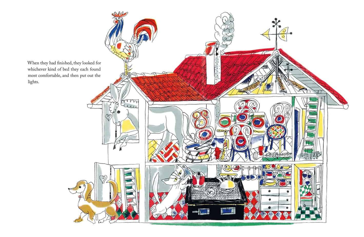
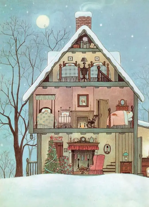
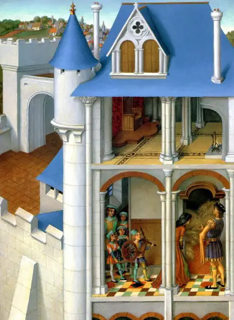
Various “Picture Book” Cutaway Houses
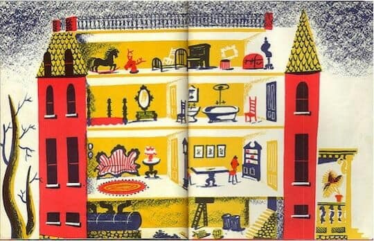
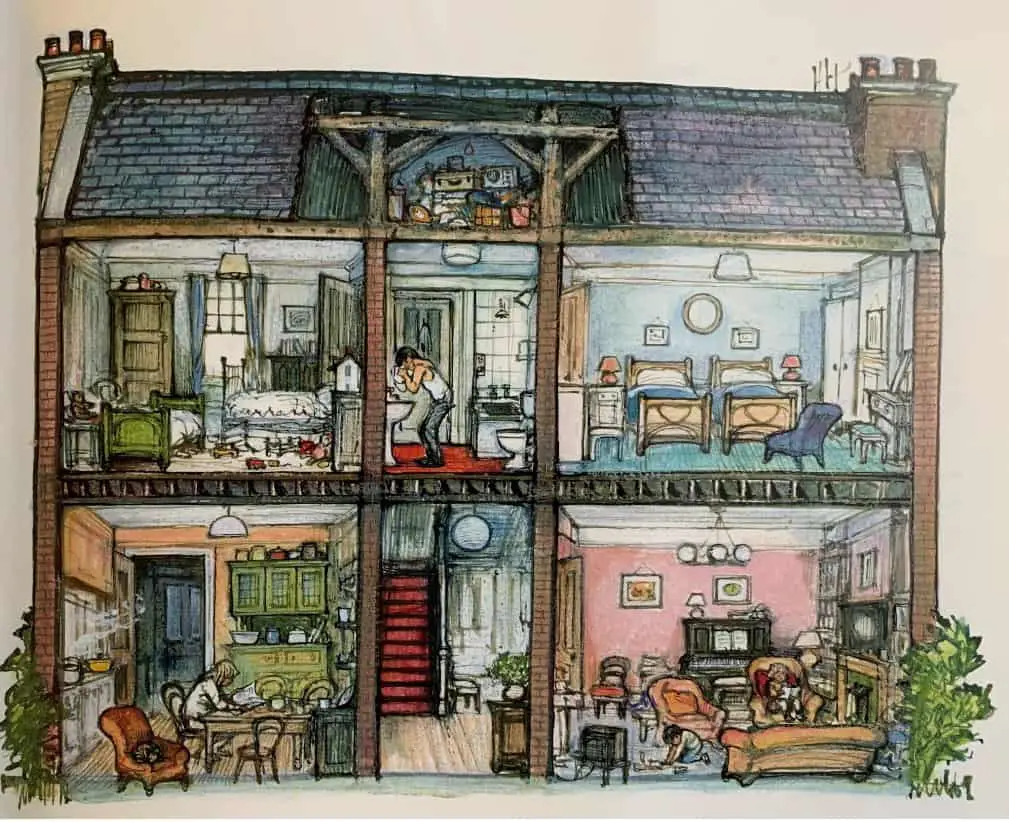
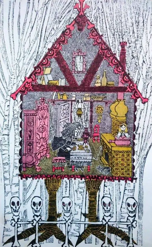
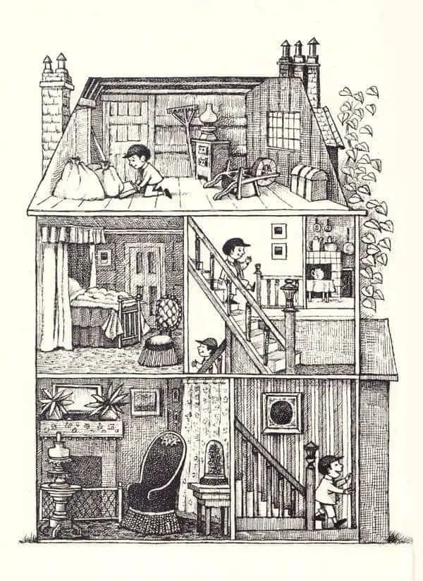
It’s not easy to find the original creators of the images below, but each of them might easily appear in a children’s book. Some of them might just as easily have appeared in 20th century advertisements.
Victorians loved to make miniatures, and rich houses often commissioned miniature replicas of their own homes. These now look like ‘doll houses’ though they were not used for play.
The intrigue for miniature houses has not gone away. Though they have a retro vibe — or precisely because of this — look on any craft website and you’ll soon find embroidery patterns of cutaway houses (a.k.a dollhouses).

THE LIVING CITY EXHIBITION
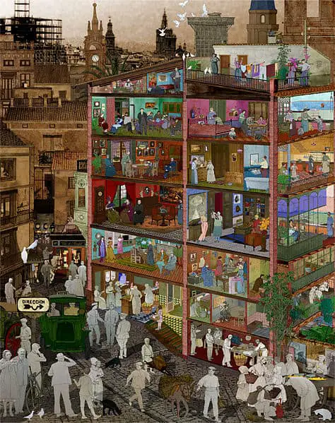
Below is a well-known image of a cutaway building. Aerial perspective is achieved by rendering the background in sepia tones, and the people outside the building as grey silhouettes. This image is my favourite cutaway illustration.

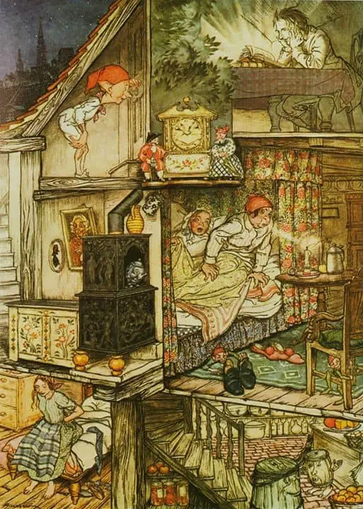
There is apparently an Inn like this the Siebel illustration below located in upstate New York. It’s called “The Bull and Garland“.
