Ah, composition. How things are arranged on the page… or on the screen. I have written before about how picture books have a lot in common with film, and that study of one equals study of the other.
Knowing how to manipulate an audience is far more important than knowing how to manipulate the technology of film.
Howard Suber, The Power of Film
Here is a useful YouTube video from Channel Criswell which introduces the topic of Composition in Storytelling. While the examples in the video are all from film, as I watch I’m thinking of the page composition of my favourite picture books.
Lewis Bond explains that composition in good films achieves two things:
- It draws your attention to the right thing.
- There is a subtext. e.g. Which character has control of the scene? How are they feeling? How have they changed? What are they about to do?
Power And Control
Composition is really good at depicting the power dynamics between characters. In fact, that is probably what it is best at. You may know this already. (Low angle means strong, high angle means weak etc.)
But control can be broken down further into two separate meanings:
- ARTIFICIAL CONTROL: The control of the aesthetics and where we should be looking. (What’s listed below: geometry, framing etc.)
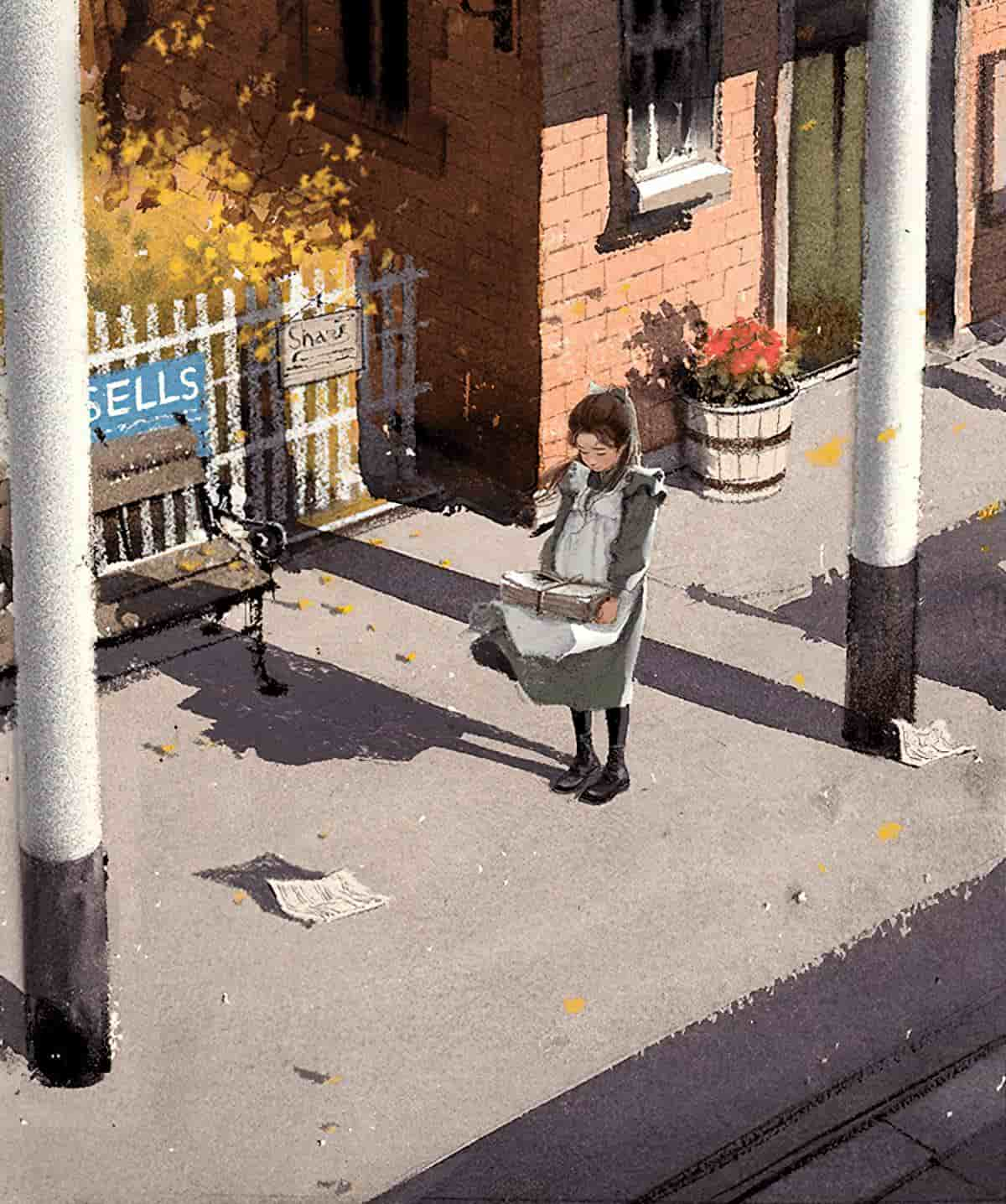
- PRIMAL CONTROL: What subject holds more weight in the narrative at that moment in time? This could show the power dynamic between characters or even between character and setting. Nothing shows this more than size and scale in an image.
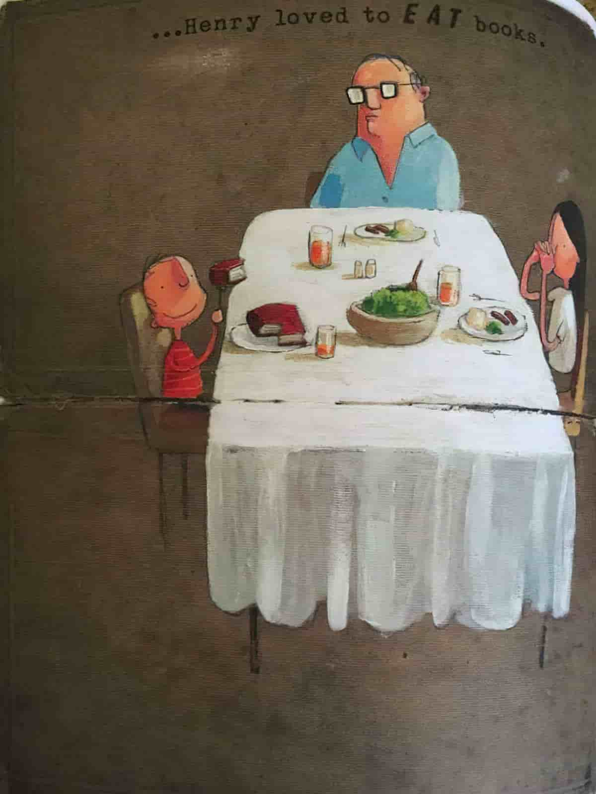
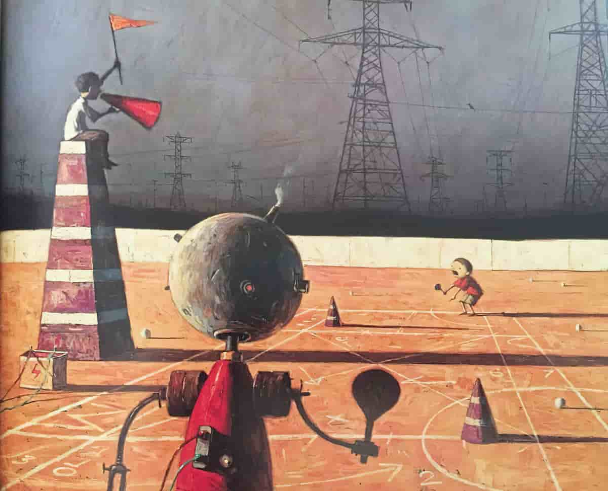
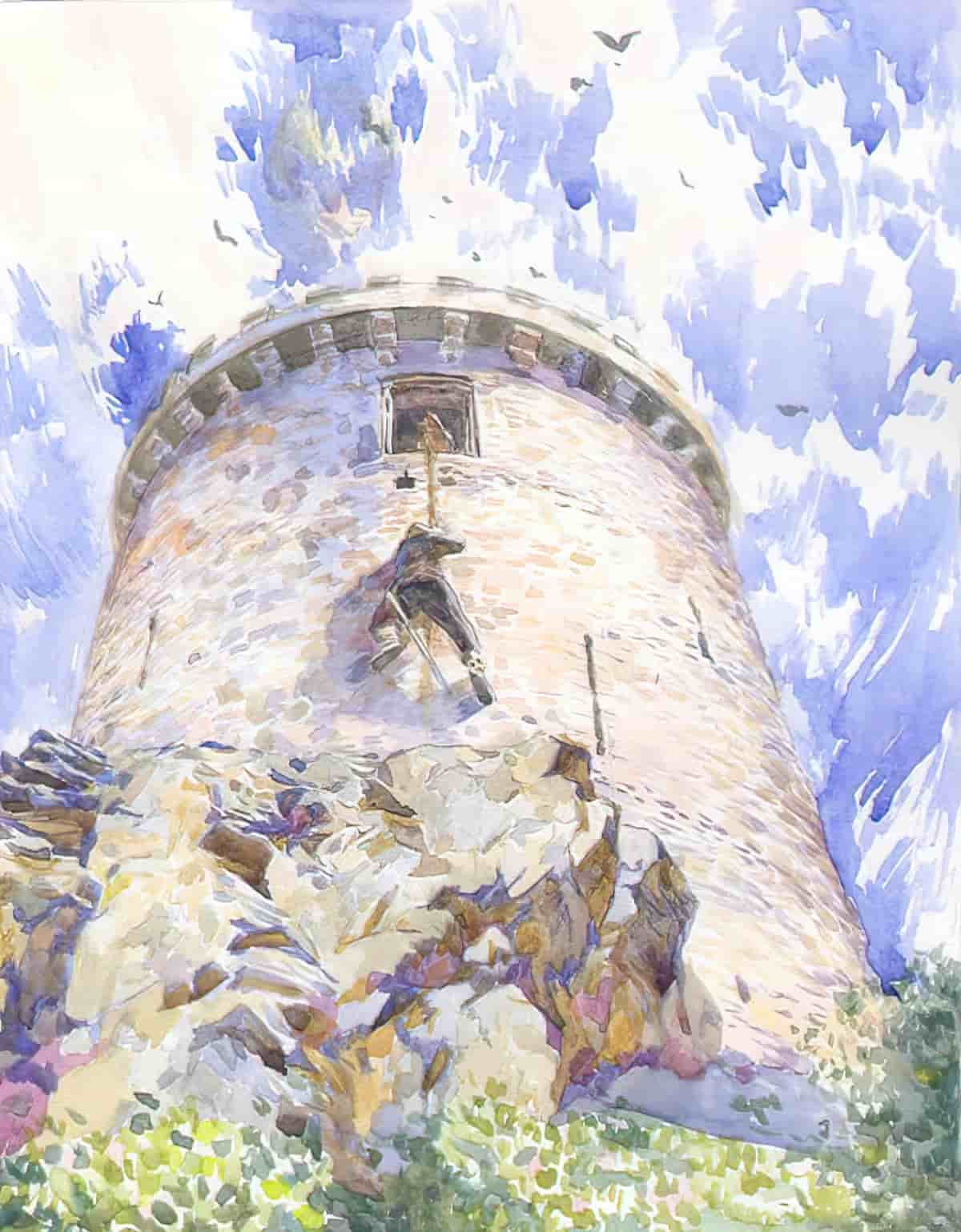

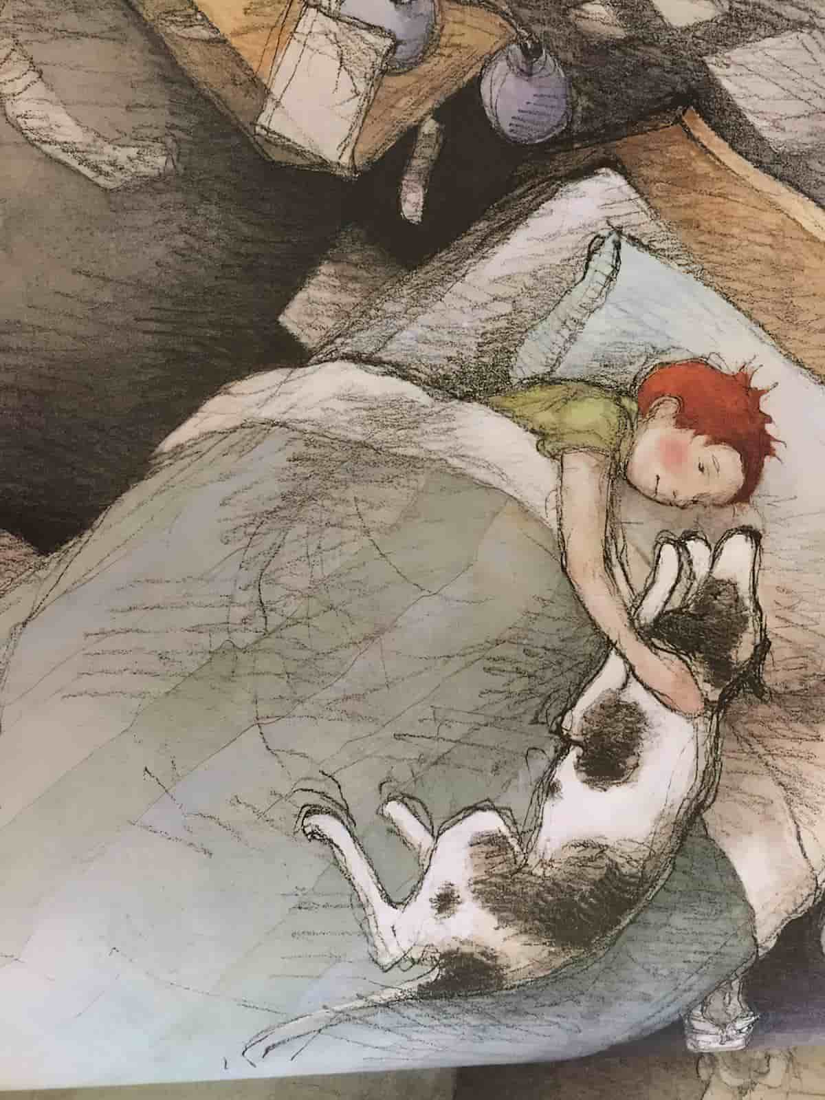
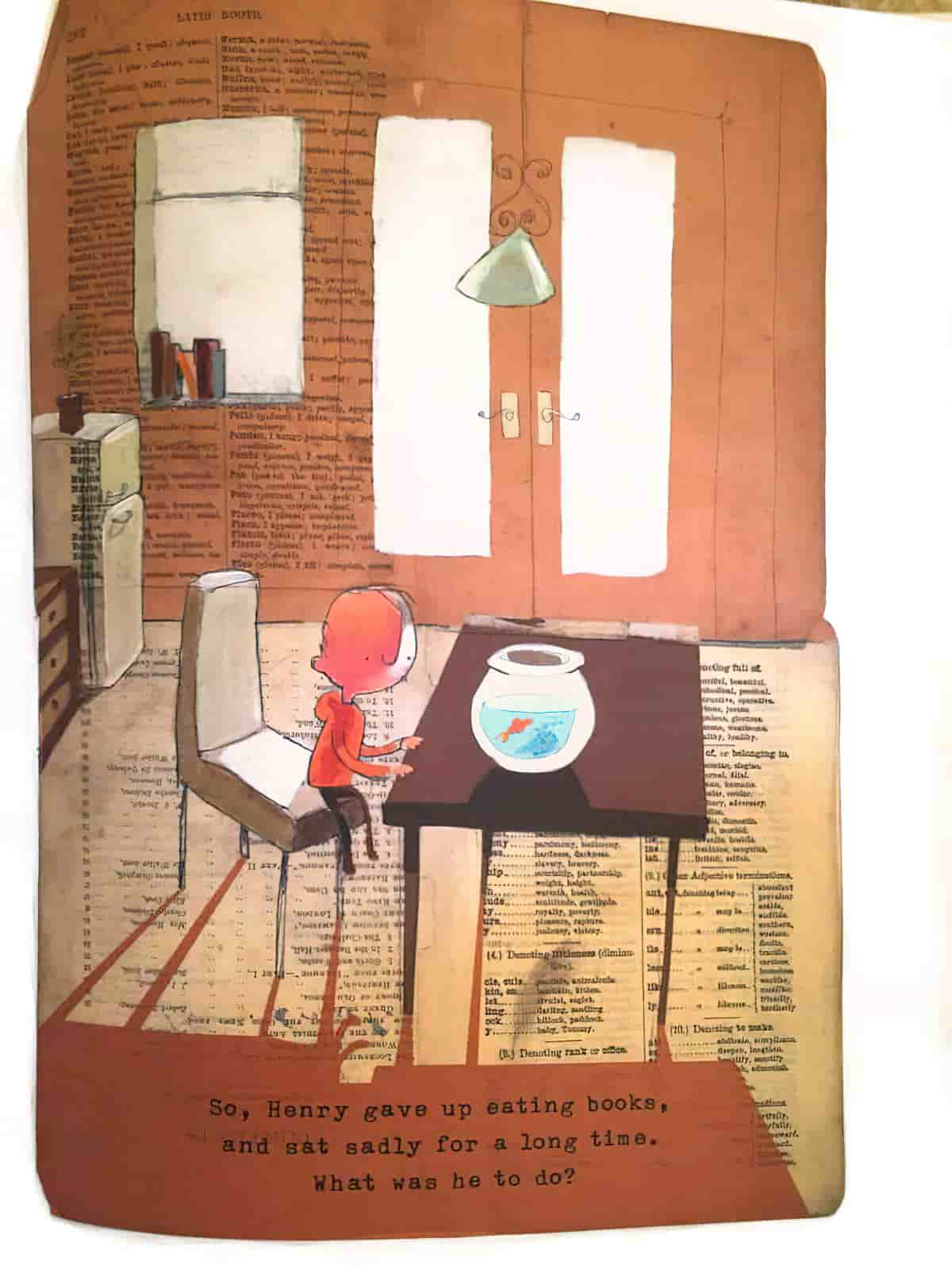
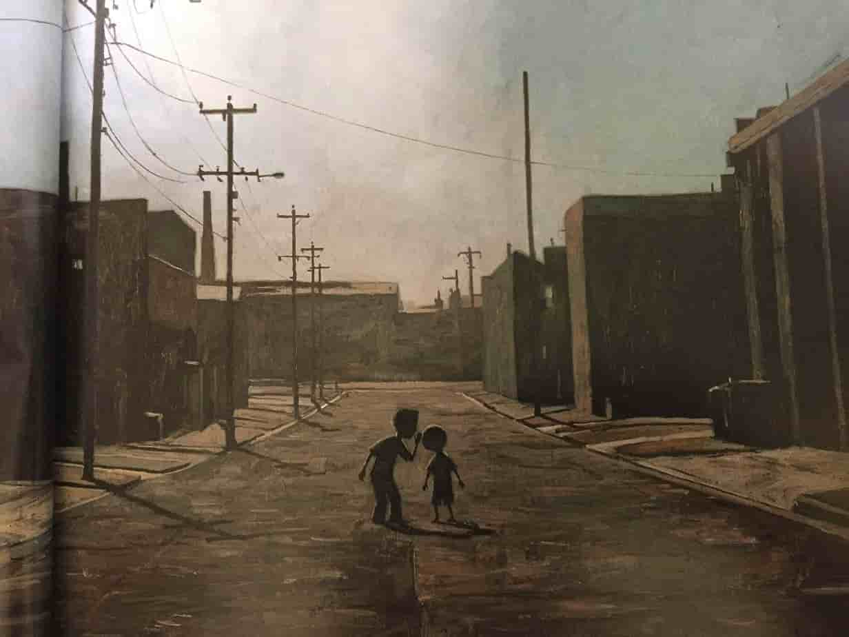
Control can also be conveyed by placing the subject right in the centre of the frame, though it can also mean loneliness and difference, as below.
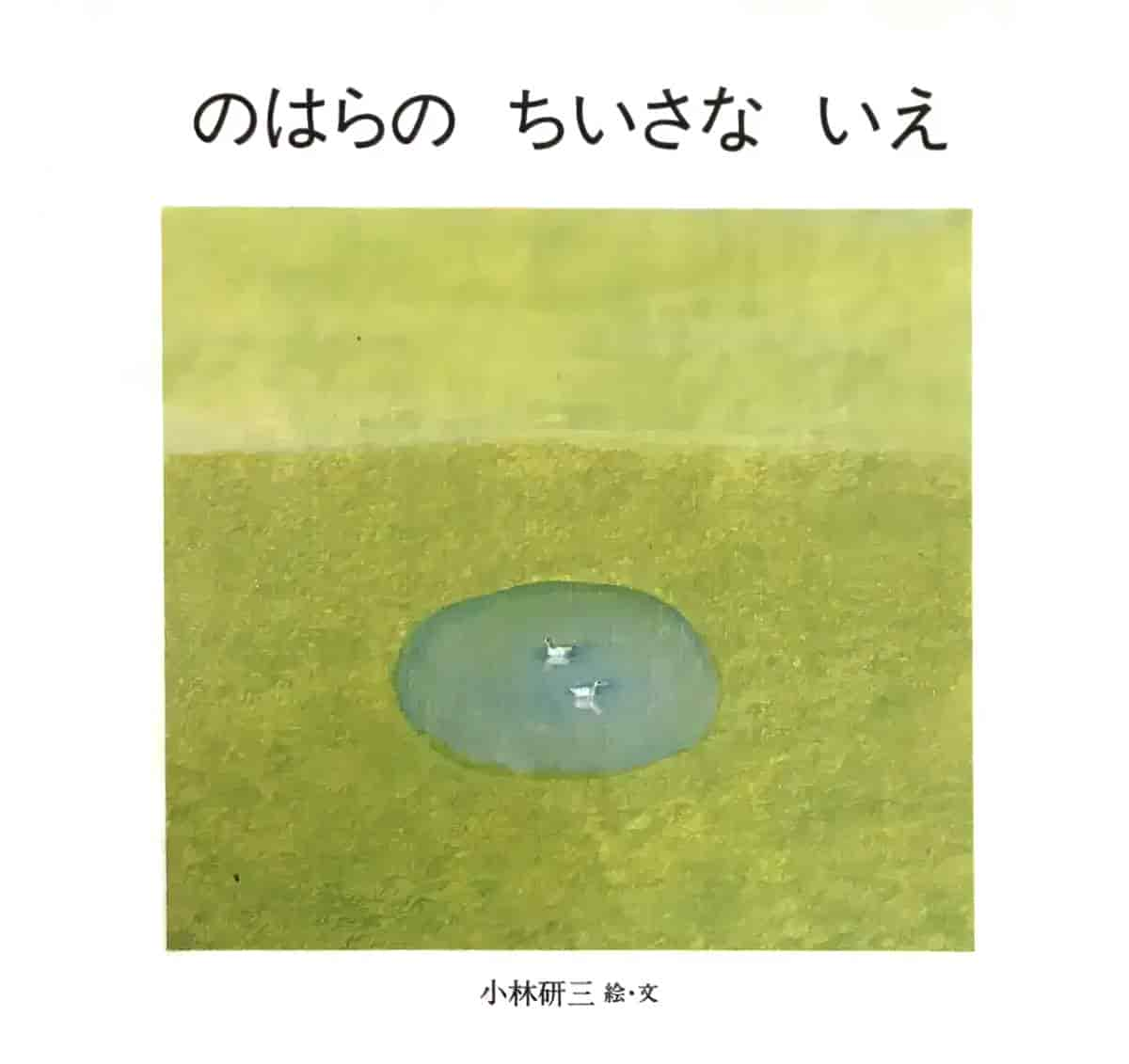
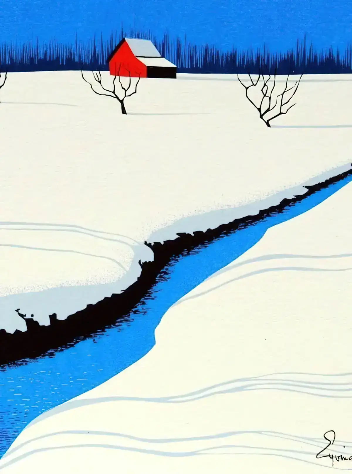
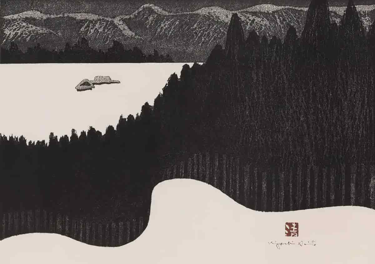
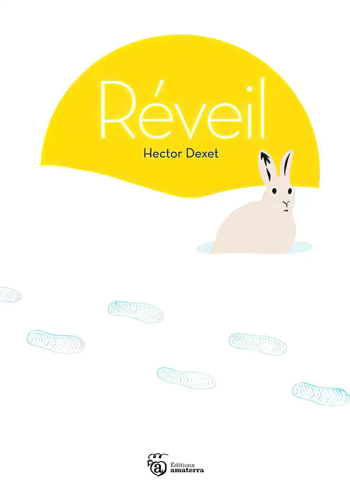
Negative Space
This is an aspect of composition which is perhaps talked about even more in picturebooks than it is in film. What is the purpose of negative space?
- It is often used to show the vast expanse of the area.
- On a psychological level, negative space creates apprehension, as we expect something to take place in the void we see.
- In characterisation, negative space can be used to show that characters have no hope. Or perhaps it signifies the great distances characters must go before reaching their goals.
- Negative space can evoke a sense of loneliness.
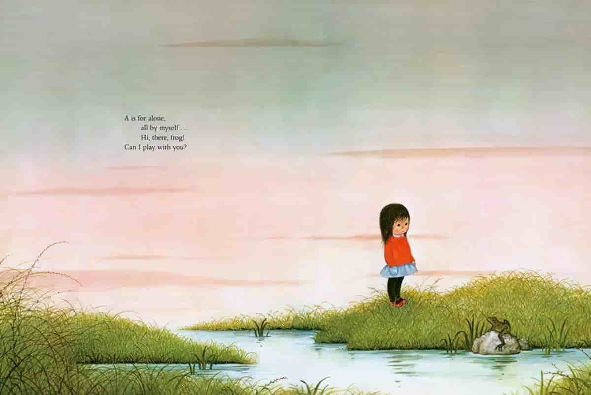
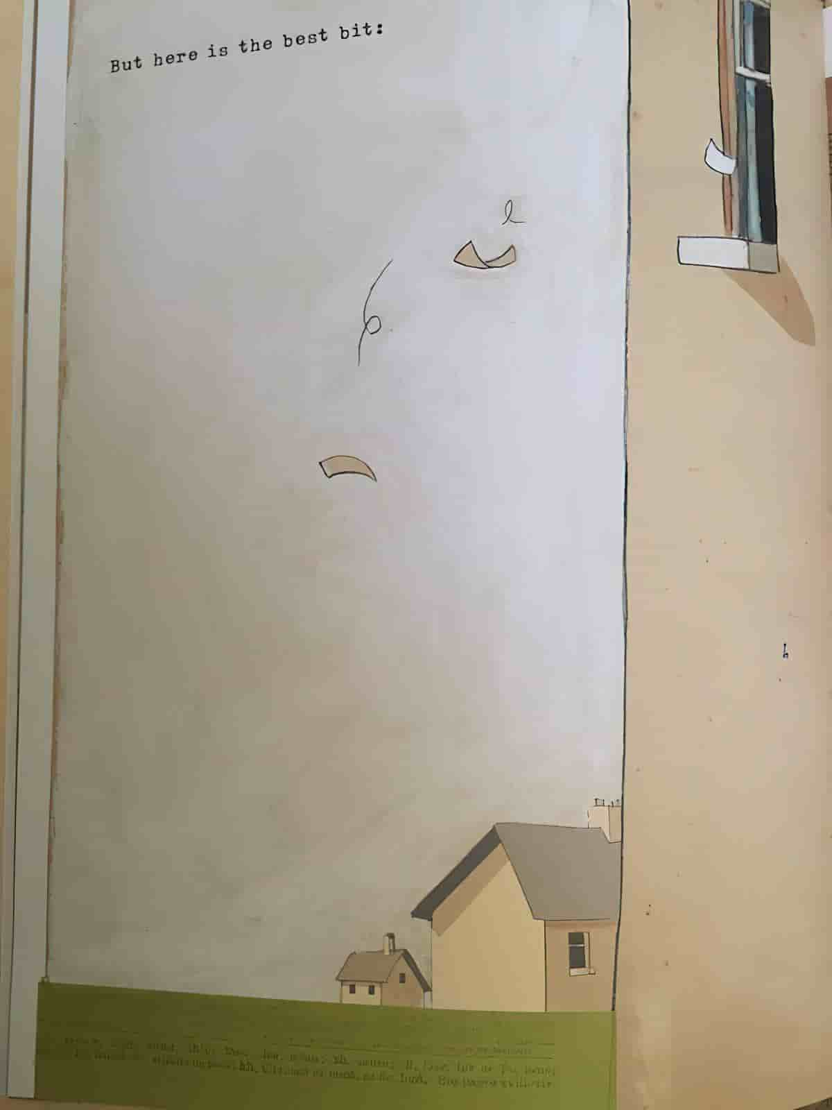
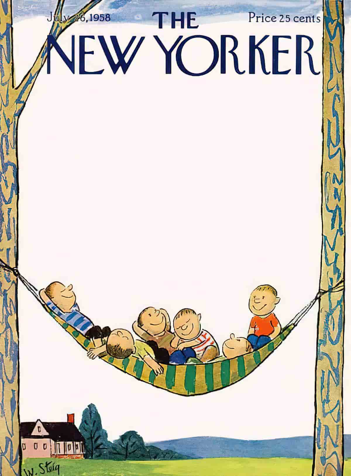
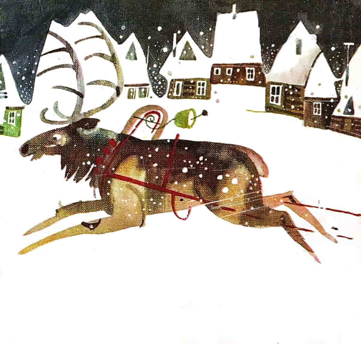
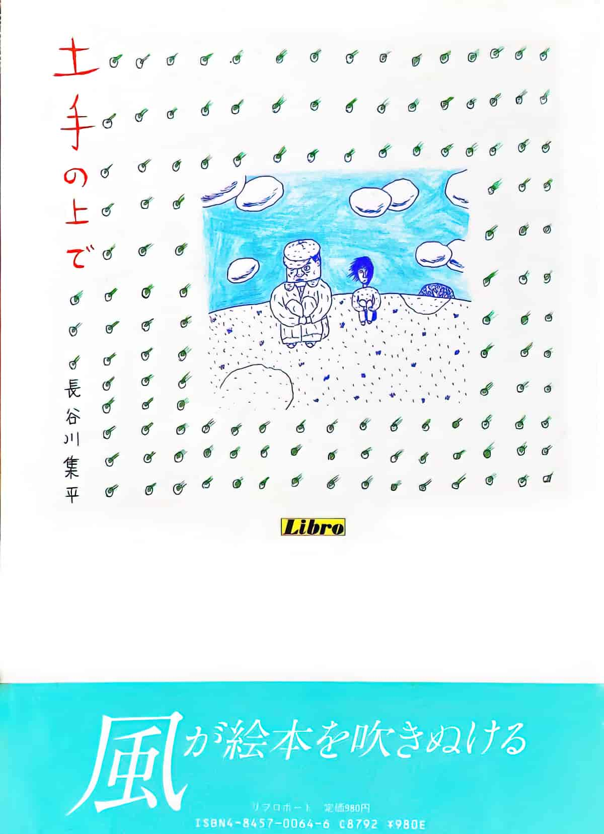
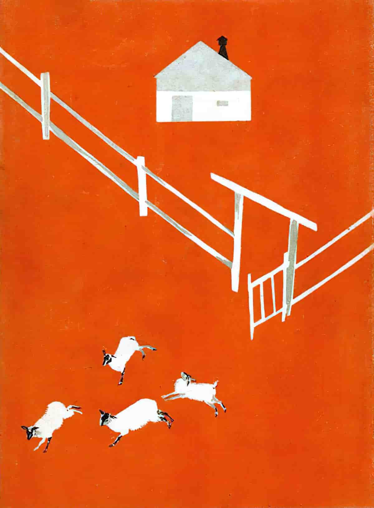
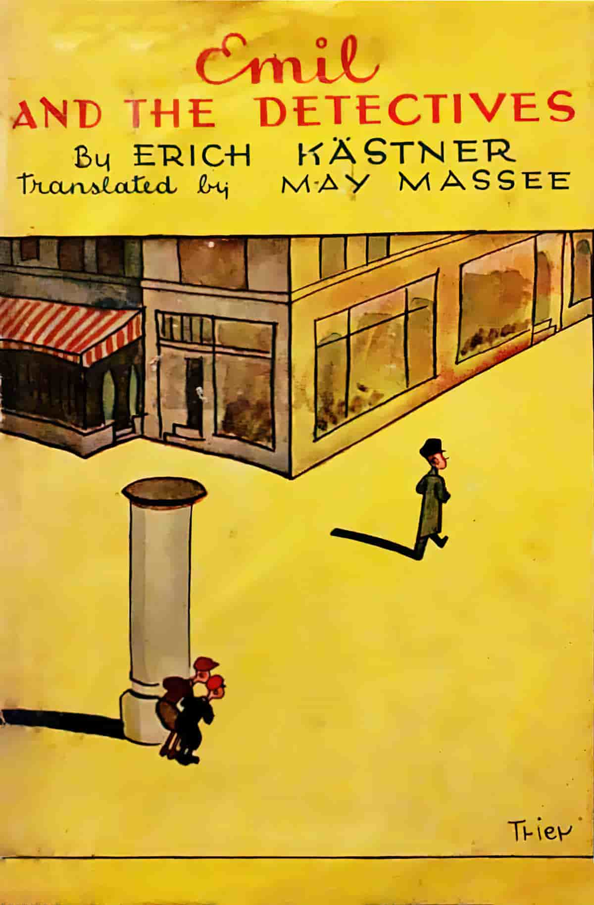
While ‘negative space’ is a word from art world, when talking about picturebooks we might say that a scene has been ‘decontextualised’. This is when we see, for example, a child putting on a jumper, but without the bedroom scene. There are a number of reasons for decontextualising a scene in a picture book:
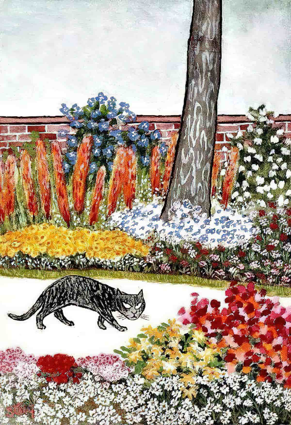
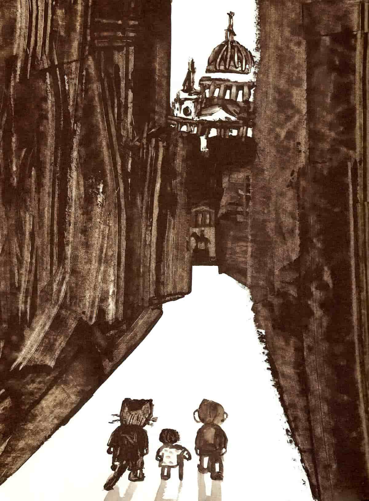
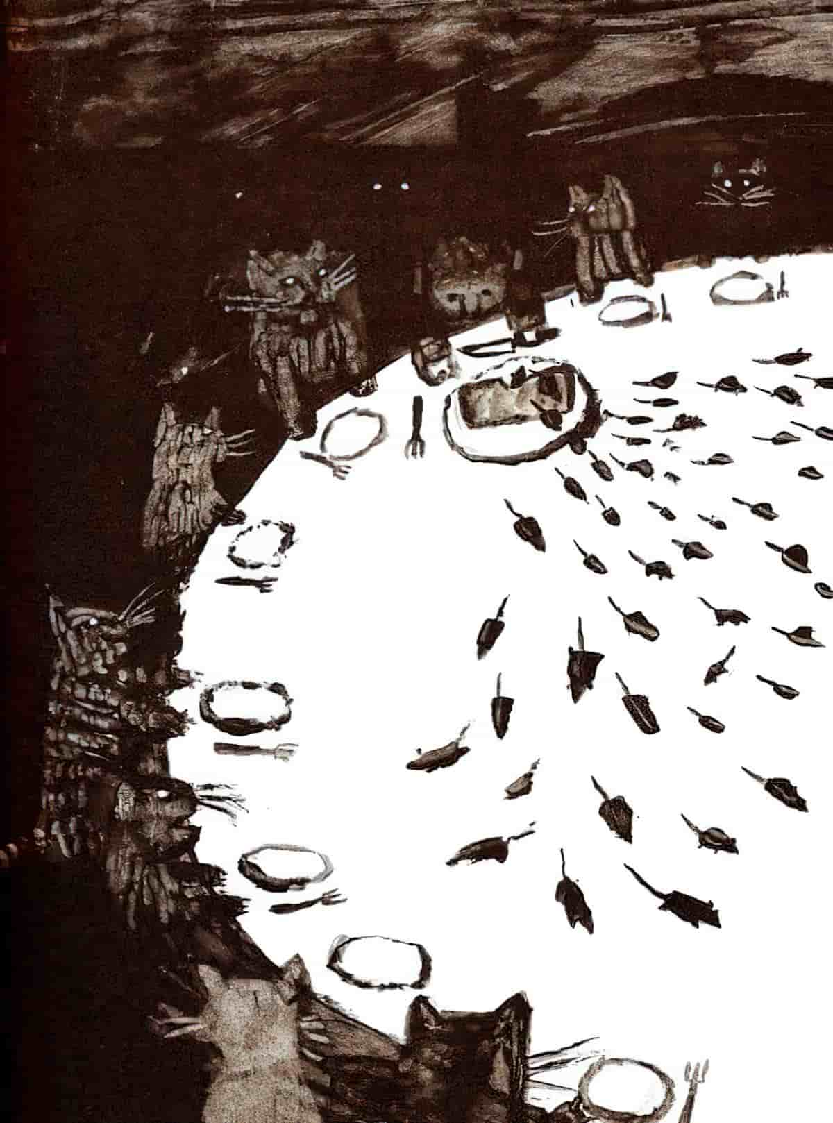
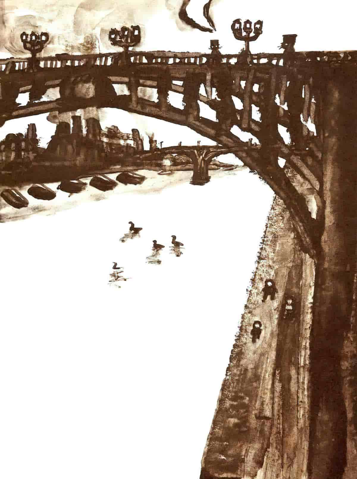
- This technique deliberately removes ‘ambience’
- And draws attention to the action rather than inviting the reader to linger on the picture (manipulating the pace of the story)
- Where words accompany the scenes the words feel more integrated with the illustration when the illustration is decontextualised, probably because there’s no clear demarcation between the edge of the picture and the start of the words.
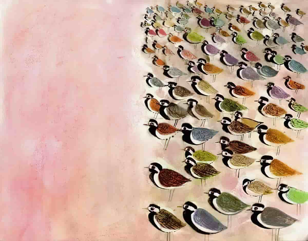
Negative space is advantageous because lack of setting means a story may not date so much. Although crisp white backdrops in picture books feel contemporary, we can find many examples which are really pretty old.
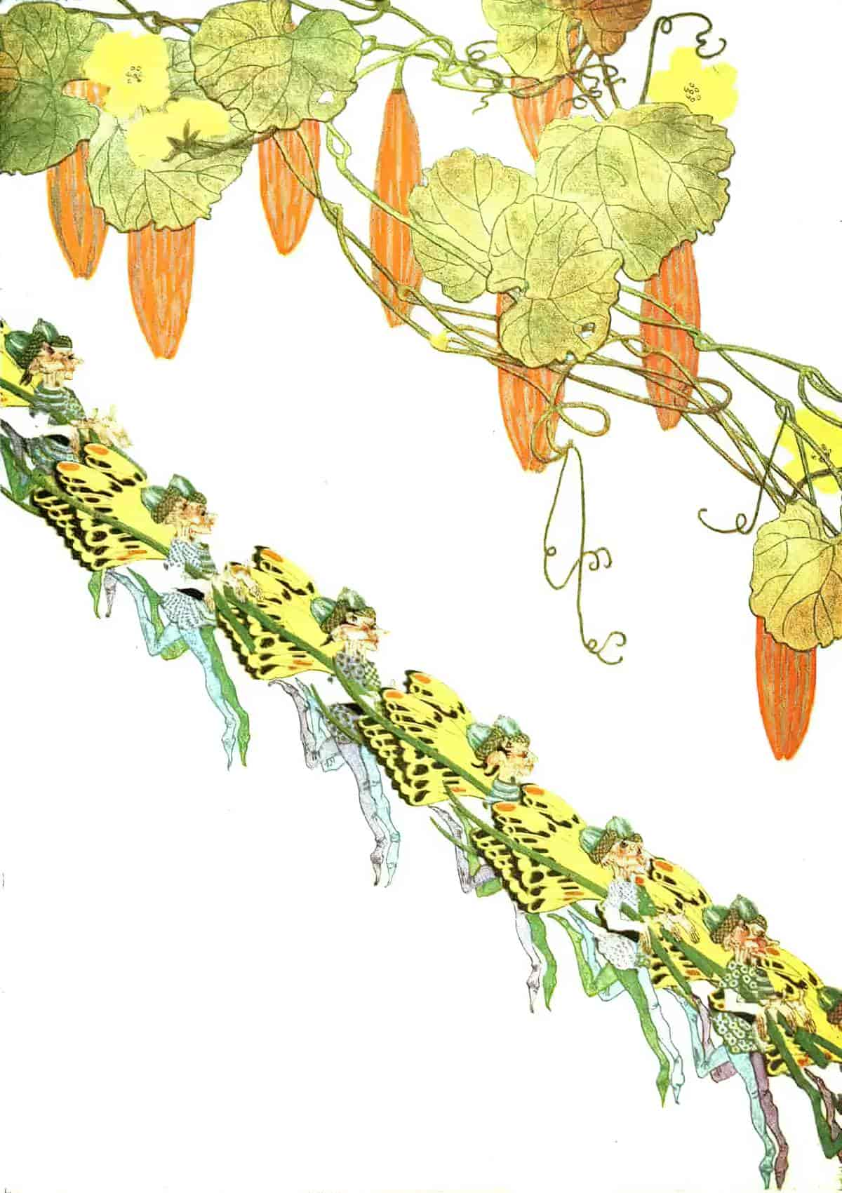
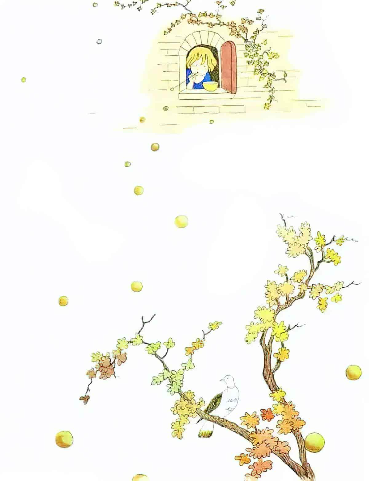
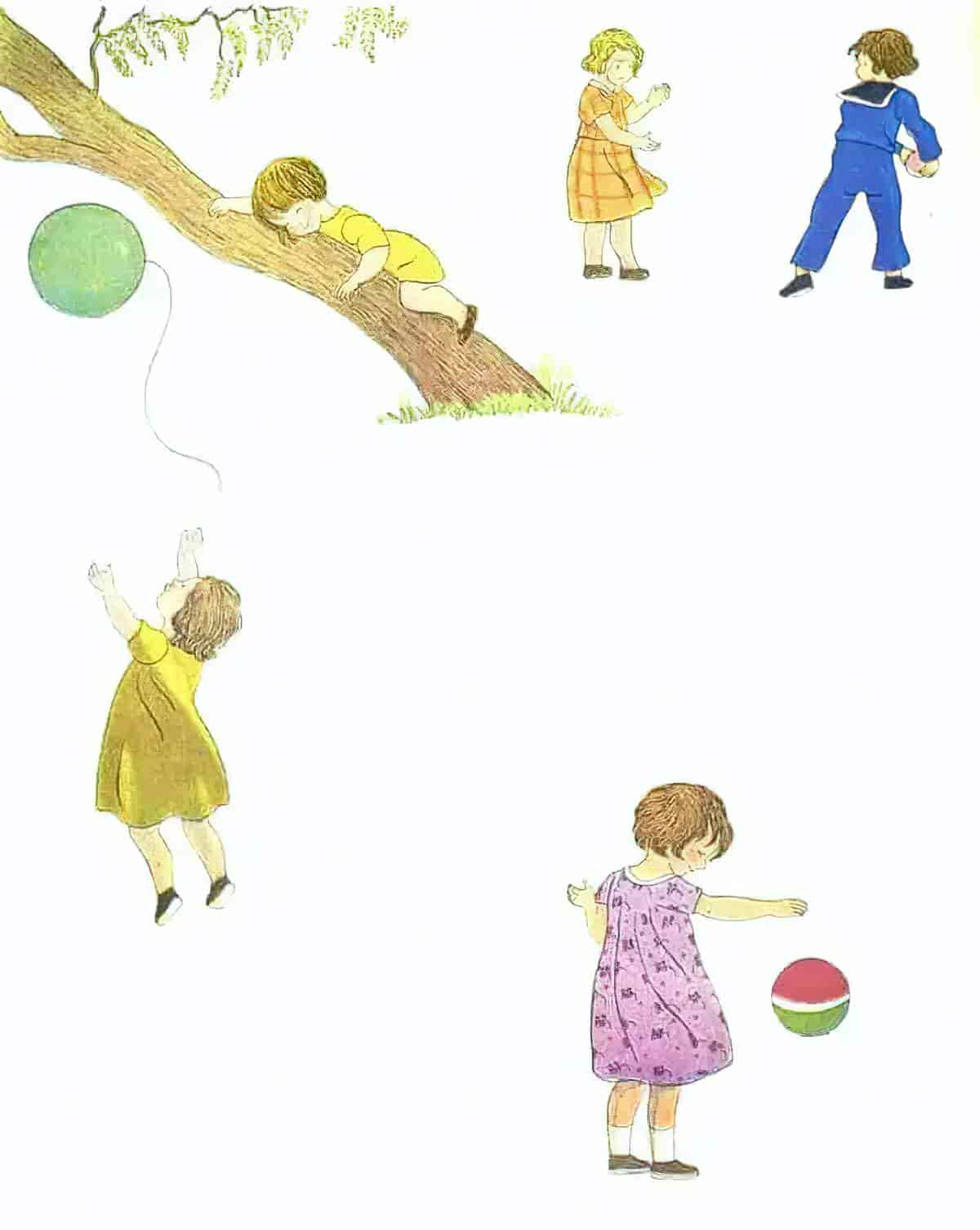
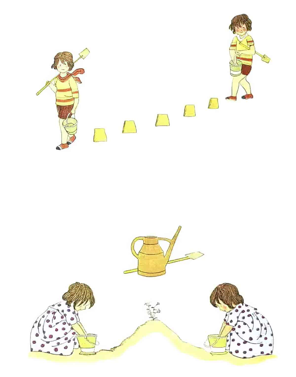
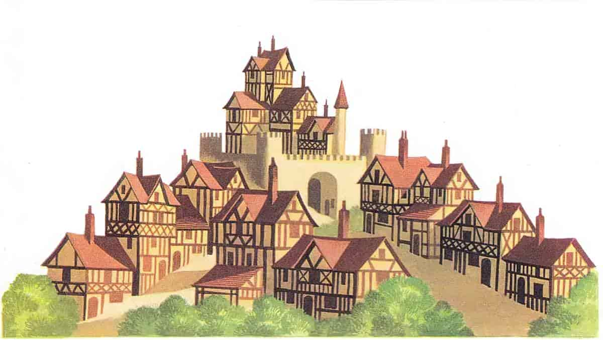
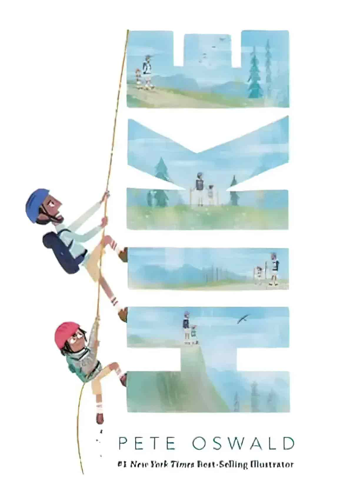

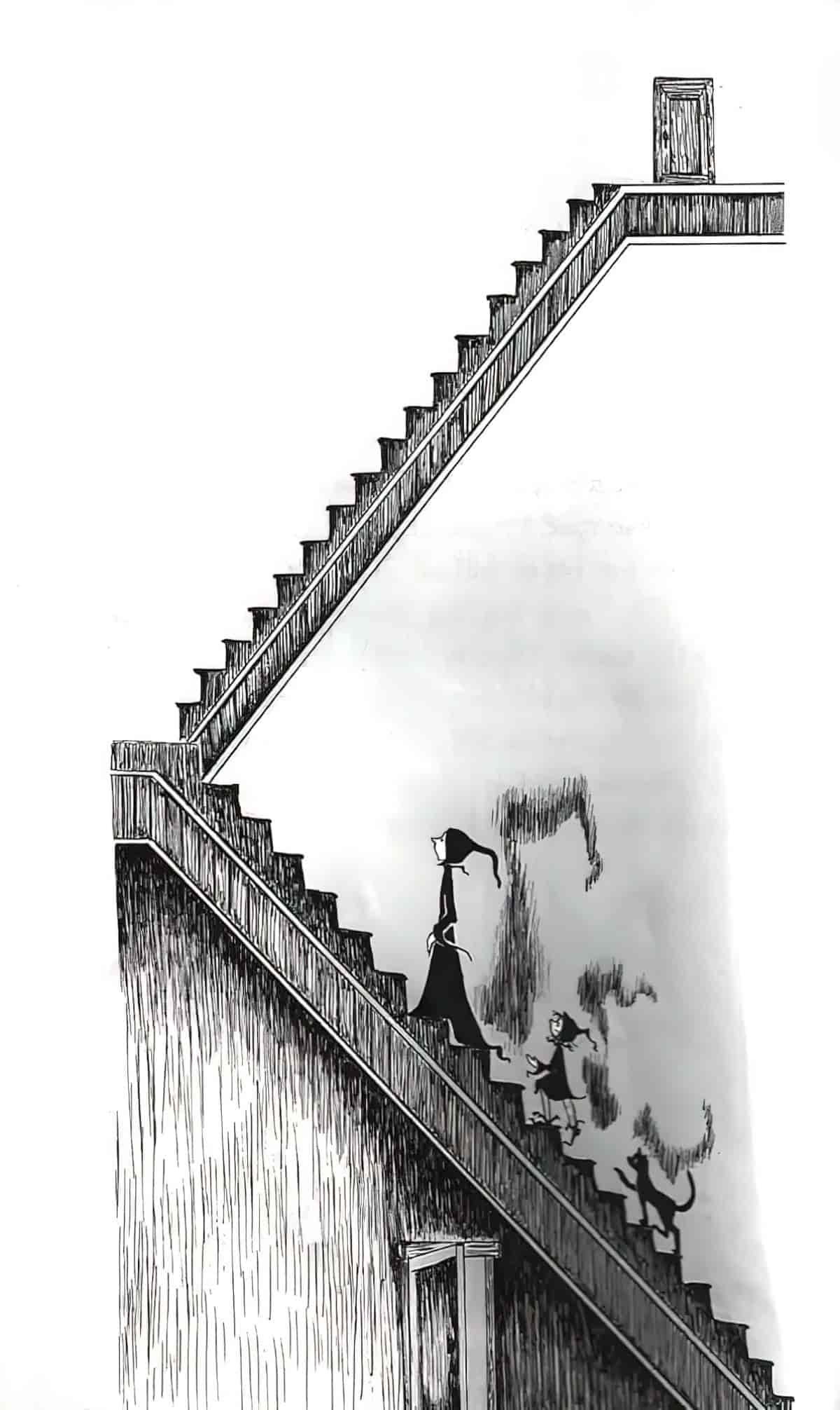
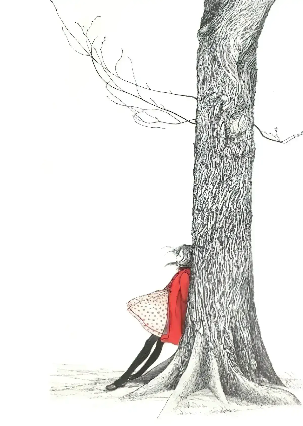
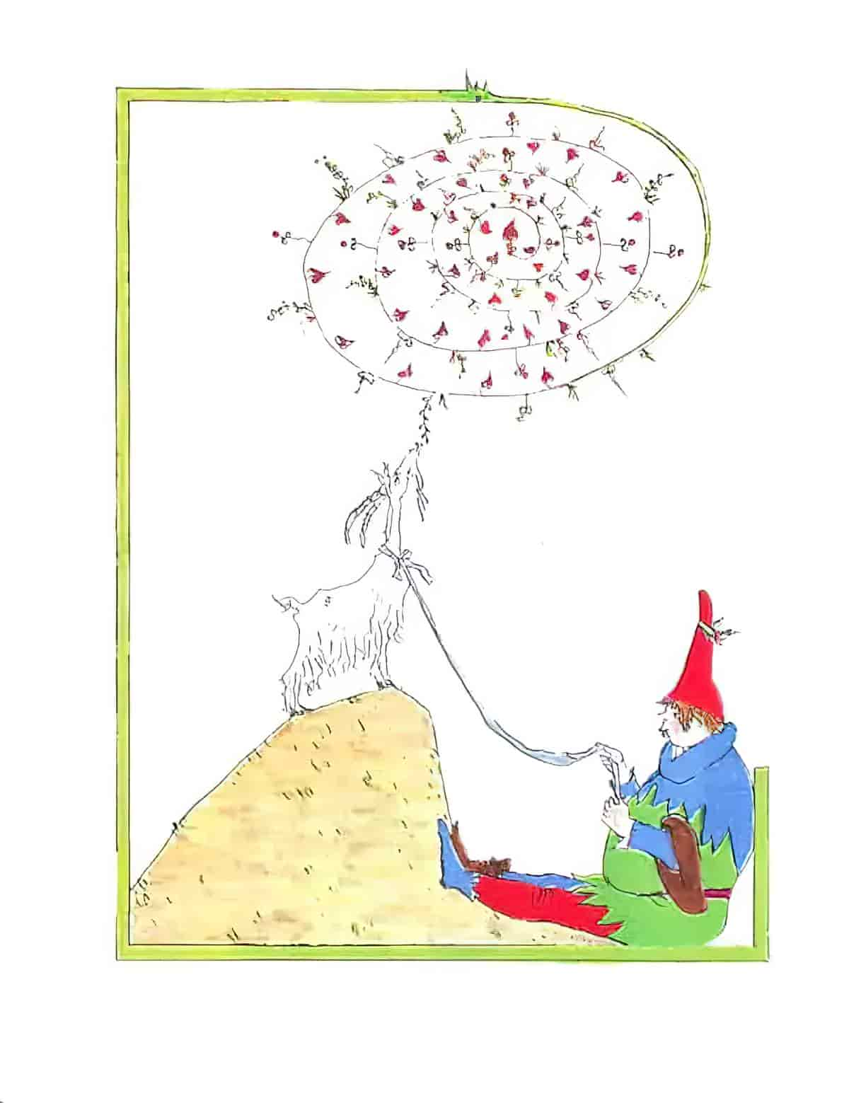
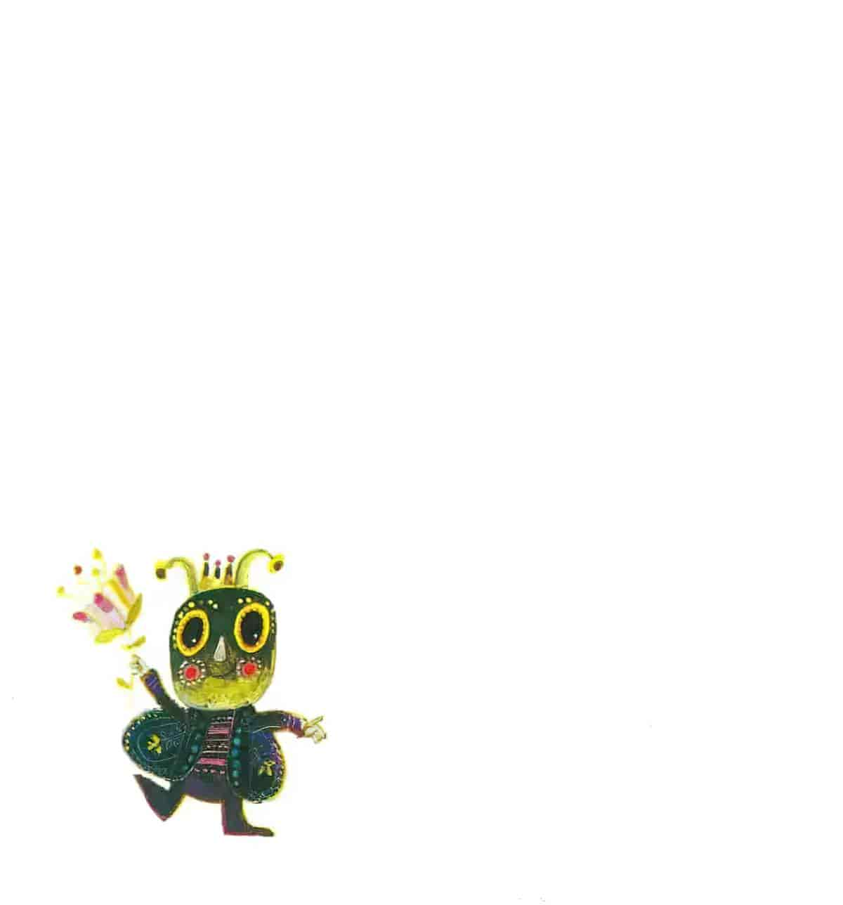
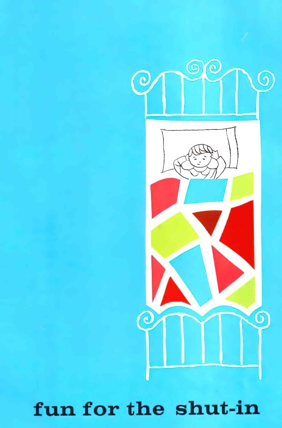
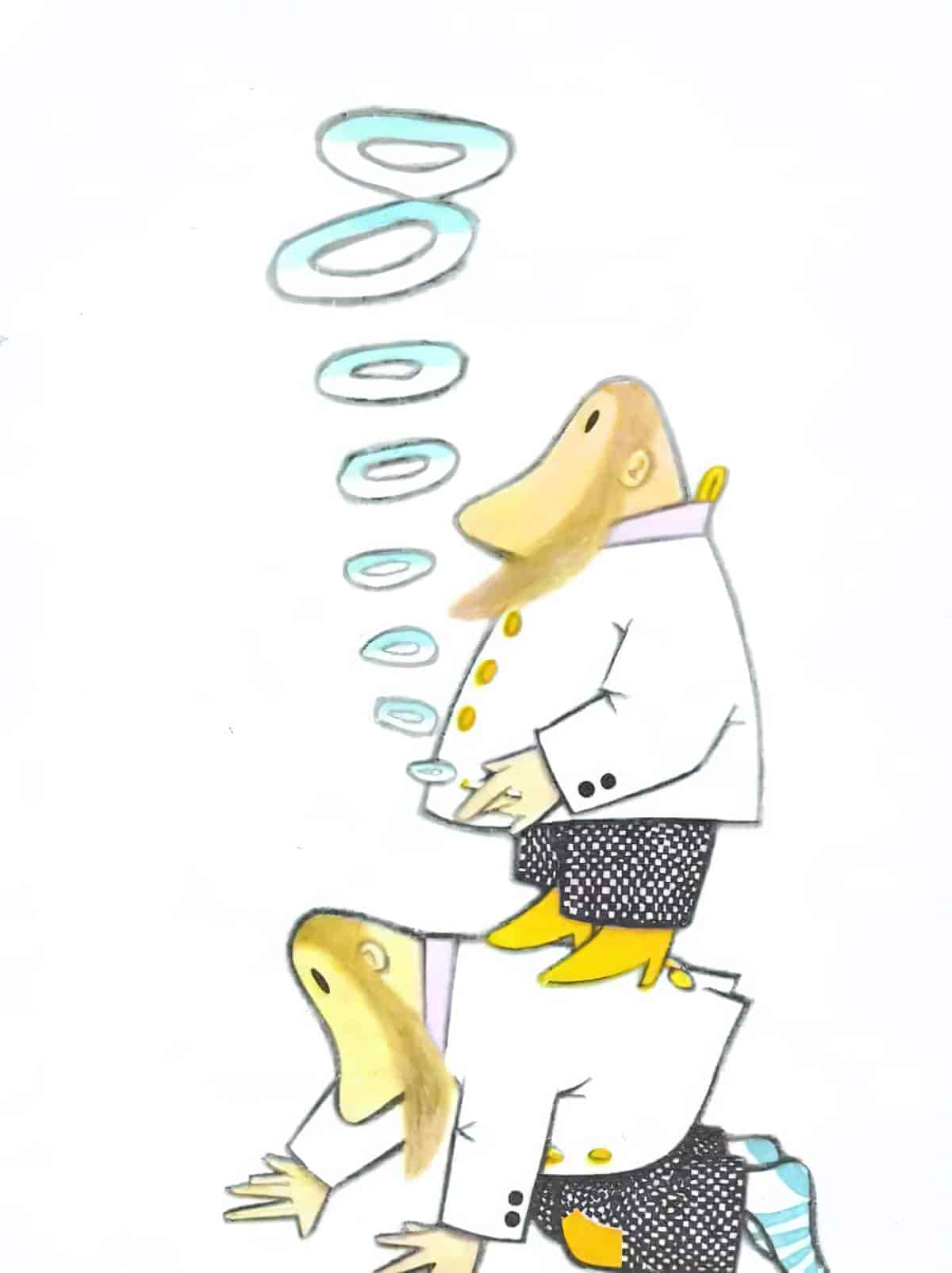
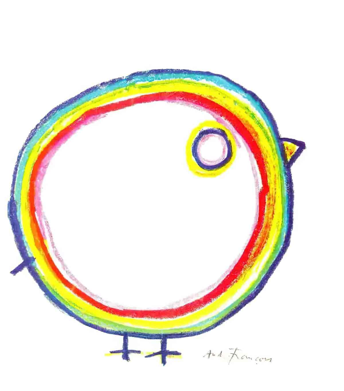
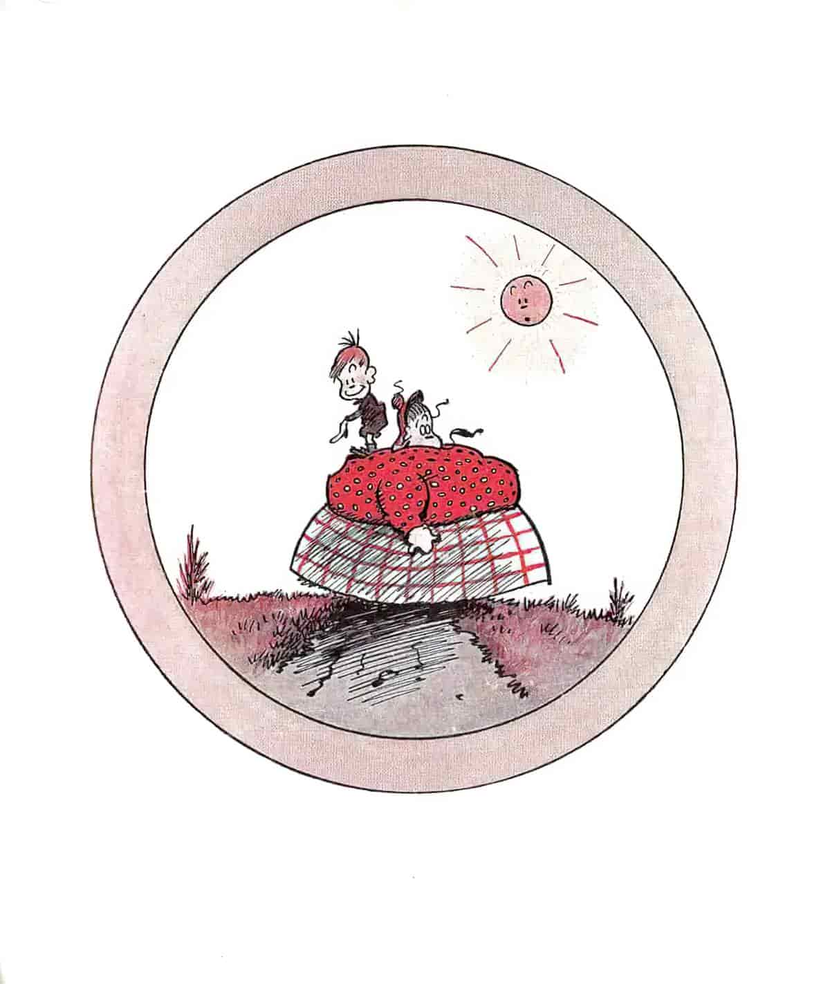
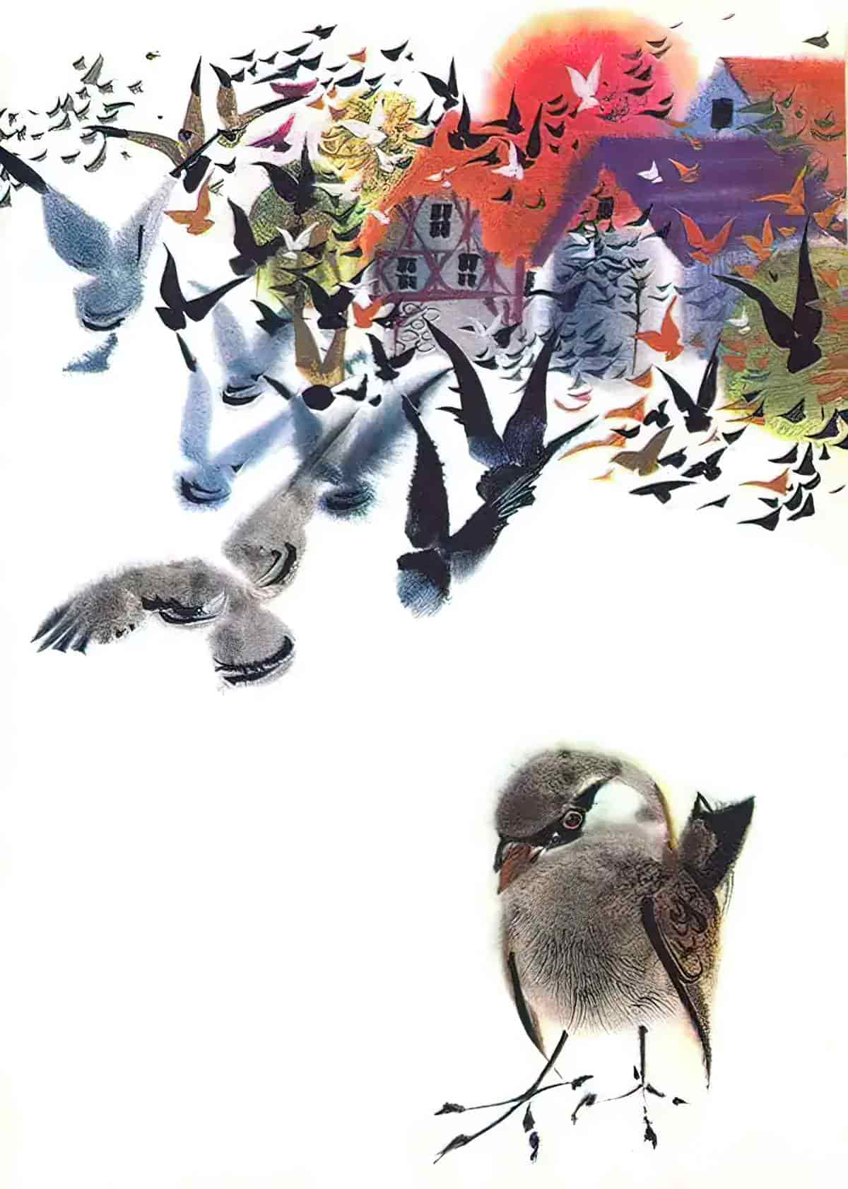
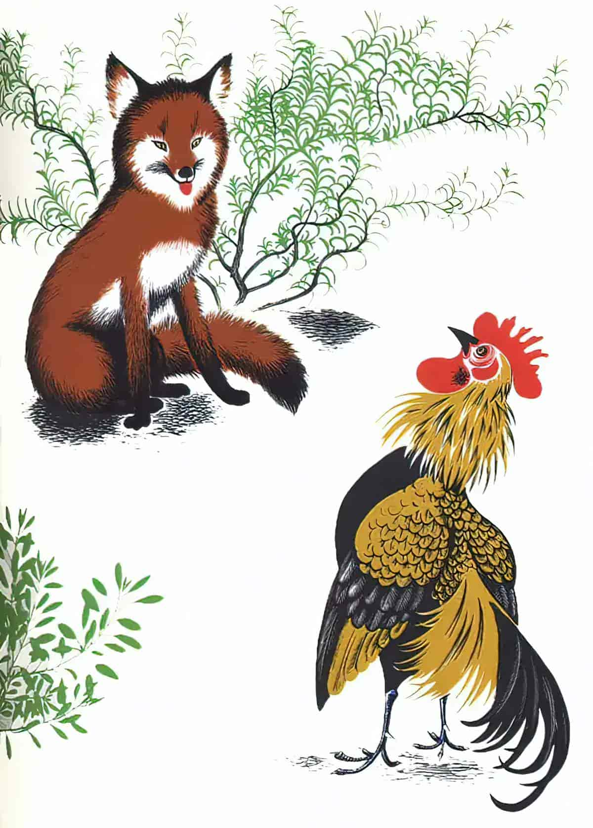
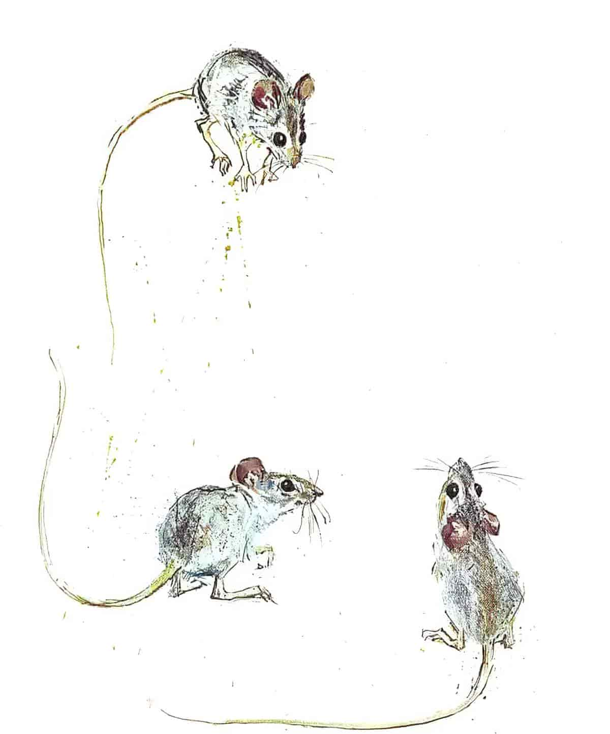
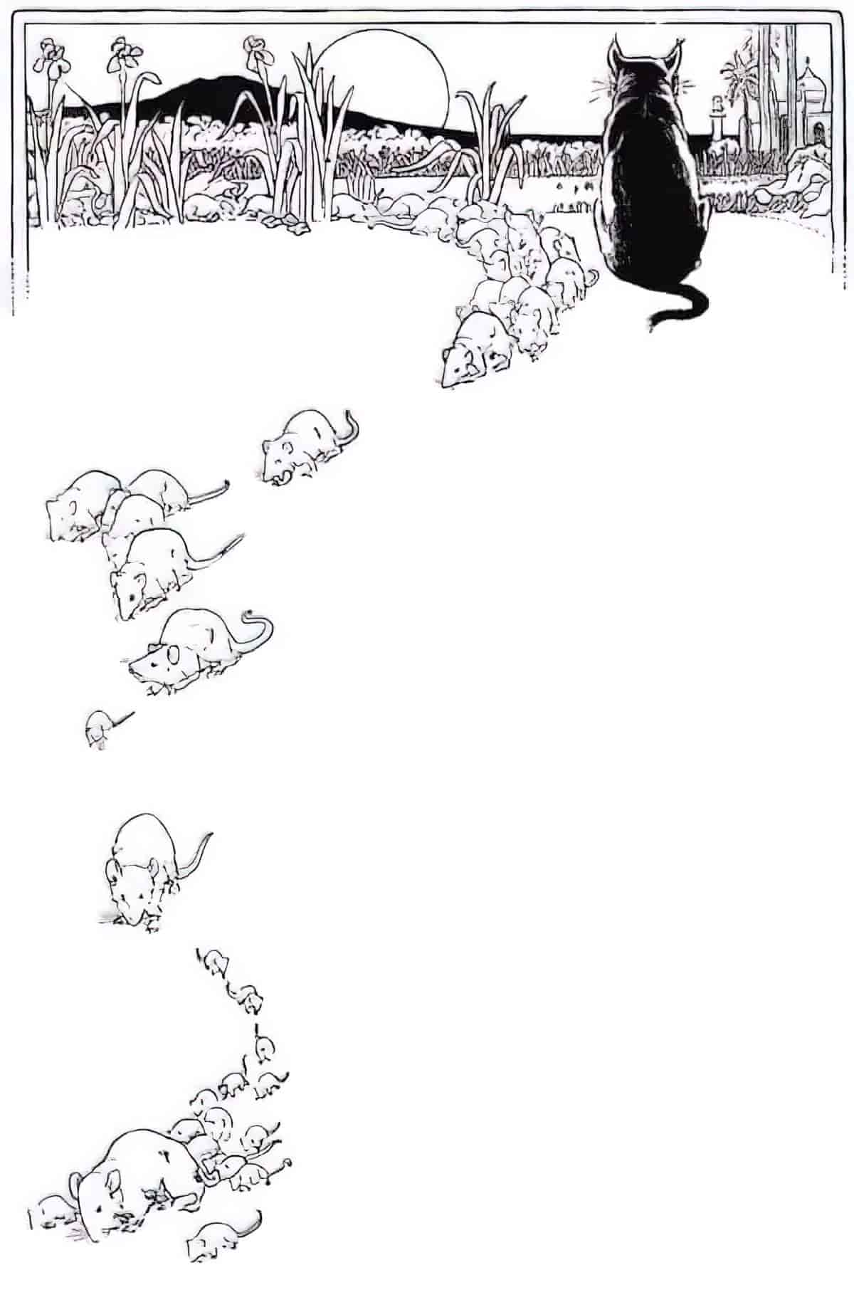
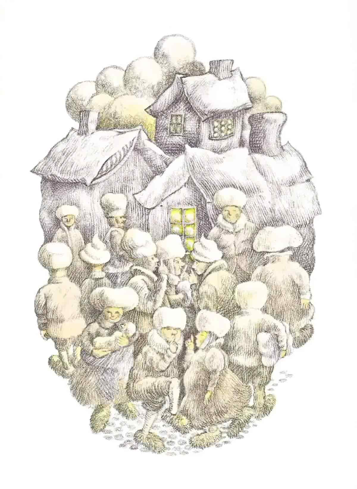
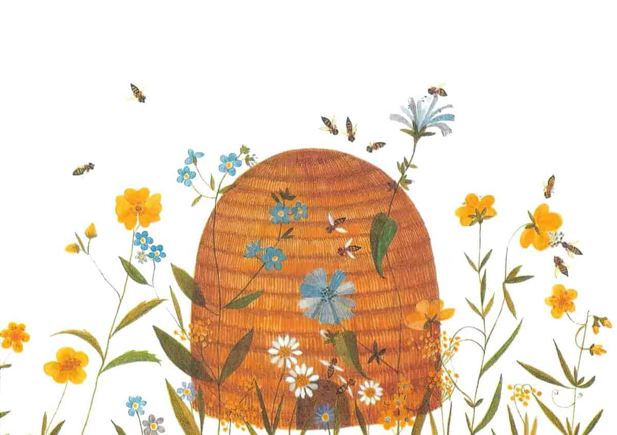
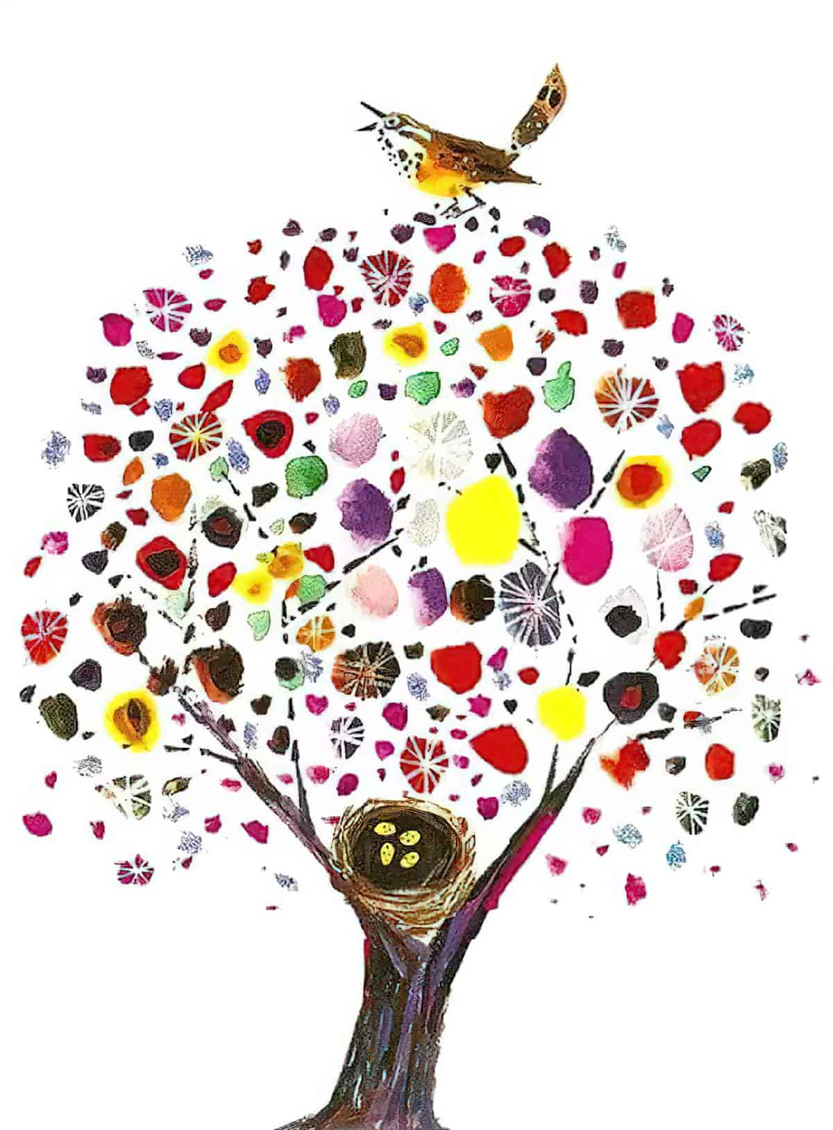
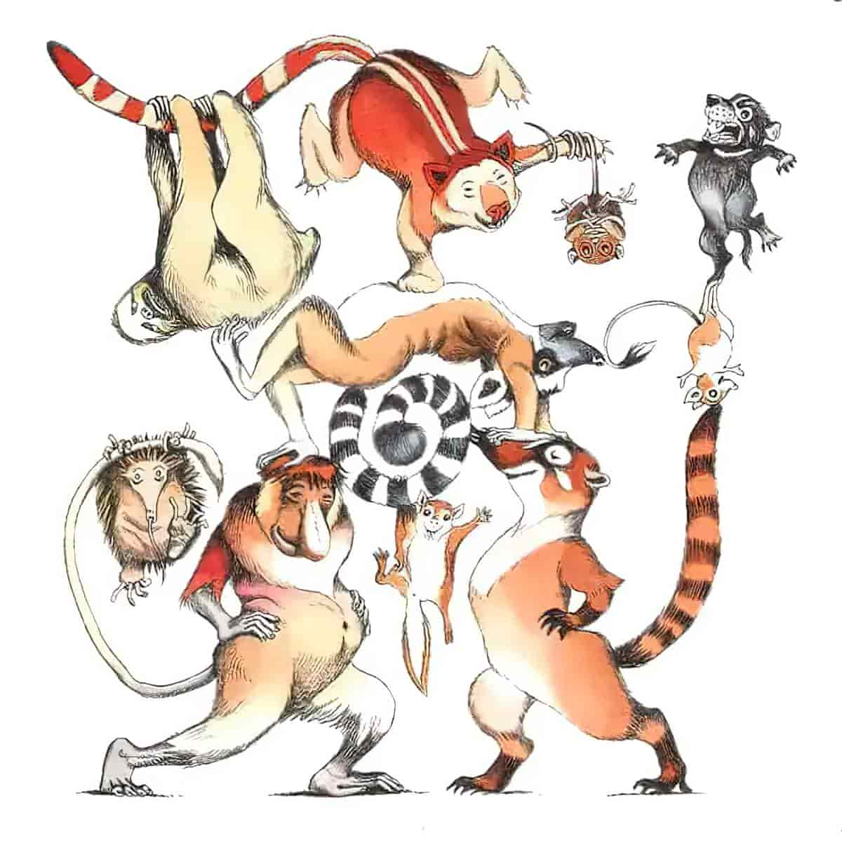
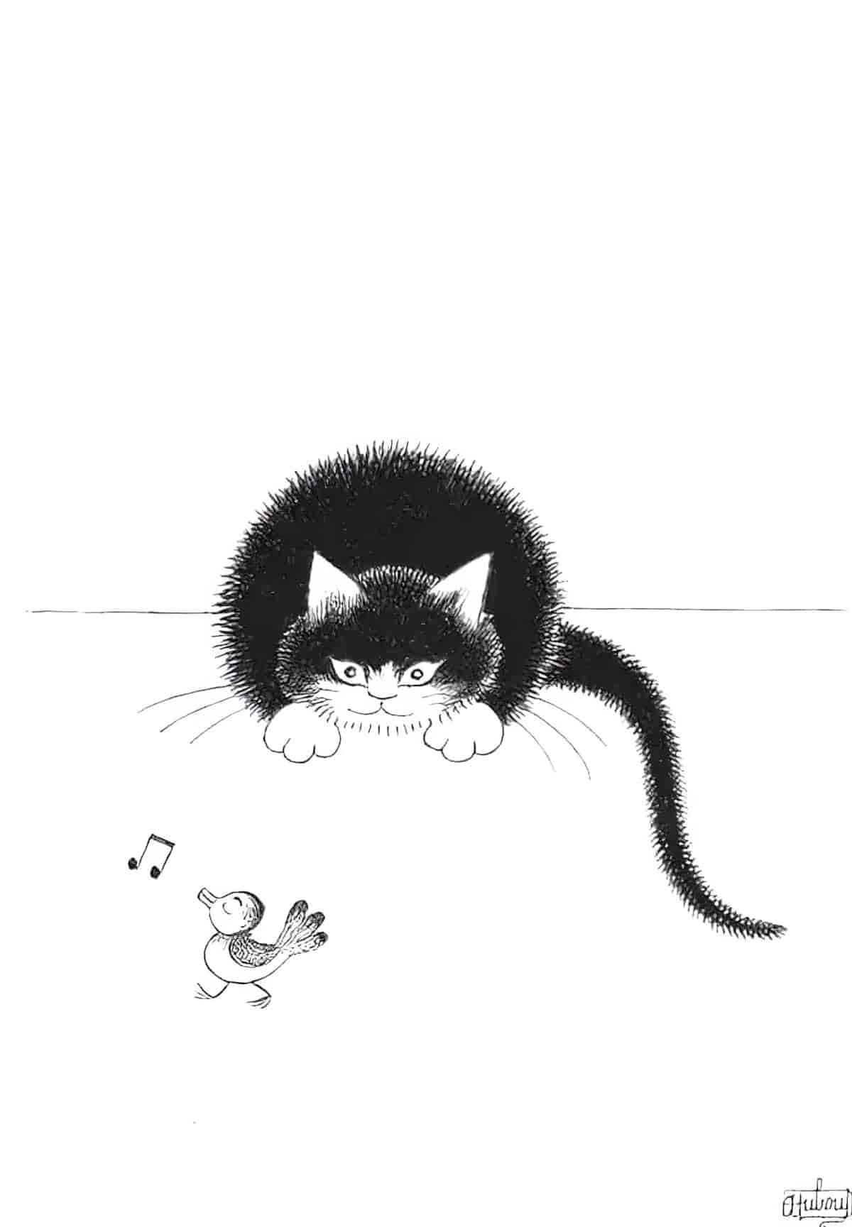
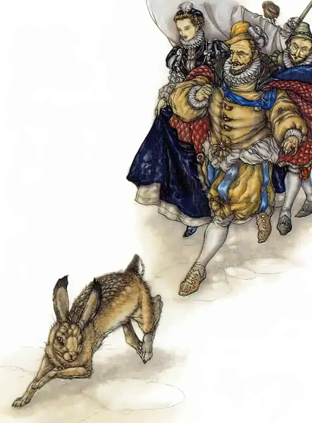
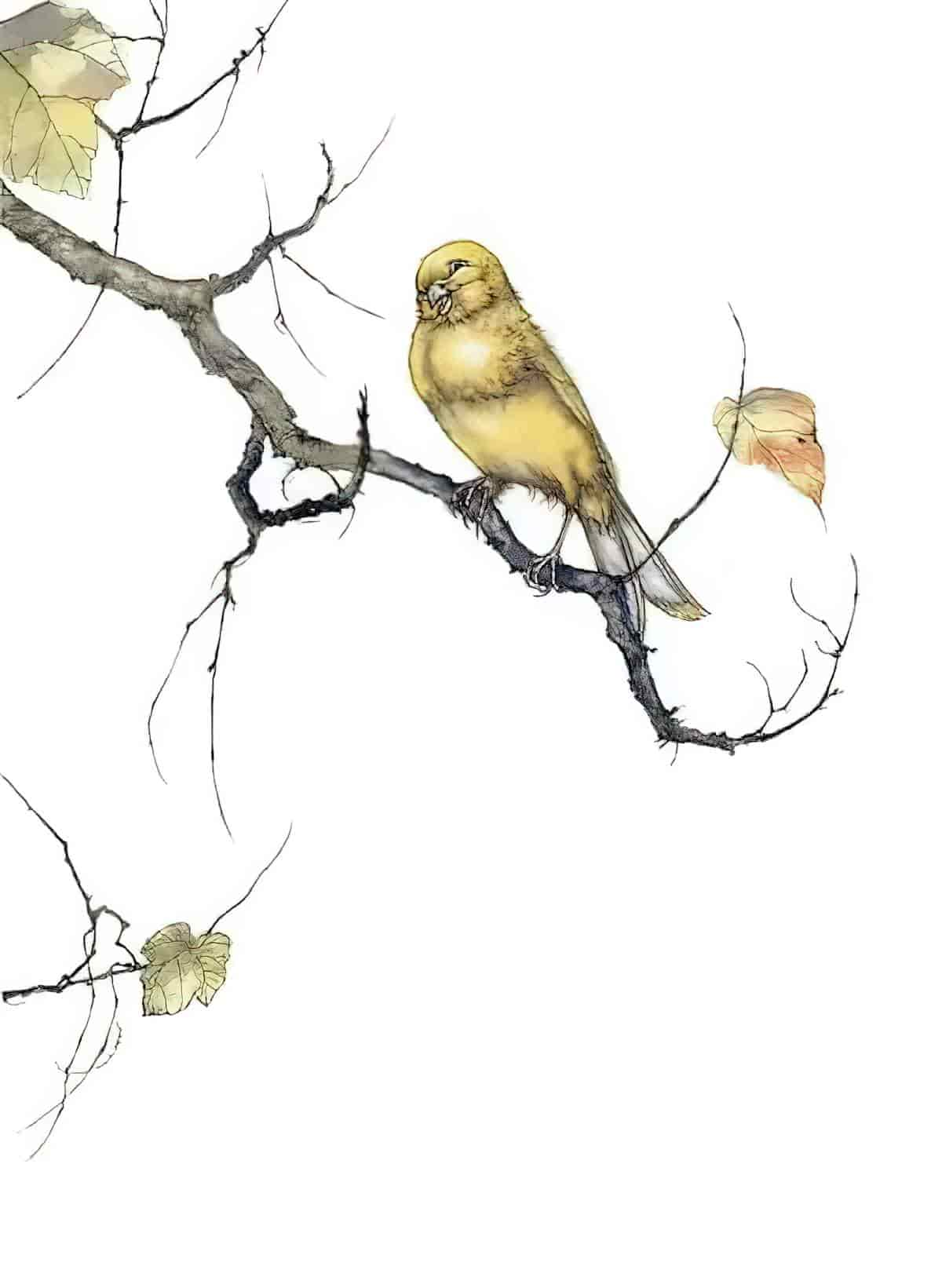
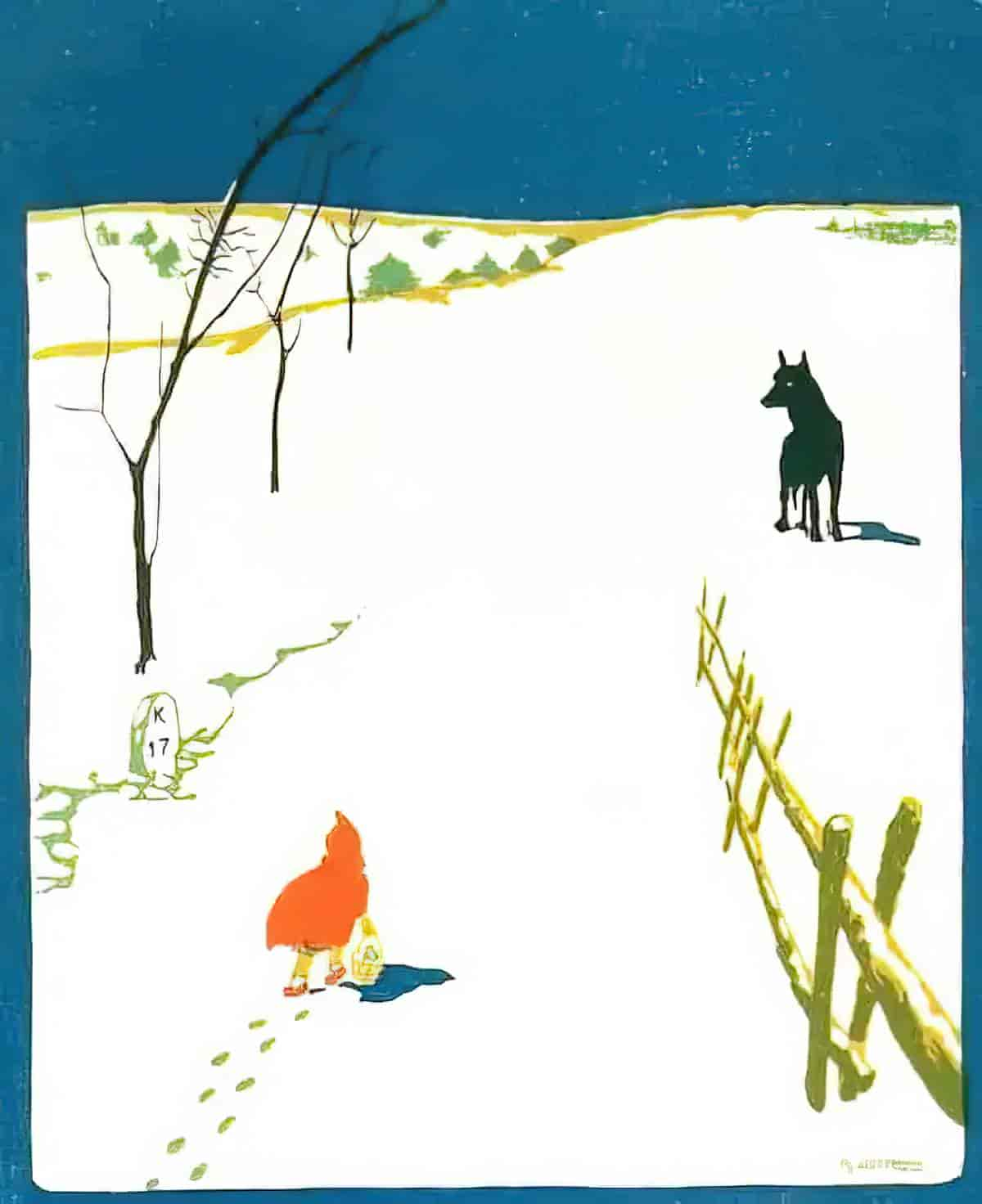
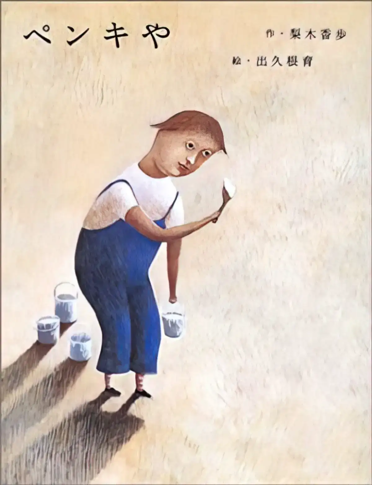
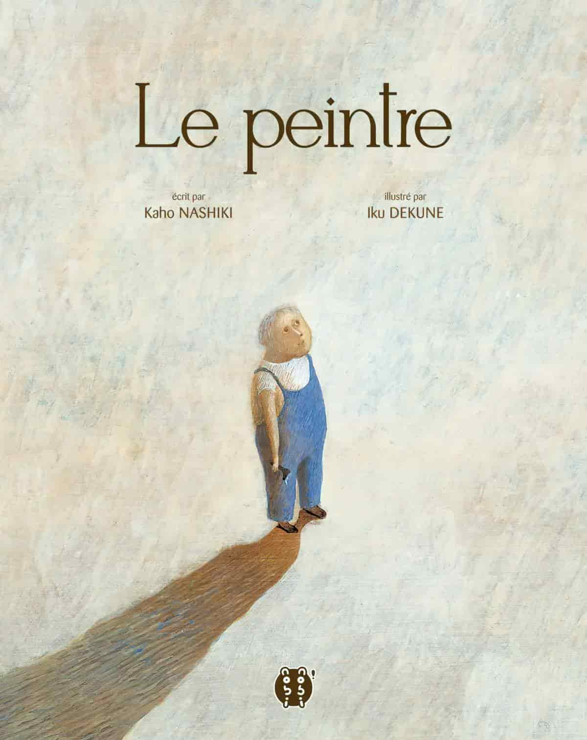
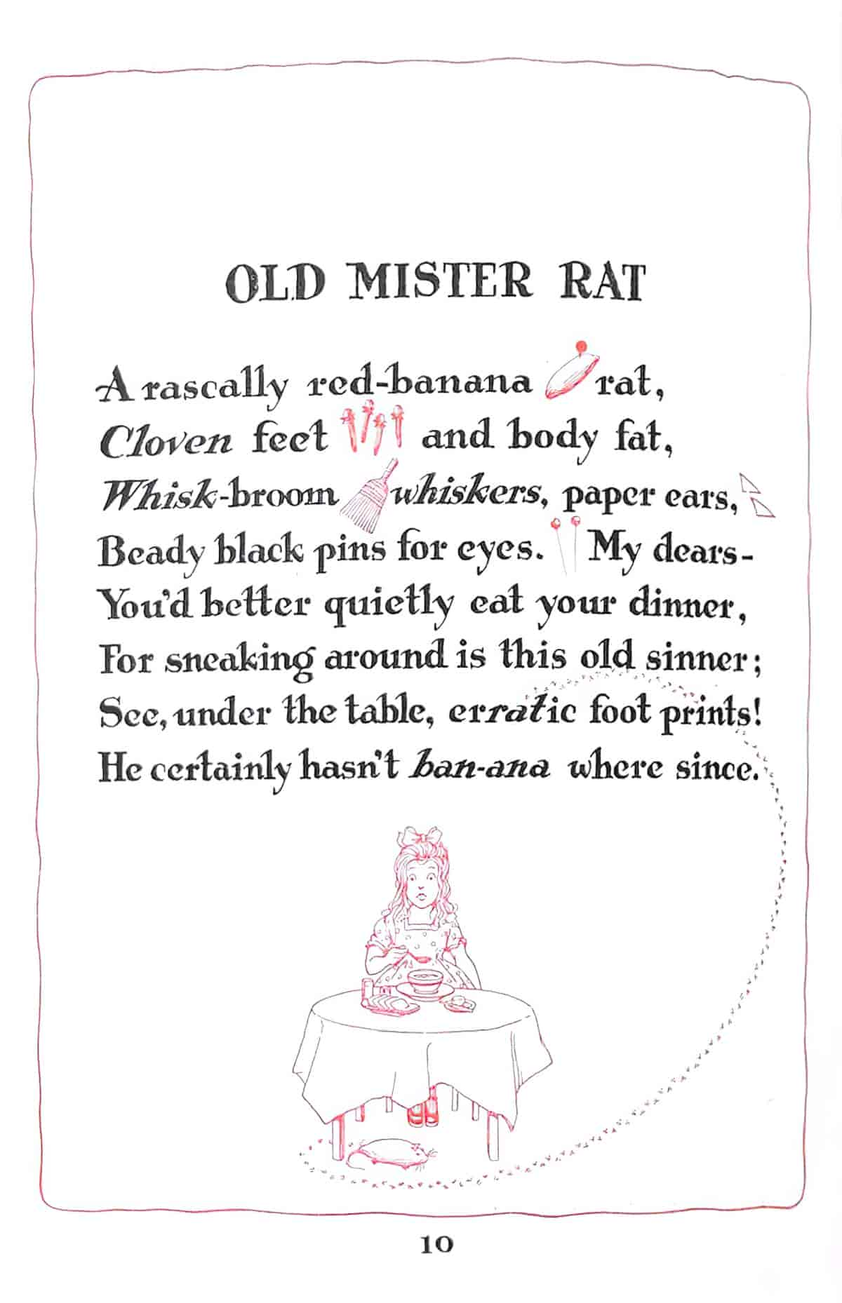
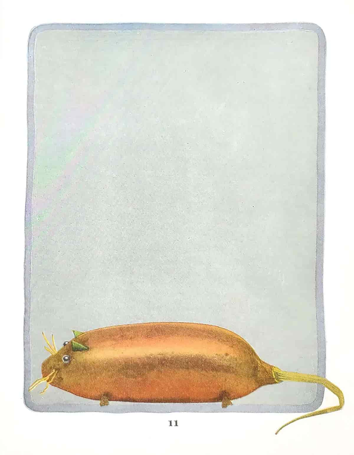
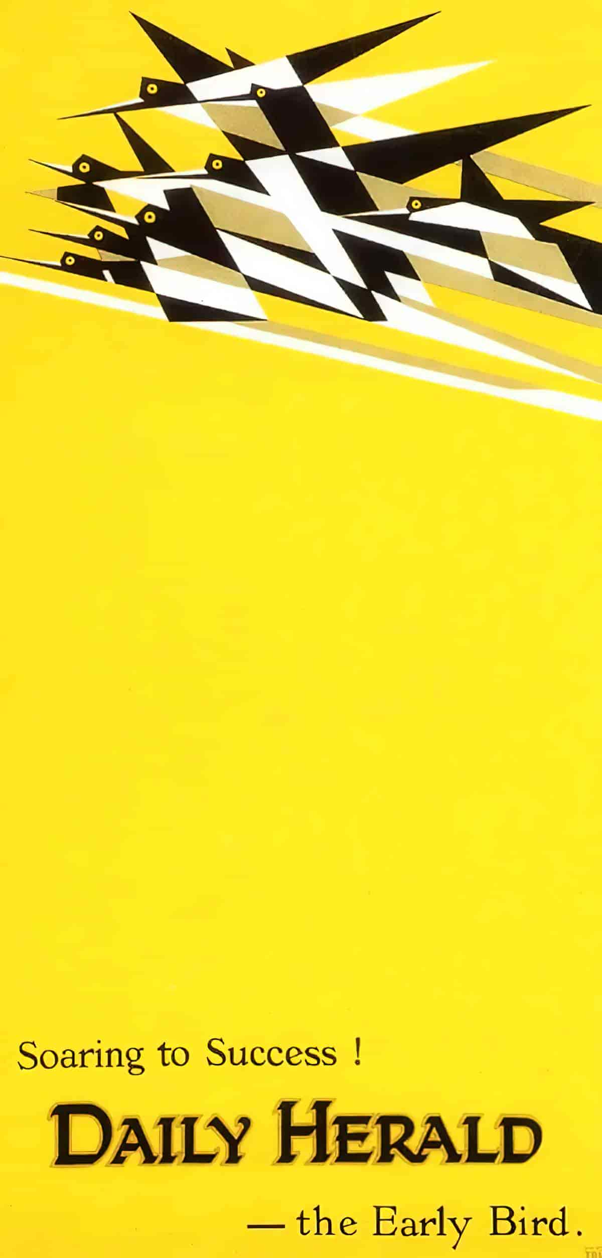
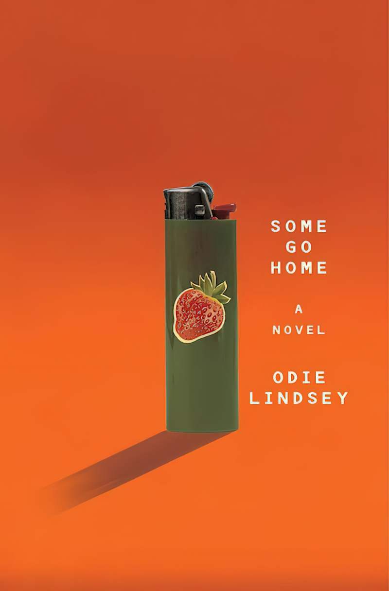
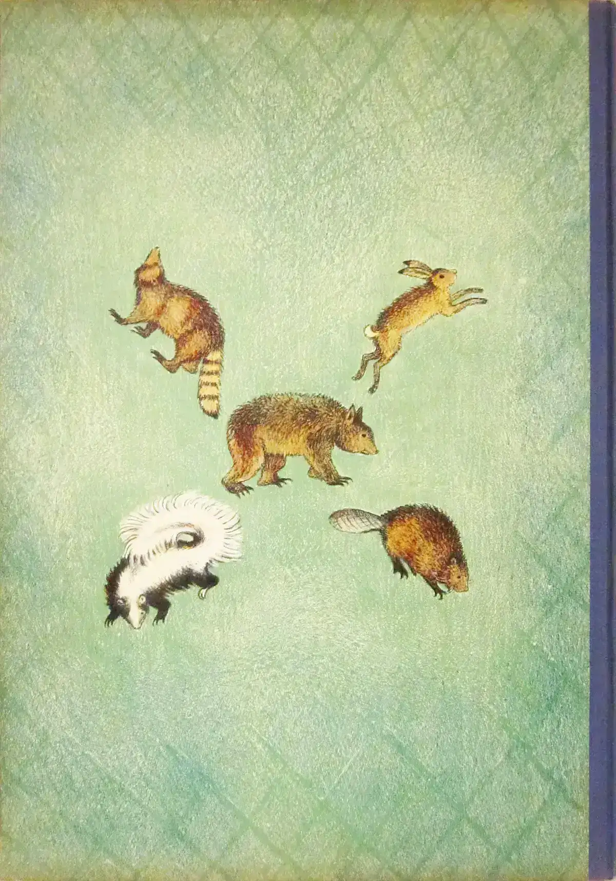
NEGATIVE SPACE ON ADULT BOOK COVERS
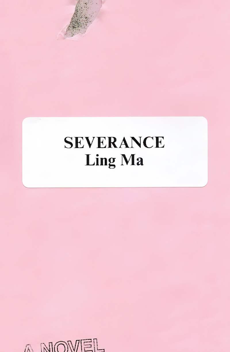
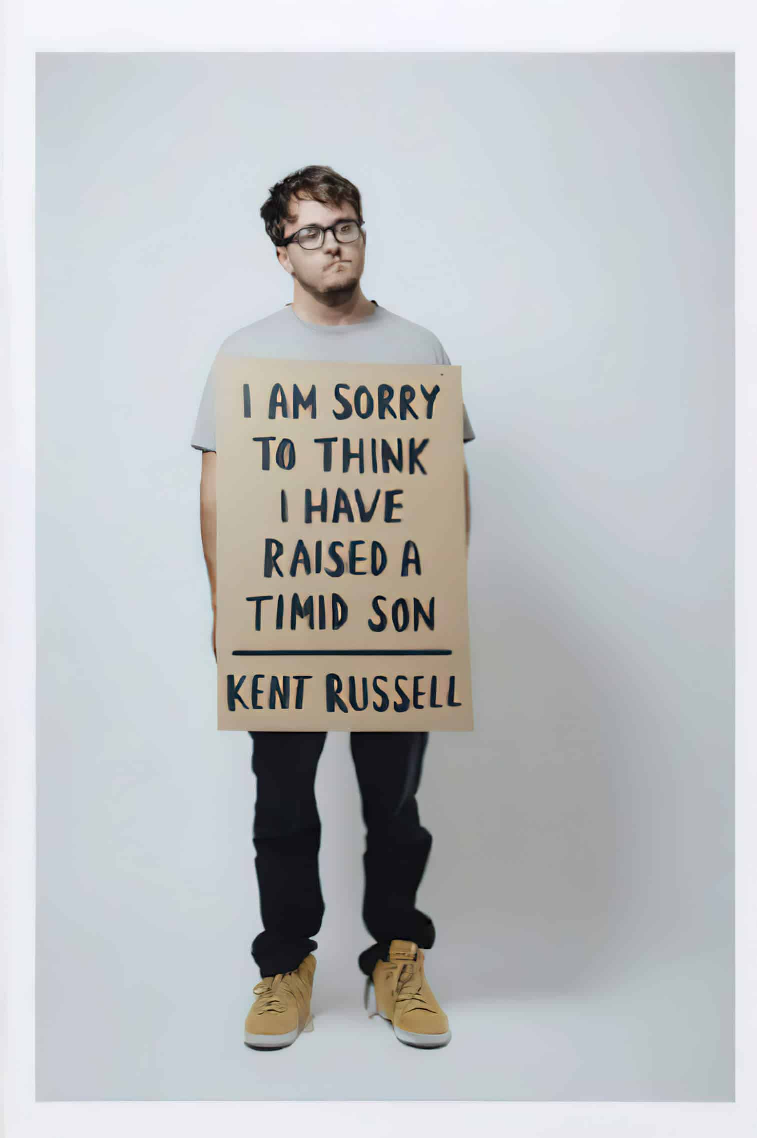
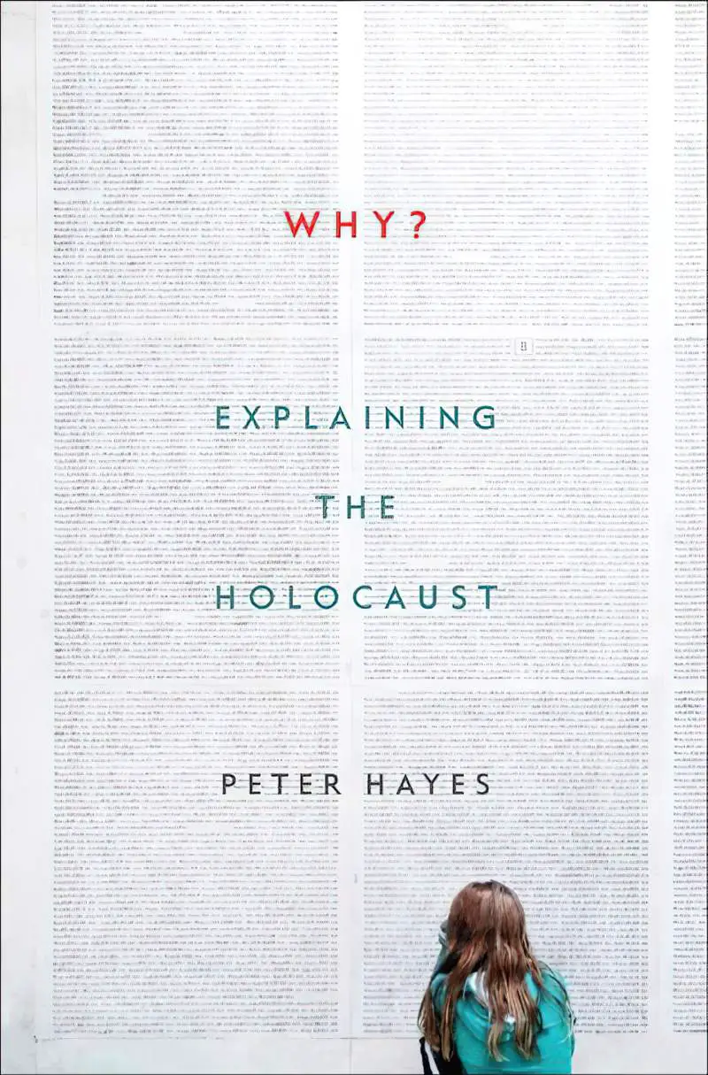
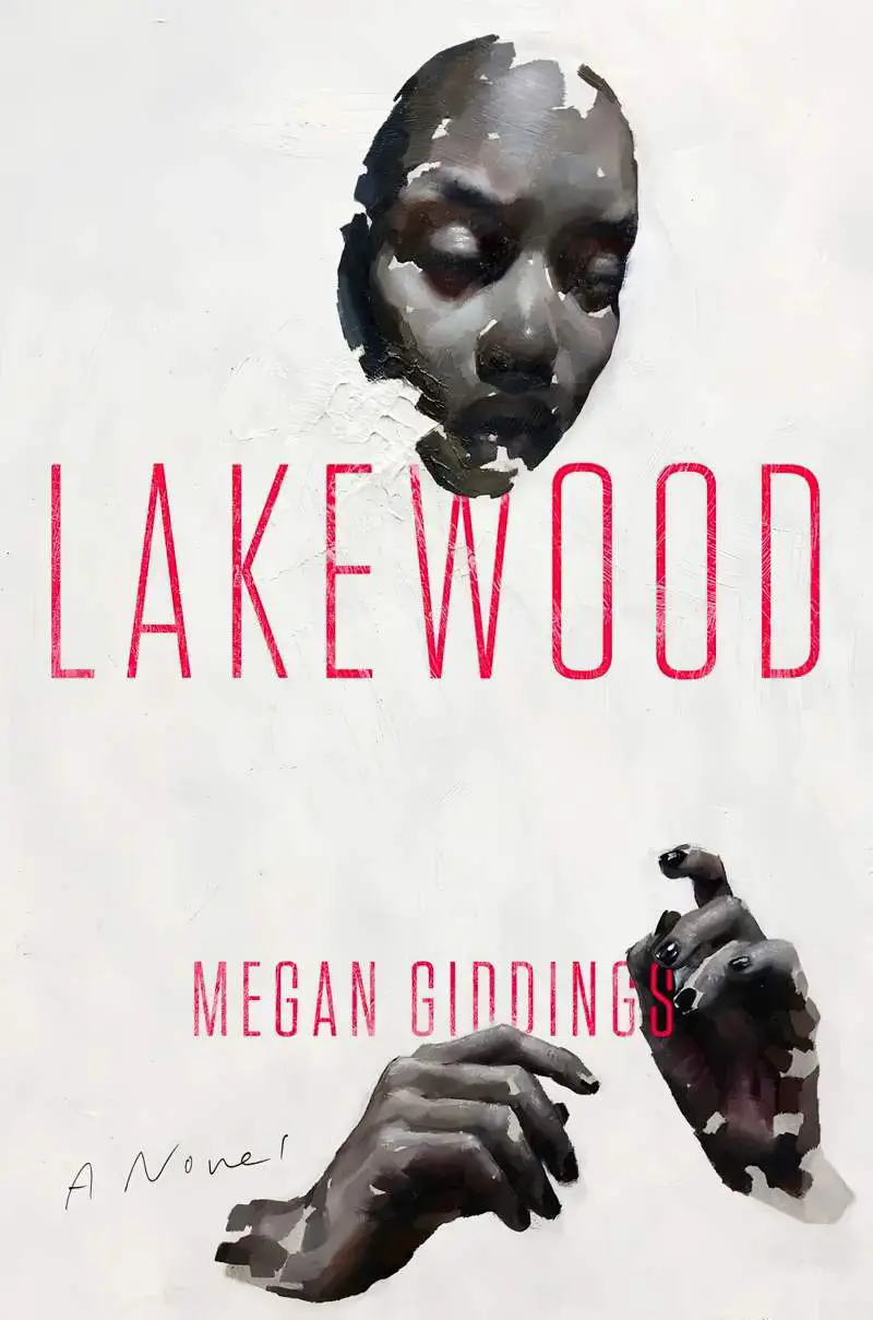
Interesting examples of negative space can sometimes be found on the back covers of hardbacks, under the dust jacket.
UNBOUND IMAGES
When an illustration extends right to the edge of the page it is called an ‘unbound’ image.
This is an unnecessary term when it comes to film, since almost all frames in a film extend to the edge of the border. Many picture books are composed entirely of unbound images. In these stories the imaginative world becomes the focus of the story throughout. If the illustrator is creating an otherworld or a work of magical realism or something that is not entirely familiar to readers (as are bathrooms/kitchens/bedrooms etc.) then you’ll likely find mostly or entirely unbound images.
It’s also possible to have both unbound and decontextualised images i.e. unbound images can still have a heap of white space. I Went Walking is made entirely of this kind of image.
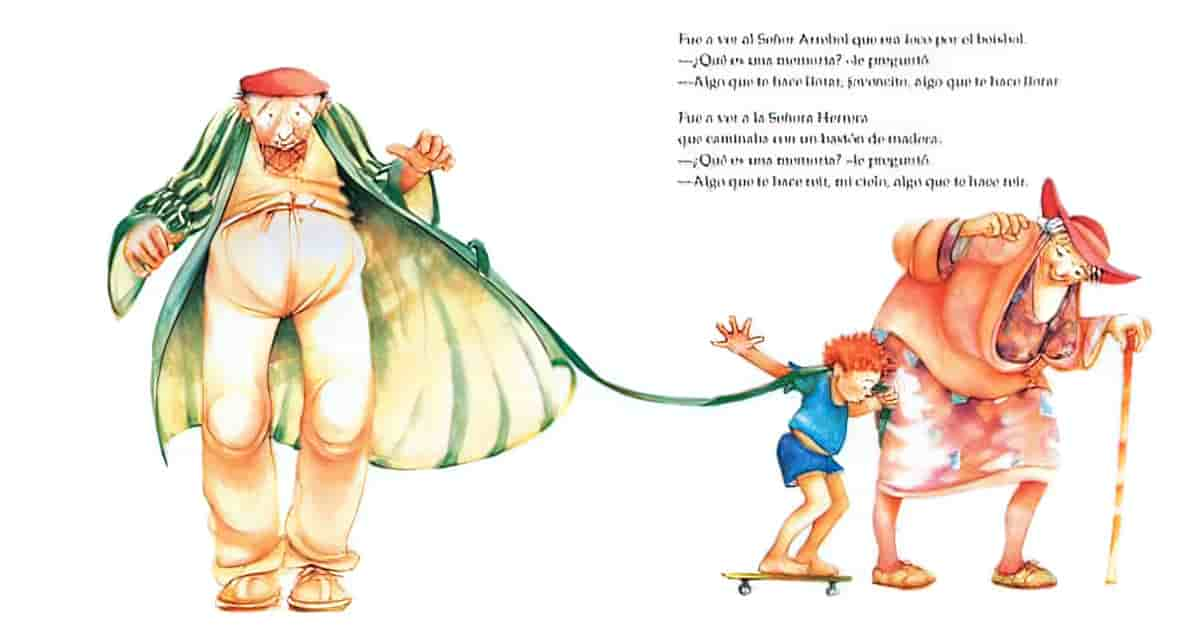
But in a large number of picture books you’ll find a mixture of bound and unbound images. When to make use of which?
Reasons to use unbound images:
- The reader is invited into the setting at selected moments
- The effect is greater when preceded by a sequence of bound images
- The removal of edges brings the reader into a room/forest/scene
BOUND IMAGES
Bound images are those which are set within a page margin or border, demarcate the setting as more distinctly separated from the reader’s world than unbound ones and may also serve to ‘contain’ or confine the character. In general, bound images separate the reader from the semiotic world of the story. Where there is both a frame and a margin, there’s a more emphatic demarcation of the two. Frames contribute to the ambience of a layout. A defined frame marks out the image as a representation to be viewed from the outside but can also afford additional meaning. A frame can either influence the attitude of the reader, or confer a symbolic attribute upon the character(s).
How to bind an image:
- Coloured ‘white space’. If the background image is anything other than white (the default) this binding colour is making some sort of statement. The ambience changes. (See Lucy’s Bay, Hyram and B, Wolves In The Walls.)
- The frame doesn’t need to surround the entire picture — it might just be on one side. This binds the picture less.
- A part of the illustration might extend out into the frame, for example a character might sit inside the framing block of colour thinking, to show that the main image on the page is part of a flashback.
- The frame might be part of the picture itself, e.g. in Voices in the Park the playground the children swing from itself forms a frame. This is called ‘an experiential frame’, and the frame serves as a symbolic attribute. The playground as frame shows that the young characters are playful.
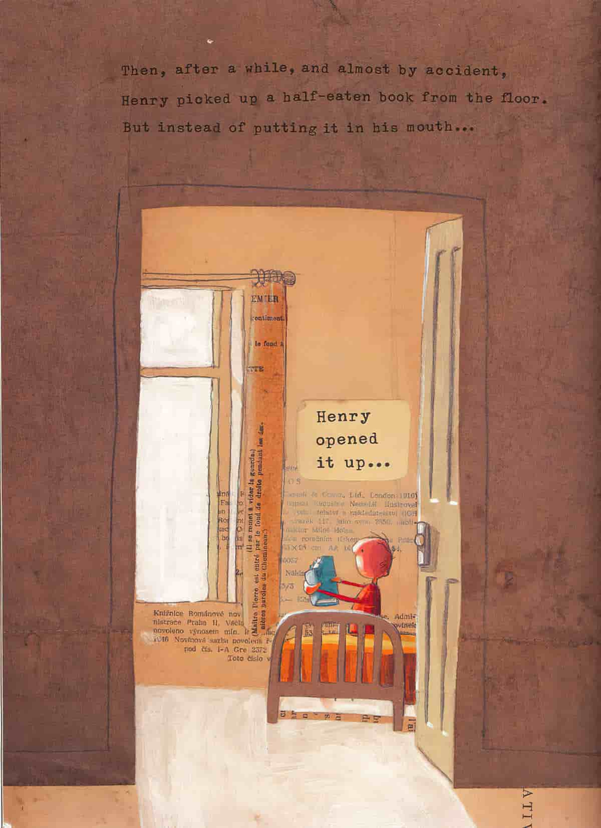
- Illustrators might use an actual frame from the world of the story (e.g. a window frame, door frame or picture frame etc.)
COMPOSITIONAL INFLUENCERS
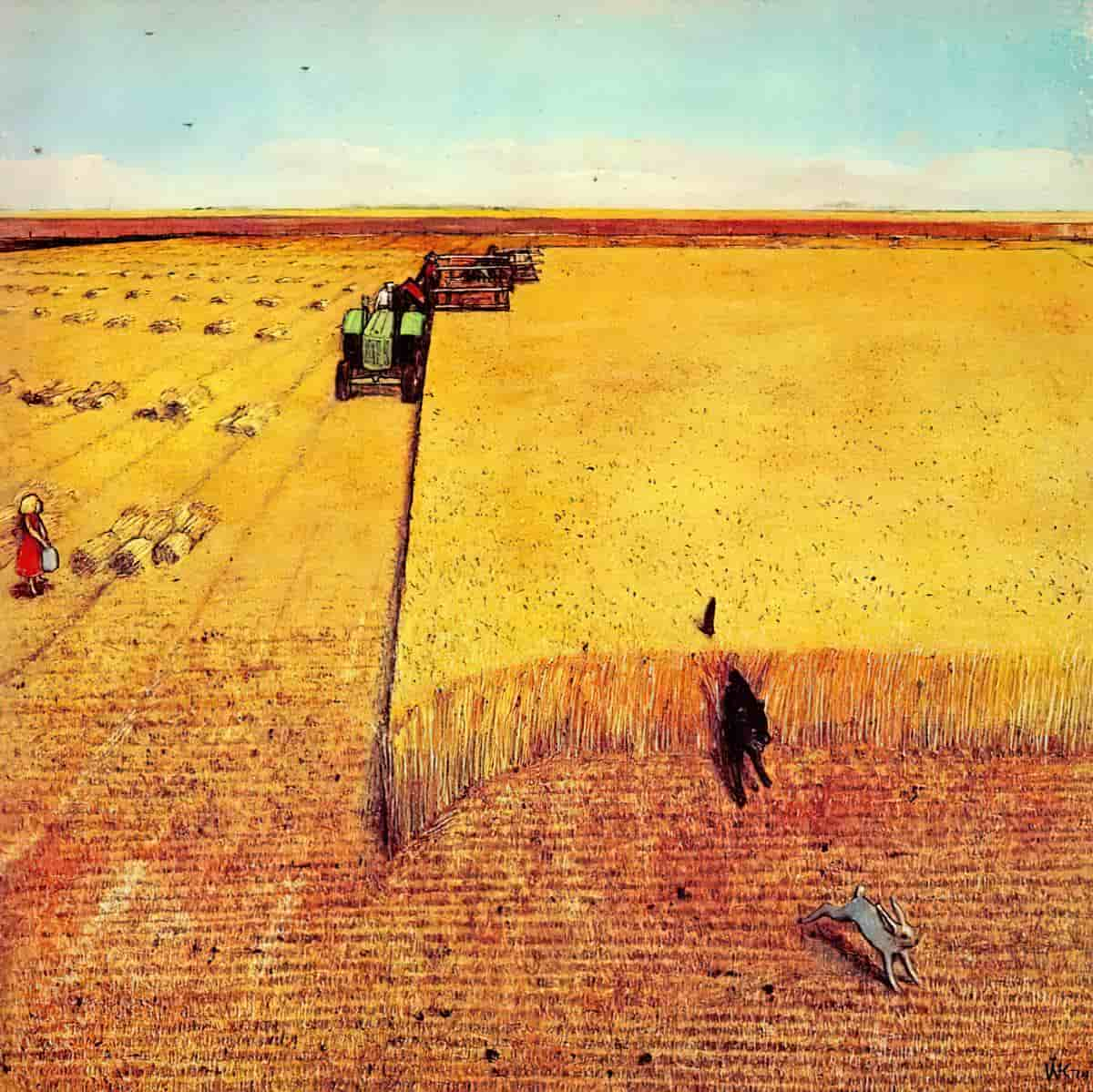
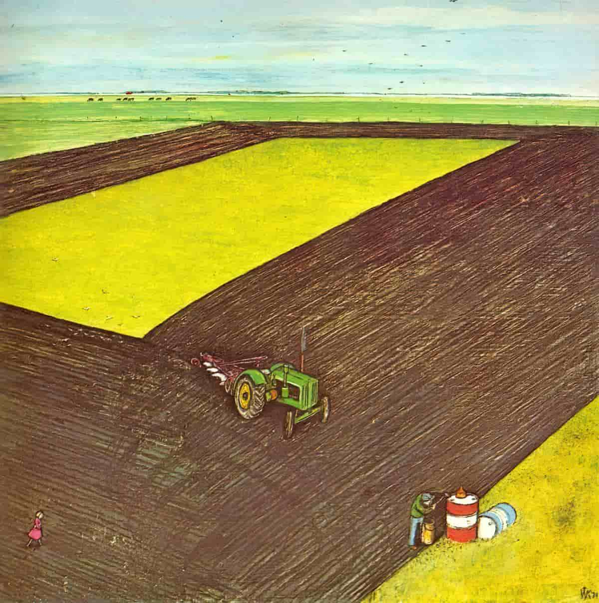
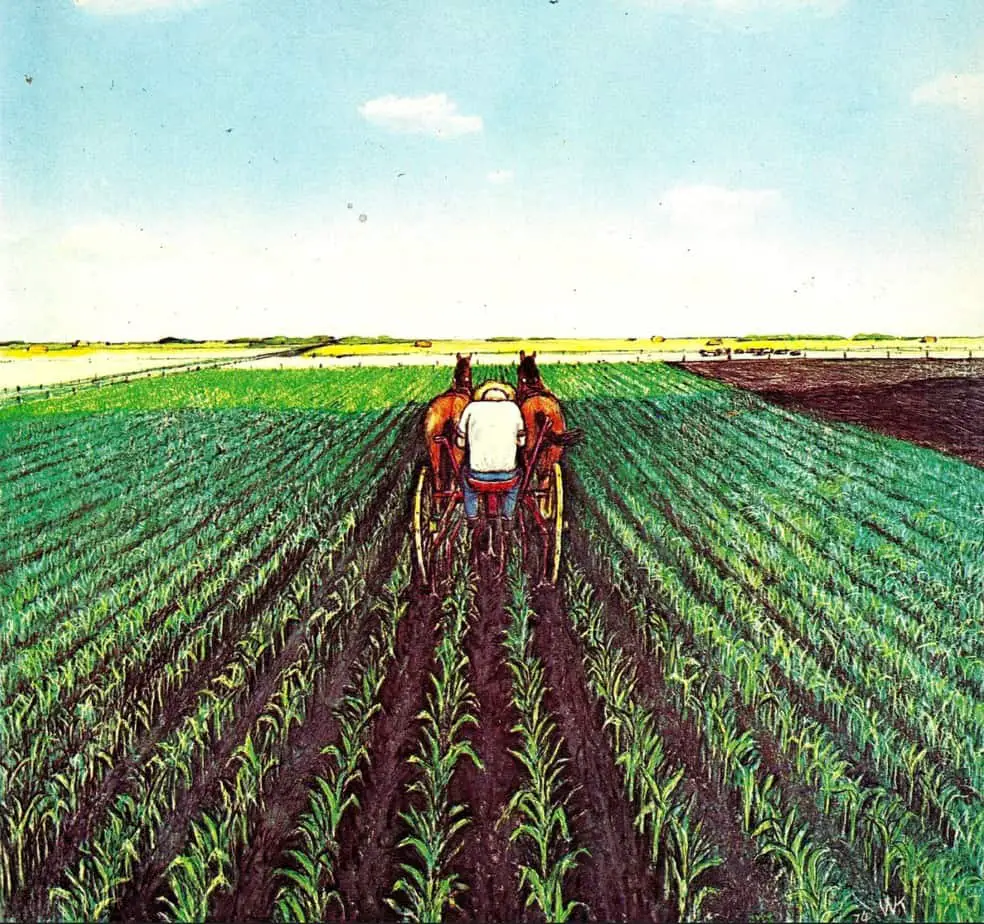
Mastering geometry helps to direct the reader’s eye.
Geometry
- Rule of thirds
- Dividing the image into rectangles, or perhaps circles, arches and triangles
- etc
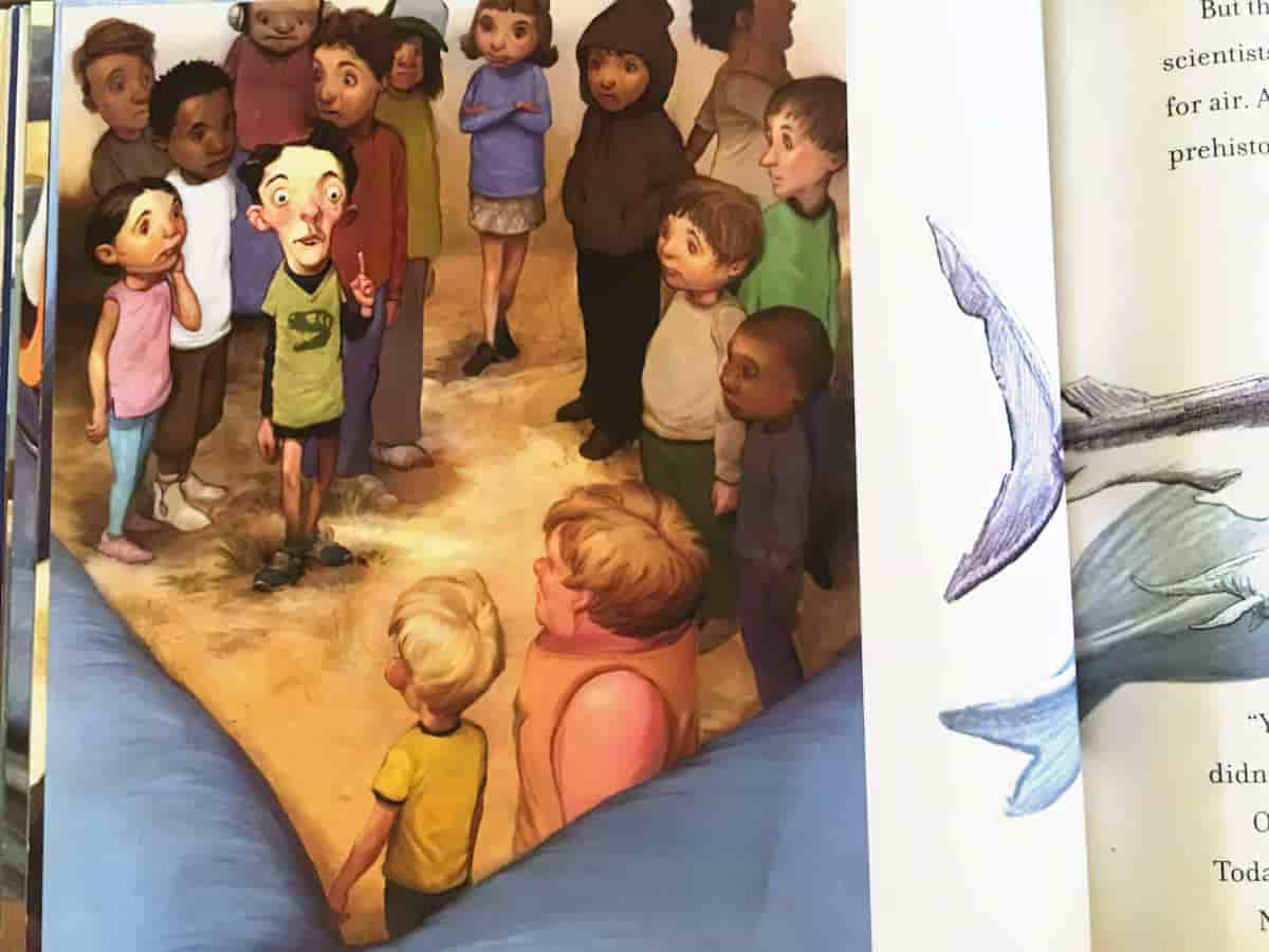
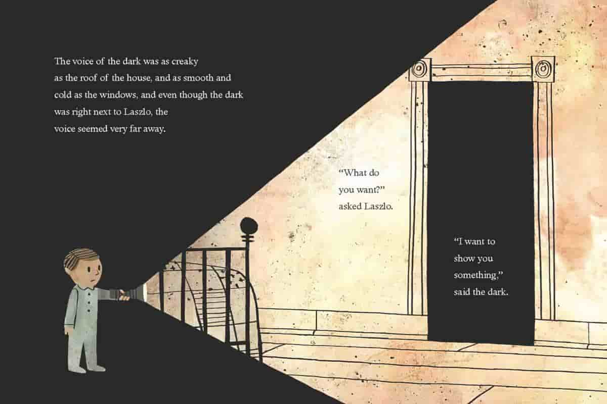
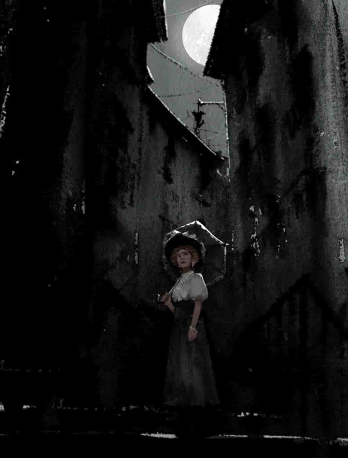
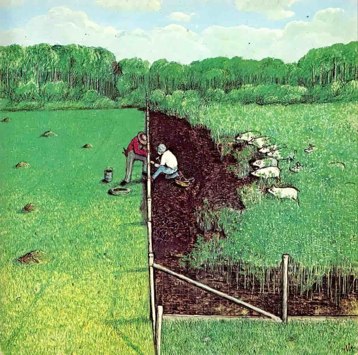
Framing
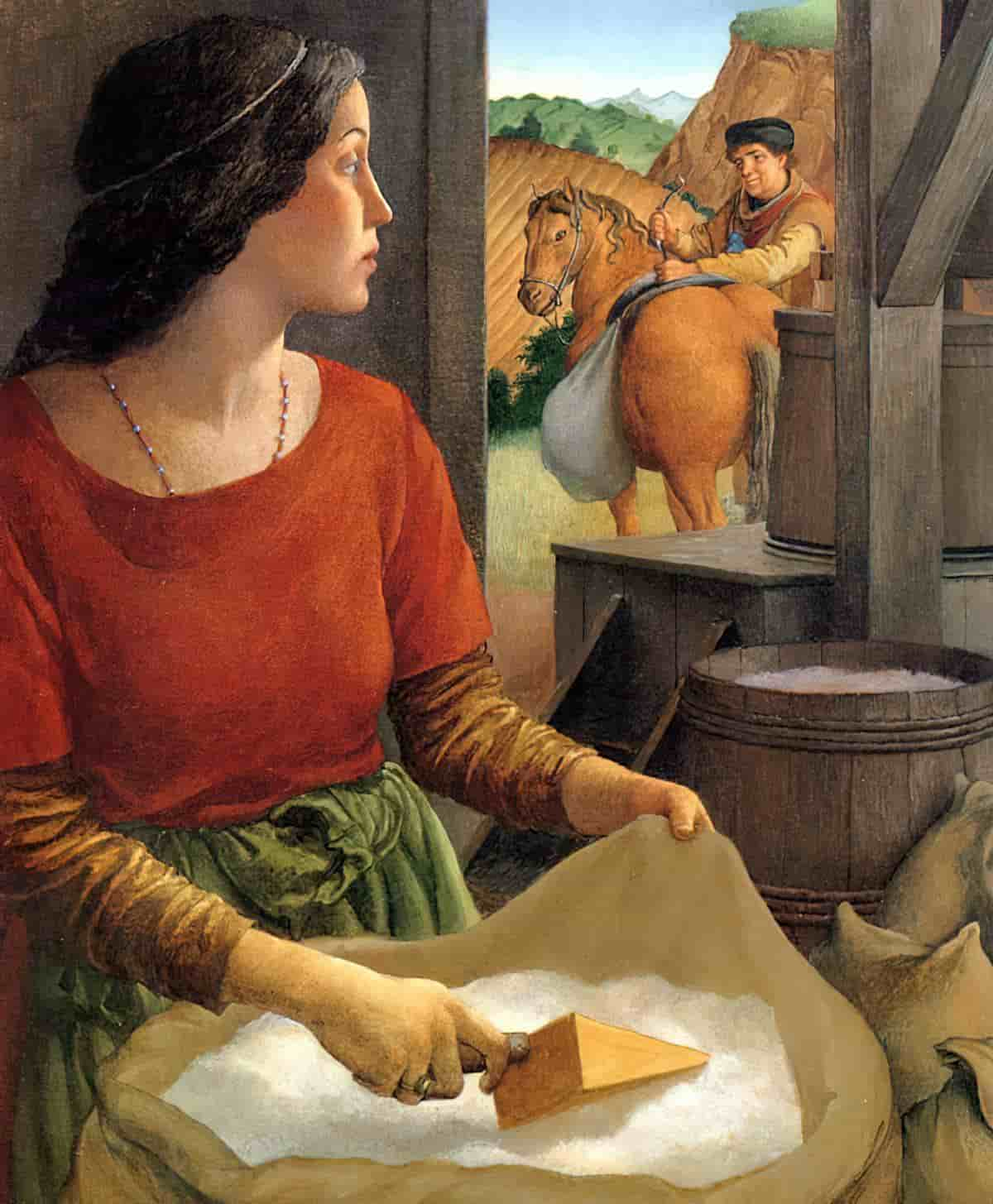
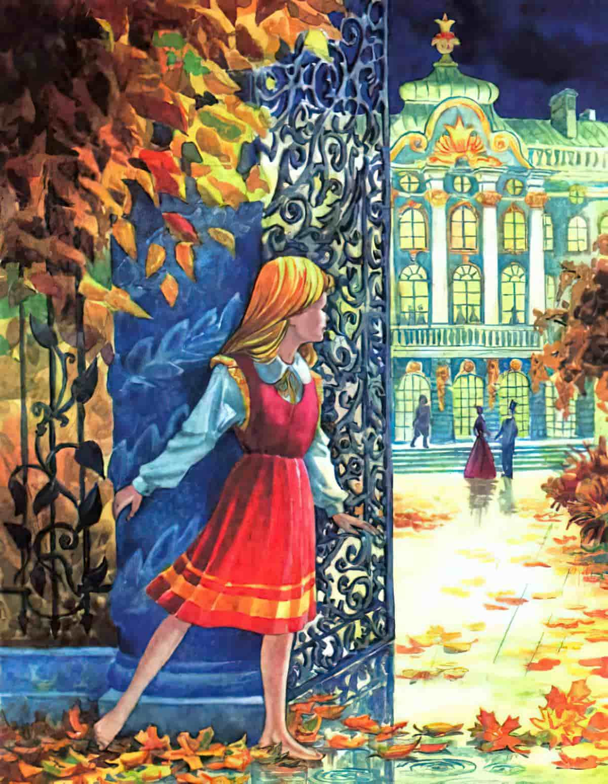
Human beings are prone to find order where there may be none, and frames in cinema work to help the elements to appear in a much more uniformed manner. They tend to dilute the external details in an image, and our eyes are drawn to them because within the frame lies order, and hopefully, our main subject. But through this technique emerges deeper implications. These frames are often used as a partition to separate. The subtext: Why not use the frame to separate the worlds on both sides of the frame. It can show a contrast as simple as freedom versus isolation, or by showing a character’s passing through a frame, we see their decision to pursue a lifestyle, contrasted to those lifestyles that other characters are denied entry to.
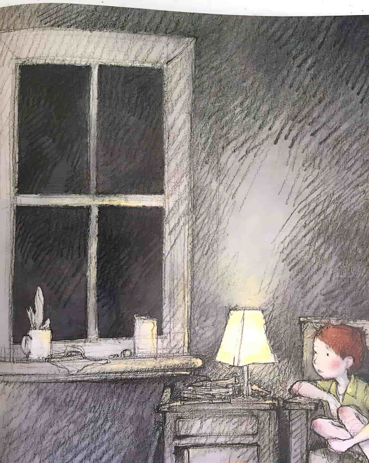
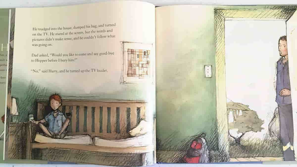
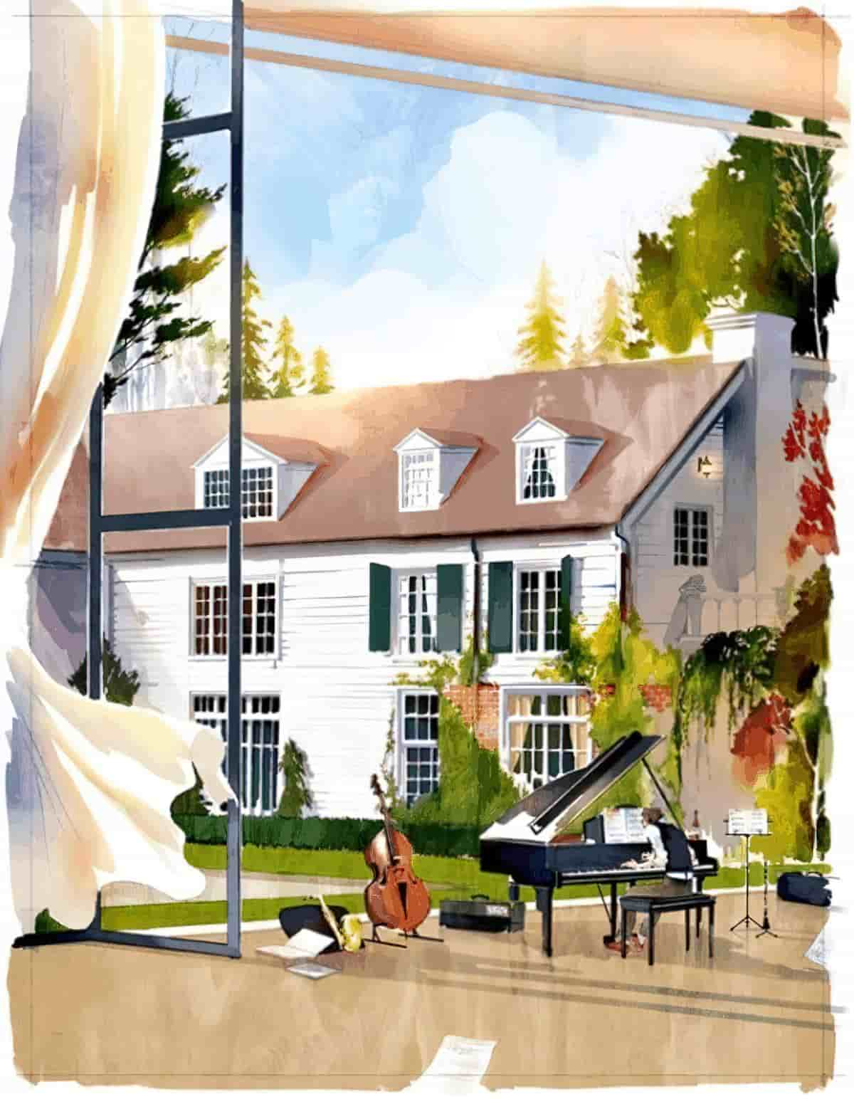
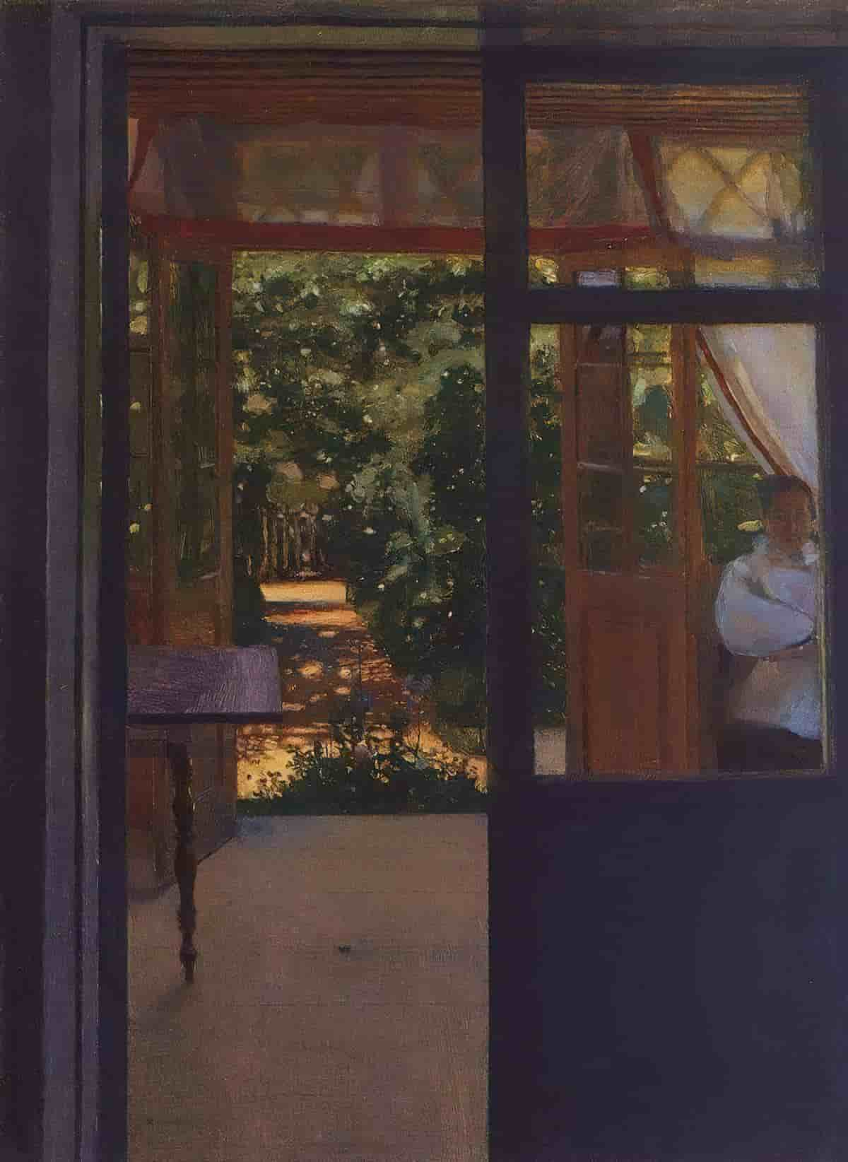
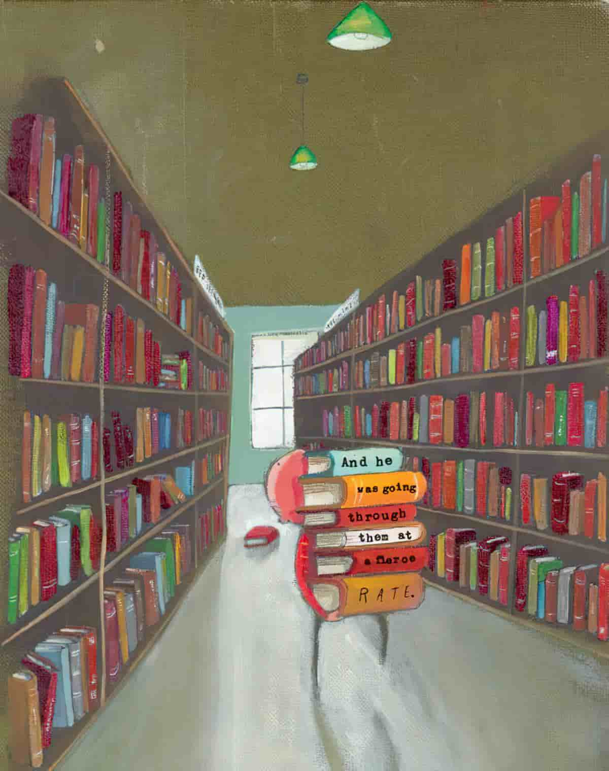
Not all frames look like frames. Doors and windows and mirrors are obviously ‘framed’. But we can also see a character through the barrel of a shot gun or a noose or two hands, through legs, books in a library, or any number of other objects.
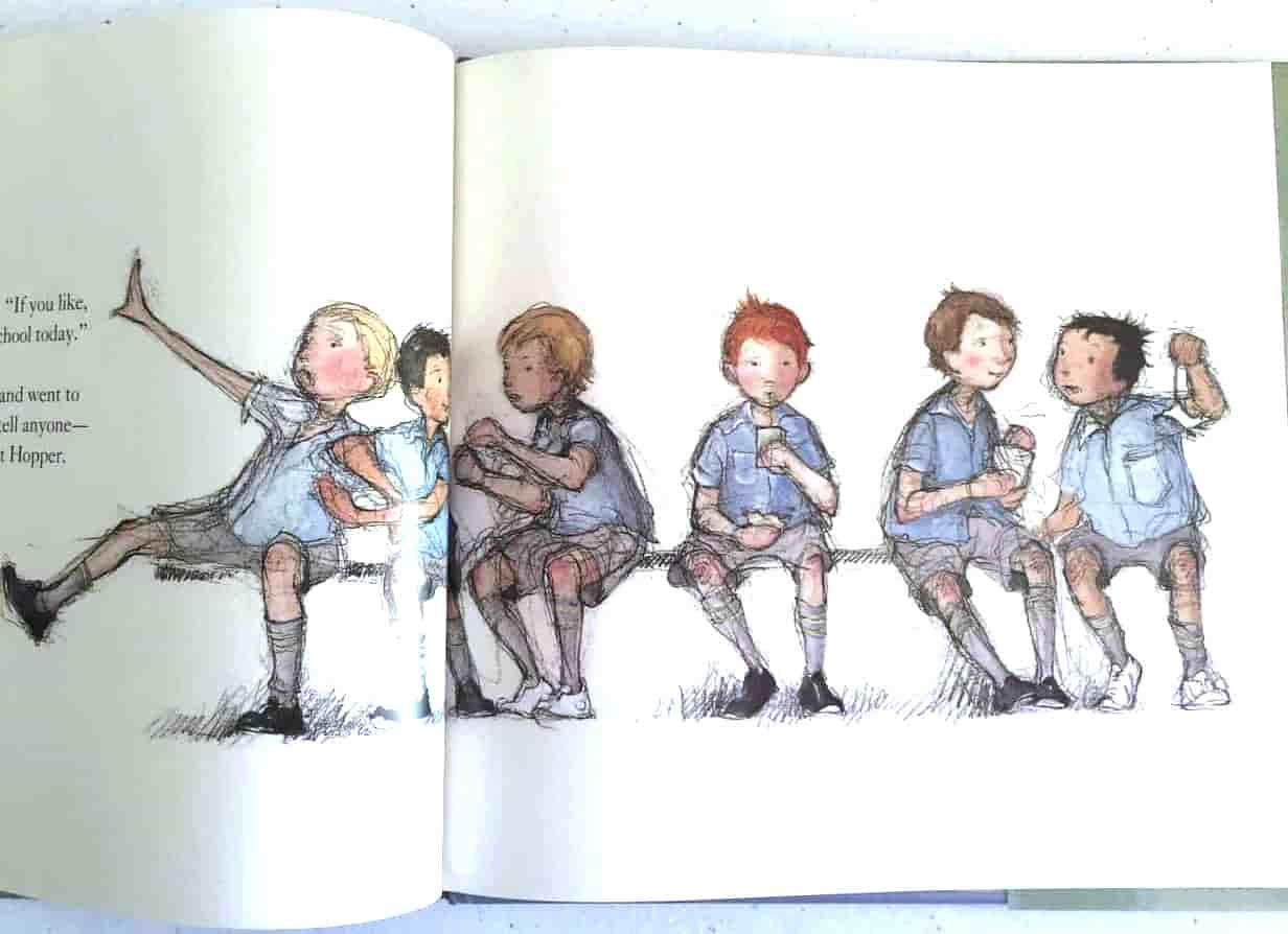
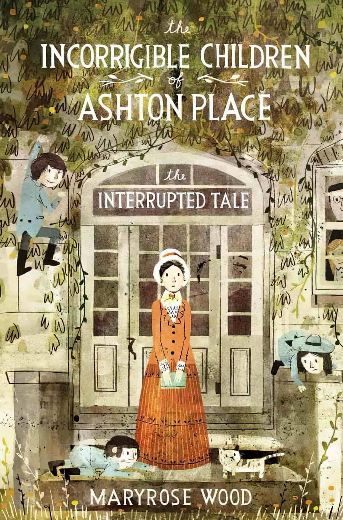
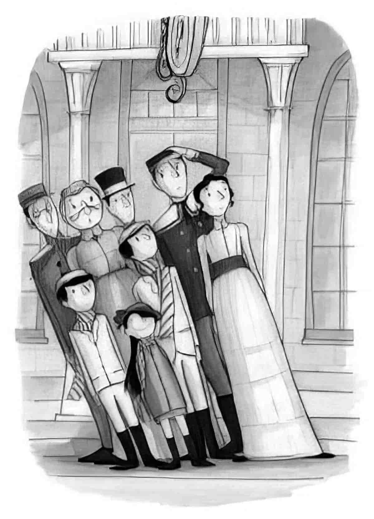
In the image below, the symmetry suggested by the architecture and the centre position of the tutor is juxtaposed with the children, who are lively and cannot be tamed.
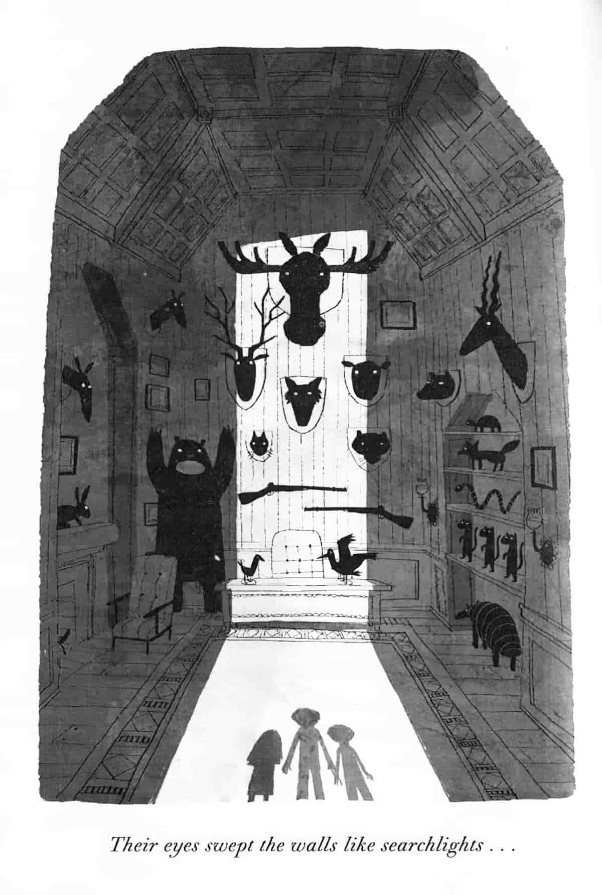
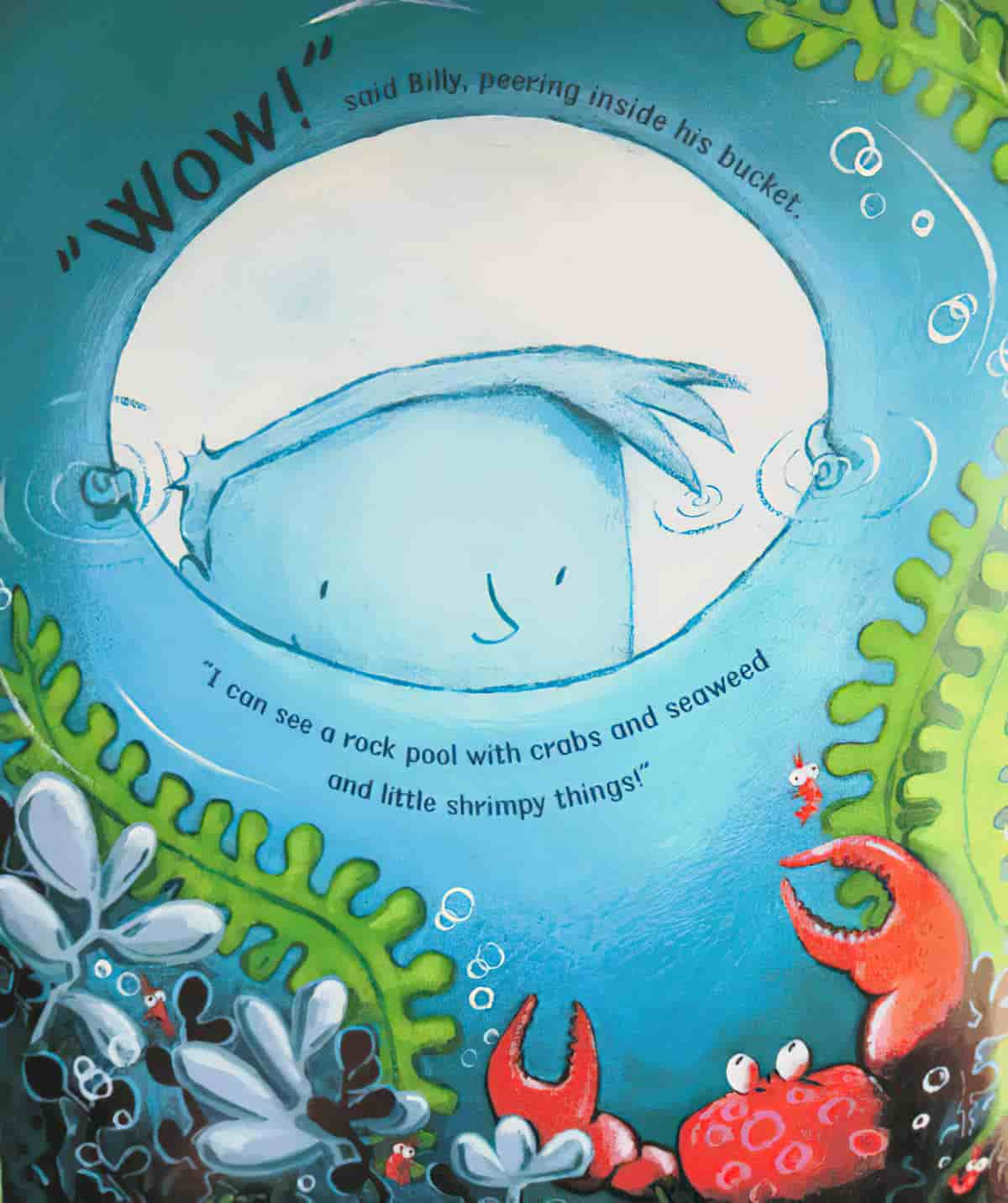
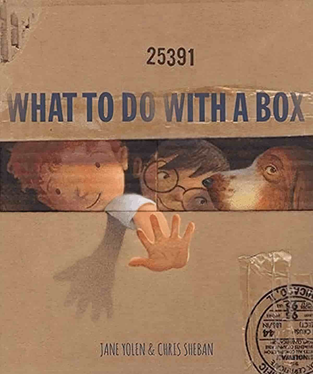
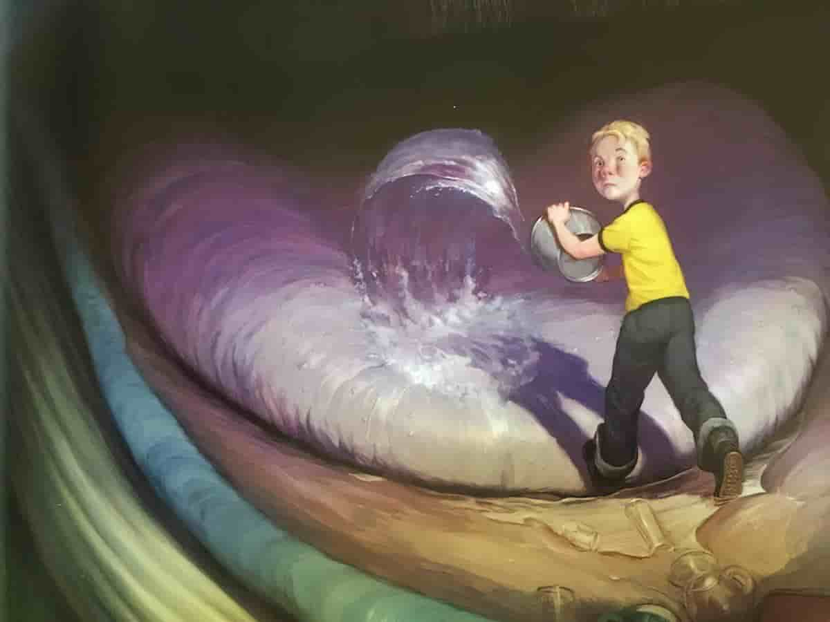
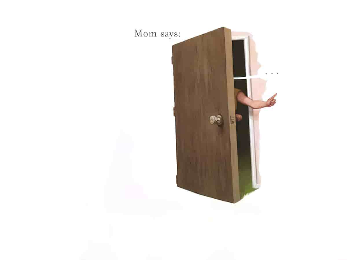
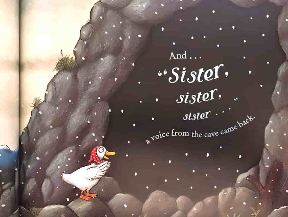
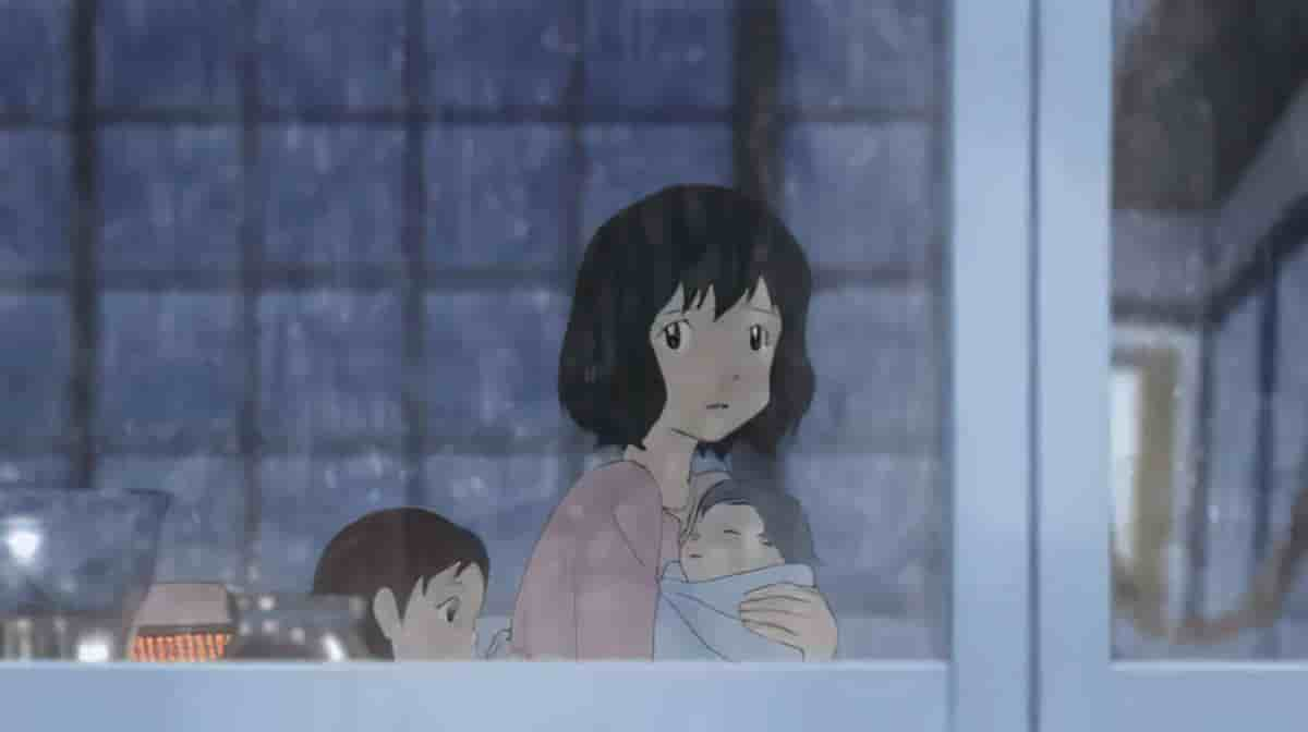
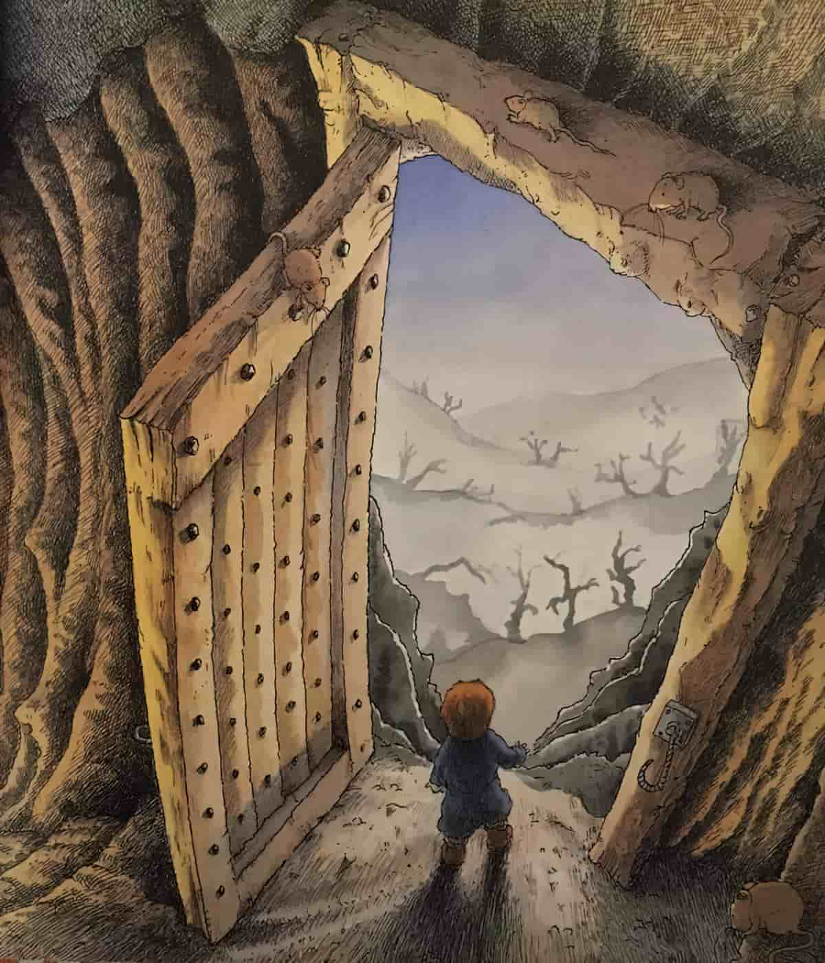
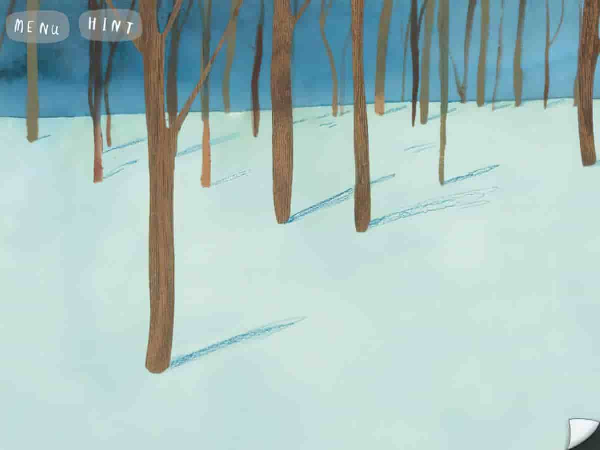
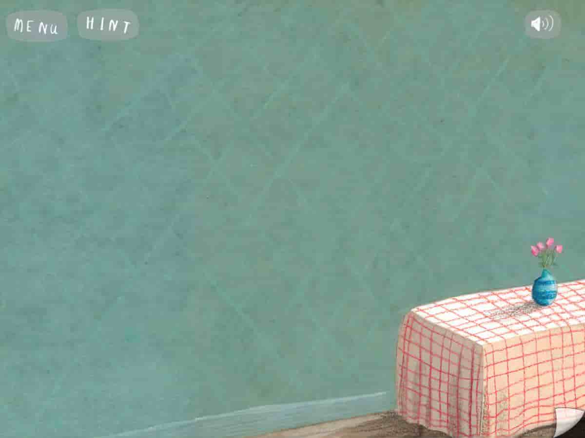
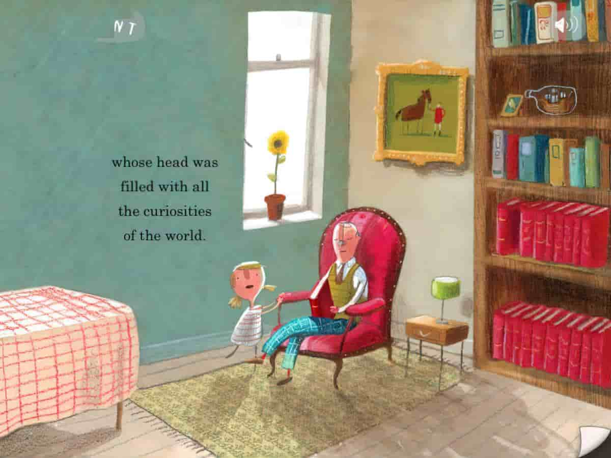
One thing that is specific to film (and not to static images of picture books is ‘reframing’ (as demonstrated in the video). However, book apps are able to make use of this technique. I haven’t seen it done nearly enough (yet) but, on a touch screen device, finger gestures are able to take readers off screen to reveal something that wasn’t there before. One example of this occurs in The Heart And The Bottle app by Oliver Jeffers.
Eye-line of Subjects
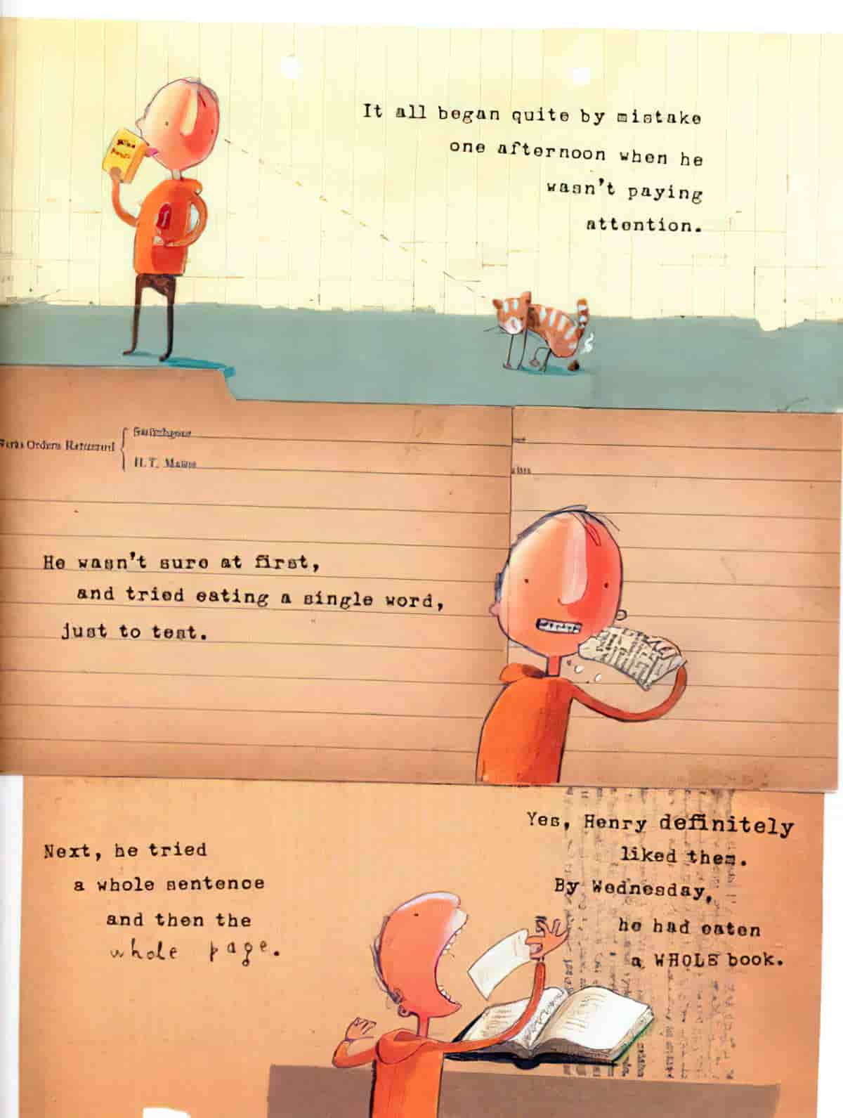
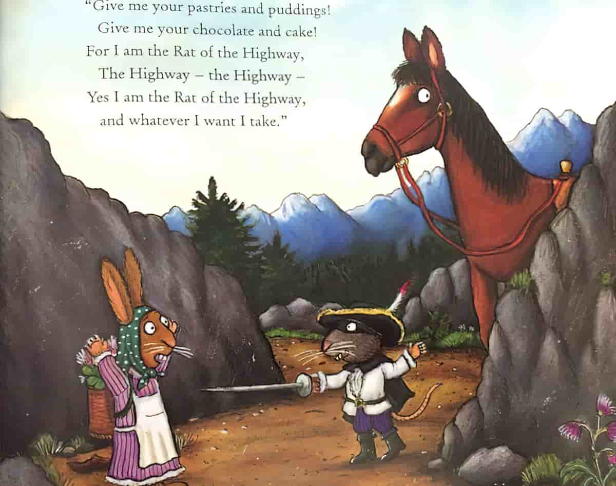
What are the characters looking at? Whatever they’re looking you’ll want to look, too.
Diagonals
Parallel lines and converging lines can intersect characters or trap them in corners.
In the illustration below, Jon Klassen emphasises the way the characters lean back by framing them with architecture in the background.
Focus
Cameras are able to pull focus to highlight the subject of a frame, in the way of an SLR camera. Picturebooks are more like point-and-shoots in that they typically tend to focus everything in the frame, by the very fact that there is no camera involved in the process. However, picture book illustrators can still mimic this technique. Illustrators have for a long time mimicked the human eye, if not the exaggerated pull-focus of cameras, by using the rules of aerial perspective. Closer objects are also more detailed, but what about when they are not? Some illustrators of picture books create work which is equally detailed no matter how far the object from the eye of the viewer. This may be because they are creating a folkart feeling, which goes hand-in-hand with light and bright stories.
Rosie’s Walk is one such example.
Subject Close To Light
Scale
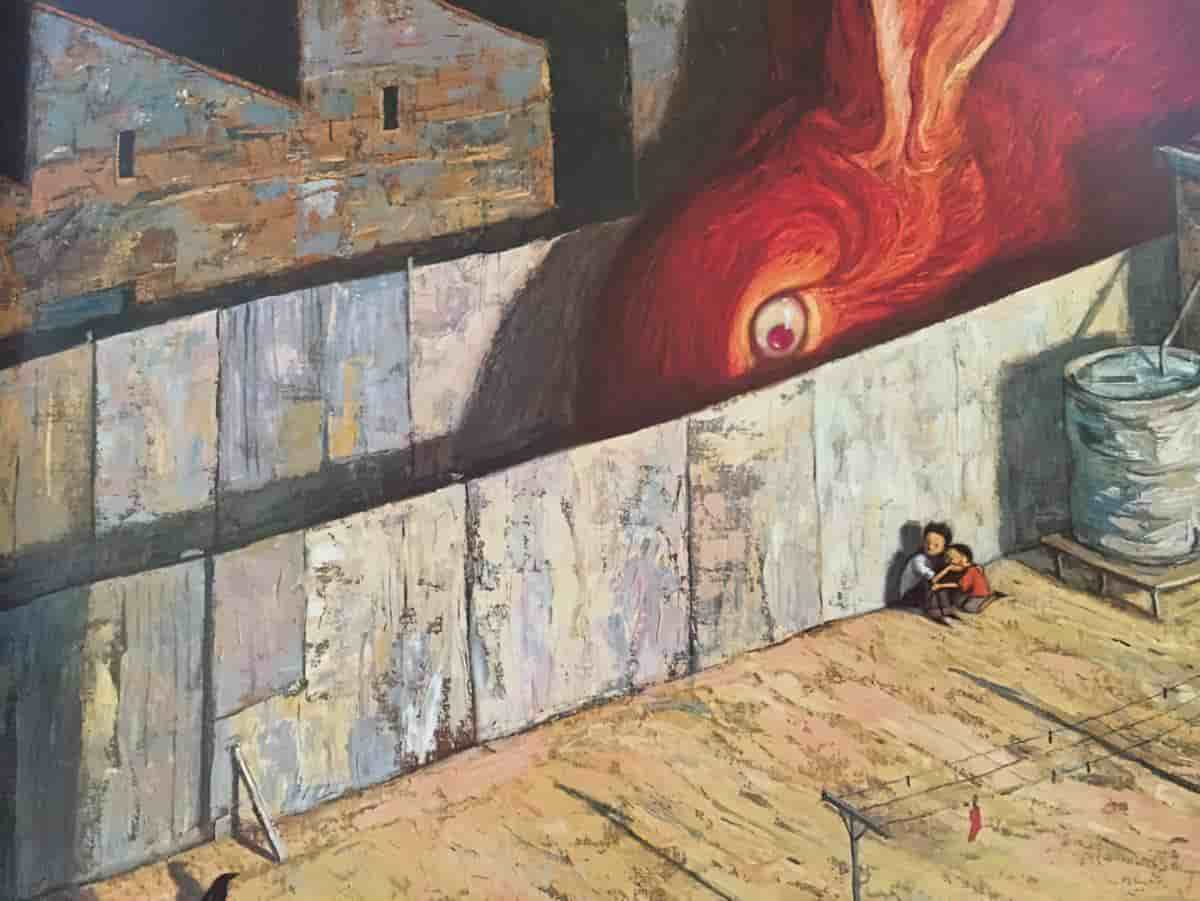
Alfred Hitchcock had a rule in which the size of the subject within a frame was in direct proportion to their importance at that point in the story.
Guiding Lines
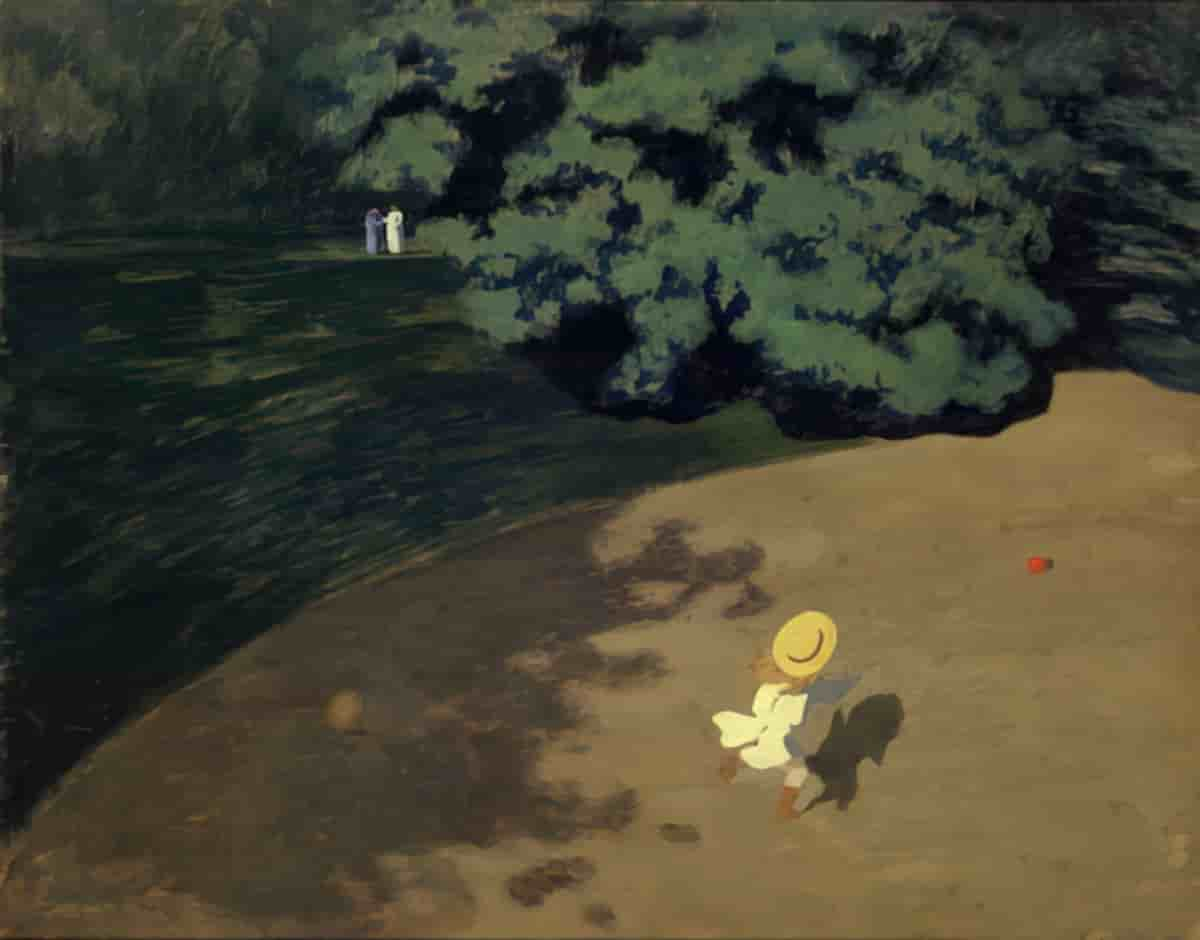
Header painting: Felix Vallotton image of a high angle view of lakeside
