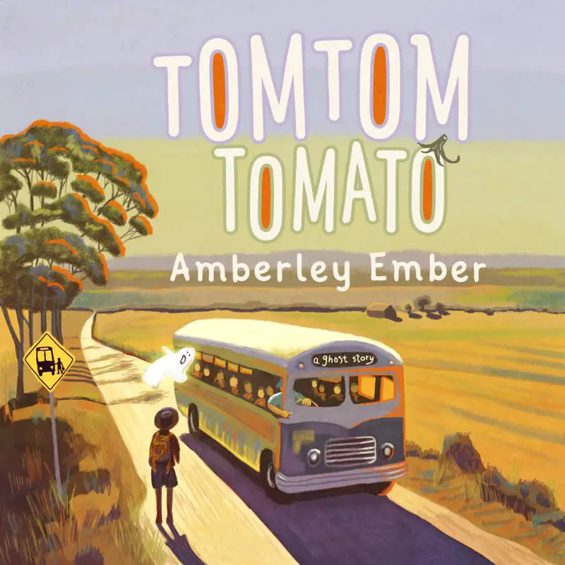
Chekhov’s gun is a storytelling technique to do with foreshadowing. The author places a gun in the story/picture and one of the characters uses it later. This is the general rule: If the gun has been placed, the author must make use of it. Otherwise the reader will wonder what on earth it was doing there. The reader will feel cheated. In this way, stories are very different from real life.
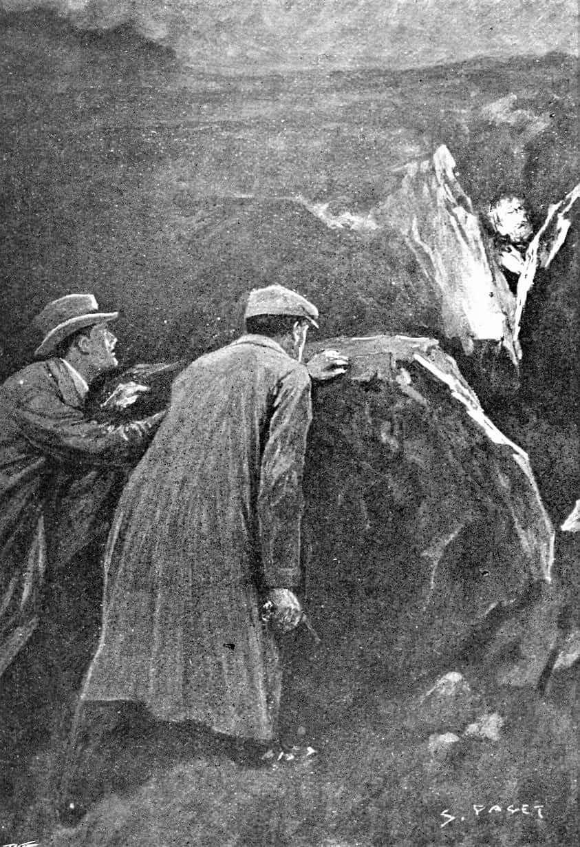
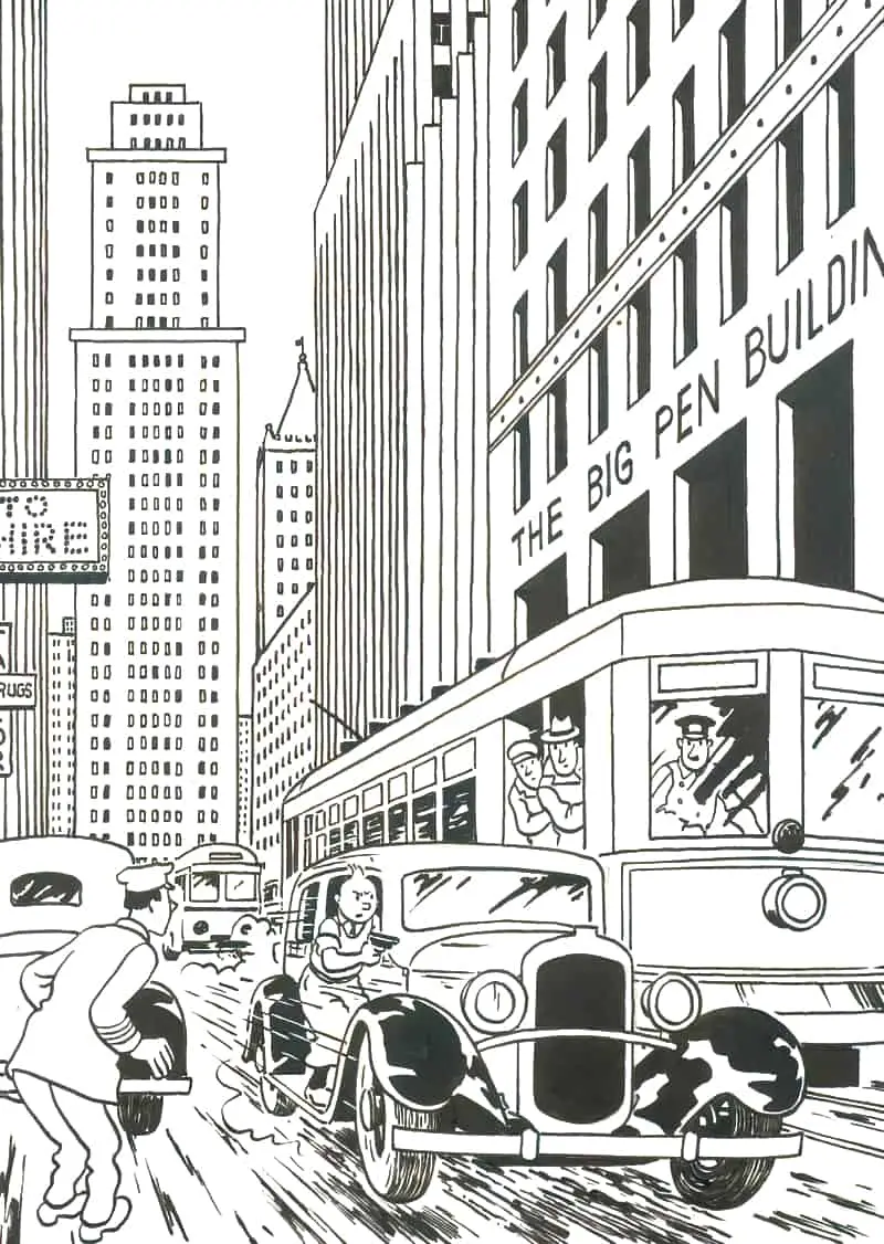
Obviously, when it comes to children’s literature, guns are a bit of a no-go. However, the Chekhov’s Gun technique is super useful for increasing tension and narrative drive. Children’s writers must be inventive when it comes to avoiding actual gun violence in stories for young readers, but do make use of this same technique.
I’m not sure if someone has already done this, but for children’s literature I’m inventing my own related terminology. The kidlit equivalent of Chekhov’s gun is…
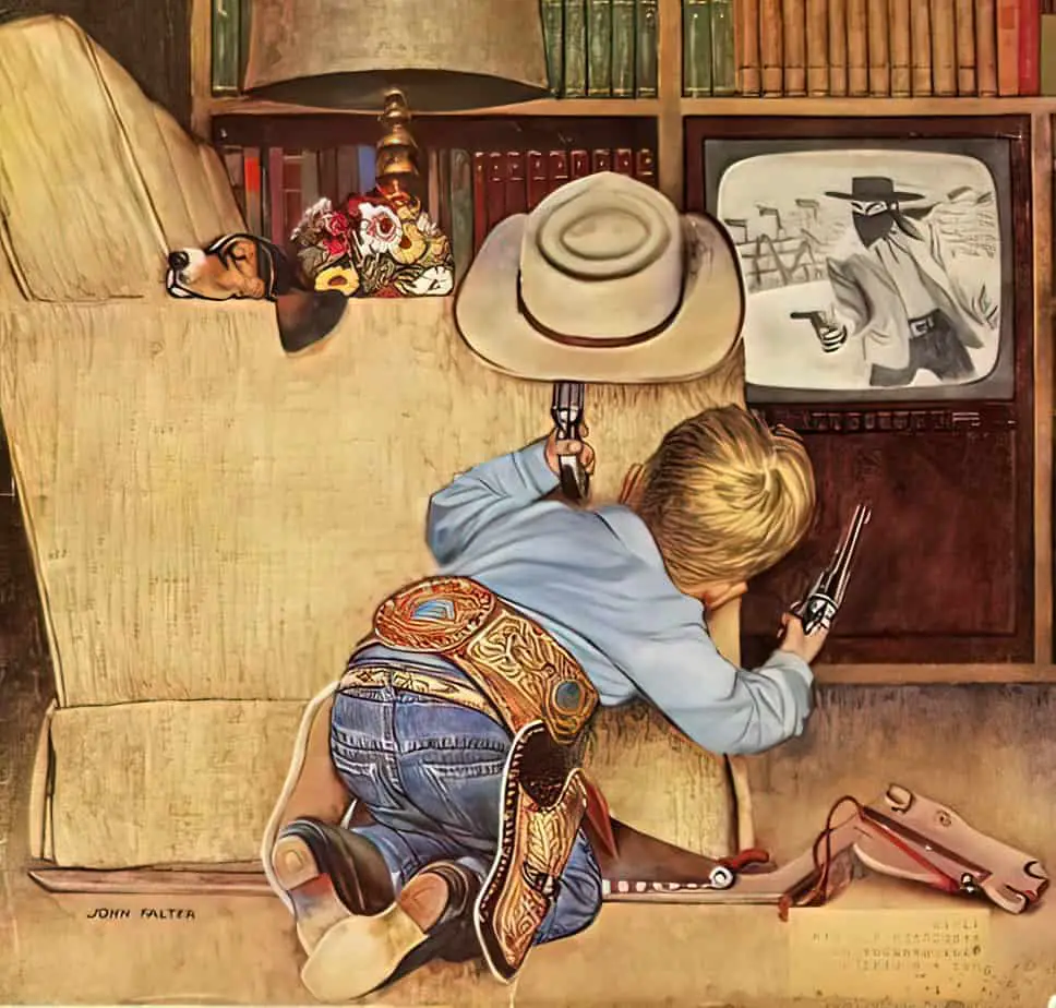
CHEKHOV’S TOY GUN
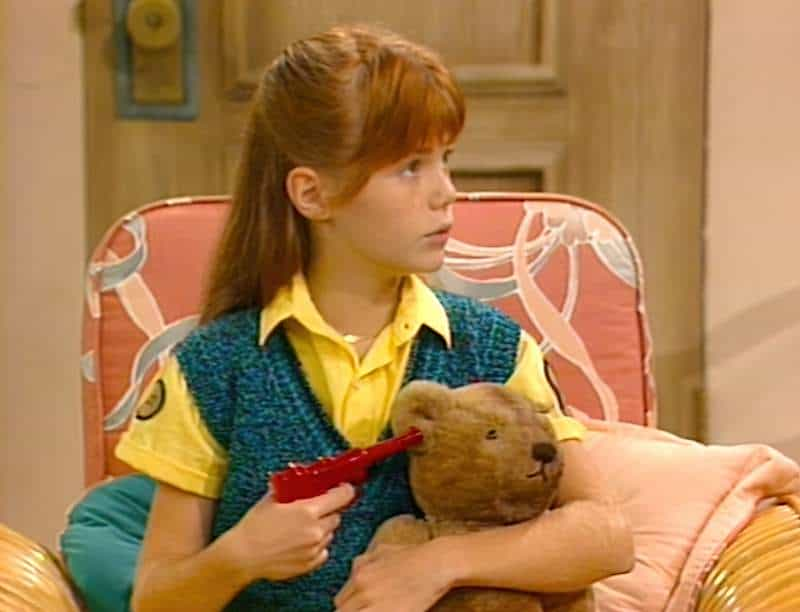
Chekhov’s TOY Gun refers to an on-the-page gun which turns out to be a toy gun, not a gun at all, or something else similarly benign.
Here’s the difference between the Chekhov’s Gun vs Chekhov’s TOY Gun: The toy gun is never going to be used to inflict harm, even when we see it on the page as a threat. We know this because this is a rule of junior fiction. In Young Adult literature, anything can happen — I’m talking about middle grade and below. In MG stories, characters don’t shoot heroes. However, the reader won’t know that until after the Battle sequence of the story. Part of the Revelation part of the plot (coinciding with the Anagnorisis) part, will be, Oh! It wasn’t any threat at all! Just seemed totally threatening!
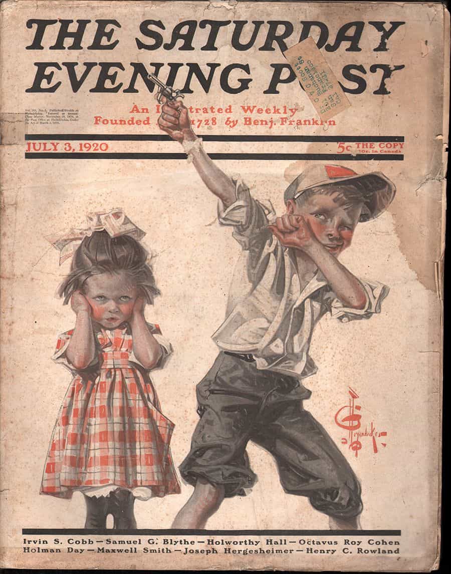
EXAMPLES OF CHEKHOV’S TOY GUN
R.L. Stine will often give his adult baddies a gun but these guns are never used to shoot our child heroes. In How I Got My Shrunken Head,the gun turns out to be a water pistol. Thanks to R.L. Stine, for inspiring me with a name for this concept.
In Pax, Sara Pennypacker suggests a character may be carrying a rifle by describing it through a naive animal’s point of view. The reader guesses a ‘long pole’ may be a rifle because the setting is a war situation. We soon learn that the ‘pole’ is actually the hero’s crutch (he has a broken leg), and this crutch is used as a weapon to scare off the attacking coyotes during the final big big struggle scene.
The examples I give are very literal examples, because the child character thinks there is an actual gun. Also very common in children’s literature: A character who looks very scary proves completely benign. For example, the gigantic man next door proves to be kind of heart when the child hero actually meets him in person. Or a rumour about a perceived opponent turns out not to be true.
To offer an extremely tangential example, in Monster House, McCracken is revealed to be a victim of the scary, enlivened, haunted house, despite being very scary to the children himself. The real opponent goes a long way back in history, with a version of intergenerational trauma being the real issue, requiring nothing more than understanding (symbolised by a massive, elongated Battle sequence) on the part of the adolescent heroes.
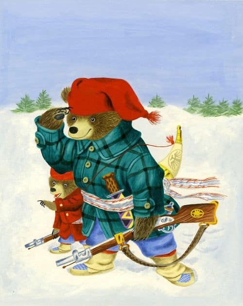
Apart from the big reveal that something is not so terrible after all, these stories by their nature tend to convey the following ideologies:
- Things (and people) are not what they seem on the surface.
- Don’t believe everything you hear.
- Look closely and pay attention or you’ll perceive danger in the exact wrong places.
- People who look like baddies are sometimes the goodies (and vice versa).
- And even if they are bad, there’s probably a reason for that and we should extend understanding. Worse bad lurks behind bad.
- Understanding to true nature of things, events and people will help us cope with the bad stuff we encounter in life.
Have you noticed examples of Chekhov’s Toy Gun in stories you’ve read lately?
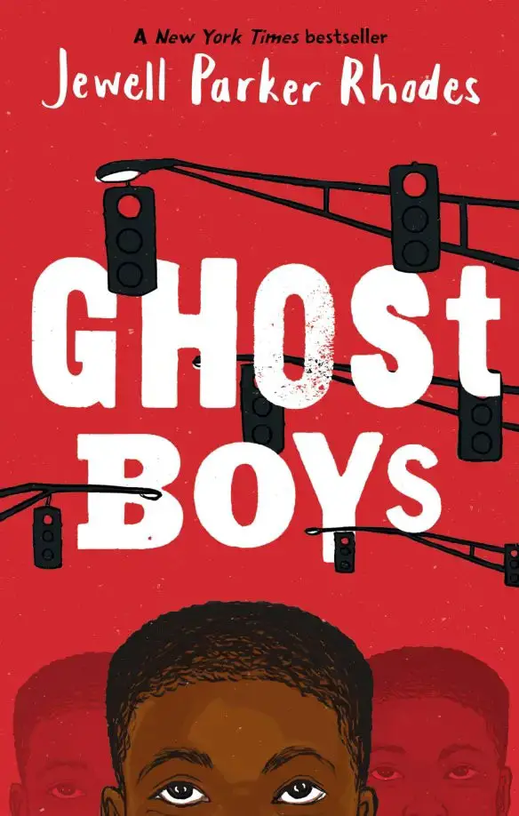
Twelve-year-old Jerome is shot by a police officer who mistakes his toy gun for a real one.
Now he is a ghost. He watches the devastation unleashed on his family and community in the wake of what they see as an unjust and brutal killing.
Soon, Jerome meets another ghost: Emmett Till, a boy from a very different time.
Any writer will have heard the following advice from Anton Chekov:
If you say in the first chapter that there is a rifle hanging on the wall, in the second or third chapter it absolutely must go off. If it’s not going to be fired, it shouldn’t be hanging there.
I’m reminded of this quotation when reading a different kind of advice: Tips for what to do and what not to do, for those of us producing interactive content for children. In The Art and Science of the Children’s eBook, Dr. Warren Buckleitner advises something similar to Chekhov:

And of course, I think of a page in our own app, Midnight Feast, which features a balloon. Incidentally, the balloon cannot be popped. Nor can the guitar be strummed. The books on the shelf cannot be read. The rug cannot be vacuumed.
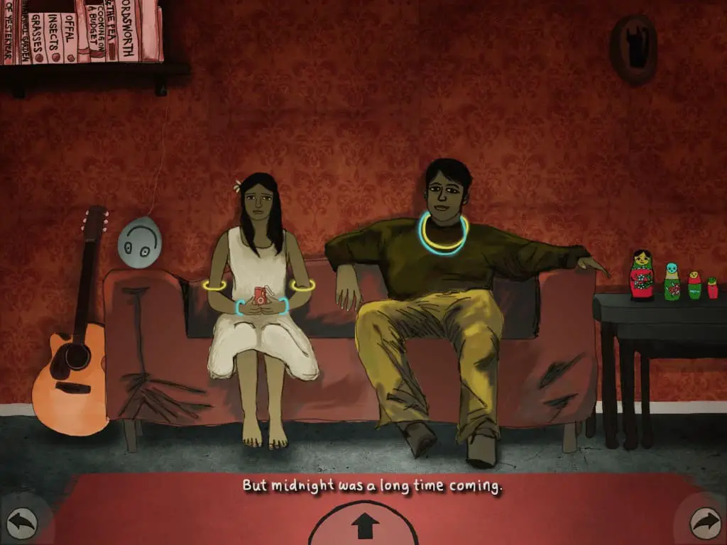
I do remember that ‘balloon pops on touch’ was a part of our initial plans for Midnight Feast. Why did we plan it that way? For exactly the reason Buckleitner explains above. But as the story took shape, it made more sense thematically and symbolically, that the interactive part of this page shouldn’t be about balloons popping — which more naturally symbolises the ‘bursting of hopes and dreams’ (this comes later in the story) — but rather this scene became about ‘enclosure’. Roya is locked inside a small house, and so the nesting of the dolls on top of the nested tables are something I wanted the reader to contemplate. So we made those interactive instead. If you touch the dolls they jump inside each other. I coloured them luridly to suggest they might be a hotspot.
The balloon remains as part of the interior decoration, because this is a father trying to create a party atmosphere for his daughter. I justified it at the time as an ironic counterpoint to the main character’s emotions — the balloon has a big smiley face on it, but is upside down, to match Roya’s lacklustre expression.
Should the balloon be pop-able, nonetheless?
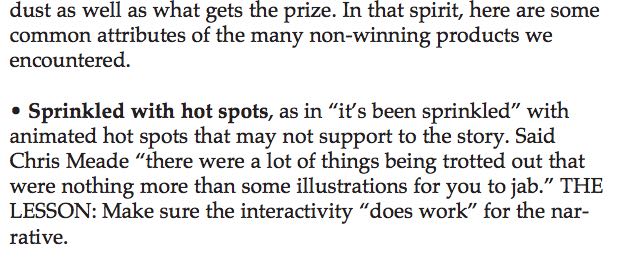
The creation of interactive stories is rife with pitfalls, and full of contradictory advice. Counter advice from the very same document cautions against ‘sprinkling an app with hotspots’ that do not support the story:
Why does the reader think that by touching a balloon it must pop? This expectation does not come from real life, because a balloon cannot be burst simply by touching it. A balloon may burst if poked with something sharp, granted, but I would argue that the reader expectation for popping balloons on screen comes not from any real-world analogue but from prior touchscreen experience. Namely, from games.
It is true, however, that when the user expects functionality and doesn’t get it, there is a micro-disappointment. This leads to several more philosophical questions:
- To what extent should creators of interactive books cater to the easily won thrills which follow the user from gaming-world?
- To what extent should we expect readers to ‘work’ for meaning? (By ‘work’, I mean ‘think’ — ‘Why is this part of the screen responsive, but not this one?’)
- When creating artwork for interactive stories, is it better to ‘leave out the balloon’ altogether, if the user expects it to pop? To what extent do we cater to this?
- And which parts of a fictional environment will the user expect to be interactive anyhow? Might this change over time?
- Must the user know exactly what to expect upon first reading, or second? Or should interactive books open themselves up slowly, upon subsequent readings? Will users even read something twice if they must tap without reward?
- Are there ways artists can signal unobtrusively to the reader which elements are hotspots and which are not, perhaps with colour? If I had made the balloon the same hue as the wallpaper, perhaps no one would think to tap it? Then again, would they even notice it?
The user expects the balloon to pop because they have popped many digital balloons on touchscreens before. As end users continue to interact with touch screens, and as touch screens become ever more integrated into our daily lives, no doubt user expectations will evolve. The question is, in which direction? And who is driving the evolution? Developers, of course. The more pop-able balloons that arrive in the touchscreen world, the more balloons will exist to be popped.
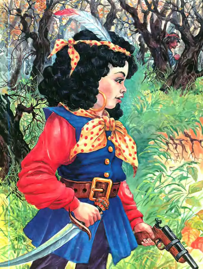


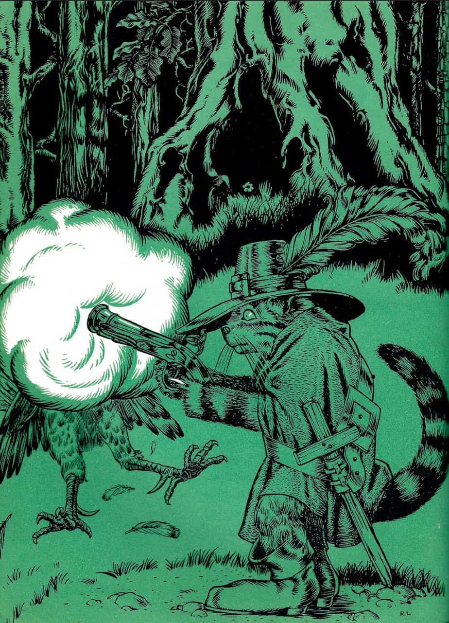
Header illustration by Tom Lovell for a 1942 magazine. A woman has fired a colt gun, which smokes.
