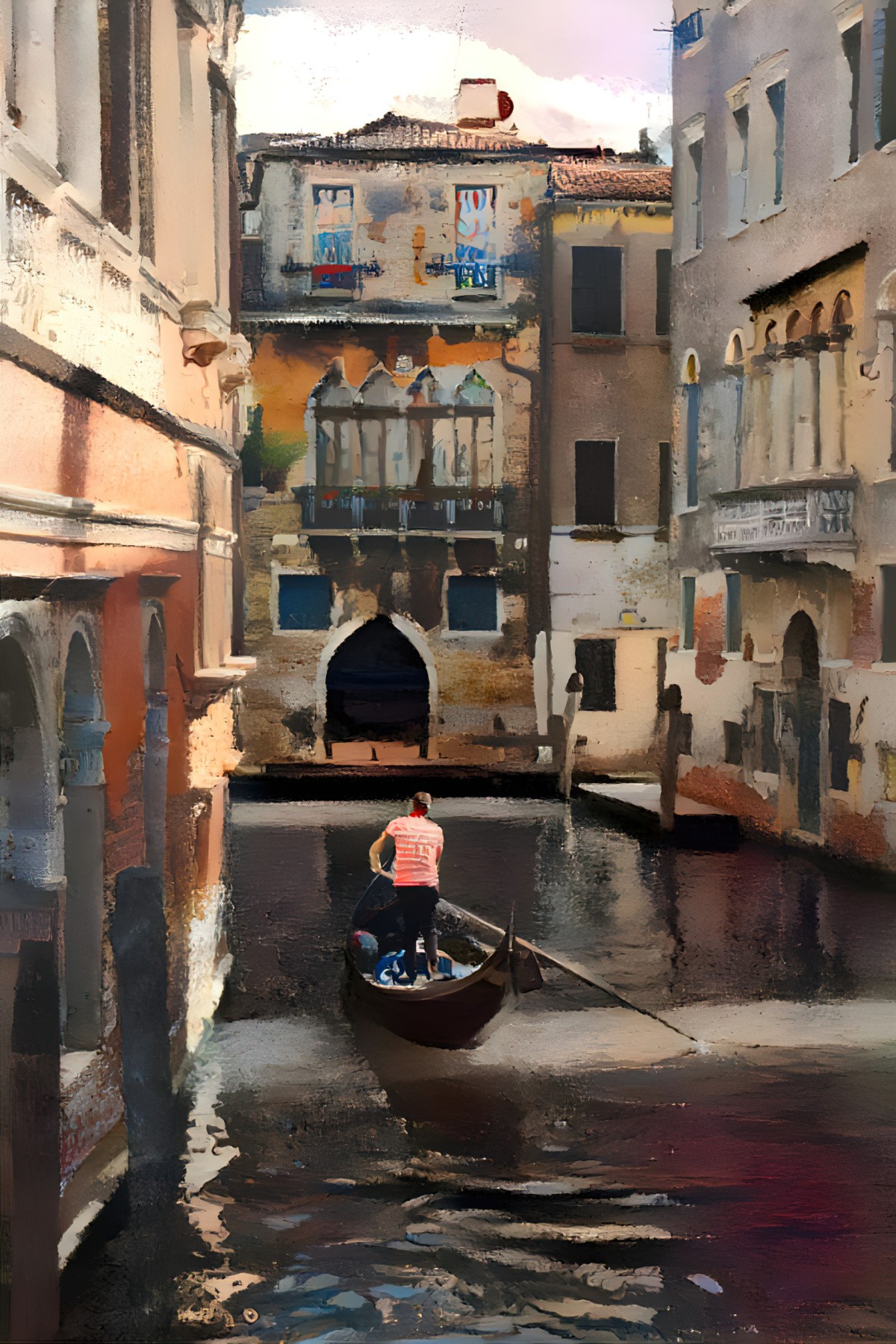
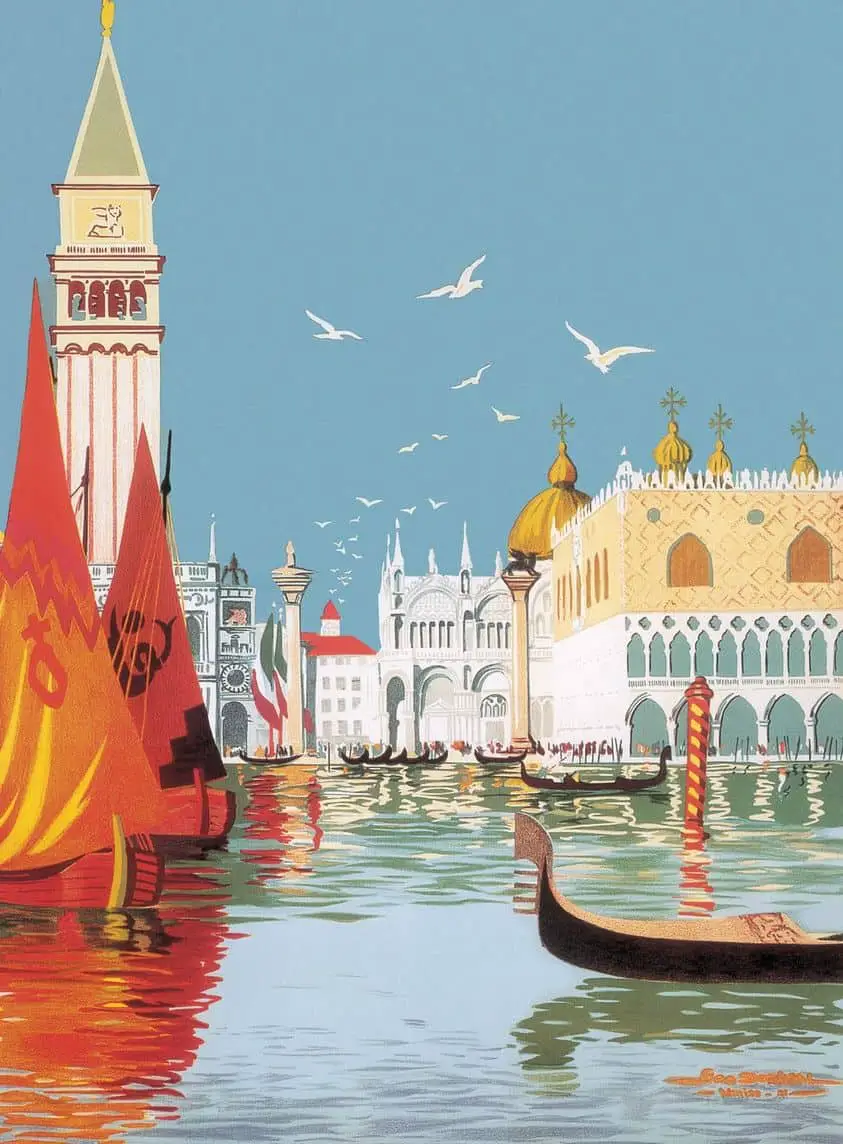
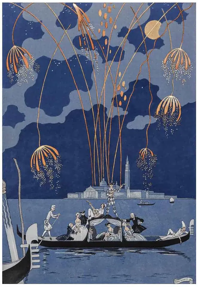
When you think of Venice, you may imagine a certain colour palette. But take a look at the illustrations and paintings below and it becomes clear: There’s no such thing as a ‘Venice palette’. It’s entirely possible to depict Venice as ominous and sinister, as well as beautiful.
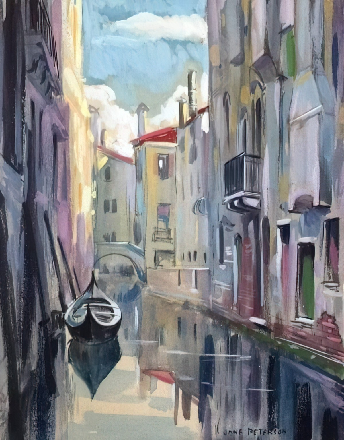
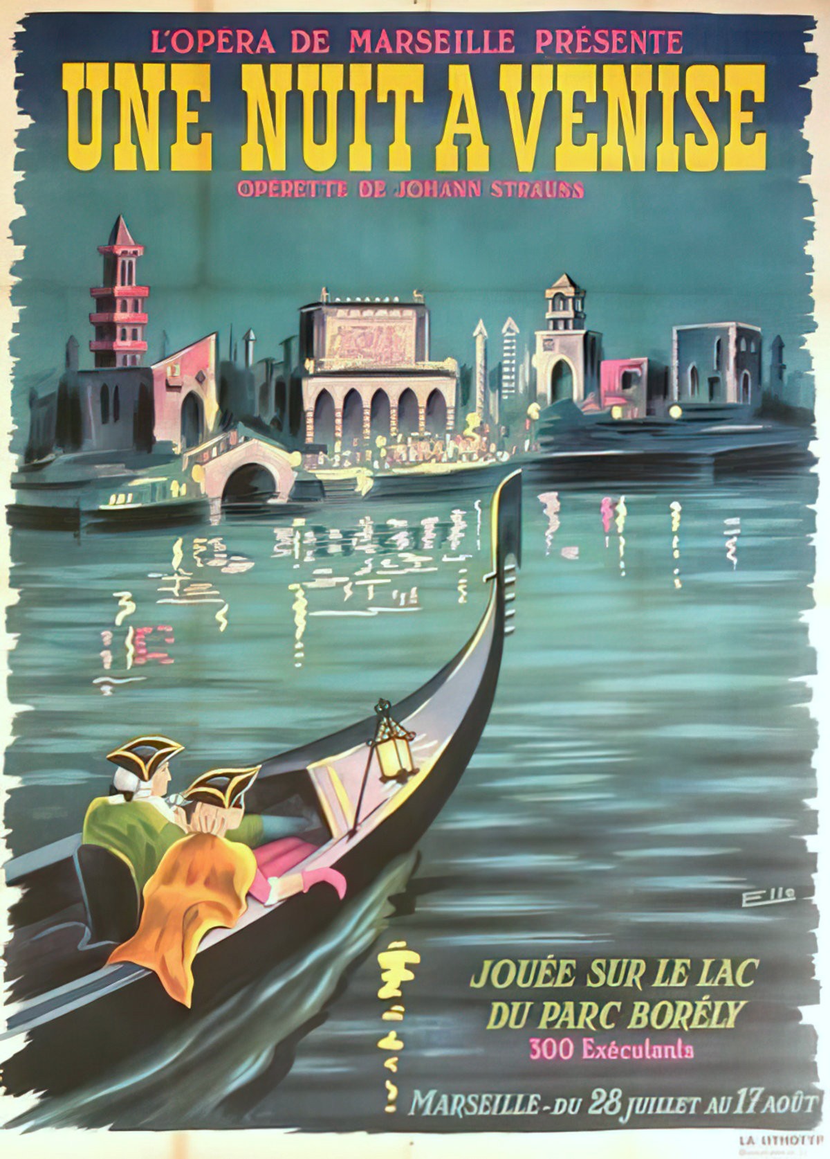
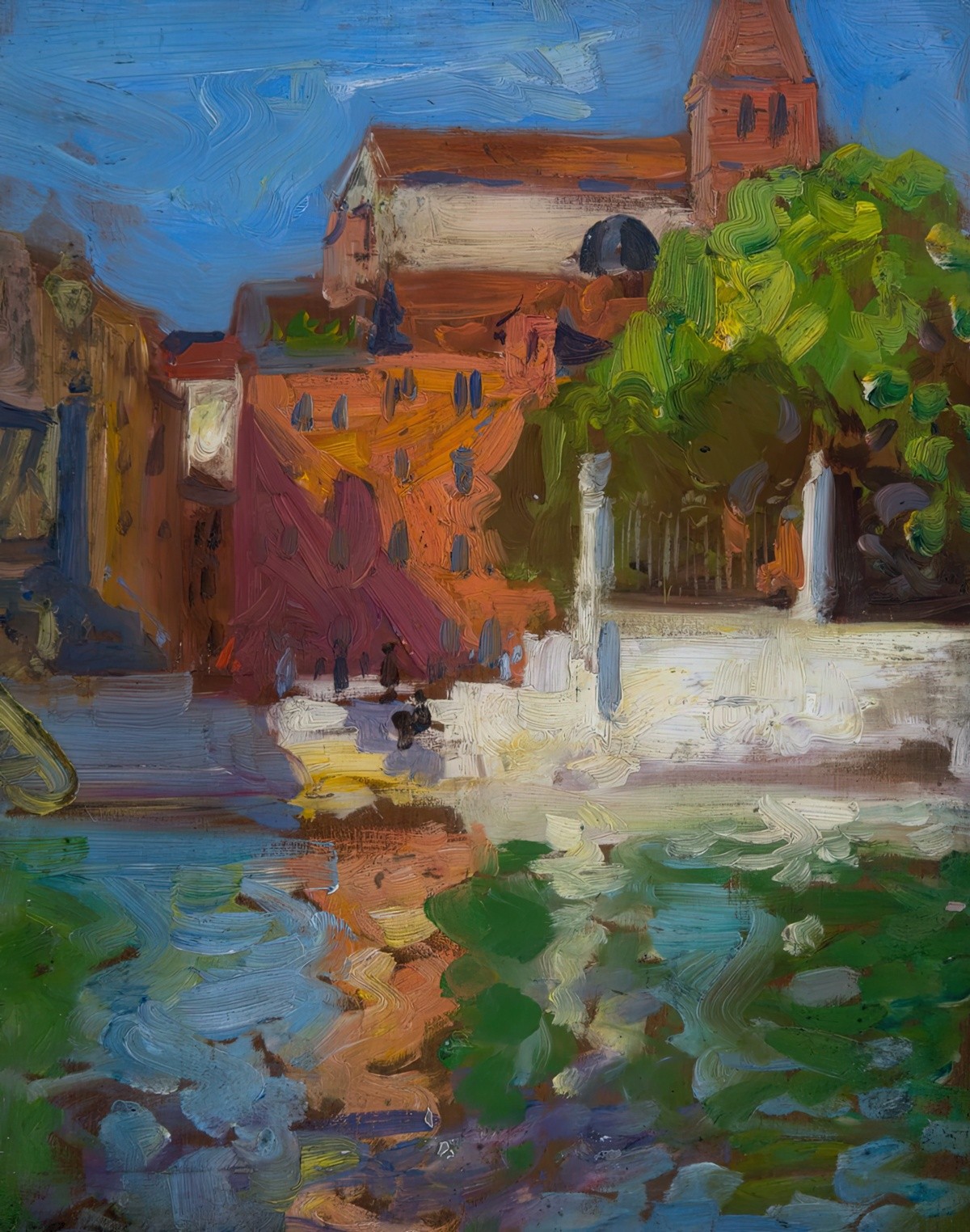
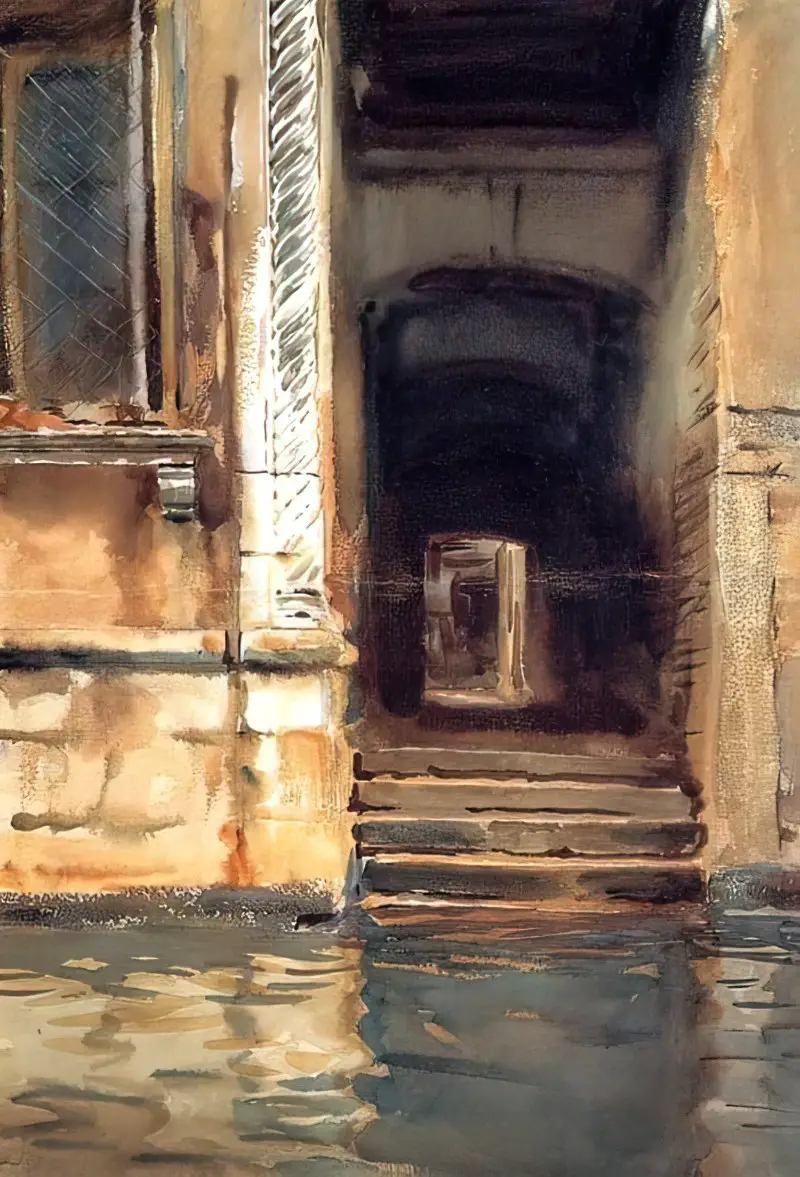
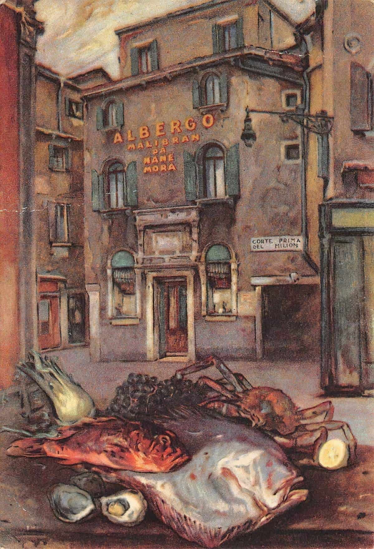
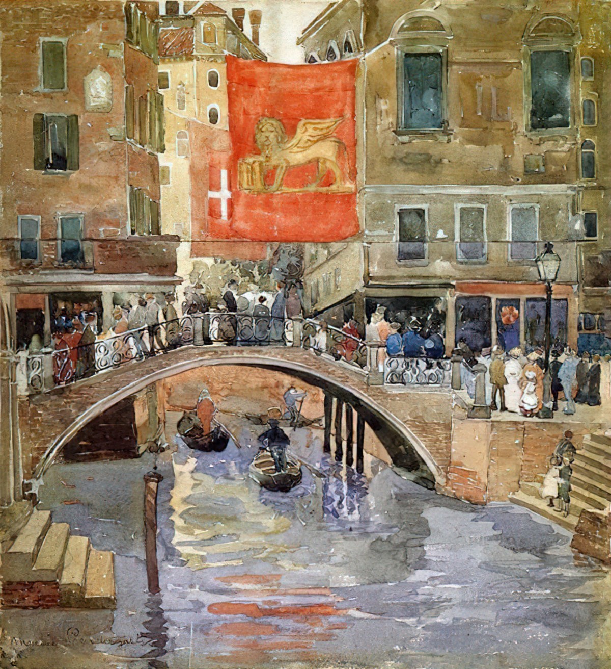
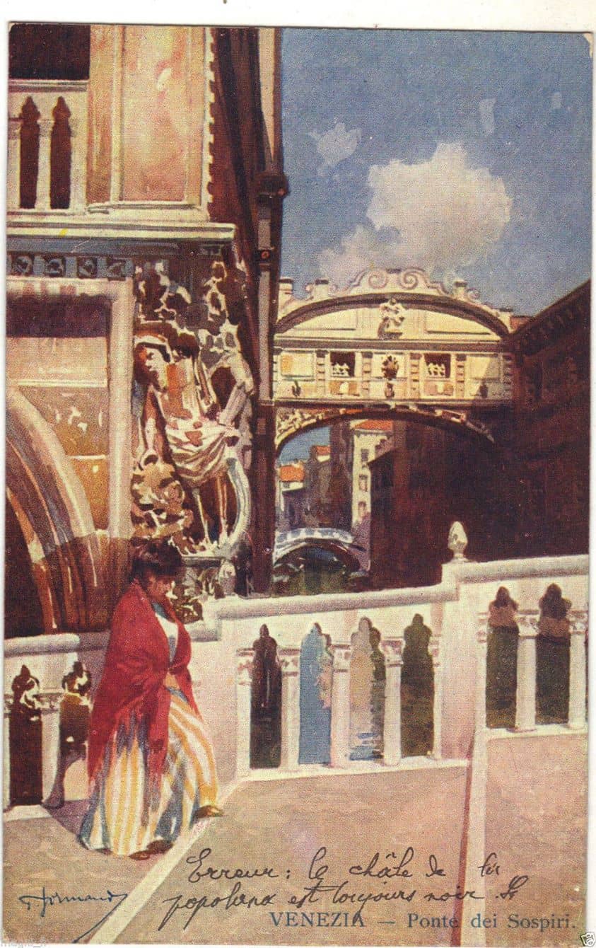
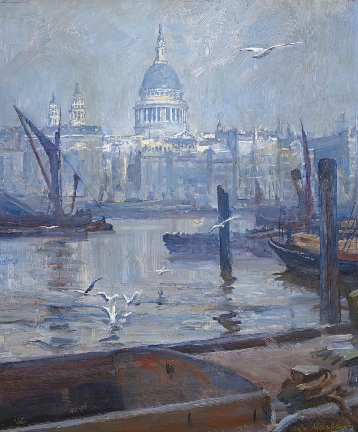
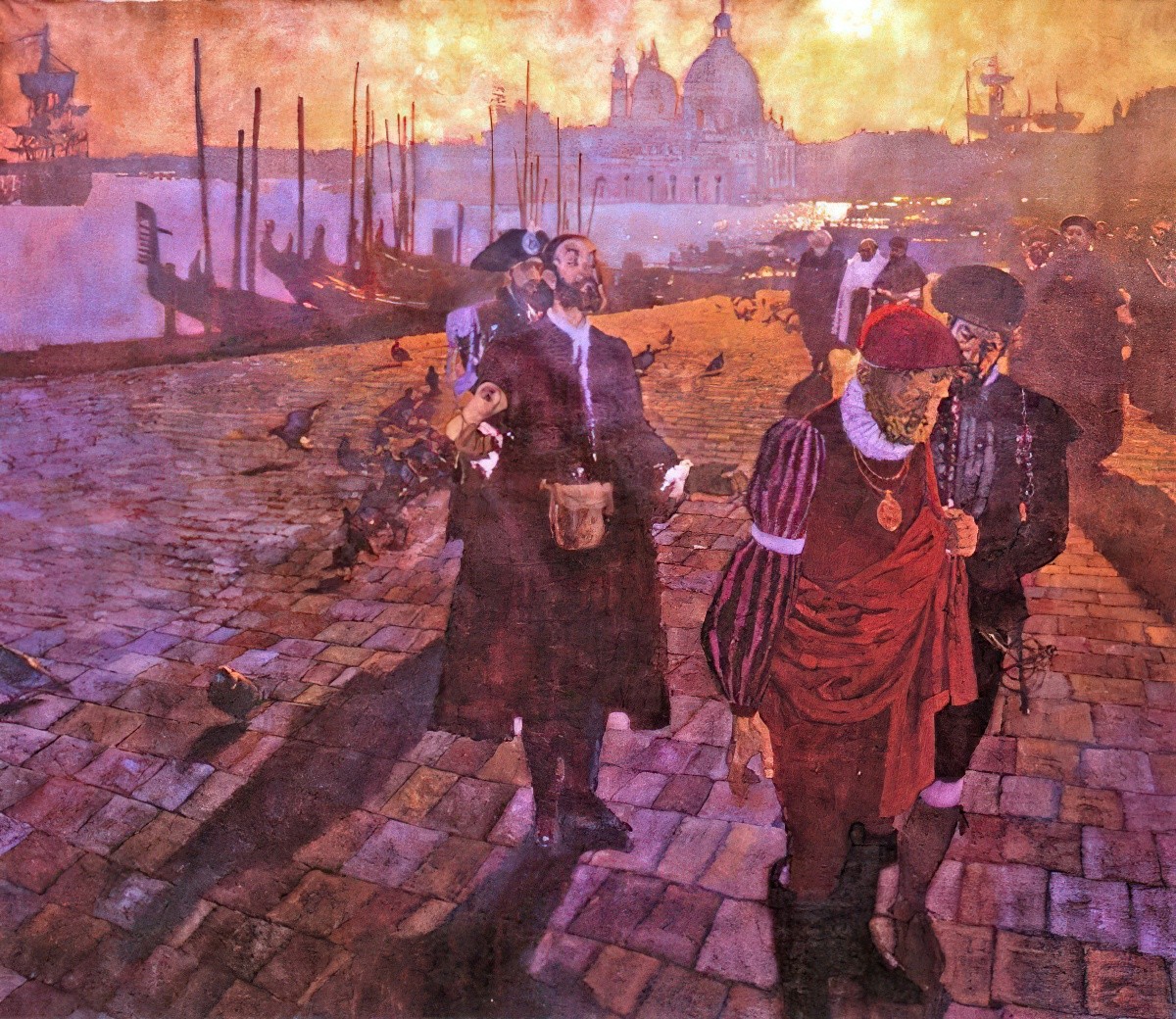
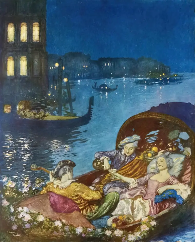
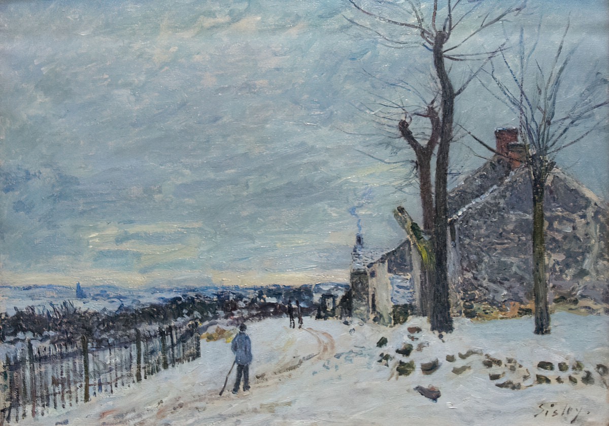
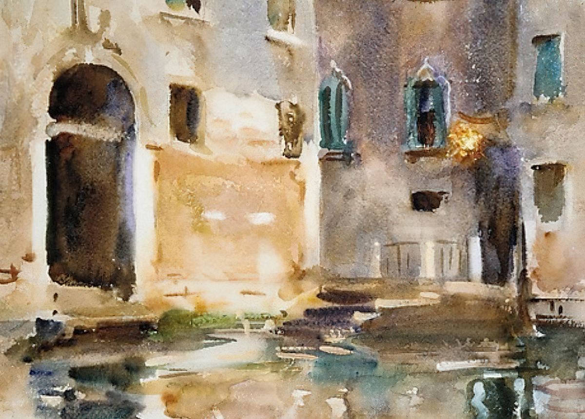
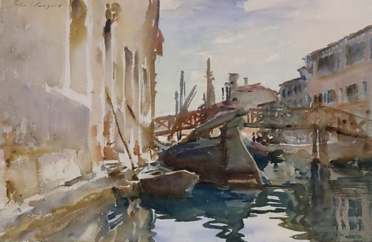
Ex-pat American artist John Singer Sargent especially loved Venice. He made numerous trips to paint the waterways between 1902 and 1912. He worked in watercolour because watercolour captures the light.
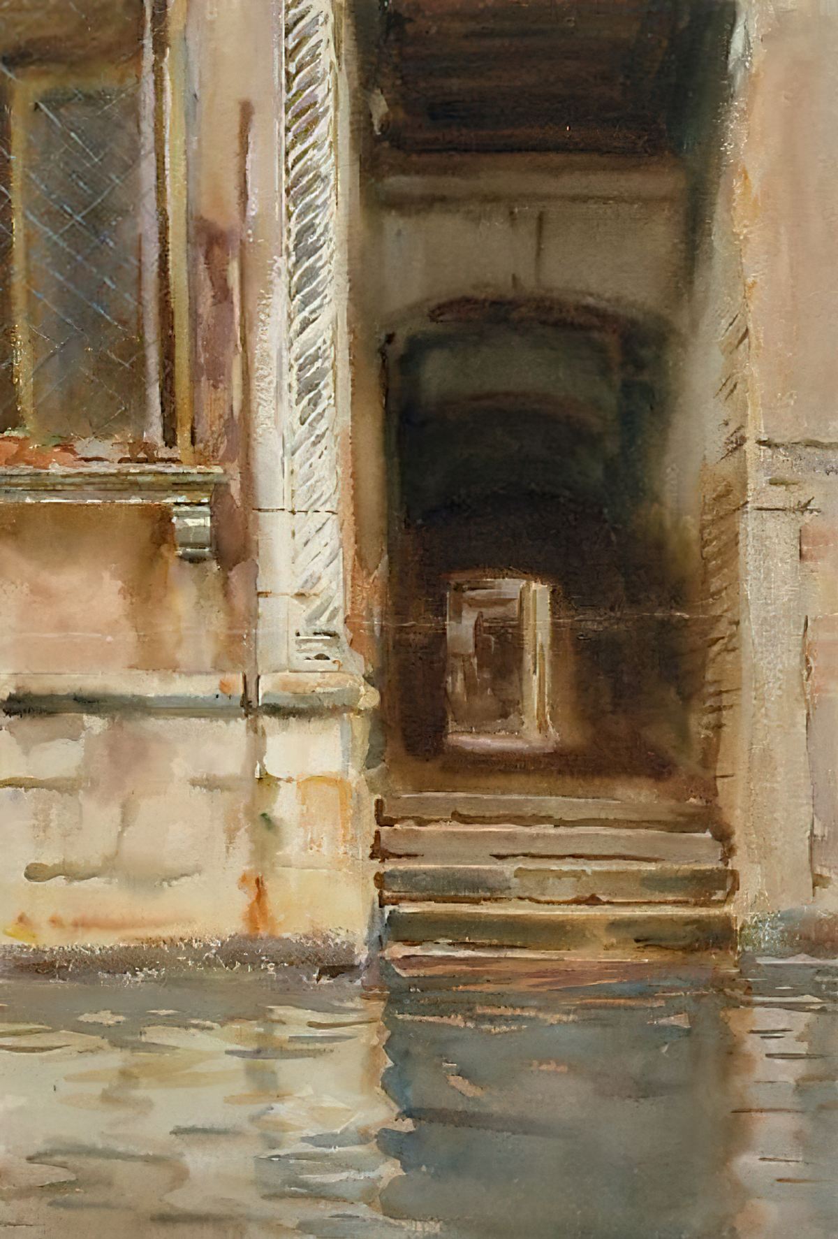
PAINTINGS OF VENICE USING ARTIFICIAL INTELLIGENCE
Now, using stock photos of Venice I’m going to create some brand new paintings of Venice. First, I’m using the colour palette of a completely non-Venice related painting by Gabriele Münter. Let’s see what the AI generator does with it.
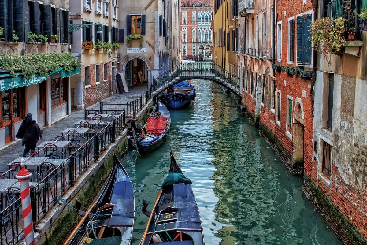
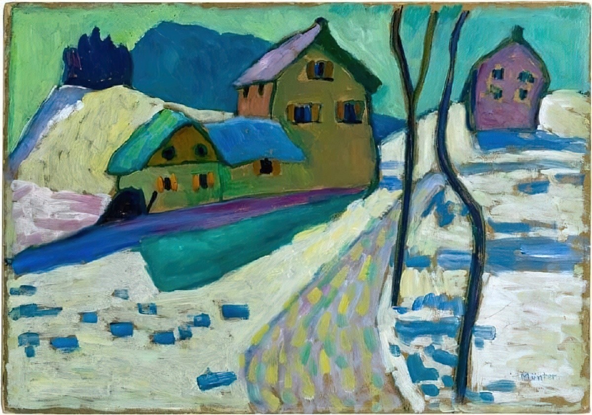
Not too bad. Large brush strokes obfuscate the details somewhat. Is this Venice? Could be. It’s kept the nice black outline of the woman walking on the left.
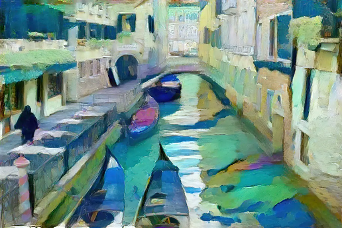
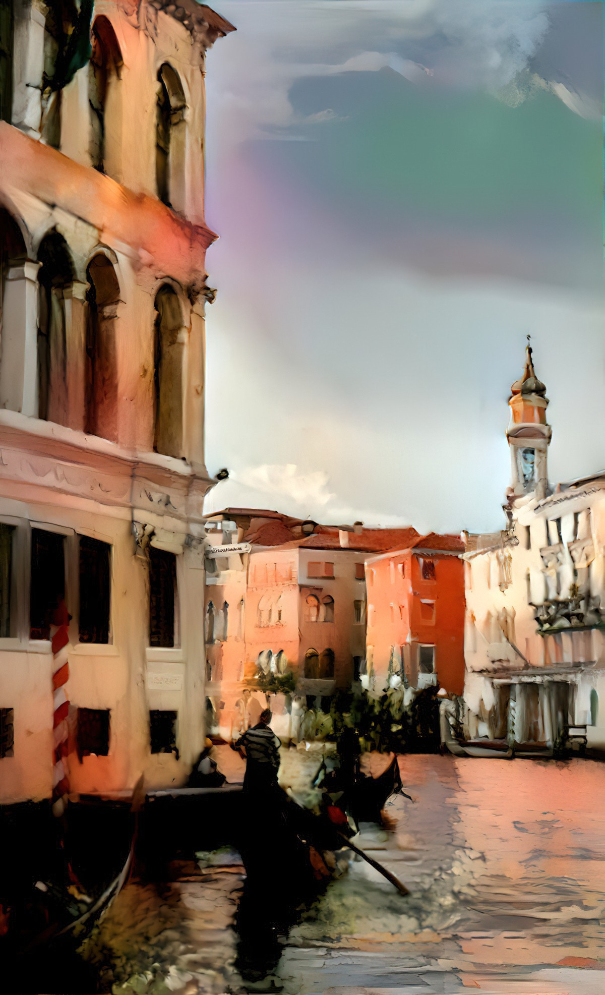
These are perhaps the ‘storybook colours’ of Venice. This time I’ll use the style of an actual painting of Venice.
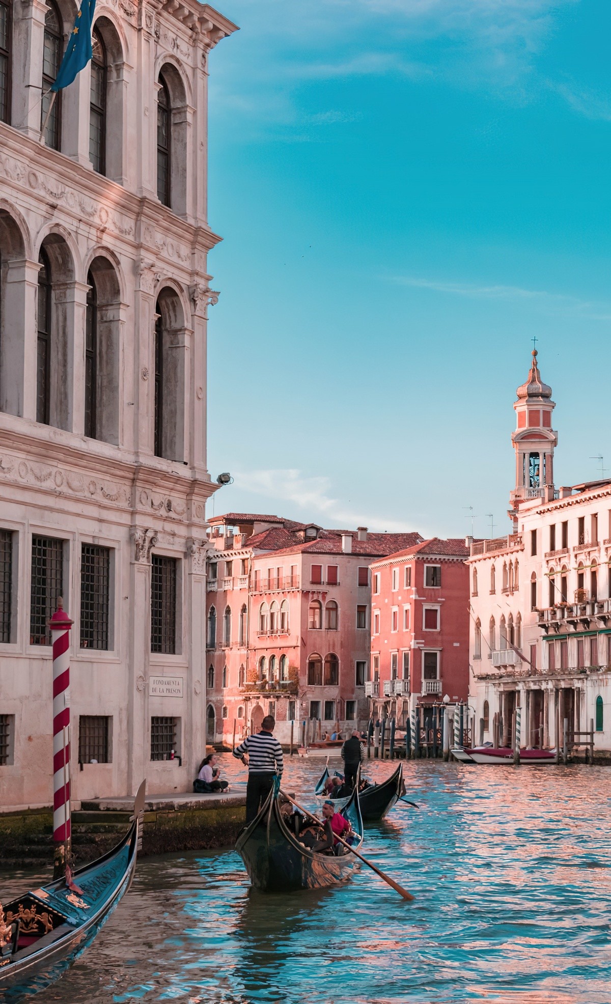
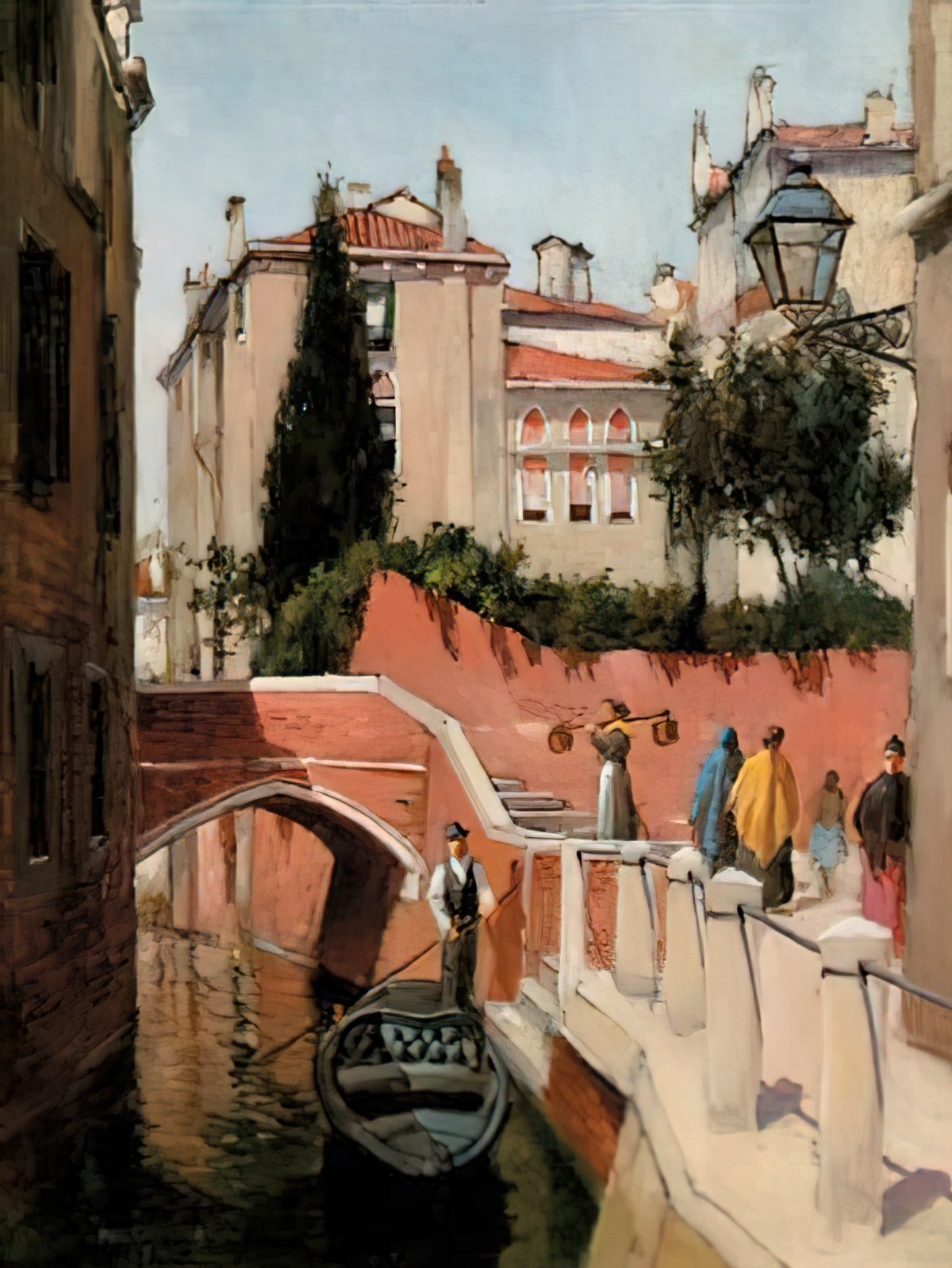
There’s some purple and green in the sky which I don’t really want. It’s a little dark down in that bottom left corner. Other than that, not too bad?
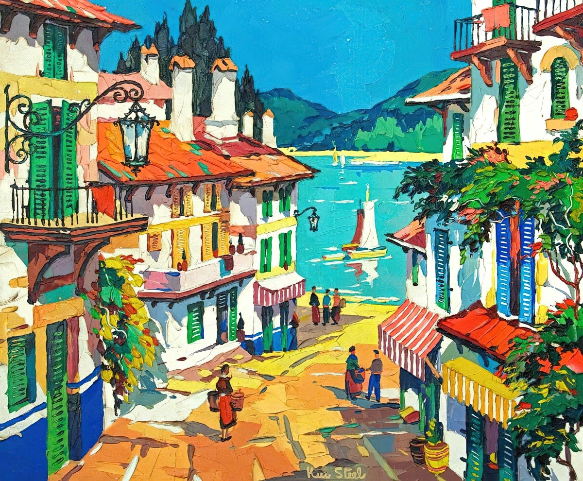
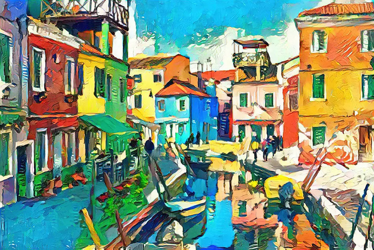
Now to the brightly coloured buildings of Burano Island. For this we need a bright style illustration so I’ll borrow the style of Kenneth Steel, famous for his travel posters.
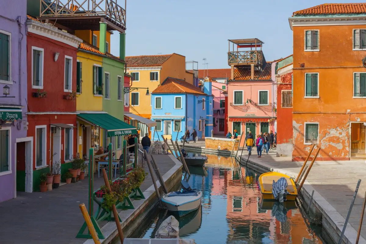
Yes, very nice. Some hand painting would make this image even better, with a clean up of the details.
The header painting is an AI generated work using the style of a Takanori Oguisu painting.
