-

I Stand Here Ironing by Tillie Olsen Short Story Analysis
“I Stand Here Ironing” is a 1950s short story by American feminist and activist author Tillie Olsen (1912 – 2007). This is one of those stories which will likely hit differently if you’re a parent, especially a mother.
-

My Cat Likes To Hide In Boxes by Lynley Dodd Analysis
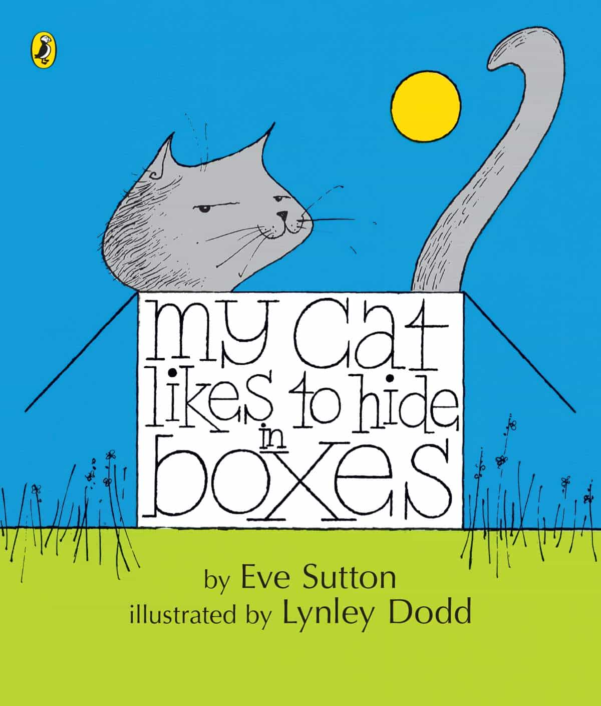
Written by Eve Sutton, My Cat Likes to Hide in Boxes is the very first picture book illustrated by New Zealand’s Dame Lynley Dodd.
-
Children of the Corn by Stephen King Short Story Analysis
What is it about corn? Sure, Stephen King can make anything creepy, and so he does in “Children of the Corn”. But long before Stephen King filled his first diaper, humans have been very wary of… yes, corn.
-
In Praise of the Sloth
Of all the deadly sins, slothfulness is the least problematic. In fact, most people would benefit from becoming more like a sloth, not less.
-
Strawberry Spring by Stephen King Short Story Analysis
“Strawberry Spring” is a short “Jack the Ripper” story by American writer Stephen King. But rather than Jack the Ripper, King utilises Victorian folklore around a figure known as Springheel Jack.
-
Steven Spielberg’s Duel Film Analysis
Duel is a 1971 TV movie, which became a feature film and launched the career of American director Steven Spielberg.
-
Click Clack the Rattle Bag by Neil Gaiman Analysis
“Click Clack the Rattle Bag” is a short Halloween story by British author Neil Gaiman. The author first published it on in 2012 as part of All Hallow’s Read.
-
Hunters in the Snow by Tobias Wolff Analysis
“Hunters in the Snow” (1976) is a short story by American author Tobias Wolff. Find it in Wolff’s collection titled In the Garden of the North American Martyrs.
-
Encounter by Noel Hilliard Short Story Analysis
“Encounter” is a 1971 short story by New Zealand author Noel Hilliard (1929-1996). Find it in New Zealand’s famous 20th century literary magazine Landfall, which is now available online. LANDFALL, VOLUME TWENTY-FIVE, NO. 3, 1971 p. 270 NOEL HILLIARD’S WRITING STYLE As you read “Encounter”, consider if you agree with the following assessment of Hilliard’s
-
What Is A Chronotope?
According to Russian literary theorist Mikhail Bakhtin (1895–1975), a chronotope is a type of image which fuses space in a time in a concrete and meaningful way. He introduced this term in 1937. The word chronotope comes by way of Russian from the Greek words for time and place. Think chronology + topography smooshed together. But when
-
How I Met My Husband by Alice Munro Short Story Analysis
The narrator of “How I Met My Husband” has a different voice from most other characters by Canadian author Alice Munro.
-
Gravity by David Leavitt Short Story Analysis
“Gravity” is a short story by David Leavitt, born 1961. I’m reading it in The Oxford Book of American Short Stories edited by Joyce Carol Oates (1992), though it was first published in 1990 in Leavitt’s A Place I’ve Never Been collection. This gay writer had his first collection published at the age of twenty-three
-
Raven and Crow Symbolism
What does the raven symbolise in art and literature? Also, how do different cultures view ravens, and how are ravens different from crows?
-
Cookie Jar by Stephen King Short Story Analysis
What do you imagine of when you think “cookie jar”? Grandmothers? Buttery, sweet snacks? Cosy kitchens? Sesame Street?
-
An Occurrence at Owl Creek Bridge Analysis
“An Occurrence At Owl Creek Bridge” is an 1890 short story by Ambrose Bierce, one of Bierce’s most famous works and an American classic.