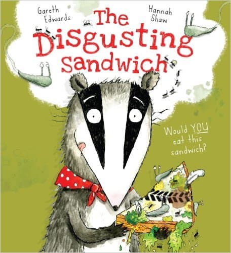
My 7-year-old kid expressed disgust at The Disgusting Sandwich and said she didn’t want to read it again, but she brought it to me again a few days later. This time, she knew what to expect, and managed to enjoy it.
Most kids I know love to be grossed out. There’s a narrow window in childhood in which this is the case. It must come soon after learning that some things are disgusting — that one can’t pick one’s nose and eat the booger, or taste-test dead flies on the window sill.
WHAT’S THE DISGUSTING SANDWICH ABOUT?
When a boy brings his mouth-watering sandwich to the park, he’s not the only one who thinks it looks rather appetizing. A series of animals also have their greedy eyes on it, including one very hungry badger.
However, before anyone can eat it, a series of accidents befall the unfortunate sandwich. Before long, it has been dropped in sand, squished by a skateboard and even slithered over by slugs. By the time the sun sets in the park and the badger gets his paws on it, the sandwich looks far from appealing.
Marketing Copy
Reviews tend to mention the twist in the ending of this picture book. The challenge with picture books in general is to make them re-readable fifty times, in which case twist-endings have to be superb. The twist in this book is likely to appeal to the younger age range across multiple readings, though I’m not sure it works all that many times for the target age range (which seems to be 6+).
The twist is achieved by having the main character do something out of character, according to how the character has been set up: We are shown/told that the badger refuses to eat something disgusting, but he ends up eating something even more disgusting than a dropped sandwich could ever be (to humans).
WONDERFULNESS
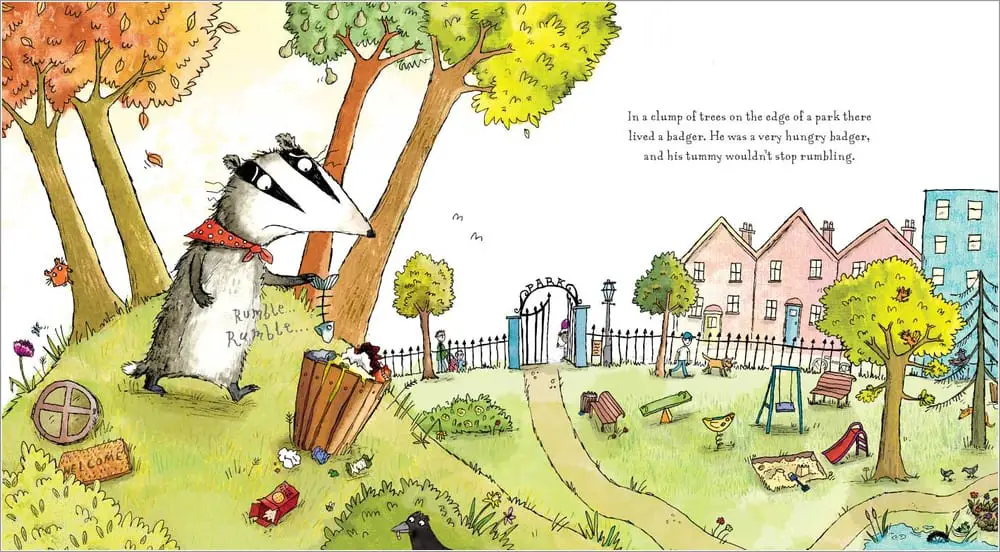
On the first first page we know Badger’s desire: He wants to find something to eat. We even have some onomatopoeic intratext over his belly: ‘Rumble rumble’.
- The Badger’s moral shortcoming is that he wants to take some food that is not his. (The sandwich belongs to the boy.)
- The Badger’s psychological shortcoming is that he’s grossed out by food which isn’t in tip-top condition — he’s an animal after all, and if he doesn’t eat dropped food, other animals will beat him to it.
The other standout feature of this picture book is the sophisticated language, which encourages the reader to revel in word play as much as in disgustingness. This is partly what makes this book suitable for the older picture book audience (ages 6+).
NOTES ON THE ILLUSTRATION
As you can see, the colour palette used in these illustrations is light-hearted and appealing, and the dominant colour on the cover is an olivey green, which is a sure sign of category: this is a gross-out book.
Inside, the sky is often left white as a place to position the text.
The font is a well-chosen style with distinctive serifs and if you look closely, it has a little bit of a hand-drawn look to it.
In this book we have an example of ‘naïve perspective’, in which the artist chooses to break the traditional rules of perspective to create a sort of off-kilter world.
The characteristics of naïve art are an awkward relationship to the formal qualities of painting, especially non-respect of the three rules of the perspective (such as defined by the Progressive Painters of the Renaissance):
- decrease of the size of objects proportionally with distance
- muting of colors with distance
- decrease of the precision of details with distance
The results are:
- effects of perspective appear geometrically erroneous
- strong use of pattern, unrefined color on all the plans of the composition, without ‘enfeeblement’ in the background
- an equal accuracy brought to details, including those of the background which should be shaded off.
— Wikipedia
Number one has been utilised in the illustration below, though numbers two and three not so much — there is still slightly more detail in the foreground than in the background (in which case we might expect to see brick patterns on the houses or something.) The wonderful advantage of ‘erroneous perspective’ is that the illustrator can include exactly what’s necessary for the story. In a photograph of this same (fictional) park, we probably wouldn’t be able to see all the goop in the rubbish bin. The cartwheel would be flat, and we wouldn’t be able to pick it out as a cartwheel. The slippery-dip might be hidden behind the tree, and so on.
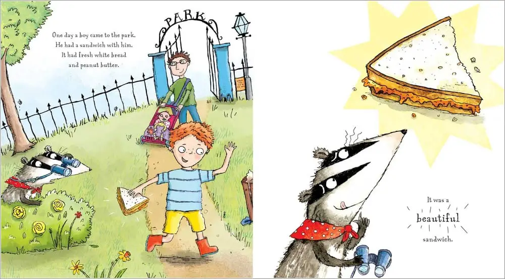
Though not a criticism of this particular book, and more a comment on the wider culture, the character in this story is a prime example of what needs to change: There’s absolutely no reason the ‘generic main human child’ in this book has to be a white boy. I think publishers are starting to request more diversity in their publications after the #WeNeedDiverseBooks campaign of late, in which case we might expect to see more Black kids and something approaching fifty per cent girls as younger writers enter the fray. (It’s currently 3:1.)
TRANSPARENT IDEOLOGIES OF GENDER
The Disgusting Sandwich is quite heavily gendered according to the traditional binaries, though we’re all so used to the norms that they probably won’t stick out for another few decades: It’s a boy who zooms past on the skateboard, and it’s a girl who first declares that the sandwich is too disgusting to eat. (Boys are active; girls are prissy.)
The female animals are all mothers, who take the food to their babies, and the fox is a male, who takes the sandwich as a gift for a female fox he likes. We almost never see the other way around in picture books, in which a female character tries to woo a male character by taking him a gift, unless it involves some sort of self-sacrifice (see Nick Bland’s The Very Cranky Bear for a similar example of this and, infamously, Shel Silverstein’s The Giving Tree). The fox ‘opened his mouth to tell her how nice [the female fox] looked’, reinforcing that old female-beauty chestnut, and how it’s the most important thing a woman can be (it must be, because it’s the first thing to be commented upon).
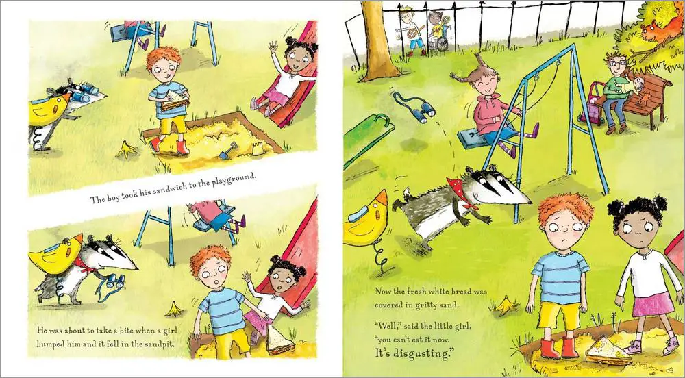
Below is an interesting example of word placement — a part of the picture has been erased to form a white strip. This dissects the illustration and makes it look like a cafe sandwich! (Sandwiches always taste better when you cut them off-kilter.)
On the opposing illustration we can see the head of the little girl who has had her head cut off. We see a non-white character now as a nod towards diversity, but she is not the ‘main character‘, introduced in the beginning as the star of the human show. It’s nice to see a character in a wheelchair, but again, we’re not seeing other-abled children as star characters, unless the story is about their disability.
STORY SPECS
32 pages
Published March 1st 2013 by Alison Green (The UK publisher, not the Australian one)
Gareth Edwards, born 1965 in Cornwall, is a producer (radio and TV) who has also written a number of children’s books, with animals as a commonality.
Hannah Shaw has illustrated a large number of picture books and is also a writer.
Reading Age: 6+
COMPARE AND CONTRAST
Gross-out or Anti-authoritarian Books For Middle Childhood
If we’re to use Maria Nikolajeva’s categorisation of children’s books (Prelapsarian, Carnivalesque and Postlapsarian), most of these anti-authoritarian books fit into the carnivalesque category. The main child characters have the freedom to play (in this case with disgusting/taboo things) without the presence of adults, and it is assumed that afterward the story has ended they return to the security of home with no real character growth or awareness of their own mortality. On the other hand, since gross-out humour is a style rather than a genre, children can be introduced to the concept of death in a light-hearted manner via gross-out humour.
For those of us currently reading picture books to our own children, we probably grew up with the books of Roald Dahl, who completely understood the childhood attraction to gross things and unpleasant people, which is why the pairing between Dahl and Blake was so successful. Even now, illustrators of gross out books tend to use Quentin Blake’s ‘messy line’ work and splotchy fills, and it’s no accident that Blake now illustrates the work of David Walliams, branding him as the Dahl of the current generation.
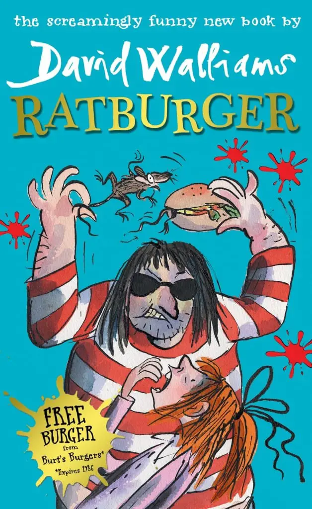
These days there are plenty of authors and illustrators working in gross-out books, including the super-popular Andy Griffiths here in Australia (The Day My Bum Went Psycho), who is perhaps less ‘gross-out’ than ‘taboo busting’, mentioning bums at every possible moment. His gags elicit laughs rather than ‘ewwww’s. I may be imagining it, but is there a disproportionate number of red-headed white boys starring in gross-out books?
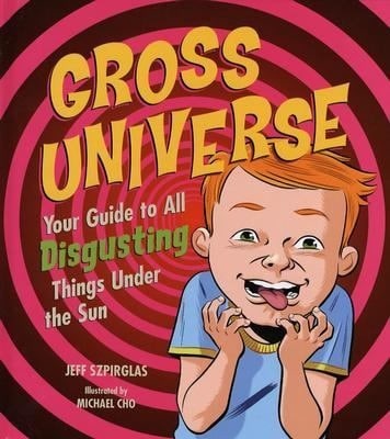
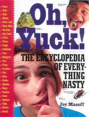
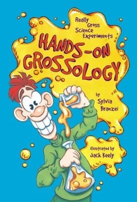
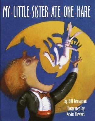
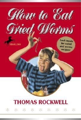
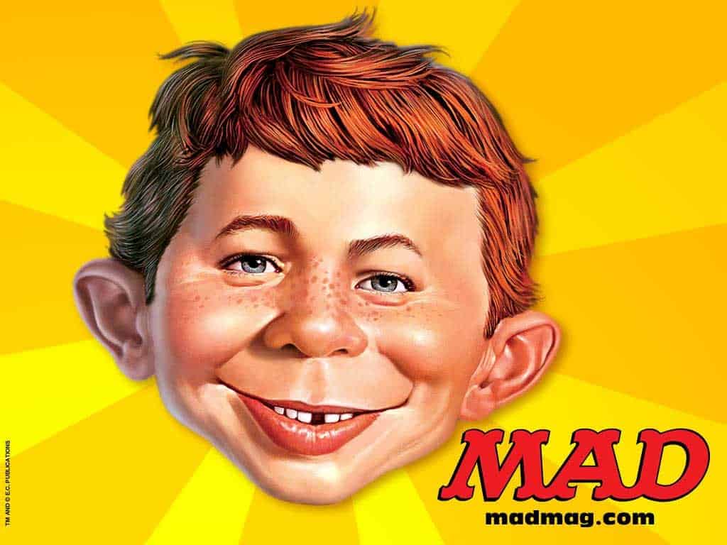
If so, I suspect a common influence:
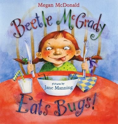
In the case of girls, perhaps the influence is that cute psychopath Pippi Longstocking? Here we even have the wayward plaits:
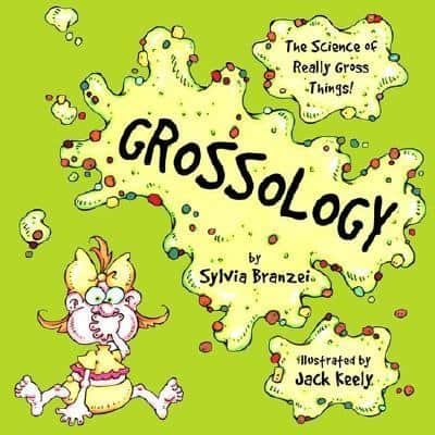
The gross-out category subverts traditional ideas of what good children should do, and also what good children should look like, with illustrators creating non-cute characters with asymmetrical features, googly eyes and patchy skin tones, though if we have a proliferation of red-headed characters in gross-out books, I’m not sure what this does for red-headed children, who already suffer discrimination from peers:
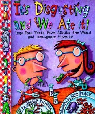
The emphasis is on bodily functions, hidden in the adult world but all-too-obvious in child life, in which children require years of indoctrination before learning to blow their own damn noses:
WRITE YOUR OWN
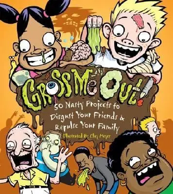
Gross out books have features in common: bodily functions feature heavily, and things which are not normally ingested/touched are ingested and touched, or sometimes there’s humour around death and rotting things. Gross out books still require a plot and rounded characters — the gross out part is simply a stylistic choice, and your target audience will be somewhere between 6 and 10.
It is said that gross out books appeal mainly to boys, though I’m not so sure that’s a useful gender distinction. Some critics have said that snot and vomit are masculine bodily fluids whereas feminine body-fluids involve tears, with toilets as a setting for the release of emotions. Personally, I think this is a stretch. What do you think about that?
Though some newer gross out books are showing more character diversity, there’s still a long way to go. Is it possible to write a gross out book starring a PoC/other abled character, or are we not in that place yet? Are white boys the only characters we can lampoon, precisely because of their relatively privileged position? And are red-headed boys simply the whitest of the white?
Books such as The Day My Bum Went Psycho actually require a sophisticated reader to grasp the full extent of the humour — the humour in that particular work relies upon an understanding of the war story genre, in which case the reader has ideally heard many war stories before encountering a spoof. Which other genres might be spoofed with a gross out style? Do gross out stories for pre-pubescent children even require a dual audience, with sophisticated humour, to avoid being lambasted by certain sectors of the reading public?
